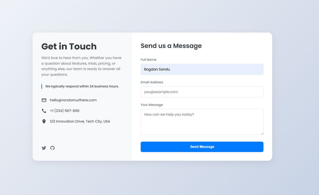
Most WordPress sites reach for a plugin the moment they need a contact form. It works, but it is not the only way. You can create forms in WordPress without…
Table of Contents
Forms drive conversions, but most fail spectacularly. Poor form design kills user engagement faster than slow loading pages.
HTML form best practices separate successful websites from digital graveyards. Users abandon poorly designed forms within seconds, taking potential revenue with them.
Modern web development demands forms that work seamlessly across devices and browsers. Accessibility standards, security requirements, and user expectations have never been higher.
This guide covers everything from input validation to mobile optimization. You’ll learn proven techniques for creating forms that users actually complete. We’ll explore form accessibility, security measures, and performance optimization strategies that improve both user experience and conversion rates.
Input Field Design and Types
Choosing the Right Input Types
HTML5 brought us a treasure trove of input types that go way beyond the basic text field. Each input type serves a specific purpose and triggers different behaviors on mobile devices.
Email inputs automatically validate email format and show appropriate keyboards on mobile. Password fields hide text for security. Number inputs restrict entry to numeric values and show number pads on touch devices.
Date pickers eliminate format confusion. Users don’t have to guess whether you want MM/DD/YYYY or DD/MM/YYYY. Tel inputs optimize mobile keyboards for phone numbers.
Text and Basic Inputs
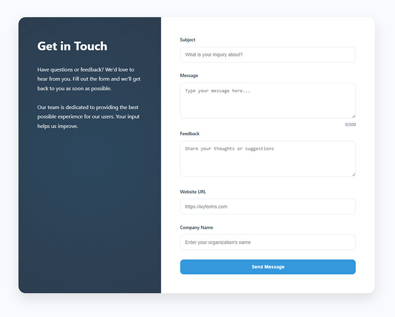
Text inputs handle most general content. But don’t default to text for everything.
URL inputs validate web addresses and show optimized keyboards. Search inputs often include a clear button and may trigger autocomplete suggestions.
File inputs need careful consideration. They should clearly indicate accepted file types and size limits.
Specialized Input Types
Range sliders work well for numeric selections within defined bounds. Color pickers eliminate the guesswork of hex codes.
Time inputs standardize time format entry. DateTime-local combines date and time selection in one control.
Hidden inputs store data without user interaction. Use them for session tokens or tracking information.
Input Field Sizing and Layout
Field width should match expected content length. ZIP codes need narrow fields. Comments need wide text areas.
Single-column layouts work best for most forms. They’re easier to scan and complete than multi-column designs.
Group related fields visually. Billing and shipping addresses should feel like separate sections.
Responsive Field Dimensions
Mobile forms require larger touch targets. Minimum 44px height prevents fat-finger mistakes.
Full-width fields on mobile eliminate horizontal scrolling. Desktop forms can use narrower, content-appropriate widths.
Text areas need adequate default height. Users shouldn’t have to resize constantly.
Visual Hierarchy
Field grouping creates logical flow. Related inputs belong together spatially.
White space separates form sections. Dense layouts overwhelm users.
Progressive disclosure reveals complex options gradually. Basic forms show essential fields first.
Input Styling and States
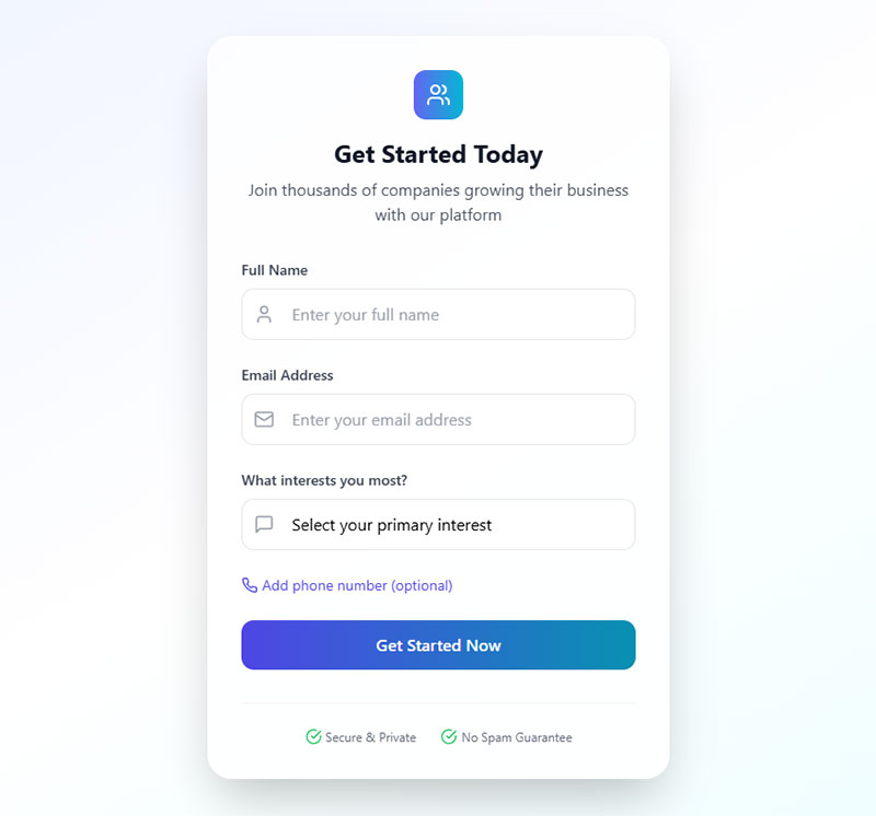
Fields need clear visual states. Default, focused, error, and disabled states should look distinct.
Focus indicators help keyboard users navigate. Don’t remove browser focus outlines without replacing them.
Consistent styling across all inputs creates professional appearance. Custom styles should maintain usability.
Error State Design
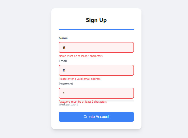
Error states need immediate visual attention. Red borders or backgrounds signal problems clearly.
Error styling should persist until users fix the issue. Premature removal confuses users.
Success states can use green indicators for positive feedback.
Labels and Field Identification
Label Implementation Methods
Every input needs a label. Screen readers rely on proper label association to understand form structure.
Explicit labeling uses the for attribute to connect labels with inputs. This method works reliably across all browsers and assistive technologies.
<label for="email">Email Address</label>
<input type="email" id="email" name="email">
Implicit labeling wraps inputs inside label elements. This approach works but explicit labeling offers more flexibility.
ARIA Labeling Techniques
Aria-label provides invisible labels for screen readers. Use it when visual labels aren’t practical.
Aria-labelledby references existing text elements as labels. This technique works well for complex form layouts.
Aria-describedby links inputs to help text or error messages. It provides additional context without cluttering labels.
Label Text Best Practices
Labels should be concise and descriptive. “Email” works better than “Please enter your email address here.”
Avoid jargon and technical terms. “Phone” beats “Telecommunications device identifier.”
Question-based labels feel conversational. “What’s your phone number?” sounds friendlier than “Phone Number.”
Writing Clear Labels
Action words create engagement. “Choose your plan” works better than “Plan selection.”
Positive phrasing feels welcoming. “Join our newsletter” beats “Newsletter subscription opt-in.”
Context matters for label clarity. “Address” might mean email, shipping, or billing address.
Required Field Indicators
Visual markers help users identify mandatory fields. Asterisks (*) are universally understood.
Consistent marking systems prevent confusion. Don’t mix asterisks with “required” text randomly.
Color alone shouldn’t indicate required fields. Some users can’t distinguish colors reliably.
Optional Field Strategies
Mark optional fields instead of required ones when most fields are mandatory. This reduces visual clutter.
“Optional” text in parentheses clearly indicates non-required fields.
Form validation should account for optional field handling. Don’t validate empty optional fields.
Placeholder Text Guidelines
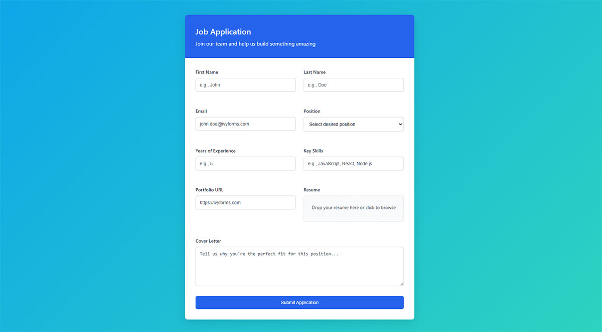
Placeholders provide input examples but shouldn’t replace labels. They disappear when users start typing.
Good placeholder text shows format examples. “[email protected]” demonstrates email format clearly.
Avoid instructions in placeholders. “Enter your email address” belongs in labels, not placeholders.
Placeholder Accessibility Issues
Low contrast placeholders create readability problems. Many users struggle with faded placeholder text.
Screen readers often ignore placeholder text. Never rely on placeholders for critical instructions.
Placeholder text works best for format clarification, not primary labeling.
Fieldset and Legend Usage
Fieldsets group related form controls semantically. Payment information, shipping details, and contact data each deserve separate fieldsets.
Legend elements provide group descriptions. They’re especially important for radio button and checkbox groups.
Screen readers announce legend text when users enter fieldset areas. This provides valuable context.
Grouping Strategies
Logical grouping reduces cognitive load. Users process information in chunks more easily than long lists.
Visual grouping should match semantic grouping. Fieldsets and CSS styling should align.
Complex forms benefit from clear section breaks. Multiple fieldsets with descriptive legends improve navigation.
Validation and Error Handling
Client-Side Validation Strategies
Client-side validation provides immediate feedback without server round trips. HTML5 validation catches basic errors before form submission.
Real-time validation can frustrate users if triggered too early. Wait until users finish typing or move to the next field before showing errors.
JavaScript validation offers more control than HTML5 constraints. Custom validation handles complex business rules that browser validation can’t manage.
HTML5 Built-in Validation
Required attributes prevent empty submissions. Pattern attributes enforce specific formats using regular expressions.
Min and max attributes limit numeric ranges. Step attributes control increment values for number inputs.
Email and URL inputs validate format automatically. No custom JavaScript needed for basic email validation.
Custom Validation Timing
Validate on blur for most fields. Users complete their input before seeing feedback.
Immediate validation works for username availability checks. Real-time feedback prevents submission errors.
Submit validation catches remaining errors. Always validate server-side regardless of client-side checks.
Error Message Design
Error messages need clear, actionable language. “Invalid email” helps less than “Please enter a valid email address like [email protected].”
Position error messages near the problematic field. Users shouldn’t hunt for error explanations.
Persistent error styling keeps problems visible until fixed. Don’t hide errors when users click elsewhere.
Writing Helpful Error Text
Explain what went wrong and how to fix it. “Password must contain at least 8 characters, one number, and one symbol” guides users clearly.
Avoid technical jargon in error messages. “Field validation failed” means nothing to most users.
Positive language feels less accusatory. “Please enter your email address” beats “Email field cannot be empty.”
Error Message Placement
Inline errors appear next to individual fields. This approach works well for form validation during completion.
Summary errors list all problems at form top. Use this method for submission validation feedback.
Modal error dialogs interrupt user flow. Reserve them for critical system errors only.
Success Feedback and Confirmations
Success indicators build user confidence. Green checkmarks or text confirm valid entries.
Submission confirmations prevent duplicate submissions. Users need clear feedback that their action succeeded.
Progress indicators help with multi-step processes. Users want to know how much remains.
Positive Validation Design
Subtle success styling avoids overwhelming green interfaces. Small icons or border changes work well.
Success messages should be specific. “Account created successfully” beats generic “Success” text.
Auto-dismiss success messages after reasonable time. Permanent success indicators clutter interfaces.
Confirmation Message Strategy
Form submission confirmation messages should include next steps. What happens after users submit?
Email confirmations provide backup verification. Users can reference submission details later.
Thank you pages offer upselling opportunities. Successful form completion creates engagement momentum.
Accessibility and Inclusive Design
Screen Reader Compatibility
Screen readers need semantic markup to understand form structure. Proper labels, fieldsets, and landmarks create navigable experiences.
ARIA attributes fill gaps in HTML semantics. Use them to enhance, not replace, good HTML structure.
Form instructions belong in labels or aria-describedby attributes. Screen readers announce this content appropriately.
ARIA Implementation Techniques
Aria-invalid marks fields with validation errors. Screen readers announce error states when users focus problematic inputs.
Aria-live regions announce dynamic content changes. Use them for real-time validation feedback.
Role attributes clarify element purposes when HTML semantics fall short. Form regions need clear landmarks.
Screen Reader Testing
Test forms with actual screen reader software. NVDA and JAWS behave differently from browser developer tools.
Keyboard-only navigation reveals accessibility problems. Tab through forms without using a mouse.
Form accessibility requires ongoing attention, not one-time fixes.
Keyboard Navigation Support
Tab order should follow logical reading sequence. Users expect left-to-right, top-to-bottom navigation.
Skip links help users bypass repetitive content. Long forms need shortcuts to main sections.
Focus management keeps users oriented. Visible focus indicators show current position clearly.
Tab Order Optimization
Tabindex values override natural document order. Use them sparingly and test thoroughly.
Modal dialogs need focus trapping. Users shouldn’t tab out of modal contexts accidentally.
Form sections require logical grouping. Related fields should tab together sequentially.
Keyboard Shortcuts
Custom shortcuts can improve efficiency. Alt+S for submit, Escape for cancel are common patterns.
Document keyboard shortcuts clearly. Users can’t guess hidden functionality.
Avoid conflicts with browser or system shortcuts. Test shortcuts across different platforms.
Visual Design for Accessibility
Color contrast affects readability for many users. WCAG guidelines specify minimum contrast ratios for text and backgrounds.
Focus indicators need sufficient visibility. Default browser outlines often lack adequate contrast.
Text sizing should respect user preferences. Avoid fixed pixel sizes that prevent scaling.
Color and Contrast Requirements
Error indicators can’t rely on color alone. Use icons, text, or patterns alongside red styling.
Link colors need enough contrast against backgrounds. Blue links on purple backgrounds fail accessibility tests.
Form validation should use multiple visual cues. Color, icons, and text together improve clarity.
Typography and Readability
16px minimum font size improves readability. Smaller text creates barriers for many users.
Line height affects text clarity. 1.4 to 1.6 line-height ratios work well for body text.
Font choices impact legibility. Sans-serif fonts generally read better on screens than serif fonts.
Inclusive Design Principles
Forms should work for users with diverse abilities and technologies. Cognitive disabilities require simple, clear interfaces.
Motor impairments affect precise clicking. Larger touch targets accommodate various interaction methods.
Inclusive design benefits everyone, not just users with disabilities. Simple forms work better for stressed or distracted users too.
Cognitive Accessibility
Clear instructions reduce cognitive load. Break complex processes into simple steps.
Consistent navigation patterns help users build mental models. Don’t change layouts unexpectedly.
Error prevention works better than error correction. Good form design anticipates user mistakes.
Motor and Dexterity Support
Large click targets accommodate various input methods. 44px minimum size works for most users.
Sufficient spacing prevents accidental activation. Crowded interfaces create interaction problems.
Alternative input methods include voice control and switch navigation. Semantic markup supports these technologies.
Mobile Form Optimization
Touch-Friendly Interface Design
Mobile users need larger interaction targets. 44px minimum height prevents accidental taps on adjacent elements.
Thumb-friendly placement keeps important buttons in reachable zones. Bottom-right corner works best for right-handed users.
Spacing between clickable elements reduces errors. 8px minimum prevents fat-finger mistakes.
Button and Input Sizing
Form buttons need adequate touch area. Small buttons frustrate mobile users and increase abandonment.
Input fields should span device width on narrow screens. Horizontal scrolling kills usability.
Visual hierarchy becomes more important on small screens. Primary actions need clear prominence over secondary options.
Touch Target Guidelines
Apple recommends 44px touch targets. Google suggests 48dp for Android interfaces.
Icon buttons need larger hit areas than their visual boundaries. CSS padding expands clickable zones invisibly.
Adjacent interactive elements require separation. Cramped layouts cause interaction errors.
Mobile Input Enhancements
Virtual keyboards optimize automatically for different input types. Email inputs show @ symbols prominently.
Autocomplete attributes speed data entry significantly. Browsers suggest saved information for common fields.
Input mode attributes control keyboard layouts. “numeric” shows number pads for ZIP codes.
Virtual Keyboard Optimization
Tel inputs display numeric keypads with phone-specific characters. URL inputs include forward slashes and .com shortcuts.
Search inputs often include “Go” buttons instead of “Return” keys. This subtle change improves user flow.
Password managers work better with proper autocomplete values. Use “new-password” for registration forms.
Autofill Support Implementation
Name attributes should match standard autofill values. “given-name” and “family-name” work better than “first_name.”
Address autocomplete speeds checkout processes. Proper implementation reduces cart abandonment significantly.
Credit card autofill needs specific input names. “cc-number” and “cc-exp” trigger browser suggestions.
Mobile Form Layout Adaptations
Single-column layouts work best on mobile devices. Multi-column forms create cramped, unusable interfaces.
Progressive disclosure reveals complex options gradually. Show essential fields first, advanced options later.
Floating labels save vertical space while maintaining accessibility. They move above inputs when focused.
Responsive Design Patterns
Collapsible sections organize long forms efficiently. Users expand relevant sections as needed.
Step indicators show progress in multi-step forms. Mobile users especially need orientation cues.
Sticky navigation keeps important actions visible. Submit buttons should stay accessible during scrolling.
Mobile-Specific Form Patterns
Drawer-style date pickers work better than dropdown calendars. They’re easier to manipulate with touch input.
Radio buttons and checkboxes need larger touch targets. Default sizes are too small for reliable mobile interaction.
Toggle switches feel more natural than checkboxes for binary choices. They communicate state changes clearly.
Performance and Loading Optimization
Form Loading Speed
Progressive rendering shows content while scripts load. Users see forms immediately, even on slow connections.
Critical CSS for form styling should load first. Defer non-essential styling to prevent render blocking.
Lazy loading works for non-visible form sections. Load additional fields only when users need them.
Progressive Form Rendering
Above-the-fold form elements need immediate rendering. Below-the-fold sections can load progressively.
Skeleton screens maintain layout during loading. They prevent jarring layout shifts.
Inline critical styles eliminate render-blocking requests. Keep essential form CSS in HTML documents.
Script Optimization Strategies
Defer validation scripts until after initial render. Forms should be usable before JavaScript loads.
Bundle related form scripts together. Multiple HTTP requests slow initial loading.
Tree-shaking removes unused JavaScript code. Smaller bundles load and parse faster.
Data Handling Efficiency
Autocomplete reduces typing and errors. Browser-stored data loads instantly compared to server requests.
Local storage preserves draft form data. Users don’t lose progress during interruptions.
Debounced validation prevents excessive server requests. Wait for typing pauses before checking availability.
Autocomplete Implementation
Standard autocomplete values work across browsers. Custom values may not trigger suggestions.
Autocomplete=”off” disables browser suggestions when inappropriate. Use sparingly since it hurts usability.
Saved payment methods speed checkout significantly. Secure storage enables one-click purchases.
Draft Saving Mechanisms
Auto-save drafts every few seconds. Don’t wait for user action to preserve data.
Local storage has size limits. Large forms may need server-side draft storage.
Clear saved drafts after successful submission. Stale data creates confusion later.
Network Considerations
Offline functionality maintains usability during connection issues. Service workers cache form assets.
Retry mechanisms handle temporary network failures gracefully. Queue submissions for automatic retry.
Connection-aware features adapt to network conditions. Reduce validation frequency on slow connections.
Offline Form Functionality
Service workers cache form HTML, CSS, and JavaScript. Forms work without internet connectivity.
IndexedDB stores form data offline. Sync with servers when connections restore.
Queue submissions during offline periods. Background sync handles uploads automatically.
Bandwidth-Conscious Design
Compress images and assets aggressively. Large files hurt mobile users on limited data plans.
Optimize forms for slower connections. Every byte counts on 3G networks.
Minimize external dependencies. Third-party scripts add unpredictable loading delays.
Connection State Handling
Network information API detects connection quality. Adjust behavior based on reported speeds.
Graceful degradation ensures forms work on any connection. Core functionality shouldn’t require high bandwidth.
Loading indicators communicate progress during slow operations. Users need feedback on form submission status.
Security and Data Protection
Input Sanitization and Validation
Server-side validation prevents malicious data from entering your system. Never trust client-side validation alone.
SQL injection attacks exploit unsanitized database queries. Use parameterized queries or prepared statements for all database interactions.
Cross-site scripting (XSS) occurs when user input contains executable code. Escape all output and sanitize input data thoroughly.
XSS Prevention Strategies
HTML encoding converts dangerous characters to safe entities. <script> becomes <script> and can’t execute.
Content Security Policy (CSP) headers block unauthorized script execution. Configure strict policies that prevent inline JavaScript.
Input filtering removes or neutralizes suspicious content. Whitelist allowed characters instead of blacklisting dangerous ones.
Database Security Measures
Prepared statements separate SQL code from user data. This approach prevents injection attacks completely.
Stored procedures add another layer of protection. They limit direct database access from application code.
Least privilege principles restrict database permissions. Form processing should only access necessary tables and operations.
Sensitive Data Handling
Password fields need special security considerations. Never store passwords in plain text or reversible encryption.
Credit card data requires PCI DSS compliance. Most applications should use payment processors instead of handling card details directly.
Personal information needs careful protection. GDPR and similar regulations impose strict requirements on data handling.
Password Security Measures
Bcrypt hashing protects stored passwords effectively. Salt values prevent rainbow table attacks.
Password strength meters guide users toward secure choices. Real-time feedback improves password quality.
Two-factor authentication adds security beyond passwords. SMS, apps, or hardware tokens provide additional verification.
PII Protection Strategies
Data minimization reduces risk exposure. Collect only necessary personal information.
Encryption protects data both in transit and at rest. Use industry-standard algorithms and key management.
Regular security audits identify vulnerabilities. Form security requires ongoing attention.
HTTPS and Secure Transmission
SSL certificates encrypt data between browsers and servers. Forms handling sensitive data must use HTTPS.
Mixed content warnings appear when HTTPS pages load HTTP resources. All form assets need secure delivery.
Certificate validation prevents man-in-the-middle attacks. Use certificates from trusted authorities.
SSL Implementation
Form action URLs must use HTTPS protocol. HTTP form submissions expose data to interception.
Secure cookies prevent session hijacking. Set secure and httpOnly flags on authentication cookies.
HSTS headers force HTTPS connections. They prevent downgrade attacks and improve security.
Data Encryption Standards
TLS 1.3 provides the strongest current encryption. Disable older protocols that have known vulnerabilities.
Forward secrecy protects past communications. Even if private keys leak, historical data stays secure.
Strong cipher suites prevent cryptographic attacks. Regularly update encryption configurations.
Advanced Form Features
Dynamic Form Elements
See the Pen
Modern Conditional Form with Pastel Theme by Bogdan Sandu (@bogdansandu)
on CodePen.
Conditional logic shows or hides fields based on user selections. This approach simplifies complex forms significantly.
JavaScript-powered forms can add or remove fields dynamically. Shopping carts often use this pattern for item quantities.
Dependent dropdowns update options based on previous selections. State/province lists change when users select countries.
Conditional Field Display
Show advanced options only when relevant. Beginner users see simpler interfaces initially.
Hide irrelevant sections to reduce cognitive load. Insurance forms benefit heavily from conditional logic.
Progressive disclosure reveals complexity gradually. Users see additional fields only when needed.
Dynamic Field Management
Add/remove buttons let users control form complexity. Contact forms might allow multiple phone numbers.
Array-style naming handles variable field counts. Use phone[0], phone[1] for multiple phone inputs.
Validation must account for dynamic fields. Check all present fields, ignore removed ones.
File Upload Handling
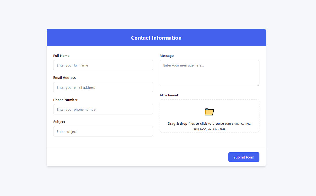
Modern file uploads support drag-and-drop interfaces. This interaction feels more natural than traditional file pickers.
Progress indicators show upload status clearly. Large files need visible progress feedback.
File type restrictions prevent unwanted uploads. Check extensions both client-side and server-side.
Drag and Drop Implementation
Drop zones need clear visual feedback. Highlight areas when users drag files over them.
Multiple file selection speeds bulk uploads. Allow users to select several files simultaneously.
Thumbnail previews help users verify correct files. Show image previews before upload completion.
Upload Security Considerations
File size limits prevent server overload. Set reasonable maximums based on use cases.
MIME type checking validates actual file content. Don’t trust file extensions alone.
Virus scanning protects against malicious uploads. Quarantine suspicious files automatically.
Multi-Step Form Implementation
See the Pen
Modern Multi-Step Job Application Form by Bogdan Sandu (@bogdansandu)
on CodePen.
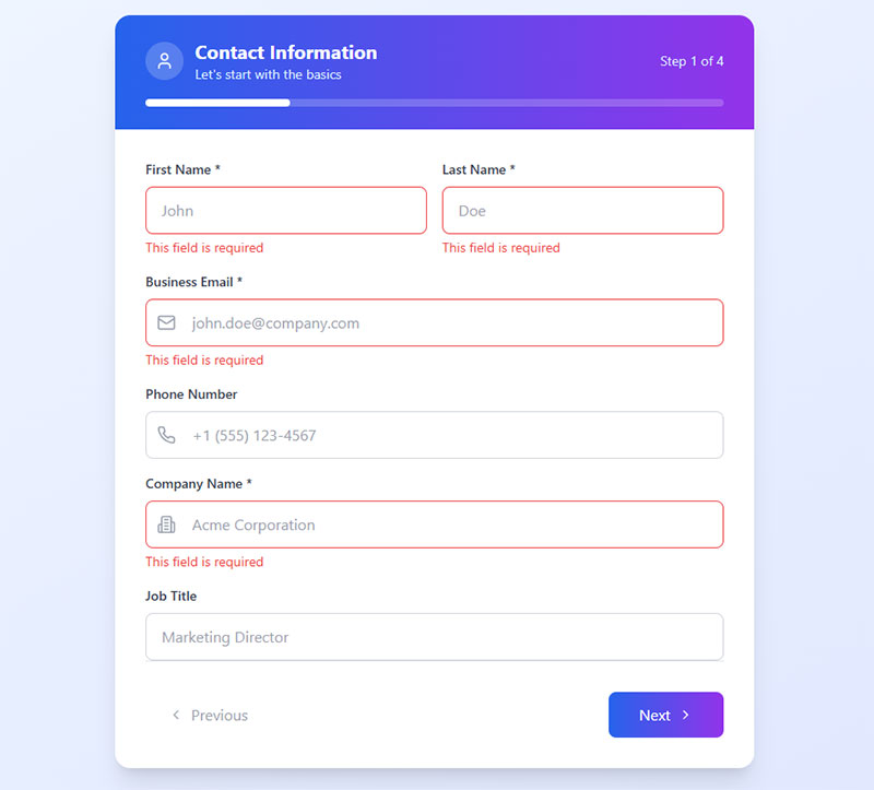
Multi-step forms break complex processes into manageable chunks. Users complete sections progressively.
Progress tracking shows completion status. Visual indicators help users understand remaining work.
Data persistence saves progress between steps. Users shouldn’t lose information when navigating.
Step Navigation Design
Breadcrumb navigation shows current position. Users can jump to previous steps easily.
Next/Previous buttons provide clear navigation. Disable unavailable directions to prevent confusion.
Step validation prevents invalid progression. Users must complete current steps before advancing.
Data Management Between Steps
Session storage preserves form data temporarily. It survives page refreshes but clears when browsers close.
Database storage handles longer processes. Save drafts for forms that take days to complete.
URL parameters can maintain simple state. Use them for short, non-sensitive step data.
Progress Communication
Step counters show completion ratios. “Step 3 of 7” gives users clear expectations.
Progress bars visualize completion percentage. They work well for forms with variable step counts.
Estimated time remaining helps users plan. “About 5 minutes left” sets realistic expectations.
Testing and Quality Assurance
Cross-Browser Form Testing
Browser inconsistencies plague form development. Chrome, Firefox, Safari, and Edge handle input validation differently.
Input type support varies across browsers. Older versions may not recognize newer HTML5 input types.
Mobile browsers add their own quirks. iOS Safari behaves differently from Chrome on Android.
Browser Compatibility Strategies
Test forms in major browsers regularly. Don’t assume identical behavior across platforms.
Polyfills fill gaps in older browser support. They enable modern features in legacy environments.
Progressive enhancement ensures basic functionality works everywhere. Advanced features layer on top safely.
Mobile Browser Testing
Real device testing reveals issues desktop testing misses. Simulators don’t capture all mobile behaviors.
Touch interaction patterns differ between devices. iPad gestures work differently than iPhone taps.
Virtual keyboards affect layout unexpectedly. Test with various keyboard configurations.
Input Behavior Validation
Different browsers validate email formats inconsistently. Some accept unusual but technically valid addresses.
Required field handling varies subtly. Test empty form submissions across all target browsers.
Date input formats cause frequent compatibility issues. Some browsers show pickers, others show text fields.
Validation Consistency Testing
HTML5 validation messages appear differently across browsers. Custom validation provides consistent messaging.
Error timing varies between implementations. Some browsers validate on submit, others on blur.
Pattern matching behavior differs slightly. Test regular expressions thoroughly across browsers.
Input Type Fallbacks
Unknown input types fallback to text inputs. This usually works but may lack desired functionality.
Feature detection helps decide validation approaches. Check browser capabilities before implementing advanced features.
Graceful degradation ensures forms work without JavaScript. Core functionality shouldn’t depend on scripting.
User Experience Testing Methods
Form completion time reveals usability problems. Long completion times suggest interface issues.
Error rate tracking identifies problematic fields. High error rates indicate poor design or unclear instructions.
Improving form abandonment rate requires understanding where users quit.
Completion Time Analysis
Short forms shouldn’t take long to complete. Measure baseline times for different form types.
Complex forms naturally take longer. Set realistic expectations based on form complexity.
Time per field metrics reveal bottlenecks. Difficult fields slow overall completion significantly.
Error Pattern Recognition
Track which fields generate the most errors. Address high-error fields first for maximum impact.
Error message effectiveness needs measurement. Do users understand and fix problems quickly?
Validation timing affects error rates. Too early validation frustrates users unnecessarily.
User Feedback Collection
Direct user feedback reveals issues analytics miss. Users explain frustrations that data can’t capture.
Usability testing sessions provide qualitative insights. Watch users struggle with specific interface elements.
Feedback forms about forms create useful meta-feedback loops.
Feedback Collection Methods
Exit surveys catch abandonment reasons. Ask users why they didn’t complete forms.
Post-submission surveys gather completion experiences. Successful users provide valuable improvement insights.
A/B testing compares form variations objectively. Split traffic between different designs systematically.
Qualitative Research Techniques
User interviews uncover deeper usability issues. Scheduled sessions provide focused feedback opportunities.
Card sorting helps organize complex forms. Users group related fields naturally.
Think-aloud protocols reveal thought processes. Listen to user confusion in real-time.
Automated Testing Approaches
Automated tests catch regressions quickly. Manual testing can’t cover every browser and device combination.
Form validation testing ensures error handling works correctly. Test both valid and invalid input scenarios.
Performance monitoring tracks form loading speed. Slow forms hurt conversion rates significantly.
Validation Testing Scripts
Unit tests verify individual validation functions. Test edge cases and boundary conditions thoroughly.
Integration tests check form submission workflows. Ensure complete user journeys work end-to-end.
Cross-browser automation tools like Selenium test multiple environments efficiently. Automate repetitive testing tasks.
Accessibility Testing Tools
Screen reader testing reveals navigation problems. Automated tools catch many but not all accessibility issues.
Keyboard navigation tests ensure forms work without mice. Tab through entire forms systematically.
Color contrast analyzers check visual accessibility. Ensure sufficient contrast for all users.
Performance Monitoring Setup
Page load time tracking identifies slow-loading forms. Monitor both desktop and mobile performance.
Conversion funnel analysis shows where users drop off. Track completion rates across form steps.
Real user monitoring captures actual user experiences. Synthetic tests miss real-world network conditions.
Quality Assurance Workflows
Systematic testing prevents embarrassing production bugs. Establish clear testing procedures before launch.
Staging environments mirror production settings. Test forms in realistic conditions before deployment.
Peer review catches issues individual developers miss. Fresh eyes spot problems creators overlook.
Testing Checklists
Form functionality checklists ensure comprehensive coverage. Include both happy path and error scenarios.
Accessibility checklists verify inclusive design. Check keyboard navigation, screen reader compatibility, and color contrast.
Security testing validates input sanitization. Test for injection attacks and data exposure vulnerabilities.
Deployment Testing
Production testing verifies deployment success. Check forms immediately after deployment.
Rollback procedures prepare for critical failures. Know how to revert problematic changes quickly.
Monitoring alerts catch post-deployment issues. Set up notifications for form submission failures.
FAQ on HTML Form Best Practices
What input types should I use for better user experience?
Use email inputs for email addresses, tel for phone numbers, and number for numeric data. Date inputs eliminate format confusion. URL inputs optimize mobile keyboards. Each type triggers appropriate virtual keyboards on mobile devices.
How do I make forms accessible to screen readers?
Proper label association is crucial. Use explicit labeling with for attributes or aria-label when visual labels aren’t practical. Fieldsets group related inputs. ARIA attributes provide additional context for complex form structures.
Should I validate forms in real-time or on submission?
Validate on blur for most fields to avoid interrupting user input. Use real-time validation for username availability checks. Always include server-side validation regardless of client-side checks for security.
What’s the best way to handle form errors?
Place error messages near problematic fields with clear, actionable language. Use consistent visual styling and maintain errors until fixed. Explain what went wrong and how to correct it specifically.
How can I optimize forms for mobile devices?
Use single-column layouts and ensure 44px minimum touch targets. Implement proper autocomplete attributes. Full-width fields prevent horizontal scrolling. Virtual keyboards should match input types automatically.
What security measures should I implement in forms?
Always use HTTPS for form transmission. Implement server-side validation and input sanitization. Use prepared statements to prevent SQL injection. Hash passwords with bcrypt and never store them in plain text.
How do I improve form completion rates?
Reduce required fields to essentials. Use clear labels and helpful placeholder text. Implement progress indicators for long forms. Save drafts automatically and provide clear success feedback upon completion.
What’s the difference between placeholder text and labels?
Labels remain visible and provide accessibility. Placeholders disappear when typing and shouldn’t replace labels. Use placeholders for format examples only. Screen readers often ignore placeholder text completely.
Should I use multi-step forms or single-page forms?
Multi-step forms work better for complex processes like checkout or registration. Single-page forms suit simple contact or newsletter signups. Consider user attention span and data complexity when choosing.
How do I test forms effectively across different browsers?
Test in major browsers including mobile versions. Check input validation behavior and visual rendering. Use automated testing tools for repetitive tasks. Real device testing reveals issues simulators miss.
Conclusion
Implementing HTML form best practices transforms user interactions from frustrating obstacles into smooth conversion pathways. Well-designed forms respect users’ time while collecting necessary data efficiently.
Form optimization requires attention to multiple layers. Input validation protects against malicious attacks. Responsive design ensures mobile compatibility. Web forms that follow accessibility standards serve all users effectively.
Testing reveals real-world performance issues that theory alone cannot predict. Cross-browser compatibility, loading speed, and user experience metrics guide iterative improvements. Regular audits catch problems before they impact conversions.
The investment in proper form implementation pays dividends through increased completion rates and reduced support requests. Users appreciate intuitive interfaces that guide them smoothly through data entry processes. Start with semantic HTML structure, add progressive enhancements carefully, and measure results consistently.
