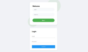
A login form is one of the most important UI components on a website or web application. It’s the entry point for users accessing accounts, dashboards, or private content. If…
Table of Contents
Your forms are costing you leads. Probably more than you realize.
The average form abandonment rate sits around 68%, and most businesses have no idea why visitors bail halfway through.
Looking at website form examples that actually convert gives you something better than theory. You see what works in practice across different industries, from simple contact forms to complex multi-step checkouts.
This guide breaks down real form designs from companies like HubSpot, Shopify, and Airbnb. You’ll learn what makes each effective, which fields to include (and skip), and how to apply these patterns to your own site.
Whether you’re building forms in WordPress, Webflow, or custom code, these examples will show you exactly what high-converting forms look like.
What is a Website Form
A website form is an HTML element that collects user input through text fields, dropdown menus, checkboxes, and radio buttons, then transmits that data to a server for processing.
Forms appear on contact pages, checkout flows, registration screens, and landing pages across every industry.
They serve as the primary bridge between visitors and businesses, turning passive browsers into active leads, customers, or subscribers.
Website Form Examples
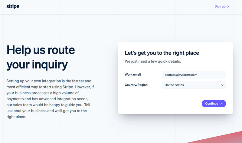
Image source: stripe.com
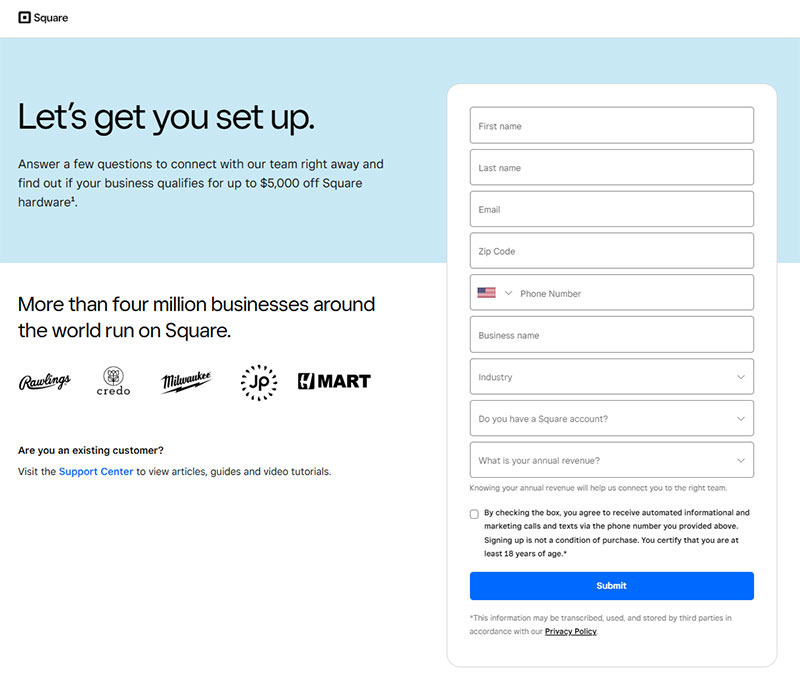
Image source: square.com
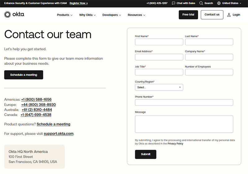
Image source: okta.com
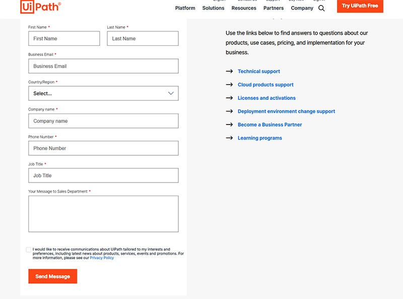
Image source: uipath.com
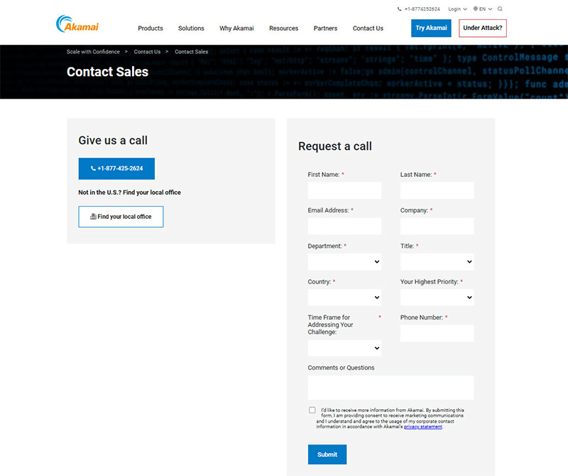
Image source: akamai.com
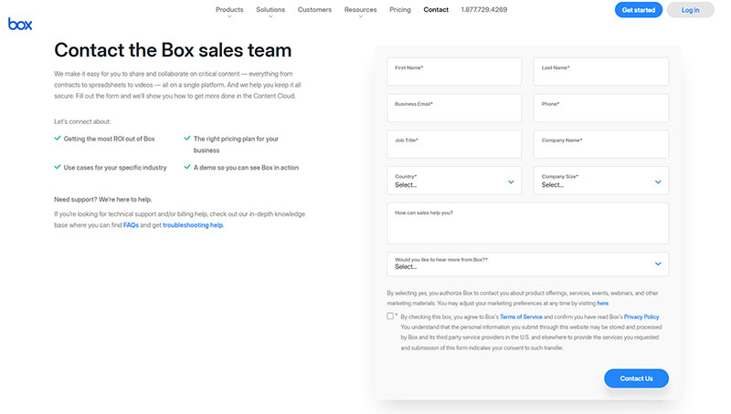
Image source: box.com

Image source: fastly.com
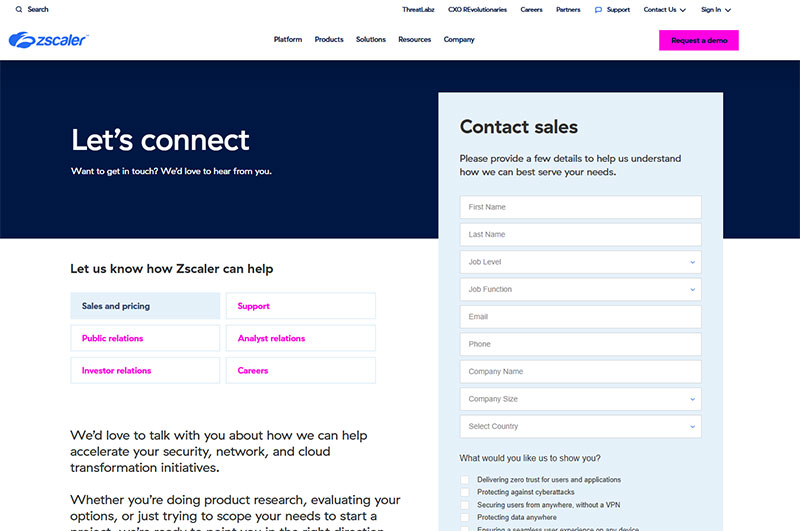
Image source: zscaler.com

Image source: photoroom.com
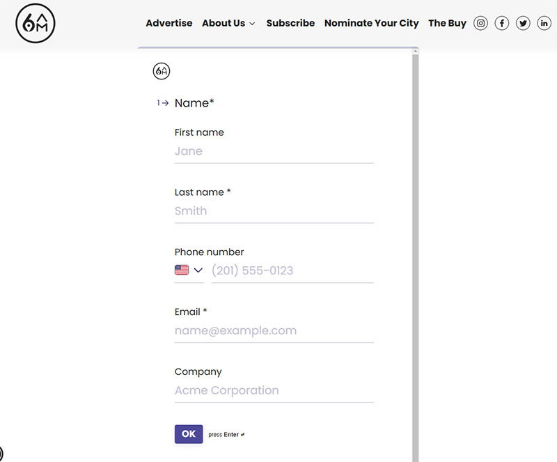
Image source: 6amcity.com
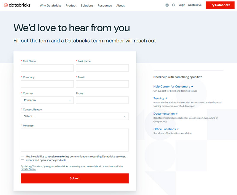
Image source: databricks.com
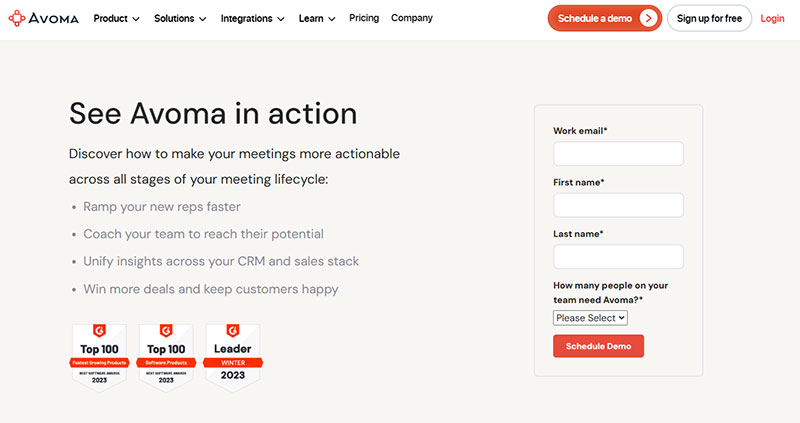
Image source: avoma.com
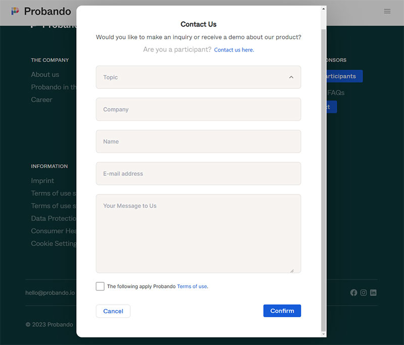
Image source: probando.io
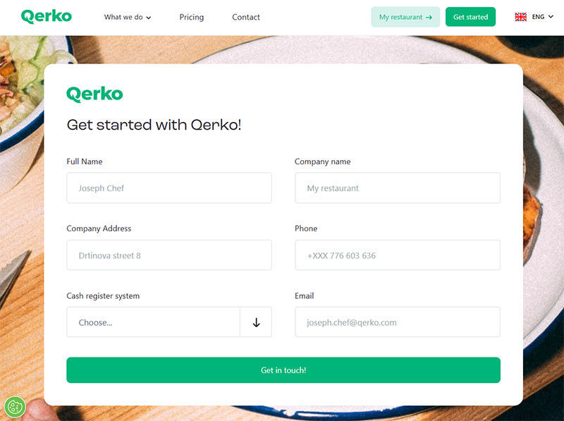
Image source: querko.com
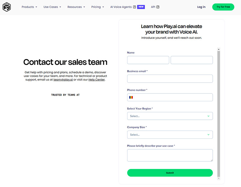
Image source: play.ht
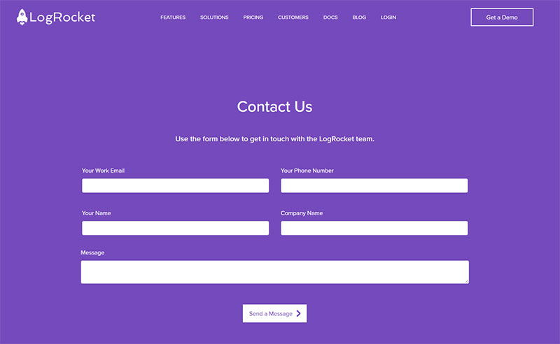
Image source: logrocket.com
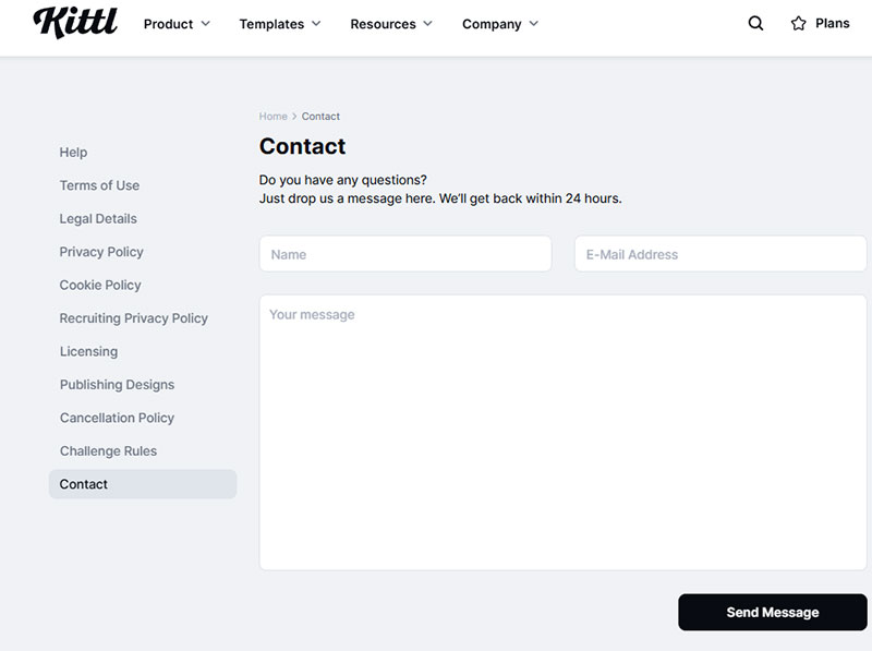
Image source: kittl.com
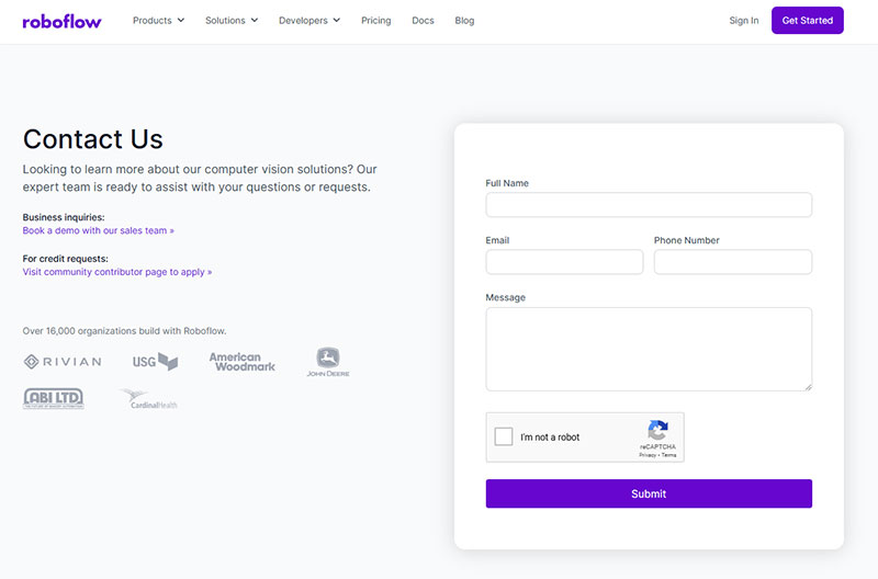
Image source: roboflow.com
How Do Website Forms Work
Forms use HTML5 form elements to create input fields that capture user data.
When someone clicks the submit button, the browser packages all field values and sends them via POST or GET request to a backend server running PHP, Python, or Node.js.
The server validates the submission, stores it in a database, and triggers actions like email notifications or CRM updates through integrations with tools like Zapier, Salesforce, or HubSpot Forms.
Modern web forms use JavaScript and AJAX for real-time form validation, checking entries before submission to reduce errors and form abandonment.
What Are the Types of Website Forms
Different types of forms serve different business goals.
Picking the right type depends on what action you want visitors to take and what data you need to collect.
What is a Contact Form
A contact form lets visitors send messages without exposing your email address to spam bots.
Typical fields include name, email, subject, and message; businesses add phone number or department dropdown for routing.
What is a Registration Form
Registration forms create user accounts for platforms, events, or memberships.
They collect credentials (email, password) plus profile data; event registrations add date preferences, dietary restrictions, ticket quantities.
What is a Checkout Form
Checkout forms process payments on ecommerce sites through integrations with Stripe, PayPal, or Square.
They require billing address, shipping details, and payment credentials while maintaining PCI DSS compliance for card data security.
What is a Survey Form
A survey form gathers opinions using multiple choice, rating scales, and open text fields.
Tools like Typeform and Google Forms make building surveys fast; the key is keeping questions focused to avoid survey fatigue.
What is a Subscription Form
Subscription forms capture email addresses for newsletters and marketing lists.
Most need just one field (email), though adding first name enables personalization; they integrate directly with Mailchimp, ConvertKit, or similar platforms.
What is a Lead Generation Form
A lead generation form qualifies prospects by collecting business-relevant data beyond basic contact info.
B2B forms often ask for company name, job title, budget range, or project timeline to help sales teams prioritize follow-ups.
What Are the Required Fields in Website Forms
Every extra field reduces conversion rate by roughly 4-5%.
Only mark fields as required when you genuinely need that data to process the submission or follow up effectively.
Identity Fields
- Full name or first/last name split
- Username (for account creation)
- Company name (B2B forms)
Contact Fields
- Email address (nearly always required)
- Phone number (optional unless callback needed)
- Preferred contact method
Purpose Fields
- Subject line or inquiry type
- Message or description box
- Department or team selector
Compliance Fields
- GDPR consent checkbox for EU visitors
- Terms acceptance for account signups
- Marketing opt-in (must be unchecked by default under GDPR compliant forms requirements)
Use placeholder text to show expected format without cluttering labels.
Mark optional fields explicitly rather than just marking required ones with asterisks.
How to Design an Effective Website Form
Good form UX design removes friction at every step.
Keep field count under 5 for lead capture, under 7 for registrations; each additional field drops conversion rate measurably.
Layout Principles
Single-column layouts outperform multi-column by 15% on completion rates.
Left-align labels above fields; place the submit button at the bottom left where eyes naturally land after scanning.
Field Organization
Group related fields visually using spacing or subtle dividers.
Put easiest questions first (name, email), harder ones later (budget, timeline); use conditional logic to hide irrelevant fields based on previous answers.
Mobile Considerations
Mobile forms need touch-friendly tap targets (minimum 44×44 pixels) and appropriate keyboard types for each field.
Numeric keypad for phone numbers; email keyboard with @ symbol visible.
Call to Action
Replace generic “Submit” with action-specific text: “Get My Free Quote,” “Start Trial,” “Book Appointment.”
Button color should contrast sharply with form background; test placement above vs below the fold for landing page forms.
What Are the Validation Methods for Website Forms
Validation prevents bad data from entering your system and reduces user frustration from rejected submissions.
The choice between client-side vs server-side form input validation affects both security and user experience.
Client-Side Validation
JavaScript checks entries before submission using HTML5 attributes (required, pattern, minlength) or custom scripts.
Fast feedback, but never trust it alone; users can disable JavaScript or bypass checks.
Server-Side Validation
Backend code (PHP, Python, Node.js) validates all data after submission regardless of client-side checks.
Required for form security; sanitizes input to prevent SQL injection and XSS attacks.
Real-Time Inline Validation
Shows success or form error messages as users type or leave each field.
Green checkmarks for valid entries, red warnings with specific fix instructions; reduces submit-and-fail frustration by 22%.
Common Validation Patterns
- Email: RFC 5322 regex pattern
- Phone: E.164 format or regional patterns
- Postal codes: Country-specific formats
- Passwords: Minimum length, complexity requirements
- Credit cards: Luhn algorithm check
What Industries Use Website Forms
Every industry relies on forms, but compliance requirements and data needs vary dramatically.
Healthcare
Intake forms collect patient history, insurance details, and symptoms before appointments.
HIPAA compliance requires encrypted transmission, access controls, and audit logging for all protected health information.
Financial Services
Account applications, loan requests, and investment inquiries need identity verification fields.
Lead generation for financial advisors typically includes net worth ranges, investment goals, and retirement timeline questions.
Ecommerce
Checkout forms, returns requests, and product reviews drive post-purchase engagement.
Checkout optimization focuses on reducing cart abandonment through guest checkout options and saved payment methods.
Real Estate
Property inquiry forms, showing requests, and mortgage pre-qualification applications.
Lead generation for real estate agents includes budget range, timeline, and property type preferences to qualify buyers.
Legal
Case evaluation forms, consultation requests, and client intake questionnaires.
Lead generation for law firms requires practice area selection, case description, and urgency indicators.
SaaS
Free trial signups, demo requests, and feature feedback collection.
Lead generation for SaaS companies balances low-friction signups against qualifying fields like company size and use case.
What Are the Accessibility Standards for Website Forms
Form accessibility ensures people with disabilities can complete submissions using assistive technologies.
WCAG 2.1 guidelines define the minimum requirements; many countries enforce these legally.
Label Requirements
Every input needs a programmatically associated label using the “for” attribute matching the input “id.”
Placeholder text alone fails accessibility; screen readers may not announce it.
Keyboard Navigation
All form elements must be reachable and operable via Tab key without requiring a mouse.
Focus indicators should be visible; never remove the default outline without providing an alternative.
Error Identification
Error messages must identify the field and describe the problem in text, not color alone.
Use aria-describedby to associate error messages with inputs; announce errors to screen readers using aria-live regions.
Color and Contrast
Text must have 4.5:1 contrast ratio against background; form borders need 3:1 minimum.
Never rely solely on color to indicate required fields, errors, or success states.
What Tools Create Website Forms
Form builders range from free plugins to enterprise platforms with CRM integrations and advanced analytics.
WordPress Plugins
WordPress forms power millions of sites through plugins like WPForms, Gravity Forms, and Ninja Forms.
Free WordPress form plugins handle basic contact forms; paid versions add conditional logic, payment processing, and user registration.
Standalone Form Builders
- Typeform: Conversational one-question-at-a-time format; $25/month starter
- JotForm: Drag-and-drop builder with 10,000+ templates; free tier available
- Formstack: Enterprise features with workflow automation; starts $50/month
- Google Forms: Free, integrates with Sheets, limited design options
Looking beyond JotForm? Check JotForm alternatives for comparable features at different price points.
CRM-Integrated Forms
HubSpot Forms, Salesforce Web-to-Lead, and Marketo forms sync submissions directly to contact records.
Built-in lead scoring, progressive profiling, and automated nurture sequences; best for sales-focused organizations.
Code-Based Solutions
Developers build custom forms using HTML form best practices with CSS3 styling and JavaScript validation.
Maximum flexibility but requires maintenance; frameworks like React Hook Form and Formik simplify state management.
FAQ on Website Forms
What makes a website form effective?
Effective forms use minimal fields, clear labels, and strong calls to action. Single-column layouts with inline validation reduce friction. Mobile responsiveness matters since over 60% of traffic comes from phones. Focus on increasing form conversions through testing.
How many fields should a website form have?
Lead capture forms perform best with 3-5 fields. Registration forms can stretch to 7 fields maximum. Each additional field reduces completion rates by 4-5%. Only ask for data you genuinely need to process the submission or follow up.
What is the best form builder for beginners?
Google Forms and JotForm offer free tiers with drag-and-drop builders. For WordPress sites, WPForms provides beginner-friendly interfaces. Typeform works well for survey forms with its conversational format. All require zero coding knowledge.
Should I use single-step or multi-step forms?
Deciding between multi-step forms or single-step forms depends on field count. Forms with 6+ fields convert better as multi-step. Shorter forms work fine as single-step. Progress indicators help users complete longer sequences.
How do I reduce form abandonment?
Tips for improving form abandonment rate include removing optional fields, adding trust signals, and using autofill. Exit-intent forms can recapture visitors about to leave. Real-time validation prevents frustrating submission errors.
What is the difference between contact forms and lead generation forms?
Understanding contact forms or lead generation forms matters for your goals. Contact forms handle general inquiries with basic fields. Lead generation forms qualify prospects with questions about budget, timeline, or company size for sales teams.
Are popup forms effective for lead capture?
Popup forms convert 3-5% of visitors when timed correctly. Exit-intent triggers outperform immediate popups. Comparing inline forms or popup forms shows each has specific use cases based on page type and traffic source.
How do I make forms accessible?
Use proper label associations, keyboard navigation, and sufficient color contrast. Screen readers need aria attributes to announce errors. Never rely on color alone for required field indicators. WCAG 2.1 AA compliance covers most legal requirements.
What form templates convert best?
Browse contact form templates and lead capture form templates for proven layouts. Templates with social proof, benefit-focused headlines, and action-oriented buttons consistently outperform generic designs. Test variations to find what works for your audience.
How do I protect forms from spam?
Use reCAPTCHA, honeypot fields, or rate limiting to block bots. Server-side validation catches submissions that bypass client checks. Honeypots add invisible fields that bots fill out, flagging automated submissions without annoying real users.
Conclusion
These website form examples prove that small design choices drive big conversion differences.
The patterns are clear: fewer fields, single-column layouts, inline validation, and action-specific buttons.
Start by auditing your current forms with heatmaps and form analytics to find drop-off points.
Test one change at a time. Maybe swap your submit button text or add a progress indicator to longer sequences.
Tools like Gravity Forms, Formstack, or Wufoo make A/B testing straightforward without developer help.
Don’t forget compliance. GDPR and CCPA requirements affect how you collect and store user data, especially for EU and California visitors.
Add spam protection through reCAPTCHA early. Build trust signals into your design.
Your forms are revenue gates. Treat them that way.
