



Most form tutorials show you what’s possible. This one shows you what actually works. The State of CSS 2024 survey puts Tailwind CSS at 62% developer usage. More teams are…
Table of contents
Most sites asking for an email address are making the same basic trade, something offered in exchange for an address. What changes from one site to the next is how pushy that ask gets. A blog tucks it into the footer where nobody has to notice it. A retailer throws a discount popup in front of the homepage before you’ve read a single line. Some SaaS company hides the whole form behind a button that only shows up once someone clicks “download the guide.”
Subscription form examples are the record of that choice in action, one brand, one format, one trigger, and usually a number attached to how it performed. They’re not templates. Copying a popup that worked for a skincare brand onto a B2B blog tends to go badly, since the audience, the intent, and the traffic source are all different.
Omnisend tracked 1.24 billion popup displays and found usage climbed 54 percent between 2024 and 2025. Average conversion per display dipped slightly anyway, down to 2.1%, as more sites compete for the same handful of seconds of attention (Omnisend, 2025).
What Are Subscription Form Examples?
What makes any single example worth looking at is the combination behind it, format, field count, trigger, and copy. Change one of those and the whole thing behaves differently, which is exactly why a case study beats a generic best-practices list.
A subscription form example is a documented case, not a template. This brand tried this trigger with this field count and got this result. Nothing more, nothing dressed up.
Subscription forms sit inside the larger group of types of forms a typical website runs, alongside contact forms and registration forms, plus the occasional survey form.
What actually separates a subscription form from those is intent. Nobody filling one out is asking a question or applying for anything. They’re opting into contact that keeps happening long after they close the tab.
That distinction ends up deciding almost everything else here, right down to how many fields a form should ask for and where it sits on the page.
General sign up form best practices cover field count, copy, and layout in more depth than this piece will.
What Types of Subscription Forms Exist?
Popups get most of the attention because they’re impossible to miss, but plenty of sites run something quieter instead: an embedded box, a slide-in panel, a sticky footer bar, a two-step reveal, or an occasional full-page takeover. Format alone tends to predict the rough conversion range before anyone’s even written the copy.
Each one trades intrusiveness for visibility differently. A popup blocks the page and gets high raw numbers. A footer box never blocks anything and gets ignored by most people scrolling past it.
| Format | Interruption Level | Typical Trigger | Best For |
|---|---|---|---|
| Popup | High | Time delay, exit intent, scroll | High-traffic content sites |
| Embedded | None | Always visible | Blogs, footers, article ends |
| Slide-in / footer bar | Low | Scroll depth | Sites avoiding popup fatigue |
| Two-step opt-in | Medium | Click | Content upgrades, lead magnets |
Popup Forms
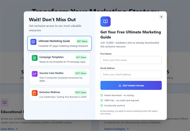
Wisepops looked at benchmark data across more than a billion popup displays and landed on an average popup conversion rate of 4.82% for 2026 (Wisepops, 2026).
A popup interrupts the page with an overlay, usually centered or full screen, and asks for a decision before the visitor can keep reading. There’s no ignoring it, which is both the appeal and the problem.
To understand the format itself before comparing it against alternatives, what is a popup form breaks down the mechanics in more depth.
The upside is straightforward. Nothing on the page competes with a popup for attention, so it consistently produces the highest raw conversion numbers of any format, and it pairs especially well with a discount or a gamified touch like a spin-to-win wheel.
The downside shows up mostly with repeat visitors. Interrupting someone who already knows and trusts the site reads as annoying rather than helpful, and a full-screen popup on mobile risks getting flagged as an intrusive interstitial, which can hurt search rankings.
Onyx Cookware swapped its standard discount popup for a value-based spin-to-win format on product pages, turning a routine email field into something closer to a small game. The campaign’s conversion rate came in above 43%.
Embedded Forms
See the Pen
Modern Header Subscription Bar by Bogdan Sandu (@bogdansandu)
on CodePen.
Nothing about an embedded form tries to grab attention. It’s a signup box built straight into the page layout, usually sitting in a footer, a sidebar, or right after an article ends, and it behaves like any other block of content on the page.
Visitors scroll past it the same way they’d scroll past a related-posts widget, easy to ignore, occasionally worth a click.
That passivity has an upside and a downside. Page experience metrics stay untouched and there’s zero risk of tripping the intrusive interstitial rules on mobile, but conversion runs lower than a popup simply because the format depends on someone noticing it rather than forcing the issue.
Media sites running a newsletter signup form tend to lean on this exact format. Their audience already trusts the brand enough to go looking for the box instead of needing it shoved in front of them.
Slide-in and Footer Forms
See the Pen
Modern Slide-In Subscription Form by Bogdan Sandu (@bogdansandu)
on CodePen.
Slide-in forms enter from a corner or edge after a scroll or a time delay. Footer bars sit fixed at the bottom of the viewport instead, staying visible without ever covering the page. Neither one takes over the main content area the way a centered popup does.
Getsitecontrol ran its own 2024 signup-rate test across five widget types, and the results went against what you’d expect. Fullscreen popups converted highest at 3.41%, modal popups followed at 2.95%, then sidebar widgets at 2.61%. Sticky bars and slide-ins actually finished last, at 2.3% and 2.17%. The two gentlest, least intrusive formats in the test produced the lowest signup rates, not somewhere in between (Getsitecontrol, 2024).
That makes this format a reasonable choice on a site already dealing with popup fatigue from other campaigns, where a gentler ask is worth the tradeoff even at the cost of some raw conversion volume. It makes less sense anywhere the offer needs urgency or scale, since a small corner element rarely earns the same attention as a full overlay.
Two-Step Opt-in Forms
A two-step opt-in form hides the email field behind a link or a button and only reveals it once someone clicks.
The visitor ends up committing twice, once to the click and then again to filling in the field. Each small commitment makes the next one feel easier, which is basically the foot-in-the-door effect researchers have written about for decades.
People who make it through the first click tend to be genuinely interested already, so completion on the second step usually runs high. Total volume takes the hit instead, since that first click filters out anyone who was only half paying attention.
A two-step form can be built as a popup or as something fully embedded in the page, and inline forms compared to popup forms is worth a read before picking one.
Where Should a Subscription Form Appear on a Page?
Placement decides who actually sees a form, and more importantly, what state of mind they’re in when they see it. A header catches everyone immediately, before they’ve read a word. A footer only reaches people who stuck around long enough to finish the page. Sidebars sit next to content that’s already holding someone’s attention, and exit overlays fire right as a visitor is halfway out the door.
None of these placements wins universally. The right one depends on what the visitor happens to be doing on the page at that exact moment, not on some general ranking of best positions.
Header and Navigation Placement
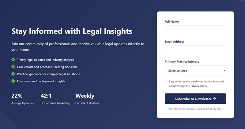
A form sitting in the header or top navigation catches every single visitor before they scroll, which maximizes reach without necessarily maximizing interest.
Nobody at this point has read anything yet. Whatever trust the offer needs has to come from the brand name itself, since there’s no context built up to lean on.
That makes it a reasonable fit for brands with strong existing recognition, where the name alone does the trust-building. It’s a weaker fit for cold traffic arriving fresh from a search result, since there’s nothing familiar to anchor the ask.
Footer Placement
See the Pen
Modern Footer Subscription Form with Social Proof by Bogdan Sandu (@bogdansandu)
on CodePen.
A footer form sits at the natural end of the reading journey, where commitment and friction are both already lowest.
By the time someone scrolls that far down, they’ve already decided the content was worth finishing. That’s a warmer signal than a header will ever get, no matter how strong the headline.
Conversion volume stays modest here, mostly because most visitors never scroll that far in the first place. The ones who do tend to convert without needing much of an incentive to push them over.
Sidebar and Inline Placement
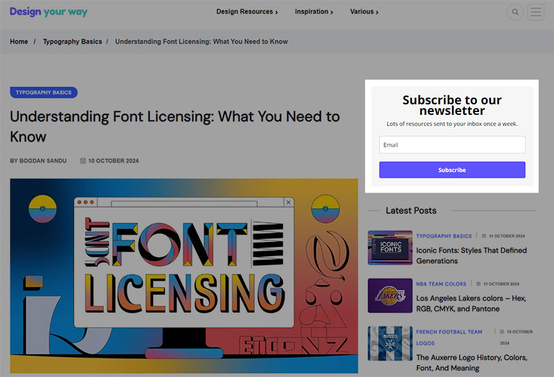
Image source: designyourway.net
Sidebar and inline forms sit next to or inside the content itself, competing directly for attention with whatever the visitor is already reading.
Sidebar widgets work fine on wide desktop layouts, though they tend to vanish entirely once the screen narrows to mobile. Inline forms placed mid-article catch readers right when they’re most engaged, which is arguably the better trade.
On a narrow viewport, a sidebar form usually needs to collapse into an inline or footer position rather than just shrinking in place. Dedicated mobile form best practices cover that exact adjustment.
Exit-Intent Overlay Placement
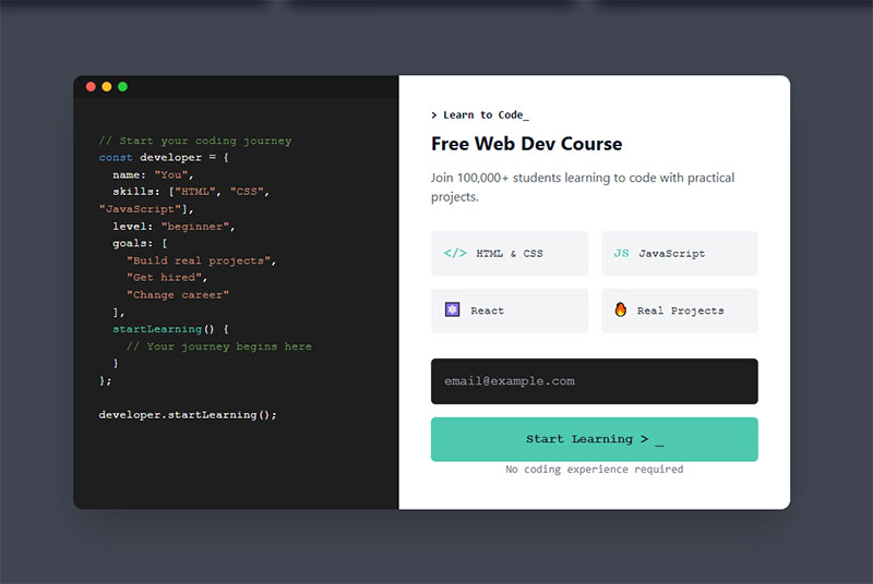
An exit-intent overlay only fires when the visitor’s cursor moves toward the browser’s close button or address bar, catching them right as they’re about to leave.
Bibado, a baby products retailer, uses this placement with a cart-value threshold instead of a flat offer, showing visitors exactly how close they are to unlocking a better discount rather than repeating the same generic popup everyone else runs.
For a broader set of formats using this same placement, exit intent popup examples shows how different brands handle the moment.
What Triggers Make a Subscription Form Appear?
A subscription form can fire off a plain time delay after the page loads, a scroll-depth threshold, an exit-intent cursor movement toward the top of the browser, or a direct click on a link or button. The trigger ends up mattering just as much as the format itself. A beautifully designed popup shown at the wrong moment still converts poorly, no matter how good the copy is.
Time-Delay Triggers
A time-delay trigger fires a set number of seconds after the page loads, regardless of what the visitor is actually doing at that moment.
Getsitecontrol’s testing found immediate popups, shown within two seconds, converting at 4.01%. A two-to-five second delay actually dropped that to 3.46%, and delays past five seconds climbed back up to 5.26% (Getsitecontrol, 2024).
The lesson isn’t that longer delays always win. It’s that a fixed delay needs testing against the specific page, since the pattern here isn’t linear at all, it dips before it climbs.
Scroll-Depth Triggers
A scroll-depth trigger fires once a visitor passes a set percentage of the page, commonly 50%. Unlike a header popup, this one targets people who are already engaged with the content rather than everyone who happens to land on the page.
It works best on long articles and product pages, where scrolling itself is basically a signal of interest. A fast skimmer and a slow, careful reader both hit that threshold at the point that actually matters to them, not at some arbitrary second count a time-delay trigger would use instead.
Exit-Intent Triggers
Exit-intent detection tracks cursor movement toward the top of the browser window, where the close button and address bar sit, and fires the instant it senses someone’s about to leave.
On desktop, cursor velocity toward that top edge triggers the popup within milliseconds. Mobile has no cursor to track at all, so the trigger relies on something else instead, a fast scroll-up, a back-button tap, or a tab switch.
Site owners on WordPress typically add this behavior through a dedicated exit intent popup plugin rather than building the cursor-tracking logic themselves from scratch.
Click Triggers
Wisepops’ trigger comparison puts click-triggered popups at 54.42% conversion, by far the highest of any trigger type it measured (Wisepops, 2025).
The number makes more sense once you separate cause from effect. A click trigger only fires after the visitor has already clicked on something asking for the offer, which means they’ve pre-qualified themselves before the form even shows up.
A “download the guide” link or a footer CTA that opens the form on demand are the usual setups. Volume runs lower than time-delay or scroll triggers overall, since not everyone clicks, but the people who do are already halfway convinced.
What Fields Belong in a Subscription Form?
Most subscription forms genuinely need nothing more than an email address. Everything added past that point trades away some completion rate in exchange for the ability to segment or personalize later.
The right number depends on what happens after someone signs up, not on what feels thorough while you’re building the form.
Single-Field Forms
A single-field form asks for nothing but an email address, and it consistently wins on raw completion rate.
Omnisend’s dataset shows forms with one to three fields converting in a similar range, roughly 2.1% to 2.2%, while four fields drop that to 1.5% and five or more fields fall further, to 1.4% (Omnisend, 2025).
The useful takeaway sits inside that range rather than at either end. One field isn’t meaningfully better than two or three, but the drop-off past three fields is consistent enough to actually plan around.
Multi-Field Forms
Name plus email is the most common step up from a bare single field, and it buys the sender one thing an email address alone can’t, personalization in the subject line and the greeting.
First name alone rarely hurts completion in any meaningful way. Company name and job title are a different story. They add friction fast, and really only belong on B2B forms where a sales team genuinely plans to use that data. Phone number shouldn’t sit on a subscription form at all unless SMS updates are an actual, stated part of the offer.
Every field beyond email needs to earn its place against what the welcome sequence or the sales team will realistically do with it. If nobody’s going to look at job title, don’t ask for it.
For general field conventions that go beyond subscription forms specifically, web form best practices covers required-field labeling and validation patterns.
Preference and Segmentation Checkboxes
A checkbox list lets a visitor pick what they actually want to hear about before a single email ever gets sent.
A clothing retailer might split subscribers into womenswear, menswear, and sale alerts right at the point of signup, so the welcome sequence already lines up with stated interest instead of guessing at it.
Segmentation happens for free this way, at the exact moment someone’s most willing to tell you what they want, rather than through a follow-up survey most people will just ignore.
Whatever gets checked here usually flows straight into the list structure of whatever sending platform is in place, Klaviyo, Mailchimp, or something else entirely.
For a full breakdown of which fields pull their weight and which ones quietly kill completion, form fields covers the tradeoffs field by field.
What Incentives Get People to Subscribe?
A percentage discount, a free resource, early access to something new, or free shipping cover most of what actually moves people to sign up. Which one works depends entirely on what the business sells, since a discount means basically nothing to someone reading a blog post with no intention of buying anything today.
Across the wider set of options available, general lead magnet ideas covers formats beyond the four most common ones here.
Discount and Percentage-Off Offers
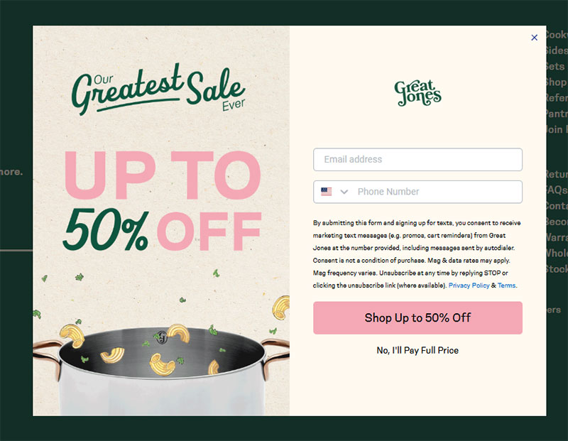
Image source: greatjonesgoods.com
Wisepops’ data shows popups offering a discount converting at 7.45%, which comes out to 62% better than popups running with no incentive at all, sitting at 4.60% (Wisepops, 2026).
Ten percent off is the most common figure out there. Large enough to feel like a real trade, small enough that it doesn’t reduce margin too much on a first order.
It works best on ecommerce sites where a purchase is already fairly likely anyway. It falls flat on content sites and B2B pages, where there’s nothing to actually buy yet.
Gift Basket Australia paired a straightforward coupon with an exit-intent trigger instead of a generic email ask, giving the visitor a reason tied to that specific visit rather than some blanket promise.
Free Resource and Content Upgrade Offers
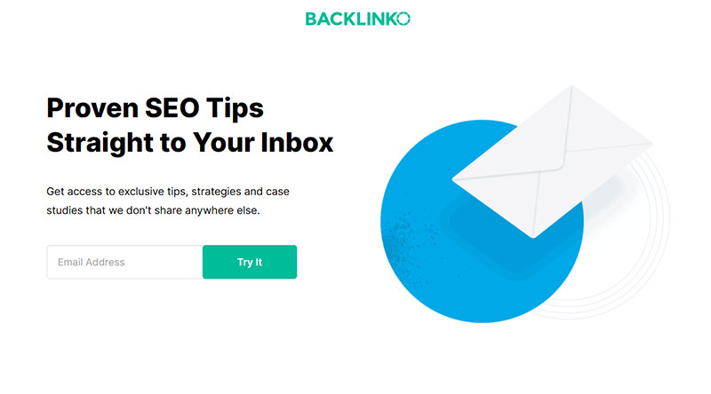
Image source: backlinko.com
Nothing generic works as well as something tied directly to the exact page a visitor is already reading. That’s the whole idea behind a content upgrade, a resource swapped for an email address, specific to the article rather than a vague newsletter promise tacked on at the bottom.
A recipe blog might offer a printable version of the exact recipe on the page. A SaaS blog might offer the checklist mentioned three paragraphs up. The specificity is really what makes it convert, not the format itself.
For a longer list of formats that work this way, content upgrades ideas breaks the format down by content type.
Early Access Offers
Early access trades scarcity for signups. Nobody’s getting a discount here, they’re getting in before everyone else does, which for the right audience matters more than money.
Superhuman built its email client’s early reputation almost entirely on an invite-only waitlist that at its peak topped 300,000 people. A limited invite process became a signal that the product was worth waiting for, rather than a bottleneck anyone needed to apologize for. The company has since opened up to public signup, but the waitlist era is what actually built the brand.
This only works when the wait carries real signal behind it. A fake countdown or an artificial “limited spots” claim on a form that lets everyone through anyway damages exactly the trust it was supposed to build.
Free Shipping Offers
Free shipping beats small discounts on some ecommerce sites, mostly because shipping cost is a well-known cart-abandonment trigger on its own. It costs the business nothing until an order actually happens, unlike a stored discount code sitting there as a liability. Pairing it with a minimum order threshold nudges average order value up at the same time it captures the email.
Apparel and beauty brands lean on this incentive more than software or media brands ever do, simply because shipping cost sits inside the buyer’s decision in the first place for physical goods.
Shopify stores often handle this logic through a dedicated popup app like Privy or Justuno, rather than custom code tied to the theme.
What Makes Subscription Form Copy Convert?
Button text and microcopy carry most of the weight here, more than headline or field labels do, since they sit right at the exact moment someone decides whether to hit submit or bail.
Button and CTA Text Patterns
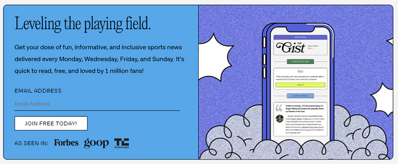
Image source: thegistsports.com
A well-known test from Unbounce, run by Michael Aagaard, changed a button from “Start your free trial” to “Start my free trial” and saw click-through rise by 90%.
The shift from second person to first person sounds tiny on paper. It changes who the visitor imagines is actually speaking, from the brand asking something of them to the visitor claiming something for themselves.
Generic verbs like “Submit” or “Send” tend to underperform, since they describe the action instead of the outcome. Leading with the benefit works better almost every time it gets tested, “Get my discount” beats “Subscribe” more often than not.
For a wider set of tested phrasing patterns beyond subscription forms specifically, call to action examples covers button copy across different form types.
Supporting Microcopy
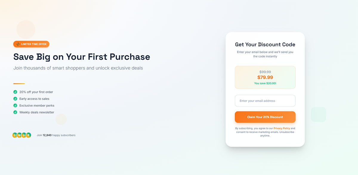
The small line of text sitting near a button or a field does reassurance work a headline never has room for. That’s what microcopy actually is, the fine print that answers an objection before anyone has to voice it.
A line like “no spam, unsubscribe anytime” answers the objection before a visitor even has to ask it out loud. A subscriber count placed near the button, something like “join 40,000 readers,” works as social proof without adding another field to the form.
One fashion retailer, documented by Sleeknote, replaced a plain “Submit” button with “yes please, get me 10% discount,” restating the actual offer instead of just naming the action.
Placeholder text inside the field plays a similar role. Practical placeholder text examples show how the wording inside an empty field can nudge completion without adding a second field.
Which Tools Build the Best Subscription Forms?
Mailchimp, Klaviyo, OptinMonster, and ConvertKit (now rebranded to Kit) cover most of what people actually need here, general use, ecommerce, popup-specific campaigns, and newsletter creators, respectively. The right pick depends on what happens after the signup, not on which tool has the prettiest popup editor.
| Tool | Best For | Pricing Model | Standout Feature |
|---|---|---|---|
| Mailchimp | General-purpose beginners | Free tier, then priced by contact count | All-in-one email and form platform |
| Klaviyo | Ecommerce stores | Free up to 250 profiles, then priced by active profiles | Deep Shopify data sync |
| OptinMonster | Popup-specific campaigns | No full free plan, tiered by site count and views | Exit-intent and page-level targeting rules |
| ConvertKit (Kit) | Newsletter creators | Free up to 10,000 subscribers, unlimited sends | Most generous free tier in the category |
Mailchimp and Klaviyo build the form and the sending platform into a single tool, so a signup drops straight into an existing list with no extra integration step required.
OptinMonster works differently. It builds and displays the form, then hands the captured email off to whatever sending platform is already in place elsewhere.
That difference matters most when it comes to targeting. A dedicated tool like OptinMonster usually offers finer control over exit-intent rules, geo-targeting, and page-level display logic than a built-in form editor tends to.
ConvertKit sits closer to Mailchimp’s model in structure, but it’s built specifically around what a creator selling a newsletter or a digital product actually needs, rather than general marketing.
Whichever tool ends up handling the form, a plugin-based approach is common on WordPress sites specifically. Free WordPress form plugins cover the simpler, embedded end of that spectrum.
What Conversion Rates Do Subscription Forms Get?
Subscription form conversion rates run anywhere from under 1% to over 50%, depending on format, trigger, and industry all at once, which is exactly why a single average number doesn’t tell you much on its own.
The figures below come from separate large-scale benchmark studies, and they’re not always directly comparable, since each one defines a conversion and counts its denominator a little differently.
- Ecommerce popups convert at 6.88% on average, versus 2.01% for B2B popups (Wisepops, 2025)
- The top 10% of A/B-tested popup campaigns convert at 26.83% of visitors (Wisepops, 2025)
- A working benchmark treats anything under 1.5% as underperforming and 5% or higher as excellent (Omnisend, 2025)
The gap between the ecommerce and B2B figures above isn’t really about popup design at all. It reflects how close each visitor already is to a buying decision by the time the form even shows up.
Some studies count a conversion against every popup display, while others count it only against visitors who already interacted with the popup somehow. A rate calculated against interactions will always look higher than one calculated against raw displays, even for the exact same campaign, so conversion rate benchmarks by industry is worth reading with that denominator in mind.
To see how a form is actually performing on a specific site rather than leaning on industry averages, how to track form submissions in Google Analytics covers the setup.
How Do You Build a High-Converting Subscription Form?
Building a subscription form that actually converts follows a fixed order, and skipping ahead to copy before deciding on the goal is the single most common reason a polished-looking form still underperforms.
- Define the goal. Decide whether the form exists to grow a general list, promote a specific offer, or gate a specific resource. The goal determines every choice that comes after it.
- Pick the format and placement. Match the format to how much intrusion the goal actually justifies, then place it where the right visitor will actually see it.
- Choose the trigger. Time delay, scroll depth, exit intent, or click, based on how visitors typically behave on that specific page.
- Decide the fields. Default to email only unless the welcome sequence genuinely needs a second data point to function.
- Write the copy. Headline states the benefit, button copy names the outcome, microcopy handles the objection.
- Test before publishing. Check the form on an actual mobile device, not just a resized browser window, before it goes live.
None of these six steps is optional, but the order matters more than any individual step does. A strong button on a form with the wrong trigger still underperforms, and how to increase form conversions covers the diagnostic process once a form is already live.
Mistakes That Kill Conversion
Most underperforming forms fail for a handful of repeatable reasons, not some mysterious mismatch with the audience.
- Showing the popup before the visitor has read anything, killing whatever context might have helped
- Running the same trigger and offer on every page regardless of what that specific page is actually about
- Testing only on desktop, then discovering later that the close button is unreachable on mobile
- Writing button copy that describes the action instead of the outcome
NiceHair avoided the second mistake by tying its exit-intent popup specifically to cart pages instead of running the same message site-wide, so the offer actually matched what the visitor was about to abandon.
Each mistake here maps back to a decision covered earlier, format, trigger, fields, or copy. Fixing conversion rarely means starting over completely. Usually it just means revisiting one of those decisions in isolation.
For a broader diagnostic pass beyond this list, improving form abandonment rate covers additional causes worth ruling out.
What Compliance Rules Apply to Subscription Forms?
GDPR consent requirements govern EU visitors, CAN-SPAM requirements govern US recipients, and then there’s the separate choice between single and double opt-in for confirming the signup itself. None of these are optional extras tacked onto a nice-to-have list. Ignoring them risks real fines under GDPR, and risks the inbox itself under the deliverability rules tied to opt-in quality.
GDPR Consent Requirements
GDPR requires consent that’s freely given, specific, informed, and unambiguous, which in practice means an unticked checkbox the visitor has to actively select themselves. Nothing pre-checked, nothing assumed.
The Court of Justice of the European Union settled this back in its 2019 Planet49 ruling. A pre-ticked checkbox doesn’t count as valid consent, no matter how clearly the surrounding text explains what it actually does.
Consent for marketing email can’t be bundled together with acceptance of terms and conditions. A visitor has to be able to download a gated resource without also getting signed up for a newsletter in the process. And the fines aren’t small either, up to 20 million euros or 4% of global annual revenue, whichever number turns out higher (GDPR, Article 83).
Litmus, among others, applies this directly on its own signup form: an unchecked opt-in box the visitor has to select themselves, with no consent assumed by default anywhere on the page.
None of this requires some specific technical field. It just requires that the checkbox exists, starts unchecked, and sits visually separate from any other consent the form is collecting. Full walkthroughs of compliant setups, including how to create GDPR compliant forms, cover the implementation details this section skips over.
CAN-SPAM Requirements
CAN-SPAM runs on different logic entirely. Unlike GDPR, it doesn’t require consent before that first email goes out at all.
What it requires instead is an easy way out, once the recipient already has the message sitting in their inbox. Every commercial email needs a visible, working opt-out link or reply option, and opt-out requests have to get honored within 10 business days, no fee or extra information required to process them.
Penalty exposure is real too, civil penalties of up to $53,088 per individual violating email, under current FTC enforcement guidance.
A subscription form built for a US audience only still needs this mechanism sitting on the sending side. The form itself isn’t really where CAN-SPAM compliance lives, the email that follows it is.
Single Opt-in vs Double Opt-in
Single opt-in adds the visitor to the list the moment they submit the form, no confirmation step required anywhere in between. Double opt-in adds an extra click: the visitor submits, then has to confirm through a link in a follow-up email before they’re actually added to anything.
ClearBounce’s comparison found double opt-in lists showing open rates typically 20% to 30% higher than single opt-in lists, though the confirmation step itself does lose a share of signups who never bother clicking through.
The tradeoff is real, not just a technicality. Faster list growth against a cleaner, more engaged list is a genuine choice to make, and modern inbox providers increasingly reward the second option now that raw list size has stopped being the only thing that matters.
When Should You Avoid Using a Subscription Form?
A subscription form is the wrong tool more often than most guides admit. Too little traffic to reach statistical significance, a checkout flow that already asks for email, a mobile landing page where a full popup risks a ranking penalty, a list nobody actually emails afterward, these situations aren’t edge cases. Most sites will run into at least one of them eventually.
A site pulling in a few hundred visits a month can’t really tell the difference between a genuinely better offer and random noise. Adding a popup here mostly adds friction without adding any usable data to act on.
Ecommerce checkout pages already ask for an email address as a required field before payment goes through. Layering a separate subscription popup onto that same flow just asks the visitor to type the same information twice, right at the exact moment friction costs the most. For ways to remove exactly this kind of friction, checkout optimization tips apply directly to this scenario.
The interstitial risk already mentioned for full-screen popups has a narrower scope than it sounds, though. Google’s penalty applies specifically to the page a visitor lands on immediately from a mobile search result, not to popups shown later in a session, and exit-intent overlays are exempted entirely since they fire on the way out rather than blocking the way in.
A subscription form that feeds an inbox nobody checks, or a welcome sequence that never actually got built, collects addresses that go nowhere useful. The list decays before anyone sends to it. Deliverability suffers later, since a stale, unengaged list behaves like a low-quality one to inbox providers regardless of how it got that way. And the visitor who signed up gets nothing back, which quietly damages trust in the brand without a single email ever technically bouncing.
In each of these cases, the fix usually isn’t a better form. It’s removing the form until whatever’s actually missing, traffic volume, page context, a backend sequence, gets put in place first.
FAQ on Subscription Forms
What is the difference between a subscription form, an opt-in form, and a signup form?
These terms overlap almost completely in practice. Signup form is the broadest of the three, covering any kind of account or list registration. Opt-in form leans on the consent angle specifically. Subscription form implies something ongoing, a newsletter or regular updates, rather than a one-time action like creating an account.
Does a subscription form need a close button for accessibility?
Yes. A popup or overlay needs a visible, keyboard-operable close control, not just an icon that only a mouse can click. Screen reader users need a way out too, and skipping this violates WCAG guidance around user control over interrupting content.
What is a lead magnet, and is it different from a discount incentive?
A lead magnet covers any free resource, a guide, a checklist, a template, given in exchange for an email address. A discount is simply one flavor of that broader category. A guide costs you time to put together. A discount costs you real margin on the sale.
Should a subscription form include an SMS opt-in checkbox?
Only if text updates are genuinely part of the offer. Adding a phone field just for the sake of it raises abandonment and invites TCPA compliance risk. Keep it as a separate, clearly labeled checkbox, never bundled silently into the email opt-in.
Do subscription forms slow down page speed or hurt SEO?
A poorly coded popup script can add load time, especially with unoptimized third-party embeds. Lazy-loading the script fixes most of that. The real SEO risk isn’t about speed, it’s about blocking content on a visitor’s entry page from mobile search.
Can a subscription form work without any incentive at all?
Yes, especially for brands that already have strong trust built up. An embedded form on a well-read blog or a known media brand can convert on curiosity and reputation alone, no discount needed. Incentive-free forms tend to work best low on the page, rarely as an interruptive popup.
What Should You Test First in Subscription Form Examples?
When conversion underperforms, trigger timing is the first thing worth testing, field count second, and incentive or copy last. Trigger changes move the needle furthest for the least amount of design effort, so there’s little reason to start anywhere else.
Click-triggered popups convert at 54.42 percent against a typical popup average of 4.82 percent, roughly an elevenfold gap. Field count, by comparison, only moves the needle from 1.4 percent up to 2.2 percent across that same benchmark set, nowhere close to double.
- Trigger timing and type
- Field count and configuration
- Incentive and button copy
Testing trigger before copy costs a slower first data cycle, since isolating one variable at a time takes longer than changing everything all at once. It’s still the only sequence that actually assigns credit to the right change instead of guessing at it after the fact.
Readers comparing consent language and checkbox design across formats can continue with opt-in form examples, which covers the same mechanism under stricter consent framing.