

Most buttons on the internet get ignored. The copy is vague, the placement is off, and the visitor leaves without doing anything. The difference between a page that converts at…
Table of Contents
Your landing page gets traffic but the form isn’t converting. The problem isn’t always your offer or your traffic source.
Most conversion rate optimization failures happen at the form itself. Field count, button copy, placement, validation errors, or missing trust signals kill completion rates.
This guide breaks down landing page form examples that actually work. You’ll see what separates high-converting forms from abandoned ones across different industries and conversion goals.
We’ll cover form design patterns, field optimization strategies, multi-step implementations, and mobile-specific considerations. Each example includes the specific elements that drive conversions, backed by data from HubSpot, Unbounce, and Typeform research.
Core Components of Landing Page Forms
Form Field Configuration
Input field types determine what data you collect and how users interact with your form.
Text fields capture names and custom responses. Email fields trigger mobile keyboards with @ symbols. Dropdowns limit choices to predefined options. Checkboxes allow multiple selections while radio buttons force single choices.
Field quantity directly impacts completion rates. HubSpot’s research shows each additional field reduces conversions by roughly 11%.
Required fields should be marked with asterisks or color coding. Optional fields give users control but risk incomplete data for your CRM integration.
Label positioning matters. Top-aligned labels scan faster than left-aligned. Placeholder text inside fields disappears on click, so never use it as the only instruction.
Visual Design Architecture
Form layout determines scanning patterns and cognitive load.
Single-column layouts perform better on mobile and create a clear vertical path. Multi-column layouts work for desktop when grouping related fields like first name and last name.
Whitespace distribution prevents visual clutter. Give each field room to breathe with minimum 15-20px between elements.
Color contrast ratios need to meet WCAG standards. Field borders should be visible against backgrounds (minimum 3:1 ratio). Active fields need clear visual states.
Button size relative to form container signals importance. Make CTAs 2-3x larger than input fields.
Typography hierarchy guides attention. Field labels should be 14-16px, helper text 12-14px, buttons 16-18px.
Call-to-Action Button Design
Button copy drives action or kills it.
Generic “Submit” converts poorly. Action words like “Get My Free Trial” or “Download Now” set expectations. First-person language (“Start My Account”) increases conversions by 90% according to Unbounce testing.
Color psychology plays a role but contrast matters more. Your CTA button needs to stand out from the page background and form fields. High-converting colors include orange, green, and red, but only when they contrast.
Size proportions should make the button impossible to miss. Minimum 44x44px for mobile touch targets, ideally 48x48px or larger.
Hover states provide feedback. Color shifts, shadows, or scale changes confirm the button is clickable.
Loading state indicators prevent double submissions. Replace button text with a spinner or “Processing…” message.
Landing Page Form Types by Conversion Goal
Different goals require different form approaches.
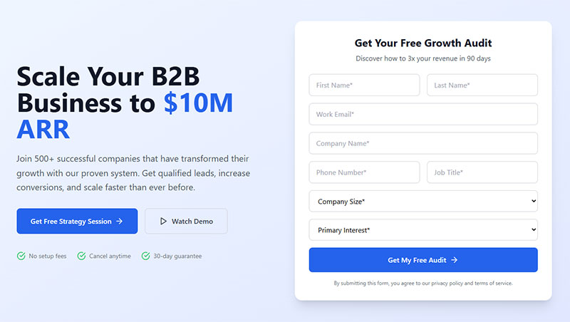
Lead Generation Forms
Lead generation forms qualify prospects while capturing contact information.
Contact fields include name, email, phone. Business qualification fields ask about company size, industry, role. Budget range indicators help sales teams prioritize.
Timeline expectation fields (“When do you plan to buy?”) separate hot leads from researchers.
Keep these forms to 4-6 fields unless you’re targeting enterprise buyers who expect longer qualification.
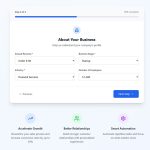
Trial Signup Forms
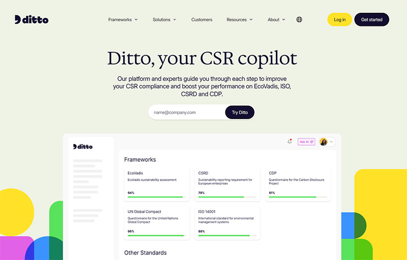
Image source: trustditto.com
Trial signups balance low friction with account creation needs.
Email and password are mandatory. Credit card collection timing varies. No credit card removes friction but increases trial abuse. Collecting cards upfront converts 2-3x lower but yields better paying customer rates.
Social login integration via Google, LinkedIn, or Microsoft reduces friction. Typeform data shows social signups convert 40% faster.
Account verification methods include email confirmation links or SMS codes. Multi-factor authentication adds security for B2B SaaS products.
Progress indicators on multi-step forms show users what’s coming next.
Newsletter Subscription Forms
Newsletter forms should be the shortest on your site.
Email-only approaches maximize signups. Multi-field versions with name and preferences reduce volume but improve segmentation.
Preference center integration lets subscribers choose content types and frequency. This prevents unsubscribes later.
Content category checkboxes work for media companies with multiple topics.
GDPR compliant forms require explicit consent language and opt-in checkboxes, not pre-checked boxes.
Demo Request Forms
Demo requests need qualification data to route leads properly.
Scheduling integration with Calendly or HubSpot Meetings removes back-and-forth emails. Industry and use case selectors help sales teams prepare.
Team size indicators separate SMB from enterprise leads. Current solution questions reveal competitive replacements versus net-new opportunities.
Urgency assessment fields like “When do you need a solution?” help prioritize follow-up. ActiveCampaign found this single field improved sales contact rates by 34%.
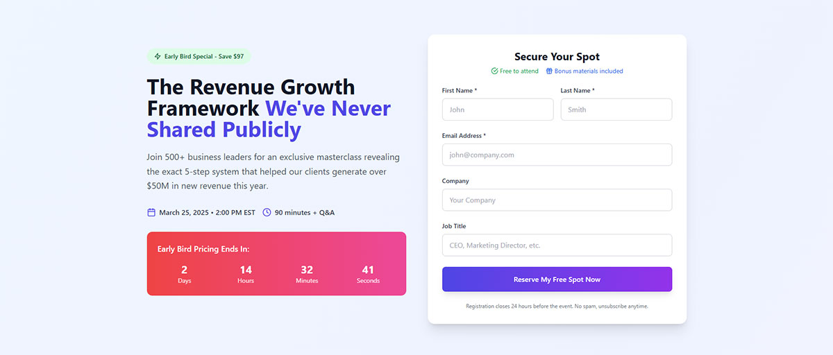
Form Length Optimization Strategies
Form length isn’t about field count. It’s about matching effort to value.
Short Forms (1-3 Fields)

Short forms work when the value proposition is unclear or users are early in their journey.
Top-of-funnel conversions like content downloads or newsletter signups. Mobile-first experiences where typing is friction. Low-commitment offers that don’t require qualification.
Progressive profiling foundations that gather more data on subsequent visits.
Email newsletter subscriptions should never exceed 2 fields. Anything more cuts conversions by half.
Medium Forms (4-7 Fields)
Medium forms balance qualification with conversion rates.
Webinar registrations need name, email, company, role. Resource downloads for mid-funnel content. Free trial activations that create accounts.
Consultation booking forms require enough data to prepare. Mid-funnel qualification separates curious visitors from serious prospects.
This range works when users understand the value but you need segmentation data.
Long Forms (8+ Fields)
Long forms only work when the offer justifies the effort.
Enterprise demo requests expect detailed qualification. High-value quote requests where you need project details. Application submissions for programs or partnerships.
Payment processing requires billing information. Account creation with verification for financial or healthcare products.
Unbounce data shows 11+ fields reduce conversions by 50% or more unless the perceived value is extremely high.
Use multi-step forms to break long forms into digestible sections.
Multi-Step Form Implementation
Multi-step forms reduce cognitive load and increase completion rates.
Progress Indicators
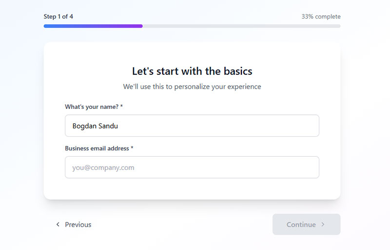
Step counter displays show “Step 2 of 4” at the top of each screen.
Progress bars visualize completion percentage. These increase completion rates by 28% according to Formstack research.
Percentage completion works well for longer forms. Visual step markers with icons represent each section.
Back button functionality lets users correct mistakes without restarting. This is critical for form UX design.
Step Segmentation Logic
Group related fields together to maintain context.
Personal information in step one. Business details in step two. Preferences or requirements in step three.
Spreading cognitive load prevents form abandonment. Each step should take 30-60 seconds maximum.
Building commitment through completion leverages the sunk cost fallacy. Users who complete step one are 70% more likely to finish.
Conditional field display shows relevant questions based on previous answers using conditional logic.
Summary and review steps confirm data before submission. This reduces errors and support tickets.
Form Placement Strategies on Landing Pages
Form position determines visibility and conversion rates.
Above-the-Fold Positioning
Immediate visibility captures users before they scroll.
Hero section integration places the form next to your value proposition. Split-screen layouts dedicate 40-50% of viewport width to the form.
Sidebar form containers work for content-heavy pages. Sticky header forms follow users down the page.
Above the fold works when traffic is warm or the offer is strong. Cold traffic needs education first.
Below-the-Fold with Scroll Trigger
Benefit presentation first builds value before asking for data.
Social proof before form with testimonials, logos, statistics. Feature explanation priority lets users understand what they’re signing up for.
CTA triggered form reveal hides the form until users click “Get Started.” Anchor link navigation scrolls directly to the form section.
Drift found below the fold forms with benefit sections convert 23% higher for complex products.
Form Field Best Practices
Field design affects completion rates and data quality.
Input Validation Techniques
Real-time validation checks fields as users type. Submit-time validation waits until form submission.
Error message placement should appear directly below the problematic field. Inline validation feedback shows green checkmarks for valid entries.
Format guidance for complex fields like phone numbers or credit cards. Use input masks to show expected formats: (___) ______.
Success indicators confirm correct entries and reduce user anxiety.
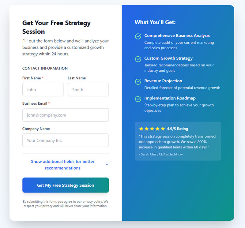
Autofill and Smart Defaults
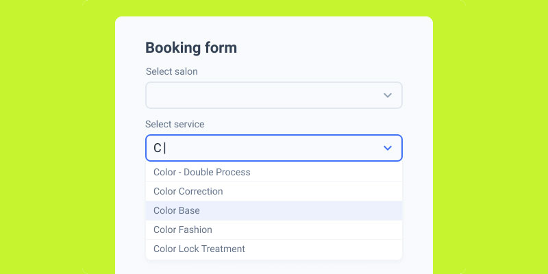
Image source: JetFormBuilder
Browser autocomplete attributes speed up form completion by 30-40%.
Geolocation for country/region selection reduces typing. Device-based default selections pre-fill obvious choices.
Previous submission memory works for returning users. Calendar date pickers prevent formatting errors for date fields.
Google’s research shows autofill enabled forms complete 25% faster.
Mobile Form Optimization
Touch target sizing requires minimum 44x44px for buttons and fields.
Keyboard type triggering shows numeric keyboards for phone fields, email keyboards with @ symbols for email fields. Mobile forms need different considerations than desktop.
Vertical scrolling patterns work better than horizontal. Thumb-friendly button placement keeps CTAs in the lower third of the screen.
Input zoom prevention stops iOS from zooming when field font size is below 16px.
Trust and Security Signaling

Trust elements reduce form abandonment from privacy concerns.
Privacy Assurance Elements
Privacy policy links should be visible near the submit button.
Data usage statements explain what happens with submitted information. “We’ll never share your email” messaging reduces anxiety.
Unsubscribe option mentions for email signups. GDPR compliance requires explicit consent language.
Mailchimp found adding “No spam, ever” increased signups by 19%.
Security Indicators
SSL certificate visibility shows the padlock icon in browser bars.
Payment security logos include Stripe, PayPal, Norton Secured. Industry compliance badges show SOC 2, HIPAA, PCI DSS certifications.
Encryption statements like “Your data is encrypted” appear near sensitive fields. Third-party verification seals from TRUSTe or BBB build credibility.
WP Rocket displays “100% secure, no spam” directly on their landing page forms.
Form Copy and Microcopy
Words matter as much as design.
Headline Formulas
Benefit-focused headlines state the outcome: “Get Your Free SEO Audit.”
Question-based approaches engage curiosity: “Ready to 3x Your Leads?” Value proposition statements combine benefit with mechanism: “Download Our Conversion Playbook.”
Urgency indicators add time pressure: “Start Your 14-Day Trial Today.” Outcome descriptions paint the end result: “Join 50,000 Marketers Getting Better Results.”
Field Label Writing
Clear beats clever every time.
Question format labels guide users: “What’s your email address?” vs. “Email.” Instruction brevity keeps labels scannable.
Helper text usage provides context without cluttering labels. Form error messages need specific guidance, not generic “Invalid input.”
Asana uses “Work email” instead of “Email” to set expectations.
Submit Button Text Variations
Generic “Submit” converts 3-5x worse than specific alternatives.
First-person action words increase ownership: “Start My Free Trial” vs. “Start Your Free Trial.” Outcome-focused copy reminds users of the benefit: “Get My Marketing Plan.”
Benefit reminders repeat the core value: “Download the Guide.” Urgency language adds immediacy: “Claim My Spot Now.”
Unbounce testing showed “Get My Free Template” outperformed “Submit” by 127%.
Form Analytics and Testing
Data reveals optimization opportunities.
Conversion Metrics
Form view to completion rate shows what percentage of viewers submit.
Field level abandonment tracking identifies problem fields. Time to complete measurements reveal friction points.
Error rate by field highlights validation issues. Multi device performance comparison shows mobile vs. desktop gaps.
Google Analytics tracks form interaction events and improving form abandonment rate becomes measurable.
A/B Testing Variables
Field quantity experiments test 3 fields vs. 5 fields vs. 7 fields.
Button color variations compare orange vs. green vs. red. Copy and headline tests change value propositions.
Layout configurations shift single-column vs. multi-column. Required field changes make optional fields required or vice versa.
HubSpot found removing one field increased conversions by 26% for one client, decreased conversions by 11% for another.
Form Integration Requirements
Forms need to connect with your marketing stack.
CRM and Email Platform Connections
API integration methods sync data in real-time.
Webhook configurations trigger actions in Salesforce, HubSpot, or Mailchimp. Data field mapping ensures form fields match CRM properties.
Duplicate prevention checks existing records. Real-time vs. batch sync affects lead follow-up speed.
WordPress contact form plugins offer native integrations with major platforms.
Marketing Automation Triggers
Welcome email sequences start immediately after submission.
Lead scoring assignments prioritize sales follow-up. Segmentation rules route leads to appropriate lists.
Nurture campaign enrollment begins automated sequences. Sales notification setup alerts reps of high-value leads.
ActiveCampaign automation connects lead capture forms to multi-touch campaigns.
Accessibility Standards for Forms
Accessible forms reach more users and rank better.
Screen Reader Compatibility
Semantic HTML structure uses proper form elements, not divs styled as inputs.
ARIA label implementation provides context for assistive technology. Logical tab order follows visual flow.
Skip navigation links let users jump past long forms. Error announcement reads validation messages aloud.
Form accessibility isn’t optional—it’s required by law in many jurisdictions.
Keyboard Navigation
Tab index configuration controls focus order.
Enter key submission lets users complete forms without mouse clicks. Escape key behavior closes modal forms.
Arrow key field movement navigates radio buttons and checkboxes. Focus indicator visibility shows which field is active.
WCAG 2.1 guidelines require all interactive elements to be keyboard accessible.
Common Form Design Mistakes
Avoid these conversion killers.
Friction-Causing Patterns
Asking for unnecessary information slows completion. Phone numbers reduce conversions by 5-10% unless required.
Poor error message clarity frustrates users. “Invalid input” doesn’t explain the problem. Unclear required field indicators leave users guessing.
Broken mobile experiences cause 40% of form abandonment. Missing privacy reassurance triggers security concerns.
Form validation should guide, not punish.
Technical Implementation Errors
No validation before submission wastes user time on server errors.
Missing success confirmation leaves users wondering if the form worked. Failed submission handling needs clear next steps.
Slow loading performance kills conversions. Forms should render in under 2 seconds. Cross browser compatibility issues break forms in Safari or Firefox.
WordPress forms built with quality plugins avoid most technical problems.
FAQ on Landing Page Form Examples
What makes a landing page form effective?
Effective forms match field quantity to offer value, use clear CTAs, validate inputs in real-time, and build trust with privacy statements. Single-column layouts, mobile optimization, and strategic placement above or below the fold improve conversion rates significantly.
How many form fields should a landing page have?
Short forms (1-3 fields) work for top-of-funnel offers. Medium forms (4-7 fields) suit webinars and trials. Long forms (8+ fields) only convert when offers justify the effort. Each additional field reduces conversions by roughly 11%.
Should landing page forms be above or below the fold?
Above the fold works for warm traffic with strong offers. Below the fold converts better for complex products needing benefit explanations first. Test both positions using A/B testing to determine what works for your specific audience and offer type.
What’s the best CTA button text for landing page forms?
First-person action words like “Start My Free Trial” outperform generic “Submit” by 90-127%. Include the benefit in button copy. Avoid vague language. Unbounce data shows outcome-focused CTAs convert significantly better than passive alternatives.
How do multi-step forms compare to single-step forms?
Multi-step forms reduce cognitive load and increase completion rates by 28%. They work best for long forms (8+ fields). Single-step forms suit short conversions. Progress indicators and logical field grouping prevent abandonment in multi-step designs.
What trust signals should landing page forms include?
Privacy policy links, SSL indicators, “no spam” messaging, and security badges from Stripe or Norton build credibility. GDPR compliance statements are legally required in many regions. WP Rocket found adding trust elements increased signups by 19%.
How should landing page forms be optimized for mobile?
Use 44x44px minimum touch targets, trigger appropriate keyboards (numeric for phone, email for email fields), implement vertical scrolling, and prevent input zoom by using 16px+ font sizes. Mobile forms need thumb-friendly button placement in lower screen areas.
What form validation approach works best?
Real-time inline validation shows errors as users type, reducing submission failures. Display error messages directly below problem fields with specific guidance, not generic “Invalid input” warnings. Success indicators confirm correct entries and reduce user anxiety throughout completion.
Should landing page forms require phone numbers?
Phone number fields reduce conversions by 5-10% unless your sales process requires calls. Make them optional when possible. For high-ticket B2B offers where phone contact is expected, required phone fields won’t significantly impact qualified lead volume.
How do you reduce form abandonment rates?
Remove unnecessary fields, fix validation errors, add progress indicators for multi-step forms, include trust signals, optimize mobile experience, and provide clear error messages. Track field-level abandonment in Google Analytics to identify specific friction points requiring attention.
Conclusion
Landing page form examples reveal patterns that separate high converters from abandoned submissions. Field optimization, strategic placement, and trust signals matter more than visual design alone.
Start with form analytics to identify your biggest friction points. Test field quantity against your specific audience and offer value.
Form validation catches errors before submission. Mobile optimization reaches users where they actually browse. Multi-step implementations reduce cognitive load for complex forms.
Your conversion funnel lives or dies at the form. Small changes like button copy, progress indicators, or removing one unnecessary field can double completion rates.
Test everything. What works for SaaS trials fails for newsletter signups. Your data beats best practices every time.

