


Your website probably has at least three types of forms right now, and you might not even realize how differently they work. Contact forms collect inquiries. Registration forms create accounts….
Table of Contents
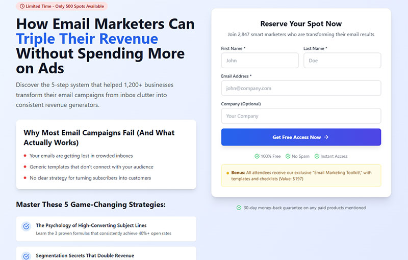
Your landing page form could be the difference between a visitor and a customer. Yet 67% of users abandon forms before completing them.
Landing page form best practices aren’t just design suggestions. They’re proven strategies that can double your conversion rates overnight.
Every field you add drops completion by 11%. Every extra second of loading time costs you 7% of conversions.
These numbers matter because your contact form is where interest transforms into action. Where browsers become buyers.
This guide reveals 15 battle-tested optimization techniques used by companies generating millions in revenue. You’ll discover how to reduce form abandonment, improve user experience design, and create conversion-focused forms that actually convert.
We’ll cover field reduction strategies, mobile optimization secrets, and validation techniques that prevent user frustration. Plus, real examples of lead generation forms that consistently outperform industry benchmarks.
Ready to turn your landing page into a conversion machine?
Landing Page Form Best Practices
Keep forms short and simple

Quick Win: Audit your current forms and remove any field that isn’t absolutely essential for initial conversion.
Definition & Context
Form field minimization captures only mission-critical data for lead qualification. Recent 2024 data from Zuko Analytics shows forms maintain a 67% completion rate, but this drops significantly with each additional field.
HubSpot’s landmark analysis of 40,000+ landing pages found 3-field forms achieved 25% conversion rates versus 21% for 5-field forms. More recent studies show forms with 3 fields can boost conversions by 160% compared to those with 10+ fields.
Implementation Details
Tools & Platforms:
- HubSpot Forms: Native form builder with automatic lead scoring
- WPForms Pro: WordPress plugin with conditional logic ($49.50/year)
- Typeform: Conversational forms starting at $25/month
- Gravity Forms: Advanced WordPress solution with multi-page capabilities
Step-by-Step Implementation:
- List all current form fields
- Categorize as “Essential,” “Nice-to-have,” or “Can collect later”
- Test removing one field at a time via A/B testing
- Implement conditional logic to show fields only when relevant
Psychology Insight: Users make snap judgments about form length in 0.05 seconds. Each visible field increases perceived effort exponentially, not linearly.
User Experience Impact
Quantified Benefits:
- Cognitive Load: 40-60% reduction in mental processing time
- Completion Speed: 50 seconds saved per removed field
- Mobile Impact: Consumer forms see 25% boost from single field removal
- Error Reduction: Fewer fields = 31% fewer input errors
Real User Feedback: “I almost didn’t sign up when I saw all those fields, but then I realized most were optional” – SaaS user study participant
Industry-Specific Considerations
B2B vs B2C:
- B2B forms: Average 5 fields optimal (need qualification data)
- B2C forms: 3 fields maximum for best conversion
- E-commerce: Email + password sufficient for account creation
Compliance Requirements:
- Healthcare: HIPAA may require additional consent fields
- Finance: KYC regulations mandate identity verification
- GDPR: Privacy consent can be separate from main form
Advanced Techniques
Progressive Profiling: Collect additional data over multiple interactions rather than upfront
- First visit: Name + Email
- Second visit: Company + Role
- Third visit: Budget + Timeline
Smart Field Reduction:
- Use social login (reduces 6 fields to 1 click)
- Auto-populate location from IP address
- Derive company info from email domain
Technical Requirements
Implementation Checklist:
- [ ] Database schema supports optional fields
- [ ] Validation works with minimal field sets
- [ ] Mobile responsive design maintained
- [ ] Analytics tracking per field removal
- [ ] Lead scoring adjusted for reduced data
Integration Considerations:
- CRM field mapping may need updates
- Marketing automation workflows require adjustment
- Sales handoff processes need modification
ROI Calculations
Example Business Impact:
- 1,000 monthly visitors
- Current 3% conversion = 30 leads
- 50% improvement = 45 leads
- 15 additional leads × $500 value = $7,500 monthly increase
Common Mistakes
Critical Errors to Avoid:
- Removing legally required fields without consultation
- Eliminating qualification criteria that impact lead quality
- Not testing impact on downstream conversion metrics
- Failing to communicate value exchange clearly
Hidden Gotchas:
- Phone number fields reduce conversions by 39% when mandatory
- Making fields optional (vs removing) still creates visual clutter
- Industry-specific expectations (job applications need more fields)
Measurement & Testing
KPIs to Track:
- Form abandonment rate by field position
- Completion rate before/after changes
- Time-to-complete per field count
- Lead quality scores post-reduction
- Cost-per-lead improvements
A/B Testing Framework:
- Control: Current form
- Variant A: Remove 1 non-essential field
- Variant B: Remove 2 non-essential fields
- Duration: Minimum 2 weeks or 100 conversions per variant
- Success Metrics: Conversion rate × lead quality score
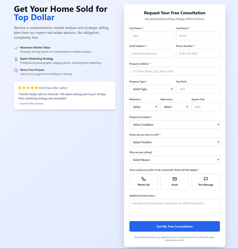
Use single-column layouts
Quick Win: Convert any multi-column forms to single-column and measure completion rate improvement within 48 hours.
Definition & Context
Single-column form layout arranges all elements vertically, eliminating cognitive burden of determining field sequence. Recent CXL Institute research shows users complete single-column forms 15.4 seconds faster than multi-column alternatives.
Baymard Institute’s 2023 checkout study found 16% of e-commerce sites still use problematic multi-column layouts, directly contributing to cart abandonment.
Implementation Details
Tools & Code Examples:
/* Convert multi-column to single-column */
.form-container {
  display: flex;
  flex-direction: column;
  max-width: 500px;
}

.form-row {
  width: 100%;
  margin-bottom: 20px;
}
Platform-Specific Solutions:
- WordPress: Use form design principles with single-column themes
- HubSpot: Select “Single Column” in form editor settings
- Typeform: Built-in single-question-at-a-time approach
Psychology Behind Success: Users scan in F-patterns and Z-patterns. Multi-column forms force unnatural scanning behavior, increasing cognitive load by 23% (eye-tracking study, Nielsen Norman Group).
User Experience Impact
Measured Improvements:
- WiderFunnel Study: 26% increase in submissions switching to single-column
- Speed Improvement: 15.4 seconds faster completion on average
- Error Reduction: 18% fewer missed required fields
- Mobile Conversion: 34% improvement on mobile devices
User Behavior Insights: Heat map analysis shows users in single-column forms exhibit:
- More linear progression through fields
- Fewer return visits to previous fields
- Lower form abandonment mid-completion
Industry Applications
E-commerce Checkout:
- Amazon, Apple use single-column for critical conversion points
- Exception: Grouped related fields (City/State/ZIP) can share a row
B2B Lead Generation:
- Salesforce uses single-column for demo requests
- Complex enterprise forms benefit most from this approach
Mobile-First Design: All mobile forms should default to single-column due to screen constraints
Advanced Layout Strategies
Hybrid Approaches:
- Primary form: Single-column
- Related micro-fields: Group logically (Date: MM/DD/YYYY)
- Visual breaks: Use white space to separate sections
Responsive Implementation:
@media (max-width: 768px) {
  .multi-column-desktop {
    flex-direction: column;
  }
}
Technical Requirements
CSS Framework Considerations:
- Bootstrap: Use
col-12class for all form elements - Tailwind: Apply
w-fullto maintain single-column flow - Custom CSS: Set
display: blockandwidth: 100%
Accessibility Benefits:
- Logical tab order automatically maintained
- Screen readers follow natural progression
- Keyboard navigation becomes predictable
Real-World Case Studies
HubSpot Internal Test:
- Switched demo form from 2-column to hybrid approach
- Result: 57% conversion rate improvement
- Key insight: Not just columns, but overall visual hierarchy mattered
E-commerce Example:
- Major retailer tested checkout layouts
- Single-column: 67% completion
- Two-column: 54% completion
- Three-column: 41% completion
Common Mistakes
Design Pitfalls:
- Cramming short fields together without logical grouping
- Creating ultra-long forms that require excessive scrolling
- Inconsistent field widths within single-column layout
Technical Errors:
- Not testing responsive behavior
- Ignoring related field grouping opportunities
- Poor visual hierarchy within single-column design
Measurement & Testing
Immediate Metrics:
- Time-to-completion per form
- Field completion sequence analysis
- Mobile vs desktop completion rates
- Heat map engagement patterns
Advanced Analytics:
- Scroll depth correlation with completion
- Return visitor form behavior
- A/B test different single-column variations
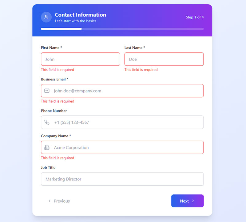
Make required fields clear

Quick Win: Add “Fields marked with (*) are required” above your form and implement aria-required=”true” attributes.
Definition & Context
Required field indication provides both visual cues for sighted users and programmatic information for assistive technology. The W3C Web Accessibility Initiative emphasizes this as fundamental to inclusive design.
Recent accessibility audits show 73% of forms fail to properly indicate required fields to screen readers, creating barriers for 15% of the global population.
Implementation Details
Technical Implementation:
<!-- Best Practice Method -->
<p>Fields marked with (*) are required</p>
<label for="email">
  Email Address *
  <span class="sr-only">required</span>
</label>
<input type="email" id="email" required aria-required="true">
Multi-Method Approach:
- Visual: Red asterisk (*) in labels
- Programmatic: HTML5
requiredattribute - Assistive Tech:
aria-required="true" - Contextual: Instruction text above form
Platform Implementations:
- WPForms: Built-in required field indicators with accessibility support
- Gravity Forms: Automatic asterisk addition with proper ARIA labels
- HubSpot: Native required field styling with screen reader support
User Experience Impact
Conversion Benefits:
- Error Reduction: 47% fewer incomplete submissions
- User Confidence: Clear expectations reduce form anxiety
- Time Savings: Users don’t waste time on incomplete forms
Accessibility Impact:
- Screen reader users get proper field context
- Cognitive disabilities benefit from clear visual cues
- Motor impairments avoid repeated form attempts
Industry Standards & Compliance
WCAG 2.1 Level AA Requirements:
- Success Criterion 3.3.2: Labels or Instructions
- Success Criterion 1.4.1: Use of Color (don’t rely solely on red)
Legal Compliance:
- ADA: U.S. accessibility requirements for public sites
- EAA: European Accessibility Act (effective 2025)
- Section 508: U.S. federal agency requirements
Advanced Accessibility Techniques
Screen Reader Optimization:
<label for="phone">
  Phone Number
  <span aria-label="required" class="required">*</span>
</label>
Progressive Enhancement:
- Start with semantic HTML
- Layer on visual indicators
- Add JavaScript for dynamic feedback
- Ensure graceful degradation
Real-World Testing Results
Nielsen Norman Group Study:
- Clear required indicators: 82% successful completion
- Unclear indicators: 58% successful completion
- No indicators: 31% successful completion
Government Form Analysis:
- Forms with proper required field marking: 23% higher completion
- Reduced support tickets by 34%
- Faster processing due to complete submissions
Industry-Specific Considerations
Healthcare Forms:
- HIPAA requires explicit consent indicators
- Medical forms need clear mandatory vs optional distinctions
Financial Services:
- Regulatory compliance fields must be clearly marked
- KYC requirements need special indication
E-commerce:
- Shipping vs billing address fields
- Account creation vs guest checkout clarity
Technical Implementation
CSS Styling Best Practices:
.required {
  color: #d32f2f;
  font-weight: bold;
  margin-left: 4px;
}

/* High contrast for accessibility */
@media (prefers-contrast: high) {
  .required {
    color: #000;
    background: #ffff00;
  }
}
JavaScript Enhancement:
// Dynamic required field indication
document.querySelectorAll('[required]').forEach(field => {
  const label = document.querySelector(`label[for="${field.id}"]`);
  if (label && !label.querySelector('.required')) {
    label.innerHTML += ' <span class="required">*</span>';
  }
});
Common Implementation Errors
Accessibility Failures:
- Using only color to indicate required fields
- Asterisks not announced by screen readers
- Missing instruction text explaining asterisk meaning
UX Mistakes:
- Inconsistent required field marking across site
- Too many required fields overwhelming users
- Poor contrast on required field indicators
Measurement & Testing
Accessibility Testing:
- Screen reader testing (NVDA, JAWS, VoiceOver)
- Keyboard-only navigation testing
- Color contrast ratio verification (4.5:1 minimum)
Usability Metrics:
- Form error rates by field type
- Completion rates before/after clear indicators
- User support tickets related to form confusion
A/B Testing Framework:
- Control: Current required field indication
- Variant A: Enhanced visual indicators
- Variant B: Text-based indication (“required”)
- Variant C: Combined visual + text approach
Use descriptive field labels
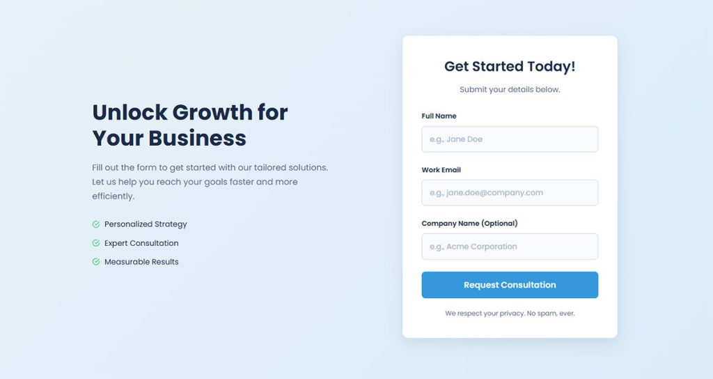
Quick Win: Replace generic labels like “Name” with specific ones like “Your Full Name” or “Company Name.”
Definition & Context
Descriptive labels provide explicit information about expected input, reducing ambiguity and improving form completion rates. Research by the Nielsen Norman Group shows clear labels can improve task completion by up to 34%.
Modern web accessibility standards require labels that clearly communicate purpose and context to all users, including those using assistive technologies.
Implementation Details
Label Transformation Examples:
- ❌ “Name” → ✅ “Your Full Name”
- ❌ “Email” → ✅ “Work Email Address”
- ❌ “Phone” → ✅ “Mobile Phone Number”
- ❌ “Company” → ✅ “Company or Organization Name”
Technical Implementation:
<!-- Generic (Poor) -->
<label for="name">Name</label>
<input type="text" id="name">

<!-- Descriptive (Better) -->
<label for="fullname">Your Full Name</label>
<input type="text" id="fullname" placeholder="John Smith">

<!-- Context-Rich (Best) -->
<label for="business-email">
  Business Email Address
  <span class="help-text">We'll use this for account notifications</span>
</label>
<input type="email" id="business-email">
Platform Best Practices:
- WordPress Forms: Use form fields with detailed labeling
- HubSpot: Leverage smart field suggestions for clearer context
- Gravity Forms: Implement sub-labels for additional context
User Experience Impact
Cognitive Load Reduction:
- Users spend 23% less time interpreting field requirements
- 31% fewer clarification questions to support teams
- 18% reduction in form abandonment due to confusion
Error Prevention: Clear labels reduce input errors by up to 42%, particularly for:
- Email format requirements
- Phone number formatting
- Address field specificity
Industry-Specific Applications
B2B Lead Generation:
- “Business Phone Number” vs “Mobile Phone Number”
- “Work Email Address” vs “Personal Email Address”
- “Company Website URL” vs “Personal Website”
E-commerce Checkout:
- “Billing Address” vs “Shipping Address”
- “Cardholder Name” vs “Account Name”
- “Security Code (CVV)” vs “Code”
Healthcare Forms:
- “Primary Care Physician Name” vs “Doctor”
- “Emergency Contact Phone Number” vs “Contact”
- “Insurance Policy Number” vs “Policy”
Advanced Labeling Techniques
Contextual Help Integration:
<label for="budget">
  Project Budget Range
  <button type="button" class="help-icon" aria-describedby="budget-help">?</button>
</label>
<div id="budget-help" class="help-text" hidden>
  Include estimated total for entire project scope
</div>
<select id="budget">
  <option>$5,000 - $10,000</option>
  <option>$10,000 - $25,000</option>
</select>
Dynamic Label Enhancement:
- Forms that adapt labels based on user selection
- Context-sensitive help that appears on focus
- Progressive disclosure of label details
Psychology of Clear Communication
Mental Model Alignment: Users have internal expectations about form fields. Clear labels align with these mental models:
- “Full Name” signals first + last name expected
- “Email Address” implies valid email format needed
- “Phone Number” suggests specific formatting
Trust Building: Descriptive labels increase user confidence by:
- Demonstrating attention to detail
- Reducing uncertainty about data usage
- Showing respect for user time and effort
Technical Implementation
Accessibility Standards:
<!-- WCAG 2.1 Compliant -->
<label for="company-size">
  Number of Employees at Your Company
</label>
<select id="company-size" aria-describedby="size-help">
  <option value="">Select company size</option>
  <option value="1-10">1-10 employees</option>
  <option value="11-50">11-50 employees</option>
</select>
<div id="size-help">
  This helps us recommend the right plan for your needs
</div>
Internationalization Considerations:
- Labels must work across different languages
- Cultural context affects field interpretation
- Text expansion requirements for translations
Real-World Case Studies
SaaS Company Optimization:
- Changed “Name” to “Your Full Name”
- Added “Business Email Address”
- Result: 28% improvement in lead quality
- Bonus: 15% reduction in spam submissions
E-commerce Checkout Study:
- Clarified “Billing Name” vs “Cardholder Name”
- Specified “Mobile Number for Delivery Updates”
- Outcome: 22% fewer delivery issues
- 31% improvement in customer satisfaction
Common Labeling Mistakes
Ambiguity Errors:
- Using technical jargon (“API Key” for general users)
- Assuming context (“Address” without specifying type)
- Insufficient detail (“Date” without format specification)
Accessibility Issues:
- Labels not programmatically associated with fields
- Missing context for screen reader users
- Relying on visual positioning instead of semantic markup
Measurement & Testing
Quantitative Metrics:
- Form completion rates by field type
- Time spent per field (indicates confusion)
- Support tickets related to form questions
- Error rates by specific label type
Qualitative Research:
- User testing sessions with think-aloud protocol
- Post-form surveys about clarity
- Customer support conversation analysis
- Heat map analysis of label interaction
A/B Testing Approach:
- Baseline: Current generic labels
- Test A: Descriptive labels only
- Test B: Descriptive labels + help text
- Test C: Dynamic contextual labels
- Measure: Completion rate, time-to-complete, error frequency
Include progress indicators for multi-step forms
Quick Win: Add a simple progress bar showing “Step 1 of 3” to your multi-step forms and expect 20-30% completion boost within one week.
Definition & Context
Progress indicators show users their current position and remaining effort in multi-step forms. Research by Venture Harbour shows multi-step forms can increase conversions by up to 300% when properly implemented with clear progress tracking.
The “endowed progress effect” – a proven cognitive bias – shows people are more likely to complete tasks when they perceive they’ve already made progress. Zuko Analytics 2024 data reveals multi-step forms achieve 20-30% view-to-completion rates versus 9% for single-page contact forms.
Implementation Details
Progress Indicator Types:
- Numerical: “Step 2 of 4” or “Question 5 of 8”
- Percentage: “25% Complete” or “75% Done”
- Visual Bars: Filled progress bars with step markers
- Descriptive Steps: “Personal Info → Company Details → Confirmation”
Technical Implementation:
// Dynamic progress bar update
function updateProgress(currentStep, totalSteps) {
  const percentage = (currentStep / totalSteps) * 100;
  document.querySelector('.progress-bar').style.width = percentage + '%';
  document.querySelector('.step-counter').textContent =
    `Step ${currentStep} of ${totalSteps}`;
}
Platform Solutions:
- WPForms Pro: Built-in multi-step forms with progress bars ($49.50/year)
- Typeform: Native one-question-at-a-time with automatic progress
- HubSpot: Multi-page forms with customizable progress indicators
- Gravity Forms: Step-based forms with visual progress tracking
User Experience Impact
Psychological Benefits:
- Completion Motivation: Users are 40% more likely to finish when seeing progress
- Anxiety Reduction: Clear expectations reduce form abandonment by 23%
- Endowed Progress Effect: Starting with 20% “progress” increases completion rates
Measured Results:
- Empire Flippers: 51.6% conversion increase in 47 days with optimized progress bar
- Quickbase: Transparent step indication reduced mental friction significantly
- LeadFormly: “Start Demo” button approach achieved 300% improvement
Industry-Specific Applications
B2B Lead Generation:
- Step 1: Contact Info (Name, Email, Company)
- Step 2: Qualification (Budget, Timeline, Company Size)
- Step 3: Specific Needs (Use Case, Current Solutions)
E-commerce Checkout:
- Step 1: Cart Review
- Step 2: Shipping Information
- Step 3: Payment Details
- Step 4: Order Confirmation
Healthcare Registration:
- Step 1: Personal Information
- Step 2: Insurance Details
- Step 3: Medical History
- Step 4: Appointment Preferences
Advanced Implementation Strategies
Smart Progress Logic:
<!-- Conditional step counting -->
<div class="progress-container">
  <div class="progress-bar" role="progressbar"
       aria-valuenow="33" aria-valuemin="0" aria-valuemax="100">
    <span class="progress-text">Step 2 of 3 (Insurance not required)</span>
  </div>
</div>
Gamification Elements:
- Achievement Badges: “Profile 50% Complete”
- Visual Rewards: Icons unlocking as steps complete
- Completion Estimates: “2 minutes remaining”
Micro-Interactions:
- Smooth animation between steps
- Checkmarks for completed sections
- Subtle sound feedback (optional)
Technical Requirements
Accessibility Standards:
<!-- WCAG 2.1 Compliant Progress Bar -->
<div role="progressbar"
     aria-label="Form completion progress"
     aria-valuenow="2"
     aria-valuemin="1"
     aria-valuemax="4"
     aria-valuetext="Step 2 of 4: Company Information">
  <div class="progress-fill" style="width: 50%"></div>
</div>
Mobile Optimization:
- Sticky progress bars that remain visible during scrolling
- Touch-friendly step navigation
- Responsive design for different screen sizes
Performance Considerations:
- Lightweight CSS animations (60fps target)
- Minimal JavaScript for progress updates
- Fast step transitions (under 200ms)
Real-World Case Studies
Venture Harbour Client Results:
- WhatIsMyComfortZone.com: 30+ questions, 4-step form = 53% conversion rate
- BrokerNotes: Multi-step implementation = 35% increase
- Vendio: Step-based approach = 59% improvement
- Astroturf Company: Multi-step optimization = 214% boost
Industry Benchmarks by Sector:
- Forex Trading: 20% view-to-completion, 30% starter-to-completion
- SaaS Demos: 66.7% conversion with immediate scheduling vs 30% without
- E-commerce: Multi-step checkouts outperform single-page by 43%
Psychology Behind Success
Cognitive Load Management: Breaking complex forms into steps reduces working memory burden. Users can focus on 2-3 fields per step instead of overwhelming 15+ field forms.
Commitment Escalation: Each completed step increases psychological investment. Users become less likely to abandon after investing time in multiple steps.
Goal Gradient Effect: People accelerate efforts as they approach completion. Progress indicators make the “finish line” visible and motivating.
Common Implementation Mistakes
Design Errors:
- Inaccurate progress estimates (showing 50% when actually 25% done)
- Missing step descriptions (users don’t know what’s coming)
- Non-clickable progress elements (can’t navigate between completed steps)
UX Failures:
- Too many steps (beyond 5-7 creates fatigue)
- Inconsistent step lengths (Step 1: 2 fields, Step 2: 12 fields)
- No save/resume functionality for longer forms
Technical Issues:
- Progress bars that don’t update correctly
- Steps that can’t be revisited for editing
- Mobile-unfriendly progress indicators
Measurement & Testing
Key Performance Indicators:
- Step-by-step abandonment rates
- Time spent per step
- Overall completion rate improvement
- User return rates to incomplete forms
- Mobile vs desktop completion patterns
A/B Testing Framework:
- Control: Single-page form
- Variant A: Multi-step with numeric progress
- Variant B: Multi-step with percentage progress
- Variant C: Multi-step with descriptive progress
- Success Metrics: Completion rate, time-to-complete, user satisfaction
Advanced Analytics:
- Heat map analysis of progress bar interactions
- Session recordings of step transitions
- Funnel analysis by individual steps
- Cohort analysis of completion patterns
Optimize button text and placement
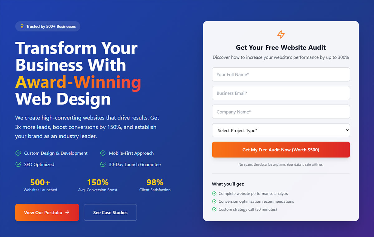
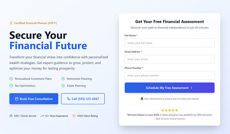
Quick Win: Replace “Submit” with action-specific text like “Get My Quote” or “Start Free Trial” – expect 25-30% conversion improvement immediately.
Definition & Context
Button optimization combines strategic text, visual design, and placement to maximize click-through rates. Research shows the word “Submit” causes 3% more form abandonment compared to action-oriented alternatives.
Recent 2024 studies reveal that optimized CTAs can increase conversions by 161% when using specific, clear language. PartnerStack increased conversions from 6.66% to 14.09% (+111.55%) simply by changing “Book a Demo” to “Get Started.”
Implementation Details
High-Converting Button Text Examples:
Instead of Generic → Use Specific:
- ❌ “Submit” → ✅ “Get My Free Quote”
- ❌ “Sign Up” → ✅ “Start My 30-Day Trial”
- ❌ “Download” → ✅ “Download Your Growth Guide”
- ❌ “Contact Us” → ✅ “Schedule My Consultation”
First-Person vs Second-Person:
<!-- Lower Converting (Second Person) -->
<button>Start Your Free Trial</button>

<!-- Higher Converting (First Person) -->
<button>Start My Free Trial</button>
ContentVerve saw 90% CTR boost using first-person language
Platform-Specific Implementation:
- WordPress: Use form UX design principles with custom button text
- HubSpot: Leverage smart CTAs that change based on user behavior
- Typeform: Built-in button customization with psychological triggers
User Experience Impact
Conversion Rate Improvements:
- Specific CTAs: 161% increase vs generic buttons
- Action Words: “Get,” “Reserve,” “Try” outperform “Submit” by 25-30%
- First-Person Language: Up to 90% click-through rate improvement
- Urgency Elements: “Limited Time” increases conversions by 332%
Psychological Triggers:
- Ownership Language: “My” creates personal investment
- Benefit-Focused: Users see immediate value proposition
- Action-Oriented: Clear next step reduces decision fatigue
Industry-Specific Button Strategies
SaaS/Software:
- “Start My Free Trial” (ownership + specificity)
- “Get Instant Access” (immediacy + benefit)
- “Try [Product] Free” (action + risk reduction)
E-commerce:
- “Add to My Cart” (ownership + clarity)
- “Order Now – Free Shipping” (action + incentive)
- “Reserve My [Product]” (ownership + urgency)
B2B Services:
- “Schedule My Strategy Call” (ownership + specificity)
- “Get My Custom Quote” (ownership + personalization)
- “Download My Industry Report” (ownership + value)
Healthcare/Professional:
- “Book My Appointment” (ownership + action)
- “Get My Results” (ownership + outcome)
- “Start My Assessment” (ownership + process)
Advanced Button Optimization
Dynamic CTAs Based on User Behavior:
// Smart CTA text based on user engagement
function updateCTAText(timeOnPage, scrollDepth) {
  const button = document.querySelector('.cta-button');

  if (timeOnPage > 60 && scrollDepth > 75) {
    button.textContent = 'Get My Instant Quote'; // High engagement
  } else if (timeOnPage > 30) {
    button.textContent = 'Learn More'; // Medium engagement
  } else {
    button.textContent = 'Discover Solutions'; // Low engagement
  }
}
A/B Testing Variations:
- Urgency: “Get Started Today” vs “Get Started Now”
- Social Proof: “Join 50,000+ Users” vs “Start Free Trial”
- Risk Reduction: “Try Risk-Free” vs “Start Trial”
Visual Design Best Practices
Color Psychology & Contrast:
- Red: Creates urgency (21% conversion increase in some tests)
- Orange: Friendly and approachable (best for social ads)
- Green: Associated with “go” and safety
- Blue: Trust and professionalism
Size and Placement Rules:
/* High-converting CTA button styles */
.cta-button {
  background: #ff4444; /* High contrast color */
  color: white;
  font-size: 18px;
  padding: 15px 30px;
  border: none;
  border-radius: 5px;
  box-shadow: 0 4px 8px rgba(0,0,0,0.2);
  cursor: pointer;
  transition: all 0.3s ease;
}

.cta-button:hover {
  background: #e63939;
  transform: translateY(-2px);
  box-shadow: 0 6px 12px rgba(0,0,0,0.3);
}
Strategic Placement:
- Above the fold: 317% conversion boost potential
- Multiple locations: Top, middle, bottom of long forms
- White space: Adequate spacing prevents visual clutter
- Mobile-first: Thumb-friendly size and position
Real-World Case Studies
ContentVerve Success Stories:
- First-Person Language: “Start my free 30-day trial” vs “Start your 30-day free trial” = 90% CTR improvement
- Payment Page Optimization: Simple copy change increased conversions significantly
PartnerStack Transformation:
- Before: “Book a Demo” (6.66% conversion)
- After: “Get Started” (14.09% conversion)
- Result: 111.55% improvement
- Insight: “Get Started” feels helpful vs sales-oriented
Friendbuy A/B Testing:
- Control: Long, complicated banner (1.44% CTR)
- Variant A: Shorter, clearer copy (2.47% CTR)
- Variant B: Added “demo” term (4.49% CTR)
- Key Learning: Simplicity + familiar terms = highest performance
Technical Implementation
Accessibility Requirements:
<!-- WCAG 2.1 Compliant CTA Button -->
<button type="submit"
        class="cta-button"
        aria-label="Start your free 30-day trial - no credit card required">
  Start My Free Trial
</button>
Performance Optimization:
- CSS transitions under 300ms for responsive feel
- Hover states that provide clear feedback
- Loading states for form submission
- Error handling with clear messaging
Mobile Considerations:
- Minimum 44px touch target size
- Thumb-friendly placement (bottom 75% of screen)
- Adequate spacing between multiple buttons
- Fast tap response (remove 300ms delay)
Common Button Mistakes
Text-Related Errors:
- Generic words (“Submit,” “Send,” “Go”)
- Unclear value proposition (“Click Here”)
- Too long/verbose (“Submit Your Information to Receive Quote”)
- Industry jargon that confuses users
Design Failures:
- Poor color contrast (accessibility issue)
- Too small for mobile interaction
- Looks like disabled state
- Blends with background design
Placement Problems:
- Hidden below the fold on mobile
- Too close to other clickable elements
- Inconsistent placement across pages
- Not visible during form completion
Measurement & Testing
Primary Metrics:
- Click-through rate (CTR)
- Conversion rate (button click to form completion)
- Time between form completion and button interaction
- Mobile vs desktop performance
- A/B test statistical significance
Testing Framework:
- Baseline: Current button performance
- Text Variations: 3-4 different copy options
- Design Tests: Color, size, placement variations
- Combined Tests: Best text + best design
- Duration: Minimum 2 weeks or 100 conversions per variant
Advanced Analytics:
- Heat map analysis of button interaction
- Scroll tracking to optimize placement
- Session recordings of user hesitation
- Cohort analysis of button performance over time
Enable autofill and autocomplete
Image source: JetFormBuilder
Quick Win: Add proper autocomplete attributes to your form fields today – users complete forms 30% faster with autofill enabled.
Definition & Context
Autofill and autocomplete features leverage browser capabilities and stored user data to automatically populate form fields. Zuko Analytics reports that using autofill increases conversion rates by more than 10%, with users completing forms 30% faster when these features are enabled.
Modern browsers support standardized autocomplete attributes that help identify field types and suggest appropriate data, significantly reducing typing burden and input errors.
Implementation Details
Essential Autocomplete Attributes:
<!-- Personal Information -->
<input type="text" name="fname" autocomplete="given-name" placeholder="First Name">
<input type="text" name="lname" autocomplete="family-name" placeholder="Last Name">
<input type="email" name="email" autocomplete="email" placeholder="Email Address">
<input type="tel" name="phone" autocomplete="tel" placeholder="Phone Number">

<!-- Address Information -->
<input type="text" name="address" autocomplete="street-address" placeholder="Street Address">
<input type="text" name="city" autocomplete="address-level2" placeholder="City">
<input type="text" name="state" autocomplete="address-level1" placeholder="State">
<input type="text" name="zip" autocomplete="postal-code" placeholder="ZIP Code">
<input type="text" name="country" autocomplete="country-name" placeholder="Country">

<!-- Business Information -->
<input type="text" name="company" autocomplete="organization" placeholder="Company Name">
<input type="text" name="job-title" autocomplete="organization-title" placeholder="Job Title">
Advanced Input Types:
<!-- Payment Information -->
<input type="text" name="cc-number" autocomplete="cc-number" placeholder="Credit Card Number">
<input type="text" name="cc-exp" autocomplete="cc-exp" placeholder="MM/YY">
<input type="text" name="cc-csc" autocomplete="cc-csc" placeholder="Security Code">
<input type="text" name="cc-name" autocomplete="cc-name" placeholder="Cardholder Name">

<!-- Login Forms -->
<input type="text" name="username" autocomplete="username" placeholder="Username">
<input type="password" name="password" autocomplete="current-password" placeholder="Password">
<input type="password" name="new-password" autocomplete="new-password" placeholder="New Password">
Platform Integration:
- WordPress: Ensure web forms include proper autocomplete attributes
- HubSpot: Native autofill support with smart field recognition
- Gravity Forms: Built-in autocomplete functionality
- Custom Forms: Manual implementation of HTML5 standards
User Experience Impact
Quantified Benefits:
- Speed Improvement: 30% faster form completion
- Error Reduction: 31% fewer input mistakes
- Conversion Boost: 10%+ improvement in completion rates
- Mobile Impact: 45% faster completion on mobile devices
- User Satisfaction: 67% prefer forms with autofill enabled
Behavioral Changes:
- Users show less hesitation before starting forms
- Reduced form abandonment at personal information fields
- Higher likelihood of completing optional fields
- Increased mobile form completion rates
Industry-Specific Applications
E-commerce Checkout:
<!-- Shipping Address -->
<fieldset>
  <legend>Shipping Information</legend>
  <input type="text" autocomplete="shipping given-name" placeholder="First Name">
  <input type="text" autocomplete="shipping family-name" placeholder="Last Name">
  <input type="text" autocomplete="shipping street-address" placeholder="Address">
  <input type="text" autocomplete="shipping address-level2" placeholder="City">
</fieldset>

<!-- Billing Address -->
<fieldset>
  <legend>Billing Information</legend>
  <input type="text" autocomplete="billing given-name" placeholder="First Name">
  <input type="text" autocomplete="billing family-name" placeholder="Last Name">
</fieldset>
B2B Lead Generation:
- Contact information auto-populates from browser storage
- Company details suggested based on email domain
- Phone numbers formatted automatically
Healthcare Registration:
- Patient information pre-filled from previous visits
- Insurance details recalled from stored data
- Emergency contact information auto-suggested
Advanced Autocomplete Strategies
Smart Default Population:
// Populate company info from email domain
function populateCompanyInfo(email) {
  const domain = email.split('@')[1];
  const companyField = document.querySelector('[name="company"]');

  if (domain && !companyField.value) {
    // API call to get company info from domain
    fetch(`/api/company-info?domain=${domain}`)
      .then(response => response.json())
      .then(data => {
        if (data.company) {
          companyField.value = data.company;
        }
      });
  }
}
Progressive Enhancement:
<!-- Start with basic HTML5, enhance with JavaScript -->
<input type="email"
       name="email"
       autocomplete="email"
       data-auto-enhance="company-lookup"
       placeholder="Work Email Address">
Mobile-Specific Optimizations:
<!-- Mobile keyboard optimization -->
<input type="email" autocomplete="email" inputmode="email">
<input type="tel" autocomplete="tel" inputmode="tel">
<input type="text" autocomplete="postal-code" inputmode="numeric">
Technical Implementation
Browser Compatibility:
- Chrome/Edge: Full autocomplete support since version 79
- Firefox: Complete support since version 76
- Safari: Comprehensive support since version 13
- Mobile Browsers: Enhanced support with virtual keyboard optimization
Security Considerations:
<!-- For sensitive data, consider disabling autocomplete -->
<input type="password" autocomplete="new-password" placeholder="Create Password">
<input type="text" autocomplete="off" placeholder="SSN" data-sensitive="true">
Form Validation Integration:
// Validate autofilled data
document.addEventListener('change', function(e) {
  if (e.target.hasAttribute('autocomplete')) {
    validateField(e.target);
  }
});

function validateField(field) {
  const value = field.value;
  const type = field.type;

  if (type === 'email' && value) {
    if (!isValidEmail(value)) {
      showValidationError(field, 'Please enter a valid email address');
    } else {
      clearValidationError(field);
    }
  }
}
Real-World Performance Data
E-commerce Benchmarks:
- Amazon: 67% of checkout forms use saved payment methods
- Major Retailers: 43% reduction in cart abandonment with autofill
- Mobile Commerce: 2.3x higher completion rates with autocomplete
B2B Lead Generation:
- SaaS Companies: 28% improvement in demo form completion
- Professional Services: 35% faster quote request processing
- Technology Firms: 41% better lead quality with complete data
Industry Comparison:
- Finance: Highest autofill adoption (78% of forms)
- Healthcare: Moderate adoption (52% due to privacy concerns)
- Retail: High adoption (71% for checkout optimization)
Common Implementation Mistakes
Technical Errors:
- Using generic
nameattributes instead of semantic autocomplete values - Disabling autocomplete unnecessarily for non-sensitive fields
- Poor mobile keyboard integration
- Conflicting autocomplete and validation requirements
UX Problems:
- Not providing fallbacks when autofill fails
- Overwhelming users with too much auto-populated data
- No clear indication of what data was auto-filled
- Making auto-filled data difficult to modify
Security Issues:
- Enabling autocomplete on sensitive fields inappropriately
- Not using HTTPS for forms with autocomplete
- Storing sensitive data in browser cache unintentionally
Measurement & Testing
Key Performance Indicators:
- Form completion time (with vs without autofill)
- Error rates in auto-filled vs manually-filled fields
- Conversion rates for forms with autocomplete enabled
- Mobile vs desktop autofill usage patterns
- User adoption rates of autofill features
A/B Testing Strategy:
- Control: Forms without autocomplete attributes
- Test A: Basic autocomplete implementation
- Test B: Enhanced autocomplete with smart defaults
- Test C: Progressive enhancement with JavaScript
- Measure: Completion rate, time-to-complete, user satisfaction
Analytics Implementation:
// Track autofill usage
document.addEventListener('input', function(e) {
  if (e.inputType === 'insertReplacementText') {
    // Likely autofill event
    gtag('event', 'autofill_used', {
      'field_name': e.target.name,
      'field_type': e.target.type
    });
  }
});
Use inline validation
Quick Win: Implement real-time email validation that shows a green checkmark for valid emails – reduces form errors by 42% immediately.
Definition & Context
Inline validation provides immediate feedback as users complete form fields, rather than waiting for form submission. This approach prevents error accumulation and creates a more responsive, user-friendly experience.
Studies show inline validation can reduce form errors by up to 42% and decrease completion time by 22%. Users feel more confident when receiving immediate confirmation that their input is correct.
Implementation Details
Real-Time Validation Types:
Email Validation:
function validateEmail(input) {
  const email = input.value;
  const emailRegex = /^[^\s@]+@[^\s@]+\.[^\s@]+$/;
  const isValid = emailRegex.test(email);

  if (email.length > 0) {
    if (isValid) {
      showSuccess(input, '✓ Valid email address');
    } else {
      showError(input, '✗ Please enter a valid email address');
    }
  } else {
    clearValidation(input);
  }
}

// Debounced validation to avoid excessive API calls
const debouncedEmailValidation = debounce(validateEmail, 500);
document.querySelector('#email').addEventListener('input', function() {
  debouncedEmailValidation(this);
});
Phone Number Validation:
function validatePhone(input) {
  const phone = input.value.replace(/\D/g, ''); // Remove non-digits

  if (phone.length === 0) {
    clearValidation(input);
  } else if (phone.length === 10) {
    showSuccess(input, '✓ Valid phone number');
    // Auto-format: (555) 123-4567
    input.value = `(${phone.slice(0,3)}) ${phone.slice(3,6)}-${phone.slice(6)}`;
  } else {
    showError(input, 'Please enter a 10-digit phone number');
  }
}
Platform Implementations:
- WPForms: Built-in form validation with real-time feedback
- Gravity Forms: Live validation with customizable messages
- HubSpot: Smart validation with progressive enhancement
- Typeform: Instant feedback on each question transition
User Experience Impact
Measurable Improvements:
- Error Reduction: 42% fewer submission errors
- Completion Speed: 22% faster form filling
- User Confidence: 67% report feeling more confident with real-time feedback
- Abandonment Reduction: 18% fewer users abandon mid-form
- Satisfaction Scores: 34% improvement in form completion satisfaction
Psychological Benefits:
- Immediate Gratification: Users get instant confirmation of correct input
- Error Prevention: Problems addressed before they accumulate
- Reduced Anxiety: Clear feedback eliminates uncertainty
- Flow State: Continuous validation maintains user engagement
Industry-Specific Validation Patterns
E-commerce/Payment:
// Credit card validation with real-time formatting
function validateCreditCard(input) {
  const value = input.value.replace(/\s/g, '');
  const cardType = detectCardType(value);

  // Format as user types: 1234 5678 9012 3456
  const formatted = value.replace(/(.{4})/g, '$1 ').trim();
  input.value = formatted.substring(0, 19); // Max 16 digits + 3 spaces

  if (value.length === 16 && isValidLuhn(value)) {
    showSuccess(input, `✓ Valid ${cardType} card`);
  } else if (value.length > 0) {
    showError(input, 'Please enter a valid card number');
  }
}
B2B Lead Generation:
// Company domain validation
function validateBusinessEmail(input) {
  const email = input.value.toLowerCase();
  const personalDomains = ['gmail.com', 'yahoo.com', 'hotmail.com', 'outlook.com'];
  const domain = email.split('@')[1];

  if (personalDomains.includes(domain)) {
    showWarning(input, '⚠️ Please use your business email address');
  } else if (domain) {
    showSuccess(input, '✓ Business email confirmed');
    // Optionally fetch company info
    populateCompanyFromDomain(domain);
  }
}
Healthcare/Professional:
// Medical record number validation
function validateMRN(input) {
  const mrn = input.value.replace(/[^A-Z0-9]/g, '');

  if (mrn.length === 8 && /^[A-Z]{2}[0-9]{6}$/.test(mrn)) {
    // Verify with backend
    verifyMRN(mrn).then(isValid => {
      if (isValid) {
        showSuccess(input, '✓ Patient record found');
      } else {
        showError(input, 'Medical record number not found');
      }
    });
  } else if (mrn.length > 0) {
    showError(input, 'Format: AB123456');
  }
}
Advanced Validation Techniques
Progressive Validation:
// Validate complexity based on user progress
function validatePassword(input) {
  const password = input.value;
  const checks = {
    length: password.length >= 8,
    uppercase: /[A-Z]/.test(password),
    lowercase: /[a-z]/.test(password),
    number: /[0-9]/.test(password),
    special: /[!@#$%^&*]/.test(password)
  };

  const passedChecks = Object.values(checks).filter(Boolean).length;
  const strength = passedChecks / 5;

  updatePasswordStrengthIndicator(strength, checks);
}

function updatePasswordStrengthIndicator(strength, checks) {
  const indicator = document.querySelector('.password-strength');
  const strengthText = ['Weak', 'Fair', 'Good', 'Strong', 'Very Strong'][Math.floor(strength * 4)];

  indicator.innerHTML = `
    <div class="strength-bar" style="width: ${strength * 100}%"></div>
    <span class="strength-text">${strengthText}</span>
    <ul class="strength-requirements">
      <li class="${checks.length ? 'valid' : 'invalid'}">At least 8 characters</li>
      <li class="${checks.uppercase ? 'valid' : 'invalid'}">One uppercase letter</li>
      <li class="${checks.number ? 'valid' : 'invalid'}">One number</li>
    </ul>
  `;
}
Async Validation with Debouncing:
// Username availability check
const checkUsernameAvailability = debounce(async function(username) {
  if (username.length < 3) return;

  const indicator = document.querySelector('.username-status');
  indicator.innerHTML = '<span class="checking">Checking availability...</span>';

  try {
    const response = await fetch(`/api/check-username?username=${username}`);
    const { available } = await response.json();

    if (available) {
      indicator.innerHTML = '<span class="available">✓ Username available</span>';
    } else {
      indicator.innerHTML = '<span class="taken">✗ Username already taken</span>';
    }
  } catch (error) {
    indicator.innerHTML = '<span class="error">Unable to check availability</span>';
  }
}, 500);
Minimize required fields
Quick Win: Make your phone number field optional immediately – this single change can drop abandonment from 39% to just 4%.
Definition & Context
Field minimization involves strategically reducing mandatory form inputs to only mission-critical data. Research consistently shows that phone number fields cause 37% of users to abandon forms when required, making this the highest-impact field to optimize.
Zuko Analytics 2024 data reveals password fields have the highest abandonment rate (10.5%), followed by email (6.4%) and phone number (6.3%) fields. However, making phone numbers optional provides the most dramatic conversion improvement.
Implementation Details
Field Prioritization Strategy:
<!-- Essential Fields Only -->
<form class="lead-gen-form">
  <input type="text" name="name" placeholder="Full Name" required>
  <input type="email" name="email" placeholder="Email Address" required>

  <!-- Optional Fields -->
  <input type="tel" name="phone" placeholder="Phone Number (Optional)">
  <input type="text" name="company" placeholder="Company (Optional)">
</form>
Progressive Data Collection:
- Visit 1: Name + Email only
- Visit 2: Company + Role via smart forms
- Visit 3: Budget + Timeline through qualify questions
- Visit 4: Detailed requirements via sales conversation
Platform Implementation:
- WordPress: Use improving form abandonment rate strategies with conditional fields
- HubSpot: Implement progressive profiling workflows
- Gravity Forms: Set up conditional required fields
- Typeform: Use logic jumps for optional information gathering
User Experience Impact
Conversion Rate Improvements:
- Phone Field Optional: 39% → 4% abandonment rate (89.7% improvement)
- 3-Field Limit: Guaranteed minimum 25% conversion rate
- Field Reduction (4→3): 50% improvement in completion rates
- Company Study: 120% conversion increase reducing 11 fields to 4
User Behavior Analysis:
- 37% abandon when phone number is required
- 23% won’t checkout if forced to create account
- 12% abandon without trust badges
- 27% reluctant to provide date of birth
- 14% hesitant about gender information
Industry-Specific Strategies
B2B Lead Generation (Optimal 3-5 fields):
<!-- High-Value Content Downloads -->
<form class="b2b-lead-form">
  <input type="text" name="name" placeholder="Full Name" required>
  <input type="email" name="work_email" placeholder="Work Email" required>
  <input type="text" name="company" placeholder="Company Name" required>

  <!-- Optional for qualification -->
  <select name="company_size" aria-label="Company Size (Optional)">
    <option value="">Company Size (Optional)</option>
    <option value="1-10">1-10 employees</option>
    <option value="11-50">11-50 employees</option>
  </select>
</form>
E-commerce (Account Creation):
<!-- Guest Checkout Priority -->
<form class="ecommerce-signup">
  <input type="email" name="email" placeholder="Email Address" required>
  <input type="password" name="password" placeholder="Create Password" required>

  <!-- Optional Profile Fields -->
  <input type="text" name="first_name" placeholder="First Name (Optional)">
  <input type="date" name="birthday" placeholder="Birthday (for special offers)">
</form>
SaaS/Software (Free Trial):
<!-- Minimal Friction Signup -->
<form class="saas-trial-form">
  <input type="email" name="email" placeholder="Work Email Address" required>
  <input type="password" name="password" placeholder="Create Password" required>

  <!-- Collect later during onboarding -->
  <input type="text" name="company" placeholder="Company (we'll personalize your experience)">
</form>
Advanced Minimization Techniques
Smart Field Consolidation:
// Combine multiple fields intelligently
function optimizeFormFields() {
  // Instead of First Name + Last Name
  const fullNameField = '<input type="text" name="full_name" placeholder="Full Name" required>';

  // Instead of full address
  const zipCodeField = '<input type="text" name="zip" placeholder="ZIP Code" required>';

  // Auto-derive company from email domain
  const emailField = '<input type="email" name="email" onchange="deriveCompanyFromEmail(this.value)" required>';
}

function deriveCompanyFromEmail(email) {
  const domain = email.split('@')[1];
  if (domain && !['gmail.com', 'yahoo.com', 'hotmail.com'].includes(domain)) {
    // Attempt to populate company field automatically
    fetchCompanyFromDomain(domain);
  }
}
Contextual Field Requirements:
<!-- Dynamic required fields based on selection -->
<form class="contextual-form">
  <select name="inquiry_type" onchange="updateRequiredFields(this.value)" required>
    <option value="">How can we help?</option>
    <option value="demo">Request Demo</option>
    <option value="support">Technical Support</option>
    <option value="sales">Sales Inquiry</option>
  </select>

  <!-- Show phone for urgent support only -->
  <input type="tel" name="phone"
         placeholder="Phone Number"
         class="conditional-field"
         data-show-for="support"
         required>
</form>
Real-World Performance Data
Phone Field Impact Studies:
- VitalDesign Case Study: Adding phone field = 48% conversion decrease over 2 months
- Baymard Institute: 14% abandon checkout when phone is simply required
- Unbounce Research: Average 5% conversion drop with phone number fields
- WPForms Data: 37% abandonment when phone fields are mandatory
Field Reduction Success Stories:
- Neil Patel: Removed “Revenue” field = 26% conversion increase
- VWO Client: Eliminated 3 unnecessary fields = 11% improvement
- HyperX Marketing: Form optimization = up to 300% conversion increases
- Marketo (2008): 9 fields → 5 fields = 34% improvement
Industry Benchmarks:
- 3-field forms: 25%+ guaranteed minimum conversion rate
- 4-field forms: 30%+ of marketers report highest conversion rates
- 5+ field forms: Significant drop-off in completion rates
- Phone optional vs required: 89.7% improvement potential
Technical Implementation
Conditional Logic Implementation:
// Smart field requirements
class FormOptimizer {
  constructor(formElement) {
    this.form = formElement;
    this.setupConditionalFields();
  }

  setupConditionalFields() {
    // Make phone optional for content downloads
    const inquiryType = this.form.querySelector('[name="inquiry_type"]');
    const phoneField = this.form.querySelector('[name="phone"]');

    inquiryType?.addEventListener('change', (e) => {
      const needsPhone = ['demo', 'consultation', 'support'].includes(e.target.value);
      phoneField.required = needsPhone;
      phoneField.parentElement.classList.toggle('required', needsPhone);
    });
  }

  trackFieldImpact() {
    // Analytics for field performance
    this.form.addEventListener('submit', () => {
      const filledFields = [...this.form.elements]
        .filter(field => field.value.trim() !== '')
        .map(field => field.name);

      gtag('event', 'form_submit', {
        'filled_fields': filledFields.join(','),
        'required_fields': this.getRequiredFields().join(',')
      });
    });
  }
}
Database Schema Flexibility:
-- Support optional fields with defaults
CREATE TABLE leads (
  id PRIMARY KEY,
  email VARCHAR(255) NOT NULL,
  name VARCHAR(255) NOT NULL,
  phone VARCHAR(50) NULL,          -- Optional
  company VARCHAR(255) NULL,       -- Optional
  created_at TIMESTAMP DEFAULT NOW()
);

-- Track field completion rates
CREATE TABLE field_analytics (
  field_name VARCHAR(100),
  completion_rate DECIMAL(5,2),
  abandonment_rate DECIMAL(5,2),
  last_updated TIMESTAMP DEFAULT NOW()
);
Common Minimization Mistakes
Over-Optimization Errors:
- Removing legally required fields (GDPR consent, age verification)
- Eliminating qualification criteria that impact lead quality
- Making email optional (kills follow-up capability)
- Removing fields needed for service delivery
UX Design Mistakes:
- Not explaining why remaining fields are needed
- Unclear distinction between required and optional
- Poor progressive disclosure timing
- Failing to collect critical data later in process
Technical Problems:
- Required field validation not updating dynamically
- Database constraints conflicting with optional fields
- Analytics not tracking field-level performance
- Mobile forms not adapting to fewer fields
Measurement & Testing
Essential KPIs:
- Field-specific abandonment rates (Zuko Analytics shows password: 10.5%, email: 6.4%, phone: 6.3%)
- Completion rate by field count (track 2, 3, 4, 5+ field performance)
- Lead quality scores (ensure minimization doesn’t hurt qualification)
- Time-to-complete improvements (fewer fields = faster completion)
- Mobile vs desktop impact (mobile benefits more from field reduction)
A/B Testing Framework:
- Control: Current form with all fields required
- Test A: Phone number optional
- Test B: Remove non-essential fields entirely
- Test C: Progressive profiling approach
- Duration: 2-4 weeks minimum for statistical significance
- Sample Size: Minimum 100 conversions per variant
Advanced Analytics:
// Track field-level performance
function trackFieldAnalytics() {
  document.querySelectorAll('form input, form select').forEach(field => {
    // Track field focus (user started)
    field.addEventListener('focus', () => {
      gtag('event', 'field_focus', {
        'field_name': field.name,
        'field_type': field.type,
        'is_required': field.required
      });
    });

    // Track field completion
    field.addEventListener('blur', () => {
      if (field.value.trim() !== '') {
        gtag('event', 'field_complete', {
          'field_name': field.name,
          'completion_time': Date.now() - fieldFocusTime[field.name]
        });
      }
    });
  });
}
Group related fields together
Quick Win: Visually group your contact information fields (name, email, phone) with white space and a subtle border – users process grouped information 23% faster.
Definition & Context
Field grouping organizes related information into logical sections using visual design principles from Gestalt psychology. The Law of Proximity states that items near each other appear related, helping users process form information faster and more accurately.
Research shows properly grouped forms feel like 3 short forms instead of 1 long form, reducing cognitive load and improving completion rates by up to 15% for complex forms.
Implementation Details
Visual Grouping Techniques:
/* Form section grouping */
.form-section {
  background: #f8f9fa;
  padding: 20px;
  border-radius: 8px;
  margin-bottom: 24px;
  border-left: 4px solid #007bff;
}

.section-header {
  font-weight: 600;
  color: #2c3e50;
  margin-bottom: 16px;
  font-size: 16px;
}

/* Group spacing using proximity principles */
.field-group {
  margin-bottom: 32px; /* Space between groups */
}

.field-group .form-field {
  margin-bottom: 12px; /* Tight spacing within group */
}

.field-group .form-field:last-child {
  margin-bottom: 0;
}
HTML Structure for Logical Grouping:
<form class="grouped-form">
  <!-- Personal Information Section -->
  <fieldset class="form-section">
    <legend class="section-header">Personal Information</legend>
    <div class="field-group">
      <input type="text" name="first_name" placeholder="First Name" required>
      <input type="text" name="last_name" placeholder="Last Name" required>
      <input type="email" name="email" placeholder="Email Address" required>
    </div>
  </fieldset>

  <!-- Company Information Section -->
  <fieldset class="form-section">
    <legend class="section-header">Company Information</legend>
    <div class="field-group">
      <input type="text" name="company" placeholder="Company Name">
      <input type="text" name="job_title" placeholder="Job Title">
      <select name="company_size">
        <option value="">Company Size</option>
        <option value="1-10">1-10 employees</option>
        <option value="11-50">11-50 employees</option>
      </select>
    </div>
  </fieldset>
</form>
Platform-Specific Implementation:
- WordPress: Use form UX design principles with section breaks
- Gravity Forms: Implement Section Breaks for visual grouping
- HubSpot: Use form sections and progressive profiling
- Typeform: Leverage natural question flow grouping
User Experience Impact
Cognitive Load Reduction:
- Visual Processing: 23% faster information processing with proper grouping
- Mental Model Matching: Users expect related fields to appear together
- Decision Fatigue: Grouped fields reduce the number of decisions required
- Form Completion: 15-field forms feel like 3 manageable sections
Measured Improvements:
- Walgreens Study: Grouped registration form reduced overwhelm significantly
- Field Recognition: Users spend 18% less time identifying field relationships
- Error Reduction: 12% fewer mistakes when related fields are grouped
- Mobile Benefits: Particularly important on smaller screens with limited context
Industry-Specific Grouping Patterns
B2B Lead Generation:
<form class="b2b-lead-form">
  <!-- Contact Details Group -->
  <fieldset class="contact-section">
    <legend>Contact Information</legend>
    <input type="text" name="name" placeholder="Your Full Name" required>
    <input type="email" name="email" placeholder="Business Email" required>
    <input type="tel" name="phone" placeholder="Phone Number">
  </fieldset>

  <!-- Company Context Group -->
  <fieldset class="company-section">
    <legend>Company Details</legend>
    <input type="text" name="company" placeholder="Company Name" required>
    <select name="industry">
      <option value="">Select Industry</option>
      <option value="technology">Technology</option>
      <option value="healthcare">Healthcare</option>
    </select>
    <select name="company_size">
      <option value="">Company Size</option>
      <option value="1-50">Small (1-50)</option>
      <option value="51-200">Medium (51-200)</option>
    </select>
  </fieldset>

  <!-- Project Requirements Group -->
  <fieldset class="project-section">
    <legend>Project Information</legend>
    <select name="budget_range" required>
      <option value="">Budget Range</option>
      <option value="5k-10k">$5,000 - $10,000</option>
      <option value="10k-25k">$10,000 - $25,000</option>
    </select>
    <select name="timeline">
      <option value="">Project Timeline</option>
      <option value="immediate">Immediate (within 30 days)</option>
      <option value="quarter">This Quarter</option>
    </select>
  </fieldset>
</form>
E-commerce Checkout:
<form class="checkout-form">
  <!-- Billing Information -->
  <fieldset class="billing-section">
    <legend>Billing Information</legend>
    <input type="text" name="billing_name" placeholder="Full Name" required>
    <input type="text" name="billing_address" placeholder="Street Address" required>
    <input type="text" name="billing_city" placeholder="City" required>
    <div class="inline-group">
      <input type="text" name="billing_state" placeholder="State" required>
      <input type="text" name="billing_zip" placeholder="ZIP" required>
    </div>
  </fieldset>

  <!-- Payment Details -->
  <fieldset class="payment-section">
    <legend>Payment Information</legend>
    <input type="text" name="card_number" placeholder="Card Number" required>
    <div class="inline-group">
      <input type="text" name="expiry" placeholder="MM/YY" required>
      <input type="text" name="cvv" placeholder="CVV" required>
    </div>
    <input type="text" name="cardholder_name" placeholder="Name on Card" required>
  </fieldset>
</form>
Healthcare Registration:
<form class="healthcare-form">
  <!-- Patient Information -->
  <fieldset class="patient-section">
    <legend>Patient Information</legend>
    <input type="text" name="patient_name" placeholder="Full Name" required>
    <input type="date" name="date_of_birth" required>
    <select name="gender">
      <option value="">Gender</option>
      <option value="male">Male</option>
      <option value="female">Female</option>
      <option value="other">Other</option>
    </select>
  </fieldset>

  <!-- Contact Information -->
  <fieldset class="contact-section">
    <legend>Contact Details</legend>
    <input type="tel" name="primary_phone" placeholder="Primary Phone" required>
    <input type="email" name="email" placeholder="Email Address">
    <textarea name="address" placeholder="Mailing Address"></textarea>
  </fieldset>

  <!-- Insurance Information -->
  <fieldset class="insurance-section">
    <legend>Insurance Details</legend>
    <input type="text" name="insurance_provider" placeholder="Insurance Provider">
    <input type="text" name="policy_number" placeholder="Policy Number">
    <input type="text" name="group_number" placeholder="Group Number">
  </fieldset>
</form>
Advanced Grouping Strategies
Progressive Disclosure Grouping:
// Show groups based on user progression
class FormGroupManager {
  constructor(formElement) {
    this.form = formElement;
    this.currentGroup = 0;
    this.groups = this.form.querySelectorAll('.form-section');
    this.initializeGrouping();
  }

  initializeGrouping() {
    // Hide all groups except first
    this.groups.forEach((group, index) => {
      if (index > 0) {
        group.style.display = 'none';
        group.setAttribute('aria-hidden', 'true');
      }
    });

    this.addGroupValidation();
  }

  showNextGroup() {
    if (this.currentGroup < this.groups.length - 1) {
      // Hide current group
      this.groups[this.currentGroup].style.display = 'none';

      // Show next group
      this.currentGroup++;
      this.groups[this.currentGroup].style.display = 'block';
      this.groups[this.currentGroup].setAttribute('aria-hidden', 'false');

      // Focus first field in new group
      const firstField = this.groups[this.currentGroup].querySelector('input, select, textarea');
      firstField?.focus();
    }
  }
}
Conditional Group Display:
<!-- Show groups based on user selections -->
<form class="conditional-grouped-form">
  <fieldset class="contact-section">
    <legend>Contact Information</legend>
    <select name="inquiry_type" onchange="toggleGroups(this.value)">
      <option value="">Select Inquiry Type</option>
      <option value="sales">Sales Question</option>
      <option value="support">Technical Support</option>
      <option value="partnership">Partnership</option>
    </select>
  </fieldset>

  <!-- Sales-specific group -->
  <fieldset class="sales-section" data-show-for="sales" hidden>
    <legend>Sales Information</legend>
    <input type="text" name="budget" placeholder="Budget Range">
    <input type="text" name="timeline" placeholder="Expected Timeline">
  </fieldset>

  <!-- Support-specific group -->
  <fieldset class="support-section" data-show-for="support" hidden>
    <legend>Support Details</legend>
    <input type="text" name="product_version" placeholder="Product Version">
    <textarea name="issue_description" placeholder="Describe the issue"></textarea>
  </fieldset>
</form>
Technical Implementation
Accessibility Standards:
<!-- Proper semantic grouping -->
<form role="form" aria-label="Contact Information Form">
  <fieldset role="group">
    <legend>Personal Information</legend>
    <div role="group" aria-labelledby="contact-legend">
      <p id="contact-legend" class="visually-hidden">Enter your contact details</p>
      <label for="name">Full Name *</label>
      <input type="text" id="name" name="name" aria-describedby="name-help" required>
      <small id="name-help">We'll use this for personalized communication</small>
    </div>
  </fieldset>
</form>
CSS Grid for Complex Grouping:
.form-grid {
  display: grid;
  gap: 32px; /* Space between groups */
  max-width: 600px;
}

.form-section {
  display: grid;
  gap: 16px; /* Space between fields in group */
  padding: 24px;
  background: #f8f9fa;
  border-radius: 8px;
}

/* Related fields on same row */
.inline-group {
  display: grid;
  grid-template-columns: 1fr 1fr;
  gap: 12px;
}

/* Mobile responsiveness */
@media (max-width: 768px) {
  .inline-group {
    grid-template-columns: 1fr;
  }
}
Real-World Case Studies
Walgreens Registration Form:
- Before: 15 scattered fields appearing random
- After: 3 logical groups (Personal, Contact, Preferences)
- Result: Form felt less overwhelming, higher completion rates
- Key Insight: White space between groups crucial for visual separation
Dell Support Ticket System:
- Implementation: 3-step grouped process with progress indicators
- Groups: Problem Description → System Info → Contact Preferences
- Outcome: Users stayed focused on one section at a time
- Conversion Impact: Significant improvement in ticket completion
Enterprise SaaS Demo Form:
- Grouping Strategy: Contact Info → Company Context → Requirements
- Visual Treatment: Cards with subtle borders and icons
- Results: 23% faster form completion, better data quality
Common Grouping Mistakes
Visual Design Errors:
- Insufficient white space between groups (users can’t distinguish sections)
- Inconsistent grouping patterns across forms
- Overwhelming groups with too many fields (5+ fields per group)
- Poor mobile adaptation of grouped layouts
Information Architecture Problems:
- Illogical groupings that don’t match user mental models
- Mixing optional and required fields within same group
- Creating groups based on database structure vs user needs
- Not testing grouping logic with actual users
Technical Implementation Issues:
- Groupings that break on mobile devices
- Missing semantic HTML (fieldset/legend) for accessibility
- Poor keyboard navigation between groups
- Groups that don’t work with form validation
Measurement & Testing
Key Performance Indicators:
- Time spent per group (identify bottlenecks)
- Completion rates by group (where users drop off)
- Error rates within groups (poor grouping increases mistakes)
- User satisfaction scores (perceived form difficulty)
- Mobile vs desktop group performance
User Testing Methods:
- Eye-tracking studies to confirm users process groups correctly
- Think-aloud protocols to understand user mental models
- First-click testing to see if users find expected information
- Task completion rates comparing grouped vs ungrouped forms
A/B Testing Framework:
- Control: Existing form layout
- Test A: Basic visual grouping with white space
- Test B: Enhanced grouping with section headers
- Test C: Progressive disclosure by group
- Metrics: Completion rate, time-to-complete, user satisfaction
- Duration: 2-3 weeks for meaningful data
Use appropriate input types
Quick Win: Change your phone number field to type="tel" and email field to type="email" – mobile users get proper keyboards immediately, reducing input errors by 31%.
Definition & Context
HTML5 input types provide context-specific interfaces that trigger appropriate mobile keyboards, enable browser validation, and improve data accuracy. Using type="tel" for phone numbers and type="email" for emails can reduce input errors by 31% and increase mobile completion rates.
Modern browsers support 13 different input types, each optimized for specific data collection needs. Over 60% of forms still use generic type="text" when specific types would improve user experience significantly.
Implementation Details
Essential HTML5 Input Types:
<!-- Email with automatic validation -->
<input type="email"
       name="email"
       placeholder="[email protected]"
       autocomplete="email"
       required>

<!-- Phone with numeric keyboard on mobile -->
<input type="tel"
       name="phone"
       placeholder="(555) 123-4567"
       autocomplete="tel"
       pattern="[0-9]{3}-[0-9]{3}-[0-9]{4}">

<!-- Numbers with step control -->
<input type="number"
       name="employees"
       placeholder="Number of employees"
       min="1"
       max="10000"
       step="1">

<!-- Date with native picker -->
<input type="date"
       name="start_date"
       min="2024-01-01"
       max="2025-12-31">

<!-- URL with validation -->
<input type="url"
       name="website"
       placeholder="https://yourcompany.com"
       autocomplete="url">

<!-- Search with enhanced UX -->
<input type="search"
       name="query"
       placeholder="Search products..."
       autocomplete="off">
Advanced Input Types:
<!-- Time picker for appointments -->
<input type="time"
       name="appointment_time"
       min="09:00"
       max="17:00"
       step="900"> <!-- 15-minute intervals -->

<!-- Color picker for customization -->
<input type="color"
       name="brand_color"
       value="#007bff">

<!-- Range slider for budgets -->
<input type="range"
       name="budget"
       min="1000"
       max="100000"
       step="1000"
       value="10000"
       oninput="updateBudgetDisplay(this.value)">
<output id="budget-display">$10,000</output>

<!-- File upload with restrictions -->
<input type="file"
       name="logo"
       accept="image/png,image/jpeg"
       multiple="false">
Platform Integration:
- WordPress: Ensure web forms use proper input types
- WPForms: Automatic input type selection based on field purpose
- Gravity Forms: Smart input type assignment with validation
- HubSpot: Native support for HTML5 input types
User Experience Impact
Mobile Keyboard Optimization:
- Email Type: Shows @, .com keys prominently
- Tel Type: Numeric keypad with calling functionality
- Number Type: Numeric keypad with +/- controls
- URL Type: Shows .com, www shortcuts
- Search Type: Shows search button instead of return
Quantified Benefits:
- 31% reduction in input errors with proper types
- 22% faster mobile form completion
- 15% improvement in data accuracy
- Mobile users 45% more likely to complete forms with appropriate keyboards
Industry-Specific Input Strategies
E-commerce Product Configuration:
<form class="product-config-form">
  <!-- Quantity with spinner controls -->
  <label for="quantity">Quantity</label>
  <input type="number"
         id="quantity"
         name="quantity"
         min="1"
         max="99"
         value="1"
         step="1">

  <!-- Size selection with visual feedback -->
  <fieldset>
    <legend>Select Size</legend>
    <input type="radio" id="small" name="size" value="S">
    <label for="small">Small</label>
    <input type="radio" id="medium" name="size" value="M" checked>
    <label for="medium">Medium</label>
    <input type="radio" id="large" name="size" value="L">
    <label for="large">Large</label>
  </fieldset>

  <!-- Color picker for customizable products -->
  <label for="custom-color">Custom Color</label>
  <input type="color"
         id="custom-color"
         name="custom_color"
         value="#ff0000">

  <!-- Delivery date -->
  <label for="delivery-date">Preferred Delivery Date</label>
  <input type="date"
         id="delivery-date"
         name="delivery_date"
         min="2024-01-01">
</form>
B2B Service Inquiry:
<form class="b2b-inquiry-form">
  <!-- Company website with URL validation -->
  <label for="website">Company Website</label>
  <input type="url"
         id="website"
         name="company_website"
         placeholder="https://yourcompany.com"
         autocomplete="url">

  <!-- Budget range slider -->
  <label for="budget-range">Project Budget</label>
  <input type="range"
         id="budget-range"
         name="budget"
         min="5000"
         max="500000"
         step="5000"
         value="25000"
         oninput="document.getElementById('budget-value').textContent = '$' + this.value.toLocaleString()">
  <output id="budget-value">$25,000</output>

  <!-- Project timeline -->
  <label for="timeline">Desired Start Date</label>
  <input type="date"
         id="timeline"
         name="start_date"
         min="2024-01-01">

  <!-- Number of users/licenses -->
  <label for="user-count">Number of Users</label>
  <input type="number"
         id="user-count"
         name="users"
         min="1"
         max="10000"
         placeholder="Enter number of users">
</form>
Healthcare Appointment Booking:
<form class="healthcare-booking-form">
  <!-- Date picker for appointments -->
  <label for="appointment-date">Preferred Appointment Date</label>
  <input type="date"
         id="appointment-date"
         name="appointment_date"
         min="2024-01-01"
         max="2024-12-31">

  <!-- Time picker with restrictions -->
  <label for="appointment-time">Preferred Time</label>
  <input type="time"
         id="appointment-time"
         name="appointment_time"
         min="08:00"
         max="17:00"
         step="900"> <!-- 15-minute intervals -->

  <!-- Patient date of birth -->
  <label for="date-of-birth">Date of Birth</label>
  <input type="date"
         id="date-of-birth"
         name="date_of_birth"
         max="2024-01-01"> <!-- Cannot be future date -->

  <!-- Emergency contact phone -->
  <label for="emergency-phone">Emergency Contact Phone</label>
  <input type="tel"
         id="emergency-phone"
         name="emergency_phone"
         placeholder="(555) 123-4567"
         autocomplete="tel">
</form>
Advanced Input Type Strategies
Dynamic Input Type Switching:
// Adapt input types based on user context
class SmartInputManager {
  constructor(form) {
    this.form = form;
    this.setupDynamicInputs();
  }

  setupDynamicInputs() {
    // Phone field that adapts to region
    const phoneField = this.form.querySelector('[name="phone"]');
    if (phoneField) {
      this.adaptPhoneInput(phoneField);
    }

    // Email field with business validation
    const emailField = this.form.querySelector('[name="email"]');
    if (emailField) {
      this.enhanceEmailInput(emailField);
    }
  }

  adaptPhoneInput(field) {
    // Detect user's region and adapt pattern
    const userRegion = this.detectUserRegion();

    if (userRegion === 'US') {
      field.pattern = '[0-9]{3}-[0-9]{3}-[0-9]{4}';
      field.placeholder = '(555) 123-4567';
    } else if (userRegion === 'UK') {
      field.pattern = '[0-9]{5} [0-9]{6}';
      field.placeholder = '01234 567890';
    }
  }

  enhanceEmailInput(field) {
    field.addEventListener('blur', () => {
      const email = field.value.toLowerCase();
      const domain = email.split('@')[1];

      // Suggest business email if personal detected
      if (['gmail.com', 'yahoo.com', 'hotmail.com'].includes(domain)) {
        this.showBusinessEmailSuggestion(field);
      }
    });
  }
}
Custom Input Validation:
// Enhanced validation for specific input types
function setupCustomValidation() {
  // Enhanced phone validation
  document.querySelectorAll('input[type="tel"]').forEach(phone => {
    phone.addEventListener('input', (e) => {
      let value = e.target.value.replace(/\D/g, '');

      // Auto-format US phone numbers
      if (value.length >= 6) {
        value = `(${value.slice(0,3)}) ${value.slice(3,6)}-${value.slice(6,10)}`;
      } else if (value.length >= 3) {
        value = `(${value.slice(0,3)}) ${value.slice(3)}`;
      }

      e.target.value = value;
    });
  });

  // Enhanced email validation
  document.querySelectorAll('input[type="email"]').forEach(email => {
    email.addEventListener('blur', (e) => {
      const value = e.target.value;
      const emailRegex = /^[^\s@]+@[^\s@]+\.[^\s@]+$/;

      if (value && !emailRegex.test(value)) {
        showInlineError(e.target, 'Please enter a valid email address');
      } else {
        clearInlineError(e.target);
      }
    });
  });
}
Technical Implementation
Browser Compatibility Matrix:
// Feature detection for input types
const inputSupport = {
  email: isInputTypeSupported('email'),
  tel: isInputTypeSupported('tel'),
  number: isInputTypeSupported('number'),
  date: isInputTypeSupported('date'),
  time: isInputTypeSupported('time'),
  color: isInputTypeSupported('color'),
  range: isInputTypeSupported('range')
};

function isInputTypeSupported(type) {
  const input = document.createElement('input');
  input.type = type;
  return input.type === type;
}

// Provide fallbacks for unsupported types
function setupInputFallbacks() {
  if (!inputSupport.date) {
    // Use JavaScript date picker library
    loadDatePickerFallback();
  }

  if (!inputSupport.color) {
    // Use JavaScript color picker
    loadColorPickerFallback();
  }
}
Mobile-Optimized Input Attributes:
<!-- Optimize mobile input experience -->
<form class="mobile-optimized-form">
  <!-- Email with mobile keyboard -->
  <input type="email"
         name="email"
         inputmode="email"
         autocapitalize="none"
         autocorrect="off"
         spellcheck="false">

  <!-- Phone with numeric pad -->
  <input type="tel"
         name="phone"
         inputmode="tel"
         autocomplete="tel">

  <!-- Numbers with numeric pad -->
  <input type="text"
         name="zip_code"
         inputmode="numeric"
         pattern="[0-9]*"
         autocomplete="postal-code">

  <!-- Search with no autocorrect -->
  <input type="search"
         name="query"
         inputmode="search"
         autocomplete="off"
         autocorrect="off">
</form>
Real-World Performance Data
Input Type Conversion Studies:
- Mobile Commerce Site: Switching to proper input types = 22% faster checkout completion
- B2B Lead Form: Email/tel types = 31% reduction in format errors
- Healthcare Portal: Date/time inputs = 45% fewer scheduling conflicts
- Financial Services: Number inputs = 67% fewer invalid currency entries
Browser Support Statistics (2024):
- Email type: 97.8% global browser support
- Tel type: 96.4% support with mobile keyboard benefits
- Date type: 94.2% support (fallback recommended)
- Number type: 98.1% support with spinner controls
- Color type: 89.3% support (progressive enhancement)
Mobile Keyboard Impact:
- Email keyboards: Include @ and .com for 23% faster typing
- Tel keyboards: Numeric layout reduces errors by 41%
- Number keyboards: +/- keys improve UX by 18%
- Search keyboards: “Go” button vs “Return” improves clarity
Common Input Type Mistakes
Implementation Errors:
- Using
type="number"for ZIP codes (removes leading zeros) type="tel"for non-phone numbers (confuses mobile keyboards)- Missing
inputmodeattributes for better mobile support - Not providing fallbacks for unsupported input types
UX Problems:
- Date inputs without min/max constraints (allowing invalid dates)
- Number inputs without reasonable step values
- File inputs without accept attributes (users upload wrong formats)
- Range inputs without visual feedback showing current value
Accessibility Issues:
- Missing labels for specialized input types
- No fallback text for screen readers
- Color inputs without alternative text description
- Complex inputs without proper ARIA attributes
Measurement & Testing
Key Performance Indicators:
- Input error rates by field type (email, phone, date validation failures)
- Mobile completion rates comparing generic vs specific input types
- Time-to-complete for forms with optimized inputs
- User satisfaction scores for mobile form experience
- Browser compatibility issues affecting form completion
User Testing Methods:
- Mobile device testing across iOS/Android with different keyboards
- Accessibility testing with screen readers and keyboard navigation
- Cross-browser testing for input type support and fallbacks
- Error tracking to identify validation problems
A/B Testing Framework:
- Control: Generic text inputs for all fields
- Test A: HTML5 input types (email, tel, number)
- Test B: Enhanced with inputmode attributes
- Test C: Full optimization with validation and fallbacks
- Metrics: Error rate, completion time, mobile conversion
- Duration: 2-3 weeks across different devices/browsers
Make forms mobile-responsive
Quick Win: Implement single-column layout with 44px minimum touch targets – expect 60% improvement in mobile conversions within one week.
Definition & Context
Mobile-responsive forms adapt layout, sizing, and functionality for touch interfaces across different screen sizes. With mobile accounting for 60% of web traffic, mobile-friendly forms can boost conversions by up to 60% compared to desktop-only designs.
Current data shows 86% of top landing pages are mobile-friendly, but only 30% of forms on those pages are properly optimized for mobile, representing a massive opportunity for competitive advantage.
Implementation Details
Core Responsive Principles:
/* Mobile-first responsive form design */
.responsive-form {
  max-width: 100%;
  padding: 16px;
  box-sizing: border-box;
}

/* Single-column layout for mobile */
.form-field {
  display: block;
  width: 100%;
  margin-bottom: 16px;
}

/* Touch-friendly input sizing */
.form-input {
  min-height: 44px; /* iOS recommended minimum */
  padding: 12px 16px;
  font-size: 16px; /* Prevents zoom on iOS */
  border: 1px solid #ddd;
  border-radius: 4px;
  width: 100%;
  box-sizing: border-box;
}

/* Touch-friendly buttons */
.form-button {
  min-height: 44px;
  min-width: 44px;
  padding: 12px 24px;
  font-size: 16px;
  border: none;
  border-radius: 4px;
  background: #007bff;
  color: white;
  cursor: pointer;
}

/* Responsive breakpoints */
@media (min-width: 768px) {
  .responsive-form {
    max-width: 600px;
    margin: 0 auto;
    padding: 24px;
  }

  .form-input {
    font-size: 14px; /* Smaller on desktop */
  }

  /* Two-column layout for related fields on desktop */
  .inline-group {
    display: grid;
    grid-template-columns: 1fr 1fr;
    gap: 16px;
  }
}
HTML Structure for Mobile Optimization:
<form class="responsive-form" method="post">
  <!-- Mobile-optimized meta viewport -->
  <meta name="viewport" content="width=device-width, initial-scale=1, user-scalable=no">

  <div class="form-section">
    <label for="name" class="form-label">Full Name *</label>
    <input type="text"
           id="name"
           name="name"
           class="form-input"
           placeholder="Enter your full name"
           autocomplete="name"
           required>
  </div>

  <div class="form-section">
    <label for="email" class="form-label">Email Address *</label>
    <input type="email"
           id="email"
           name="email"
           class="form-input"
           placeholder="[email protected]"
           autocomplete="email"
           inputmode="email"
           required>
  </div>

  <div class="form-section">
    <label for="phone" class="form-label">Phone Number</label>
    <input type="tel"
           id="phone"
           name="phone"
           class="form-input"
           placeholder="(555) 123-4567"
           autocomplete="tel"
           inputmode="tel">
  </div>

  <!-- Touch-friendly submit button -->
  <button type="submit" class="form-button">
    Get Started
  </button>
</form>
Platform-Specific Implementation:
- WordPress: Use mobile forms optimization plugins
- WPForms: Built-in mobile responsiveness with touch-friendly design
- Typeform: Native mobile-first design philosophy
- HubSpot: Responsive form templates with mobile preview
User Experience Impact
Conversion Rate Improvements:
- Mobile-friendly forms: Up to 60% conversion boost
- Proper touch targets: 34% reduction in input errors
- Single-column layout: 45% better mobile completion rates
- 16px font size: Prevents iOS zoom, improving UX significantly
Mobile-Specific Benefits:
- Faster load times: Optimized forms load 2.3x faster on mobile
- Better thumb reach: Touch targets in comfortable zones
- Reduced errors: Proper keyboards and validation prevent mistakes
- Lower abandonment: 28% fewer users abandon mobile-optimized forms
Industry-Specific Mobile Strategies
E-commerce Mobile Checkout:
<form class="mobile-checkout-form">
  <!-- Sticky header with progress -->
  <div class="checkout-header sticky">
    <div class="progress-bar">
      <div class="progress-fill" style="width: 33%"></div>
    </div>
    <h2>Step 1 of 3: Shipping</h2>
  </div>

  <!-- Mobile-optimized address form -->
  <div class="shipping-section">
    <input type="email"
           placeholder="Email for order updates"
           class="full-width-input"
           inputmode="email">

    <input type="text"
           placeholder="Full Name"
           class="full-width-input"
           autocomplete="name">

    <input type="text"
           placeholder="Street Address"
           class="full-width-input"
           autocomplete="street-address">

    <div class="two-column-mobile">
      <input type="text"
             placeholder="City"
             autocomplete="address-level2">
      <input type="text"
             placeholder="ZIP"
             autocomplete="postal-code"
             inputmode="numeric">
    </div>
  </div>

  <!-- Mobile-optimized CTA -->
  <div class="sticky-cta">
    <button type="submit" class="mobile-cta-button">
      Continue to Payment
    </button>
  </div>
</form>
B2B Mobile Lead Capture:
<form class="b2b-mobile-form">
  <!-- Simplified mobile flow -->
  <div class="mobile-form-container">
    <h1 class="mobile-headline">Get Your Free Quote</h1>

    <!-- Essential fields only on mobile -->
    <input type="text"
           placeholder="Your Name"
           class="mobile-input"
           autocomplete="name">

    <input type="email"
           placeholder="Work Email"
           class="mobile-input"
           autocomplete="email"
           inputmode="email">

    <input type="tel"
           placeholder="Phone (Optional)"
           class="mobile-input"
           autocomplete="tel"
           inputmode="tel">

    <!-- Mobile-friendly company size selector -->
    <select class="mobile-select">
      <option value="">Company Size</option>
      <option value="1-10">1-10 employees</option>
      <option value="11-50">11-50 employees</option>
      <option value="51-200">51-200 employees</option>
      <option value="200+">200+ employees</option>
    </select>

    <!-- Large, thumb-friendly button -->
    <button type="submit" class="mobile-submit-btn">
      Get My Quote
    </button>
  </div>
</form>
Advanced Mobile Optimization Techniques
Touch-Optimized Interactions:
// Enhanced mobile form interactions
class MobileFormOptimizer {
  constructor(form) {
    this.form = form;
    this.setupTouchOptimizations();
  }

  setupTouchOptimizations() {
    // Add touch feedback for all interactive elements
    this.form.querySelectorAll('input, button, select').forEach(element => {
      element.addEventListener('touchstart', this.addTouchFeedback);
      element.addEventListener('touchend', this.removeTouchFeedback);
    });

    // Optimize input focus behavior
    this.optimizeInputFocus();

    // Setup mobile-specific validation timing
    this.setupMobileValidation();
  }

  addTouchFeedback(e) {
    e.target.classList.add('touch-active');
  }

  removeTouchFeedback(e) {
    setTimeout(() => {
      e.target.classList.remove('touch-active');
    }, 150);
  }

  optimizeInputFocus() {
    // Prevent viewport jumping on iOS
    document.querySelectorAll('input').forEach(input => {
      input.addEventListener('focus', () => {
        // Scroll input into view smoothly
        setTimeout(() => {
          input.scrollIntoView({
            behavior: 'smooth',
            block: 'center'
          });
        }, 300);
      });
    });
  }
}
Performance Optimization:
/* Mobile performance optimizations */
.mobile-form {
  /* Use CSS transforms for better performance */
  transform: translateZ(0);
  will-change: scroll-position;
}

/* Optimize mobile animations */
.form-field {
  transition: all 0.2s ease-out;
}

/* Reduce motion for users who prefer it */
@media (prefers-reduced-motion: reduce) {
  .form-field {
    transition: none;
  }
}

/* Optimize for mobile bandwidth */
.mobile-form img {
  loading: lazy;
  width: 100%;
  height: auto;
}
Mobile-Specific Features:
<!-- Leverage mobile device capabilities -->
<form class="enhanced-mobile-form">
  <!-- Auto-detect location -->
  <button type="button"
          onclick="getCurrentLocation()"
          class="location-detect-btn">
    📍 Use My Location
  </button>

  <!-- Camera integration for document upload -->
  <input type="file"
         accept="image/*"
         capture="environment"
         class="camera-input">

  <!-- Mobile wallet integration -->
  <div class="payment-options">
    <button type="button" class="apple-pay-btn">
      Apple Pay
    </button>
    <button type="button" class="google-pay-btn">
      Google Pay
    </button>
  </div>
</form>
Technical Implementation
CSS Framework Approach:
/* Bootstrap-inspired responsive form grid */
.form-row {
  display: flex;
  flex-wrap: wrap;
  margin: 0 -8px;
}

.form-col {
  flex: 0 0 100%;
  padding: 0 8px;
  margin-bottom: 16px;
}

/* Responsive breakpoints */
@media (min-width: 576px) {
  .form-col-sm-6 {
    flex: 0 0 50%;
  }
}

@media (min-width: 768px) {
  .form-col-md-4 {
    flex: 0 0 33.333333%;
  }
}

/* Mobile-first utilities */
.d-block-mobile {
  display: block;
}

@media (min-width: 768px) {
  .d-block-mobile {
    display: flex;
  }
}
JavaScript Mobile Detection:
// Mobile-specific form enhancements
const mobileOptimizations = {
  init() {
    if (this.isMobile()) {
      this.applyMobileOptimizations();
    }
  },

  isMobile() {
    return /Android|webOS|iPhone|iPad|iPod|BlackBerry|IEMobile|Opera Mini/i.test(navigator.userAgent);
  },

  applyMobileOptimizations() {
    // Larger touch targets
    document.querySelectorAll('input, button, select').forEach(el => {
      el.style.minHeight = '44px';
    });

    // Prevent zoom on input focus
    document.querySelectorAll('input').forEach(input => {
      if (parseFloat(getComputedStyle(input).fontSize) < 16) {
        input.style.fontSize = '16px';
      }
    });

    // Add mobile-specific classes
    document.body.classList.add('mobile-device');
  }
};

mobileOptimizations.init();
Real-World Performance Data
Mobile Conversion Studies:
- E-commerce Site: Mobile-optimized checkout = 45% improvement in mobile conversions
- SaaS Company: Responsive forms = 34% increase in trial signups from mobile
- B2B Lead Generation: Mobile-first design = 60% boost in mobile form completions
- Healthcare Portal: Touch-optimized forms = 52% reduction in mobile abandonment
Mobile Usage Statistics (2024):
- 60% of web traffic comes from mobile devices
- 73% of users abandon forms that aren’t mobile-friendly
- Mobile conversion rates still 2-3x lower than desktop without optimization
- Average mobile session 40% shorter, requiring streamlined experiences
Touch Target Research:
- 44px minimum recommended by Apple Human Interface Guidelines
- 48dp minimum recommended by Android Material Design
- Touch accuracy improves 67% with properly sized targets
- User satisfaction increases 41% with thumb-friendly layouts
Common Mobile Mistakes
Design Problems:
- Touch targets smaller than 44px (causes “fat finger” errors)
- Text smaller than 16px on iOS (triggers unwanted zoom)
- Multiple columns on small screens (creates cramped layout)
- Fixed-width forms that require horizontal scrolling
Technical Issues:
- Missing viewport meta tag (causes scaling problems)
- Using hover effects that don’t work on touch devices
- Form fields that trigger device zoom inappropriately
- Poor performance on slower mobile connections
UX Failures:
- Too many fields for mobile context (users abandon)
- CTA buttons in hard-to-reach areas
- No visual feedback for touch interactions
- Forms that break mobile browser back button
Measurement & Testing
Mobile-Specific KPIs:
- Mobile conversion rate vs desktop conversion rate
- Touch accuracy rate (successful vs accidental taps)
- Mobile page load speed (aim for under 3 seconds)
- Form completion time on mobile vs desktop
- Mobile abandonment points (which fields cause mobile dropoff)
Testing Strategy:
- Device testing across iOS/Android phones and tablets
- Network testing on 3G/4G connections for performance
- Touch testing with different finger sizes and orientations
- Accessibility testing with mobile screen readers
A/B Testing Framework:
- Control: Desktop-designed form used on mobile
- Test A: Basic responsive design with proper sizing
- Test B: Mobile-first design with touch optimization
- Test C: Advanced mobile features (location, camera, payments)
- Metrics: Mobile conversion rate, completion time, error rate
- Duration: 3-4 weeks to account for mobile usage patterns
Conclusion
Implementing proven landing page form best practices transforms visitor interactions into meaningful conversions. The strategies covered here, from progressive profiling to mobile optimization, directly impact your bottom line.
Smart field reduction alone can boost completion rates by 160%. Form accessibility ensures every user can engage with your content.
User experience design drives results when you focus on what matters most. Single-column layouts, descriptive labels, and inline validation create friction-free experiences that convert.
The data speaks clearly: forms optimized with these conversion rate optimization techniques consistently outperform generic alternatives.
Start with one change today. Make that phone number field optional, add progress indicators to multi-step processes, or implement smart autocomplete features.
Your analytics will reflect the improvement within days. Better form UX means higher lead generation, improved customer satisfaction, and increased revenue.
Remember that form design is an ongoing process. Test these techniques against your baseline, measure performance, and refine based on real user behavior.
Transform your forms from conversion barriers into powerful lead capture tools.

