
Gallup’s 2024 data shows only 31% of U.S. employees feel engaged at work. Annual surveys can’t catch that kind of decline fast enough. Pulse surveys can. These short, frequent questionnaires…
Table of Contents
Users abandon forms they can’t see the end of.
A well-designed form progress bar fixes that problem. It tells people exactly where they are, how far they’ve come, and what’s left.
Stripe, Typeform, and HubSpot all use progress indicators in their checkout flows and signup wizards. There’s a reason these companies obsess over such a small UI component.
This guide breaks down real form progress bar examples from major platforms. You’ll see what works, what doesn’t, and how to build your own using CSS, JavaScript, Bootstrap, or React.
Code snippets included. No fluff.
What is a Form Progress Bar
A form progress bar is a visual UI component that displays completion status during multi-step form processes.
It shows users their current position within a form sequence and how many steps remain.
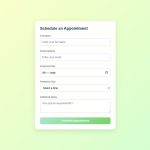
Think of checkout flows on Shopify or registration wizards in WordPress. That horizontal bar at the top telling you “Step 2 of 4”? That’s a progress bar doing its job.
Form progress bars reduce abandonment by setting clear expectations. Users know exactly what they’re getting into before they start, and they can see the finish line while filling out fields.
The psychological effect matters here. Nobody wants to start something without knowing when it ends. A visible step indicator gives users that control back.
How Does a Form Progress Bar Work
See the Pen
Interactive Multi-Step Medical by Bogdan Sandu (@bogdansandu)
on CodePen.
Progress bars track user advancement through form sections using JavaScript state management.
When a user completes required fields and clicks “Next,” the progress indicator updates. The current step gets marked complete, and the bar advances to show the new position.
Most implementations use CSS transitions for smooth animations between states. React and Vue.js handle this particularly well with their reactive data binding.
The technical flow looks like this:
- User fills out current step fields
- Form validation checks inputs
- Valid data triggers state change
- Progress component re-renders with updated position
- Visual feedback confirms advancement
Some forms use percentage-based tracking instead of discrete steps. These calculate completion based on filled fields divided by total fields.
The choice between step-based and percentage-based depends on your form structure. Discrete steps work better for multi-step forms with clear sections. Percentage tracking suits longer single-page forms.
What Are the Types of Form Progress Bars
Progress indicators come in several distinct styles. Each serves different use cases and design requirements.
Step Indicators
See the Pen
Modern Multi-Step Form with Animated Progress Indicators by Bogdan Sandu (@bogdansandu)
on CodePen.
Numbered or labeled markers showing discrete form stages. Best for checkout flows and registration forms with 3-7 steps.
Segmented Progress Bars
See the Pen
Modern Segmented Progress Bar Form by Bogdan Sandu (@bogdansandu)
on CodePen.
Divided sections representing each form phase. Bootstrap and Material Design both include these as standard components. Clean visual separation without numbers.
Linear Progress Bars
See the Pen
Modern Linear Progress Bar Form by Bogdan Sandu (@bogdansandu)
on CodePen.
Continuous horizontal bars that fill from left to right. Simple implementation with CSS3 width transitions. Works well for single-page forms with percentage tracking.
Circular Progress Indicators
See the Pen
Startup Project Form w/ Circular Progress by Bogdan Sandu (@bogdansandu)
on CodePen.
Radial designs that fill clockwise as users advance. Popular in mobile form design where horizontal space is limited. Figma and Adobe XD templates often feature these.
What Are the Best Practices for Form Progress Bars
Implementation details determine whether your progress bar helps or annoys users. Small decisions compound.
How to Position a Form Progress Bar
Top placement works best. Users scan pages top-to-bottom. A progress indicator above the form content gets seen immediately.
Fixed positioning keeps the bar visible during scroll. Especially useful for longer form steps where users might lose context.
Left-side vertical progress bars work for desktop dashboards with persistent navigation. Avoid this pattern on mobile.
What Colors Work Best for Form Progress Bars
Use your brand’s primary accent for completed and active states. Gray tones for upcoming steps.
Green checkmarks signal completion effectively. Users recognize this pattern from other interfaces.
Maintain WCAG AA contrast ratios minimum. Better yet, hit AAA. Color alone should never be the only indicator of state.
How to Handle Progress Bar States
Four states cover most scenarios: inactive, active, completed, and error.
- Inactive: Grayed out, reduced opacity, no interaction
- Active: Highlighted, possibly animated, current focus
- Completed: Checkmark or filled indicator, clickable for editing
- Error: Red accent, warning icon, clear message about what needs fixing
Proper state management connects directly to improving your form abandonment rate. Users who see their progress clearly complete forms more often.
What Animations Improve Form Progress Bars
Subtle transitions beat flashy effects. A 200-300ms ease-out curve feels responsive without being distracting.
Animate width changes on linear bars. Fade checkmarks into completed steps. Pulse the active step gently to draw attention.
Skip animations entirely for users who prefer reduced motion. Check the “prefers-reduced-motion” media query and respect it.
Loading spinners belong in buttons, not progress bars. The bar shows form position, not processing status.
FAQ on Form Progress Bar Examples
What is a form progress bar?
A form progress bar is a visual indicator showing users their current position in a multi-step form. It displays completed steps, the active step, and remaining sections. Common in checkout flows, registration wizards, and survey forms.
Why should I add a progress bar to my forms?
Progress bars reduce form abandonment by setting clear expectations. Users see exactly how much work remains. This transparency builds trust and increases completion rates, especially for longer web forms requiring multiple inputs.
What types of form progress bars exist?
Five main types: step indicators with numbers, segmented bars showing sections, linear percentage bars, circular progress indicators, and numbered step trackers. Bootstrap and Material Design include pre-built components for each style.
How do I create a progress bar with CSS?
Use a container div with a nested fill div. Set the container’s background to gray, the fill to your brand color. Update the fill’s width percentage via JavaScript as users advance through form fields.
Which JavaScript frameworks work best for form progress bars?
React and Vue.js handle progress bars efficiently with reactive state management. Angular Material includes a stepper component. jQuery works for simpler implementations. Choose based on your existing tech stack.
How many steps should a progress bar show?
Three to seven steps work best. Fewer than three makes the bar unnecessary. More than seven overwhelms users. If your form needs more sections, consider grouping related fields or using conditional logic to hide irrelevant steps.
Should progress bars be clickable for navigation?
Yes, allow backward navigation to completed steps. Users often need to edit previous answers. Disable clicking on future steps to maintain form sequence. This pattern follows form UX design best practices.
How do I make a progress bar accessible?
Add ARIA labels describing current position. Use “aria-valuenow” and “aria-valuemax” attributes. Ensure sufficient color contrast meeting WCAG standards. Never rely on color alone to indicate state. Support keyboard navigation between steps.
What animations work best for form progress bars?
Subtle CSS transitions between 200-300ms feel responsive without distraction. Animate width changes smoothly. Fade checkmarks into completed steps. Respect the “prefers-reduced-motion” media query for users who disable animations.
Can I use a progress bar on single-page forms?
Yes. Use percentage-based tracking instead of discrete steps. Calculate completion by dividing filled fields by total fields. The bar fills gradually as users complete each input. Works well for longer survey forms.
Conclusion
These form progress bar examples prove that small UI details drive big conversion gains. Stripe, Material Design, and Tailwind CSS implementations all share one thing: they respect the user’s time.
Pick the pattern that fits your stack. Angular and Vue.js offer reactive components out of the box. Vanilla CSS works fine for simpler builds.
Test your step indicator on mobile first. Touch targets need space. Labels might need to collapse into icons.
Remember WCAG compliance. ARIA attributes matter. Color contrast matters more.
Start with three to five steps maximum. Track your form conversions before and after implementation. The data will tell you what’s working.
Ship it. Measure. Iterate.

