




A screen reader user tabs into a checkout form and one of the fields just announces “edit text.” No name, no hint about what it wants, nothing. That’s the actual…
Table of contents
Short forms outperform long ones, and timing matters just as much as length. Send a form too late and people forget what happened. Send one that drags on and they close the tab halfway through.
Product teams, support departments, and HR groups all run into the same problem: they need honest feedback right after a purchase, a support ticket, or an onboarding period, and completion rate is the number that tells them whether what they collected is actually usable.
Layout affects that number more than most people assume. CXL Institute ran usability tests back in 2016 and found single-column form layouts finish 15.4 seconds faster on average than two-column layouts. That’s a small difference on paper, but it’s enough to shift completion rate on its own.
What Is a Feedback Form
People mix this up with a contact form or a lead capture form constantly, and the confusion causes real problems down the line. Those two exist to move a visitor toward a transaction, a reply, a next step. A feedback form does something else entirely: it captures what someone thinks after something has already happened to them.
Put it next to the other types of forms on a website and it sits closer to research than to conversion. Nobody’s counting submissions here. The point is getting an honest read on how people actually experience a brand, warts and all.
Categories exist mostly to organize how teams talk about these forms internally. Customer feedback forms tie to a purchase or a support interaction. Employee feedback forms cover morale, culture, process, the stuff that’s harder to measure but matters just as much. Product feedback forms zero in on features and usability, and website feedback forms look at navigation and content clarity, whether people can actually find what they came for.
Whichever category applies, the output is a mix of two things: what someone says in their own words, and a score or rating that turns that opinion into something you can chart. HubSpot keeps these categories separate in its own template library, and there’s a reason for that. A question written for a support ticket usually falls flat on a product roadmap survey.
What Question Types Work Best on a Feedback Form
Most forms that actually work mix formats. Closed-ended questions do the heavy lifting for measurable scoring, and a handful of open-ended ones fill in the context that a 1-to-5 scale can’t capture on its own. Relying on just one format tends to backfire, whichever one you pick.
| Question Type | Format | Best For | Response Effort |
|---|---|---|---|
| Rating scale | 1 to 5 or 1 to 10 | Tracking sentiment over time | Low |
| Open-ended | Free text box | Capturing specific detail | High |
| Multiple choice | Predefined options | Fast, structured feedback | Low |
| NPS | 0 to 10 scale | Loyalty and referral likelihood | Low |
| CSAT / CES | Short scale, 3 to 5 points | Transaction or support quality | Low |
It’s worth reading through the full range of types of survey questions before locking in a format. Too many forms default to whatever the last one used, not what actually fits the question being asked.
Closed Versus Open-Ended Questions
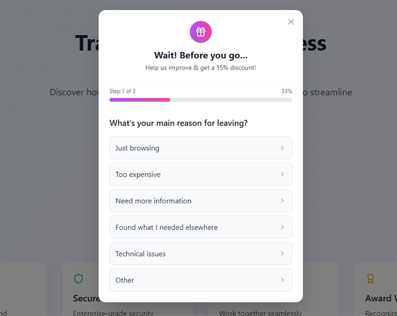
Closed questions are the ones people actually finish. They’re fast, they’re comparable across respondents, and analyzing a thousand of them takes an afternoon instead of a week. Open questions ask for more, understandably, and what comes back can surface something a rating scale would never catch on its own, even if it takes longer to read and doesn’t reduce neatly to a chart.
Where you put each type matters too, not just how many you use. SurveyMonkey’s 2025 platform analysis looked at this directly and found surveys opening with a multiple-choice question average an 89% completion rate. Surveys that open with a blank comment box average 83%. Six points doesn’t sound huge until it’s applied across a few thousand responses.
NPS, CSAT and CES: When to Use Which
Fred Reichheld introduced the Net Promoter Score in a 2003 Harvard Business Review article, and companies including Apple, American Express, and Southwest Airlines have leaned on it since to track loyalty over time.
NPS asks one simple thing: how likely is someone to recommend you? It’s built for the long game, tracking loyalty across months and years rather than a single visit. CSAT works on a shorter timescale, checking how satisfied someone felt about one specific interaction, which is why it shows up right after a purchase or a closed support ticket.
CES asks a different question entirely, how much effort something took, and it’s the one worth reaching for when you’re trying to find exactly where a process gets friction-heavy.
Anyone building loyalty tracking into a form should look closely at real NPS survey questions before writing their own. Phrasing changes the score more than most teams expect.
Form Length and Structure That Keep Completion Rates High
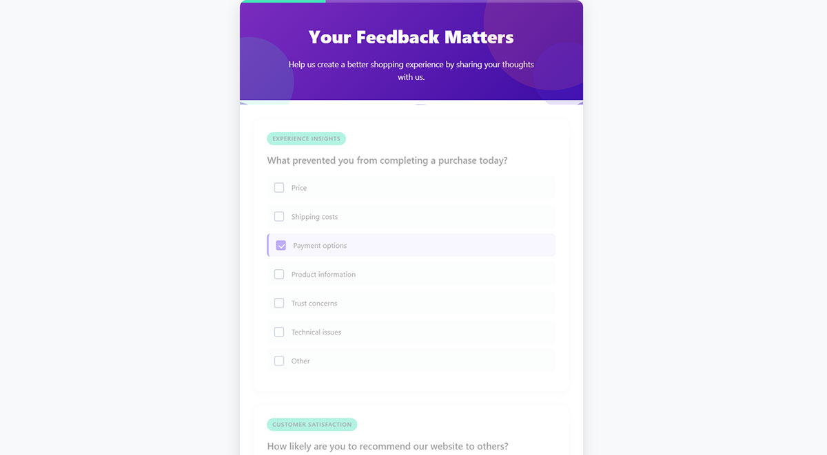
Shorter forms finish more often, plain and simple. Every extra field is a small tax on someone’s patience, and that tax compounds faster than most people expect.
Ideal Field Count and Completion Time
SurveyMonkey’s 2025 platform data puts average completion at 89% for a 10-question form. Push that to 40 questions and completion drops to 79%.
The decline isn’t a straight line at every stage, but it never reverses either. Longer forms lose people along the way, and the ones who stick around tend to rush the last few questions rather than sit with them.
A form running 1 to 5 fields gets the highest completion by a wide margin, though the data it returns is thin almost by definition. Somewhere between 6 and 15 fields is where most teams land, since that range tends to balance depth against patience reasonably well. Past 16 fields, you’re really building something for a research panel, not a quick feedback ask, and treating it otherwise usually just tanks the response rate.
Conditional Logic and Progress Indicators
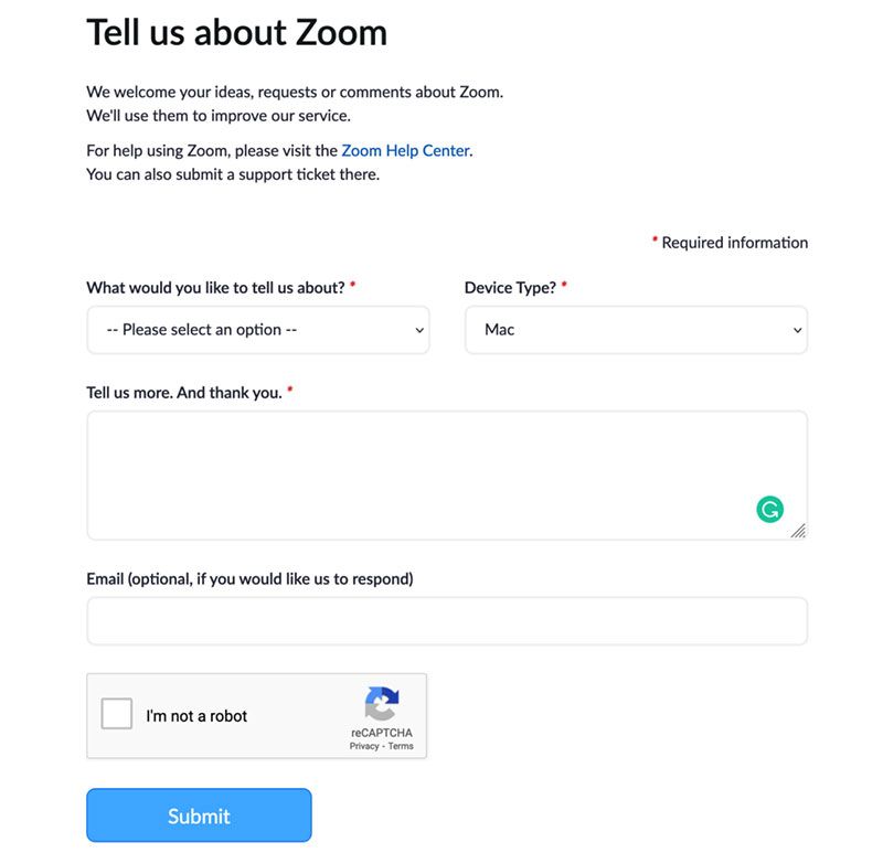
Conditional logic does one useful thing: it shows or hides fields depending on how someone answered the question before it, so nobody wastes time on something that doesn’t apply to them.
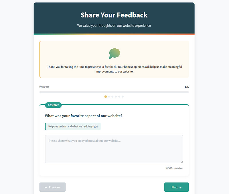
Progress bars work on perception more than reality. The actual field count hasn’t changed, but seeing a bar fill up makes the remaining effort feel smaller, and that’s often enough to get someone across the finish line.
Required fields are where a lot of forms sabotage themselves. Keep the mandatory ones down to the two or three that genuinely matter, because every field marked required is a spot where someone can get stuck and just leave.
Getting a handle on what is conditional logic before building anything with multiple sections saves a lot of rework down the line. Browsing through actual form progress bar examples is also just a faster way to find a style that fits than trying to picture it from scratch.
Feedback Form Platforms Compared
Five platforms cover most of what teams actually need here: Google Forms, Typeform, SurveyMonkey, JotForm, and Qualtrics. Picking between them usually comes down to budget first, then how much conditional logic you need, then where the form actually has to live on your site.
| Platform | Best For | Pricing Model | Standout Feature |
|---|---|---|---|
| Google Forms | Free, simple internal feedback | Free | Direct Sheets integration |
| Typeform | Conversational, one-question-at-a-time forms | Free tier, paid plans | Conversational flow design |
| SurveyMonkey | Research-grade customer and employee surveys | Free tier, paid plans | Built-in benchmark data |
| JotForm | Drag-and-drop custom builds | Free tier, paid plans | Large template library |
| Qualtrics | Enterprise experience management | Enterprise pricing | Advanced statistical analysis |
Google Forms handles the basics fine, honestly, but the moment a team needs real branding, skip logic, or payment fields built in, they’re usually browsing Google Forms alternatives within a week.
Sites already running on WordPress skip a dedicated survey platform a lot of the time. WPForms and Gravity Forms both handle feedback collection natively without any extra plugin, and looking through the current free WordPress form plugins shows just how far the free tier has come.
Where and When to Place a Feedback Form
Timing beats almost everything else here. A feedback form does its best work right after the moment it’s asking about, not days later once the details have gone fuzzy.
Post-Purchase and Transactional Triggers
Post-purchase surveys go out immediately after checkout or delivery, right while the experience is still fresh enough that someone can describe it accurately instead of reconstructing it from memory.
Airbnb runs this well. Its review system gives both guests and hosts a 14-day window after checkout to submit feedback, and the whole thing triggers automatically by email once the stay wraps up.
Exit-intent triggers run on completely different logic. Instead of following a completed action, they catch someone right as they’re about to leave the page, mid-thought, before they’ve committed to going anywhere. Anyone testing that trigger for the first time could do worse than starting with a look through current WordPress exit intent popup plugins.
In-App and On-Site Widgets
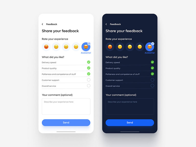
In-app widgets grab feedback without pulling someone away from whatever they were actually doing, and that alone tends to raise participation compared to an email link that shows up in their inbox an hour later.
The numbers back this up. SurveyMonkey’s 2025 platform data shows mobile SDK in-app surveys averaging a 34.37% response rate, well above what most email-linked forms manage.
Not every channel fits every situation, though. Email-embedded forms work best for the low-friction, one-click kind of rating. In-app widgets make more sense when the feedback ties to one specific feature someone just used. On-site tabs are the odd one out, sitting there quietly, always available, for whenever someone feels like leaving a note without being asked.
Worth reading a quick primer on what is a popup form before deciding whether a widget should interrupt the page outright or just sit to the side.
How to Write Unbiased Feedback Form Questions
A neutral question describes something plainly and lets the person answering supply the opinion. The moment a form nudges someone toward the answer its author already wanted, it stops being feedback and starts being confirmation.
Leading questions are the most obvious offender. Asking how much someone loved a feature, instead of just asking what they thought of it, plants the assumption right there in the wording before anyone’s had a chance to think.
Double-barreled questions cause a quieter kind of damage, since they ask about two things at once and force a single answer to somehow cover both. “Was support fast and helpful” is really two separate questions wearing one sentence, and whoever answers it has to guess which one you actually wanted to know about.
Then there’s jargon, the internal shorthand that makes total sense to whoever wrote the form and to basically nobody else. A respondent who has to stop and guess what a term means will usually just skip the question rather than work it out.
One habit catches most of this before it ships: hand the form to a colleague who had nothing to do with writing it. If they hesitate on a question, a customer will hesitate too, and that hesitation shows up later as a lower completion rate than the form deserved.
Loaded framing is the quiet version of the same problem, and it’s easy to miss in your own writing. Phrase a question around what the business hopes to hear, rather than what actually happened, and the data that comes back flatters the team while misleading everyone who reads the report afterward.
Privacy and Accessibility Requirements for Feedback Forms
Feedback forms that collect personal data fall under privacy law, and any form served to the public runs into accessibility standards too, regardless of how small the business behind it happens to be.
The anonymous-versus-identified question comes up constantly, and there’s no clean answer. Anonymity gets you more honesty on sensitive topics, people say what they actually think when their name isn’t attached, but it also means there’s no way to follow up with a specific respondent or verify what they said.
Identified forms flip that trade: you can follow up directly, track a person’s feedback over time, segment responses by customer. The catch is that identified forms tend to suppress the harshest criticism, and that effect is especially strong in employee feedback, where nobody wants their manager reading their name next to a complaint.
Data Privacy Rules
Collect an email address, a name, or even just an IP address on a feedback form, and GDPR applies for European respondents while CCPA applies for anyone in California.
GDPR Recital 32 spells this out clearly: pre-ticked boxes don’t count as consent, and neither does silence. That single line ruled out the quiet opt-in checkboxes that used to be standard practice on forms everywhere.
Getting consent right the first time beats retrofitting it later, every time. A walkthrough on how to create GDPR compliant forms covers the consent language and data retention settings that most teams end up missing.
Accessibility Standards
State and local government sites have to meet WCAG 2.1 Level AA under the DOJ’s ADA Title II Final Rule, though the timeline shifted recently. The original compliance date was April 24, 2026, and DOJ pushed it back in an interim final rule issued that same month: entities serving a population of 50,000 or more now have until April 26, 2027, while smaller entities and special districts get until April 26, 2028. That extension technically only covers public entities, for what it’s worth, but private sites are increasingly held to the same WCAG 2.1 AA bar anyway, mostly through litigation and contract terms rather than direct regulation.
None of this works without a few basics in place:
- Every field needs a label a screen reader can actually pick up
- Color contrast has to clear WCAG AA thresholds, not just look fine to the eye
- Keyboard navigation needs to work end to end, since mouse-only interactions lock out a chunk of the audience entirely
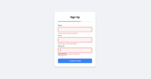
- Error messages should explain what went wrong, not just turn a border red and leave someone guessing
Passing an automated scanner doesn’t mean a form is compliant, not even close. Manual testing against the current form accessibility best practices catches the gaps scanners tend to miss entirely, focus order and screen reader announcements especially.
How to Increase Feedback Form Response Rates
Response rates go up when a form is easy to fill out and reaches someone at the right moment. Add a real reason to bother beyond pure goodwill, and the number climbs further still.
Incentives have the biggest research base behind them. A meta-analysis of 38 mail-survey studies found prepaid monetary incentives raised response rates by an average of 19.1 percentage points, far outperforming incentives that were only promised rather than delivered upfront (Church, 1993). A later Cochrane systematic review of postal and electronic questionnaires backed up that pattern on a broader scale, finding monetary incentives roughly doubled the odds of response compared with non-monetary ones (Edwards et al., Cochrane Database of Systematic Reviews).
Channel matters on its own, separate from any incentive. SurveyMonkey’s 2025 platform data shows SMS-delivered surveys averaging an 18.54% response rate, a noticeably different profile than what email-linked forms typically pull.
Incentive design isn’t just about whether to offer one, it’s about picking the right kind. Iron Mountain tested a charitable donation incentive on an NPS survey and saw response rates climb by around 30% (Genroe), which says something about how a cash-adjacent reward can still work even when it’s not cash at all.
Cash isn’t the only lever, and honestly it’s not always the smartest one either. A discount code fits a retail feedback form in a way it never will an employee engagement survey.
Most of the response rate lost on a live form disappears mid-form, not before someone even opens it. Looking closely at where people actually quit, and the fixes for improving form abandonment rate, usually points back to field count and question order rather than to the incentive at all.
Once the mechanics are sound, whatever’s left tends to come from conversion-focused tweaks rather than structural fixes. A broader pass through proven tactics for how to increase form conversions applies just as well to a feedback form as it does to a lead form. Both are asking a stranger to spend a minute of their attention on something that benefits you more than them, at least on paper.
Steps to Build a Feedback Form From Scratch
There’s a fixed order to building one of these that actually works, and skipping a step early almost always means redoing it later, usually at a worse time than if you’d just done it right the first time.
- Define the objective and the exact decision the data will inform
- Match the platform to that objective and to where the form needs to live
- Choose question types and put the easiest one first
- Add conditional logic, required fields, and a clean layout
- Set the confirmation message and any incentive delivery
- Test across browsers and devices, then launch and track submissions
Layout ends up mattering more than most teams plan for going in. A form that looks cluttered on a small screen loses respondents before they’ve even read the first question. A walkthrough of current form design practices covers spacing, field width, and label placement in a level of depth no checklist really can.
Launch isn’t the finish line either, even though it feels that way. Wiring up form submission tracking in Google Analytics right away means the team can see drop-off by device and by question starting day one, instead of guessing three months later why the numbers look off.
How to Analyze and Act on Feedback Form Data
Raw responses sitting in a spreadsheet aren’t insight yet. Someone still has to group them, score them, and tie them back to an actual decision before they’re worth anything.
Sentiment Analysis and Thematic Coding
Sentiment analysis scores open-text responses as positive, neutral, or negative, and it’s mostly useful for tracking mood over time across a large volume of comments rather than understanding any single one deeply.
Thematic coding does something different. It groups comments into recurring topics, whether that’s done by hand or with software, and it’s usually how a team finds the handful of issues actually driving the score in the first place.
Qualtrics and platforms like it build sentiment scoring directly into their text analytics tools now, which cuts out the manual tagging step once a dataset gets big enough that hand-coding stops being realistic.
A full walkthrough of how to analyze survey data is worth reading before picking between automated scoring and manual review. The right call usually comes down to volume, not budget.
Closing the Feedback Loop
CustomerGauge’s own research found that closing the loop within 48 hours increases retention by 12% and lifts NPS by an average of 6 points. Both numbers hold up better than most feedback-program claims tend to.
There’s a real example behind it too. CustomerGauge published case work on Eaton, a global power management company, showing a B2B account team applying that same 48-hour rule to hang onto enterprise customers who might otherwise have drifted.
Telling someone what changed because of their answer is really the whole difference between a feedback form and a data-collection exercise nobody remembers giving input to.
When a Feedback Form Fails
A feedback form fails for one of two reasons, usually. Either the audience is too fatigued to answer honestly anymore, or the form itself creates more friction than whatever insight comes out the other side is actually worth.
Conditions Where Feedback Forms Underperform
Survey fatigue isn’t rare, and industry research keeps flagging it as a growing problem, mostly because feedback requests keep multiplying across every product, team, and platform someone touches in a given week.
McKinsey’s research points at something sharper than volume alone, though. Employees stop responding once they believe their input never leads to real change, and that happens regardless of how often they’re asked.
Some conditions just make a form the wrong tool, no matter how well it’s designed. An audience too small to support any real conclusion from a handful of responses is one. A moment right after a service failure is another, since a live conversation resolves more in five minutes than a questionnaire ever will. And anything needing real back-and-forth dialogue doesn’t belong in a form to begin with, since a form only ever captures one static answer.
Reading up on this before launching yet another one is worth the time for any organization already watching its response rate shrink, and the practical fixes for avoiding survey fatigue start with frequency, not phrasing.
Design Mistakes That Reduce Response Quality
A form that never explains why it exists gets treated as optional busywork, and people skip busywork, that’s just how it goes.
Requiring a login before someone can leave feedback is another one. It adds a barrier that has nothing whatsoever to do with the actual feedback, and it costs more responses than most teams realize.
Then there’s the habit of reusing one long template for a support ticket, a product launch, and an annual review alike, as if each of those moments doesn’t call for a completely different length and tone.
Worst of all might be feedback theater: collecting responses and never acting on a single one of them. It trains an audience to stop bothering, and it’s about the fastest way there is to turn a healthy response rate into a dead one.
None of these mistakes show up in any one bad response, taken alone. They show up months later, quietly, in a response rate that drops a little more every time the form goes back out.
FAQ on Best Practices For Creating Feedback Forms
How Is a Feedback Form Different From a Survey or an Evaluation Form
A survey is the umbrella term, the broader research instrument. A feedback form is one specific type of survey, built around a single interaction rather than a wide-ranging research question. An evaluation form works differently. It judges performance against a set of predefined criteria, usually for one specific person, while a feedback form just collects unscored opinion, nothing formal, no grade attached.
What Is the Difference Between a Customer Feedback Form and an Employee Feedback Form
Customer feedback forms stick to product, service, or purchase experience, and they usually default to anonymous. Employee forms cover more ground, morale, management, culture, the stuff that’s harder to put a number on, and anonymity carries a lot more weight there too. Identified answers tend to suppress honest criticism at work in a way they just don’t for a customer rating a checkout experience.
What Is a Good Response Rate for a Feedback Form
There’s no universal number here, and anyone who gives you one flat percentage is oversimplifying. It comes down to channel. An embedded widget and a post-purchase email operate on completely different baselines, so comparing them head to head doesn’t really tell you anything useful. Better to compare a form against its own channel history over time than against some unrelated benchmark another team pulled from a different context.
Is a Short Feedback Form Always Better Than a Long One
Not always, no. Casual customer feedback should stay short to protect completion rate, that part holds. But research panels, compliance forms, and detailed product studies justify a lot more length than that, and cutting them down just to hit some arbitrary short-form ideal loses the depth they’re built for. Length really just matches the stakes of whatever decision the data is going to inform. There’s no fixed rule underneath it.
Which Tools Help Automate Feedback Form Follow-Up and Data Routing
Zapier connects a feedback form to a CRM, a spreadsheet, or a Slack channel the moment a response lands, which removes the manual export work most teams used to do by hand. SurveyMonkey and Qualtrics both build routing and alerts directly into their platforms too, so a separate automation layer isn’t always necessary.
How Soon After an Interaction Should a Feedback Form Be Sent
Within 24 hours for a support interaction, while the details are still fresh in someone’s head. Transactional feedback tied to a purchase or a delivery works best sent immediately after the action completes. Any delay lets memory soften, and that softening lowers how accurate the response ends up being.
What Should You Fix First in Best Practices For Creating Feedback Forms?
Field count comes before question wording when it’s time to fix a feedback form. A bloated form suppresses response no matter how carefully each individual question gets phrased, so trimming length is the correction that pays off first, before anything else gets touched.
- Trim field count and cut anything not tied to the objective
- Rewrite question type and wording for the shortened form
- Fix placement and timing so the shorter form reaches people at the right moment
Skipping ahead in that order undercuts whatever comes after it, which is why it holds up as a fixed sequence rather than a suggestion.
Cutting a form down to its shortest defensible length trades some depth of insight for a higher response rate. That trade only makes sense when the decision resting on the data doesn’t actually need nuance to begin with. Adapting one of the ready-made feedback form templates is the fastest way to apply this whole order without starting from a blank page.