The Rating field allows you to collect quick feedback from users using visual rating icons such as stars, hearts, or likes. Instead of typing an answer, users simply select a rating level that represents their experience.
For example, you can add a rating field at the end of a contact form to ask visitors how satisfied they were with your service, or include it in a feedback form where users rate a product, event, or support interaction.
What is the Rating field used for?
The Rating field is commonly used to measure user satisfaction or gather quick feedback in a visual and intuitive way.
Ask customers to rate their overall experience
Collect product or service satisfaction scores
Measure event feedback after registration
Gather quick survey responses
Evaluate customer support interactions
How do I configure rating values?
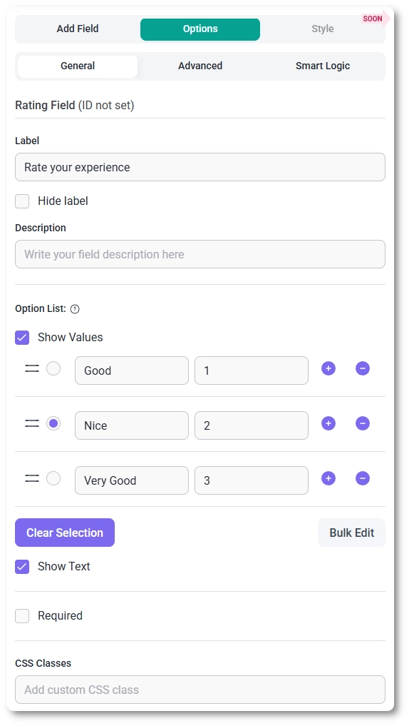
The rating options are configured in the Option List section of the General tab.
By default, the field contains five rating levels:
Good
Nice
Very Good
Awesome
Amazing
You can modify these labels or add additional options if you want a larger rating scale. For example, you can create a 10-point rating system by adding more entries to the list.
If you want to update multiple values at once, click the Bulk Edit button to open a modal where all labels can be edited together.
What does the Show Values option do?
Enabling the Show Values option displays a numeric value for each rating option. These values appear as a separate field in the option list and are typically used for scoring or data analysis.
For example, the first option may have value 1, the second option 2, and so on. These numbers represent the actual values submitted with the form when a user selects a rating.
What does the Show Text option do?
When Show Text is enabled, the descriptive label for the selected rating appears next to the icons on the front end.
For example, if a user selects the second star and that option is labeled Nice, the text “Nice” will appear next to the selected rating.
This helps provide clearer feedback to users about the meaning of their selection.
How do I require a rating in the form?
You can make the rating mandatory by enabling the Required option in the General tab.
When this option is enabled, users must select a rating before they can submit the form.
How do I change the rating icon type?
In the Advanced tab, you can change the appearance of the rating icons.
Open the Icon Type dropdown and choose one of the available options:
Stars
Hearts
Likes
This allows you to adjust the rating style to better match the context of your form. For example, hearts may be more suitable for customer satisfaction surveys, while likes may fit product feedback forms.
How do I change the label position?
Like other fields in IvyForms, the label position can be adjusted in the Advanced tab.
You can choose one of the following positions:
Default
Top
Left
Right
This setting only affects where the label appears relative to the rating icons.
Can the Rating field use Smart Logic?
Yes. The Rating field fully supports Smart Logic.
Using the Smart Logic tab, you can configure the field to appear only when certain conditions are met based on previous form inputs.
For example, you might display the rating field only after a user completes a specific section of the form or selects a particular option.
Guides
Explore the IvyForms documentation through key sections like Get Started,
Form Creation, Entry Management, Settings, Integrations, Advanced Features,
and Support & Troubleshooting to make the most of your form-building experience