Gallup’s 2024 data shows only 31% of U.S. employees feel engaged at work. Annual surveys can’t catch that kind of decline fast enough. Pulse surveys can. These short, frequent questionnaires…
Table of Contents
Think about the last time you filled out an online form. Was it quick and effortless, or did you find yourself frustrated, clicking away before completing it?
Website forms are everywhere – whether you’re signing up for a newsletter, booking an appointment, or completing a checkout. They serve as critical touchpoints between you and your visitors, influencing conversions, user experience, and even customer trust.
But here’s the problem: poorly designed forms drive users away.
A confusing, cluttered form with unnecessary fields, unclear instructions, or frustrating error messages can instantly kill conversions. Research into website form design suggests that:
- According to FormStory, 27% of users abandon forms because they are too long or complex.
- 22% of shoppers abandon purchases due to a long or complicated checkout process: Research by the Baymard Institute indicates that 22% of U.S. online shoppers have abandoned an order in the past quarter solely due to a “too long / complicated checkout process.”
- Users expect forms to be intuitive, quick, and effortless – anything less, and they’re gone: While specific percentages vary, it’s widely acknowledged that users anticipate seamless and straightforward form experiences. C
On the flip side, a well-designed website form enhances user experience and boosts conversions. When forms are simple, visually clear, and friction-free, they:
- Reduce bounce rates and form abandonment
- Increase user trust and engagement
- Lead to higher conversion rates (whether it’s sign-ups, purchases, or inquiries)
In this guide, you’ll learn how to create high-converting, user-friendly forms by understanding form design principles, best practices, accessibility, and common mistakes to avoid.
Core Principles of Website Form Design
A well-designed form isn’t just about looking good – it’s about guiding users effortlessly from start to submission. Whether you’re collecting sign-ups, processing orders, or gathering feedback, form usability directly affects completion rates and conversions.
Following these principles ensures your forms are intuitive, frustration-free, and optimized for conversions.
Simplicity & clarity
Less is more. The shorter your form, the higher your completion rate. Remove unnecessary fields and only ask for essential information. If a field isn’t crucial, leave it out.
Example: Instead of asking for First Name, Last Name, Username, and Display Name, just ask for Full Name and generate the rest automatically.
Logical flow & structure
Forms should follow a natural sequence that makes sense to the user. Group related fields together and organize them in a logical order.
Best Practice: Place name and contact details first, followed by additional info.
Avoid: Jumping between unrelated fields (e.g., asking for a phone number before an email address).
Minimize cognitive load
The easier your form feels, the more likely users are to complete it. Reduce decision-making friction by:
- Using dropdowns or radio buttons instead of forcing users to type answers.
- Pre-filling known information (e.g., country based on IP address).
- Auto-formatting fields (e.g., adding spaces in credit card numbers).
Clear labels & instructions
Users should instantly understand what’s required. Use concise labels and provide hints where needed.
Good Example:
Email Address (e.g., [email protected])
Bad Example:
Enter your primary digital communication identifier. (Confusing!)
Error handling & feedback
Errors are inevitable, but how you handle them makes all the difference.
Bad practice: Showing errors only after clicking “Submit.”
Best practice: Real-time validation with clear error messages.
Instead of “Invalid input”, say “Please enter a valid email address (e.g., [email protected]).”
Form Layout & Structure Optimization for Better Design
The structure and layout of your form significantly impact user experience and conversion rates. A well-organized form makes it easier for users to scan, understand, and complete the required fields quickly. Below, we’ll explore key layout considerations and how to optimize them for usability.
Single-column vs. multi-column layouts – which works better?
One of the biggest form design decisions is whether to use a single-column or multi-column layout.
Single-column forms (Best for simplicity and usability)
- Easier to scan and complete
- Works well on mobile devices
- Follows a natural reading flow from top to bottom
Best for: Sign-up forms, contact forms, checkout pages, lead generation forms
Multi-column forms (Use with caution)
- Can make forms appear shorter at first glance
- Works well for short, related fields such as first and last name
- Can cause confusion if users are unsure which field to fill in next
Best for: Payment details, address forms, or when grouping small, related fields such as date of birth
Best practice: Use a single-column layout for most forms, but apply a multi-column format sparingly for fields that naturally belong together.
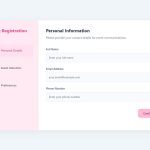
Grouping related fields – how to improve readability
Grouping related fields enhances readability and makes it easier for users to complete a form efficiently. Instead of presenting a long list of unrelated fields, forms should be structured into logical sections.
A well-structured form guides users naturally from one section to the next, reducing cognitive load and form abandonment.
Effective field grouping strategies:
- Organize fields by topic, such as personal information, contact details, and payment information.
- Use visual separators or headings to distinguish sections.
- Keep closely related fields side by side when appropriate, such as city, state, and zip code.
Label placement (top, left, or inside fields?) – UX pros & cons
| Label placement | Pros | Cons | Best for |
| Top-aligned labels |
|
|
Long forms, mobile-friendly design, accessibility |
| Left-aligned labels |
|
|
Desktop forms with limited vertical space |
| Labels inside fields (Placeholder text) |
|
|
Simple forms with minimal fields, but not recommended for critical inputs like passwords or email addresses |
Pro tip: Use top-aligned labels for the best readability and speed. Left-aligned labels work well for compact forms on large screens, while placeholders should only supplement labels, not replace them.
Field length & input types
Field size should reflect the expected input to create a more intuitive experience.
- Short fields: Best for data like first name, zip code, and phone number.
- Medium-length fields: Ideal for email addresses and usernames.
- Long fields: Suitable for open-ended responses, comments, or addresses.
Choosing the correct input type also improves usability. Dropdown menus work well for predefined options, while radio buttons are more efficient for short selections. For fields requiring specific formats, such as phone numbers or dates, using input masks can reduce errors and improve accuracy.
Best Practices for Website Form Design
A well-designed form reduces friction, improves user experience, and increases conversion rates. Below are the most effective best practices, complete with detailed explanations and examples to guide you in creating optimized website forms.
Keep it short and simple
Users are more likely to complete a form when it asks for minimal, essential information. Long and unnecessary forms increase friction, leading to higher abandonment rates.
Why it works
- Reduces cognitive load, making it easier for users to complete the form.
- Creates a more streamlined experience, particularly on mobile devices.
- Eliminates hesitation caused by privacy concerns when asking for too much information.
Best Practice: Only request what is necessary for the intended action. If additional information is required, collect it later.
Good example: Simple newsletter sign-up form
This form only asks for an email, minimizing effort and increasing the likelihood of completion.
Sign Up for Our Newsletter
Why this works well:
- Minimal fields with personalization: Asking for a first name and email gives a more personalized experience while still keeping it simple.
- Clear call-to-action button: Users know exactly what they’re doing with the “Subscribe” button.
- Checkbox for consent: A checkbox for agreeing to receive marketing emails helps ensure compliance and builds trust.
Bad example: Unnecessarily long sign-up form
This form asks for unnecessary details and can overwhelm users. Too many fields can lead to abandonment.
Sign Up for Our Newsletter
Why this doesn’t work:
- Too many fields: Asking for a phone number and company name when they aren’t necessary.
- Increases user effort: More fields mean more time required to complete the form.
- Higher abandonment rate: Users may decide it’s not worth the effort.
Provide clear and concise instructions
| Best Practice | Description | Why It Works Well |
| Use helper text or tooltips | Provide additional information or examples to clarify the required format for specific fields. | Helps users understand input requirements, reducing errors and confusion. |
| Use placeholder text for short hints | Include short hints or examples within the input field to guide users on what to enter. | Quickly guides users on the expected data format and improves form efficiency. |
| Provide context for complex fields | Offer context or input masks to specify the expected format for fields like dates or phone numbers. | Reduces guessing and errors by clearly showing what information is needed. |
| Provide real-time error validation | Display error messages instantly as users fill out the form, allowing corrections before submission. | Gives immediate feedback, reducing frustration and improving form completion. |
Minimize form fields
One of the biggest factors influencing form completion rates is the number of fields. Long forms with numerous fields can feel overwhelming to users, leading them to abandon the form. Minimizing fields is crucial for improving user experience and conversions.
Ask for only essential information
Stick to collecting only the most necessary information to achieve your goal. If additional data can be gathered later, defer those fields to a follow-up step or page. The fewer fields users need to fill out, the more likely they are to complete the form.
Use conditional fields
In some cases, you can reduce the visible fields by using conditional logic. Display fields based on user responses (e.g., only asking for a phone number if the user opts to receive a call). This helps keep the form clean and relevant.
- Reduces clutter: Users aren’t faced with unnecessary fields, making the form less intimidating.
- Enhances personalization: Users see only the fields that are relevant to them, improving the overall experience.
Group similar fields together
For forms that require multiple inputs, group similar fields together logically. This helps users process the information they need to provide more easily and understand the flow of the form.
- Improves readability: Logical grouping helps users focus on one section at a time.
- Reduces cognitive load: Breaking the form into sections makes it easier to complete and navigate.
Use clear, action-oriented button labels
The form’s submit button plays a crucial role in guiding users toward completion. The text on the button should clearly state the action the user is about to take, such as “Submit,” “Sign Up,” or “Download Now.”
Avoid generic labels like “Submit” and use more specific terms related to the form’s purpose, such as “Subscribe Now” or “Get My Free Trial.”
- Clarifies intent: Users immediately understand what will happen once they click the button.
- Improves conversions: A clear call to action can create a sense of urgency or excitement.
Make the button stand out
Use contrasting colors, larger text, or a button design that grabs attention. However, ensure that it remains consistent with your website’s overall design so it feels natural.
Why this works well:
- Draws attention: A prominent button increases the likelihood that users will notice and interact with it.
- Encourages action: When the button is easy to find and stands out, users are more likely to complete the form.
Make form design mobile-friendly
With an increasing number of users accessing websites from mobile devices, ensuring your form is optimized for mobile use is essential. A responsive design will make filling out forms much easier on smartphones and tablets.
Ensure fields are large enough for easy input
On mobile devices, input fields should be large enough to easily tap and type in. Also, ensure buttons are appropriately sized for touch interaction.
Why this works well:
- Improves accessibility: Larger fields and buttons make forms easier to interact with on small screens.
- Reduces errors: Users are less likely to make mistakes when tapping larger, properly spaced buttons.
Simplify mobile forms with fewer fields
For mobile users, limit the number of fields to those that are most important. On mobile devices, long forms can be especially tedious, so minimizing fields increases the likelihood of completion.
Why this works well:
- Enhances user experience: A simplified mobile form makes it easier and faster for users to submit their information.
- Improves conversion rates: Shorter, mobile-optimized forms are less likely to be abandoned.
Website Form Design for Accessibility & Inclusivity
Designing forms with accessibility and inclusivity in mind ensures that all users, regardless of their abilities, can interact with and complete them easily.
Accessible forms are not only essential for meeting legal requirements but also create a better user experience for everyone.
Descriptive labels and field instructions
Labels should be clear and descriptive, helping all users, including those with visual impairments, understand the purpose of each field. Descriptive labels also aid users who rely on screen readers or those with cognitive impairments.
What to do:
- Ensure labels are clearly associated with their respective input fields. This is crucial for users who depend on assistive technologies.
- For complex fields, provide additional field instructions or helper text below the field to clarify what information is required.
Keyboard navigability
Many users with mobility impairments navigate websites using only the keyboard rather than a mouse. Forms that are keyboard-friendly allow these users to interact more easily with form fields, checkboxes, and buttons.
What to do:
- Ensure that form elements are easily navigable via the “Tab” key, and the focus is in a logical order.
- Ensure that buttons, links, and form fields are accessible using the keyboard alone, with no reliance on mouse hover or clicks.
Text alternatives for non-text content
For users with visual impairments or those using screen readers, non-text content such as images, icons, and buttons can be inaccessible without proper text descriptions.
What to do:
- Use alternative text (alt text) for any non-text elements such as icons, logos, and images.
- Describe the functionality or meaning of icons and images within the form so screen reader users can comprehend the content and take the necessary action.
High contrast colors
Some users have difficulty distinguishing text from background colors, particularly those with color blindness or poor vision. Ensuring high contrast between text and background colors increases readability for these users.
What to do:
- Choose color combinations that offer high contrast, ensuring readability for users with visual impairments.
- Don’t rely solely on color to communicate important information. Use text labels or symbols alongside color for clarity, especially in error messages or form validation.
Error identification and suggestions
When a user makes a mistake in a form field, it’s essential to clearly identify and correct it. This is crucial for all users, but particularly for those with cognitive disabilities or visual impairments who may miss subtle error indicators.
What to do:
- Provide real-time error messages that are easy to spot. Ensure that the error message is accompanied by a clear description of what needs to be fixed.
- Use text and icons together, not just color, to identify errors and guide users in fixing them.
Mobile accessibility
Many users now access websites on mobile devices, including those with disabilities. Ensuring that your form is accessible on mobile devices is key to offering an inclusive experience.
What to do:
- Ensure that the form is fully responsive and that fields are appropriately sized for easy tapping on touch screens.
- Use mobile-friendly input fields and buttons that are large enough to interact with, without the need for zooming in.
A/B Testing Form Design for Higher Conversions
A/B testing is a powerful method for optimizing your website forms and increasing conversions. By comparing two or more versions of a form, you can identify which elements perform best with your audience and make data-driven decisions to enhance the user experience and drive better results.
Here’s how A/B testing can help you fine-tune your form design for higher conversions:
Testing different form layouts
The layout of your form can significantly affect user experience and completion rates. Whether you use a single-column or multi-column format can influence how users interact with your form.
What to test:
- Single-column layout vs. multi-column layout: Test if users complete forms faster and with fewer errors when the fields are stacked vertically or arranged horizontally.
- Field grouping: Experiment with different ways of grouping related fields (e.g., contact info vs. payment info) to see which makes the process clearer and more intuitive.
What to look for:
- Which layout encourages more submissions?
- Does one layout reduce the time it takes to complete the form?
Simplifying fields: Quantity vs. quality
The number of fields in a form directly impacts user completion rates. Too many fields can overwhelm users and lead to abandonment, while too few might make users feel unsure about submitting incomplete information.
What to test:
- Reducing fields: Experiment with removing non-essential fields (e.g., asking only for an email address vs. both name and email).
- Progressive disclosure: Test showing only the most necessary fields initially, then gradually revealing others as needed.
What to look for:
- Does removing fields increase form completion rates?
- How does showing fewer fields affect the user experience?
CTA button text and placement
The call-to-action (CTA) button is crucial for conversions. Small tweaks, like changing the text or placement, can have a significant impact on whether users click it or not.
What to test:
- Text on the button: Test different variations of the CTA text, such as “Submit” vs. “Get Started” or “Sign Up” vs. “Subscribe.”
- Placement of the button: Try placing the CTA button above the fold or at the end of the form to see which position gets more clicks.
What to look for:
- Which CTA text results in more clicks?
- Does changing the button’s location improve conversions?
Form design visuals
The look and feel of your form plays a big role in user trust and engagement. Test different design elements to understand how visuals can influence behavior.
What to test:
- Field styling: Test different border styles, colors, and shadows to see which are more visually appealing.
- Submit button styling: Test variations like colored vs. transparent buttons, or adding hover effects to see if it increases user interaction.
- Visual cues: Experiment with icons, arrows, or progress bars to guide users through the form more smoothly.
What to look for:
- Which visual elements lead to better user engagement?
- Do users prefer certain button styles or colors over others?
Form validation and error messaging
Forms that don’t provide immediate or clear error messages lead to frustration and abandoned submissions. Testing error messages can help you understand which feedback methods work best for users.
What to test:
- Real-time validation vs. post-submission validation: Test whether users respond better to real-time error detection (e.g., as they type) or to messages shown after submitting the form.
- Clear vs. vague error messages: Experiment with detailed error messages versus more generic ones to see which are more helpful.
What to look for:
- Do real-time error messages reduce abandonment rates?
- Does offering detailed error descriptions lead to more form completions?
Mobile vs. desktop versions
With a growing number of users accessing websites on mobile devices, testing your form design for mobile-friendliness is critical. Forms that work well on desktop might not be as effective on mobile.
What to test:
- Mobile-first vs. desktop-first designs: Test if forms designed with mobile users in mind (larger buttons, simplified fields) perform better than those optimized for desktop users.
- Responsiveness of fields: Try different input field sizes and button designs to see what works best on smaller screens.
What to look for:
- Does mobile optimization increase conversion rates?
- Are there any significant differences between mobile and desktop conversions?
How to run effective A/B tests for forms
- Define your goal: Before testing, know what you want to improve—whether it’s form completion rates, lower bounce rates, or higher conversions.
- Use proper test tools: Implement A/B testing tools such as Google Optimize, Optimizely, or Unbounce to manage the tests and gather data.
- Test one element at a time: Focus on one specific change per test (e.g., CTA button text or layout), as testing multiple changes at once can make it difficult to pinpoint what caused the results.
- Track metrics: Monitor key performance indicators like form abandonment rate, completion rate, and conversion rate to assess the success of each variation.