
Long forms lose people. HubSpot data shows that multi step forms convert 86% higher than single-page forms, yet most websites still cram every field onto one screen. The fix is…
Table of Contents
Placeholder text is the short hint displayed inside an input field before users start typing. It helps users understand what information to enter and in what format. Good placeholder text reduces form errors, improves usability, and increases form completion rates by guiding users through each field.
Forms often fail because users are unsure what information is expected. Even a simple field like “Name” or “Phone Number” can cause hesitation if formatting isn’t clear.
Well-written placeholder text removes that uncertainty.
Instead of leaving users guessing, placeholders show exact examples of the expected input, such as:
-
e.g. John Smith -
(555) 123-4567
In this guide, you’ll find:
-
Practical placeholder text examples for common form fields
-
UX patterns that improve form completion rates
-
Accessibility rules for using placeholders correctly
-
Best practices for designing intuitive form inputs
Use these examples when designing contact forms, registration forms, checkout pages, surveys, and application forms to create smoother user experiences and reduce form abandonment.
Free Form Placeholder Text Generator
Placeholder Text Examples
If you’re looking for quick inspiration, the examples below show effective placeholder text you can use in most forms. Each example demonstrates how placeholders should clarify format, expectations, or example input without replacing field labels.
Personal information placeholder text
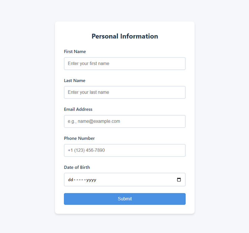
- First Name: Enter your first name
- Last Name: Enter your last name
- Email Address: e.g., [email protected]
- Phone Number: +1 (123) 456-7890
- Date of Birth: MM/DD/YYYY
These placeholders show realistic examples or formatting, which prevents common mistakes like incomplete names or incorrect email formatting.
| Form Field | Good Placeholder Example |
|---|---|
| First Name | e.g. John |
| Last Name | e.g. Smith |
| Full Name | e.g. John Smith |
| Email Address | [email protected] |
| Phone Number | (555) 123-4567 |
| Date of Birth | MM/DD/YYYY |
| Username | Choose a unique username |
Address placeholder
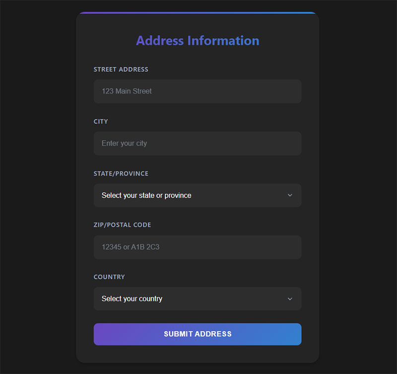
- Street Address: 123 Main Street
- City: Enter your city
- State/Province: Select your state or province
- ZIP/Postal Code: 12345 or A1B 2C3
- Country: Select your country
Address forms benefit from placeholders because they help users understand the expected level of detail, especially for international visitors.
| Form Field | Good Placeholder Example |
|---|---|
| Street Address | 123 Main Street |
| Apartment / Suite | Apt 4B |
| City | e.g. Chicago |
| State / Province | Select your state |
| ZIP / Postal Code | 12345 |
| Country | Select your country |
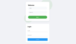
Login and registration placeholder text example
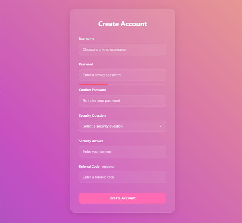
- Username: Choose a unique username
- Password: Enter a strong password
- Confirm Password: Re-enter your password
- Security Question: What is your mother’s maiden name?
- Referral Code: Enter a referral code (optional)
| Form Field | Good Placeholder Example |
|---|---|
| Username | choose a unique username |
| Password | minimum 8 characters |
| Confirm Password | re-enter password |
| Referral Code | optional code |
| Security Question | e.g. first pet’s name |
For login forms, placeholders should clarify requirements without revealing sensitive data.
For example, instead of showing a password example, indicate rules or requirements.
Explore handpicked examples of CSS login forms
Contact forms
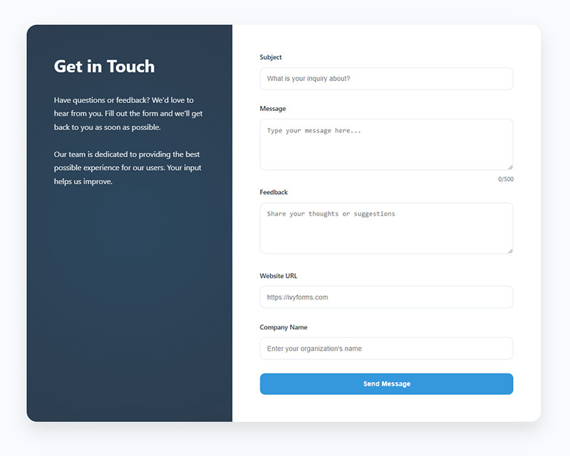
- Subject: What is your inquiry about?
- Message: Type your message here…
- Feedback: Share your thoughts or suggestions
- Website URL: https://ivyforms.com
- Company Name: Enter your organization’s name
Contact forms should use placeholders to encourage clear messages and guide users toward meaningful submissions.
| Form Field | Good Placeholder Example |
|---|---|
| Subject | What is your inquiry about? |
| Message | Type your message here… |
| Website URL | https://example.com |
| Company Name | e.g. Acme Inc. |
| Feedback | Share your thoughts |
Payment and checkout
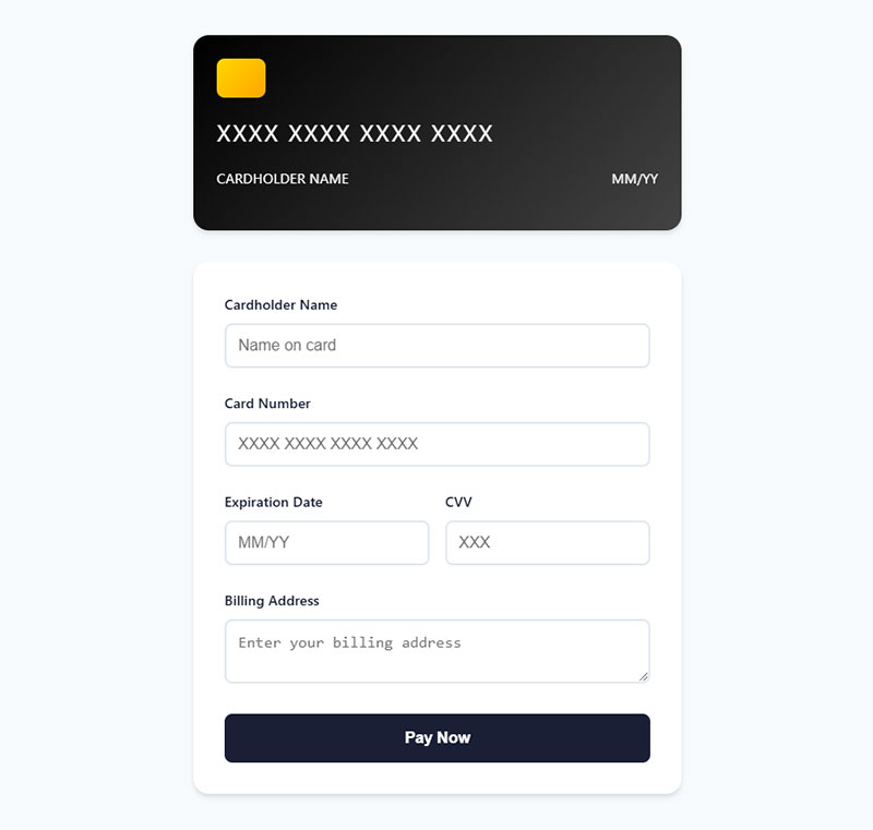
- Cardholder Name: Name on card
- Credit Card Number: XXXX XXXX XXXX XXXX
- Expiration Date: MM/YY
- CVV: 3-digit code on the back of your card
- Billing Address: Enter your billing address
Checkout forms are a major conversion bottleneck, so placeholders should reduce friction and prevent formatting errors.
| Form Field | Good Placeholder Example |
|---|---|
| Cardholder Name | Name on card |
| Credit Card Number | XXXX XXXX XXXX XXXX |
| Expiration Date | MM/YY |
| CVV | 3-digit code |
| Billing Address | Enter billing address |
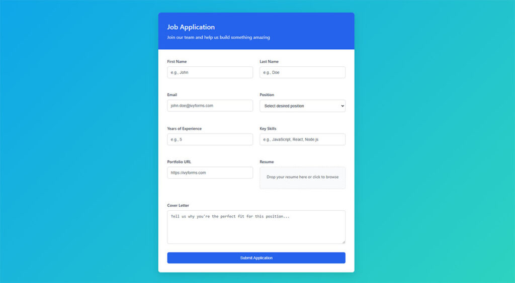
Application forms placeholder text
| Form Field | Good Placeholder Example |
|---|---|
| Full Name | First and last name |
| Position Applied For | e.g. Marketing Intern |
| LinkedIn Profile | https://linkedin.com/in/yourname |
| Upload Resume | Choose file… |
| Portfolio | https://portfolio.com |
These placeholders help applicants quickly understand what information is required, especially when submitting professional profiles or documents.
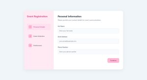
Event registration form placeholder text example
| Form Field | Good Placeholder Example |
|---|---|
| Attendee Name | e.g. Sarah Miller |
| Email Address | Enter email for confirmation |
| Company Name | optional |
| Select Session | choose your session time |
For event forms, placeholders help guide users toward correct contact details and scheduling choices.
Order form placeholders
| Form Field | Good Placeholder Example |
|---|---|
| Product Name | e.g. Stainless Steel Water Bottle |
| Quantity | 1, 2, 3… |
| Shipping Address | Street, City, ZIP |
| Promo Code | Enter discount code |
Order forms benefit from placeholders because they clarify purchasing information and reduce checkout confusion.
Survey/feedback form placeholders
| Form Field | Good Placeholder Example |
|---|---|
| Satisfaction Rating | 1 = Very Dissatisfied, 5 = Very Satisfied |
| Feedback | Your feedback helps us improve |
| Email (optional) | [email protected] |
These placeholders encourage more detailed responses and help users understand how to provide feedback.
Client intake form placeholder text
- Business Name: e.g. Acme Corporation
- Website URL: https://yourbusiness.com
- Project Budget: e.g. $1,000 – $5,000
- Deadline: Select a preferred project deadline
Job application forms
- Desired Role: e.g. Junior Frontend Developer
- Cover Letter: Briefly tell us why you’re a good fit
- Expected Salary: e.g. $50,000/year
Miscellaneous
| Form Field | Good Placeholder Example |
|---|---|
| Search | Search products or articles |
| Newsletter Signup | Enter your email |
| Tags / Keywords | Add relevant keywords |
| Comment | Write your comment here… |

Why These Placeholder Examples Work
Good placeholder text follows three key principles:
- It shows a realistic example
Users immediately understand the expected format.
- It reduces cognitive load
Visitors don’t have to guess what information to enter.
- It prevents errors before they happen
Clear formatting hints minimize validation issues.
When implemented correctly, placeholders make forms faster to complete and easier to understand, which can significantly improve conversion rates.
Best Practices for Using Placeholder Text in Forms
Placeholder text can significantly improve form usability—but only when used correctly. Poorly implemented placeholders can confuse users, hurt accessibility, and even reduce conversion rates.
Follow these best practices to make your form placeholders clear, helpful, and user-friendly.
Keep Placeholder Text Short and Clear
Placeholder text should be brief and easy to understand. Long instructions inside an input field can make forms feel cluttered and harder to scan.
Instead of writing full sentences, use short examples or hints.
Good example
e.g. John Smith
Bad example
Please enter your full name in this field
Short placeholders allow users to quickly understand the expected input without slowing down form completion.
Use Placeholders to Show Format
The most effective placeholders demonstrate the correct format for the information users should enter.
For example, formatting hints help users avoid validation errors.
| Field | Placeholder Example |
|---|---|
| [email protected] | |
| Phone | (555) 123-4567 |
| Date | MM/DD/YYYY |
| Website | https://example.com |
Showing the expected format reduces mistakes and improves the overall form experience.
Never Use Placeholder Text Instead of Labels
A common mistake in form design is relying only on placeholder text without field labels.
When users start typing, placeholder text disappears. If there is no visible label, users may forget what the field was asking for.
Correct approach
Label: Email Address
Placeholder: [email protected]
Placeholder: [email protected]
This ensures users always know what information they are entering.
Labels also improve accessibility and screen reader compatibility.
Avoid Important Instructions in Placeholders
Critical instructions should never exist only inside placeholders.
Because placeholders disappear once users start typing, important guidance can easily be lost.
For example:
Bad
Password placeholder: Must contain 8 characters, one number, and one symbol
Instead, show this information below the field as help text.
Better approach
Label: Password
Placeholder: minimum 8 characters
Helper text: Must contain one number and one symbol
Placeholder: minimum 8 characters
Helper text: Must contain one number and one symbol
This ensures users always see the requirements.
Maintain Good Color Contrast
Placeholder text is often displayed in light gray, which can make it difficult to read for some users.
To improve readability:
-
Ensure sufficient color contrast
-
Avoid extremely faint placeholder colors
-
Test forms on both desktop and mobile devices
Good contrast helps users quickly recognize the expected input.
Be Consistent Across the Entire Form
Consistency improves usability and reduces confusion.
For example, if one field uses example-based placeholders, all fields should follow the same style.
Consistent placeholders
- e.g. John Smith
- [email protected]
- (555) 123-4567
Avoid mixing styles like:
- Enter your name here
- [email protected]
- Phone number
A consistent pattern makes forms easier to complete.
Don’t Use Placeholders for Error Messages
Placeholders are designed to guide input before typing, not to correct mistakes.
Validation errors should appear as clear error messages near the field.
Example:
Error: Please enter a valid email address
This approach ensures users understand what went wrong and how to fix it.
Test Placeholders on Mobile Devices
Mobile users interact with forms differently than desktop users.
Because screen space is limited, placeholders play an important role in helping users quickly understand fields.
When testing mobile forms:
-
Ensure placeholders remain readable
-
Check spacing between fields
-
Verify keyboard types match input formats (email, number, etc.)
Well-designed mobile forms dramatically improve completion rates.
Why Placeholder Best Practices Matter
Forms are one of the most critical conversion points on a website.
If users struggle to understand what information is required, they may abandon the form entirely.
Effective placeholder text:
-
clarifies expectations
-
prevents formatting errors
-
speeds up form completion
-
improves accessibility
Even small improvements to input guidance can significantly increase successful form submissions.
Use our form templates with smart placeholder text to improve completion rates.
Accessibility Guidelines for Placeholder Text
Using placeholder text correctly isn’t just about clarity—it’s also a critical accessibility requirement. Many users rely on screen readers, keyboard navigation, or high-contrast settings, and poorly designed placeholders can make your forms unusable for them.
Here’s how to ensure your placeholder text supports all users.
Always Pair Placeholders with Labels
Why: Screen readers often ignore placeholder text. If the input field doesn’t have a proper label, users with visual impairments may not know what to type.
Correct approach
<label for=”email”>Email Address</label>
<input type=”email” id=”email” placeholder=”[email protected]”>
Tip: Labels should remain visible at all times, even when users type in the field. Placeholders are just examples or hints, not replacements.
Don’t Rely on Color Alone
Light gray placeholder text may look clean but can be difficult to read for:
-
Users with low vision
-
Colorblind users
-
High-glare or low-light environments
Best practices
-
Ensure a minimum 4.5:1 contrast ratio with the background (WCAG 2.1 AA standard)
-
Avoid ultra-faint grays
-
Test across multiple devices
Provide Persistent Instructions
Because placeholder text disappears when a user starts typing, any critical instructions or format requirements should be displayed elsewhere:
-
Use helper text below the field
-
Include tooltips for complex inputs
-
Use inline validation messages for immediate feedback
Example
<label for="password">Password</label>
<input type="password" id="password" placeholder="Minimum 8 characters">
<small>Include at least one number and one special character.</small>
This ensures instructions are always visible to everyone.
Make Forms Keyboard-Friendly
Accessibility guidelines require that all form elements be usable without a mouse.
-
Ensure users can tab through fields logically
-
Placeholders should not interfere with focus styling
-
Use visible focus indicators for each field
Keyboard users rely on labels, not placeholders, to understand each field.
Consider Cognitive Accessibility
Users with cognitive disabilities may struggle if placeholder text disappears:
-
Keep placeholders short and straightforward
-
Avoid vague instructions like “Enter info here”
-
Provide real examples instead of abstract guidance
Example: "[email protected]" is clearer than "Type your email".
Test With Assistive Technology
The best way to ensure accessibility is to test your forms:
-
Screen readers (VoiceOver, NVDA, JAWS)
-
Keyboard-only navigation
-
Color contrast analyzers
-
Mobile accessibility features
Testing helps catch hidden issues that could prevent users from completing forms.
Summary: Accessible Placeholder Text
-
Always use labels alongside placeholders
-
Avoid relying on color alone for readability
-
Provide persistent guidance for critical input rules
-
Support keyboard navigation and focus indicators
-
Keep instructions simple for cognitive accessibility
-
Test forms with assistive tools before going live
Accessible forms not only improve usability but also increase conversion rates by letting all users complete your forms successfully.
How Placeholder Text Works in IvyForms
IvyForms makes it easy to create user-friendly, high-converting forms with smart placeholder text. Every input field can include custom placeholders that guide users on what to enter, showing examples, formats, or hints directly inside the field.
Key Features in IvyForms
-
Customizable placeholders for every field
Whether it’s a contact form, booking form, or application form, you can define placeholders like"[email protected]","MM/DD/YYYY", or"Enter your full name"to set clear expectations for users. -
Works with field labels and helper text
Placeholders in IvyForms are designed to complement labels, not replace them. Users always see what the field is for, and the hint disappears when typing, keeping the interface clean. -
Supports conditional forms and multi-step forms
In more advanced workflows, placeholders adapt dynamically to the user’s selections, ensuring that the guidance is always relevant and reduces confusion. -
Accessibility-friendly
IvyForms ensures your placeholder text is readable with proper color contrast and screen reader compatibility, helping all users navigate forms without friction. -
Boosts completion and reduces errors
By showing examples and formats upfront, IvyForms placeholders minimize mistakes like wrong email formatting, incomplete phone numbers, or invalid dates, improving your form conversion rates.
Using IvyForms, you can turn plain input fields into guided, intuitive experiences that increase engagement and make form submissions faster and easier for your visitors.
FAQ on Placeholder Text For Forms
What is a placeholder text example?
A placeholder text example is a sample input shown inside a form field before the user types, like “e.g. John Doe” or “[email protected].” It gives users a hint about the expected format or type of information.
What to write in a placeholder?
Write short, clear hints that show users what to enter, like names, dates, emails, or sample phrases (e.g. “Type your message here…”).
When to use placeholder text?
Use placeholder text to guide users through filling out forms when the field label alone might not be clear or when you want to show an example format.
How to insert a text placeholder?
To insert a text placeholder in HTML, use the placeholder attribute in the input tag, for example: <input type=”text” placeholder=”e.g. John Doe”>.
What is placeholder text in HTML forms?
Placeholder text appears inside input fields as light gray hints that disappear when users start typing. The HTML placeholder attribute provides user interface hints that guide data entry without cluttering the form design. It’s different from field labels, which remain visible throughout the interaction process.
Should placeholder text replace field labels?
No. Input field labels should always accompany placeholders for proper form accessibility. Screen readers often skip placeholder content, making forms unusable for visually impaired users. Labels provide permanent identification while placeholders offer additional entry examples and formatting guidance.
What makes effective placeholder content?
Effective placeholders are specific, actionable, and format-focused. Use field descriptions like “[email protected]” instead of vague “Email.” Show exact formatting requirements, provide realistic examples, and keep text concise. Avoid instructions better suited for help text or form field guidance outside the input.
How do placeholders affect form conversion rates?
Well-crafted input prompts reduce form abandonment by clarifying user expectations. They eliminate guesswork, prevent formatting errors, and speed up completion. However, poor placeholder implementation can hurt conversions if users mistake them for pre-filled values or if they disappear too quickly during progressive form filling.
Can placeholder text improve mobile form usability?
Yes. Mobile forms benefit significantly from touch-friendly interfaces with clear placeholders. Limited screen space makes concise field entry guides essential. Placeholders reduce the need for external labels on small screens while maintaining responsive form design principles and improving user experience.
What placeholder text works best for email fields?
Use realistic email input formatting examples like “[email protected]” or “[email protected].” Avoid generic “Enter email” text. Show the complete email structure including the @ symbol and domain extension. This input demonstration prevents common formatting mistakes and reduces form validation errors.
How should password fields use placeholder text?
Password placeholders should indicate requirements without revealing actual passwords. Use field sample text like “8+ characters, 1 number, 1 symbol” or “Minimum 8 characters.” Never show example passwords. Focus on validation feedback text that guides secure password creation while maintaining form security best practices.
Are there accessibility concerns with placeholder text?
Multiple form accessibility guidelines highlight placeholder limitations. Low contrast makes text hard to read. Screen reader compatibility issues occur when placeholders replace labels. Users with cognitive disabilities may struggle when hints disappear. Always pair placeholders with permanent labels and ensure WCAG compliance guidelines are met.
Should placeholder text be different colors?
Standard placeholder styling uses light gray text for clear visual hierarchy. Avoid colors too similar to regular text or too faint for color contrast requirements. The default browser styling typically provides adequate contrast, but test with actual users to ensure visual design hierarchy doesn’t compromise readability.
How do placeholders work with form validation?
Form validation patterns should complement placeholder guidance. Use placeholders to show correct formatting while error state handling provides specific correction instructions. Combine input field styling changes with clear validation feedback text when users enter incorrect data. This creates comprehensive user guidance prompts throughout the interaction.
Conclusion
Placeholder text for forms represents a critical component in modern web development that directly impacts user experience and conversion rates. These input assistance text elements bridge the gap between user intent and successful form completion.
Effective form helper text reduces cognitive load while guiding users through complex data entry processes. Whether you’re implementing WordPress forms or designing custom solutions, strategic placeholder implementation creates smoother user interface components.
The best field tooltips combine clarity with brevity. They show exact formatting requirements, provide realistic examples, and eliminate confusion during form interaction hints. This approach transforms potentially frustrating experiences into intuitive workflows.
Remember these key principles:
- Use specific entry field prompts instead of generic instructions
- Maintain keyboard navigation support for all users
- Test form completion aids across different devices
- Implement proper form validation alongside placeholder guidance
Master these interface messaging techniques and watch your form conversion optimization metrics improve significantly.
