


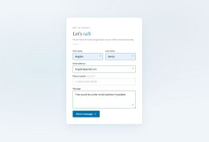
Most WordPress sites reach for a plugin the moment they need a contact form. It works, but it is not the only way. You can create forms in WordPress without…
Table of contents
Most forms lose more than half their visitors before a single submission lands.
The average form completion rate sits below 50% across all industries – meaning the majority of users who reach your form never finish it. That’s not a traffic problem. It’s a friction problem.
Knowing how to optimize forms for better conversions means understanding exactly where users drop off, which field types cause hesitation, and what design and copy decisions move people toward the submit button.
This article covers the specific, data-backed methods that reduce form abandonment and increase completion rates – from field count and inline validation to CTA copy, mobile autofill, and page speed.
What Is Form Conversion Optimization?
Form conversion optimization is the process of reducing friction in form interactions to increase the percentage of users who complete and submit a form.
It covers everything from field count and layout decisions to error handling and CTA copy – all with one goal: getting more people across the finish line.
The average form conversion rate across all industries sits at just 1.7% (Ruler Analytics). That gap between visitors and completions is almost entirely explained by friction – friction that is measurable, diagnosable, and fixable.
The 3 Metrics That Actually Matter
Most teams track submit volume and stop there. That misses two-thirds of the picture.
Completion rate: the percentage of users who start a form and submit it.
Time-to-complete: how long the average session takes. Checkout forms average 3 minutes and 21 seconds (Zuko Analytics). Registration forms average 1 minute 35 seconds. Any form that breaks those norms has a friction problem worth investigating.
Field error rate: the percentage of field interactions that trigger a validation error. High error rates on specific fields tell you exactly where users are struggling, long before they abandon.
Form Optimization vs. Landing Page Optimization

These are related but not the same.
Landing page optimization focuses on what happens before the form: headlines, hero copy, trust signals, page layout. Form optimization starts the moment a user engages with the first input field.
Both affect conversion rate. But a perfectly written landing page with a broken or confusing form still loses users. The form design layer is where conversions are actually won or lost.
Conversion Rate Benchmarks by Form Type
| Form type | Average completion rate | Avg. time to complete |
|---|---|---|
| Contact forms | 9% (view-to-submit) | Under 2 minutes |
| Registration forms | ~47% (starter-to-completion) | 1 min 35 sec |
| Checkout forms | ~60–67% (starter-to-completion) | 3 min 21 sec |
| Lead gen forms | 1.7% avg (varies by industry) | 2–4 minutes |
Source: Zuko Analytics, Ruler Analytics
Not all form types share the same optimization playbook. A checkout form failing at 50% completion has different root causes than a contact form failing at 5%.
How Does Form Length Affect Conversion Rate?
Reducing form fields from 11 to 4 increases conversions by up to 120%. Every field added beyond what is strictly needed is a conversion penalty, not a neutral choice (Quicksprout).
That said, the relationship between field count and conversion rate is not perfectly linear. There is a measurable cliff between 5 and 7 fields. Conversion drops gradually from 23.1% at 3 fields to 17% at 5 fields, then collapses to 11.4% at 7 fields and 6.9% at 10+ fields (Digital Applied, 2026).
The implication: audit any form that crosses 5 visible fields and either cut fields or break it into steps.
Required vs. Optional Field Strategy
Labeling fields as optional changes how users perceive effort, even if the total field count stays the same.
37% of users will abandon a form when asked for a phone number, unless the field is clearly marked optional (WPForms). Asking for date of birth causes an additional 17% drop compared to baseline. These are not small numbers.
The practical rule: if a field is optional, say so explicitly. Don’t make users guess whether they have to fill it in.
Progressive Disclosure Forms
Some forms can’t be shortened without losing data quality. Progressive disclosure is the fix.
The approach: collect only the minimum information needed upfront. Gather additional data in follow-up interactions as the relationship deepens. This is common in B2B lead gen, where marketers want company size, role, and budget, but showing all those fields at once kills completion rates.
HubSpot’s progressive profiling feature does exactly this, dynamically replacing already-answered fields with new questions on return visits.
What Form Field Types Produce the Highest Drop-Off Rates?
The password field has the highest abandonment rate on any form, at a mean of 10.5%. Email fields cause 6.4% abandonment and phone number fields cause 6.3% (Zuko Analytics / FormStory).
Not all fields are created equal. Some are friction by design.
CAPTCHA and Its Conversion Cost
CAPTCHA is the most commonly overlooked conversion killer.
Enabling CAPTCHA on a form consistently produces higher abandonment rates (Moz, WPForms). Case-sensitive CAPTCHAs have a 29% failure rate among legitimate users. Even simple CAPTCHAs fail 8% of the time.
That’s a significant tax on real users for the benefit of blocking bots. CAPTCHA alternatives like honeypot fields handle spam without asking users to decode distorted text or identify fire hydrants.
Dropdown Fields and Selection Friction
Dropdown menus look clean but perform poorly, especially on mobile.
Luke Wroblewski calls dropdowns “a UI of last resort.” Mobile dropdowns require more taps, obscure available choices, and take longer to complete than equivalent checkbox groups or segmented controls (CXL).
The fix depends on how many options you have:
- 2–4 options: radio buttons or a segmented control
- 5–8 options: checkbox group with visible choices
- Large datasets (countries, states): keep the dropdown, but add search/filter
Two-Column Form Layouts
Multi-column form layouts consistently underperform single-column layouts.
Two-column forms create visual confusion about reading order and field sequence. Users frequently skip fields, fill them in the wrong order, or miss them entirely. The fix is simple: one column, top to bottom. Every time.
How Does Form Design Impact Completion Rate?

Single-column layouts with top-aligned labels outperform multi-column layouts by 15.4 seconds in average completion time (CXL Institute). That time gap compounds across thousands of form sessions into measurable conversion differences.
Form UX design choices send subconscious signals about complexity. A dense, multi-column form looks hard before a user reads a single label.
Label Placement and Readability
Label placement directly affects how fast the eye travels through a form.
Top-aligned labels support a single downward scan path. Left-aligned labels require horizontal eye movement between label and input, which slows completion. Placeholder-only labels (no external label) disappear once a user starts typing, causing confusion during error recovery.
According to Zuko Analytics, forms following proper labeling practices see 78% of users submitting without errors on the first try. Forms that don’t implement best practices see significantly lower first-attempt success.
CTA Button Design Rules
The CTA button is the last decision a user makes before submitting. Design matters.
Avoid the word “Submit.” Using it increases abandonment by 3% because it feels transactional (Insiteful). Better options: “Get My Free Quote,” “Start My Trial,” “Send My Request.” The pattern is: state the value, not the action.
White space around buttons matters too. CTA buttons surrounded by sufficient white space convert at rates over 200% higher than buttons embedded in dense layouts (VWO).
Color contrast is non-negotiable. WCAG requires a minimum 4.5:1 contrast ratio for text. A button that fails contrast requirements doesn’t just harm accessibility; it directly reduces clicks from users on lower-quality screens or in bright lighting.
What Role Does Inline Validation Play in Form Conversions?
Inline validation increases form completion rates by 22%, reduces errors by 22%, cuts completion time by 42%, and raises satisfaction ratings by 31% compared to post-submission validation (Luke Wroblewski).
Post-submission validation is the worst pattern in form UX. A user fills out 12 fields, clicks submit, and gets slapped with a list of errors at the top of the page. The work of finding and fixing each error is entirely on them.
Inline validation catches errors field-by-field as users move through the form.
Validation Timing: On-Blur vs. On-Input
Timing matters more than most developers realize.
On-input validation (validating while the user types) works for format-heavy fields like email addresses, but can feel aggressive on free-text fields like names.
On-blur validation (validating when the user leaves a field) is the safer default for most field types. It gives users space to finish their input before showing feedback.
On-submit-only validation should only be used for the simplest 1–2 field forms. For anything longer, it creates unnecessary error-recovery friction.
Despite all this evidence, 31% of e-commerce sites still offer no inline validation, according to Baymard Institute’s 2024 checkout research. Another 4% implement it incorrectly. Over a third of sites are losing conversions to a solved problem.
Writing Error Messages That Actually Help
Error messages are part of the conversion path, not an afterthought.
“Invalid email” tells users nothing useful. “Enter a valid email like [email protected]” tells them exactly what to fix.
The form error message examples that perform best follow a simple pattern: state what’s wrong, then state what correct looks like. No blame, no vague language.
Avoid red-border-only errors. They flag the problem visually but don’t explain it, leaving users to guess. Always pair visual error states with descriptive text.
How Does Mobile Optimization Affect Form Conversion Rates?
Mobile lead-gen forms convert at roughly 32% below the desktop rate – 8.7% on mobile vs. 12.8% on desktop for normalized 5-field forms (Digital Applied, 2026).
That gap is not inevitable. Most of it comes from fixable technical and UX issues, not from user behavior differences.
Keyboard Type Optimization
Using the wrong keyboard type on a mobile field is one of the most common and easily fixed conversion errors.
A phone number field that opens a QWERTY keyboard instead of a numeric keypad adds unnecessary friction. The fix takes one line of HTML.
| Field type | Correct input attribute |
|---|---|
| Phone number | type="tel" |
| Email address | type="email" |
| Numeric values | inputmode="numeric" |
| URL entry | type="url" |
| Search fields | type="search" |
Getting these right costs nothing and makes a measurable difference in mobile completion rates.
Autofill Attribute Implementation
Browser autofill is one of the highest-leverage mobile optimization levers available.
Users who trigger autofill complete forms at a 71% rate, compared to 59% for users who don’t use autofill (Zuko Analytics). That’s a 12-point gap explained entirely by one technical feature.
The implementation requires adding autocomplete attribute tokens to form fields: autocomplete="name", autocomplete="email", autocomplete="tel", autocomplete="street-address". Avoiding dynamic field IDs (which break autofill recognition) is equally important.
Adding Apple Pay and Shop Pay to checkout forms collapses the mobile-to-desktop conversion gap from 27% to just 8% – a larger lift than any visual redesign achieves (Digital Applied, 2026).
Tap targets are the other basic requirement. Apple’s Human Interface Guidelines specify a minimum of 44x44px. Google Material Design requires 48x48dp. Fields and buttons that fall below these sizes cause fat-finger errors that send users straight to the back button.
Check out the full breakdown of mobile form best practices for implementation-ready specifics on keyboard types, input sizing, and autofill setup.
What Is the Impact of Trust Signals on Form Submission Rates?

12% of users abandon a checkout form when no trust badges are present (Insiteful). 29% of users cite security as a primary reason for not completing forms (The Manifest / FormStory).
Trust signals are not decorative. They directly answer the question users are asking before they submit sensitive information: “Is this safe?”
Security Badges and SSL Indicators
Not all trust badges carry equal weight.
35.6% of users recognize and trust the Norton Secured badge most, making it the most effective single trust badge in conversion research (Insiteful). SSL padlock indicators in the browser address bar are a baseline expectation, not a differentiator.
For payment forms specifically, Baymard Institute’s research shows that 42% of users actively look for trust indicators before submitting financial information. Placing a recognizable badge directly adjacent to credit card fields, not in the page footer, produces the strongest conversion lift.
Privacy Micro-Copy
The placement and wording of privacy copy near email fields affects opt-in rates directly.
“We respect your privacy. Unsubscribe at any time.” placed immediately below an email input field reduces hesitation at the point of commitment. Burying GDPR consent language in a footer or making it visually smaller than the surrounding text signals that something is being hidden.
For GDPR-compliant forms, the consent mechanism needs to be visible, specific, and affirmative – not buried in a pre-checked box.
Social Proof Placement
Social proof near forms works when it is specific, not generic.
“Join 14,000 marketers” outperforms “Trusted by thousands.” A real company logo from a recognizable brand outperforms a testimonial from an unnamed user. The specificity of the claim determines how much trust it transfers.
| Trust signal type | Placement | Conversion impact |
|---|---|---|
| Security badge | Adjacent to payment / email field | High |
| Privacy micro-copy | Below email input | Medium-High |
| Testimonial with name / company | Sidebar or above CTA | Medium |
| User count (“Join X users”) | Near CTA button | Medium |
| Brand logos | Above the form | Low-Medium |
Source: Baymard Institute, Insiteful
How Do Multi-Step Forms Compare to Single-Step Forms?
Multi-step forms average a 13.85% conversion rate compared to 4.53% for single-page forms – a difference of over 200% (Formstack / Venture Harbour data, confirmed in 2024–2025 benchmarks).
Only 40% of marketers use multi-step forms despite that performance gap, according to HubSpot. That’s a large, largely untapped optimization available to most teams right now.
| Format | Avg. conversion rate | Best for |
|---|---|---|
| Single-step | 4.53% | 1–4 field forms Newsletter signups |
| Multi-step | 13.85% | Lead gen Applications Checkout |
| Multi-step (lead gen only) | +21% vs. single-step | B2B qualification Detailed intake |
Source: Formstack, Digital Applied 2026
Progress Indicator Design
Progress bars don’t just show position – they increase completion by making abandonment feel costly.
The Zeigarnik Effect explains this: once someone has invested effort in a partially completed task, leaving it unfinished creates psychological discomfort. A progress bar at 33% after the first low-friction step makes quitting feel like waste.
Numeric indicators (“Step 2 of 3”) outperform vague bars when the remaining steps are few. For longer forms, percentage-based bars reduce perceived effort more effectively than step counts.
Step Ordering for Low-Friction Entry
Ask easy questions first. Name and email before company size, budget, or phone number.
This follows Robert Cialdini’s commitment and consistency principle: small early actions increase the likelihood of completing larger later ones. Venture Harbour’s case studies show multi-step form examples where BrokerNotes saw a 35% conversion increase and Vendio saw a 59% lift – both attributed to step ordering changes alongside the multi-step format itself.
Single-step forms still win for simple use cases. A newsletter form with one email field doesn’t need a progress bar. The format choice should match the actual field count, not a preference for looking thorough.
What Are the Best A/B Testing Methods for Form Optimization?
Marketers who run A/B tests on forms report conversion rates 10% higher on average than those who don’t run split tests (HubSpot). Structured A/B testing programs produce an average 18% conversion lift within 6 months (HubSpot, 2024).
Only 36% of marketers run any user tests on their forms at all, according to HubSpot data. That makes systematic form testing one of the most accessible competitive advantages available.
Test Priority Order
Not all form elements have equal conversion impact. Test in this sequence:
- CTA copy – highest impact, lowest implementation cost
- Field count – second highest impact (cutting 11 fields to 4 lifts conversions 120%)
- Form layout – single-column vs. multi-column, label placement
- Label type – top-aligned vs. left-aligned vs. placeholder-only
- Button color – meaningful only when contrast is otherwise poor
CTA copy consistently outperforms color as a test variable. Changing “Submit” to “Start My Free Trial” (first-person framing) increased click-through rates by 90% in ContentVerve’s testing. That’s an effect no color change replicates.
Sample Size and Statistical Validity
You need at least 1,000 submissions per variant at 95% statistical confidence before drawing conclusions from a form test (HubSpot / Optimizely).
Low-traffic forms are tricky. Running a test on a form that receives 50 submissions per month means waiting 20 months for clean data from each variant. For those cases, testing qualitatively first – session recordings via Hotjar or Microsoft Clarity – gives directional insight faster.
DocuSign achieved a 35% increase in mobile conversion rates by using systematic field removal and A/B testing across their sign-up flow (Optimizely, 2024). That’s a real-world result from a structured testing process, not a one-off tweak.
Tools for Form A/B Testing
VWO and Convert.com cover full-funnel form testing with visual editors.
Optimizely handles enterprise-level multivariate testing across form elements.
Hotjar and Microsoft Clarity provide qualitative diagnostic data through session recordings and heatmaps – useful for forming test hypotheses before committing to a split test.
How Does CTA Copy Affect Form Submission Rate?

First-person CTA copy outperforms second-person by 90% in click-through rate. “Start My Free Trial” vs. “Start Your Free Trial” – one word changed everything (ContentVerve / Unbounce).
The psychology: “my” creates a sense of ownership and personal relevance before the user has clicked. “Your” feels like a prompt from someone else. The difference is subtle, but the behavioral impact is not.
Words That Kill Conversion
“Submit” increases abandonment by 3% (Insiteful). It’s transactional, impersonal, and communicates only what the user has to do, not what they get.
The best-performing CTA verbs – confirmed across multiple studies (WordStream, Unbounce) – are: “Get,” “Start,” “Try,” “Reserve,” “Claim.” Each emphasizes receiving value rather than performing an action.
Personalized CTA buttons convert 202% better than generic defaults, according to HubSpot. Dynamic CTAs that reflect visitor behavior, traffic source, or funnel stage outperform static labels across every industry tested.
CTA Copy Length and Specificity
The pattern that consistently works: state the specific benefit inside the button label.
“Get My Free Report” outperforms “Download” for the same asset. “Claim My Spot” outperforms “Register” for webinars. The call to action examples that convert best do one thing: they make the value of clicking explicit before the click happens.
2–5 word CTA labels perform better than single-word labels or sentence-length labels. Short enough to scan instantly, specific enough to communicate value.
What Causes Form Abandonment and How Is It Measured?
81% of users have abandoned at least one web form after starting it (The Manifest). Of those who encounter complications mid-form, 67% abandon permanently and only 20% follow up with the business in any other way (WPForms).
Those are not recoverable users in most cases. Prevention beats re-engagement here.
The 6 Main Abandonment Causes
A Formisimo / Zuko study across 93 million sessions identified the top causes by frequency:
- Security concerns – 29% of users cite worry about data use
- Form length – 27% abandon because the form looks too long
- Promotional content – 11% leave when forms include mid-flow upsells
- Irrelevant questions – 10% quit when asked for unnecessary information
- Unexpected required fields – fields that appear mandatory without warning
- Slow load time – performance issues that delay form render on mobile
Field-Level Drop-Off Tracking Setup
Standard Google Analytics tracks completed submissions. It tells you nothing about where users stopped.
Zuko Analytics and Formisimo track per-field drop-off rates, time-in-field, and field return counts – the metrics that actually locate friction. Improving the form abandonment rate requires this field-level view, not just the aggregate submit count.
Hotjar and Microsoft Clarity add session recordings that show the exact moment users hesitate, scroll back, or leave a specific field without filling it.
GA4 Form Event Configuration
GA4 tracks form_start and form_submit as default enhanced measurement events.
The gap between those two numbers is your raw abandonment rate. For field-level data, custom events using Google Tag Manager are required: set triggers on blur events for each input, then push field names to the data layer. This setup reveals drop-off at the field level, which standard GA4 cannot provide without customization.
How Do Autofill and Saved Credentials Improve Form Completion?

Users who trigger browser autofill complete forms at a 71% rate, compared to 59% for users who skip autofill – a 12-point gap tied entirely to one technical feature (Zuko Analytics).
Autofill reduces both completion time and cognitive load. When fields populate instantly, users don’t need to recall or type routine information.
autocomplete Attribute Implementation
The autocomplete attribute tells browsers which data to offer for each field. Missing or incorrect tokens break autofill entirely.
| Field | Correct Token |
|---|---|
| Full name | autocomplete="name" |
| Email address | autocomplete="email" |
| Phone number | autocomplete="tel" |
| Street address | autocomplete="street-address" |
| Credit card number | autocomplete="cc-number" |
| Card expiry | autocomplete="cc-exp" |
Source: MDN Web Docs / Google Chrome Autofill documentation
The most common implementation error: setting autocomplete="off" on checkout fields to prevent “incorrect” autofill. This disables autofill entirely and consistently lowers completion rates. The fix is to use correct tokens, not to disable the feature.
Dynamic field IDs (common in React and Angular forms that regenerate IDs on each render) also break autofill. Password managers and browsers rely on stable IDs to match saved credentials to the correct fields.
Google One Tap and Social Login
For registration and account creation forms, Google One Tap and social login options (Sign in with Google, Sign in with Apple) function as the autofill equivalent for identity fields.
They reduce the registration flow from 6–8 fields down to a single interaction. Sign up form best practices consistently recommend offering social login as a primary option alongside the manual registration path, not as a secondary or hidden alternative.
What Is the Effect of Page Speed on Form Conversion Rate?
Each 1-second delay in page load time reduces conversions by 7% (Aberdeen Group / Akamai). A 3-second delay compounds that to a 20% reduction. For mobile users, 53% abandon a page entirely if load time exceeds 3 seconds (WIRO, 2026).
Form pages sit at the most critical point in the conversion funnel. A slow form page penalizes every other optimization already in place.
LCP and Core Web Vitals for Form Pages
Google’s Largest Contentful Paint (LCP) target is under 2.5 seconds for a good user experience rating.
Form-specific performance problems often come from 3 sources:
- Third-party scripts (analytics, chat widgets, ad tags) that load before the form renders
- Heavy JavaScript form validation libraries that block the critical render path
- Unoptimized images on the form page that delay the LCP element
Pinterest reduced page load time and saw sign-up conversions increase by 15% as a direct result of their 2015 performance overhaul. The form was the same. The speed changed.
Lighthouse Audit as a Form Page Diagnostic
A Lighthouse audit run on the specific form URL (not the homepage) surfaces performance issues directly tied to the form page’s load behavior.
The audit flags render-blocking resources, unused JavaScript, and image optimization opportunities. The checkout optimization cases that produce the biggest conversion lifts almost always include a page speed component alongside the UX changes.
LCP below 2.5 seconds is the target. Scores above 4 seconds on form pages warrant immediate attention before any other CTA or layout optimization.
Lazy loading non-critical page elements (below-fold images, secondary scripts) while keeping the form in the critical render path keeps LCP tight without removing features.
FAQ on How To Optimize Forms
How many form fields should I use to maximize conversions?
Keep it to 3–5 fields for most lead gen forms. Reducing fields from 11 to 4 increases conversions by up to 120% (Quicksprout). Every field beyond what is strictly necessary is a conversion penalty. When in doubt, cut it.
What is the biggest cause of form abandonment?
Security concerns top the list at 29%, followed by form length at 27% (Formisimo / Zuko, 93M sessions). Users need to trust that their data is safe before they submit. Trust badges and privacy micro-copy placed near the submit button address both issues directly.
Does multi-step or single-step form design convert better?
Multi-step forms average a 13.85% conversion rate versus 4.53% for single-page forms (Formstack). For forms with more than 5 fields, splitting into steps consistently outperforms a single long page. Single-step wins only for very short forms with 1–3 fields.
What CTA button copy converts best?
First-person copy outperforms second-person by 90% in click-through rate. “Start My Free Trial” beats “Start Your Free Trial.” Avoid “Submit” – it increases abandonment by 3%. Use verbs like “Get,” “Start,” or “Claim” paired with a specific benefit.
How does mobile optimization affect form completion rates?
Mobile lead-gen forms convert 32% below desktop on average (Digital Applied, 2026). Correct keyboard types, proper autocomplete attributes, and tap targets of at least 44x44px close most of that gap without redesigning the form.
What is inline validation and why does it matter?
Inline validation shows field-level feedback as users move through a form, rather than after submission. It reduces errors by 22% and increases completion rates by 22% (Luke Wroblewski). Despite that, 31% of e-commerce sites still don’t use it (Baymard Institute, 2024).
How does page speed affect form conversion rate?
Each 1-second delay in load time cuts conversions by 7% (Aberdeen Group). A 3-second delay compounds that to a 20% reduction. Form pages need an LCP under 2.5 seconds. Third-party scripts and heavy validation libraries are the most common causes of slow form page renders.
What trust signals improve form submission rates?
Security badges placed adjacent to form fields, privacy micro-copy directly below the email input, and specific social proof (“Join 14,000 marketers”) all reduce hesitation at the point of submission. 12% of users abandon checkout forms when no trust badges are present (Insiteful).
How do I track where users abandon my form?
Standard Google Analytics only tracks completed submissions. For field-level drop-off data, use Zuko Analytics or Formisimo. Pair that with session recordings from Hotjar or Microsoft Clarity to see exactly where users hesitate or leave a specific field without filling it.
Does CAPTCHA hurt form conversions?
Yes. Enabling CAPTCHA consistently increases form abandonment rates (Moz, WPForms). Case-sensitive CAPTCHAs fail 29% of legitimate users. Honeypot fields handle spam effectively without asking real users to solve puzzles, making them the better default for most contact and lead gen forms.
Conclusion
Understanding how to optimize forms for better conversions comes down to removing friction at every stage – from the first field to the submit button.
Field count, inline validation, CTA copy, and mobile autofill are not isolated fixes. They compound. Each improvement raises the baseline that the next test builds on.
The form abandonment rate drops when users trust the process, feel the form is worth completing, and face no unnecessary barriers.
Start with field reduction and trust signals – they produce the fastest measurable lift. Then layer in multi-step structure, progress indicators, and page speed improvements.
The gap between median and top-performing forms keeps widening. The teams closing it are the ones testing systematically, not guessing.
