

A blank quiz builder staring back at you is where most people quit. The questions feel off, the scoring logic gets confusing, and the whole thing takes three times longer…
Table of Contents
You collected 500 survey responses. Now what?
Most teams stare at spreadsheets full of numbers and open-ended comments without knowing how to extract meaning from them.
Learning how to analyze survey data and gain actionable insights separates companies that improve from those that just measure.
A 2024 Forrester Research study found that while 74% of organizations aim to be data-driven, only 29% successfully turn feedback into decisions they act on.
This guide covers the complete process: data cleaning, statistical analysis methods, pattern recognition, and translating findings into business decisions.
You’ll learn which tools work for different dataset sizes, how to avoid common analysis mistakes, and how to present findings that drive action.
How Does Survey Data Analysis Work
The process moves through distinct phases. Each phase builds on the previous one.
Skip a step and your conclusions fall apart.
What Types of Data Do Surveys Collect
Surveys generate two categories of information. Both require different handling.
Quantitative Data
Numbers. Ratings. Scales. Percentages.
Think Likert scale questions (1-5 ratings), multiple choice selections, and demographic checkboxes.
Quantitative metrics allow statistical analysis through tools like SPSS, R, or Python.
You can calculate mean, median, standard deviation, and run regression modeling on this data type.
Qualitative Data
Words. Opinions. Explanations.
Open-ended responses capture sentiment and context that numbers miss.
Qualitative coding transforms these text blocks into categorized themes.
NVivo and MAXQDA handle this thematic analysis at scale.
What Are the Steps in Analyzing Survey Data
Five stages. Each one matters.
How Do You Clean Survey Data
Raw responses contain garbage. Incomplete submissions. Bot entries. Duplicate respondents.
Remove them first.
Check for:
- Response time outliers (too fast means random clicking)
- Straight-line responses (same answer for every question)
- Logical inconsistencies between answers
- Missing required fields
A 2023 Qualtrics benchmark showed that 15-20% of typical survey responses require removal during cleaning.
Your sample size drops. Your accuracy rises.
How Do You Organize Survey Responses
Structure your clean data by variable type.
Categorical variables (gender, location, job title) go in separate columns from numerical variables (satisfaction scores, age, purchase frequency).
Microsoft Excel handles basic organization. Larger datasets need Tableau or Power BI for proper data aggregation.
Create consistent naming conventions. Label everything clearly.
Future you will appreciate this when running cross-tabulation reports six months later.
How Do You Code Open-Ended Responses
Read through 50-100 responses first. Patterns emerge.
Group similar comments into themes. Assign codes to each theme.
Common coding approaches:
- Descriptive coding (what they said)
- In vivo coding (using respondent’s exact words)
- Process coding (actions mentioned)
Software like MAXQDA automates pattern recognition across thousands of responses.
Manual coding works for smaller datasets under 200 responses.
What Statistical Methods Work for Survey Analysis
Your question type determines your method. Match them correctly.
How Does Descriptive Statistics Summarize Survey Results
Descriptive statistics give you the overview. The snapshot. The baseline understanding before deeper analysis.
What Is Mean in Survey Data
Add all values. Divide by count. That’s your mean.
Average customer satisfaction: 4.2 out of 5. Average purchase frequency: 3.1 times monthly.
Mean works best with normally distributed data. Outliers skew it badly.
What Is Median in Survey Data
Line up all values. Pick the middle one.
Median resists outlier influence better than mean.
If five customers rate you 5, 5, 5, 5, and 1, your mean is 4.2 but your median is 5.
Use median when your frequency distribution shows skewed data.
What Is Mode in Survey Data
The most common answer. That’s mode.
If 47% of respondents selected “Very Satisfied,” that’s your modal response.
Mode matters most for categorical data where mathematical averages make no sense.
What Is Standard Deviation in Survey Data
How spread out are your responses from the average?
Low standard deviation means respondents agree. High deviation means opinions scatter widely.
A satisfaction mean of 4.0 with 0.3 deviation signals consensus. The same mean with 1.8 deviation shows polarized opinions.
How Does Cross-Tabulation Compare Survey Variables
Cross-tabulation (crosstab) reveals relationships between two variables.
Example: satisfaction scores broken down by customer age group, or product preference segmented by geographic region.
The Chi-Square Test determines if observed differences are statistically significant or random noise. According to Minitab research, compare the p-value to your alpha level (commonly 0.05). If p-value is less than or equal to alpha, the variables are associated.
Qualtrics and SurveyMonkey include built-in crosstab features. Excel pivot tables work for manual analysis.
What Is Regression Analysis in Survey Research
Regression modeling predicts outcomes based on input variables.
Which factors most influence customer satisfaction? How much does response time affect Net Promoter Score?
Linear regression handles continuous outcomes. Logistic regression works for yes/no predictions.
R Programming Language and Python run regression analysis efficiently on large datasets. Polling.com’s 2024 analysis notes AI and machine learning integration now enables predictive analytics and automated pattern recognition in survey data.
How Does Correlation Analysis Identify Relationships
Correlation measures how two variables move together.
Positive correlation: as one increases, the other increases. Negative correlation: opposite movement.
The correlation coefficient ranges from -1 to +1.
Karl Pearson developed this coefficient in the 1890s. Still the standard method today.
A correlation of 0.7 between training hours and performance scores suggests strong relationship. Correlation of 0.1 suggests almost none.
What Is Factor Analysis in Survey Data
Factor analysis reduces complexity.
Twenty survey questions might actually measure just three underlying factors.
Qualtrics research confirms factor analysis works best on Likert scale questions and behavioral/psychographic questions. A beverage company example: 30 questions about product attributes condensed into three factors (Product Attributes, Marketing Effectiveness, Brand Perception).
IBM’s SPSS handles factor analysis through principal component analysis methods.
Use factor analysis when survey length exceeds 15 questions.
How Does ANOVA Compare Multiple Groups
ANOVA (Analysis of Variance) compares means across three or more groups.
T-Test handles two groups. ANOVA handles more.
Example: comparing satisfaction scores across five different product lines, or response rates across four marketing channels.
Ronald Fisher developed ANOVA in the 1920s. The method remains foundational for hypothesis testing.
Significant ANOVA results tell you groups differ. Post-hoc tests reveal which specific groups differ from each other.
Sample Size Requirements
| Confidence Level | Minimum Sample | Notes |
|---|---|---|
| 90% confidence | 200 responses | Basic insights |
| 95% confidence | 400-500 responses | Industry standard |
| Statistical significance | 100+ minimum | Statistician consensus per Survicate |
Blitzllama research indicates 200 sample size achieves 90% confidence, while 500 responses reaches 95% confidence interval.
CloudResearch data shows even large populations (330 million) can be understood with approximately 1,000 respondents when using proper sampling techniques.
What Software Tools Analyze Survey Data
Your tool choice depends on dataset size, technical skill, and budget.
How Does Excel Handle Survey Analysis
Excel works for datasets under 1,048,576 rows (Excel’s hard limit according to Microsoft). For survey analysis, practical performance limits hit around 10,000-50,000 responses before slowdowns occur.
Built-in functions cover mean calculation, median, mode, and standard deviation. Pivot tables enable basic cross-tabulation.
Microsoft’s 2024 update added Copilot features that summarize textual data like survey results and comments directly within Excel.
Limitations hit fast with complex analysis. No built-in regression without the Data Analysis ToolPak add-in. Manual formula creation for advanced statistics.
Good starting point. Not an endpoint.
How Does SPSS Process Survey Responses
SPSS (Statistical Package for Social Sciences) targets researchers without programming backgrounds.
Point-and-click interface. Pre-built statistical tests. Automatic output formatting.
IBM owns SPSS. G2 reports pricing starts at $99/month for base subscription, scaling up to $3,830 for perpetual premium licenses. According to SelectHub analysis, 81% of users rank SPSS as easy to use.
Academic institutions provide free student licenses.
How Does R Analyze Survey Data
R is free, open-source, and extremely powerful.
Learning curve is steep. Syntax requires programming knowledge.
Packages like survey, dplyr, and ggplot2 handle everything from data cleaning to visualization.
According to Stack Overflow data, R maintains approximately 3% of developer usage, holding strong in its niche despite Python’s broader adoption.
Best for: teams with technical resources, complex longitudinal study analysis, reproducible research workflows.
How Does Python Work for Survey Analysis
Python combines statistical analysis with automation capabilities.
Libraries: pandas for data manipulation, scipy for statistics, matplotlib for visualization.
Kaggle Survey 2021 data shows 77% of data scientists use Python. TIOBE Index 2024 ranks Python #1 with a 16.33% rating, up +2.88% from the previous year.
Integrates with machine learning workflows. Handles predictive analytics and sentiment tracking on text responses.
Growing preference among data science teams over R.
| Tool | Best For | Cost | Learning Curve |
|---|---|---|---|
| Excel | Under 10,000 responses | Included with Microsoft 365 | Low |
| SPSS | Researchers, academics | $99-$179/month | Medium |
| R | Statistical analysis, academia | Free | High |
| Python | ML integration, automation | Free | High |
What Online Survey Platforms Include Analysis Features
Most survey platforms include basic analytics dashboards.
Platform analytics work for quick summaries. Export to dedicated tools for serious analysis.
When building surveys for WordPress sites, WordPress survey plugins offer direct integration with your existing setup.
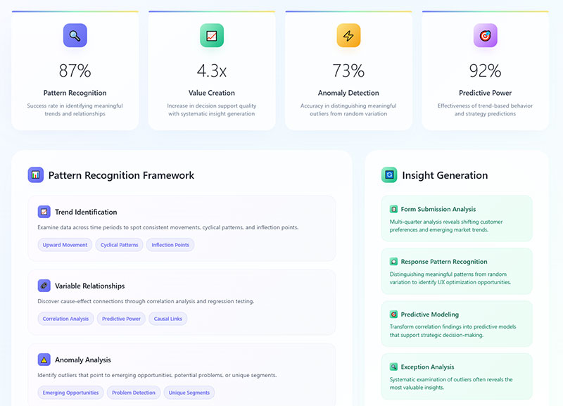
How Do You Identify Patterns in Survey Responses
Pattern recognition separates useful data from noise.
What Is Frequency Distribution
Frequency distribution shows how often each response appears.
Display format: tables or histograms showing response counts per answer option.
Quick insights: which options dominate, which get ignored, where opinions cluster.
A satisfaction survey might show 45% selecting “Satisfied,” 30% selecting “Very Satisfied,” 15% neutral, 10% dissatisfied categories.
How Do You Spot Trends Across Demographics
Demographic segmentation reveals hidden patterns.
Segment your data by:
- Age groups
- Geographic location
- Customer tenure
- Purchase history
- Industry vertical
Different segments often show completely different response patterns.
Overall satisfaction might be 78%. But new customers show 65% while loyal customers show 89%.
Accenture research found 91% of consumers are more likely to purchase from brands that recognize and provide relevant recommendations. That gap drives action.
Questions about demographic survey questions determine what segmentation options you’ll have during analysis.
How Do You Find Outliers in Survey Data
Outliers are extreme values that fall far outside normal ranges.
Detection methods:
- Values beyond 3 standard deviations from mean
- Interquartile range method (below Q1-1.5×IQR or above Q3+1.5×IQR)
- Visual inspection through box plots
Decide: remove outliers or investigate them.
Sometimes outliers represent data entry errors. Sometimes they reveal your most important customers.
What Is Sentiment Analysis for Open-Ended Questions
Sentiment analysis categorizes text responses as positive, negative, or neutral.
Natural language processing tools scan thousands of responses automatically.
Wikipedia research notes human raters typically only agree about 80% of the time on sentiment classification. Modern AI sentiment analysis achieves 85-90% accuracy on standard datasets according to research published in Applied Sciences journal.
Output: percentage breakdown of sentiment plus keyword frequency within each category.
Lumoa and Thematic specialize in customer feedback sentiment tracking.
Manual sentiment coding works for under 500 responses. Beyond that, automation becomes necessary.
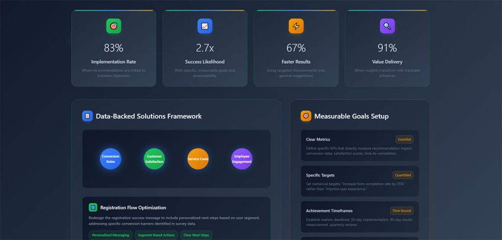
What Makes an Insight Actionable
Not all findings deserve attention. Some data points sit there, interesting but useless.
Actionable insights prescribe specific steps you can take immediately.
What Characteristics Define Actionable Insights
Four qualities separate actionable findings from background noise.
Specificity in Survey Findings
Vague: “Customers are unhappy with service.”
Specific: “42% of customers in the Northeast region rate phone support wait times as unacceptable, with average hold times exceeding 8 minutes.”
Specificity enables targeted response. General observations enable nothing.
Timeliness of Data
Insights expire. Customer preferences from 18 months ago reflect a different market.
Act on fresh data. Archive old findings for trend analysis only.
Real-time reporting dashboards keep insights current.
Relevance to Business Goals
A fascinating pattern that connects to nothing strategic wastes everyone’s time.
Filter findings through your objectives. Does this insight help achieve a stated goal?
If no clear connection exists, document it and move on.
Measurable Outcomes
“Improve customer experience” is a wish. “Reduce support ticket volume by 15% within Q3” is measurable.
Tie each insight to a metric you can track.
McKinsey research shows 90% of organizations that significantly outperform their peers devote more than half of their analytics budgets to bridging the gap between insights and action. IDG Enterprise data indicates 78% of enterprise decision-makers believe data analysis will revolutionize their business practices.
How Do You Separate Insights from Raw Data
Raw data: 67% of respondents selected option B.
Insight: Preference for option B correlates with users who completed onboarding within 24 hours, suggesting faster activation drives long-term feature adoption.
The difference? Context plus implication plus recommended action.
Data tells you what happened. Insights tell you what to do about it.
| Data | Insight |
|---|---|
| Static number | Context + business implication |
| “What happened” | “What to do about it” |
| Requires no interpretation | Prescribes specific action |
What Is the Difference Between Correlation and Causation
Correlation: two variables move together.
Causation: one variable directly causes the other to change.
Survey data reveals correlation easily. Proving causation requires controlled experiments.
A finding that engaged employees have higher satisfaction doesn’t prove engagement causes satisfaction. The relationship might reverse. Or a third factor drives both.
State correlations carefully. Never claim causation from survey data alone.
How Do You Turn Survey Findings into Business Decisions
Analysis without action is expensive procrastination.
How Do You Prioritize Survey Insights
Not everything matters equally. Rank findings by:
- Impact potential (revenue, retention, efficiency gains)
- Implementation difficulty (resources, timeline, dependencies)
- Confidence level (sample size, statistical significance)
High impact plus low difficulty equals immediate priority.
Low impact plus high difficulty equals archive or ignore.
How Do You Create Action Plans from Data
Each priority insight needs an owner, deadline, and success metric.
Template:
- Insight: [specific finding]
- Action: [what changes]
- Owner: [responsible person/team]
- Deadline: [completion date]
- Success metric: [how you’ll measure impact]
SSR research shows employees who strongly agree their managers act on survey results are twice as likely to be engaged. Yet only 8% strongly agree their organization actually acts on those surveys.
McKinsey research indicates SMBs implementing data-driven decision-making can achieve 6% higher profits than competitors. Citizens Business Outlook Report found 87% of insight-driven companies anticipate fast expansion, with 72% expecting double-digit growth over five years.
How Do You Measure the Impact of Changes Based on Survey Data
Baseline measurement before changes. Follow-up measurement after.
Compare the delta. Did your NPS calculation improve? Did customer satisfaction survey scores shift?
Control groups strengthen measurement validity when possible.
Track leading indicators weekly, lagging indicators quarterly.
| Metric Type | Tracking Frequency | Examples |
|---|---|---|
| Leading indicators | Weekly | Website visits, support tickets, feature usage |
| Lagging indicators | Quarterly | Revenue, retention, NPS |
| Baseline comparison | Before/after implementation | Same metric at two time points |
How Do You Communicate Findings to Stakeholders
Different audiences need different formats.
Embryo research found interactive data visualizations increase stakeholder engagement by 52%. Additionally, 77% of businesses state data visualization helps simplify complex data for non-experts. Aberdeen Group reports 82% of businesses using data visualization tools report better understanding of company data.
Visualize data. Nobody reads tables of numbers.
Databox survey data shows 44% of data professionals face challenges balancing simplicity with information density when creating visualizations.
Stakeholder-specific formats:
- Executives: High-level KPIs, strategic implications, 1-page summaries
- Department heads: Detailed performance metrics, trend analysis
- Operational teams: Specific action items, implementation guidance
Tableau and Power BI create shareable dashboards for ongoing visibility.
What Sample Size Do You Need for Reliable Survey Analysis
Small samples produce unreliable findings. Oversized samples waste resources.
How Do You Calculate Confidence Intervals
Confidence interval tells you the range where the true population value likely falls.
A 95% confidence interval of 72-78% means you’re 95% certain the real value sits between those numbers.
Qualtrics explains a 95% confidence level means if you took a random sample 100 times, you would expect the value to fall within the confidence interval 95 times.
Wider intervals signal less precision. Narrower intervals require larger samples.
What Is Margin of Error in Survey Data
Margin of error measures potential deviation from actual population values.
Survey result: 65% satisfaction. Margin of error: +/- 4%. True value falls between 61-69%.
SurveyMonkey data shows for a population of 500,000 with 95% confidence and 5% margin of error, you need approximately 384 respondents. For 80% confidence with 10% margin of error on 300 employees, you need only 37 respondents.
Standard political polling targets +/- 3% margin. Business surveys often accept +/- 5%.
| Confidence Level | Z-Score | Typical Use |
|---|---|---|
| 90% | 1.65 | Exploratory research |
| 95% | 1.96 | Standard business surveys |
| 99% | 2.58 | Critical decisions |
Nielsen and other research firms publish their methodology including margin of error for transparency.
How Does Response Rate Affect Data Quality
Low response rates introduce non-response bias.
The 30% who responded might think differently than the 70% who ignored your survey.
Response rate benchmarks:
- Email surveys: 10-30% typical
- In-app surveys: 20-40% typical
- Phone surveys: 5-15% typical
Higher response rates reduce bias risk but don’t eliminate it entirely.
Creative Research Systems notes population size becomes irrelevant when sample exceeds a few percent of total population. A sample of 500 people is equally useful for a state of 15 million as a city of 100,000.
Boost rates through shorter surveys, clear value propositions, and appropriate timing. Following best practices for creating feedback forms improves completion rates significantly.
Respondents experiencing survey fatigue skip questions or abandon entirely, damaging data quality.
What Mistakes Should You Avoid in Survey Data Analysis
Common errors invalidate conclusions. Avoid these.
How Does Small Sample Size Affect Results
Under 100 responses? Treat findings as directional only.
Statistical significance requires adequate sample size. The Chi-Square Test and ANOVA produce meaningless results with insufficient data.
Minimum viable samples vary by analysis type:
- Simple percentages: 100+ responses
- Segment comparisons: 30+ per segment
- Regression analysis: 10-20 observations per variable
What Is Response Bias
Certain people respond to surveys more than others.
Satisfied customers respond. Angry customers respond. Indifferent customers ignore you.
Your results skew toward extremes while missing the moderate middle.
Mitigation: randomized sampling, incentive structures that don’t favor specific groups, multiple contact attempts.
How Do Leading Questions Skew Data
“How much did you enjoy our excellent service?” assumes positive experience.
Neutral alternative: “How would you rate your service experience?”
Question wording shapes responses. Biased questions produce biased data.
Understanding types of survey questions prevents this error during survey design.
What Happens When You Ignore Statistical Significance
A 3% difference between groups might be random chance. Or it might be real.
Statistical significance testing tells you which.
P-value below 0.05 traditionally indicates significance. Above 0.05 means the difference could be noise.
Report significance levels alongside findings. Never present random variation as meaningful insight.
How Do You Visualize Survey Data
Visual presentation accelerates comprehension and retention.
Research from MIT shows the brain processes images in just 13 milliseconds. Visuals are processed 60,000 times faster than text, according to the University of Minnesota.
Teams using data visualization tools are 43% more effective in making data-driven choices, per Spiralytics research.
The key: match chart type to your data story.
When Should You Use Bar Charts
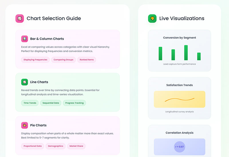
Bar charts compare discrete categories.
Satisfaction ratings across departments. Response counts per answer option. Segment comparisons.
Research from the University of Surrey found bar charts are more precise than pie charts for ranking elements. When participants needed to compare values against each other, bar charts consistently outperformed alternatives.
Horizontal bars work better for long category labels.
Vertical bars suit time-based comparisons.
Best practices from Statistics Canada:
- Use consistent spacing between bars
- Avoid 3D effects (they distort perception)
- Start the y-axis at zero for accurate comparisons
- Limit to 5-6 categories for clarity
When Should You Use Pie Charts
Pie charts show parts of a whole. Use sparingly.
Effective for:
- Market share distribution
- Budget allocation breakdown
- Simple two or three category splits
Ineffective for:
- Comparing values across time
- Showing more than 5-6 categories
- Precise value comparisons
A 2024 eye-tracking study from the University of Surrey found all chart types were equally accurate for extracting part-to-whole relationships. Pie charts tap into our brain’s natural ability to assess proportions. We can instinctively recognize that a slice is 25% without reading labels.
Too many slices create visual chaos. Switch to bar charts beyond six segments.
The researchers noted that effect sizes between chart types were often small. Use pie charts when the question is about proportion of the whole. Use bar charts when comparing individual values matters more.
How Do Line Graphs Show Trends Over Time
Line graphs excel at trend analysis across time periods.
Monthly NPS scores. Quarterly satisfaction tracking. Annual benchmark comparison.
Multiple lines on one graph enable direct comparison between segments or metrics.
Line chart best practices:
- Keep line count under four. Beyond that, create separate charts (or use small multiples)
- Use dashed or dotted lines for missing data periods
- Time flows left to right
- Aspect ratio matters. Try 16:9 for optimal trend visibility
- Add shading to show uncertainty or confidence intervals
According to Statistics Canada guidelines, line charts should only be used when showing changes over a continuous period. If data points are disconnected, use dots instead.
For comparing two related metrics (like impressions vs. clicks), consider column + line combination charts.
What Is a Heat Map in Survey Analysis
Heat maps use color intensity to show value magnitude across two dimensions.
Rows might represent customer segments. Columns represent satisfaction categories. Color intensity shows response concentration.
Quick pattern recognition across large matrices.
According to Sigma research, our brains process visual information 60,000 times faster than text. Heat maps leverage this by translating abstract numbers into colors that reveal patterns immediately.
Heat map applications for survey data:
- Cross-tabulation visualization (segment × response)
- Scroll depth analysis (how far respondents read)
- Click concentration on interactive surveys
- Response pattern clustering
Research from Embryo found interactive data visualizations increase stakeholder engagement by 52% compared to static reports.
Color selection guidelines:
- Use sequential palettes (light to dark) for density
- Use diverging palettes (two gradations meeting in middle) for scales with a meaningful midpoint
- Avoid red-green combinations (colorblind accessibility)
Tableau and similar tools generate heat maps automatically from crosstab data.
Chart Selection Quick Reference
| Data Type | Best Chart | Avoid |
|---|---|---|
| Category comparison | Bar chart | Pie (if >6 categories) |
| Part of whole (2-5 items) | Pie or donut | Bar chart |
| Trend over time | Line chart | Bar chart |
| Two-variable relationship | Heat map or scatter | Pie chart |
| Distribution | Histogram | Line chart |
| Ranking | Horizontal bar | Pie chart |
Visualization Impact Statistics
- 42% more information retained when presented visually vs. text alone (Applied Cognitive Psychology)
- 323% better task performance when following visual directions vs. text-only (Springer)
- 28% faster decision-making for businesses using visualization tools (University of Idaho)
- 68% improvement in audience retention with visual storytelling (Springer)
- Visual language shortens meetings by 24% (Stanford University research)
How Do You Compare Survey Results Over Time
Single surveys capture moments. Repeated surveys reveal trajectories.
What Is Benchmarking in Survey Analysis
Benchmark comparison measures your results against external standards.
Industry averages. Competitor data. Best-in-class performers.
SurveyMonkey Benchmarks compares your scores against thousands of similar organizations.
2024-2025 NPS benchmarks by industry (ClearlyRated, Retently, SurveySensum data):
| Industry | Average NPS (2024) |
|---|---|
| Insurance (B2C) | 80 |
| IT Services | 55 |
| B2B Services | 45 |
| Staffing | 45 |
| SaaS/Software | 40 |
| Accounting | 38 |
| Healthcare | 46 |
| Retail | 41 |
| E-commerce | 33 |
Global NPS standards from ClearlyRated classify 50+ as excellent and 70+ as world-class.
For context: Starbucks and USAA score around 75-77. Comcast sits at -25.
Internal benchmarking tracks your own historical performance. Often more actionable than external comparisons since you control all variables.
How Do You Track Changes in Customer Satisfaction
Consistent methodology matters more than perfect methodology.
Same questions. Same scales. Same timing. Same segments.
Changes in approach break trend comparability.
Qualtrics research emphasizes that maintaining consistent question types and data analysis methods creates like-for-like measurement over time. This lets you use initial results as a baseline for future comparison.
Tracking frequency guidelines:
- Quarterly minimum for most customer metrics
- Monthly for fast-moving industries (CPG, retail, SaaS)
- Bi-annually for slower-cycle industries (insurance, B2B services)
- Post-interaction for transactional feedback
Track NPS survey questions and customer satisfaction metrics quarterly at minimum.
Customer service survey questions provide department-specific tracking when service quality is a focus area.
Key consistency rules from SightX:
- Keep questions identical wave over wave
- Maintain the same demographic quotas
- Use consistent fielding windows (if one wave takes one week, all waves should take one week)
- Keep timing intervals regular (don’t mix early Q1, late Q2, early Q3)
What Is Longitudinal Survey Analysis
Longitudinal study follows the same respondents across multiple time periods.
Different from repeated cross-sectional surveys that sample different people each wave.
Longitudinal data reveals individual change patterns. Cross-sectional data reveals population-level shifts.
Panel attrition (people dropping out over time) challenges longitudinal designs.
Research from the HaBIDS panel study found that needing to send reminders was the strongest predictor of later dropout. The effect was even larger in extended study phases (hazard ratio of 4.20) compared to initial phases (1.44).
The Malaysian Cohort Study reported only 42.7% follow-up retention. The top reasons for dropout: receiving medical treatment elsewhere (7.0%) and loss of interest (5.1%).
According to research standards, a 50% follow-up rate is considered adequate, 60% is good, and 70% is very good.
Mitigate attrition through:
- Incentives (consider variety: gift cards, monetary, non-monetary)
- Shorter surveys
- Maintaining respondent relationships
- Flexible participation options
- Multi-mode approach (allow online, phone, or mail)
- Regular engagement between waves
A 2022 meta-analysis found that strategies offering flexibility and reducing respondent burden provided the greatest retention benefits.
Trend Analysis Implementation
Survey data sitting in spreadsheets helps nobody.
The transformation from raw responses to strategic recommendations requires systematic methodology, appropriate statistical analysis, and disciplined action planning.
Building an effective tracking study:
- Define research goals first. What decisions will this data inform?
- Choose measurement intervals. Match frequency to how fast your market changes.
- Lock core metrics. Your key KPIs (awareness, satisfaction, NPS) must stay identical.
- Set quotas. Keep demographic representation consistent across waves.
- Schedule rigorously. Put wave launch dates on shared calendars. Set reminders.
- Maintain fielding windows. If wave one closes in seven days, all waves should close in seven days.
Start with clean data. Apply the right statistical methods. Identify patterns worth pursuing. Translate findings into specific, measurable actions.
Then measure results and feed learnings back into your next survey cycle.
Statistical significance matters. SightX recommends using IMR (Individuals Moving Range) charts to distinguish real trends from random variation.
Small shifts can signal larger emerging patterns. Track subtle changes over time to see if they grow.
FAQ on How To Analyze Survey Data
What is the best software for survey data analysis?
SPSS and R handle complex statistical analysis effectively. Excel works for datasets under 10,000 responses. Python offers automation capabilities. Qualtrics and SurveyMonkey include built-in analytics dashboards for basic reporting needs.
How many survey responses do I need for reliable analysis?
Minimum 100 responses for simple percentages. Segment comparisons require 30+ responses per group. Regression analysis needs 10-20 observations per variable. Smaller samples provide directional insights only, not statistically significant conclusions.
What is the difference between quantitative and qualitative survey data?
Quantitative data includes numbers, ratings, and Likert scale responses suitable for statistical analysis. Qualitative data captures open-ended text responses requiring thematic analysis and sentiment tracking through coding methods or NLP tools like NVivo.
How do I clean survey data before analysis?
Remove incomplete submissions, bot entries, and duplicate respondents. Check for straight-line responses and logical inconsistencies. Flag response times that seem too fast. Expect 15-20% of raw responses to require removal during cleaning.
What statistical methods work best for survey analysis?
Descriptive statistics (mean, median, mode) for summaries. Cross-tabulation for variable comparisons. Chi-Square Test for categorical relationships. ANOVA for comparing multiple groups. Regression modeling for predicting outcomes based on input variables.
How do I identify patterns in survey responses?
Use frequency distribution to see response clustering. Apply demographic segmentation to reveal hidden trends across groups. Run correlation analysis to find relationships between variables. Sentiment analysis categorizes open-ended responses automatically.
What makes a survey insight actionable?
Actionable insights are specific, timely, relevant to business goals, and tied to measurable outcomes. They prescribe concrete steps rather than vague observations. Raw data shows what happened. Actionable insights tell you what to do about it.
How do I calculate margin of error for survey results?
Margin of error depends on sample size and confidence level. Standard formula uses sample size, population size, and desired confidence interval. Most business surveys accept +/- 5% margin. Political polling typically targets +/- 3% precision.
What common mistakes should I avoid when analyzing surveys?
Small sample sizes produce unreliable results. Leading questions skew data before collection begins. Ignoring statistical significance treats random variation as meaningful. Response bias from non-representative samples invalidates conclusions about broader populations.
How do I present survey findings to stakeholders?
Executives need one-page summaries. Managers need department-specific slide decks. Analysts require full methodology and data access. Visualize data through Tableau or Power BI dashboards. Nobody reads tables of raw numbers effectively.
Conclusion
Knowing how to analyze survey data and gain actionable insights transforms raw feedback into strategic advantage.
The process requires discipline: clean your data thoroughly, select appropriate statistical methods like ANOVA or regression modeling, identify meaningful patterns through cross-tabulation and demographic segmentation, then translate findings into measurable actions.
Tools matter less than methodology. Excel handles basic analysis. SPSS and Python scale for complex datasets.
The real differentiator? Moving from data interpretation to decision-making quickly.
Track your metrics over time. Compare against industry benchmarks from sources like Nielsen or Gallup Poll data. Build feedback loops that connect survey findings to business outcomes.
Start with your next survey response export. Apply these methods systematically. Watch scattered data points become clear direction.