


Most form tutorials show you what’s possible. This one shows you what actually works. The State of CSS 2024 survey puts Tailwind CSS at 62% developer usage. More teams are…
Table of contents
Most forms fail quietly. Not because of broken validation or bad design, but because of five words (or fewer) sitting inside an input field.
Form placeholder text shapes how users understand what a field expects, whether they pause, and whether they submit or leave.
Get it wrong and you get confusion, errors, and abandoned forms. Get it right and the whole experience feels effortless.
This article covers real-world examples across field types: search bars, password inputs, date fields, contact forms, and more. All of those with clear guidance on what works, what doesn’t, and why the difference matters for both usability and form accessibility.
Free Form Placeholder Text Generator
Placeholder Text Examples
If you’re looking for quick inspiration, the examples below show effective placeholder text you can use in most forms. Each example demonstrates how placeholders should clarify format, expectations, or example input without replacing field labels.
Personal information placeholder text
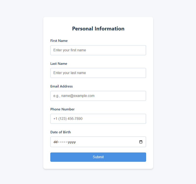
- First Name: Enter your first name
- Last Name: Enter your last name
- Email Address: e.g., [email protected]
- Phone Number: +1 (123) 456-7890
- Date of Birth: MM/DD/YYYY
These placeholders show realistic examples or formatting, which prevents common mistakes like incomplete names or incorrect email formatting.
| Form Field | Good Placeholder Example |
|---|---|
| First Name | e.g. John |
| Last Name | e.g. Smith |
| Full Name | e.g. John Smith |
| Email Address | [email protected] |
| Phone Number | (555) 123-4567 |
| Date of Birth | MM/DD/YYYY |
| Username | Choose a unique username |
Address placeholder
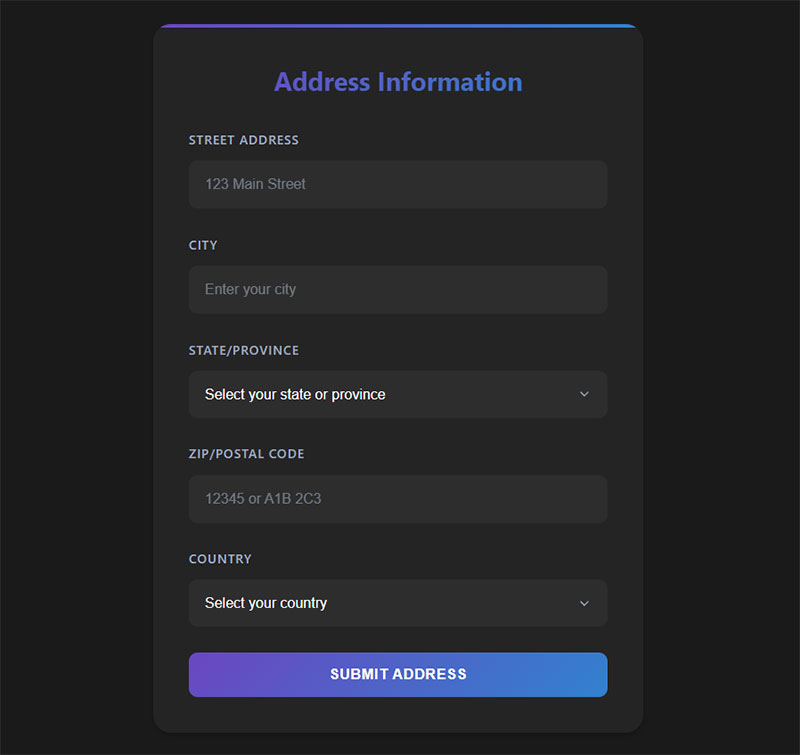
- Street Address: 123 Main Street
- City: Enter your city
- State/Province: Select your state or province
- ZIP/Postal Code: 12345 or A1B 2C3
- Country: Select your country
Address forms benefit from placeholders because they help users understand the expected level of detail, especially for international visitors.
| Form Field | Good Placeholder Example |
|---|---|
| Street Address | 123 Main Street |
| Apartment / Suite | Apt 4B |
| City | e.g. Chicago |
| State / Province | Select your state |
| ZIP / Postal Code | 12345 |
| Country | Select your country |
Login and registration placeholder text example
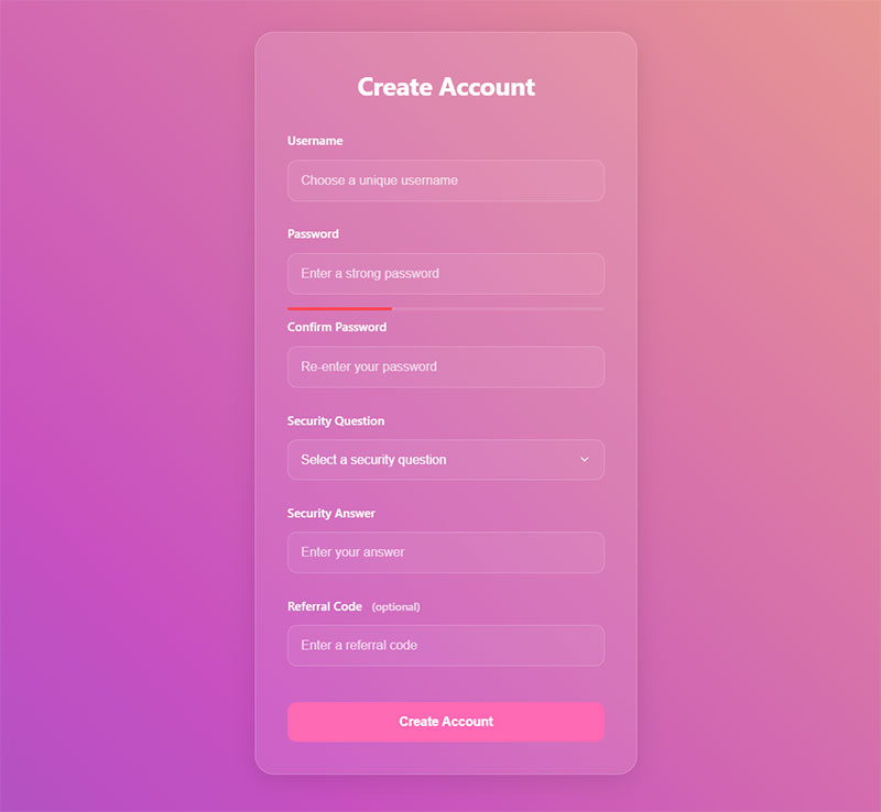
- Username: Choose a unique username
- Password: Enter a strong password
- Confirm Password: Re-enter your password
- Security Question: What is your mother’s maiden name?
- Referral Code: Enter a referral code (optional)
| Form Field | Good Placeholder Example |
|---|---|
| Username | choose a unique username |
| Password | minimum 8 characters |
| Confirm Password | re-enter password |
| Referral Code | optional code |
| Security Question | e.g. first pet’s name |
For login forms, placeholders should clarify requirements without revealing sensitive data.
For example, instead of showing a password example, indicate rules or requirements.
Explore handpicked examples of CSS login forms
Contact forms
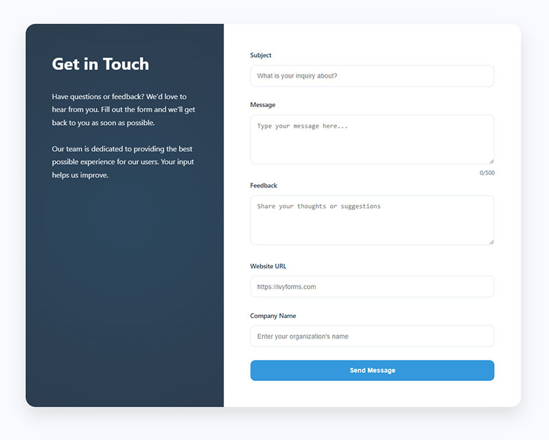
- Subject: What is your inquiry about?
- Message: Type your message here…
- Feedback: Share your thoughts or suggestions
- Website URL: https://ivyforms.com
- Company Name: Enter your organization’s name
Contact forms should use placeholders to encourage clear messages and guide users toward meaningful submissions.
| Form Field | Good Placeholder Example |
|---|---|
| Subject | What is your inquiry about? |
| Message | Type your message here… |
| Website URL | https://example.com |
| Company Name | e.g. Acme Inc. |
| Feedback | Share your thoughts |
Payment and checkout

- Cardholder Name: Name on card
- Credit Card Number: XXXX XXXX XXXX XXXX
- Expiration Date: MM/YY
- CVV: 3-digit code on the back of your card
- Billing Address: Enter your billing address
Checkout forms are a major conversion bottleneck, so placeholders should reduce friction and prevent formatting errors.
| Form Field | Good Placeholder Example |
|---|---|
| Cardholder Name | Name on card |
| Credit Card Number | XXXX XXXX XXXX XXXX |
| Expiration Date | MM/YY |
| CVV | 3-digit code |
| Billing Address | Enter billing address |
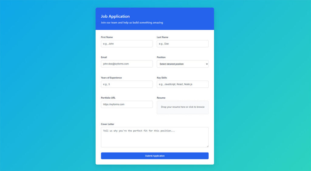
Application forms placeholder text
| Form Field | Good Placeholder Example |
|---|---|
| Full Name | First and last name |
| Position Applied For | e.g. Marketing Intern |
| LinkedIn Profile | https://linkedin.com/in/yourname |
| Upload Resume | Choose file… |
| Portfolio | https://portfolio.com |
These placeholders help applicants quickly understand what information is required, especially when submitting professional profiles or documents.
Event registration form placeholder text example
| Form Field | Good Placeholder Example |
|---|---|
| Attendee Name | e.g. Sarah Miller |
| Email Address | Enter email for confirmation |
| Company Name | optional |
| Select Session | choose your session time |
For event forms, placeholders help guide users toward correct contact details and scheduling choices.
Order form placeholders
| Form Field | Good Placeholder Example |
|---|---|
| Product Name | e.g. Stainless Steel Water Bottle |
| Quantity | 1, 2, 3… |
| Shipping Address | Street, City, ZIP |
| Promo Code | Enter discount code |
Order forms benefit from placeholders because they clarify purchasing information and reduce checkout confusion.
Survey/feedback form placeholders
| Form Field | Good Placeholder Example |
|---|---|
| Satisfaction Rating | 1 = Very Dissatisfied, 5 = Very Satisfied |
| Feedback | Your feedback helps us improve |
| Email (optional) | [email protected] |
These placeholders encourage more detailed responses and help users understand how to provide feedback.
Client intake form placeholder text
- Business Name: e.g. Acme Corporation
- Website URL: https://yourbusiness.com
- Project Budget: e.g. $1,000 – $5,000
- Deadline: Select a preferred project deadline
Job application forms
- Desired Role: e.g. Junior Frontend Developer
- Cover Letter: Briefly tell us why you’re a good fit
- Expected Salary: e.g. $50,000/year
Miscellaneous
| Form Field | Good Placeholder Example |
|---|---|
| Search | Search products or articles |
| Newsletter Signup | Enter your email |
| Tags / Keywords | Add relevant keywords |
| Comment | Write your comment here… |

What is Form Placeholder Text?
Form placeholder text is the short hint displayed inside an HTML input field before the user types anything.
It renders via the placeholder attribute on <input>, <textarea>, and certain <select> elements. The text sits inside the field at roughly 60–70% opacity, disappears the moment the field receives focus or a character is entered, and serves one purpose: give users a quick signal about what the field expects.
| Element | Placeholder Support |
|---|---|
<input type="text"> |
Full support |
<input type="email"> |
Full support |
<input type="password"> |
Full support |
<textarea> |
Full support |
<input type="checkbox"> |
Not supported |
<input type="file"> |
Not supported |
Ghost text, field hint text, and input hint are all informal names for the same thing.
The HTML5 specification introduced the placeholder attribute. Every modern browser (Chrome, Firefox, Safari, Edge) renders it natively, with no polyfill needed.
It’s worth being clear on what it is not:
- Not a field label
- Not a default value that gets submitted with the form
- Not persistent help text
- Not a replacement for instructions
That last point trips up more teams than you’d expect. The placeholder is temporary by design. Anything a user needs to remember while filling a field should never live only inside the placeholder.
Placeholder Text vs. Labels: Why They Are Not the Same
These two elements look similar in some designs. They function completely differently.
Labels are persistent. They sit above or beside the input, remain visible after the user starts typing, and are programmatically associated with the field via the for attribute. Placeholder text disappears on focus. A user who starts typing in a field and forgets what it asked for has to delete their input to see the placeholder again.
The Nielsen Norman Group research explicitly flags placeholder-only forms as causing usability problems. When placeholder text acts as the sole label, users repeatedly lose context mid-fill.
| Label | Placeholder | |
|---|---|---|
| Persists after typing | Yes | No |
| Read by screen readers as field name | Yes | Inconsistently |
| Required for WCAG compliance | Yes | No |
| Best for | Identifying the field | Format hints |
The accessibility gap is real. WCAG 2.1 Success Criterion 1.3.1 requires that form field purpose be programmatically determinable. A placeholder alone does not satisfy this.
Screen readers like VoiceOver (Apple) and NVDA announce placeholder text inconsistently across browsers. Some read it as the accessible name; others skip it. Depending on placeholder text for accessibility is a gamble.
Google Forms uses persistent labels above every field with optional placeholder text below. That’s the pattern worth copying.
HTML Placeholder Attribute: Syntax and Browser Support
Basic implementation is one line of HTML.
<input type="email" placeholder="[email protected]">
No JavaScript. No plugins. Just the attribute.
Input types that support placeholder:
text,email,password,search,tel,url,number<textarea>
Input types that do not:
checkbox,radio,file,range,color,date
For date fields, the placeholder attribute is ignored. Use helper text below the field instead, or a visible format label.
Browser rendering is near-universal as of 2024. The attribute was part of the HTML5 specification and has had full support in Chrome, Firefox, Safari, and Edge for well over a decade.
Styling Placeholder Text with CSS
The ::placeholder CSS pseudo-element controls how placeholder text appears.
input::placeholder {
  color: #767676;
  font-style: italic;
  opacity: 1; /* Required in Firefox to override default transparency */
}
Three things worth knowing:
- Firefox applies a default opacity of ~0.54 to placeholder text. Without
opacity: 1, styled colors render darker than intended. - Color contrast is not optional. WCAG 2.2 Success Criterion 1.4.3 requires a minimum 4.5:1 contrast ratio for placeholder text against its background. The hex value
#767676on white passes at exactly 4.48:1 (borderline). Use#6c6c6cor darker to be safe. - Legacy prefixes (
:-ms-input-placeholder,:-moz-placeholder) are only needed if you’re supporting Internet Explorer or very old Firefox. Safe to skip in most 2024+ projects.
Color contrast is the most common accessibility violation on the web, affecting 83.6% of all websites according to WebAIM’s 2024 Million analysis. Placeholder text is a frequent contributor.
When Placeholder Text Helps (and When It Doesn’t)
This is where most form design advice goes wrong. The answer isn’t “always use it” or “never use it.” Context matters.
Placeholder text adds value when:
- The field has a persistent visible label already in place
- You’re showing a format example (“+1 555 000-0000”, “MM/DD/YYYY”)
- The form is short with obvious fields (search bars, single-input newsletter signups)
- The hint is genuinely optional context, not required instruction
It creates friction when:
- It’s the only identifier for the field (replaces the label entirely)
- The hint contains instructions the user needs while filling the field
- The form is long and users will lose context mid-fill
- Mobile users are likely (small screen, virtual keyboard often covers fields)
Zuko Analytics data shows only 45% of users who visit a form go on to complete it, meaning 55% abandon. Poor field labeling and confusing input expectations are consistent contributors.
User testing at Nielsen Norman Group found that placeholder-only forms cause confusion in a specific pattern: users complete one field, move to the next, and then second-guess what the previous field expected. They clear their input to check. This adds time and frustration.
The practical rule: if a user needs the hint to successfully fill the field, it belongs in a visible label or helper text below the input, not in a placeholder.
Placeholder Text Best Practices for UX
Keep it short. Three to five words. Anything longer gets truncated on mobile screens or overwhelms users who scan rather than read.
Use example values, not restated labels. If the label says “Phone Number,” a placeholder that says “Enter your phone number” adds zero information. A placeholder that says “+1 555 000-0000” tells the user exactly what format to use.
Never use placeholder as the only form of instruction for required or complex fields. This is the rule most teams violate. Inline form-field validation combined with clear labels reduces form errors by 22% and decreases completion time by 42% (CXL). Good placeholder text supports that pattern; it doesn’t replace structural clarity.
Good form design treats the placeholder as a secondary, optional aid. The form should function perfectly without it.
Writing Placeholder Copy That Works
There are two approaches worth distinguishing:
Example-based placeholders show sample data. They work best for fields where format matters.
- Email:
[email protected] - Date:
MM/DD/YYYY - Credit card:
1234 5678 9012 3456 - Phone:
+1 (555) 000-0000
Action-based placeholders give a short instruction. These work for open-ended fields where format isn’t the concern.
- Search:
Search products... - Message:
Tell us about your project - Subject:
What's this about?
Avoid mixing both in the same form. Pick one style and stay consistent across all fields. Tone should also match the product. A B2B enterprise intake form and a consumer onboarding flow should feel different, right down to the microcopy inside input fields.
One pattern that consistently underperforms: placeholder text that replicates the label exactly. If your label says “First Name” and your placeholder says “First Name,” you’ve added visual noise and no value.
Placeholder Text Accessibility Requirements
Accessibility isn’t an edge case. It’s baseline. And placeholder text fails in several specific ways if you’re not careful.
The core WCAG requirements:
- SC 1.4.3 (Contrast Minimum): Placeholder text must meet the 4.5:1 contrast ratio requirement. Browser defaults (typically a light gray with reduced opacity) often fail this. Always override with CSS.
- SC 1.3.1 (Info and Relationships): Placeholder text cannot serve as the programmatically associated label for a field. Use
<label>elements. Associate them withforandidattributes. - SC 1.4.1 (Use of Color): Don’t rely on placeholder text color alone to convey field state or requirements.
Deque’s 2024 research notes that people with short-term memory difficulties, ADHD, traumatic brain injuries, and low vision are disproportionately affected by placeholder-only forms. The disappearing text removes reference points that these users rely on more heavily.
What assistive technology actually does:
VoiceOver on iOS and macOS reads placeholder text as the accessible name when no label exists, but this behavior is not reliable across all screen readers or browser combinations.
NVDA with Firefox may announce the placeholder. NVDA with Chrome behaves differently.
The aria-label and aria-describedby attributes can supplement or replace placeholder-based labeling for screen reader users. Use aria-label when no visible label exists; use aria-describedby to associate helper text or format instructions with the field.
Tools like Google Lighthouse and Axe will flag:
- Missing
<label>associations - Placeholder text as the only accessible name
- Contrast failures on placeholder color
Run both tools before shipping any form. Fixing these issues after launch is tricky, especially in component libraries where placeholder defaults get applied globally. Material UI (MUI) and Bootstrap 5 both have specific overrides for placeholder contrast that require explicit CSS attention.
Good form accessibility practice treats these as non-negotiable. Not aspirational guidelines, not nice-to-haves. Required.
Placeholder Text in Popular Form Frameworks and Libraries
How placeholder text gets handled differs quite a bit depending on which tool you’re building with. The HTML attribute is the same everywhere. The implementation patterns, defaults, and gotchas are not.
| Framework | Placeholder Syntax | Notable Behavior |
|---|---|---|
| React | placeholder prop on <input> |
Supports dynamic state-driven placeholders |
| Angular | [placeholder]="variable" binding |
Works with Reactive Forms and Template Forms |
| Bootstrap 5 | Standard HTML attribute | Default styling overrides needed for contrast |
| Material UI (MUI) | placeholder prop, but floating label preferred |
Shrink pattern replaces placeholder on focus |
| Formik / RHF | Passed through field registration | No special handling, inherits HTML defaults |
React treats placeholder as a standard prop, as confirmed in React’s official documentation. You pass it as a string directly on any <input> element, and you can bind it to state for dynamic placeholders. Controlled and uncontrolled inputs both support it without any special configuration.
Angular Reactive Forms use property binding: [placeholder]="formPlaceholder". Static values work fine with the regular placeholder="..." attribute. The tricky part comes with date inputs, where Angular’s date picker ignores the placeholder entirely on some browsers. A workaround is to start the field as type="text" and swap to type="date" on focus.
Material UI deserves a separate mention.
MUI’s default TextField component uses a floating label pattern, where the label sits inside the field (looking like a placeholder) and animates upward when the field is focused or filled. If you pass a placeholder prop alongside a label prop, both can appear simultaneously in an empty field before focus. That’s a visual mess. Use one or the other, not both.
Bootstrap 5 applies no special placeholder styling beyond the browser default. The default contrast often fails WCAG 1.4.3. Always override with ::placeholder CSS targeting Bootstrap’s form control classes.
Placeholder Text for Different Form Field Types
Not every field needs placeholder text. And the fields that do benefit from it need different kinds of hints.
Search Fields
Short and action-oriented. Search is the one context where placeholder-only fields are widely accepted, because the single-input search bar is so familiar that users don’t need a persistent label.
Good examples:
- “Search products…”
- “Search by name or SKU”
- “Find an article”
One word placeholder (“Search”) adds nothing useful. So does “Type here to search.” The best search placeholders tell users what they’re searching, not that they’re searching.
Password Fields
Password fields need extra care. The placeholder disappears when typing starts, which is the worst time to lose format requirements.
The correct approach:
- Use a short placeholder for format hints: “Min. 8 characters”
- Put full requirements in persistent
aria-describedbyhelper text below the field - Never use the placeholder as the only location for password rules
Stripe’s password field uses exactly this pattern: a minimal placeholder combined with an always-visible strength indicator below the input.
Date and Phone Fields
Format hints matter most here. Users genuinely don’t know which format a system expects.
Date: MM/DD/YYYY or DD/MM/YYYY depending on your audience. Spell it out. Don’t assume.
Phone: +1 (555) 000-0000 shows international format and grouping at once. For US-only forms, 555-000-0000 works.
Avoid field masks that conflict with placeholder text. If a field auto-formats input, the placeholder becomes misleading when the mask fills in different characters than shown.
Address and Credit Card Fields
Address fields rarely need placeholder text on standard lines like “Street address” or “City.” The labels handle it. Where placeholders genuinely help is in fields with format ambiguity, like a postcode field that accepts both US zip codes and Canadian postal codes.
Credit card fields are a special case. Payment providers like Stripe, PayPal, and Braintree use their own input components that handle placeholder text internally. If you’re using Stripe Elements, don’t override its default placeholder handling without testing across card types.
Placeholder Text in Mobile Forms
Mobile is where placeholder text causes the most real-world damage.
Zuko Analytics data shows a 42% mobile form completion rate versus 47% on desktop. The gap isn’t just screen size. It’s how placeholder text behaves differently on mobile compared to desktop.
Why Mobile Makes Placeholder Problems Worse
The virtual keyboard covers a significant portion of the screen when a field is active. On an iPhone with a modal form, the keyboard can hide two-thirds of the visible form area. When a user taps into a field and the keyboard appears, the field is often the only thing visible.
At that point, the placeholder is gone. The label needs to carry all the context.
What breaks on mobile specifically:
- Long placeholder text truncates on small screens, cutting off the most useful part of the hint
- iOS Safari renders
::placeholderwith a default opacity that often fails contrast thresholds - Browser autofill bypasses placeholder text entirely; a pre-filled field shows no hint at all
- Virtual keyboards cause scroll jumps that disorient users who relied on placeholder context from above
iOS Safari and Android Chrome Differences
iOS Safari applies an opacity reduction to placeholder text by default. Without opacity: 1 in your CSS, styled placeholder colors render differently than intended, and the contrast almost always drops below 4.5:1. This is a known and persistent behavior.
Android Chrome handles placeholder contrast more consistently but has its own autofill overlay behavior. When Chrome autofills a field, the field background turns yellow/blue and the placeholder is completely hidden. Users who needed that format hint won’t see it.
The fix in both cases is the same: move critical hints below the field as persistent helper text, not inside the placeholder.
Common Placeholder Text Mistakes and How to Fix Them
Most placeholder text problems follow predictable patterns. I’ve seen the same five mistakes in production forms across dozens of projects.
Placeholder as the Only Label
The most common and most damaging mistake. Designers remove visible labels to create a “cleaner” look. The form looks minimal. It converts worse.
The fix: Add a visible <label> element above every field. Associate it with the input using for and id. The placeholder stays as a secondary hint.
NNGroup’s research is consistent on this: placeholder-only forms increase memory load and error rates for all users, not just those with accessibility needs.
Low-Contrast Placeholder Text
Browser defaults fail WCAG 1.4.3 more often than not. This is especially true after developers apply custom color themes where the background color changes but the placeholder CSS doesn’t.
The fix:
input::placeholder {
  color: #6c6c6c;
  opacity: 1;
}
Test every form with a contrast checker (WebAIM’s is reliable). The 4.5:1 minimum applies to placeholder text, not just body copy.
Placeholder Text That Mimics Real Input
When placeholder text looks too much like actual typed content, users think the field is already filled. They skip it and submit an incomplete form.
The fix: Use clearly example-based phrasing (“e.g., [email protected]”) or a visually distinct style (lighter weight, italic). The distinction between hint and input has to be obvious.
Deque’s 2024 accessibility research confirms this is especially problematic for users with cognitive disabilities, who are more likely to interpret placeholder text as a pre-filled value.
Overly Long Placeholder Text on Narrow Fields
Long hints get truncated. The part that gets cut off is usually the most specific and useful part.
The fix: Keep placeholder text under 30 characters for most fields. Anything longer belongs in helper text below the input, where it can wrap and stay fully visible.
On mobile forms, truncation happens at even shorter character counts. Design for the smallest screen in your user base.
Placeholder Text That Conflicts with Autofill
When a browser autofills a field, the placeholder disappears. If the user needs to verify format or requirements before submitting, they have no reference point.
The fix: Any instruction that matters at submission time belongs as persistent helper text, not in the placeholder. The placeholder is only useful before the user interacts with a field. Everything else needs a different home.
A quick audit of any live web form reveals these issues fast. Fill every field with autofill, then check whether users still have all the information they need to verify their input correctly.
FAQ on Form Placeholder Text
What is form placeholder text?
Form placeholder text is the short hint displayed inside an HTML input field before the user types anything. It’s added via the placeholder attribute and disappears on focus. It’s not a label, not a default value, and not a substitute for field instructions.
Should placeholder text replace field labels?
No. Placeholder text disappears when users start typing, leaving no context for the field. Labels persist. WCAG 2.1 requires a programmatically associated label for every input. Using placeholder as the only identifier fails accessibility compliance.
What is the correct HTML syntax for placeholder text?
<input type="email" placeholder="[email protected]">
Add the placeholder attribute directly to any supported input element. Works on text, email, password, search, tel, and textarea. Does not work on checkbox, radio, or file inputs.
Does placeholder text need to meet contrast requirements?
Yes. WCAG 2.2 Success Criterion 1.4.3 applies to placeholder text. The minimum contrast ratio is 4.5:1 against the background. Browser defaults typically fail this. Always override with ::placeholder CSS using a color no lighter than #6c6c6c on white.
How do you style placeholder text with CSS?
Use the ::placeholder pseudo-element:
input::placeholder {
  color: #6c6c6c;
  opacity: 1;
}
The opacity: 1 line is required for Firefox, which applies a default transparency that reduces contrast. Omitting it causes styled colors to render darker than intended.
What’s the difference between placeholder text and helper text?
Placeholder text lives inside the field and disappears on focus. Helper text sits below the field permanently and stays visible throughout the entire interaction. For instructions users need while filling a field, helper text is always the safer choice.
Can placeholder text hurt form conversion rates?
Yes. Nielsen Norman Group research shows placeholder-only forms increase memory load and error rates. Zuko Analytics data puts the average form completion rate at just 45%. Unclear or disappearing field hints are consistent contributors to that 55% abandonment.
How should placeholder text be written for mobile forms?
Keep it under 30 characters. Long placeholder text truncates on small screens, cutting off the useful part. Use format examples over instructions. And always pair with a visible label above the field, since the virtual keyboard hides field context once a user taps in.
How does placeholder text work in React?
Pass it as a standard prop:
<input type="text" placeholder="Your full name" />
React supports static strings and dynamic state-driven placeholders. Bind to state with placeholder={placeholderText} for values that change based on user interaction or form context.
What are the most common placeholder text mistakes?
- Using placeholder as the only field label
- Low-contrast placeholder color that fails WCAG
- Text that looks like pre-filled input, confusing users
- Instructions that disappear mid-fill on complex fields
- Long hints that truncate on mobile screens
Fix each with persistent labels, proper CSS contrast, and helper text for anything users need at submission time.
Conclusion
Form placeholder text is a small detail with a disproportionate impact on how users experience your input fields.
Used correctly, it reduces errors, speeds up completion, and guides users through format requirements without adding visual clutter.
Used poorly, it kills context, fails WCAG contrast requirements, and pushes users toward abandonment before they ever hit submit.
The fix is rarely complicated. Pair every field with a persistent label. Keep hint text short and example-based. Override browser defaults with ::placeholder CSS. Move critical instructions into helper text below the field.
Good input field design doesn’t rely on placeholder text to carry the whole load. It treats the placeholder as one small, optional layer of a well-structured form.

