


Every form on your site is only as good as the fields inside it. Bad field choices drive users away. The right ones, in the right order, with the right…
Table of contents
Your users are abandoning forms faster than you can say “responsive design.”
Mobile traffic now accounts for over 60% of web browsing, yet most mobile form best practices remain overlooked by developers and designers alike. Touch-friendly interfaces aren’t just nice to have anymore.
They’re conversion lifelines.
Poor mobile form optimization costs businesses millions in lost leads annually. Tiny touch targets, awkward keyboard triggers, and frustrating validation errors create user experience nightmares that send potential customers straight to competitors.
This guide reveals proven techniques for creating mobile forms that actually convert.
You’ll discover how to implement touch target sizing that works, master responsive form layout principles, and reduce form abandonment rates through strategic form design decisions.
From iOS-specific considerations to Android input optimization, we’ll cover the essential elements that transform frustrating mobile interactions into seamless conversion opportunities.
Mobile Form Best Practices
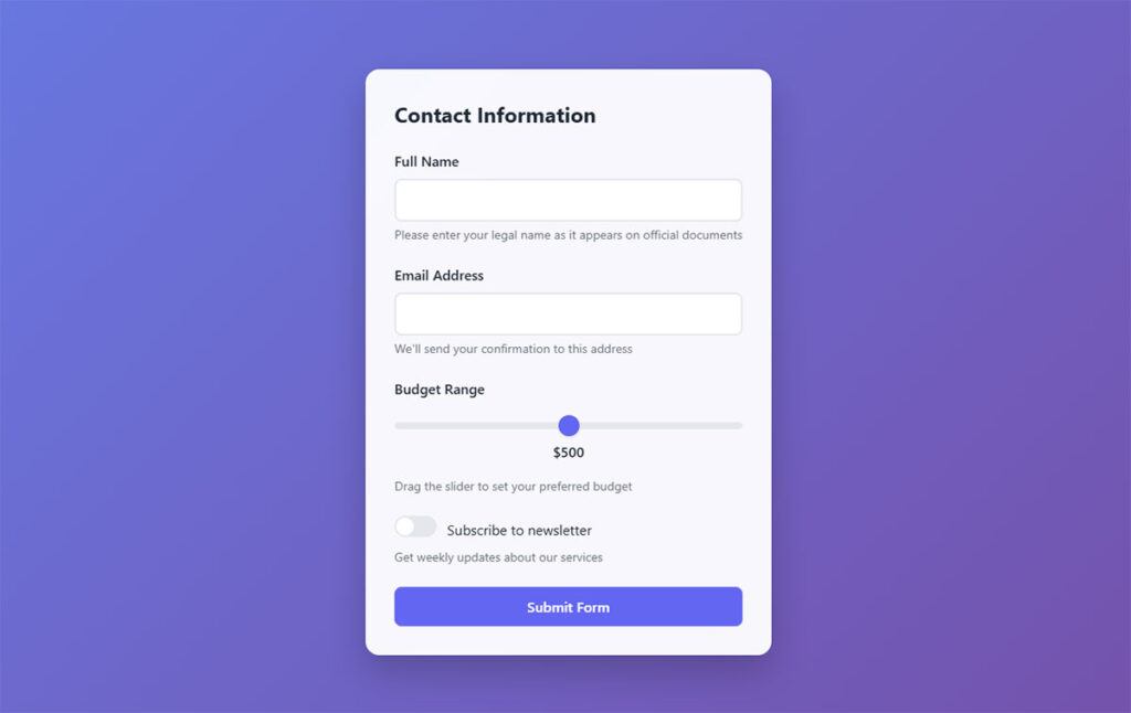
Single Column Layout

Single column layout arranges all form fields vertically in one continuous column. This mobile-first design pattern eliminates horizontal scanning and creates a linear progression path for users.
Technical Specifications
- Input Type: Universal application across all form field types
- Touch Target Size: Maintains 44px × 44px minimum with single-column flow
- Viewport Behavior: Full-width field utilization, no horizontal scrolling required
- Validation Method: Supports all validation patterns without layout interference
User Experience Impact
Single-column forms demonstrate measurable performance advantages on mobile devices:
- Completion rate improvements of 15.4 seconds faster than multi-column alternatives
- Error reduction through simplified visual scanning patterns
- Task completion optimization via natural top-to-bottom progression
- WCAG 2.1 AA compliance through simplified navigation structure
Mobile-Specific Considerations
- Screen Size Adaptation: Full viewport width utilization across all breakpoints
- Touch Interaction: Eliminates accidental taps on adjacent columns
- Keyboard Optimization: Consistent field-to-field progression without layout jumps
- Connectivity Impact: Reduced rendering complexity improves performance on slower connections
Related Form Elements
- Associated Input Fields: All text inputs, dropdowns, checkboxes integrate seamlessly
- Validation Patterns: Real-time feedback displays without column layout conflicts
- Navigation Controls: Tab order follows natural reading progression
- Accessibility Features: Screen readers process forms linearly without spatial confusion
Implementation Requirements
- CSS flexbox or grid layout with flex-direction: column
- Responsive design breakpoints favoring mobile-first approach
- Framework compatibility: Bootstrap, Foundation, Material Design
- Cross-browser testing on iOS Safari, Chrome Mobile, Samsung Internet
Large Tap Targets (44px Minimum)
Large tap targets establish touch-friendly interface elements meeting Human Interface Guidelines standards. Apple recommends minimum target size of 44 pixels wide by 44 pixels tall for optimal finger interaction.
Technical Specifications
- Input Type: Universal button, link, and interactive element sizing
- Touch Target Size: 44px × 44px minimum, 48px × 48px optimal for Material Design
- Viewport Behavior: Maintains consistent physical size across device densities
- Validation Method: Touch target validation through user testing protocols
User Experience Impact
Properly sized touch targets significantly improve mobile interaction quality:
- Touch target compliance reduces user errors and frustration
- Completion rate improvements through reduced mis-taps
- Task efficiency gains from confident target acquisition
- WCAG 2.1 AA compliance for motor impairment accessibility
Mobile-Specific Considerations
- Screen Size Adaptation: Physical dimensions remain consistent regardless of screen density
- Touch Interaction: Accommodates average finger pad size of 10-14mm
- Keyboard Optimization: Touch targets maintain sizing when virtual keyboards appear
- Connectivity Impact: Larger targets reduce interaction errors requiring page reloads
Related Form Elements
- Associated Input Fields: Input focus states, submit buttons, navigation controls
- Validation Patterns: Error correction buttons and retry mechanisms
- Navigation Controls: Form progression buttons, step indicators
- Accessibility Features: High contrast focus indicators for touch feedback
Implementation Requirements
- CSS min-height and min-width properties set to 44px minimum
- Padding adjustments to maintain visual hierarchy while meeting size requirements
- Touch target spacing of 8px minimum between adjacent elements
- iOS and Android platform testing for consistent behavior
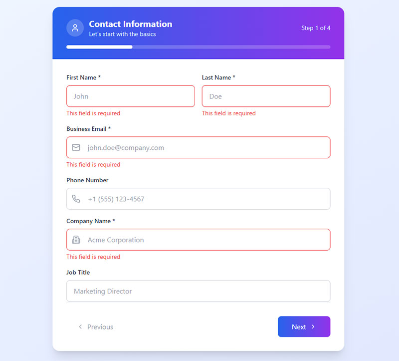
Clear, Concise Labels
Clear labeling provides immediate context for form field requirements using straightforward language. Effective labels eliminate user confusion and reduce cognitive load during form completion.
Technical Specifications
- Input Type: Text labels positioned above or alongside input fields
- Touch Target Size: Label text maintains readability without compromising touch targets
- Viewport Behavior: Labels remain visible during virtual keyboard display
- Validation Method: Label clarity reduces validation errors through better user understanding
User Experience Impact
Well-crafted labels dramatically improve form UX design and completion metrics:
- Completion rate improvements through reduced field interpretation time
- Error reduction via clear expectation setting
- Task completion acceleration through immediate comprehension
- WCAG 2.1 AA compliance through descriptive text requirements
Mobile-Specific Considerations
- Screen Size Adaptation: Truncation prevention across narrow viewports
- Touch Interaction: Labels serve as touch targets for associated fields
- Keyboard Optimization: Labels remain visible above virtual keyboards
- Connectivity Impact: Simplified text reduces page weight and loading time
Related Form Elements
- Associated Input Fields: Direct semantic relationship with form controls
- Validation Patterns: Error messages complement label information
- Navigation Controls: Labels guide logical form progression
- Accessibility Features: Screen reader compatibility through proper markup
Implementation Requirements
- HTML label elements with for attributes linking to input IDs
- CSS font-size minimum 16px to prevent iOS zoom on focus
- Label positioning considerations for small screen real estate
- Multi-language support for international mobile users
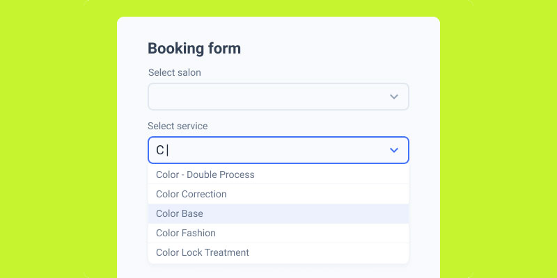
Use Appropriate Input Types

HTML5 input types trigger device-specific keyboards and interface elements. Proper input type selection improves data entry speed and accuracy on mobile devices.
Technical Specifications
- Input Type: Email, tel, number, date, url, search based on data requirements
- Touch Target Size: Input fields maintain 44px minimum height regardless of type
- Viewport Behavior: Custom keyboards display without viewport disruption
- Validation Method: Built-in browser validation leverages input type constraints
User Experience Impact
Strategic input type implementation creates measurable mobile improvements:
- Completion rate improvements through reduced typing effort
- Error reduction via appropriate keyboard interfaces
- Task completion optimization through smart input assistance
- WCAG 2.1 AA compliance through enhanced input accessibility
Mobile-Specific Considerations
- Screen Size Adaptation: Virtual keyboards optimize screen space utilization
- Touch Interaction: Specialized keyboards reduce touch precision requirements
- Keyboard Optimization: Email keyboards include @ symbol, number keyboards eliminate letters
- Connectivity Impact: Reduced client-side validation requests through proper input constraints
Related Form Elements
- Associated Input Fields: Input types work with autocomplete and autofill features
- Validation Patterns: Type-specific validation messages provide relevant feedback
- Navigation Controls: Keyboard “Next” and “Done” buttons improve navigation
- Accessibility Features: Screen readers announce input expectations correctly
Implementation Requirements
- HTML5 input type attribute specification (type=”email”, type=”tel”, etc.)
- Browser compatibility testing across mobile platforms
- Fallback handling for unsupported input types
- iOS-specific attribute considerations (inputmode, autocomplete)
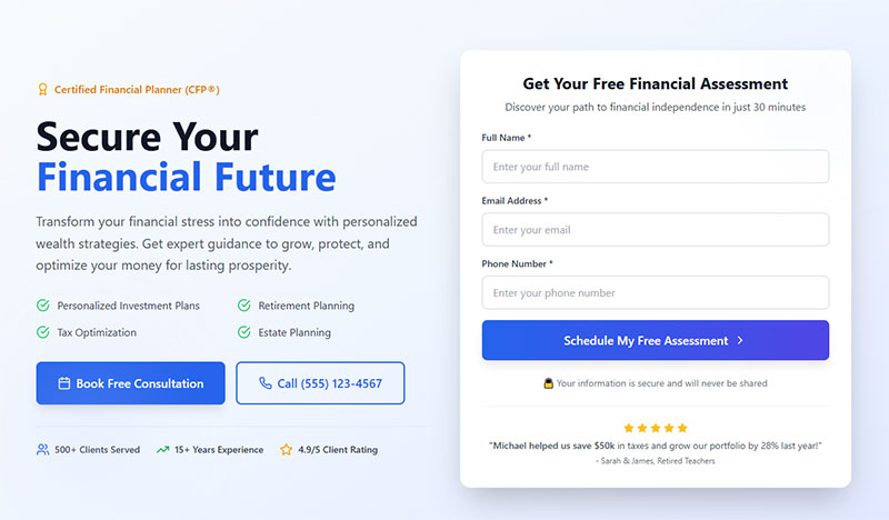
Minimize Required Fields
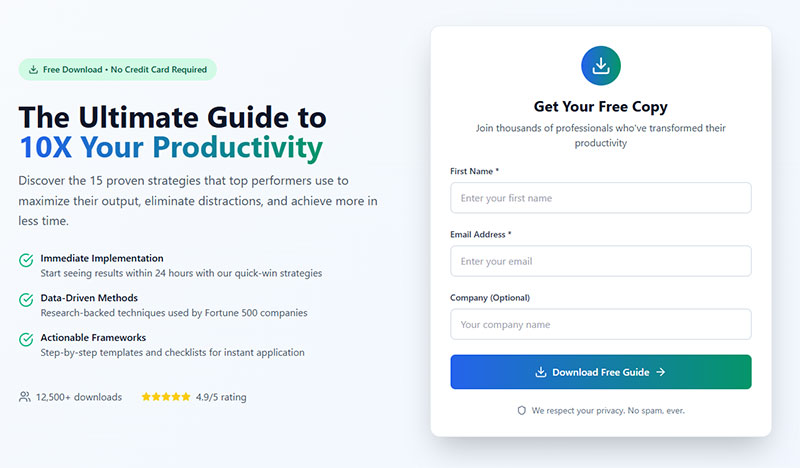
Field reduction focuses on essential data collection only. Strategic field elimination reduces form abandonment while maintaining lead quality and business requirements.
Technical Specifications
- Input Type: Required attribute applied selectively to critical fields only
- Touch Target Size: Fewer fields allow larger touch targets within viewport
- Viewport Behavior: Reduced scrolling requirements improve mobile experience
- Validation Method: Simplified validation logic with fewer potential failure points
User Experience Impact
Strategic field minimization creates significant mobile conversion improvements:
- Completion rate increases through reduced perceived effort
- Error reduction via fewer validation points
- Task completion time reduction through streamlined workflows
- WCAG 2.1 AA compliance through simplified cognitive requirements
Mobile-Specific Considerations
- Screen Size Adaptation: Forms fit within single viewport reducing scroll fatigue
- Touch Interaction: Fewer touch points reduce interaction errors
- Keyboard Optimization: Reduced keyboard switching between field types
- Connectivity Impact: Smaller forms load faster on mobile networks
Related Form Elements
- Associated Input Fields: Essential fields receive priority positioning and styling
- Validation Patterns: Simplified error handling with fewer validation rules
- Navigation Controls: Shorter forms reduce need for progress indicators
- Accessibility Features: Reduced cognitive load improves accessibility compliance
Implementation Requirements
- Business requirement analysis to identify truly essential data points
- A/B testing protocols to measure impact of field reduction
- Conditional logic implementation for progressive data collection
- Lead scoring adjustments to account for reduced initial data capture
Auto-focus First Field
Auto-focus immediately positions cursor in the primary form field upon page load. This eliminates the initial tap requirement and signals form interaction priority to mobile users.
Technical Specifications
- Input Type: HTML autofocus attribute applied to primary input field
- Touch Target Size: Auto-focused field maintains 44px minimum requirements
- Viewport Behavior: Virtual keyboard displays automatically with field focus
- Validation Method: Focus state integration with validation feedback systems
User Experience Impact
Strategic auto-focus implementation improves mobile form engagement:
- Completion rate improvements through reduced interaction friction
- Task initiation acceleration via immediate input readiness
- User experience enhancement through clear interaction cues
- WCAG 2.1 AA compliance considerations for focus management
Mobile-Specific Considerations
- Screen Size Adaptation: Auto-focus triggers keyboard display affecting viewport
- Touch Interaction: Eliminates initial touch requirement for form engagement
- Keyboard Optimization: Appropriate keyboard type displays immediately
- Connectivity Impact: Focus states may trigger additional resource loading
Related Form Elements
- Associated Input Fields: Focus management between sequential form fields
- Validation Patterns: Focus integration with real-time validation systems
- Navigation Controls: Focus affects tab order and keyboard navigation
- Accessibility Features: Screen reader focus announcements require careful implementation
Implementation Requirements
- HTML autofocus attribute on primary field with single instance per page
- JavaScript focus management for dynamic form scenarios
- iOS Safari focus behavior testing for proper keyboard display
- Accessibility testing to ensure screen reader compatibility
Show Password Option
Password visibility toggles allow users to verify password entry accuracy. This pattern reduces password-related form abandonment common on mobile devices with challenging virtual keyboards.
Technical Specifications
- Input Type: Password field with adjacent visibility toggle button
- Touch Target Size: Toggle button maintains 44px × 44px minimum sizing
- Viewport Behavior: Password field maintains consistent width during type switching
- Validation Method: Password visibility affects validation timing and user confidence
User Experience Impact
Password show functionality creates measurable mobile form improvements:
- Completion rate improvements through reduced password entry errors
- Error reduction via visual password verification capability
- Task completion confidence through transparent password handling
- WCAG 2.1 AA compliance through alternative input verification methods
Mobile-Specific Considerations
- Screen Size Adaptation: Toggle button positioning within limited space constraints
- Touch Interaction: Clear visual distinction between password field and toggle control
- Keyboard Optimization: Consistent keyboard type regardless of visibility state
- Connectivity Impact: Client-side functionality requires no additional network requests
Related Form Elements
- Associated Input Fields: Password confirmation fields benefit from synchronized visibility
- Validation Patterns: Password strength indicators work with visibility toggles
- Navigation Controls: Focus management between password and toggle elements
- Accessibility Features: Screen reader announcements for visibility state changes
Implementation Requirements
- JavaScript toggle functionality switching input type between “password” and “text”
- CSS styling for clear visual indication of visibility state
- Icon selection for universal show/hide password recognition
- Security considerations ensuring password visibility resets appropriately
Real-time Validation
Real-time validation provides immediate feedback during user input. This approach catches errors early and guides users toward successful form completion without waiting for submission.
Technical Specifications
- Input Type: JavaScript event listeners on blur, input, or change events
- Touch Target Size: Validation messages display without disrupting touch targets
- Viewport Behavior: Error messages appear inline without layout disruption
- Validation Method: Client-side validation with server-side verification backup
User Experience Impact
Strategic real-time validation significantly improves mobile form completion:
- Completion rate improvements through early error detection and correction
- Error reduction via immediate feedback and guidance
- Task completion confidence through progressive validation success
- WCAG 2.1 AA compliance through descriptive error messaging
Mobile-Specific Considerations
- Screen Size Adaptation: Validation messages fit within constrained mobile layouts
- Touch Interaction: Error correction requires minimal additional touch points
- Keyboard Optimization: Validation timing respects keyboard switching patterns
- Connectivity Impact: Client-side validation reduces server requests and data usage
Related Form Elements
- Associated Input Fields: Validation states affect field styling and interaction
- Validation Patterns: Success and error states require consistent visual design
- Navigation Controls: Validation affects form progression and submission enabling
- Accessibility Features: Screen reader announcements for validation state changes
Implementation Requirements
- JavaScript validation libraries or custom validation logic
- CSS classes for validation state styling (error, success, neutral)
- Form validation timing optimization to avoid overwhelming users
- Performance testing to ensure validation doesn’t impact form responsiveness
Progress Indicators for Multi-Step Forms
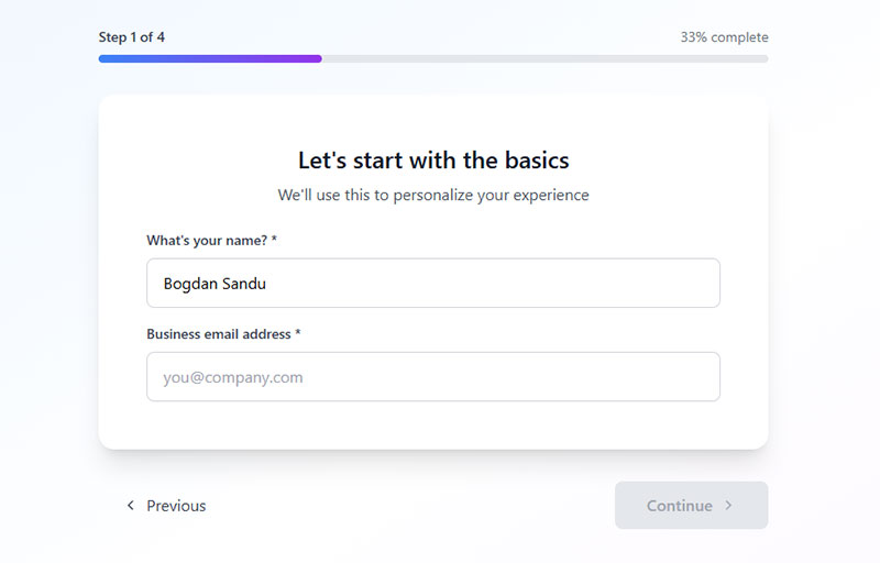
Progress indicators communicate user advancement through multi-step forms using visual elements. These components reduce form abandonment by providing clear completion expectations and psychological progress feedback.
Technical Specifications
- Input Type: Visual progress bars, step counters, or percentage completion displays
- Touch Target Size: Progress elements maintain visibility without requiring interaction
- Viewport Behavior: Progress indicators remain visible during virtual keyboard display
- Validation Method: Progress updates correlate with successful step completion and validation
User Experience Impact
Strategic progress indicator implementation creates significant mobile engagement improvements:
- Completion rate improvements up to 300% for longer multi-step processes
- Form abandonment reduction through endowed progress effect psychology
- Task completion confidence via clear expectations setting
- WCAG 2.1 AA compliance through descriptive progress communication
Mobile-Specific Considerations
- Screen Size Adaptation: Compact progress displays optimize limited mobile screen space
- Touch Interaction: Progress indicators provide visual feedback without touch requirements
- Keyboard Optimization: Indicators remain visible above virtual keyboards
- Connectivity Impact: Lightweight visual elements minimize data usage during form progression
Related Form Elements
- Associated Input Fields: Progress indicators coordinate with step-based field grouping
- Validation Patterns: Progress advancement requires successful field validation
- Navigation Controls: Step progression buttons integrate with progress tracking
- Accessibility Features: Screen reader announcements for progress state changes
Implementation Requirements
- CSS flexbox or grid layouts for responsive progress bar design
- JavaScript progress calculation based on completed required fields
- Animation libraries for smooth progress transitions
- Cross-platform testing for consistent visual behavior across mobile browsers
Sticky Submit Buttons
Sticky submit buttons remain fixed within viewport during form interaction. This pattern ensures form submission access regardless of scroll position, reducing completion friction on mobile devices.
Technical Specifications
- Input Type: Fixed positioning submit buttons or floating action elements
- Touch Target Size: 44px × 44px minimum with sufficient padding for thumb interaction
- Viewport Behavior: Button positioning avoids virtual keyboard interference
- Validation Method: Sticky buttons integrate with form validation states
User Experience Impact
Strategic sticky button placement addresses mobile form completion challenges:
- Completion rate improvements through consistent submission access
- Error reduction by eliminating scroll-to-submit requirements
- Task completion acceleration via immediate action availability
- WCAG 2.1 AA compliance through persistent navigation options
Mobile-Specific Considerations
- Screen Size Adaptation: Button placement accounts for device-specific interface elements
- Touch Interaction: Sticky positioning avoids accidental activation from system gestures
- Keyboard Optimization: Button placement remains accessible during keyboard display
- Connectivity Impact: Fixed elements reduce page reflow and rendering overhead
Related Form Elements
- Associated Input Fields: Sticky buttons coordinate with form validation status
- Validation Patterns: Button states reflect overall form completion requirements
- Navigation Controls: Sticky elements complement rather than replace standard submission flows
- Accessibility Features: Focus management ensures keyboard navigation compatibility
Implementation Requirements
- CSS position fixed or sticky with appropriate z-index values
- JavaScript validation integration for button state management
- iOS Safari testing for virtual keyboard behavior compatibility
- Android system button placement considerations
Auto-Capitalize Appropriately
Auto-capitalization controls format text input automatically based on field context. Strategic implementation improves data consistency while reducing user typing effort on mobile virtual keyboards.
Technical Specifications
- Input Type: HTML autocapitalize attribute with values: words, sentences, characters, off
- Touch Target Size: Standard input field sizing with enhanced keyboard usability
- Viewport Behavior: Capitalization settings optimize virtual keyboard behavior
- Validation Method: Automatic formatting reduces validation errors for name and address fields
User Experience Impact
Contextual auto-capitalization creates measurable mobile input improvements:
- Completion rate improvements through reduced typing effort
- Error reduction via consistent text formatting
- Task completion efficiency through intelligent input assistance
- WCAG 2.1 AA compliance through enhanced input accessibility
Mobile-Specific Considerations
- Screen Size Adaptation: Keyboard optimization maximizes screen real estate utilization
- Touch Interaction: Reduced key switching improves typing accuracy
- Keyboard Optimization: Context-appropriate capitalization minimizes correction requirements
- Connectivity Impact: Client-side formatting reduces server validation requests
Related Form Elements
- Associated Input Fields: Capitalization settings complement input type specifications
- Validation Patterns: Automatic formatting works with validation logic
- Navigation Controls: Consistent formatting improves form progression efficiency
- Accessibility Features: Screen readers benefit from properly formatted text output
Implementation Requirements
- HTML autocapitalize attribute specification for appropriate field types
- CSS text-transform properties for additional formatting control
- JavaScript fallback implementations for older mobile browsers
- Testing across iOS and Android virtual keyboard implementations
Disable Zoom on Input Focus
Zoom prevention maintains consistent viewport scale during input field interaction. This mobile-specific optimization prevents disorienting zoom behavior while preserving form layout integrity.
Technical Specifications
- Input Type: Viewport meta tag configuration with user-scalable=no or maximum-scale=1
- Touch Target Size: Zoom prevention maintains designed touch target proportions
- Viewport Behavior: Fixed scale prevents automatic zoom during input focus
- Validation Method: Consistent viewport scale improves validation message positioning
User Experience Impact
Strategic zoom control addresses common mobile form interaction issues:
- Completion rate improvements through maintained visual context
- Error reduction by preventing layout disruption during input
- Task completion confidence via consistent interface behavior
- WCAG 2.1 AA accessibility considerations require careful implementation
Mobile-Specific Considerations
- Screen Size Adaptation: Fixed viewport scale requires responsive design optimization
- Touch Interaction: Zoom prevention maintains intended touch target relationships
- Keyboard Optimization: Consistent scale during virtual keyboard display
- Connectivity Impact: Reduced viewport reflow improves rendering performance
Related Form Elements
- Associated Input Fields: Zoom settings affect all form field interactions uniformly
- Validation Patterns: Consistent viewport scale improves error message positioning
- Navigation Controls: Fixed scale maintains button and control accessibility
- Accessibility Features: Zoom prevention may conflict with user accessibility preferences
Implementation Requirements
- Viewport meta tag configuration:
<meta name="viewport" content="width=device-width, initial-scale=1, maximum-scale=1"> - CSS font-size minimum 16px to prevent iOS automatic zoom triggers
- Accessibility testing to ensure compliance with zoom requirements
- User preference detection for accessibility override options
Use Native Date/Time Pickers
Native date and time input controls leverage device-specific interface elements. HTML5 input types trigger optimized mobile picker interfaces improving data accuracy and user experience.
Technical Specifications
- Input Type: HTML5 date, time, datetime-local, month, week input types
- Touch Target Size: Native pickers optimize touch interaction automatically
- Viewport Behavior: System-level date pickers overlay without viewport disruption
- Validation Method: Built-in date validation reduces custom validation requirements
User Experience Impact
Native picker implementation creates significant mobile interaction advantages:
- Completion rate improvements through familiar interface patterns
- Error reduction via constrained input options and validation
- Task completion acceleration through optimized data entry methods
- WCAG 2.1 AA compliance through platform accessibility integration
Mobile-Specific Considerations
- Screen Size Adaptation: Native pickers optimize display for device screen dimensions
- Touch Interaction: Platform-specific gestures and interaction patterns
- Keyboard Optimization: Date pickers eliminate keyboard requirements entirely
- Connectivity Impact: Client-side date selection reduces network dependencies
Related Form Elements
- Associated Input Fields: Date pickers integrate with form validation workflows
- Validation Patterns: Native validation reduces custom error handling requirements
- Navigation Controls: Date selection affects form progression logic
- Accessibility Features: Platform accessibility features integrate automatically
Implementation Requirements
- HTML5 input type specification (type=”date”, type=”time”, etc.)
- Progressive enhancement for unsupported browsers with polyfill solutions
- CSS styling considerations for consistent visual integration
- Testing across iOS and Android native picker implementations
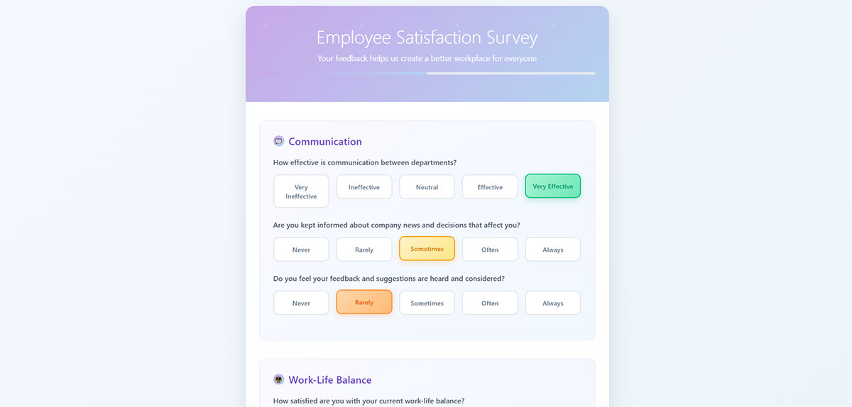
Group Related Fields
Field grouping organizes related information into logical sections using visual and semantic clustering. This organizational pattern reduces cognitive load and improves form completion efficiency on mobile devices.
Technical Specifications
- Input Type: Fieldset and legend elements or visual grouping with CSS
- Touch Target Size: Grouped fields maintain individual 44px minimum requirements
- Viewport Behavior: Groups optimize mobile screen space through logical organization
- Validation Method: Group-level validation provides contextual error feedback
User Experience Impact
Strategic field grouping creates measurable mobile form improvements:
- Completion rate improvements through reduced cognitive complexity
- Error reduction via logical information organization
- Task completion efficiency through clear section boundaries
- WCAG 2.1 AA compliance through semantic markup and clear organization
Mobile-Specific Considerations
- Screen Size Adaptation: Field groups accommodate single-column mobile layouts
- Touch Interaction: Related fields minimize touch point navigation requirements
- Keyboard Optimization: Logical grouping improves tab order and field progression
- Connectivity Impact: Organized sections enable progressive loading strategies
Related Form Elements
- Associated Input Fields: Group membership affects validation and submission logic
- Validation Patterns: Group-level feedback provides contextual error guidance
- Navigation Controls: Section progression follows logical information hierarchy
- Accessibility Features: Semantic grouping improves screen reader navigation
Implementation Requirements
- HTML fieldset and legend elements for semantic field grouping
- CSS visual grouping with borders, backgrounds, or spacing
- Responsive design considerations for mobile group layout
- Form accessibility testing for proper group announcement
Clear Error Messages
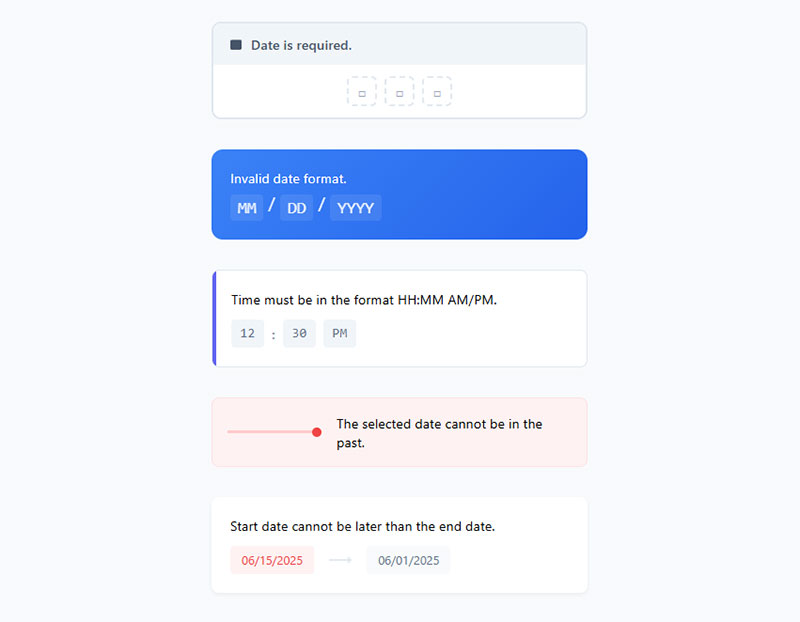
Clear error messaging provides specific, actionable feedback for form validation failures. Effective error communication reduces user frustration and guides successful form completion on mobile devices.
Technical Specifications
- Input Type: Inline error text with clear problem identification and solution guidance
- Touch Target Size: Error messages display without disrupting touch target accessibility
- Viewport Behavior: Error states remain visible during virtual keyboard interaction
- Validation Method: Real-time error display coordinates with validation timing
User Experience Impact
Strategic error messaging significantly improves mobile form completion:
- Completion rate improvements through clear problem resolution guidance
- Error reduction via specific validation feedback and correction instructions
- Task completion confidence through supportive error communication
- WCAG 2.1 AA compliance through descriptive error identification and guidance
Mobile-Specific Considerations
- Screen Size Adaptation: Error messages fit within constrained mobile viewport space
- Touch Interaction: Error correction requires minimal additional touch points
- Keyboard Optimization: Error feedback remains visible during virtual keyboard display
- Connectivity Impact: Client-side error messaging reduces server validation roundtrips
Related Form Elements
- Associated Input Fields: Error states affect field styling and interaction behavior
- Validation Patterns: Error messages coordinate with validation timing and logic
- Navigation Controls: Error states may prevent form progression until resolved
- Accessibility Features: Screen reader announcements for error state changes
Implementation Requirements
- ARIA live regions for dynamic error message announcements
- CSS error state styling with sufficient color contrast ratios
- JavaScript error message timing and positioning logic
- Form error message content guidelines for clarity and actionability
Auto-Complete Support
Auto-complete functionality leverages browser and device capabilities to suggest and fill form data. HTML autocomplete attributes enable intelligent data entry assistance reducing typing effort on mobile devices.
Technical Specifications
- Input Type: HTML autocomplete attribute with standardized values (name, email, address-line1, etc.)
- Touch Target Size: Auto-complete suggestions maintain accessibility during dropdown display
- Viewport Behavior: Suggestion dropdowns accommodate virtual keyboard constraints
- Validation Method: Auto-completed data integrates with standard validation processes
User Experience Impact
Strategic auto-complete implementation creates substantial mobile efficiency gains:
- Completion rate improvements through reduced typing requirements
- Error reduction via standardized data format suggestions
- Task completion acceleration through intelligent input assistance
- WCAG 2.1 AA compliance through enhanced input accessibility
Mobile-Specific Considerations
- Screen Size Adaptation: Auto-complete dropdowns optimize limited mobile screen real estate
- Touch Interaction: Suggestion selection requires accessible touch targets
- Keyboard Optimization: Auto-complete reduces virtual keyboard usage requirements
- Connectivity Impact: Browser-stored data reduces network dependency for common inputs
Related Form Elements
- Associated Input Fields: Auto-complete settings coordinate across related form sections
- Validation Patterns: Suggested data works with existing validation logic
- Navigation Controls: Auto-complete affects field-to-field progression efficiency
- Accessibility Features: Screen reader compatibility with auto-complete suggestions
Implementation Requirements
- HTML autocomplete attribute specification with standardized values
- Progressive enhancement for browsers without auto-complete support
- CSS styling for auto-complete dropdown integration
- Testing across mobile browsers for consistent suggestion behavior
Logical Tab Order
Logical tab order establishes predictable keyboard navigation sequences through form elements. This accessibility-critical pattern ensures form controls receive focus in intuitive progression matching visual layout and user expectations.
Technical Specifications
- Input Type: Sequential keyboard navigation through all interactive form elements
- Touch Target Size: Tab order complements touch target accessibility without modification
- Viewport Behavior: Focus indicators remain visible during virtual keyboard interactions
- Validation Method: Tab sequence integrates with validation feedback timing and positioning
User Experience Impact
Strategic tab order implementation creates fundamental mobile accessibility improvements:
- Completion rate improvements for keyboard and assistive technology users
- Error reduction through predictable navigation patterns
- Task completion efficiency via logical field progression
- WCAG 2.1 AA compliance through structured keyboard accessibility
Mobile-Specific Considerations
- Screen Size Adaptation: Tab order accommodates responsive layout changes across breakpoints
- Touch Interaction: Focus indicators coordinate with touch-based navigation methods
- Keyboard Optimization: External keyboard support for mobile devices with accessibility needs
- Connectivity Impact: Client-side focus management reduces server dependencies
Related Form Elements
- Associated Input Fields: Tab order encompasses all focusable form controls systematically
- Validation Patterns: Focus management integrates with error state navigation
- Navigation Controls: Tab sequence includes form progression and submission elements
- Accessibility Features: Screen reader navigation follows logical tab order progression
Implementation Requirements
- HTML source order matching visual layout for natural tab progression
- CSS positioning considerations maintaining logical focus sequence
- JavaScript focus management for dynamic content and custom widgets
- Accessibility testing with keyboard-only navigation and screen readers
Remove Unnecessary Fields
Field elimination focuses on essential data collection by removing non-critical form inputs. Strategic field reduction addresses mobile form completion barriers while maintaining business requirements and lead quality.
Technical Specifications
- Input Type: Systematic evaluation and removal of optional or redundant form fields
- Touch Target Size: Fewer fields allow optimal spacing for remaining interactive elements
- Viewport Behavior: Reduced field count minimizes scrolling and viewport management
- Validation Method: Simplified validation logic with fewer potential failure points
User Experience Impact
Strategic field elimination creates significant mobile conversion improvements:
- Completion rate improvements up to 50% through reduced cognitive load
- Error reduction via simplified form complexity and validation requirements
- Task completion acceleration through streamlined data entry processes
- WCAG 2.1 AA compliance through reduced cognitive complexity requirements
Mobile-Specific Considerations
- Screen Size Adaptation: Fewer fields optimize limited mobile screen real estate utilization
- Touch Interaction: Reduced touch points minimize potential interaction errors
- Keyboard Optimization: Shorter forms require less virtual keyboard usage
- Connectivity Impact: Smaller forms improve loading performance on mobile networks
Related Form Elements
- Associated Input Fields: Remaining fields receive priority positioning and enhanced usability
- Validation Patterns: Simplified error handling with focused validation requirements
- Navigation Controls: Shorter forms may eliminate need for progress indicators
- Accessibility Features: Reduced complexity improves cognitive accessibility compliance
Implementation Requirements
- Business requirement analysis distinguishing essential versus optional data collection
- A/B testing protocols measuring conversion impact of field reduction
- Lead scoring methodology adjustments accounting for reduced initial data capture
- Progressive profiling strategies for gathering additional information over time
Use Smart Defaults
Smart defaults pre-populate form fields with intelligent suggestions based on user context, location, or previous interactions. This optimization reduces typing effort while accelerating form completion on mobile devices.
Technical Specifications
- Input Type: Pre-filled form fields using contextual data, geolocation, or user preferences
- Touch Target Size: Default values maintain standard input field accessibility requirements
- Viewport Behavior: Pre-populated fields integrate seamlessly with mobile form layouts
- Validation Method: Default values work with standard validation processes and error handling
User Experience Impact
Strategic default implementation creates measurable mobile efficiency advantages:
- Completion rate improvements through reduced manual data entry requirements
- Error reduction via accurate pre-populated information and formatting
- Task completion acceleration through intelligent field pre-filling
- WCAG 2.1 AA compliance through enhanced input assistance and accessibility
Mobile-Specific Considerations
- Screen Size Adaptation: Default values optimize mobile screen space utilization effectively
- Touch Interaction: Pre-filled fields reduce required touch interactions significantly
- Keyboard Optimization: Smart defaults minimize virtual keyboard usage requirements
- Connectivity Impact: Geolocation and context data may require network requests
Related Form Elements
- Associated Input Fields: Default values coordinate across related form field groups
- Validation Patterns: Pre-populated data integrates with existing validation logic
- Navigation Controls: Smart defaults affect field-to-field progression efficiency
- Accessibility Features: Default values enhance screen reader user experience
Implementation Requirements
- Geolocation API integration for location-based field pre-filling
- User preference storage and retrieval systems for personalized defaults
- Business logic implementation for context-appropriate default value selection
- Privacy considerations ensuring user consent for data usage in smart defaults
FAQ on Mobile Form Best Practices
What’s the optimal touch target size for mobile form elements?
Touch targets should be minimum 44px × 44px following Apple’s Human Interface Guidelines. Material Design recommends 48px × 48px for optimal accessibility.
Larger targets reduce user errors and improve form completion rates significantly on smartphones and tablets.
Should I use single-column or multi-column layouts for mobile forms?
Single-column layouts consistently outperform multi-column designs on mobile devices. Users complete linear forms 15.4 seconds faster than multi-column alternatives.
The top-to-bottom flow feels natural and reduces form abandonment rates substantially.
How many form fields should mobile forms contain?
Minimize required fields to essential information only. Reducing fields from 4 to 3 can boost conversion rates by 50%.
However, context matters. Some longer forms with proper design convert better than poorly optimized short ones.
What input types work best for mobile form optimization?
Use HTML5 input types like email, tel, number, and date. These trigger appropriate virtual keyboards automatically.
Native date pickers eliminate typing errors while email inputs display @ symbols, improving user experience dramatically.
How should I handle form validation on mobile devices?
Implement real-time validation with inline feedback. Mobile users prefer immediate error correction over submission-time validation.
Display clear error messages near problematic fields without disrupting the overall form layout or touch targets.
Are progress indicators necessary for mobile multi-step forms?
Yes, progress indicators reduce anxiety and improve completion rates up to 300% for longer processes.
Use visual progress bars or step counters. Clear progression feedback encourages users to continue through multi-step forms effectively.
Should submit buttons be sticky or inline on mobile?
Sticky submit buttons work well for longer forms, ensuring constant submission access. However, avoid conflicts with iOS Safari gestures.
For shorter forms, inline placement at the bottom follows user expectations and natural reading patterns.
How do I optimize mobile forms for accessibility?
Maintain logical tab order, use descriptive labels, and ensure sufficient color contrast ratios.
Screen reader compatibility requires proper semantic markup while keyboard navigation needs clear focus indicators throughout the form.
What’s the best approach for mobile form error messages?
Use specific, actionable error messages that explain the problem and solution clearly.
Position errors near relevant fields with ARIA live regions for screen reader announcements. Avoid generic messages like “Invalid input.”
How can I reduce mobile form abandonment rates?
Eliminate unnecessary fields, use auto-complete features, and implement smart defaults based on user context.
Consider conditional logic to show relevant fields only, reducing perceived complexity and cognitive load significantly.
Conclusion
Implementing effective mobile form best practices transforms user interactions from frustrating obstacles into seamless conversion opportunities. The strategies covered here directly impact your bottom line through improved completion rates and reduced abandonment.
Touch-friendly design with 44px minimum targets creates immediate usability improvements. Native input types and auto-complete functionality reduce typing effort significantly on virtual keyboards.
Progressive enhancement through multi-step workflows and smart defaults guides users toward successful submissions. Real-time validation prevents errors while logical tab order ensures accessibility compliance across all devices.
The mobile-first approach isn’t optional anymore. Over 60% of form submissions now happen on smartphones and tablets, making responsive design critical for business success.
Remember that testing beats assumptions every time. What works for one audience might fail for another, so implement these practices systematically and measure results continuously.
Start with the biggest impact changes: eliminate unnecessary fields, implement single-column layouts, and add progress indicators for longer forms. These foundational improvements often deliver 50%+ conversion increases immediately.
Your forms should feel effortless, not like digital paperwork.

