

Most lead generation programs produce data. Few produce the right decisions from it. Knowing which lead generation KPIs to track is what separates teams that grow their pipeline with intention…
Table of contents
Your opt-in page lives or dies in three seconds.
That’s how long visitors take to decide if your offer matters. Most lead magnet landing page examples miss this completely. They bury the value proposition under generic headlines and cluttered designs that confuse rather than convert.
The difference between a 2% conversion rate and a 40% one? It’s not magic. Real landing page examples from successful campaigns show specific patterns in layout, copy, and form design that work consistently across industries.
This guide breaks down high-performing pages that actually generate subscribers. You’ll see what makes people stop scrolling and start typing their email addresses. More importantly, you’ll understand the psychology and structure behind each conversion-optimized element.
No theory. Just proven examples you can adapt today.
Lead Magnet Landing Page Examples
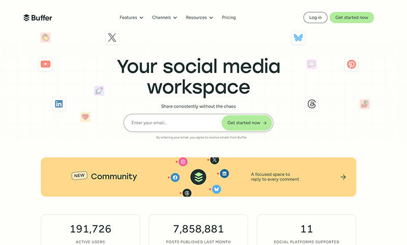
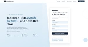
Buffer
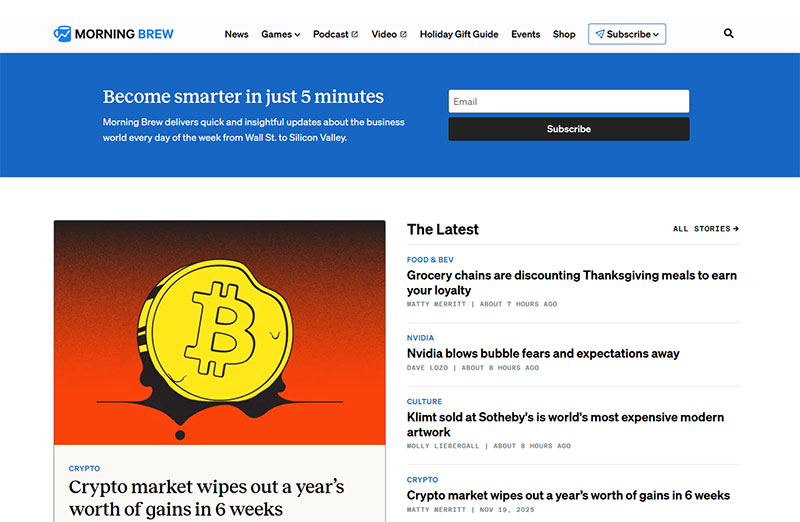
Morning Brew
Backlinko

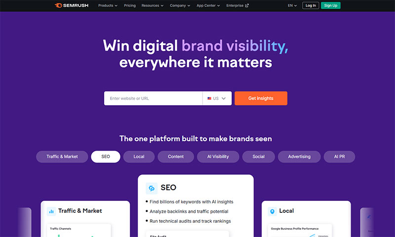
Semrush
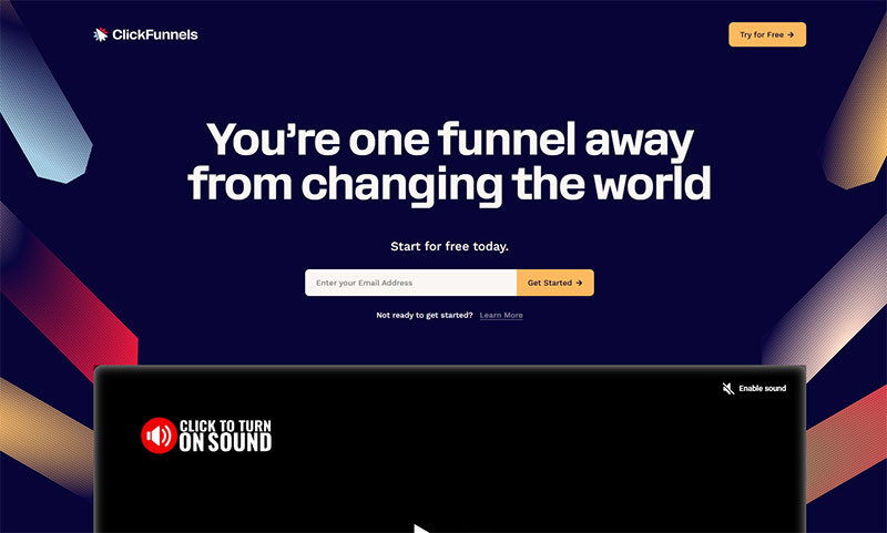
ClickFunnels
Copyblogger

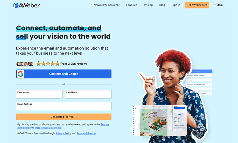
Aweber
Later

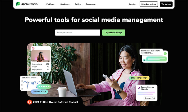
Sprout Social
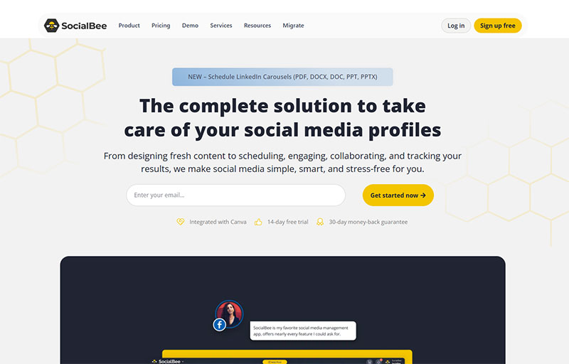
SocialBee
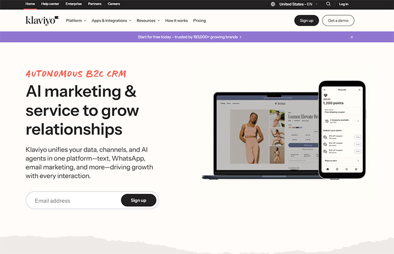
Klaviyo
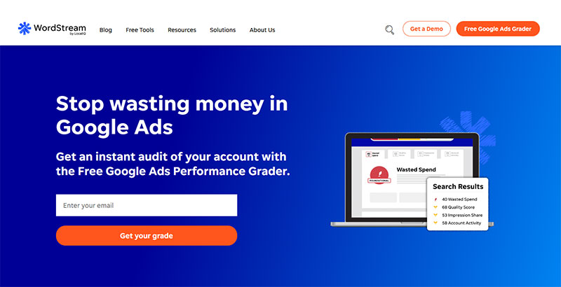
WordStream
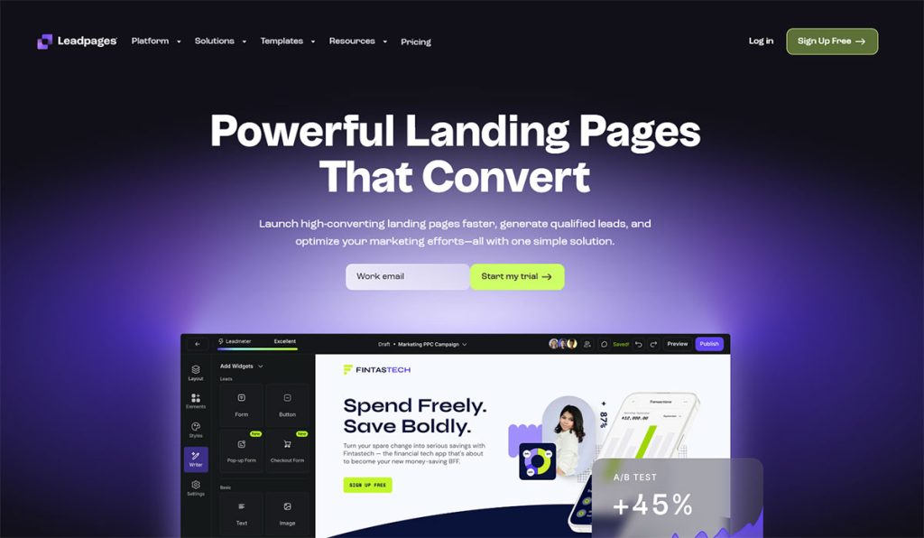
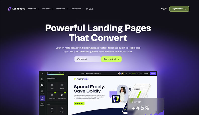
Leadpages
FAQ on Lead Magnet Landing Pages
What makes a lead magnet landing page different from a regular landing page?
A lead magnet page focuses exclusively on capturing email addresses in exchange for free content. Regular pages might promote products or services directly. The opt-in form is the only conversion goal, with minimal navigation and distraction-free design that pushes one action.
How many form fields should a high-converting lead capture page include?
Three fields maximum works best for most industries. Name and email are standard. Adding a third field (like company name) drops conversion rates by 15-20% but improves lead quality. Test what matters more for your funnel.
Should I use a popup form or dedicated landing page for my lead magnet?
Dedicated pages convert 25-40% higher than popups for cold traffic. Popup forms work better for existing visitors who already trust you. Run both through your lead generation funnel and track which source produces better subscribers.
What’s the ideal length for landing page copy?
Long copy (400+ words) converts better when explaining complex offers or targeting skeptical audiences. Short copy (under 150 words) works for simple, obvious value propositions. Your headline and subheadline matter more than total word count anyway.
Do I need testimonials on a lead magnet page?
Yes, but only if they’re specific. Generic praise kills credibility. Real results with names, photos, and exact outcomes build trust signals. Skip testimonials entirely if you’re offering something genuinely free with zero commitment required.
How important is mobile optimization for lead capture pages?
Critical. Over 60% of opt-ins happen on mobile devices. Your landing page forms must load under three seconds and use large tap targets. Single-column layouts and thumb-friendly buttons are non-negotiable for mobile responsive design.
Should my lead magnet be gated or freely accessible?
Gate it. Freely available content generates zero email list growth. The exchange creates perceived value (people want what requires commitment). Use lead capture forms to deliver your resource and start nurturing relationships immediately.
What conversion rate should I expect from a lead magnet landing page?
Industry average sits around 20-30% for targeted traffic. Anything above 40% is exceptional. Below 15% signals problems with your value proposition, targeting, or page design. Track metrics in Google Analytics and run A/B tests to improve performance.
Can I use the same landing page template for different lead magnets?
Absolutely. Successful templates work because of structure, not uniqueness. Swap headlines, images, and copy while keeping proven layouts from tools like Unbounce or Leadpages. Test variations but don’t reinvent layouts that already convert well.
How do I reduce form abandonment on my opt-in page?
Remove unnecessary fields (each extra field costs 10-15% conversions). Add clear privacy statements below your form. Use form validation that shows errors inline, not after submission. Consider multi-step forms for complex offers requiring more information.
Conclusion
The lead magnet landing page examples in this guide aren’t templates to copy blindly. They’re frameworks that reveal what actually drives subscriber growth across different industries and audiences.
Your page needs clarity more than creativity. Visitors should understand your offer in seconds and know exactly what action to take next.
Start with one proven layout. Test different headlines and value propositions before redesigning everything. Small changes to your lead generation form fields or call-to-action button color often matter more than complete overhauls.
Track your conversion rates religiously. What works for SaaS companies might fail for ecommerce brands. Your audience tells you what resonates through their behavior, not their opinions.
Build your page around the promise your lead magnet delivers. Everything else is distraction.
The best landing pages feel inevitable, not clever. Focus on removing friction instead of adding features, and your email list will grow consistently without expensive paid traffic.
