



Most form tutorials show you what’s possible. This one shows you what actually works. The State of CSS 2024 survey puts Tailwind CSS at 62% developer usage. More teams are…
Table of contents
Most marketers building a new signup flow don’t start from a blank canvas. They pull up a handful of forms that already work, borrow the field order, steal the button copy, and adjust from there. That’s really what a lead generation form example is: a working reference, not a theory about what a form should look like.
Agencies do the same thing when a client asks for a demo request page, and SaaS teams do it building gated content offers and multi-step signups. The metric that actually matters when comparing these layouts isn’t traffic.
It’s completion rate, and FormAssembly’s 2025 analysis of 1.6 billion form interactions puts the baseline at a 68% completion rate across submitted forms. Every example on this page gets measured against that number.
What Is a Lead Generation Form
Fill one out and the same trade happens every time: contact information in exchange for something worth having, a demo, a discount code, a downloadable guide. That exchange is the entire point. Everything else, the field order, the button color, the number of steps, is just packaging around it.
This particular form sits inside a much wider category of web form types, though its actual job stays narrow. Grab a name, an email, maybe a phone number, and pass that person along to sales or marketing.
Strip away the industry and the offer and every version shares the same skeleton:
- A handful of input fields, usually name and email at minimum
- A call to action button with copy that names the benefit
- A privacy consent line or checkbox
- A connection to a CRM, spreadsheet, or email list on the back end
A contact form basically asks the visitor how it can help. A lead generation form flips that around and asks who the visitor even is, often before they’ve said a single word, which is a strange thing to ask if you think about it for more than a second.
The form itself is just the mechanism though. What happens around it, the actual practice of lead generation, covers the offer, the routing, and the follow-up sequence that kicks in the moment someone hits submit.
Types of Lead Generation Forms
The shapes these forms take are all over the place, though they tend to cluster into a handful of familiar patterns depending on how much you’re asking a stranger to give up.
A one-field popup collects almost nothing about someone. A ten-question quiz collects a lot, but only from someone patient enough to sit through the whole thing.
| Form Type | Best For | Strength | Weakness |
|---|---|---|---|
| Multi-step form | Demo requests, high-ticket offers | Splits a long ask into small steps | More engineering to build correctly |
| Gated content form | Whitepapers, guides, reports | Pre-qualifies interest before contact | Only works if the content earns the trade |
| Quiz funnel form | Coaches, consultants, personalized offers | Feels interactive, not transactional | Takes longer to build and test |
| Popup or exit-intent form | Newsletter signups, discount capture | Reaches visitors about to leave | Can annoy users if overused |
| Embedded form | Blog posts, product pages | Sits in context, low friction | Lower visibility than a popup |
BrokerNotes, a financial comparison site, rebuilt its enquiry form as a multi-step layout instead of a single page and watched its conversion rate move from 11% to 46%, according to Venture Harbour’s published case data. Roughly four times the leads, from an identical offer.
Gated content forms only work when what’s behind them is genuinely hard to find elsewhere. There’s a deeper breakdown of gated content as a strategy, including how to avoid gating something nobody actually wants badly enough to trade an email for.
Popups and exit-intent forms cause the most arguments out of the five, mostly because a badly timed one interrupts someone mid-read instead of catching a genuine exit. The mechanics behind exit-intent forms get into why the timing of the trigger matters more than whatever offer sits behind it.
Design Elements That Drive Conversions
Field count matters more than almost anything else on this list, though CTA copy and layout choices aren’t far behind it. None of it is complicated once you actually look at what’s driving the numbers, and none of it cares which of the five form types above you happen to be running.
Field Count and Form Length
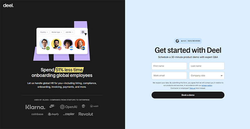
Image source: deel.com
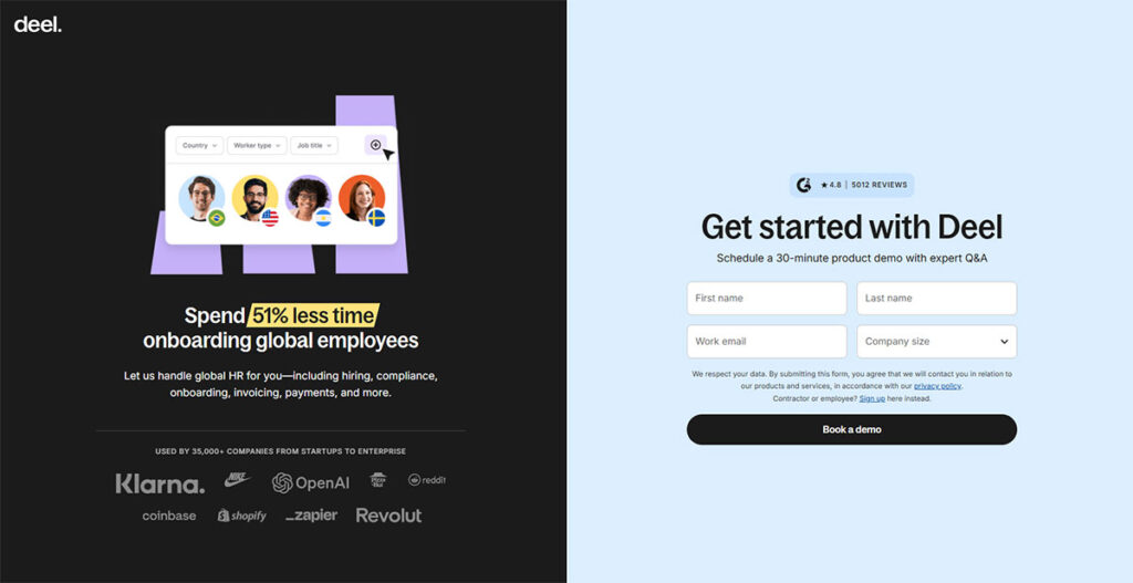
HubSpot ran the numbers on more than 40,000 landing pages and found forms with three fields converting at roughly 25%, with that number dropping sharply once a fourth field shows up.
Less friction, more submissions. There’s no secret trick buried in there, it’s really just that simple.
Three fields cover most first-touch offers, and they usually show up in this order:
- Name
- Work email
- Company, only when the offer is B2B
Picking the right three fields matters more than just hitting the number three. A closer look at which fields actually predict a good lead found that email domain and job title do more predictive work than a phone number ever does.
CTA Copy That Converts

Image source: KlientBoost
Specific copy beats generic copy, pretty much every time. “Submit” doesn’t tell a visitor anything about what’s waiting on the other side of that click.
- “Get My Free Quote” for services with variable pricing
- “Send Me the Guide” for gated content
- “Start My Free Trial” for SaaS signups
That pattern holds up across industries generally, though what works for a roofing company won’t look anything like what works for a SaaS trial page. Worth scanning a broader look at call to action phrasing across different form types before locking anything in.
Layout and Trust Signals
Single-column layout wins over multi-column almost every time. Fields stacked vertically read top to bottom the way people naturally scan anyway, so there’s less relearning involved.
Trust signals do a lot of quiet work closing the gap between someone reading a form and someone actually submitting it.
- A privacy line near the submit button, stating plainly what happens to the data
- A small security badge or lock icon for forms asking for anything sensitive
- Inline validation that flags an error the moment it happens, not after submission
None of this is decoration, really. Each piece answers some question the visitor’s already asking themselves before they’ll commit anything.
Free Form Conversion Rate Calculator
Best Form Placement for Lead Generation
Visitor intent decides this more than any design rule does. Someone who already knows exactly what they want needs the form somewhere close to the headline, not buried three scrolls down. Someone who’s still deciding is a different case entirely, and a sidebar or a triggered popup usually works better there.
Placement matters just as much as which type of form you picked in the first place. A gated content form sitting in a footer barely gets seen, no matter how good the offer behind it actually is.
Someone landing from a branded search or a paid ad has usually already made up their mind before they arrive. Put the form right where they land. Don’t make them hunt for it.
A look through a range of hero section layouts shows most of the high-converting ones keep the form visible without any scrolling, sitting right next to the headline.
Sidebar and footer forms play a different role entirely. They’re there to catch someone who isn’t ready yet, someone still reading, still weighing it.
Exit-intent popups convert an additional 2 to 4% of visitors into subscribers or leads, according to OptinMonster, triggering the instant a cursor moves toward the browser’s close button.
Storyly, a B2B content-experience platform, added an exit-intent popup to one of its product pages, redirecting visitors about to bounce toward its Contact Sales page or a related tutorial instead of just losing them to a closed tab. Its Contact Sales form saw an 80% higher conversion rate afterward, according to OptinMonster’s published case study.
A wider set of exit-intent popup examples shows this pattern holding up across ecommerce, SaaS, and publishing sites.
Placement has to survive a phone screen too. Desktop forms finish at 54.48% compared with 47.53% on mobile, a gap Zuko’s 2026 form analytics mostly blames on smaller tap targets and slower connections.
A form sitting pretty in a hero section on desktop can still fail completely on mobile if those fields end up below the fold once the screen shrinks down. Test it on an actual phone. A resized browser window doesn’t count.
Lead Generation Form Examples by Industry
Industry changes the shape of these forms more than almost anything covered so far. A SaaS signup wants almost nothing. A real estate inquiry wants a lot more, mostly because the follow-up conversation depends on it.
SaaS and B2B
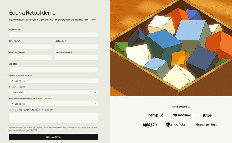
Image source: Retool.com
SaaS signup forms ask for as little as they can get away with, usually just a work email, sometimes tacking on a name and a password.
Dropbox’s own signup form asks for an email, a first and last name, and a password, and leaves everything else to the onboarding flow that follows once someone’s actually inside the product.
Enterprise B2B forms ask for more, since a sales team needs some qualifying detail before that first call ever gets booked. What fields show up depends on company size, budget authority, and use case, and that’s exactly what a form built around SaaS lead generation has to account for.
Real Estate and Ecommerce
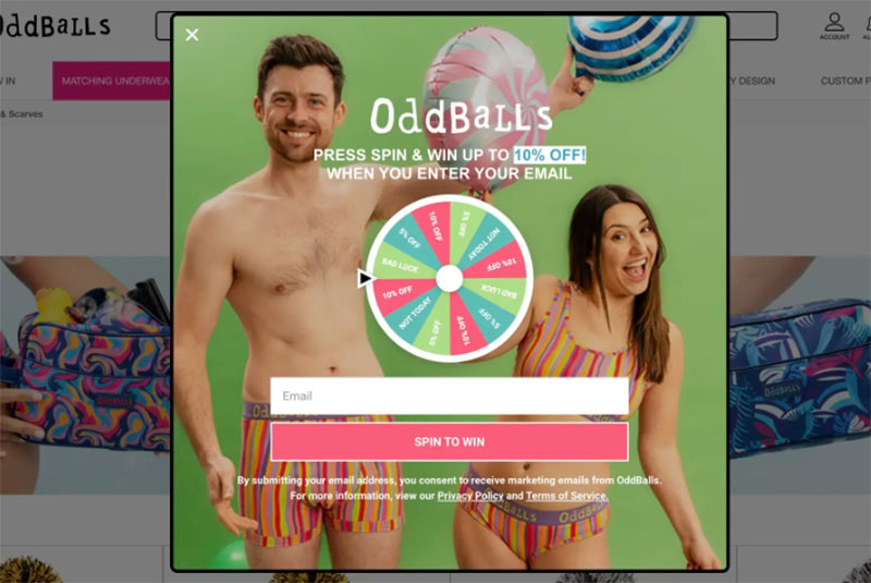
Image source: OddBalls
Field counts swing hard depending on the vertical.
| Industry | Common Form Type | Typical Field Count |
|---|---|---|
| Real estate | Property inquiry form | 4 to 6 fields, plus location |
| Ecommerce | Discount or newsletter form | 1 to 2 fields |
| Events | Registration form | 5 to 8 fields |
| B2B services | Gated content form | 3 to 4 fields |
Real estate forms carry location fields that most other industries skip entirely. Which neighborhood someone’s asking about changes the entire follow-up conversation, so it has to be captured somewhere.
A property inquiry form built around real estate lead generation usually pairs a short form with an immediate phone follow-up rather than just dropping someone into an email drip and hoping.
Ecommerce runs the opposite direction entirely. A ten percent discount code needs almost nothing beyond an email address to fire off.
Events and Webinars

Image source: Marie Forleo
Event registration forms land somewhere in the middle of the two extremes above. They need a name and an email at minimum, plus whatever logistics the event actually requires:
- Ticket type or session selection
- Date or time slot, when multiple options exist
- Company name, for B2B conferences tracking attendee lists
Webinars trim even that down. No physical logistics to plan around means webinar signups usually run shorter than anything happening in person.
Short Form Versus Long Form
Cold traffic responds better to short forms almost every time, there’s just not enough trust built up yet to ask for much. Long forms flip that script on high-cost purchases, where extra fields end up pre-qualifying a lead before any salesperson wastes time on a call.
The industry patterns above really just boil down to this same tension. Fewer fields on one side, more qualifying detail on the other.
Venture Harbour’s own consulting inquiry form moved from a 0.96% conversion rate to 8.1% after switching from one long page to a multi-step layout, a 743% increase using the exact same fields and the exact same traffic.
Nothing about the actual offer changed there. Just how it got presented.
Progressive profiling is the middle path most people don’t think to try. Grab an email on the first visit, then come back for job title or company size once some trust already exists.
Deciding between formats really comes down to how many fields the offer actually needs. A closer look at multi-step versus single-step form performance breaks down exactly where that crossover point sits.
| Format | Fields | Best Use Case | Risk |
|---|---|---|---|
| Short single-step | 1 to 3 | Newsletter signups, discount capture | Under-qualified leads |
| Long single-step | 7 or more | High-cost, high-consideration offers | High abandonment before submit |
| Multi-step | 5 to 12, split across steps | Demo requests, quotes, applications | More build and QA effort |
Formstack’s own platform data puts multi-step form conversion at 13.85% against 4.53% for single-step forms handling that same field count, which is a big enough gap to change how a form gets built from day one.
Long single-step forms carry the worst abandonment risk of the three, especially once you’re past the fifth field. There’s a dedicated piece on cutting form abandonment that covers fixes that don’t require rebuilding the whole thing from scratch.
Best Lead Generation Form Builder Tools
Which builder actually works best comes down to whatever platform a team’s already living inside. Someone deep in a CRM stack wants something different than someone running a scrappy WordPress site with a page builder bolted on.
Multi-step layouts and progressive profiling both depend on what the builder can actually pull off out of the box, and that narrows the realistic options fast.
HubSpot’s form builder is drag-and-drop and plugs directly into HubSpot’s own CRM, so a submitted lead lands in a contact record without needing some Zapier connection stitched in between.
Unbounce built its whole product around landing pages first, forms second, which fits teams pouring a lot of paid traffic into single-purpose pages.
Typeform shows one question at a time in that conversational format everyone recognizes now, and it tends to raise completion specifically on longer forms.
OptinMonster is built purpose-first for popup and exit-intent campaigns rather than standalone contact pages, so it’s a bit of a mismatch if that’s not what you need.
JotForm and Gravity Forms sit on the lighter end. Gravity Forms in particular lives natively inside WordPress and handles conditional logic without needing extra plugins bolted on.
Conditional logic decides which fields even show up based on some earlier answer, and it’s worth understanding before committing to a tool. A closer look at WordPress form builders with conditional logic covers which platforms handle branching well and which ones fake it with clunky workarounds.
| Tool | Best For | Native Integration |
|---|---|---|
| HubSpot | Teams already on HubSpot CRM | Built-in CRM sync |
| Unbounce | Paid traffic landing pages | Landing page and form combined |
| Typeform | Conversational, longer forms | Zapier, Mailchimp, Google Sheets |
| Gravity Forms | WordPress sites needing logic | Native WordPress plugin |
Plugin choice matters even more on WordPress specifically, since whatever builder gets picked has to actually work inside an existing theme and page builder setup. A wider comparison of WordPress lead generation plugins covers pricing tiers and template libraries in more depth than fits here.
How to Build a High-Converting Lead Generation Form
Whatever builder tool ends up handling the technical side, the same handful of decisions decide whether the form actually performs once it’s live.
- Define the single goal of the form before picking a single field. A demo request and a newsletter signup should never share the same form.
- Choose fields in order of sensitivity, easy questions first, anything like phone number or budget saved for last.
- Write the call to action around the outcome, not the action. “Book My Free Consultation” beats “Submit” on almost every test run.
- Connect the form to a CRM or email tool and confirm the data actually lands somewhere the sales team can see it.
- Submit a real test entry and check that the thank you page, the confirmation email, and the CRM record all fire correctly.
Empire Flippers rebuilt its multi-step business valuation form with clickable buttons and a visible progress bar. Conversions rose 51.6% within 47 days, with nothing about the actual offer changed.
Step two is where most teams trip up, since the instinct is always to ask for everything up front. A deeper look at designing lead capture forms covers how to order fields so the easy ones build some momentum before the harder ones show up.
Step three deserves more attention than it usually gets too. A wider set of examples on landing page form best practices shows how CTA wording shifts depending on where the form actually sits on the page.
Common Mistakes That Cause Form Abandonment
A handful of small decisions account for most of the abandonment that happens on forms, and they show up again and again across totally different industries.
Security worries drive more of it than almost anything else on this list. 29% of users cite worry about how their data will be used as the reason they left a form unfinished, based on a Formisimo and Zuko analysis of 93 million sessions.
- Marking a field mandatory when the information is nice to have, not need to have, like forcing a company name or job title before anyone will let you move forward.
- Leaving off a progress indicator, which makes a long form feel endless even when it genuinely isn’t.
- Auto-advancing a multi-step screen the second someone clicks a radio button, before they’ve actually decided they’re ready to move on.
- Using a free-text box where a dropdown or radio button would work faster and cause fewer typing errors in the first place.
Missing inline validation belongs on this list too, honestly. Someone who only discovers a typo in their email address after hitting submit is a lot more likely to just leave than to come back and fix it.
A field-by-field breakdown of how error messages should read covers wording that keeps someone moving instead of getting them frustrated and bailing.
Timing matters just as much as the wording itself. A closer look at form validation best practices covers when to validate on blur versus waiting until submit.
Making Lead Generation Forms Compliant
Compliance for one of these forms isn’t just a GDPR checkbox and calling it done. More than one regulation has a stake in how the fields get built, and skipping any of them creates real exposure, not just some theoretical risk sitting in a legal memo somewhere.
| Regulation | Applies To | Key Form Requirement |
|---|---|---|
| GDPR | EU visitors | Unchecked opt-in checkbox, clear consent wording |
| CCPA | California visitors | Visible link to data access and deletion rights |
| WCAG | Screen reader and keyboard users | Linked labels on every field |
GDPR consent has to default to opt-in. The checkbox sits unchecked until a visitor actually goes and ticks it themselves, not the other way around.
Regulators don’t treat this lightly either. The CNIL, France’s data protection regulator, fined SHEIN 150 million euros in September 2025 after finding cookies were being set before consent was given, and that its reject-all option didn’t always even work.
A step-by-step approach to building GDPR compliant forms covers consent wording, data retention limits, and what actually counts as a valid opt-in.
CCPA takes a different approach entirely. No opt-in checkbox required, just a visible link explaining a California visitor’s right to know what got collected and to ask for it to be deleted.
Accessibility gets a lot less attention than privacy law does, even though it carries its own legal risk. Missing form labels showed up on 48.2% of homepages analyzed in WebAIM’s 2025 Million report, making it one of the most common accessibility failures found anywhere on the web.
A screen reader can’t announce a field it can’t identify. Every input needs an actual linked label, not a placeholder that disappears the second someone starts typing.
A closer look at form accessibility best practices covers label structure, focus order, and how error announcements should work for screen reader users.
How to Measure Lead Generation Form Performance
Conversion rate is the metric that actually matters here, everything else exists to explain why that number looks the way it does. Session recordings and A/B tests are the layer that comes after, not instead of it.
A conversion rate by itself just tells you what happened. It doesn’t tell you why, which is the part that actually matters if you’re trying to fix something.
A few current numbers worth having on hand:
- Median landing page conversion rate: 6.6% across all industries, based on 464 million visits to 41,000 pages (Unbounce, 2024 Conversion Benchmark Report)
- Average cost per lead from Google Ads: $70.11, alongside a 7.52% average conversion rate (WordStream by LocaliQ, 2025 benchmark report)
- Average website conversion rate: 5.13% across 13 industries, drawn from more than 110 million sessions (Ruler Analytics, 2026)
Conversion rate doesn’t mean anything without a tracking setup behind it first. Most teams wire form submissions into Google Analytics as a goal or event, then check that number against whatever traffic source brought the visitor in.
A walkthrough of tracking form submissions in Google Analytics covers the exact event setup, since a misconfigured goal will quietly report a false number for months without anyone noticing.
Session recording tools like Hotjar and Crazy Egg show where someone’s cursor actually pauses, backtracks, or gives up on the form entirely.
A/B testing platforms like Optimizely and VWO turn that observation into something you can actually test, changing one field or one line of copy at a time to see what really moves the number.
A field count change is worth testing before jumping straight to a full redesign. A practical rundown of increasing form conversions covers which single-variable tests tend to pay off the fastest.
When Lead Generation Forms Do Not Work
There are a handful of situations where no amount of design polish saves a lead generation form, because the problem sits upstream of the form itself entirely.
- Cold traffic where nobody’s heard of the brand yet, so there’s no real reason to trade contact details before any value’s been proven.
- High-intent transactional pages, where someone ready to book a call converts better through a direct scheduling link than a form that adds one more step in the way.
- Slow mobile connections, where a flow that already asks too much only gets worse once load times stretch past a couple of seconds.
- No clear value exchange, where the offer itself isn’t something anyone actually wants enough to trade an email for, no matter how the form around it looks.
Calendly and similar scheduling tools solve the transactional case pretty directly, letting someone just pick a time instead of sitting around waiting on a follow-up email that may or may not show up quickly.
Conversational formats solve a different piece of this problem. A direct comparison of chatbots vs forms covers where a chat interface genuinely outperforms a static field, and where it just adds one more decision for the visitor to make.
Multi-step forms carry their own failure mode too, worth mentioning here. Splitting a three-field newsletter signup into three separate screens adds clicks without removing any real friction, which is kind of the opposite of the entire point.
A closer look at where multi-step forms hurt more than they help covers the specific offer types where the format actually backfires.
FAQ on Lead Generation Forms
What is the difference between a lead generation form and a contact form?
Contact forms wait. They sit there with an open message field until a visitor decides to say something. A lead generation form doesn’t wait for anything, it offers something specific up front and asks for a name and email before any actual conversation has even started.
What happens to lead data after a form is submitted?
It routes into a CRM or an email tool, usually through some native integration or a Zapier connection stitched together in the background. By the time a salesperson actually looks at the record, most setups have already fired off a confirmation email and dropped the contact into a nurture sequence.
Is Google Forms good enough for lead generation?
For basic collection, sure. Google Forms doesn’t do native CRM sync, doesn’t do conditional logic, and doesn’t do much for branded design either. It’s fine for a quick survey or some internal request form, but most businesses outgrow it fast once lead volume picks up or the field logic needs to get any more complex.
Do popups convert better than embedded forms?
Neither one wins outright, honestly. A popup form catches attention and reaches people right as they’re about to leave. An embedded form sits quietly in context and feels a lot less intrusive doing it.
Which one’s right just depends on where the visitor actually is in their decision.
Should a lead form require a phone number?
Only when a phone call is genuinely the next step, something like a home service quote or a real estate inquiry. Content downloads and newsletter signups are a different story: a phone field there just adds friction without adding any useful data, and abandonment climbs because of it.
What Should You Fix First in Lead Generation Form Examples?
Most underperforming examples share the same early mistake. The offer and field count get finalized after launch instead of before it, while all the attention meant for the offer itself gets spent on layout and copy instead.
Fixing three things in order closes most of the performance gap:
- Offer and field count
- Placement and CTA copy
- Compliance and tracking setup
Fixing the offer first costs a slower initial read, worth knowing going in. Layout changes show some visible bump within days, while offer and field changes need a full traffic cycle before they show up in the conversion rate at all.
Reviewing a dedicated set of landing page form layouts is the natural next step for seeing these same field-count and placement ideas applied across full page designs.