

Gallup’s 2024 data shows only 31% of U.S. employees feel engaged at work. Annual surveys can’t catch that kind of decline fast enough. Pulse surveys can. These short, frequent questionnaires…
Table of Contents
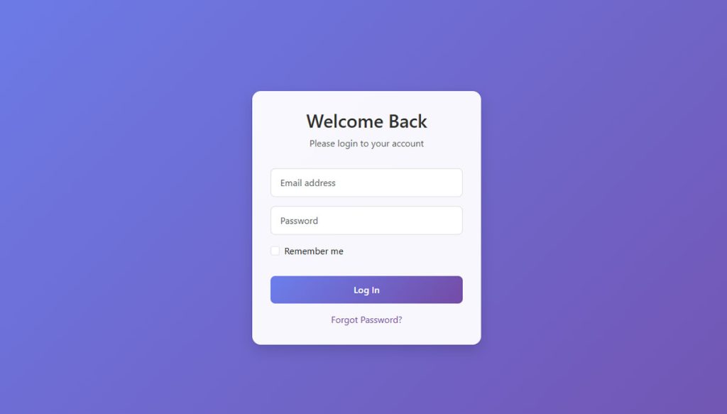
A login form is the first thing users interact with on most web apps. Get it wrong, and they leave before they even start. Bootstrap login forms examples give you tested patterns that work across screen sizes without writing custom CSS from scratch.
Bootstrap 5 handles responsive layouts, form validation states, and component styling out of the box. But choosing the right login form layout for your project takes more than copying a template from a tutorial.
This guide covers ready-to-use patterns, from basic centered cards and floating labels to dark mode themes, split-screen layouts, social sign-in buttons, and multi-step login flows. Each example includes the specific Bootstrap classes and HTML structure you need, plus the accessibility and responsive details most tutorials skip.
What Is a Bootstrap Login Form
A Bootstrap login form is a user authentication interface built with the Bootstrap CSS framework. It uses Bootstrap’s built-in classes, grid system, and component library to create responsive sign-in pages without writing custom CSS from scratch.
Think of it as a shortcut. Instead of styling every input field, button, and layout container by hand, you get pre-built components like .form-control, .form-label, and .btn-primary that handle most of the heavy lifting.
The baseline HTML structure is simple: an email or username input, a password input field, a submit button, and optionally a “remember me” checkbox. That’s the skeleton. Everything else is layout and polish.
Bootstrap 4 vs. Bootstrap 5 matters here. Bootstrap 5 dropped jQuery as a dependency, renamed several classes (goodbye .form-group, hello spacing utilities), and introduced floating labels natively. If you’re copying a login form template from a tutorial, check the version first. Class names that worked in Bootstrap 4 won’t always carry over.
W3Techs data shows that roughly 17.5% of all websites globally use Bootstrap. That’s millions of sites relying on the same form components you’re about to use. The framework’s grid system (.container, .row, .col-md-6) makes centering a login card on any screen size almost effortless.
Bootstrap login forms differ from generic HTML login forms in one key way. Standard HTML forms need custom CSS for every visual detail. Bootstrap gives you consistent, cross-browser styling out of the box, plus responsive behavior that adapts from desktop to mobile without extra media queries.
If you’ve worked with other types of forms before, you’ll notice that login forms are among the simplest to build. Two fields, one button, maybe a link. But getting the layout, validation states, and responsive behavior right is where most people trip up.
Examples Of Bootstrap Login Forms
As promised, here are examples of bootstrapped login forms I’ve handpicked for you:
Generic bootstrap login form examples
See the Pen
Modern Bootstrap Form Collection – Login, Contact, Newsletter & Checkout by Bogdan Sandu (@bogdansandu)
on CodePen.
General examples of bootstrap forms
See the Pen
Modern Form Collection V2 – Auth, Profile, Support & Settings by Bogdan Sandu (@bogdansandu)
on CodePen.
Simple example
See the Pen
Simple Login Form With Bootstrap 5 by indeveloper.id (@indeveloper)
on CodePen.
Common bootstrap login form example
See the Pen
Bootstrap Login page by Yinka Enoch Adedokun (@YinkaEnoch)
on CodePen.
Well-designed, modern example
See the Pen
Bootstrap Login Page by Emre Berber (@emreberber)
on CodePen.
Funny bootstrap login form example
See the Pen
Login Form (Using Bootstrap) by dvrrajashekhar (@rajashekhar90)
on CodePen.
#2 Common bootstrap login form example
See the Pen
Bootstrap 5 Login Form Template Page by aniketrod (@aniketrod)
on CodePen.
Bootstrap login form with background
See the Pen
Another Login by Peeyush Gupta (@Peeyush200)
on CodePen.
Blue login form
See the Pen
Bootstrap Login Page Card with Floating Labels by Braytiner (@braytiner)
on CodePen.
Colorful example
See the Pen
Simple Bootstrap Login Form by Coding League (@coding-league)
on CodePen.
Responsive Behavior and Common Layout Mistakes
Building a Bootstrap login form that looks good on desktop is easy. Keeping it from breaking on a 320px-wide phone screen is where people run into trouble.
The Fixed-Width Mistake
The most common error: using a hardcoded width on the form container instead of responsive column classes. Something like width: 400px works fine on desktop and then overflows on any phone smaller than an iPhone 12.
The fix: Use .col-12 .col-sm-8 .col-md-6 .col-lg-4 on the form wrapper. The form takes full width on mobile, then progressively narrows as the viewport grows. No fixed pixel values needed.
Baymard Institute found that 61% of mobile sites don’t use the correct keyboard layout for form fields. On a login form, that means making sure the email input uses type="email" (triggers the @ keyboard) and the password uses type="password".
Padding and Margin Issues
A card that looks perfectly centered on desktop can smash into the screen edges on mobile. The fix is almost always missing padding.
- Add
.px-3to the row or container on small screens - Use
.p-4on the card body so content doesn’t touch the card edges - Apply
.my-5to the outer container for vertical breathing room
Testing Checklist
Minimum viewport widths to test: 320px (iPhone SE), 375px (standard iPhone), 768px (iPad), 1024px (small laptop). If the form works at all four, you’re covered for roughly 95% of devices in real-world traffic.
Check the form at exactly 768px, where Bootstrap’s md breakpoint triggers. Columns reflow at this point, and it’s where most layout bugs surface. Also verify that mobile form elements like buttons and inputs have adequate tap target sizes (at least 44x44px per WCAG guidelines).
Accessible Bootstrap Login Forms
The 2025 WebAIM Million analysis found that 94.8% of the top million homepages had detectable WCAG 2 failures. Forms are a consistent problem area. Login forms, despite being simple, regularly fail basic accessibility checks.
Required ARIA Attributes
aria-describedby: Links an input to its error message element. When validation fails, a screen reader announces both the field label and the error text.
aria-required=”true”: Tells assistive technology that the field must be completed. The HTML required attribute handles this natively in most browsers, but adding the ARIA version ensures wider screen reader coverage.
aria-live=”polite”: Add this to any container whose content changes dynamically (like validation messages appearing after form submission). Without it, screen readers won’t announce new error text.
Label Association
Every input needs a <label> with a matching for attribute. No exceptions, even on login forms where the layout seems “obvious” to sighted users.
If the design calls for hidden labels (floating label patterns, for instance), use Bootstrap’s .visually-hidden class. This keeps the label in the DOM for screen readers while hiding it visually. Never use display: none or visibility: hidden on labels. Both remove them from the accessibility tree entirely.
Keyboard Navigation and Color Contrast
Tab order should flow logically: email field, password field, “remember me” checkbox, submit button, “forgot password” link. If the tab order jumps around or skips elements, something in your HTML structure is wrong.
| Element | WCAG AA Minimum Ratio | Common Failure Point |
| Form labels | 4.5:1 | Light gray on white backgrounds |
| Placeholder text | 4.5:1 | Bootstrap’s default placeholder is too light |
| Error messages | 4.5:1 | Red text on dark backgrounds |
| Focus indicators | 3:1 | Overridden by custom CSS resets |
Bootstrap’s default placeholder text color (#6c757d) on a white background gives a contrast ratio of about 4.6:1. That barely passes WCAG AA for normal text. On dark mode backgrounds, the same color fails. Always test placeholder contrast when switching between light and dark themes.
Building accessible web forms isn’t optional anymore. With 8,800 ADA Title III complaints filed in 2024 (a 7% increase from the prior year, per AudioEye), the legal risk of ignoring accessibility is real and growing. A login form is often the first interaction a user has with your product. Making it accessible from the start is both the right call and the practical one.
FAQ on Bootstrap Login Forms Examples
What is a Bootstrap login form?
A Bootstrap login form is a sign-in interface built with the Bootstrap CSS framework. It uses pre-built classes like .form-control, .card, and the grid system to create responsive login pages without writing custom CSS.
How do I center a login form in Bootstrap 5?
Wrap the form in a .container with a .row using .justify-content-center. Place the card inside a .col-md-6 or .col-lg-4 column. Add .vh-100, .d-flex, and .align-items-center for full vertical centering.
How do floating labels work in Bootstrap login forms?
Use the .form-floating wrapper in Bootstrap 5. The input element must come before the label in the HTML. A placeholder attribute is required on the input, even though it won’t display visually.
Can I add social login buttons to a Bootstrap form?
Yes. Place Google, GitHub, or Facebook buttons above or below the email and password fields. Use .btn-outline-dark for Google-style buttons and separate them from the main form with a visual “or” divider built with flex utilities.
How do I create a dark mode login form in Bootstrap?
In Bootstrap 5.3+, add data-bs-theme="dark" to the form’s parent element. For older versions, manually apply .bg-dark and .text-light classes, then override .form-control background and border colors with custom CSS.
What is client-side form validation in Bootstrap?
Bootstrap provides built-in validation styling through the .needs-validation class and novalidate attribute. After submission, JavaScript adds .was-validated, which triggers .is-invalid borders and displays .invalid-feedback error messages below each field.
How do I make a Bootstrap login form responsive?
Use responsive column classes like .col-12 .col-sm-8 .col-md-6 .col-lg-4 instead of fixed widths. Add .px-3 padding on mobile to prevent the form from touching screen edges. Test at 320px, 375px, 768px, and 1024px widths.
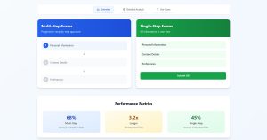
How do I build a multi-step login form with Bootstrap?
Create two <div> containers inside one form. Toggle visibility using Bootstrap’s .d-none class with JavaScript. Add a .progress-bar component above the form to show which step the user is on.
What makes a Bootstrap login form accessible?
Every input needs a <label> with a matching for attribute. Add aria-describedby to link inputs with error messages. Use .visually-hidden for hidden labels instead of display: none, which removes them from the accessibility tree.
What is the difference between Bootstrap 4 and Bootstrap 5 login forms?
Bootstrap 5 dropped jQuery as a dependency and removed .form-group. It introduced native floating labels, the data-bs-theme attribute for dark mode, and updated spacing utilities that replace several Bootstrap 4 class names.
Conclusion
These Bootstrap login forms examples cover the patterns that actually get used in production. Centered cards, floating labels, dark mode themes, split-screen layouts, social sign-in buttons, and multi-step flows. Each one solves a specific design problem.
Start with the basic centered card layout. It works on every device and takes minutes to build with Bootstrap 5’s grid system and utility classes.
Then layer in what your project needs. Add data-bs-theme=”dark” for dark mode support. Use .form-floating for compact mobile layouts. Drop in client-side validation with the .needs-validation` class.
Don’t skip accessibility. Every input needs a label. Every error message needs an ARIA link to its field. Screen reader users hit login forms just like everyone else.
Pick a pattern, test it at 320px and 1024px, and ship it. You can always refine from there.
