

Your login form is the first real interaction users have with your product. Get it wrong and they bounce. Get it right and they barely notice it exists. These examples…
Table of contents
Most free trial pages fail. Not because the product is bad, but because the page itself doesn’t do its job.
The difference between a SaaS trial page that converts at 2% and one that hits 15% often comes down to specific design and copy decisions. Headline structure, CTA placement, form layout, social proof positioning. Small choices with measurable impact.
This breakdown covers free trial landing page examples from companies like Shopify, Semrush, HubSpot, Salesforce, and ClickUp. Each one is analyzed for what actually works, what doesn’t, and why their approach fits their product.
You’ll also find the specific page components, trial offer types, and signup flow patterns that separate high-converting pages from the ones people bounce off in three seconds.
What Is a Free Trial Landing Page
A free trial landing page is a standalone web page built to convert visitors into trial users by promoting a time-limited or feature-limited product experience at no cost. It focuses on one action: getting the signup.
Unlike a homepage or a general landing page, a free trial page strips away navigation menus, sidebars, and competing links. Everything points toward the signup form.
SaaS companies like Shopify, HubSpot, and Semrush use these pages as their primary acquisition channel. Fitness apps, streaming platforms, and cybersecurity tools do the same.
Four trial models exist:
- Time-based trials give full access for a set period, typically 7, 14, or 30 days. Unbounce runs a 14-day version.
- Feature-limited trials restrict certain tools while keeping the trial open-ended.
- Freemium upgrade trials let users access a basic plan free, then trial premium features for a limited window.
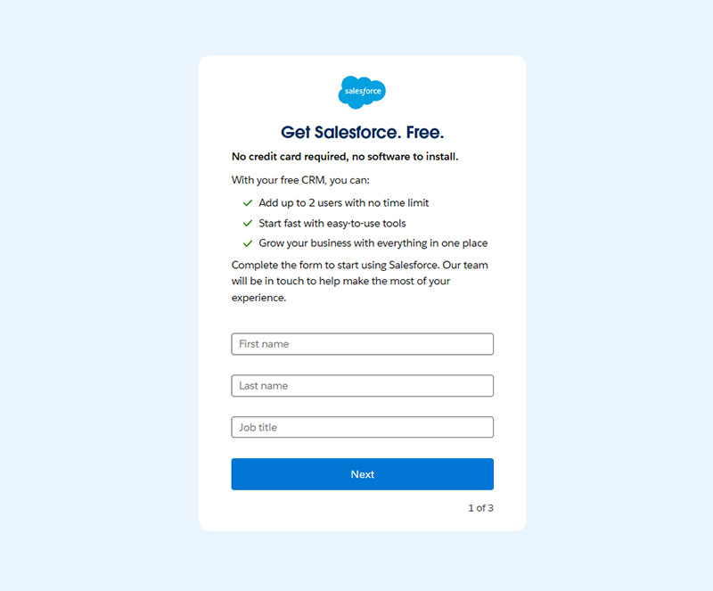
- Credit-card-required trials ask for payment details upfront. Lucidchart does this. Salesforce does not.
The model you pick depends on product complexity, average contract value, and how much hand-holding your users need before they see value.
How a Free Trial Landing Page Converts Visitors Into Users
The conversion mechanics are straightforward. One page, one goal, zero distractions.
Analysis of 41,000 landing pages shows the median conversion rate sits at 6.6%. A visitor lands on the page, reads the headline, scans the social proof, and either fills out the signup form or leaves. That’s it.
The entire page exists to reduce the gap between “I’m curious” and “I’m in.”
The hero section carries most of the weight. A clear headline, a subheadline that states the benefit, and a high-contrast CTA button sitting above the fold.
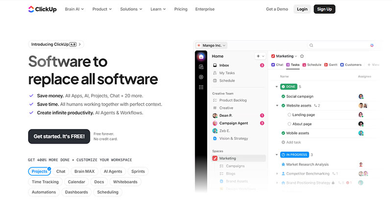
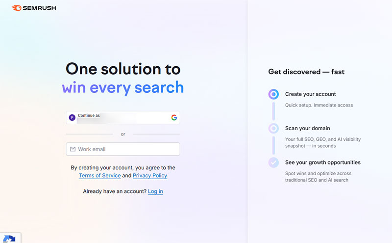
Semrush pairs an orange CTA button against a white background. ClickUp puts “No credit card required” directly next to theirs. Both choices reduce hesitation at the exact moment it matters.
Research from Unbounce shows landing pages with 5 or fewer form fields convert 120% better than longer forms.
Signup form design affects completion rates more than most teams realize. Leadpages asks for a name, email, and password. Zendesk runs a nine-step registration flow with a progress bar.
The right approach depends on your product.
Form field optimization matters:
- HubSpot’s analysis of 40,000 forms found conversion rates increase by nearly 50% when fields drop from 4 to 3
- Each additional field beyond 5 can reduce conversions by 8-50%, according to industry research
- Average form submission rate across all industries: 4.14% for standard landing pages
For low-complexity tools, fewer form fields win. For enterprise software with longer sales cycles, more qualifying questions can actually improve lead quality.
Free trial conversion benchmarks by model:
First Page Sage data from 86 SaaS companies (2022-2025) shows clear patterns. Opt-in trials (no credit card) convert 18.2% of visitors to paid customers. Opt-out trials (credit card required) hit 48.8% conversion from organic traffic.
CRM tools lead industry conversions at 29%, while HR software reaches 22.7%.
The happy path in UX terms means the lowest-friction route from landing to value. Every element on the page either shortens that path or it shouldn’t be there.
Landing page copy and readability:
Unbounce research reveals pages written at 5th-7th grade reading level convert at 11.1%. College-level writing converts at just 5.3%, a 109% difference.
Attention spans dropped from 2.5 minutes in 2004 to 47 seconds in 2024, making simple copy critical.
Implementation checklist:
- Test your current form field count (aim for 3-5 fields maximum)
- Add social proof above the fold (testimonials appear on 36% of top performers)
- Simplify copy to 5th-7th grade reading level
- Place CTA button in high contrast color
- Include trust signals (“No credit card required” or privacy statements)
- Use progress indicators for multi-step forms
- Test opt-in vs opt-out trial models based on your customer segment
Performance tracking table:
| Metric | Baseline | Good | Excellent |
|---|---|---|---|
| Landing page conversion | 6.6% | 10% | 15%+ |
| Trial signup (opt-in) | 8.5% | 12% | 18%+ |
| Trial signup (opt-out) | 2.5% | 5% | 8%+ |
| Trial-to-paid (opt-in) | 18% | 25% | 40%+ |
| Trial-to-paid (opt-out) | 49% | 60% | 75%+ |
Mobile users account for 82.9% of landing page traffic but desktop visitors convert at higher rates. Make sure forms work flawlessly on both.
Email traffic converts 77% better than paid search visitors. Landing pages with embedded video can increase conversions by 86%.
What Makes a High-Converting Free Trial Landing Page
Conversion doesn’t come from one clever trick. It comes from every element on the page working together toward the same outcome.
The pages that perform best share specific patterns in how they handle headlines, social proof, CTA buttons, and form length. Here’s what actually moves the numbers.
How Does a Headline Affect Free Trial Signups
Benefit-driven headlines outperform feature-driven ones. Shopify’s trial page leads with what you can do, not what the software includes.
Research shows well-written headlines can increase conversion rates by 307%. Value-focused headlines improve conversions by 27% compared to generic messaging.
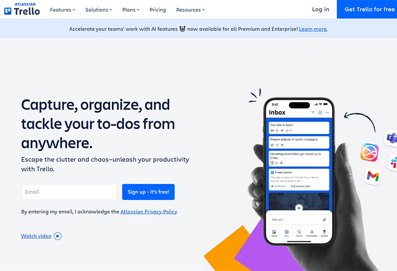
Trello mentions the trial length directly in the headline, which sets expectations immediately and cuts bounce rates.
Headline testing delivers results:
- Average 9% lift from headline tests according to CRO data
- Benefit-driven copy outperforms feature lists by 27%
- 70% of visitors decide whether to stay within 8 seconds
Why Does Social Proof Matter on a Free Trial Page
Testimonials, customer logos, and user count claims reduce perceived risk. ClickUp places star ratings and review counts right next to the CTA button.
According to industry research, 93% of consumers say online reviews impact their purchase decisions. B2B buyers exhibit similar behavior, with 88% trusting reviews as much as personal recommendations.
Jasper AI features ratings from multiple review platforms in a sticky bar that follows you down the page.
Social proof conversion impact:
- Testimonials on sales pages increase conversions by 34%
- Video testimonials boost conversion rates by 80% over text
- B2B companies implementing comprehensive social proof see 10-270% conversion improvements
- Products with 5+ reviews are 270% more likely to be purchased
- 92% of consumers hesitate to buy without reviews
Real-time social proof notifications boost conversions by 98%. Sales pages with testimonials convert 34% better than those without.
What Role Does the CTA Button Play in Free Trial Conversions
Color contrast between the button and background is non-negotiable. Semrush uses orange on white. ExpressVPN uses a bold green.
Adobe research found high-contrast CTA buttons improve visibility by 50%. Color contrast can increase clicks by 50% when done right.
Microcopy matters just as much. “Start free trial” performs differently than “Try it free.”
CTA optimization benchmarks:
- Personalized CTAs convert 42% more visitors than generic ones
- Action-oriented verbs increase conversions by 20%
- Switching “your” to “my” (e.g., “Start my free trial”) can boost conversions by 90%
- Placing CTAs after testimonials increases conversions by 25%
- Above-the-fold CTAs boost engagement by 84%
Adding “No credit card required” directly below the button removes a major objection before it forms.
Marker.io runs a dual CTA approach with both “Start a Free Trial” and “Book a Demo” on the same page, which works because both actions serve lead generation.
How Does Form Length Impact Free Trial Signup Rates
Fewer fields generally mean higher completion rates for self-serve products. Baremetrics offers Google, Apple, and Xero prefill options alongside a manual form with just five fields.
Landing pages with 5 or fewer fields convert 120% better than longer forms. Each additional field beyond 5 can reduce conversions by 8-50%.
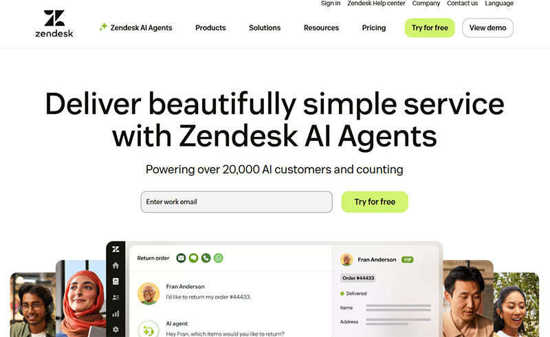
Zendesk takes the opposite approach with nine registration steps, but adds a progress bar and green checkmarks to keep users moving forward.
Form optimization data:
- HubSpot analysis of 40,000 forms: conversions increase 50% when fields drop from 4 to 3
- Average form completion rate: 38% across all contact forms
- Multi-step forms can increase conversions by 30% despite having more total fields
- Forms with progress indicators reduce abandonment
- Mobile-friendly forms increase tap-through rates by 42%
When deciding between multi-step forms or single-step forms, test both. Product complexity should guide that decision, not assumptions.
Implementation tracking table:
| Element | Test This | Good Performance | Excellent |
|---|---|---|---|
| Headline | Value vs features | 9% lift | 27%+ lift |
| Social proof placement | Near CTA vs footer | 14% lift | 34%+ lift |
| CTA contrast ratio | 3:1 minimum | 4:1 ratio | 7:1+ ratio |
| Form fields | 3-5 fields | 38% completion | 50%+ completion |
| Video testimonials | Text vs video | 80% lift | 150%+ lift |
Test one element at a time. Changing button color boosted conversions 21% in HubSpot’s tests, but what matters is contrast with your specific design. CTA A/B testing delivers an average 28% performance improvement for consistent testers.
Best Free Trial Landing Page Examples
Each example below is ranked on five criteria: signup friction reduction, CTA clarity, trust signal placement, conversion-focused form design, and overall user experience flow.
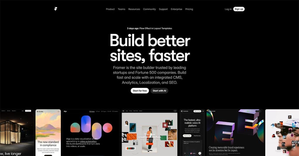
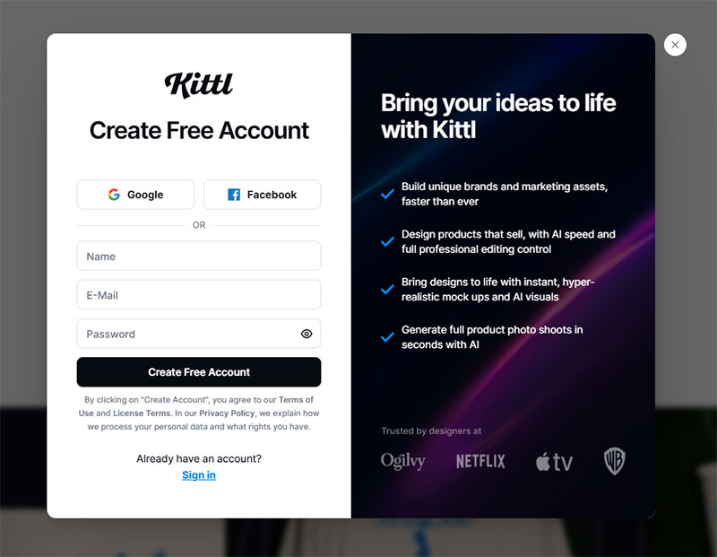
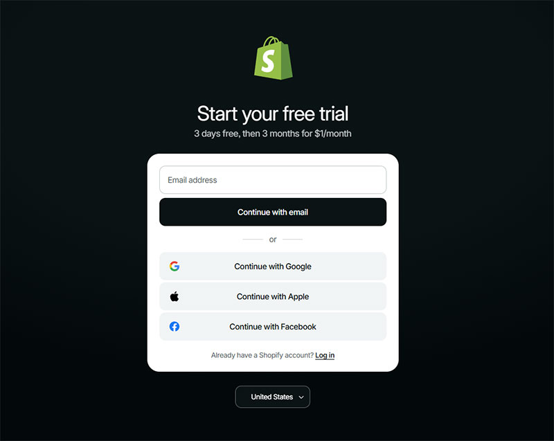
Shopify
Semrush
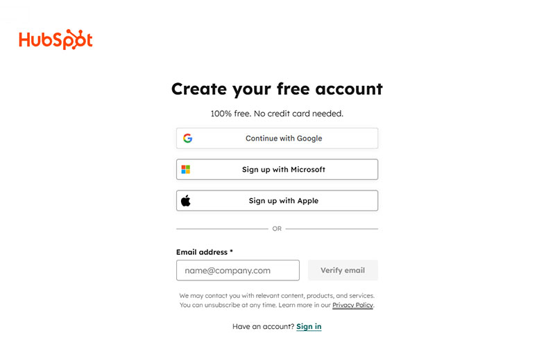
HubSpot
Salesforce
ClickUp
Zendesk
Trello
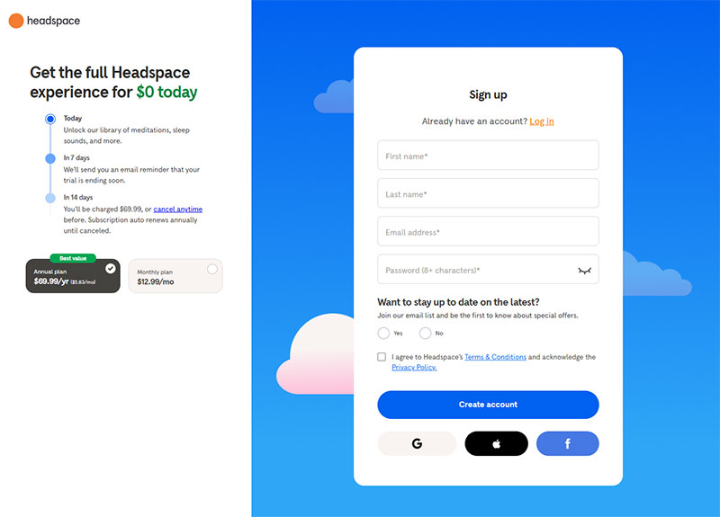
Headspace
What Are the Different Types of Free Trial Offers
Not every free trial works the same way. The structure of the offer changes how users engage with your product and how likely they are to convert to paid.
Time-based trials give full product access for a fixed window. Unbounce offers 14 days. Hootsuite gives 30. Wistia gives 14 with a guided setup flow.
Research from the University of Washington shows 7-day trials outperform longer periods. Their field experiment with 337,724 users found 7-day trials beat 30-day trials by 5.6% in conversions, 6.4% in retention, and 7.9% in revenue.
This model works best when the product delivers clear value within the first week.
Trial length performance data:
- 7-14 day trials with urgency cues outperform 30-day trials by 71%
- Shorter trials (7-14 days) convert 20% better than 30+ day trials according to Gartner
- Trials under 7 days yield 40.4% conversion rate
- Trials over 61 days drop to 30.6% conversion
- 50% of conversions happen within 14 days regardless of trial length
Feature-limited trials keep the door open indefinitely but lock premium features. Lucidchart shows you what you’re missing on the plan selection screen before you even start.
Users can see the upgrade path from day one.
Freemium-to-trial upgrades let users sit on a free plan, then offer a limited trial of paid features. Canva and Notion both use this approach.
First Page Sage data (2022-2025) from 86 SaaS companies shows freemium models convert differently than trials:
- Freemium visitor signup rate: 13.3% organic, 15.9% paid
- Freemium-to-paid conversion: 2.6% organic, 2.8% paid
- Free trial converts at 3-5x higher rates than freemium
- Freemium works for products with network effects
It works for products where the free version is genuinely useful on its own.
Credit-card-required trials filter for serious buyers. Lucidchart asks for payment at step 3 of 3. Salesforce and HubSpot skip the card entirely.
Opt-in vs opt-out conversion benchmarks:
| Model | Visitor Signup | Trial-to-Paid | Notes |
|---|---|---|---|
| Opt-in (no card) | 8.5% organic | 18.2% | Higher volume, lower quality |
| Opt-out (card required) | 2.5% organic | 48.8% | Lower volume, higher quality |
| Freemium signup | 13.3% organic | 2.6% to paid | Volume play |
Requiring a card lowers signup volume but often increases trial-to-paid conversion rates.
Data from First Page Sage shows opt-out trials convert at 48.8% compared to 18.2% for opt-in trials. That’s a 168% difference in conversion rate.
Industry-specific trial conversion rates:
- CRM platforms: 29% trial-to-paid (highest)
- HR software: 22.7%
- AdTech: 24.3%
- Healthcare: 21.5%
- IoT: 25.2%
- Enterprise software: 18.6% (lowest)
Choosing the right model comes down to your price point and product complexity.
Decision framework:
Low-cost, self-serve tools ($10-50/month) benefit from:
- 7-14 day opt-in trials
- No credit card requirement
- Maximize signup volume
- Target conversion: 18-25%
High-ticket enterprise software ($500+/month) can afford:
- 14-30 day opt-out trials
- Credit card required upfront
- Lower volume, higher quality leads
- Target conversion: 40-60%
Complex products with long learning curves work better with 21-30 day trials. Simple tools should stick to 7-14 days to create urgency.
Achievement-based upgrade prompts (triggered by user actions) convert 258% higher than calendar-based “trial ending” emails. Every 10-minute delay in time-to-first-value costs roughly 8% in conversion.
Mobile apps with trials lasting 5-32 days convert at 44-45%, while 1-4 day trials see only 30% conversion. The sweet spot for most SaaS products remains 7-14 days with strong onboarding.
FAQ on Free Trial Landing Pages
What is a free trial landing page?
A free trial landing page is a standalone page designed to convert visitors into trial users. It focuses on a single action, the signup, and removes distractions like navigation menus or competing links. SaaS companies like HubSpot and Shopify use them as primary acquisition pages.
How long should a free trial last?
Most SaaS products offer 7, 14, or 30-day trials. Unbounce uses 14 days. Hootsuite gives 30. The right length depends on how quickly users reach the product’s core value. Complex tools need longer windows.
Should a free trial page require a credit card?
It depends on your goal. No-card trials like Salesforce’s increase signup volume. Card-required trials like Lucidchart’s lower volume but improve trial-to-paid conversion rates. High-ticket products can afford the friction. Self-serve tools usually cannot.
What makes a free trial landing page convert well?
A clear headline, minimal form friction, strong social proof near the CTA, and a single focused goal. Pages from Semrush and ClickUp convert well because every element supports one action: starting the trial.
How many form fields should a free trial signup have?
For self-serve products, three to five fields work best. Baremetrics uses five plus social login options. Zendesk uses nine steps with a progress bar for enterprise buyers. Match field count to product complexity and buyer expectations.
What is the difference between a free trial page and a demo page?
A free trial page lets users access the product directly. A demo page schedules a sales call or guided walkthrough. Semrush offers trials. Ahrefs pushes demos. Some companies like Marker.io run both CTAs on the same page.
Do free trial landing pages need social proof?
Almost always. Customer logos, testimonials, and review ratings reduce perceived risk. ClickUp places star ratings next to the CTA button. Adobe is the exception, relying on brand recognition alone. Most companies aren’t Adobe.
What CTA text works best on a free trial page?
“Start free trial” and “Try it free” are the most common. Adding microcopy like “No credit card required” below the button removes objections. ExpressVPN and ClickUp both use this pattern with measurable impact on click-through rates.
Can a free trial page have more than one CTA?
Yes, if both CTAs serve lead generation for SaaS. Marker.io uses “Start a Free Trial” alongside “Book a Demo” on the same page. Both capture leads at different intent levels. Test before committing to dual CTAs.
What trial model works best for SaaS products?
Time-based trials with full feature access convert best for most SaaS products. Feature-limited trials work when the free version has standalone value, like Canva or Notion. Freemium-to-trial upgrades suit products with a strong free tier already in place.
Conclusion
The free trial landing page examples covered here, from Shopify’s minimal approach to Zendesk’s multi-step registration flow, all prove one thing. Conversion comes from alignment between page design, trial model, and product complexity.
A/B testing your headline, CTA button contrast, and signup form length will move the numbers more than any redesign. Stripe-connected payment pages, Google Analytics 4 event tracking, and heatmap tools like Hotjar give you the data to back every decision.
Don’t copy what Adobe or HubSpot does without understanding why it works for their specific audience. Enterprise CRM software and meditation apps play by completely different rules.
Pick one element from these examples. Test it against your current page. Measure the trial activation rate after 30 days. That’s how good landing page forms get built, one tested change at a time.