
The first message a user sees after creating an account sets the tone for everything that follows. Get it wrong, and you lose them at the exact moment they’re most…
Table of contents
Your login form is the first real interaction users have with your product. Get it wrong and they bounce. Get it right and they barely notice it exists.
These examples of Bootstrap login forms cover every major layout pattern in use today, from basic single-column forms to split-screen designs, modal overlays, card-centered layouts, and forms with social login buttons.
Each example includes working Bootstrap 5 code, class-level explanations, and notes on when each pattern fits best. You will also find guidance on form validation, background image setups, free template sources, and WCAG accessibility requirements.
What Is a Bootstrap Login Form?
A Bootstrap login form is an HTML authentication form built using Bootstrap’s grid system, utility classes, and pre-styled components. It uses built-in classes like form-control, btn, and card to produce a responsive, cross-browser-consistent login UI without writing custom CSS from scratch.
Bootstrap handles responsiveness at the layout level. The grid system uses a 12-column structure with breakpoint classes (col-sm-*, col-md-*, col-lg-*) so the login form adapts automatically to mobile, tablet, and desktop screen sizes.
As of 2024, Bootstrap is used by 77.5% of all websites that use a known CSS framework (Quora, June 2024). That dominance comes down to practicality: developers get a complete component library with zero design decisions required upfront.
Over 40,000 companies use Bootstrap, including Spotify, LinkedIn, and Udemy (Stackshare). For authentication UIs specifically, Bootstrap provides everything needed out of the box:
- form-control: styles text, email, and password inputs uniformly across browsers
- btn and btn-primary: styled submit buttons with hover and focus states
- card and card-body: containers for centering the login form on a page
- was-validated and is-invalid: built-in validation state classes with error feedback
Bootstrap 5.3 is the current stable release (August 2025). New projects should use Bootstrap 5, not Bootstrap 4, since Bootstrap 4 no longer receives feature updates.
Bootstrap 4 vs Bootstrap 5 for Login Forms
The 3 structural differences that affect login form code directly are the removal of form-group, the replacement of data-toggle with data-bs-toggle, and the removal of the jQuery dependency.
| Feature | Bootstrap 4 | Bootstrap 5 |
|---|---|---|
| Input wrapper class | form-group |
mb-3 (utility class) |
| Modal trigger attribute | data-toggle="modal" |
data-bs-toggle="modal" |
| JavaScript dependency | Requires jQuery | Vanilla JS only |
| Floating labels | Not supported | Supported via form-floating |
| RTL support | Not built-in | Built-in |
Key point: if you’re working from a Bootstrap 4 template and copying the code into a Bootstrap 5 project, replace every form-group with mb-3 and every data-toggle with data-bs-toggle. That covers 90% of the migration work for a login form.
What Are the Main Types of Bootstrap Login Forms?
There are 4 main Bootstrap login form types used in production: basic login forms, modal login forms, split-screen login forms, and card-centered login forms. Each uses a different layout structure and fits different project contexts.
Choosing the wrong layout for your context is a common mistake. A full-page split-screen form is great for a SaaS marketing page. It looks completely out of place in an admin panel.
| Type | Layout Structure | Best For |
|---|---|---|
| Basic | Single column, stacked inputs | Simple apps, quick prototypes |
| Modal | Overlay dialog triggered from page | Navbar login, no page redirect |
| Split-screen | Two columns: image + form | SaaS landing pages, B2B portals |
| Card-centered | Centered card on background | Admin dashboards, internal tools |
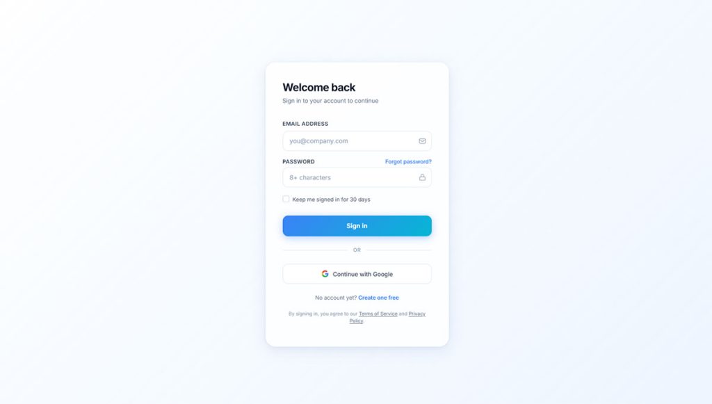
Basic Login Form
See the Pen
Clean Bootstrap 5 Login Form by Bogdan Sandu (@bogdansandu)
on CodePen.
The most minimal pattern. A single-column layout with email input, password input, submit button, and an optional “remember me” checkbox.
Bootstrap 5 classes used: container, form-label, form-control, mb-3, btn btn-primary w-100.
No custom CSS required. Good for prototypes and internal tools where design polish is secondary to speed of build.
Modal Login Form
The login form sits inside a modal-body wrapper and is triggered by a button or navbar link. The user never leaves the current page.
Trigger structure: data-bs-toggle="modal" on the button + data-bs-target="#loginModal" pointing to the modal’s ID.
This pattern works well for content sites where guests browse freely but need to log in for premium features. The form loads inline without a redirect.
Split-Screen Login Form
Two equal columns using col-md-6 on each side. The left column holds branding content or imagery. The right holds the form. Both columns stack vertically on mobile.
Platforms like Notion and Linear use split-screen login layouts. The left side reinforces product value while the right side handles authentication. This layout needs min-height: 100vh added via inline CSS since Bootstrap alone doesn’t stretch columns to full screen height.
Card-Centered Login Form
See the Pen
Card-Centered Login Form with Bootstrap 5 by Bogdan Sandu (@bogdansandu)
on CodePen.
A card component centered both vertically and horizontally using d-flex justify-content-center align-items-center on the outer wrapper. The most common pattern in admin templates.
AdminLTE, SB Admin 2, and CoreUI all default to this layout for their authentication pages. Width is controlled with w-100 on the card plus a max-width inline style (typically 400px).
What Does a Basic Bootstrap Login Form Look Like?
A basic Bootstrap 5 login form uses 5 core components: a container for centering, form-label elements for input labels, form-control for styled inputs, mb-3 for spacing, and btn btn-primary for the submit button.
Here’s a working Bootstrap 5 basic login form:
See the Pen
Bootstrap 5 Login Form – Full-Bleed Hero with Frosted Glass Card by Bogdan Sandu (@bogdansandu)
on CodePen.
What Each Class Does
container + row + col-md-4: centers the form to one-third of the page width on medium screens and up. On smaller screens, it falls back to full width.
form-label: adds display: block and bottom margin to labels. Importantly, linking each label to its input via matching for and id attributes is required for screen reader compatibility.
form-control: applies padding, border, border-radius, and focus ring to the input. Focus ring color follows Bootstrap’s default blue but can be overridden with CSS custom properties.
autocomplete attributes: autocomplete="email" and autocomplete="current-password" are not Bootstrap-specific, but they are required for password managers to work. Leave these out and you’ll get frustrated users. Worth noting: 65% of users will abandon forms that create unnecessary friction (Userzoom).
Responsive Behavior
The col-md-4 class makes the form occupy 4 of 12 columns on medium screens (768px+). On mobile, it fills 100% width automatically since no col-xs-* class is set.
Swap col-md-4 for col-md-5 or col-lg-4 depending on your layout. There is no single correct column width. It depends on your surrounding content.
What Does a Bootstrap Modal Login Form Look Like?
See the Pen
Bootstrap 5 Modal Login Form by Bogdan Sandu (@bogdansandu)
on CodePen.
A Bootstrap modal login form wraps the standard login inputs inside Bootstrap’s modal component. The form triggers on button click and overlays the current page without any navigation change.
Trigger and Structure
Two parts are required: a trigger button and the modal markup itself.
The trigger button uses data-bs-toggle="modal" and data-bs-target="#loginModal". The modal uses a matching id="loginModal" on the outer div.
Key Attributes to Get Right
modal-dialog-centered vertically centers the dialog in the viewport. Without it, the modal snaps to the top of the screen, which feels abrupt on larger monitors.
aria-labelledby on the outer modal div links to the modal-title element. Screen readers announce the modal title when it opens. Skip this and keyboard-only users get no context.
tabindex=”-1″ on the modal div keeps it out of the natural tab order until it opens. Bootstrap’s JavaScript moves focus into the modal automatically on open.
When to Use Modal Login vs Dedicated Page
Modal login works when users need to authenticate without losing their current context. A blog reader hitting a paywall mid-article benefits from a modal. A user starting a checkout flow needs a dedicated page.
Content-heavy sites like Medium and news publications commonly use this pattern. It keeps users on the content they were reading rather than bouncing them to a separate auth page.
What Does a Split-Screen Bootstrap Login Form Look Like?
See the Pen
Split-Screen Login Form with Bootstrap 5 by Bogdan Sandu (@bogdansandu)
on CodePen.
A split-screen Bootstrap login form uses a two-column grid layout where one column displays branding or imagery and the other contains the login inputs. Both columns sit side by side on desktop and stack vertically on mobile.
Grid Structure
The outer wrapper needs min-height: 100vh to fill the full screen. Bootstrap’s grid handles the column split.
CSS That Bootstrap Doesn’t Handle Alone
min-height: 100vh on the row is the one thing you always need to add manually. Bootstrap’s row has no default height, so without this the layout collapses to the height of its content.
Background images on the left panel require background-size: cover and background-position: center as inline styles or in a CSS file. Add a semi-transparent overlay div if the image makes text hard to read.
Where This Pattern Appears
SaaS companies use split-screen login heavily because the left panel gives them space to reinforce product value at the exact moment a user is returning. A UX study by Eleken on 200+ SaaS products found split-screen and centered card layouts are the 2 dominant login patterns across the category.
B2B portals and enterprise dashboards favor it over other layouts for the same reason: the left panel can display a company logo, a dashboard preview, or a short value statement without crowding the form itself.
What Does a Card-Centered Bootstrap Login Form Look Like?
A card-centered Bootstrap login form places the login inputs inside a card component, which is then centered both horizontally and vertically in the viewport using flexbox utility classes. This is the most common login layout in admin templates and internal dashboards.
Admin Templates That Use This Pattern
AdminLTE, SB Admin 2, and CoreUI all default to the card-centered layout for their authentication screens. These are 3 of the most downloaded Bootstrap admin templates on GitHub, with AdminLTE alone exceeding 43,000 GitHub stars.
The pattern is popular for internal tools because it’s clean and fast to implement. No image assets, no extra CSS files, no JavaScript beyond Bootstrap’s defaults.
Controlling Card Width
max-width: 400px is the standard starting point. Narrower than 360px and the inputs start feeling cramped on mobile. Wider than 480px and the card looks sparse on desktop.
The w-100 class on the card ensures it fills its parent container on small screens. The max-width inline style caps it on larger screens. Both are needed together.
Shadow and Background
Bootstrap’s shadow-sm adds a subtle box shadow that lifts the card off a light background. For a darker background, shadow or shadow-lg increases the depth effect. The background color on the outer wrapper is set with an inline style here, but a utility class like bg-light works equally well.
What Does a Bootstrap Login Form with Social Login Buttons Look Like?
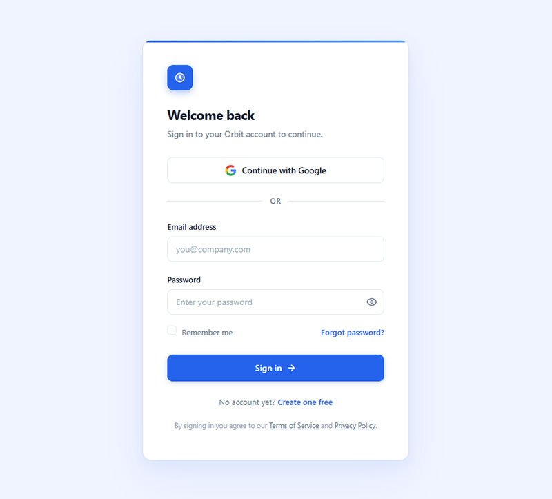
A Bootstrap login form with social login adds branded buttons for third-party authentication providers above or below the standard email and password inputs. Google and Facebook are the 2 most used social login options, and adding more than 3 total providers creates visual noise without meaningful conversion benefit (State of Consumer Identity Trends, 2023).
Button and Divider Structure
Icon Integration
Bootstrap Icons (bi bi-google, bi bi-github) is the simplest option since it’s part of the Bootstrap ecosystem. Font Awesome 6 works equally well but requires a separate CDN link.
Bootstrap Icons is a separate package from the main Bootstrap CSS. Include it via CDN: <link rel="stylesheet" href="https://cdn.jsdelivr.net/npm/[email protected]/font/bootstrap-icons.min.css">.
The Divider Pattern
The horizontal rule with “or” text separating social buttons from credential inputs is a standard UI pattern. The flexbox approach (d-flex + flex-grow-1 on each hr) keeps the divider clean without any extra CSS.
Don’t skip this separator. Without it, users scan the form as one block and may try entering credentials into the social buttons area. The visual break reduces cognitive load and clarifies that 2 separate authentication paths are available.
For context on how different CSS login form patterns handle the social login layout differently from Bootstrap’s component-based approach, the structural contrast is worth reviewing.
What Does a Bootstrap Login Form with Validation Look Like?
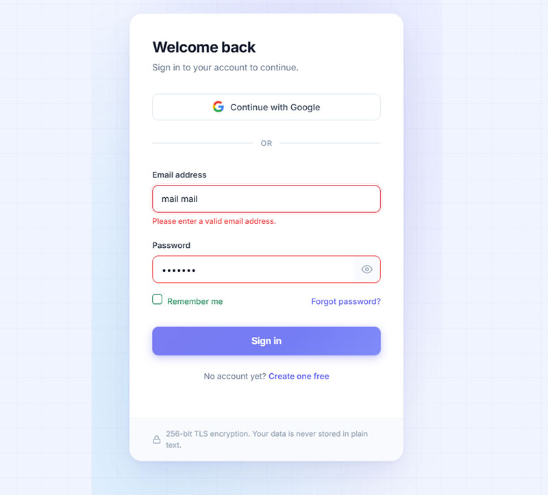
Bootstrap 5 validation works by scoping :invalid and :valid CSS pseudo-classes to a parent .was-validated class on the form element. Fields do not show error states on page load. The validation styles appear only after a submit attempt.
The WebAIM Million study found that nearly half of all websites have form inputs without proper labels, which breaks both validation UX and screen reader compatibility (WebAIM, 2024). Getting the structure right from the start avoids both problems at once.
Client-Side Validation Pattern
3 components are required: novalidate on the form, was-validated added via JavaScript on submit, and invalid-feedback divs beneath each input.
Server-Side Errors vs Client-Side Errors
Client-side validation catches empty fields and format errors before submission. Server-side errors (wrong password, account not found) arrive after the round trip and need different handling.
For server-side errors, skip was-validated entirely. Add is-invalid directly to the input and populate the invalid-feedback div with the server response message. No JavaScript validator needed.
<!-- After server returns "Invalid credentials" -->
<input type="email" class="form-control is-invalid" id="srvEmail"
value="[email protected]" autocomplete="email">
<div class="invalid-feedback">
Email or password is incorrect.
</div>
Accessibility Gap in Bootstrap Validation
Bootstrap’s official documentation acknowledges that client-side custom validation tooltips are not accessible to assistive technologies (getbootstrap.com). The styles render visually but are not announced by screen readers.
The fix: add aria-describedby on each input pointing to the invalid-feedback div’s ID, and add aria-invalid="true" when the field is invalid. Bootstrap does not do this automatically.
For a deeper look at how client-side and server-side approaches compare in terms of user experience and compliance, the breakdown of client-side vs server-side form input validation covers the tradeoffs in detail.
What Does a Bootstrap Login Form with a Background Image Look Like?
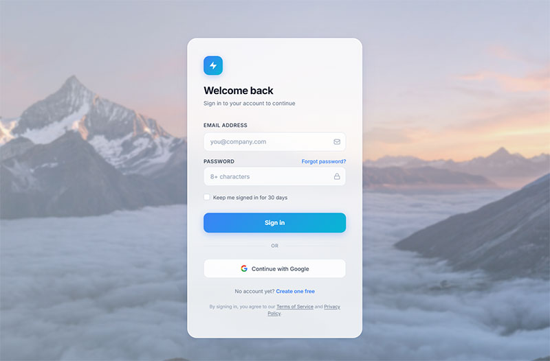
A full-page background image login form overlays the form-control inputs on top of a CSS background image applied to the outer wrapper. The card remains readable through a semi-transparent overlay div placed between the background and the card.
Why the Overlay Matters
Without the overlay, white card text and input borders disappear against light background images, and dark text becomes unreadable against busy photography.
The rgba(0,0,0,0.5) value covers 50% opacity. Adjust between 0.3 and 0.6 depending on how busy the image is. Use rgba(255,255,255,0.3) for a light overlay on dark imagery.
z-index and Position Context
The outer wrapper needs position: relative. The overlay gets position: absolute; inset: 0. The card needs position: relative; z-index: 1 to sit above the overlay layer.
Colorlib’s Login Form V20 template (released 2025) uses this exact stacking pattern, with a transparent card variant that lets the background image show through the form fields themselves.
What Are Free Bootstrap Login Form Templates and Where to Find Them?
5 reliable sources offer free Bootstrap login form templates that are production-ready, licensed for commercial use, and built with current Bootstrap versions.
| Source | Bootstrap Version | License | Best For |
|---|---|---|---|
| Start Bootstrap | BS5 | MIT | Clean admin-style templates |
| Bootsnipp | BS4 + BS5 | MIT | Community snippets, quick copy |
| CodePen | Mixed | Varies | Live preview before copying |
What to Check Before Using a Template
3 things to verify before dropping a template into a project:
- Bootstrap version: check which CDN link the template uses. A Bootstrap 4 template in a Bootstrap 5 project will break modal triggers and form spacing.
- jQuery dependency: Bootstrap 4 templates often include a jQuery CDN link. If your project doesn’t use jQuery, remove it and refactor any jQuery-based validation to vanilla JS.
- License type: Colorlib uses CC BY 3.0, which requires attribution. MIT templates (Start Bootstrap, FreeFrontend) have no attribution requirement.
Migrating a Bootstrap 4 Template to Bootstrap 5
The 4 class replacements that cover the majority of login form migration work:
form-groupbecomesmb-3data-togglebecomesdata-bs-toggledata-targetbecomesdata-bs-targetdata-dismissbecomesdata-bs-dismiss
Remove the jQuery CDN link after making these changes. Bootstrap 5 components run on vanilla JavaScript and do not need jQuery to function.
For a broader view of how Bootstrap’s native form patterns compare with other CSS frameworks, the guide covering Bootstrap forms covers components beyond login, including multi-field layouts and input groups.
How Do Bootstrap Login Form Examples Differ Between Bootstrap 4 and Bootstrap 5?
Bootstrap 5 was released in May 2021. The 3 changes with direct impact on login form code are the removal of form-group, the renaming of data attributes from data-* to data-bs-*, and the removal of the jQuery dependency (Reintech, 2025).
Class-Level Differences in Login Form Code
| Element | Bootstrap 4 Class | Bootstrap 5 Class |
|---|---|---|
| Input wrapper | form-group |
mb-3 |
| Modal trigger | data-toggle="modal" |
data-bs-toggle="modal" |
| Modal dismiss | data-dismiss="modal" |
data-bs-dismiss="modal" |
| Floating label | Not available | form-floating wrapper |
The jQuery Removal in Practice
Bootstrap 4 requires jQuery for all JavaScript-powered components, including modals. Remove the jQuery CDN link from a Bootstrap 4 project and modal login forms stop working entirely.
Bootstrap 5 rewrote all JavaScript plugins in vanilla JS. No jQuery required. The same modal trigger syntax (data-bs-toggle) works without any additional library.
Floating Labels: Bootstrap 5 Only
Bootstrap 5 introduced the form-floating class, which animates label text above the input when a user starts typing. Login form templates built with this feature cannot be backported to Bootstrap 4.
<!-- Bootstrap 5 floating label input -->
<div class="form-floating mb-3">
<input type="email" class="form-control" id="floatEmail"
placeholder="[email protected]" autocomplete="email">
<label for="floatEmail">Email address</label>
</div>
The label and placeholder are both required for floating labels to work. The placeholder can be any text since it is hidden after the label animates, but an empty placeholder string breaks the CSS animation trigger.
Which Version to Use for New Projects
Bootstrap 5.3 is the current stable release as of August 2025. New projects should default to Bootstrap 5. Bootstrap 4 templates remain common on template sites, so always check the CDN link version before integrating a downloaded login form.
What Accessibility Requirements Apply to Bootstrap Login Forms?
96.3% of homepages had detectable WCAG failures in 2024, with an average of 56.8 errors per page (WebAIM Million, 2024). Login forms are a common failure point because placeholder-only labeling and missing ARIA attributes are widespread.
Over 4,600 web accessibility lawsuits were filed in U.S. federal courts in 2023 (WCAG 2.2 Checklist, 2026). Login forms that fail WCAG 1.3.1 (using placeholder text as the only label) are a specific litigation risk.
Required Attributes for WCAG Compliance
4 attributes are required on every Bootstrap login form input to meet WCAG 2.1 Level AA:
- label linked via for/id: every input needs a visible
<label>with aforattribute matching the input’sid - aria-describedby: links each input to its error message element so screen readers announce validation feedback
- autocomplete:
autocomplete="email"andautocomplete="current-password"are required for WCAG 1.3.5 (Identify Input Purpose) - aria-invalid=”true”: added dynamically to invalid inputs so screen readers announce the error state, not just the visual red border
The Placeholder vs Label Problem
Using placeholder instead of <label> fails WCAG 1.3.1. Placeholder text disappears when a user starts typing, leaving users with cognitive disabilities unable to remember what the field requires.
Some screen readers skip placeholder text entirely (Pilot Digital, 2026). A user relying on a screen reader gets no field context at all when labels are absent.
Never replace labels with placeholders. Use both. The label stays visible; the placeholder provides formatting hints.
Bootstrap’s Default Focus Outline
Bootstrap 5’s default focus ring uses a blue box shadow on form-control inputs. The color meets the WCAG 2.1 contrast ratio of 4.5:1 against white backgrounds. Against non-white backgrounds, verify contrast manually.
Bootstrap’s own documentation notes that some color combinations in the default palette fall below the 4.5:1 threshold on light backgrounds (getbootstrap.com). Test your specific background color before shipping.
visually-hidden vs placeholder as Label Replacement
If a design requires hiding labels visually while keeping them accessible, Bootstrap 5 provides the visually-hidden class. This hides the element from sighted users while keeping it available to screen readers.
Do not use display: none or visibility: hidden on labels. Both remove the element from the accessibility tree completely.
For a broader look at patterns that affect how accessible forms behave across device types, the guide on form accessibility best practices covers ARIA patterns, keyboard navigation, and error announcement in detail. And if validation messaging is a specific concern, form validation best practices covers both the UX and technical requirements side by side.
FAQ on Bootstrap Login Forms
What is a Bootstrap login form?
A Bootstrap login form is an HTML authentication form built using Bootstrap’s grid system, utility classes, and pre-styled components like form-control, btn, and card. It produces a responsive, cross-browser login UI without custom CSS.
What are the main types of Bootstrap login form layouts?
The 4 main types are basic single-column forms, modal login forms, split-screen layouts, and card-centered forms.
Each fits a different context. Card-centered works best for admin dashboards. Split-screen suits SaaS landing pages.
What is the difference between a Bootstrap 4 and Bootstrap 5 login form?
Bootstrap 5 removes form-group, replaces data-toggle with data-bs-toggle, and drops the jQuery dependency entirely.
New projects should use Bootstrap 5.3, the current stable release as of August 2025.
How do I add validation to a Bootstrap login form?
Add novalidate to the form, use JavaScript to call checkValidity() on submit, then add was-validated to the form element. Place invalid-feedback divs beneath each input for error messages.
How do I center a Bootstrap login form on the page?
Wrap the form in a card component and apply d-flex justify-content-center align-items-center to the outer container. Set min-height: 100vh on the wrapper and max-width: 400px on the card.
How do I add social login buttons to a Bootstrap login form?
Use btn btn-outline-* classes for Google and GitHub buttons above the credential inputs. Separate them with a flexbox divider using d-flex, two hr elements, and an “or” span. Limit social options to 3 providers maximum.
How do I create a Bootstrap modal login form?
Wrap standard login inputs inside a modal-body div. Add data-bs-toggle="modal" and data-bs-target="#loginModal" to the trigger button. Use modal-dialog-centered to vertically center the dialog in the viewport.
Where can I find free Bootstrap login form templates?
Colorlib offers 40+ free Bootstrap login form templates under CC BY 3.0. Start Bootstrap, FreeFrontend, and Bootsnipp provide MIT-licensed options. Always check the Bootstrap version and remove any unnecessary jQuery dependency before using a template.
How do I make a Bootstrap login form accessible?
Link every input to a visible label via matching for and id attributes. Add aria-describedby for error messages, aria-invalid="true" on invalid fields, and autocomplete attributes on email and password inputs.
Can I use a Bootstrap login form with a background image?
Yes. Apply background-image, background-size: cover, and background-position: center to the outer wrapper. Add a semi-transparent overlay div between the background and the card to keep inputs readable against busy imagery.
Conclusion
This conclusion is for an article presenting the most useful Bootstrap login form examples available, from card-centered dashboards to full-page background image layouts and modal overlays.
The right layout depends on your context. A split-screen login form fits a SaaS product page. A basic single-column form works fine for a quick internal tool.
Whatever pattern you choose, get the fundamentals right: linked labels, autocomplete attributes, proper form validation states, and WCAG-compliant ARIA markup.
Bootstrap 5.3 gives you the grid system, utility classes, and component library to build any of these patterns cleanly. Use the free templates from Colorlib, Start Bootstrap, or FreeFrontend as starting points, then adapt.