




Here’s the rewritten article as HTML markup, ready to paste into WordPress. Facts, stats, links, and tables are preserved exactly as given. html Most agency owners are still the ones…
Table of contents
An HTML checkbox is a form input element that lets a user select any number of independent options from a group at the same time, with each box holding its own true or false state.
Browsers render it through the input element once its type attribute is set to checkbox, a rule that separates it from the single-choice radio button and the list-based select element. Its checked state exists independently of every other control in the group, even when two or more share the same name attribute for group submission.
The element entered the language through RFC 1866, the HTML 2.0 specification the IETF published in November 1995, which fixed checkbox, radio, and text inputs into HTML’s original form-handling model.
What Is an HTML Checkbox?
An HTML checkbox is an input element that lets a user turn one option on or off, independent of any other option on the same form.
It belongs to the wider group of form fields used to collect structured input, sitting alongside text boxes, radio buttons, and select lists.
The browser renders it from an input element with its type attribute set to checkbox, and the DOM tracks the result as a single boolean value.
What it is not: a single-choice control like a radio button, and not a list-based picker like a select dropdown.
MDN Web Docs classifies the checkbox input type as Baseline Widely available, meaning its core behavior has held steady across major browsers since 2015.
Checkbox vs Radio Button vs Toggle Switch
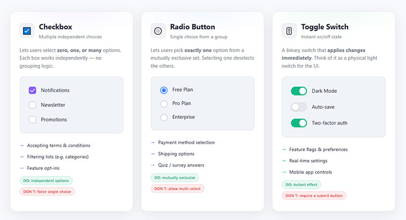
Three controls get mixed up constantly, and the difference comes down to how many options a user can pick.
A checkbox allows multiple selections in a group, a radio button allows exactly one, and a toggle switch is really just a checkbox wearing different CSS.
| Control | Selection Limit | Best For |
|---|---|---|
| Checkbox | Multiple per group | Independent yes/no choices |
| Radio button | One per group | Mutually exclusive choices |
| Toggle switch | One state per control | On/off settings, styled checkbox |
Checkbox vs Radio Button
Radio buttons force a single choice within a shared name group, while checkboxes let every option in that group stay independent.
Picking the wrong one is a common markup mistake.
The distinction between radio buttons and checkboxes comes down to one question: can more than one answer be true at once?
Checkbox: any number of boxes in a group can be checked at the same time.
Radio button: checking one box in the group automatically unchecks every other box sharing that name.
Checkbox vs Toggle Switch
A toggle switch is not a distinct HTML element.
It is a checkbox restyled with CSS to look like a sliding switch, while the underlying type attribute and checked state stay exactly the same.
- Same type=”checkbox” markup underneath
- Same checked and unchecked states
- Same value submitted with the form
HTML Checkbox Syntax and Attributes
A checkbox is built from a small set of attributes, and each one controls a different piece of its behavior.
Some are boolean, present or absent, while others carry a specific value.
| Attribute | Type | Default | Effect |
|---|---|---|---|
| type | Fixed value | None, must be set | Declares the input as a checkbox |
| checked | Boolean | Absent | Sets the box checked on load |
| value | String | “on” | Data sent when checked |
| name | String | None | Groups checkboxes for submission |
| disabled | Boolean | Absent | Blocks interaction and submission |
| required | Boolean | Absent | Forces checked state before submit |
Boolean attributes like checked, disabled, and required work on presence alone.
Adding the word “false” inside one of them does nothing, since the attribute only cares whether it exists in the markup at all.
Declaring these attributes explicitly, rather than leaning on browser defaults, matches widely accepted practices for building HTML forms.
How the Checked and Indeterminate States Work
A checkbox carries more state than it first appears, and confusing the attribute with the property causes a lot of debugging headaches.
The Checked Attribute vs the Checked Property
HTML attribute: sets only the initial state when the page loads.
DOM property: exposed through the HTMLInputElement interface, it reflects the live, current state as the user interacts with the box.
Changing the attribute after the page has loaded does nothing to a checkbox the user has already touched. Only the property updates from that point forward.
The Indeterminate State
The indeterminate property carries Baseline Widely available status, according to MDN Web Docs, though it behaves nothing like a normal state.
It can only be set through JavaScript, never through an HTML attribute, and most platforms render it as a horizontal line across the box.
- Never reflected as an HTML attribute
- Not tied to the checked property; an indeterminate box can be checked or unchecked underneath
- Ignored entirely during form submission
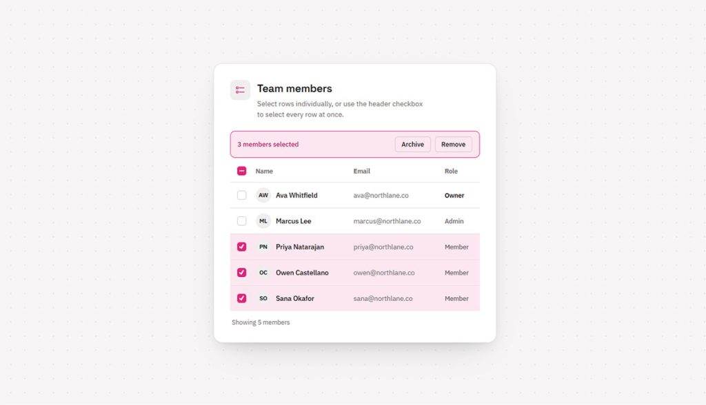
A classic use case is a “select all” checkbox sitting above a list of child checkboxes, where some but not all children are checked.
How to Associate a Label With a Checkbox
A checkbox without a properly linked label is hard to click and invisible to assistive technology.
Wrapping the Input Inside the Label
Placing the input element inside the label element is the simplest method, and it needs no id or for attribute at all.
Clicking anywhere on the label text then toggles the checkbox, which matters more on mobile than most developers expect.
- No id needed on the input
- No for attribute needed on the label
- Larger click target automatically
Linking With the For and Id Attributes
Real-world pattern: the GOV.UK Design System wraps grouped checkboxes in a fieldset with a legend, and requires every checkbox to carry a correctly linked label before it ships.
This separate-elements approach is useful when the label and the input cannot sit next to each other in the markup, such as inside a table cell layout.
The label’s for attribute must match the input’s id attribute exactly, character for character, or the association silently fails.
Getting this right is one of several form accessibility best practices that keep form controls usable for people relying on screen readers or switch devices.
How Checkbox Data Is Submitted With a Form
An unchecked box and a missing field look identical to a server, and that trips up more form handlers than it should.
The Name and Value Attributes
The name attribute decides which key the data submits under, and the value attribute decides what gets sent when the box is checked.
Leave the value attribute off, and the checkbox falls back to submitting the string “on”, a default written directly into the HTML specification.
Default fallback: the word “on”, not an empty string and not the word “true”.
Multiple Checkboxes as an Array
- Give every checkbox in the group the same name attribute
- Append square brackets to the name when the server expects an array, such as toppings[]
- Each checked box contributes one entry to that array
This is the standard pattern for building a checkbox group, from newsletter topic pickers to multi-select filters on ecommerce sites.
What Happens When a Checkbox Is Unchecked
Nothing gets sent. Nothing at all.
An unchecked checkbox is omitted from the submitted form data entirely, unlike a text field left blank, which still submits an empty string under its name.
Server-side code that assumes a missing key means “false” will work by accident. Code that expects the key to always exist will break the first time a user unchecks a box.
How to Require a Checkbox Before Submission
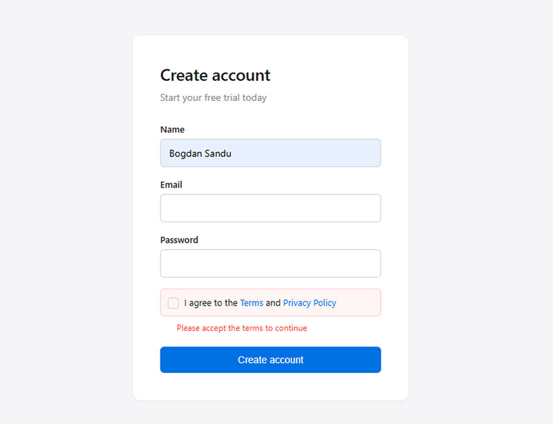
Adding the required attribute stops a form from submitting until the box is checked.
Browsers show a native validation message pointing at the unchecked box, no JavaScript required for the basic case.
Common use case: a terms-of-service or privacy-policy acceptance box sitting above a submit button.
The property behind that message, validationMessage, has been Baseline Widely available across browsers since July 2015, according to MDN Web Docs.
Required only blocks submission. It does not pre-check the box, and it does not stop a user from unchecking it again after checking it once.
Pairing required with a clear inline error keeps the control in line with common form validation best practices, rather than leaving users to guess why a form silently refused to submit.
How to Style a Checkbox With CSS
See the Pen
16 Ways to Style a Checkbox by Bogdan Sandu (@bogdansandu)
on CodePen.
The default checkbox rendering varies by operating system and browser, which is exactly why teams reach for custom CSS.
Three approaches cover almost every real project.
| Approach | Effort | Visual Control |
|---|---|---|
| Appearance: none reset | Low | Full, but manual |
| Accent-color | Very low | Color only |
| Custom pseudo-elements | Higher | Complete |
Removing Default Appearance
The appearance property, set to none, strips away the browser’s built-in checkbox rendering entirely.
What remains is a plain, unstyled box ready for custom borders, backgrounds, and a check mark drawn in CSS.
The appearance property reached Baseline Widely available status in March 2022, with Safari joining at version 15.4, according to MDN Web Docs.
Before this milestone: Safari needed a vendor prefix, and inconsistent support made cross-browser custom checkboxes fragile.
Using Accent-Color for Quick Styling
- One property, one line of CSS
- Works on checkboxes, radio buttons, range sliders, and progress bars
- Respects the user’s light or dark color scheme automatically
Accent-color changes the fill and outline color without touching size, shape, or the check mark icon.
Trade-off: fast to apply, but it gives zero control over box shape, size, or check mark style.
Building a Fully Custom Checkbox With CSS
A fully custom checkbox pairs the appearance reset with a pseudo-element that draws the check mark only when the checked pseudo-class matches.
Real-world benchmark: Google’s Material Design 3 specification sizes its checkbox at 18 by 18 density-independent pixels, wrapped inside a 40 by 40 pixel touch target.
That gap between the visible box and the touch target is deliberate, since small controls need generous invisible padding to stay usable on a touchscreen.
- The native check mark disappears once appearance is reset
- A custom mark gets drawn through the before or after pseudo-element
- The checked pseudo-class triggers the mark’s visibility
Native Styling vs Custom Checkbox: When to Choose Each
The decision usually comes down to how much design control a project needs against how much accessibility risk a team is willing to own.
Native styling:
- Inherits keyboard support and screen reader behavior automatically
- Needs no ongoing maintenance as browsers update
- Limited to color, size, and basic border customization
Custom checkbox:
- Full control over shape, animation, and brand-matched design
- Renders identically across every browser and operating system
- Requires rebuilding and testing keyboard and screen reader behavior by hand
Smaller teams without dedicated accessibility testing usually come out ahead sticking with native styling and accent-color adjustments.
How to Control a Checkbox With JavaScript
Reading and reacting to checkbox state follows the same short pattern in almost every project.
- Select the element: grab the checkbox with a method like getElementById or querySelector.
- Attach a listener: add a change event listener rather than a click listener, since change also fires after keyboard toggles.
- Read the state: check the checkbox’s checked property inside the handler.
- Update dependent elements: loop through related checkboxes and set their checked property to match.
Building a Select-All Checkbox Group
A select-all checkbox needs listeners working in both directions: one on the parent box, and one on each child box.
Parent behavior: checking the parent sets every child’s checked property to true in a loop.
Child behavior: checking or unchecking any single child recalculates whether the parent should show checked, unchecked, or indeterminate.
None of this requires a library. Vanilla JavaScript handles the whole pattern in well under twenty lines.
How to Make an Accessible Checkbox
See the Pen
Accessible Checkbox – Notification Preferences Form by Bogdan Sandu (@bogdansandu)
on CodePen.
A checkbox that works with a mouse but not a keyboard or screen reader is only half built.
Key figures:
- A native checkbox exposes its role and state automatically, with no ARIA attributes required (WAI-ARIA Authoring Practices Guide, W3C)
- The specification defines two checkbox widget types: dual-state and tri-state, where tri-state adds a partially checked value (WAI-ARIA APG, W3C)
- Space toggles a focused checkbox, and Tab moves focus to the next control (WAI-ARIA APG, W3C)
ARIA Role and States
A native checkbox input already carries the correct role and state for assistive technology, pulled straight from the browser’s accessibility tree.
A custom-built checkbox, a div styled to look like one, needs role checkbox and aria-checked added by hand, updated as the state changes.
WAI-ARIA distinction: the tri-state checkbox pattern maps directly onto the indeterminate state covered earlier, but only the custom version needs the ARIA attribute spelled out manually.
Keyboard Interaction Expectations
| Key | Function |
|---|---|
| Tab | Moves focus to the checkbox |
| Space | Toggles the checked state of the focused checkbox |
Native checkboxes get this behavior for free.
Common oversight: a custom checkbox missing a keydown handler for the space key leaves keyboard users completely unable to toggle it.
When an HTML Checkbox Does Not Work as Expected
A handful of quirks catch developers off guard once a checkbox moves beyond the simplest use case.
Disabled checkboxes vanish from submission: a disabled checkbox is excluded from the submitted form data entirely, even if it was checked before being disabled.
Indeterminate never submits as a third value: the state is purely visual, and the submitted data only ever reflects the checked property underneath it.
Setting the checked property from JavaScript does not fire a change event, a behavior confirmed in WebKit’s own layout test suite and consistent across Chromium and Firefox as well.
Only genuine user interaction (a click, or a space-bar press on a focused box) triggers that event. Code listening for change to react to a programmatic update simply never runs.
Custom checkboxes lose native behavior by default: a div styled to look like a checkbox has no keyboard support, no accessible role, and no place in the tab order until all three get added by hand.
12 HTML Checkbox Examples You Can Use
Each one builds on the attributes, states, and patterns already covered. Screenshots or code shots slot in right under each bolded line.
Basic and State Examples
Basic checkbox
See the Pen
Basic Checkbox – Newsletter Signup Form by Bogdan Sandu (@bogdansandu)
on CodePen.
An input with type="checkbox" and a name attribute, wrapped inside a label that says “Subscribe to newsletter.” Wrapping the input in the label matters more than people think. Click the text, not just the tiny box, and it still toggles. Skip the wrapping and you’ve made a checkbox that’s annoying to use on a phone.
Checked by default
See the Pen
Checkbox – Checked by Default by Bogdan Sandu (@bogdansandu)
on CodePen.
Same markup, but add the checked attribute and the box loads already ticked. Useful for settings that default to “on,” like remembering a login. Worth a second thought before you use it for anything involving marketing consent, though. Pre-checked opt-ins get flagged by GDPR reviewers a lot.
Disabled checkbox
See the Pen
Disabled Checkbox: Notification Preferences Form by Bogdan Sandu (@bogdansandu)
on CodePen.
Add disabled and the box greys out. It won’t submit with the form, and users can’t click it at all. Screen readers announce it as unavailable too, so it’s not just a visual thing. Good for showing an option exists but isn’t available yet (a plan tier someone hasn’t unlocked, say).
Required checkbox
See the Pen
No JS Required – the required checkbox pattern by Bogdan Sandu (@bogdansandu)
on CodePen.
Add required to a terms-of-service box and the form won’t submit until it’s checked. Most browsers pop up a small native message pointing at the box when someone tries to skip it. No JavaScript needed for this one, which is nice.
Styling Examples
These three build on the CSS methods covered earlier in the article.
Custom CSS checkbox
See the Pen
Custom CSS Checkbox: Anatomy of the appearance: none Trick by Bogdan Sandu (@bogdansandu)
on CodePen.
Set appearance: none on the input, then pair it with a pseudo-element check mark that only shows up under the :checked pseudo-class. This is the base technique behind almost every “designed” checkbox you see on modern sites. Once you get the pseudo-element positioned right, everything else is just color and size tweaks.
Toggle switch styled with CSS
See the Pen
Toggle Switch: Restyled Checkbox, Still Accessible by Bogdan Sandu (@bogdansandu)
on CodePen.
Same checkbox markup underneath, just restyled: a rounded track, a circle that slides across it using pseudo-elements and a transition property. It looks nothing like a checkbox anymore, but semantically it still is one. That matters for accessibility, actually, since assistive tech still reads it correctly.
Accent-color example
See the Pen
Accent-Color: Native Plan Setup Form by Bogdan Sandu (@bogdansandu)
on CodePen.
One line, accent-color, set on the input selector. It changes the fill color without touching the shape or requiring any pseudo-element trickery. Browser support is solid now (Chrome, Firefox, Edge, Safari all handle it), so this is usually the first thing to try before reaching for a full custom build.
JavaScript and Framework Examples
Get checkbox value with JavaScript
See the Pen
Reading Checkbox State: Live .checked Output by Bogdan Sandu (@bogdansandu)
on CodePen.
Select the input, attach a change event listener, and read the .checked property inside it to log true or false. Simple, and it’s the pattern almost every other checkbox script builds on. If you’re debugging why a checkbox “isn’t working,” this is usually the first thing to check.
Select-all checkbox group
See the Pen
Select-All Checkbox Group: Team Members Table by Bogdan Sandu (@bogdansandu)
on CodePen.
A parent checkbox loops through a group of child checkboxes on change, setting each one’s .checked property to match. Common on any table with row selection (email inboxes, admin dashboards, that kind of thing). The trickier part is making the parent reflect the children’s state too, which is where the last example comes in.
React controlled checkbox
See the Pen
React Controlled Checkbox: The onChange Warning, Live by Bogdan Sandu (@bogdansandu)
on CodePen.
A checked prop tied to component state, updated through an onChange handler instead of left for the DOM to manage on its own. This is the controlled component pattern, and React will actually warn you in the console if you forget the handler. Annoying the first time it happens, useful after that.
Accessibility Examples
Accessible checkbox with label and aria-checked
See the Pen
Accessible Custom Checkbox: ARIA Filter Chips by Bogdan Sandu (@bogdansandu)
on CodePen.
A custom div-based checkbox with role="checkbox", a tabindex of zero, and an aria-checked value kept in sync through both a keydown handler and a click handler. Needed anytime you build a checkbox that isn’t an actual <input> element (styled component libraries do this a lot). Miss the keydown handler and keyboard users can’t operate it at all, which defeats the point.
Indeterminate state set with JavaScript
See the Pen
Indeterminate Checkbox: File Export Tree by Bogdan Sandu (@bogdansandu)
on CodePen.
A parent checkbox whose .indeterminate property gets set to true whenever some, but not all, of its child checkboxes are checked. You can’t set this through HTML attributes, only through script. It’s the little dash-in-a-box state you see in file managers and settings panels, and it pairs naturally with the select-all example above.
FAQ on HTML Checkboxes
What Is the Difference Between a Checkbox and a Select Dropdown?
A select dropdown collapses a list of options behind one closed control, showing a single selection until the user opens it. A checkbox exposes every option at once, independent of the others, which is why forms favor checkboxes when every option needs to stay visible.
Which JavaScript Framework Approach Fits Checkbox State Control?
React ties the checked prop to component state and updates it through onChange. Vue binds state directly with v-model, skipping manual event wiring. Angular uses ngModel for the same two-way binding. Plain JavaScript remains simplest for a handful of static checkboxes.
Can a Checkbox Be Read-Only Instead of Disabled?
HTML does not support a native readonly attribute on checkboxes; it only works on text-based inputs. Faking read-only behavior means pairing disabled with a hidden input carrying the same value, or blocking clicks with JavaScript while keeping the box focusable.
What Should You Fix First in Html Checkbox?
The first fix for an HTML checkbox is a correctly linked label, since a missing accessible name blocks assistive technology before layout, color, or JavaScript behavior even becomes relevant.
Priority runs in a specific order:
- Label association
- Keyboard and focus handling
- Name and value structure for submission
Missing form input labels showed up on 48.2% of home pages, according to WebAIM’s 2025 Million report, making this the single most common point of failure across the web.
Fixing labels first delays visual polish, since a correctly wired but unstyled control still beats a styled one nobody using a screen reader can operate.
Once markup and behavior hold up, the next step is assembling the surrounding structure by building forms in WordPress without a plugin.