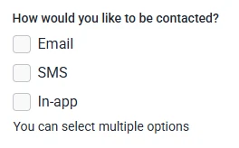
The Checkbox field allows users to select one or more options from a list of choices. It is ideal for multi-select questions such as preferences, interests, or additional services. This article explains how the Checkbox field works and how you can customize its choices, layout, and visibility in the IvyForms builder.
Front-end appearance
Where can I find the checkbox field in IvyForms?
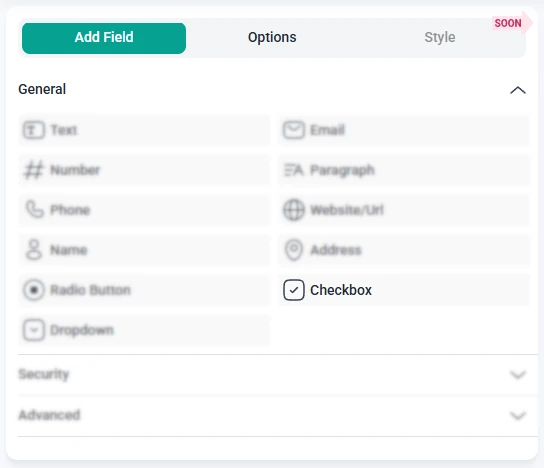
The Checkbox field is located in the General fields section of the IvyForms builder. Expand this section to see the list of available inputs, then click the Checkbox field to add it to your form. Once placed in the preview, select the field to open its configuration options.
What settings can I configure for the checkbox field?
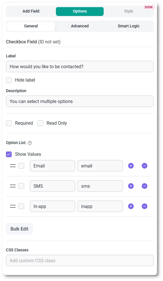
When you click the Checkbox field in the preview area, the left panel switches to the Options view. Settings are divided into three tabs: General, Advanced, and Smart logic. These determine how the checkbox list looks, how choices behave, and under which conditions the field appears.
How do general settings work for the checkbox field?
The General tab provides all essential configuration options for the Checkbox field. Here you can manage the field label, description, required status, and full list of selectable choices.
Label – defines the title or question shown above the list of checkboxes.
Hide label – removes the visible label on the front-end, displaying only the checkbox items.
Description – adds a short explanation below the label to guide users.
Required – ensures users select at least one option before submitting the form.
Read-only – shows the checkbox list without allowing any changes.
Option list – contains the editable list of checkbox choices.
You can rename each option directly.
To remove an option, click the minus (-) icon on the right.
To add a new choice, click the plus (+) icon.
The small checkbox next to each option marks that choice as preselected on the front-end.
Show values – displays the stored values next to the visible labels, useful when using custom values for processing.
Below the list of choices, two additional settings help control how the field behaves:
Shuffle the available options – randomizes the order of the checkbox choices each time the page loads.
CSS classes – allows you to apply custom styling by adding your own class names.
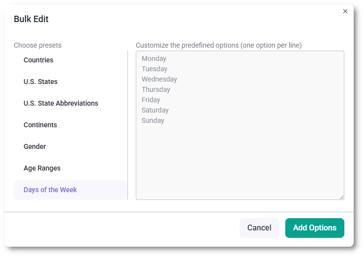
How does bulk editing work for option-based fields?
For option-based fields such as Checkboxes, Radio Buttons, and Dropdowns, IvyForms includes a Bulk Edit option that helps you manage longer lists of choices more efficiently.
When the field is selected in the builder, the Bulk Edit button appears directly below the option list. Clicking it opens a dedicated panel where you can add multiple options at once instead of creating them one by one.
Inside the Bulk Edit panel, you can choose from predefined presets and modify their values manually but you can’t add your own presets. Presets include commonly used option sets such as countries, age ranges, days of the week, and similar standardized lists.
When you click Add Options, the listed values are added directly to the field’s option list. These options behave the same as manually created ones and can still be reordered, renamed, or removed afterward.
How do advanced settings work for the checkbox field?
The Advanced tab for the Checkbox field contains a single option: Label position. This setting changes where the main label appears in relation to the checkbox list. You can keep the default placement or switch to Top, Left, or Right depending on your form layout. All other customization options remain in the General tab.
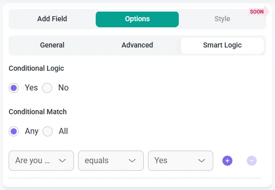
How can I use smart logic with the checkbox field?
Smart Logic is available only in the Pro version of IvyForms.
The Smart logic settings allow you to show or hide the Checkbox field based on conditions from other inputs. Smart logic is disabled by default. Once enabled, you can set up rules that control when this field becomes visible.
When Smart logic is turned on, you can choose how conditions should be evaluated using the Conditional match setting:
Any – the Checkbox field appears when at least one selected condition is met.
All – the Checkbox field appears only when all defined conditions are satisfied at the same time.
These rules help you display checkbox choices only when relevant. For example, you might show this field after a user selects a specific category, chooses a service type, or indicates they want to add extra options. This keeps your forms streamlined and easy to complete.
Guides
Explore the IvyForms documentation through key sections like Get Started,
Form Creation, Entry Management, Settings, Integrations, Advanced Features,
and Support & Troubleshooting to make the most of your form-building experience