


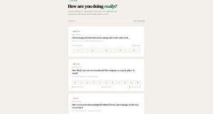
Gallup’s 2024 data shows only 31% of U.S. employees feel engaged at work. Annual surveys can’t catch that kind of decline fast enough. Pulse surveys can. These short, frequent questionnaires…
Table of Contents
Most forms stack vertically because it’s easy. But horizontal layouts solve real problems when space matters.
Horizontal form examples show how labels and input fields align side-by-side instead of stacking. This pattern works brilliantly for login screens, search bars, and filter controls where vertical space is limited.
Getting horizontal alignment right requires understanding Bootstrap grid systems, CSS Grid, and Flexbox techniques. Poor implementation creates accessibility nightmares and mobile disasters.
This guide covers implementation methods, responsive behavior, code examples, and common mistakes. You’ll learn when horizontal forms improve user experience and when they hurt conversion rates.
What is a Horizontal Form
A horizontal form is a layout pattern where labels and input fields align side-by-side on the same row.
Labels typically sit on the left, inputs on the right. This creates a compact, organized appearance that works well for desktop interfaces.
The structure relies on CSS Grid, Flexbox, or Bootstrap’s grid system to position form elements horizontally instead of stacking them vertically.
Popular in login interfaces, search bars, and filter controls where space efficiency matters.
Types of Horizontal Form Layouts
Different use cases require different horizontal form structures. Login screens need minimal fields. Registration flows demand more complex arrangements.
Basic Horizontal Forms
Single-row forms contain one label-input pair with a submit button.
Search bars are the simplest example with just a text input and search icon or button. No labels needed in most cases.
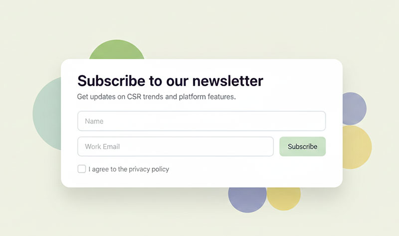
Login forms typically include username, password, and optional “remember me” checkbox arranged horizontally. All fields visible at once.
Authentication interfaces benefit from horizontal layouts since they contain few fields and need quick visual scanning.
Multi-Field Horizontal Forms
Registration forms use multiple rows with consistent label-input alignment throughout.
Each row maintains the same column proportions (2-10, 3-9, or 4-8 split). Consistency matters more than the exact ratio.
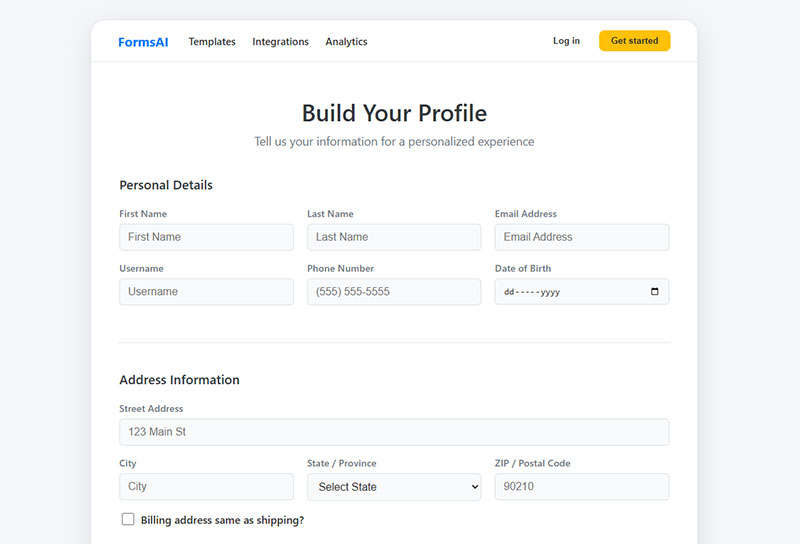
Contact forms work well horizontally for name, email, phone fields. Message textarea usually spans full width below.
Profile update interfaces arrange related fields in groups. Billing info, shipping address, and account preferences each get their own section with horizontal alignment.
Complex Horizontal Forms
Multi-column layouts place two or more label-input pairs side-by-side in the same row.
Use this for related short fields like city/state/zip or first name/last name. Long fields (email, address) should occupy full row width.
Conditional fields appear or hide based on previous selections. The conditional logic maintains horizontal alignment when fields toggle visibility.
Nested form groups create hierarchical structures. Billing address might nest under a “Same as shipping?” checkbox, inheriting the parent’s horizontal layout.
Best Practices for Horizontal Form Design
Poor horizontal form implementation creates usability problems worse than vertical forms. Getting alignment right matters.
Label and Input Alignment

Vertical centering prevents labels from floating above or below input fields.
Top-aligned labels work better for multi-line inputs or when help text appears below fields. Center alignment suits single-line inputs only.
Padding utilities fine-tune spacing when default alignment looks off. Bootstrap provides .pt-* and .pb-* classes for pixel-perfect adjustments.
Label width consistency across all rows creates visual harmony. One field with a 150px label and another with 250px breaks the layout rhythm.
Responsive Behavior
Mobile viewports can’t accommodate horizontal layouts. Labels and inputs need to stack vertically below 576px or 768px breakpoints.
Bootstrap handles this automatically with .col-sm-* classes. Custom CSS requires media queries to switch from horizontal to vertical.
Touch target sizing matters more on mobile than desktop. Input fields need minimum 44px height for comfortable tapping.
Horizontal scrolling is terrible UX. If fields don’t fit viewport width, stack them vertically instead of forcing horizontal scroll.
Some forms maintain horizontal layout on tablets (768-991px) but stack on phones. Test breakpoints with actual devices, not just browser resize.
Accessibility Requirements
Every input needs an associated <label> element. Use the for attribute matching the input’s id.
<label for="email-field" class="col-sm-2">Email</label>
<input type="email" id="email-field" class="form-control">
ARIA attributes enhance screen reader compatibility. Add aria-describedby to inputs that have help text or error messages.
Keyboard navigation must follow logical tab order (top to bottom, left to right). CSS positioning shouldn’t break natural DOM flow.
Screen readers announce labels before inputs. Long labels slow down form accessibility, so keep them concise (2-3 words maximum).
Color alone shouldn’t indicate required fields or errors. Use asterisks, icons, or text alongside color changes.
Common Use Cases for Horizontal Forms
Horizontal layouts excel in specific scenarios where vertical space matters more than horizontal real estate.
Login Interfaces
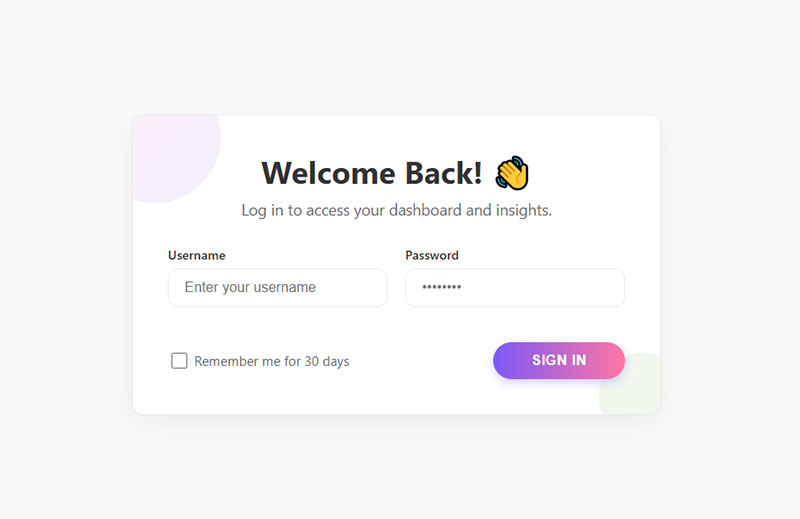
Username and password fields sit side-by-side with labels on the left, creating compact authentication screens.
Most login forms use this pattern because users expect quick visual scanning. Two fields total means horizontal layout never feels cramped.
“Remember me” checkboxes typically appear below the password field or inline with the submit button to maintain clean alignment.
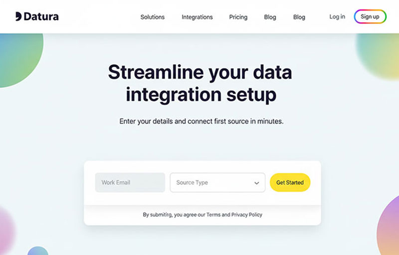
Filter and Search Forms
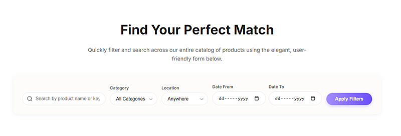
Date range selectors benefit from horizontal arrangement since “From” and “To” labels naturally pair with their inputs on the same line.
Category dropdowns, price ranges, and location filters work well horizontally when grouped above product listings or search results.
Quick search inputs with icon buttons use minimal horizontal space in headers or sidebars. Label often omitted, replaced by placeholder text.
Compact Data Entry

Credit card forms place expiry date and CVV side-by-side because both fields require short inputs (4-5 characters maximum).
Address fields arrange city, state, and zip horizontally after the street address spans full width. Related geography data clusters visually.
Name components (first, middle, last) appear in one row when all three are required. Two-column split for first/last name is more common though.
Horizontal Form vs Vertical Form Comparison
Layout choice significantly impacts user behavior and conversion rates.
Space Efficiency
Horizontal forms occupy less vertical space, fitting more content above the fold on desktop screens.
Vertical forms extend page length but feel less overwhelming with generous spacing between stacked fields.
Information density varies by field count. Three fields horizontal looks clean; ten fields horizontal creates visual chaos.
User Experience Factors
F-pattern reading follows horizontal scanning for headlines, then vertical scanning for content. Horizontal forms align with the initial horizontal scan.
Z-pattern suits horizontally arranged elements where eyes move left-to-right, then diagonally down-left. Works well for simple horizontal forms.
Completion rates suffer when horizontal layouts force excessive eye movement between distant labels and inputs. Studies show vertical forms convert better for multi-step forms with many fields.
Error identification becomes harder in horizontal layouts when validation messages appear below inputs instead of inline with the field.
Mobile Device Performance
Viewport width limitations make horizontal forms nearly impossible on phones without awkward label truncation or text wrapping.
Vertical scrolling feels natural on mobile; horizontal scrolling triggers user frustration and immediate abandonment.
Input field visibility suffers when mobile keyboards appear. Horizontal layouts push labels offscreen while vertical layouts keep context visible.
Touch accuracy improves with vertical stacking because each field occupies full screen width. Horizontal layouts create smaller touch targets.
Styling Horizontal Forms
Visual treatment affects perceived professionalism and trustworthiness more than layout structure.
Visual Design Elements

Border treatments distinguish inputs from surrounding content. Solid 1px borders in neutral gray work universally; colored borders signal brand identity.
Shadow effects add depth perception. Subtle box-shadows (0 1px 3px rgba(0,0,0,0.1)) lift inputs slightly without overwhelming the interface.
Typography choices impact scannability. Labels in 14px work well with 16px input text; too much size variation creates hierarchy confusion.
Interactive States
Focus indicators must be obvious. Default browser outlines work but custom focus rings in brand colors feel more polished.
Hover effects on inputs signal interactivity before clicking. Light background color change (white to light gray) provides sufficient feedback.
Disabled states need clear visual differentiation. Reduced opacity (0.6) plus cursor:not-allowed prevents interaction attempts.
Error highlighting combines color, icon, and border changes. Red border alone fails accessibility standards; add icon and descriptive text.
Form Validation Display
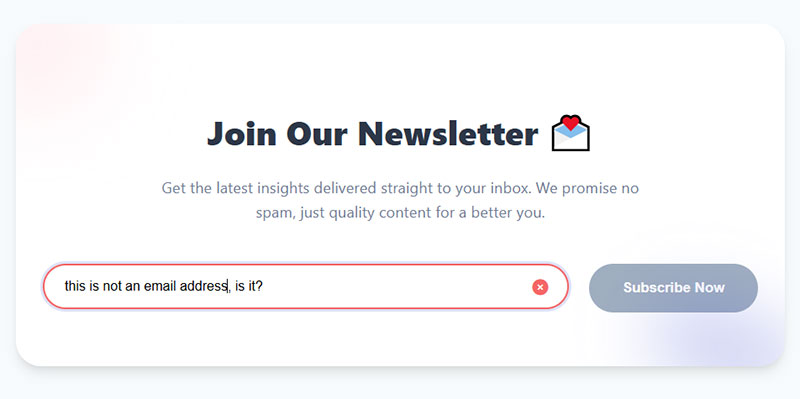
Inline error messages appear below inputs immediately after blur events. Real-time form validation prevents submission errors.
Success indicators confirm correct input before submission. Green checkmarks or borders provide positive reinforcement during completion.
Warning states handle non-critical issues like weak passwords or common email typos. Yellow/orange colors differentiate from hard errors.
Horizontal Form Browser Compatibility
Different browsers render form elements with varying default styles and behaviors.
Cross-Browser Considerations
Chrome and Edge (Chromium-based) handle CSS Grid and Flexbox identically. No compatibility issues with modern horizontal form techniques.
Firefox implements specifications strictly. Occasionally renders sub-pixel rounding differently than Chrome, causing minor alignment shifts.
Safari on macOS and iOS sometimes applies unexpected margins to form controls. Normalize.css or CSS resets fix most issues.
Internet Explorer 11 requires -ms- prefixes for Flexbox and limited CSS Grid support. Use autoprefixer or avoid IE11 support entirely.
Fallback Strategies
Progressive enhancement starts with functional vertical forms, then adds horizontal styling for capable browsers.
Feature detection using @supports queries applies horizontal layouts only when CSS Grid is available:
@supports (display: grid) {
  .form {
    display: grid;
    grid-template-columns: 200px 1fr;
  }
}
Graceful degradation assumes modern browser support, provides basic vertical fallback for old browsers. Most sites abandoned IE11 support by 2022.
Performance Optimization for Horizontal Forms
Faster forms convert better, even when differences measure in milliseconds.
Loading Speed
CSS minification reduces stylesheet size by removing whitespace and comments. Horizontal form styles typically add 2-3KB minified.
Resource prioritization loads critical form CSS before non-essential page styles. Inline small stylesheets (< 14KB) to eliminate render-blocking requests.
Framework overhead matters. Bootstrap’s full CSS bundle exceeds 150KB; using only grid components reduces this to under 20KB.
Client-Side Processing
JavaScript validation efficiency depends on debouncing input events. Validate on blur instead of every keystroke to reduce processing.
DOM manipulation optimization caches selectors outside event handlers. Repeated querySelector() calls slow down form interactions.
Event handler management uses event delegation on the form element instead of individual listeners per field. Reduces memory usage on large forms.
Common Horizontal Form Mistakes
Most horizontal form failures stem from ignoring mobile viewport constraints and accessibility requirements.
Layout Problems
Misaligned labels and inputs occur when vertical centering is missing. The .col-form-label class or align-items: center fixes this.
Inconsistent spacing between rows breaks visual rhythm. Use the same margin utility (.mb-3) or gap value throughout.
Overflow issues happen when labels or inputs exceed their container width. Set max-width on the form container and overflow-wrap: break-word on labels.
Usability Errors
Insufficient label clarity forces users to guess field purpose. “Name” is ambiguous; “Full Name” or “First Name” clarifies expectations.
Poor mobile adaptation keeps horizontal layout on phones where it doesn’t fit. Always stack vertically below 768px breakpoint.
Inadequate error feedback hides validation problems. Place error messages directly below their fields with clear explanatory text.
Accessibility Violations
Missing label associations prevent screen readers from announcing field purpose. Every <input> needs a <label> with matching for/id attributes.
Insufficient color contrast makes labels unreadable for visually impaired users. WCAG requires 4.5:1 contrast ratio minimum for normal text.
Keyboard trap problems occur when tab order jumps illogically or gets stuck in specific fields. Test navigation with keyboard only, no mouse.
FAQ on Horizontal Form Examples
What is a horizontal form layout?
A horizontal form layout positions labels and input fields side-by-side on the same row instead of stacking vertically. Labels typically appear on the left, inputs on the right, creating compact interfaces for login screens and search bars.
When should I use horizontal forms instead of vertical forms?
Use horizontal layouts for simple forms with 2-5 fields where desktop space is limited. Login interfaces, search bars, and filter controls work well. Avoid for complex forms with many fields or primarily mobile audiences.
How do I create a horizontal form in Bootstrap?
Use Bootstrap’s grid system with .row class for containers. Add .col-sm-2 to labels with .col-form-label class, and .col-sm-10 to input wrapper divs. This creates proper alignment and responsive behavior automatically.
Do horizontal forms work on mobile devices?
Horizontal forms perform poorly on mobile due to viewport width constraints. Labels truncate and inputs shrink to unusable sizes. Always stack fields vertically on screens below 768px using responsive breakpoints like .col-sm-* classes.
What’s the best label-to-input width ratio for horizontal forms?
The 2:10 column split (Bootstrap’s 12-column grid) works for most cases. This gives labels 16.67% width and inputs 83.33%. Adjust based on label length—longer labels need 3:9 or 4:8 ratios.
How do I align labels vertically with input fields?
Use Bootstrap’s .col-form-label class or apply display: flex with align-items: center to the row container. CSS Grid requires padding-top adjustment. Without proper alignment, labels float above or below inputs awkwardly.
Are horizontal forms accessible for screen readers?
Yes, when implemented correctly. Every input needs an associated <label> element with matching for and id attributes. Add ARIA attributes for error messages and help text. Keyboard navigation must follow logical tab order.
Can I mix horizontal and vertical layouts in one form?
Yes. Use horizontal layout for short related fields like city/state/zip, then switch to full-width vertical layout for longer inputs like street address or message textareas. Maintain consistent spacing throughout though.
How do I handle form validation in horizontal layouts?
Place error messages directly below input fields, not next to labels. Use .is-invalid class on inputs with .invalid-feedback divs for Bootstrap. Include icons and color changes beyond text for better visibility and accessibility compliance.
What CSS frameworks support horizontal forms besides Bootstrap?
Tailwind CSS, Foundation, Bulma, and Material Design all support horizontal form layouts through their grid systems. Pure CSS with CSS Grid or Flexbox works without frameworks. Each approach requires different class names or custom styling.
Conclusion
Horizontal form examples demonstrate how label-input alignment creates space-efficient interfaces for desktop users. But implementation requires careful attention to responsive breakpoints, accessibility standards, and browser compatibility.
Bootstrap grid systems, CSS Grid, and Flexbox each offer viable approaches. Choose based on project requirements and existing framework dependencies.
Test horizontal layouts on actual mobile devices, not just browser resize. What looks acceptable at 768px often fails at 375px viewport width.
Prioritize keyboard navigation and screen reader compatibility over visual aesthetics. Beautiful forms that exclude disabled users fail both ethically and legally under WCAG guidelines.
Start with simple two-field forms before attempting complex multi-column layouts. Master alignment, spacing, and validation display patterns first.

