

Your website probably has at least three types of forms right now, and you might not even realize how differently they work. Contact forms collect inquiries. Registration forms create accounts….
Table of Contents
Bad forms kill conversions faster than slow loading times. Every designer has seen it – users abandon checkout flows, bounce from registration pages, and skip contact forms entirely because the input field design feels broken or confusing.
The form fields any designer should know go far beyond basic text boxes and submit buttons. Modern user interface elements require understanding everything from autocomplete search functionality to accessibility standards that make forms work for everyone.
This guide covers the essential form field types that separate amateur interfaces from professional user experiences. You’ll learn when to use dropdown menus versus radio buttons, how to implement proper form validation rules, and why touch-friendly sizing matters more than you think.
From simple text input fields to complex multi-step form wizards, these fundamentals shape how users interact with your designs. Master these components and watch your form completion rates improve dramatically.
The Most Used Form Fields
Selection and Choice Fields
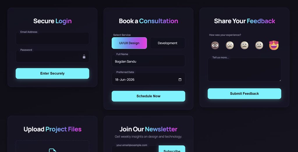
Dropdown Menus and Select Lists
Single selection dropdowns form the backbone of most data collection interfaces. These input field components work perfectly when users need to pick one option from a predetermined list.
The beauty of dropdown menu design lies in its space efficiency. Rather than cluttering your interface with dozens of radio button styling options, a well-designed select list keeps things clean.
Search-Enhanced Dropdowns
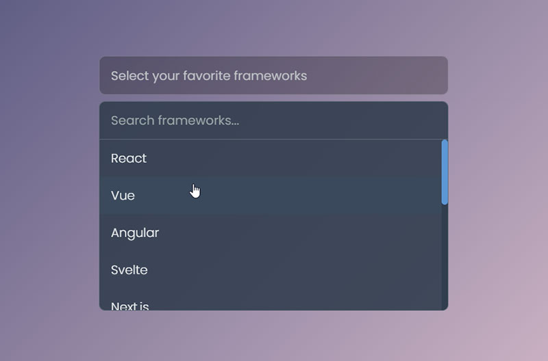
Modern autocomplete search field functionality transforms basic dropdowns into powerful tools. Users can type to filter options instantly instead of scrolling through endless lists.
Multi-select dropdown implementations take this further. They let users choose multiple items while maintaining the compact footprint of a single input control.
Grouped Categories
Organizing options into fieldset legend styling groups improves usability dramatically. Think of country selectors with continents as headers, or product categories with subcategories nested underneath.
The key is logical hierarchy. Users should understand the grouping system without explanation.
Radio Buttons and Checkboxes
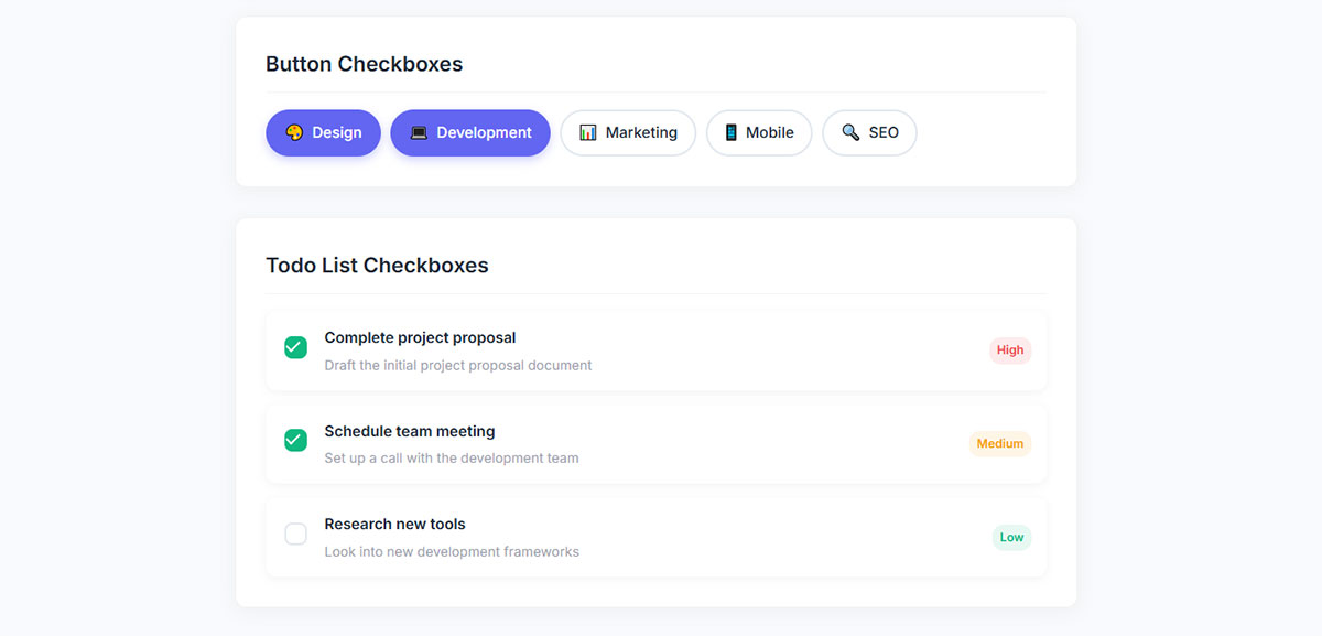
Radio button groups excel when you need exactly one choice from a small set of options. The visual clarity beats dropdowns when dealing with 2-5 choices.
Checkbox field options serve a different purpose entirely. They’re perfect for multiple selections, optional features, or binary yes/no decisions.
Custom Styling Approaches
Default browser styling looks dated in 2025. Custom input styling transforms these basic controls into polished interface elements that match your design system.
Mixed states add complexity but solve real problems. Indeterminate checkboxes show partial selections in hierarchical lists perfectly.
Consider how Bootstrap form components or Material Design inputs handle these states. They provide excellent patterns to follow.
Toggle Switches and Buttons
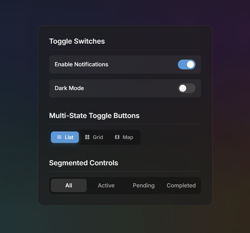
Binary on/off switches communicate state more clearly than checkboxes for settings and preferences. The physical metaphor just clicks with users.
Multi-state toggle buttons work great for view switchers. List view, grid view, map view – users understand the concept immediately.
Segmented Controls
Button group selections shine in filtering interfaces. Active states show current selections while inactive buttons reveal available options.
The spacing between segments matters more than you’d think. Too close feels cramped, too far looks disconnected.
Numeric and Data Input Fields
Number Input Controls
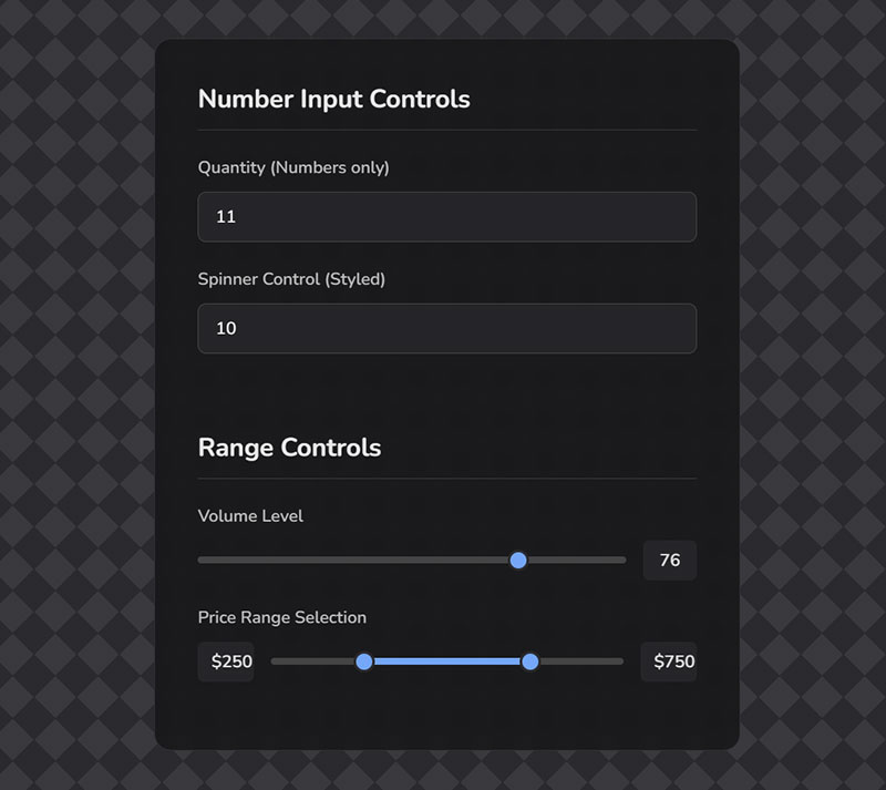
Basic numeric input validation prevents common user errors before they happen. Restricting input to numbers only saves everyone headaches later.
Spinner controls add convenience for small adjustments. Those little up/down arrows help users fine-tune values without typing.
Range Controls
Range sliders excel when exact values matter less than relative positioning. Volume controls, price filters, and date ranges all benefit from this approach.
Dual handle sliders solve range selection elegantly. Users can set minimum and maximum values in one intuitive interaction.
Currency and Formatting
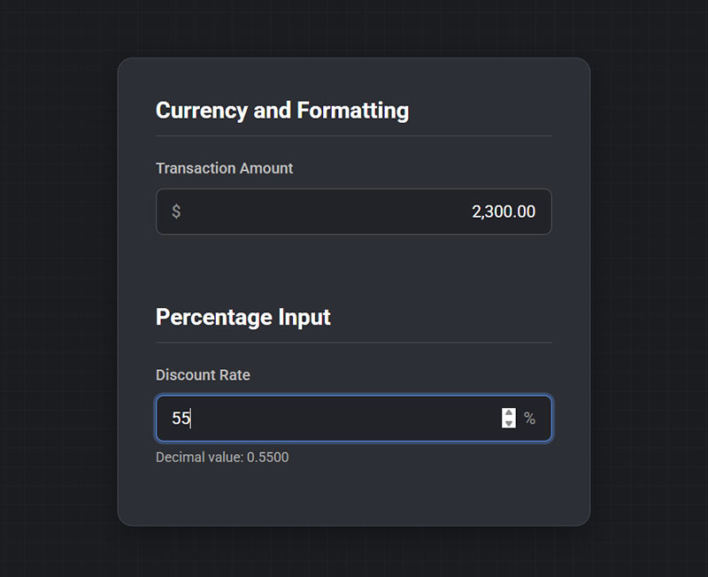
Currency input formatting requires careful consideration. Auto-formatting as users type feels magical when done right, annoying when buggy.
Percentage inputs need clear visual indicators. A simple % symbol prevents confusion about whether 50 means 50% or 0.5.
Date and Time Pickers
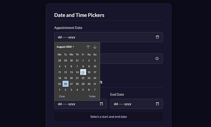
Calendar popup interfaces remain the gold standard for date selection. Users understand calendars instinctively – no learning curve required.
Mobile implementations need special attention. Touch-friendly date pickers require larger tap targets and gesture support.
Time Selection
Time picker widgets vary wildly in quality. The best ones adapt to user preferences – 12-hour vs 24-hour format, regional conventions, etc.
Date range picker components solve booking and reporting scenarios beautifully. Two calendars side-by-side let users select start and end dates visually.
Timezone Considerations
Timezone handling gets complex fast. Auto-detection works well for local events, but international scheduling needs explicit timezone selection.
Consider how your data gets stored. UTC on the backend with local display on the frontend prevents most timezone headaches.
File Upload Fields
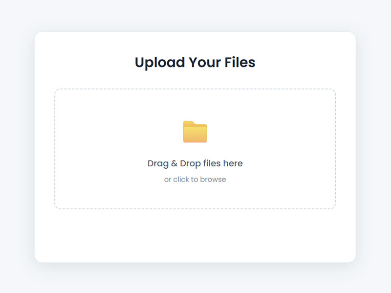
Drag and drop upload areas feel modern and intuitive. The visual feedback when users hover files over the drop zone provides essential confirmation.
Progress indicators become crucial for larger files. Users need to know their upload is working, not stalled.
File Management
File type restrictions prevent support nightmares. Clear error messages explain what went wrong when users try uploading invalid formats.
Multiple file selection handling requires careful UX design. Show selected files clearly, allow individual removal, and indicate upload status per file.
Modern browsers support excellent file APIs. Preview thumbnails, client-side validation, and progress tracking all enhance the user experience significantly.
The combination of form validation rules and user-friendly error handling makes file uploads feel reliable rather than fragile.
Advanced Input Components
Search and Filter Fields
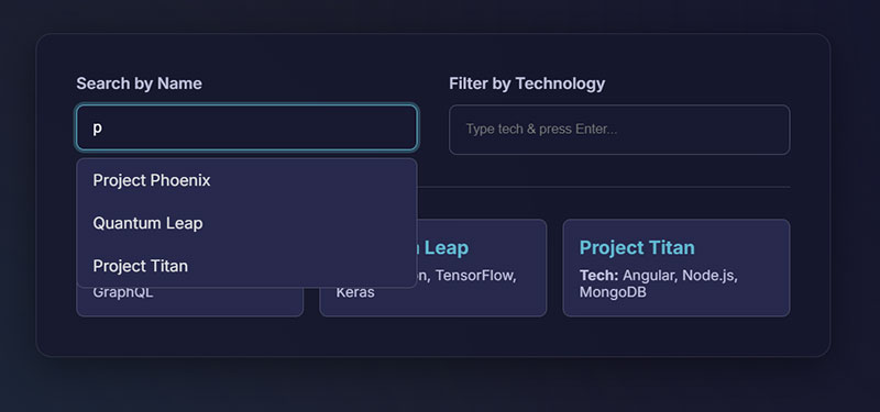
Autocomplete search boxes transform basic text inputs into powerful discovery tools. Users get instant suggestions as they type, reducing errors and speeding up data entry.
The key lies in smart filtering algorithms. Good autocomplete learns from user behavior and prioritizes relevant results.
Filter Implementation
Filter tag inputs let users build complex queries visually. Each selected filter appears as a removable tag, making the current search state crystal clear.
Advanced search builders take this concept further. Power users can construct detailed queries using dropdowns, operators, and nested conditions.
Real-Time Results
Real-time search results create that magical instant feedback loop. Users see matches appear immediately, no waiting for page refreshes or loading spinners.
This approach works best with proper debouncing. Wait for users to pause typing before firing search requests.
Rating and Feedback Fields
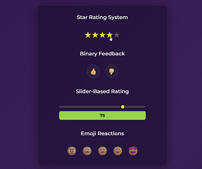
Star rating systems remain the most recognizable feedback mechanism. Five stars feels natural to most users, though some contexts benefit from 10-point scales.
Interactive hover states provide essential feedback. Users should see exactly which rating they’re about to select.
Alternative Rating Methods
Thumbs up/down controls work perfectly for binary feedback scenarios. Simple, clear, and mobile-friendly by default.
Slider-based ratings offer more granular control. They’re especially useful for subjective qualities like satisfaction or likelihood scores.
Emoji Reactions
Emoji reaction pickers add personality to feedback collection. They work particularly well for customer satisfaction surveys and social features.
The key is choosing emojis that translate across cultures and devices. Stick to universally understood expressions.
Color and Media Selectors
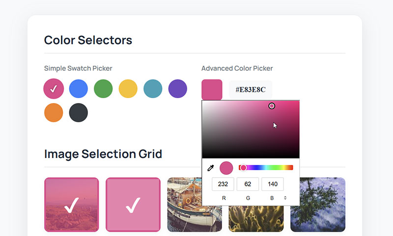
Color picker interfaces vary dramatically in complexity. Simple preset swatches work for most use cases, while full spectrum pickers serve design tools.
Consider your users’ needs carefully. Graphic designers need precision, while blog writers just want decent color options.
Media Management
Image selection grids excel when users choose from existing assets. Pinterest-style layouts make browsing large collections manageable.
Video upload controls require robust progress tracking and format validation. Users need clear feedback about file size limits and supported formats.
Audio Integration
Audio recording fields open new possibilities for user feedback and content creation. Browser support has improved dramatically, making basic recording straightforward.
Quality considerations matter here. Set appropriate bitrates and time limits to balance file size with usability.
Form Structure and Layout Elements
Grouping and Organization
Fieldset groupings create logical sections within longer forms. They help users understand information hierarchy and reduce cognitive load.
Legend elements provide clear section labels. Screen readers rely on these for proper navigation assistance.
Progressive Disclosure
Progressive disclosure patterns reveal complexity gradually. Start with essential fields, then expose advanced options as needed.
Multi-step form wizards break overwhelming forms into digestible chunks. Each step should feel achievable and logically connected to the next.
Accordion Sections
Accordion-style sections work well for optional information groups. Users can focus on relevant sections while keeping others collapsed.
The expand/collapse animations should feel snappy, not sluggish. Smooth transitions enhance the experience without adding delay.
Validation and Error Handling
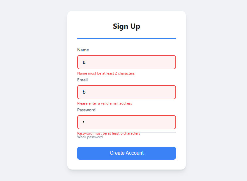
Inline validation messages catch problems early. Users get immediate feedback without waiting for form submission to see what went wrong.
Timing matters critically here. Validate on blur for most fields, but handle passwords and usernames on input for instant availability checking.
Error State Design
Field-level error states need clear visual hierarchy. Red borders, warning icons, and explanatory text should work together harmoniously.
Success confirmation displays provide positive reinforcement. Green checkmarks or subtle success messages encourage users to continue.
Required Field Indicators
Required field indicators prevent submission errors. Asterisks work, but “required” labels often communicate more clearly.
Consider using form validation techniques that guide users toward successful completion rather than just flagging errors.
Helper Text and Instructions
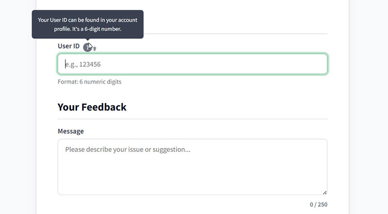
Contextual help tooltips provide assistance without cluttering the interface. Users can access additional information when they need it.
Format example displays eliminate guesswork. Show users exactly how phone numbers, dates, or IDs should be formatted.
Progress Indicators
Character count feedback helps users stay within limits. Real-time counters work better than warnings after the fact.
Progress saving indicators build confidence in longer forms. Users need to know their work won’t be lost if something goes wrong.
Accessibility Features
Proper form accessibility starts with semantic HTML and clear labeling. Screen readers depend on these foundations for meaningful navigation.
Focus management becomes crucial in complex forms. Users should always know where they are and how to proceed logically through the interface.
Mobile and Accessibility Considerations
Touch-Friendly Design
Finger-sized tap targets solve the biggest mobile usability problem. Anything smaller than 44px becomes frustrating to tap accurately.
Spacing between interactive elements matters just as much. Users need buffer zones to avoid accidental taps.
Mobile Keyboard Optimization
Smart input type attributes trigger the right keyboard automatically. type="email" brings up keyboards with @ symbols, while type="tel" shows number pads.
Mobile form best practices include leveraging these mobile forms patterns consistently across all input fields.
Gesture Integration
Gesture-based interactions feel natural on touch devices. Swipe to dismiss, pinch to zoom on complex inputs, and pull-to-refresh for dynamic content.
Responsive field sizing adapts to different screen densities. What looks perfect on desktop might be impossibly small on mobile.
Platform-Specific Patterns
iOS and Android users expect different interaction patterns. Toggle switches look different, date pickers behave differently, and even basic buttons have platform conventions.
CSS user-agent detection helps deliver appropriate experiences. But progressive enhancement works better than device-specific code paths.
Accessibility Features
Screen reader compatibility starts with semantic HTML structure. Proper heading hierarchy, form labels, and ARIA attributes create the foundation.
Label association becomes critical for assistive technology. Every input needs a properly connected label element or aria-label attribute.
Keyboard Navigation
Keyboard navigation support means logical tab order and visible focus indicators. Users should move through forms predictably without getting trapped.
Focus indicator visibility often gets overlooked in custom designs. The default browser outline might be ugly, but removing it breaks accessibility completely.
ARIA Implementation
ARIA attributes fill gaps where HTML semantics fall short. aria-describedby connects help text to inputs, while aria-invalid indicates validation states.
Live regions announce dynamic changes to screen readers. Form validation messages should appear in aria-live regions for immediate feedback.
Visual Accessibility
High contrast mode support requires testing with Windows High Contrast and similar tools. Custom colors often disappear, leaving interfaces unusable.
Text size flexibility accommodates users who zoom browsers to 200% or higher. Fixed pixel layouts break at these zoom levels.
Color and Motion
Color alone never conveys important information. Error states need icons or text labels alongside red colors.
Motion sensitivity affects more users than most designers realize. Respect prefers-reduced-motion settings for animations and transitions.
Cross-Platform Compatibility
Browser-specific styling creates inconsistent experiences. Feature detection beats user-agent sniffing for handling differences gracefully.
Different browsers render form controls differently. Custom styling ensures consistency but requires thorough testing across platforms.
Input Method Variations
Input method variations include voice input, switch navigation, and eye tracking. Flexible designs accommodate these diverse interaction methods.
Platform-native appearances sometimes work better than custom styling. Native controls feel familiar and work reliably with assistive technology.
Testing and Validation
Automated accessibility testing catches obvious issues but misses nuanced problems. Manual testing with real assistive technology reveals the actual user experience.
Mobile testing requires real devices, not just browser resize tools. Touch behaviors, keyboard differences, and performance characteristics vary significantly.
Progressive Enhancement
Fallback option handling ensures basic functionality works everywhere. Enhanced features should layer on top of solid foundations.
JavaScript failures shouldn’t break core form functionality. Server-side validation and semantic HTML provide essential baseline experiences.
Start with HTML that works, then enhance with CSS and JavaScript. This approach creates resilient interfaces that degrade gracefully when things go wrong.
FAQ on Form Fields
What’s the difference between radio buttons and checkboxes?
Radio buttons allow single selection from a group, while checkboxes enable multiple choices. Use radio buttons for exclusive options like payment methods. Checkboxes work for multiple selections like newsletter preferences or feature lists.
When should I use dropdowns versus radio buttons?
Choose dropdowns for 6+ options to save space. Radio button styling works better for 2-5 choices since users see all options immediately. Dropdowns hide choices, requiring extra clicks to explore.
How do I make forms accessible for screen readers?
Connect labels to inputs using for attributes or aria-labelledby. Include ARIA accessibility markup for complex controls. Ensure logical tab order and visible focus indicators throughout your form field design.
What’s the ideal size for mobile touch targets?
Touch interfaces need minimum 44px tap targets with adequate spacing. Smaller buttons frustrate users and increase error rates. Consider finger size variations when designing mobile form fields for different devices.
How can I reduce form abandonment rates?
Break long forms into logical sections using multi-step form wizards. Implement real-time validation and clear error messages. Show progress indicators and auto-save functionality to build user confidence throughout the process.
What validation should happen client-side versus server-side?
Client-side validation provides immediate feedback for format checking and required fields. Server-side validation handles security and data integrity. Always validate on both sides – never trust client-side validation alone.
Should I use placeholder text or labels?
Labels provide better form accessibility and remain visible during input. Placeholder text can supplement labels but shouldn’t replace them. Screen readers and users with cognitive disabilities rely on persistent labels.
How do I handle file uploads effectively?
Implement drag and drop upload areas with progress indicators. Clearly communicate file size limits and accepted formats. Provide preview thumbnails and allow individual file removal in multiple file selection scenarios.
What’s the best way to group related form fields?
Use fieldset groupings with descriptive legends for logical sections. Visual spacing and background colors help separate groups. Progressive disclosure keeps complex forms manageable by showing relevant sections conditionally.
How do I optimize forms for conversion?
Reduce form field count to essentials only. Use smart defaults and autocomplete suggestions where possible. Apply form design principles that guide users smoothly toward completion without friction.
Conclusion
Mastering the form fields any designer should know transforms user experiences from frustrating barriers into smooth pathways. These interface components shape how people interact with your designs every single day.
Smart input field behavior reduces cognitive load while proper field validation states prevent user errors before they happen. The difference between amateur and professional interfaces often comes down to these fundamental details.
User input controls continue evolving with new browser capabilities and changing user expectations. Touch-friendly sizing, keyboard navigation support, and screen reader compatibility aren’t optional extras anymore – they’re baseline requirements.
Great form UX design balances visual appeal with functional reliability. Users don’t notice perfect forms, but they definitely remember broken ones.
Start implementing these patterns in your next project. Your users will complete more forms, abandon fewer processes, and trust your interfaces to work reliably across all their devices.