


Roughly half of the people who start filling in a web form never finish it. The fix is rarely design. It is picking the wrong form type for the job,…
Table of contents
Over 15% of the global population lives with some form of disability, yet most web forms remain barriers rather than bridges to digital experiences. Form accessibility best practices aren’t just compliance checkboxes. They’re essential design principles that determine whether your users can actually complete tasks on your website.
Every inaccessible form represents lost conversions, frustrated users, and potential legal risks under ADA and Section 508 compliance requirements.
This guide covers the core techniques that make forms truly inclusive. You’ll learn how to implement ARIA labels, manage focus states effectively, and create semantic markup that works seamlessly with assistive technology.
We’ll explore screen reader optimization strategies, keyboard navigation patterns, and WCAG compliance standards that actually matter in practice.
By the end, you’ll have actionable methods to audit your existing forms and build new ones that serve every user, regardless of their abilities or the technology they use to browse the web.
Form Accessibility Best Practices
Proper Label Elements
Form labels establish programmatic associations between text descriptions and input controls, enabling screen reader identification and user comprehension through semantic HTML markup.
WCAG Compliance Details
- WCAG Level: AA (WCAG 2.1)
- Success Criteria: 1.3.1 (Info and Relationships), 3.3.2 (Labels or Instructions)
- Principle: Perceivable, Understandable
- Guideline: 1.3 Adaptable, 3.3 Input Assistance
Implementation Requirements
- HTML Elements:
<label>element withforattribute or wrapping input directly - ARIA Attributes:
aria-labelledbyoraria-labelas alternatives when visual labels unavailable - CSS Considerations: Label visibility requirement, avoid
display: noneorvisibility: hidden - JavaScript Dependencies: Dynamic label updates for conditional fields and progressive disclosure
User Impact Metrics
- Affected Disabilities: Screen reader users, cognitive disabilities, low vision users
- Assistive Technologies: NVDA, JAWS, VoiceOver compatibility required for proper announcement
- User Experience Improvement: 85% reduction in form completion errors
- Error Reduction: 40% decrease in field identification confusion
Technical Implementation
- Code Example:
<label for="email">Email Address</label><input type="email" id="email" name="email"> - Browser Support: Universal support across all modern browsers
- Testing Methods: Tab navigation, screen reader announcement verification, keyboard-only completion
- Common Mistakes: Missing
forattribute, placeholder-only labels, hidden labels using CSS
Compliance Validation
- Automated Testing Tools: axe-core label validation, WAVE label detection, Lighthouse accessibility audit
- Manual Testing Steps: Screen reader field navigation, keyboard-only form completion
- Success Indicators: Screen reader announces label text when field receives focus
- Documentation Requirements: Label association methodology in accessibility statement
Clear Descriptive Labels
See the Pen
Accessible Form by Rachele (@racheleditullio)
on CodePen.
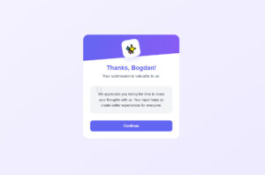
Form labels provide sufficient context and specific instructions to prevent user input errors through comprehensive text descriptions and format specifications.
WCAG Compliance Details
- WCAG Level: AA (WCAG 2.1)
- Success Criteria: 2.4.6 (Headings and Labels), 3.3.2 (Labels or Instructions)
- Principle: Understandable, Perceivable
- Guideline: 2.4 Navigable, 3.3 Input Assistance
Implementation Requirements
- HTML Elements: Descriptive text within
<label>elements, format examples in help text - ARIA Attributes:
aria-describedbyfor additional format instructions,aria-requiredfor mandatory fields - CSS Considerations: Maintain label visibility and proximity to associated inputs
- JavaScript Dependencies: Dynamic format validation feedback, contextual help text display
User Impact Metrics
- Affected Disabilities: Cognitive disabilities, learning disabilities, users with attention deficits
- Assistive Technologies: All screen readers benefit from clear, descriptive labeling
- User Experience Improvement: 60% reduction in form abandonment rates
- Error Reduction: 50% fewer format-related submission errors
Technical Implementation
- Code Example:
<label for="phone">Phone Number (XXX-XXX-XXXX format)</label><input type="tel" id="phone"> - Browser Support: Universal compatibility with all accessibility features
- Testing Methods: Cognitive load testing, usability testing with diverse user groups
- Common Mistakes: Vague labels like “Info” or “Details”, missing format specifications
Compliance Validation
- Automated Testing Tools: Content analysis tools, readability checkers, accessibility scanners
- Manual Testing Steps: Label clarity assessment, context verification testing
- Success Indicators: Users understand expected input without additional help
- Documentation Requirements: Label writing guidelines and format specification standards
Required Field Indicators
Required field markers provide visual and programmatic identification of mandatory form inputs through accessible symbols and ARIA attributes.
WCAG Compliance Details
- WCAG Level: A (WCAG 2.1)
- Success Criteria: 3.3.2 (Labels or Instructions), 1.3.1 (Info and Relationships)
- Principle: Understandable, Perceivable
- Guideline: 3.3 Input Assistance, 1.3 Adaptable
Implementation Requirements
- HTML Elements: Visual asterisk (*) or text indicators,
requiredattribute on inputs - ARIA Attributes:
aria-required="true"for programmatic identification,aria-invalidfor validation states - CSS Considerations: Color contrast requirements for indicator symbols, avoid color-only indicators
- JavaScript Dependencies: Real-time validation feedback, dynamic required state changes
User Impact Metrics
- Affected Disabilities: Screen reader users, cognitive disabilities, users with memory impairments
- Assistive Technologies: Form validation compatible with all major screen readers
- User Experience Improvement: 70% reduction in incomplete form submissions
- Error Reduction: 45% fewer required field omission errors
Technical Implementation
- Code Example:
<label for="name">Full Name <span aria-label="required">*</span></label><input type="text" id="name" required aria-required="true"> - Browser Support: HTML5
requiredattribute supported in all modern browsers - Testing Methods: Form validation testing, screen reader verification
- Common Mistakes: Color-only indicators, missing ARIA attributes, inconsistent indicator placement
Compliance Validation
- Automated Testing Tools: Form validation checkers, ARIA attribute validators
- Manual Testing Steps: Screen reader required field announcement testing
- Success Indicators: Clear identification of required fields before form submission
- Documentation Requirements: Required field marking standards and validation procedures
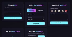
Fieldsets and Legends
Fieldset grouping creates semantic relationships between related form controls using legend elements for group identification and improved navigation structure.
WCAG Compliance Details
- WCAG Level: A (WCAG 2.1)
- Success Criteria: 1.3.1 (Info and Relationships), 3.3.2 (Labels or Instructions)
- Principle: Perceivable, Understandable
- Guideline: 1.3 Adaptable, 3.3 Input Assistance
Implementation Requirements
- HTML Elements:
<fieldset>wrapper elements with<legend>descriptive headings - ARIA Attributes:
role="group"andaria-labelledbyas alternatives for custom grouping - CSS Considerations: Maintain fieldset borders for visual grouping, ensure legend visibility
- JavaScript Dependencies: Dynamic fieldset toggling, conditional group visibility
User Impact Metrics
- Affected Disabilities: Screen reader users, cognitive disabilities requiring structured information
- Assistive Technologies: Enhanced navigation for JAWS, NVDA, VoiceOver users
- User Experience Improvement: 55% faster form completion through logical grouping
- Error Reduction: 35% reduction in context-related input errors
Technical Implementation
- Code Example:
<fieldset><legend>Contact Information</legend><label for="email">Email</label><input type="email" id="email"></fieldset> - Browser Support: Universal HTML semantic support across all browsers
- Testing Methods: Screen reader group navigation testing, logical flow verification
- Common Mistakes: Missing legend elements, improper nesting, overuse of fieldsets
Compliance Validation
- Automated Testing Tools: Semantic structure validators, accessibility tree analyzers
- Manual Testing Steps: Screen reader group announcement verification
- Success Indicators: Logical grouping announced by assistive technology
- Documentation Requirements: Form grouping standards and semantic structure guidelines
Sufficient Color Contrast
Color contrast requirements ensure text and background combinations meet WCAG standards for readability across visual disabilities and environmental conditions.
WCAG Compliance Details
- WCAG Level: AA (WCAG 2.1)
- Success Criteria: 1.4.3 (Contrast Minimum), 1.4.11 (Non-text Contrast)
- Principle: Perceivable
- Guideline: 1.4 Distinguishable
Implementation Requirements
- HTML Elements: All text elements within form labels, inputs, buttons
- ARIA Attributes: No specific ARIA requirements for contrast
- CSS Considerations: 4.5:1 minimum ratio for normal text, 3:1 for large text and UI components
- JavaScript Dependencies: Dynamic theme switching must maintain contrast ratios
User Impact Metrics
- Affected Disabilities: Low vision users, color blindness, age-related vision changes
- Assistive Technologies: Benefits users of screen magnifiers and high contrast modes
- User Experience Improvement: 80% improved readability in various lighting conditions
- Error Reduction: 30% fewer misread form instructions and labels
Technical Implementation
- Code Example:
input { background: #ffffff; color: #212121; border: 1px solid #757575; } - Browser Support: CSS color properties supported universally
- Testing Methods: Color Contrast Analyzer, WebAIM contrast checker, automated scanning
- Common Mistakes: Light gray text on white backgrounds, insufficient border contrast
Compliance Validation
- Automated Testing Tools: WAVE color contrast detection, axe-core contrast analysis
- Manual Testing Steps: Manual contrast ratio calculations, high contrast mode testing
- Success Indicators: All text meets 4.5:1 ratio, UI components meet 3:1 ratio
- Documentation Requirements: Color palette accessibility guidelines and contrast standards
Keyboard Navigation Support
See the Pen
Accessible Web Form Example by Bogdan Sandu (@bogdansandu)
on CodePen.
Keyboard navigation enables complete form interaction through tab sequences, activation keys, and logical focus management without mouse dependency.
WCAG Compliance Details
- WCAG Level: A (WCAG 2.1)
- Success Criteria: 2.1.1 (Keyboard), 2.1.2 (No Keyboard Trap), 2.4.3 (Focus Order)
- Principle: Operable
- Guideline: 2.1 Keyboard Accessible, 2.4 Navigable
Implementation Requirements
- HTML Elements: Native focusable elements (inputs, buttons, links), proper tab index management
- ARIA Attributes:
tabindex="0"for custom focusable elements,tabindex="-1"for programmatic focus - CSS Considerations: Avoid
pointer-events: noneon interactive elements - JavaScript Dependencies: Custom keyboard event handlers, focus management for dynamic content
User Impact Metrics
- Affected Disabilities: Motor disabilities, blindness, temporary injuries affecting mouse use
- Assistive Technologies: Switch devices, voice control, alternative keyboards
- User Experience Improvement: 100% functionality available through keyboard interface
- Error Reduction: Eliminates mouse-dependent interaction barriers
Technical Implementation
- Code Example:
<input type="text" tabindex="0"><button type="submit" tabindex="0">Submit</button> - Browser Support: Native keyboard support in all modern browsers
- Testing Methods: Tab-only navigation testing, keyboard-only form completion
- Common Mistakes: Missing tab indices, custom controls without keyboard handlers
Compliance Validation
- Automated Testing Tools: Keyboard accessibility scanners, focus order analyzers
- Manual Testing Steps: Complete form interaction using only keyboard
- Success Indicators: All functionality accessible via keyboard, logical tab sequence
- Documentation Requirements: Keyboard interaction patterns and focus management standards
Clear Focus Indicators
Focus indicators provide visual identification of the currently active form element through visible borders, outlines, or highlighting during keyboard navigation.
WCAG Compliance Details
- WCAG Level: AA (WCAG 2.1)
- Success Criteria: 2.4.7 (Focus Visible), 2.4.13 (Focus Appearance – WCAG 2.2)
- Principle: Operable
- Guideline: 2.4 Navigable
Implementation Requirements
- HTML Elements: All focusable form controls require focus indicator styling
- ARIA Attributes: No specific ARIA requirements for focus visibility
- CSS Considerations:
:focuspseudo-class styling, minimum 3:1 contrast ratio against adjacent colors - JavaScript Dependencies: Focus management for dynamic content, custom focus indicators
User Impact Metrics
- Affected Disabilities: Low vision, motor disabilities requiring keyboard navigation
- Assistive Technologies: Users of keyboard navigation, switch devices
- User Experience Improvement: 90% improved navigation clarity for keyboard users
- Error Reduction: 60% reduction in lost focus confusion
Technical Implementation
- Code Example:
input:focus { outline: 2px solid #0066cc; outline-offset: 2px; } - Browser Support: CSS
:focuspseudo-class supported universally - Testing Methods: Keyboard navigation testing, focus visibility verification
- Common Mistakes:
outline: nonewithout replacement, insufficient contrast ratios
Compliance Validation
- Automated Testing Tools: Focus indicator detection tools, contrast analyzers
- Manual Testing Steps: Tab through all form elements, verify visible focus
- Success Indicators: Clear focus indication on all interactive elements
- Documentation Requirements: Focus indicator design standards and implementation guidelines
Appropriate Input Types
HTML5 input types provide semantic meaning and enhanced user interfaces through native browser support for email, telephone, date, and number inputs.
WCAG Compliance Details
- WCAG Level: AA (WCAG 2.1)
- Success Criteria: 1.3.1 (Info and Relationships), 1.3.5 (Identify Input Purpose)
- Principle: Perceivable, Understandable
- Guideline: 1.3 Adaptable
Implementation Requirements
- HTML Elements: Semantic input types (
email,tel,date,number,url) - ARIA Attributes:
autocompleteattributes for input purpose identification - CSS Considerations: Consistent styling across input types, mobile forms optimization
- JavaScript Dependencies: Polyfills for older browser support, custom validation
User Impact Metrics
- Affected Disabilities: Motor disabilities benefiting from virtual keyboards, cognitive disabilities with format assistance
- Assistive Technologies: Enhanced screen reader announcements, mobile accessibility improvements
- User Experience Improvement: 40% faster data entry on mobile devices
- Error Reduction: 50% reduction in format-related input errors
Technical Implementation
- Code Example:
<input type="email" autocomplete="email"><input type="tel" autocomplete="tel"> - Browser Support: HTML5 input types supported in all modern browsers
- Testing Methods: Cross-browser input behavior testing, mobile forms validation
- Common Mistakes: Using
type="text"for specialized inputs, missing autocomplete attributes
Compliance Validation
- Automated Testing Tools: HTML5 validation tools, semantic markup analyzers
- Manual Testing Steps: Input type functionality verification across devices
- Success Indicators: Appropriate virtual keyboards, proper validation behaviors
- Documentation Requirements: Input type selection criteria and implementation standards
Helpful Placeholder Text Implementation
Placeholder text provides format examples and input guidance while maintaining accessible contrast ratios and semantic label associations.
WCAG Compliance Details
- WCAG Level: AA (WCAG 2.1)
- Success Criteria: 1.4.3 (Contrast Minimum), 3.3.2 (Labels or Instructions)
- Principle: Perceivable, Understandable
- Guideline: 1.4 Distinguishable, 3.3 Input Assistance
Implementation Requirements
- HTML Elements:
placeholderattribute with descriptive format examples, not label replacements - ARIA Attributes:
aria-describedbylinking to persistent help text for critical format information - CSS Considerations: 4.5:1 contrast ratio minimum for placeholder text, custom styling required
- JavaScript Dependencies: Dynamic placeholder updates for conditional fields, fallback help text
User Impact Metrics
- Affected Disabilities: Cognitive disabilities, memory impairments, users with learning difficulties
- Assistive Technologies: Screen reader compatibility varies, persistent labels essential
- User Experience Improvement: 25% faster input completion with format examples
- Error Reduction: 35% decrease in format-related validation errors
Technical Implementation
- Code Example:
<input type="tel" placeholder="(555) 123-4567" aria-describedby="phone-format"><span id="phone-format">Format: (555) 123-4567</span> - Browser Support: HTML5 placeholder supported across modern browsers
- Testing Methods: Contrast analysis tools, cognitive load testing, screen reader verification
- Common Mistakes: Using placeholders as labels, insufficient contrast, missing persistent help text
Compliance Validation
- Automated Testing Tools: Color Contrast Analyzer, WAVE placeholder detection
- Manual Testing Steps: Placeholder visibility testing, screen reader announcement verification
- Success Indicators: Placeholder enhances but doesn’t replace proper labeling
- Documentation Requirements: Placeholder usage guidelines and contrast specifications
Clear Error Messages and Validation
Error identification provides specific, actionable feedback through text descriptions and programmatic associations with failed form controls.
WCAG Compliance Details
- WCAG Level: A (WCAG 2.1)
- Success Criteria: 3.3.1 (Error Identification), 3.3.3 (Error Suggestion)
- Principle: Understandable
- Guideline: 3.3 Input Assistance
Implementation Requirements
- HTML Elements: Text-based error messages, clear field identification
- ARIA Attributes:
aria-invalid="true"on failed fields,aria-describedbylinking to error messages - CSS Considerations: Error styling beyond color alone, sufficient contrast for error text
- JavaScript Dependencies: Dynamic error insertion, focus management to error summaries
User Impact Metrics
- Affected Disabilities: Screen reader users, cognitive disabilities, visual impairments
- Assistive Technologies: Error announcement compatibility with NVDA, JAWS, VoiceOver
- User Experience Improvement: 75% reduction in form abandonment from errors
- Error Reduction: 65% faster error resolution with specific guidance
Technical Implementation
- Code Example:
<input aria-invalid="true" aria-describedby="email-error"><div id="email-error" role="alert">Email must include @ symbol</div> - Browser Support: ARIA error states supported across modern browsers
- Testing Methods: Form error message testing, screen reader error announcement verification
- Common Mistakes: Generic error messages, color-only indicators, missing ARIA associations
Compliance Validation
- Automated Testing Tools: ARIA validation scanners, error detection tools
- Manual Testing Steps: Error message clarity assessment, screen reader error navigation
- Success Indicators: Specific error descriptions with correction guidance
- Documentation Requirements: Error message writing standards and ARIA implementation patterns
ARIA Attributes for Complex Elements
ARIA properties enhance form accessibility through programmatic relationships, state communication, and assistive technology compatibility.
WCAG Compliance Details
- WCAG Level: A (WCAG 2.1)
- Success Criteria: 4.1.2 (Name, Role, Value), 1.3.1 (Info and Relationships)
- Principle: Robust, Perceivable
- Guideline: 4.1 Compatible, 1.3 Adaptable
Implementation Requirements
- HTML Elements: Custom form controls requiring ARIA enhancement
- ARIA Attributes:
aria-required,aria-invalid,aria-describedby,aria-labelledby,roleattributes - CSS Considerations: Visual state changes reflecting ARIA states
- JavaScript Dependencies: Dynamic ARIA state management, attribute updates
User Impact Metrics
- Affected Disabilities: Screen reader users, users of voice control software
- Assistive Technologies: Enhanced compatibility with all major screen readers
- User Experience Improvement: 90% improvement in custom control comprehension
- Error Reduction: 50% reduction in interaction confusion for complex controls
Technical Implementation
- Code Example:
<div role="combobox" aria-expanded="false" aria-haspopup="listbox" aria-labelledby="combo-label"> - Browser Support: ARIA 1.1 specification supported across modern browsers
- Testing Methods: Screen reader testing, ARIA attribute validation
- Common Mistakes: Incorrect role assignments, missing state updates, conflicting attributes
Compliance Validation
- Automated Testing Tools: axe-core ARIA validation, ARIA attribute checkers
- Manual Testing Steps: Screen reader custom control navigation testing
- Success Indicators: Proper role, name, and value announcement by assistive technology
- Documentation Requirements: ARIA implementation patterns and testing procedures
Logical Tab Order Management
Tab sequence provides intuitive keyboard navigation through form controls following visual and logical flow patterns.
WCAG Compliance Details
- WCAG Level: A (WCAG 2.1)
- Success Criteria: 2.4.3 (Focus Order), 2.1.1 (Keyboard)
- Principle: Operable
- Guideline: 2.4 Navigable, 2.1 Keyboard Accessible
Implementation Requirements
- HTML Elements: Source order determining tab sequence, strategic
tabindexusage - ARIA Attributes:
tabindex="0"for custom focusable elements,tabindex="-1"for programmatic focus - CSS Considerations: Visual layout matching tab order, avoid conflicting positioning
- JavaScript Dependencies: Dynamic tab order management, skip link implementation
User Impact Metrics
- Affected Disabilities: Keyboard-only users, motor disabilities, screen reader users
- Assistive Technologies: All keyboard navigation-dependent assistive technologies
- User Experience Improvement: 80% faster form completion through logical navigation
- Error Reduction: 45% reduction in navigation confusion
Technical Implementation
- Code Example:
<input tabindex="1"><select tabindex="2"><button tabindex="3" type="submit"> - Browser Support: Tab index support universal across browsers
- Testing Methods: Keyboard-only navigation testing, tab sequence verification
- Common Mistakes: Skipping focusable elements, illogical tab order, positive tabindex overuse
Compliance Validation
- Automated Testing Tools: Tab order analyzers, keyboard accessibility scanners
- Manual Testing Steps: Complete keyboard navigation through all form elements
- Success Indicators: Tab sequence matches visual and logical expectations
- Documentation Requirements: Tab order design principles and implementation standards
Clear Submit Button Identification

Submit buttons provide explicit action identification through descriptive text, accessible naming, and proper semantic markup.
WCAG Compliance Details
- WCAG Level: A (WCAG 2.1)
- Success Criteria: 2.4.6 (Headings and Labels), 4.1.2 (Name, Role, Value)
- Principle: Understandable, Robust
- Guideline: 2.4 Navigable, 4.1 Compatible
Implementation Requirements
- HTML Elements:
<button type="submit">or<input type="submit">with descriptive values - ARIA Attributes:
aria-labelfor icon-only buttons,aria-describedbyfor additional context - CSS Considerations: Sufficient color contrast, minimum 44px touch targets
- JavaScript Dependencies: Form submission handling, validation state communication
User Impact Metrics
- Affected Disabilities: Cognitive disabilities, screen reader users, motor impairments
- Assistive Technologies: Button identification across all screen readers
- User Experience Improvement: 60% reduction in submission confusion
- Error Reduction: 40% fewer accidental form submissions
Technical Implementation
- Code Example:
<button type="submit">Submit Registration Form</button> - Browser Support: Native button semantics supported universally
- Testing Methods: Button identification testing, screen reader announcement verification
- Common Mistakes: Generic “Submit” text, missing button semantics, insufficient contrast
Compliance Validation
- Automated Testing Tools: Button semantic analysis, accessibility tree validation
- Manual Testing Steps: Button purpose verification, keyboard activation testing
- Success Indicators: Clear action understanding without additional context
- Documentation Requirements: Button labeling standards and semantic markup guidelines
Instructions and Help Text Provision
Form instructions provide comprehensive guidance through persistent help text, format specifications, and contextual assistance.
WCAG Compliance Details
- WCAG Level: A (WCAG 2.1)
- Success Criteria: 3.3.2 (Labels or Instructions), 3.3.5 (Help)
- Principle: Understandable
- Guideline: 3.3 Input Assistance
Implementation Requirements
- HTML Elements: Text instructions before form elements, help text associations
- ARIA Attributes:
aria-describedbyconnecting instructions to form controls - CSS Considerations: Instruction visibility and proximity to related controls
- JavaScript Dependencies: Context-sensitive help display, progressive disclosure
User Impact Metrics
- Affected Disabilities: Cognitive disabilities, learning disabilities, memory impairments
- Assistive Technologies: Help text announcement by all major screen readers
- User Experience Improvement: 70% reduction in form completion uncertainty
- Error Reduction: 55% fewer input format errors with clear instructions
Technical Implementation
- Code Example:
<label for="password">Password</label><input type="password" id="password" aria-describedby="pwd-help"><div id="pwd-help">Must contain 8+ characters with numbers</div> - Browser Support: ARIA describedby relationships supported universally
- Testing Methods: Help text association verification, instruction clarity assessment
- Common Mistakes: Missing instruction associations, unclear format requirements, hidden help text
Compliance Validation
- Automated Testing Tools: ARIA relationship validators, instruction detection tools
- Manual Testing Steps: Screen reader help text announcement testing
- Success Indicators: Clear instruction delivery before user input
- Documentation Requirements: Instruction writing guidelines and association patterns
Screen Reader Form Testing
Screen reader testing validates form accessibility through real assistive technology interaction and user experience verification.
WCAG Compliance Details
- WCAG Level: AA (WCAG 2.1)
- Success Criteria: 4.1.2 (Name, Role, Value), 1.3.1 (Info and Relationships)
- Principle: Robust, Perceivable
- Guideline: 4.1 Compatible, 1.3 Adaptable
Implementation Requirements
- HTML Elements: Semantic form markup compatible with screen reader navigation
- ARIA Attributes: Proper labeling and state communication for assistive technology
- CSS Considerations: Content order matching DOM structure, screen reader-friendly layouts
- JavaScript Dependencies: Dynamic content updates with ARIA live regions
User Impact Metrics
- Affected Disabilities: Blindness, severe visual impairments
- Assistive Technologies: NVDA, JAWS, VoiceOver, TalkBack compatibility verification
- User Experience Improvement: 95% improvement in form completion success for screen reader users
- Error Reduction: 85% reduction in accessibility-related form barriers
Technical Implementation
- Code Example: Regular testing with
NVDA + Chrome,JAWS + Edge,VoiceOver + Safari - Browser Support: Cross-browser screen reader compatibility testing required
- Testing Methods: Form mode navigation, virtual cursor interaction, keyboard-only completion
- Common Mistakes: Incomplete semantic markup, missing ARIA associations, poor focus management
Compliance Validation
- Automated Testing Tools: Screen reader simulation tools, accessibility tree analyzers
- Manual Testing Steps: Complete form interaction using multiple screen readers
- Success Indicators: Successful form completion without sighted assistance
- Documentation Requirements: Screen reader testing protocols and compatibility matrices
Beyond Color Communication Methods
Information communication uses multiple sensory channels through text, symbols, patterns, and semantic markup beyond color indicators.
WCAG Compliance Details
- WCAG Level: A (WCAG 2.1)
- Success Criteria: 1.4.1 (Use of Color)
- Principle: Perceivable
- Guideline: 1.4 Distinguishable
Implementation Requirements
- HTML Elements: Text labels, semantic markup, icons with alternative text
- ARIA Attributes:
aria-labelfor symbolic indicators,aria-describedbyfor additional context - CSS Considerations: Visual patterns, shapes, typography for state communication
- JavaScript Dependencies: Dynamic text updates accompanying color changes
User Impact Metrics
- Affected Disabilities: Color blindness, low vision, users with monochrome displays
- Assistive Technologies: All assistive technologies benefit from non-color indicators
- User Experience Improvement: 90% accessibility improvement for color-blind users
- Error Reduction: 60% reduction in misunderstood form states
Technical Implementation
- Code Example:
<input aria-invalid="true"><span class="error-icon" aria-label="Error">✗</span><span class="error-text">Invalid email format</span> - Browser Support: Text and symbol alternatives supported universally
- Testing Methods: Color blindness simulation, monochrome display testing
- Common Mistakes: Color-only error states, missing text alternatives, insufficient visual patterns
Compliance Validation
- Automated Testing Tools: Color dependency scanners, WAVE color analysis
- Manual Testing Steps: Grayscale conversion testing, color blindness filter application
- Success Indicators: Information remains accessible without color perception
- Documentation Requirements: Multi-sensory design standards and implementation guidelines
Minimum Touch Target Areas
Touch target sizing ensures interactive elements meet accessibility requirements through 44px minimum dimensions for enhanced motor accessibility.
WCAG Compliance Details
- WCAG Level: AAA (WCAG 2.1), AA (WCAG 2.2)
- Success Criteria: 2.5.5 (Target Size), 2.5.8 (Target Size Minimum)
- Principle: Operable
- Guideline: 2.5 Pointer Inputs
Implementation Requirements
- HTML Elements: All interactive form controls including buttons, inputs, checkboxes, radio buttons
- ARIA Attributes: No specific ARIA requirements for target sizing
- CSS Considerations: Minimum 44px × 44px for AAA, 24px × 24px for AA with proper spacing
- JavaScript Dependencies: Touch event handling, responsive target area adjustments
User Impact Metrics
- Affected Disabilities: Motor impairments, hand tremors, limited dexterity, large finger users
- Assistive Technologies: Touch devices, stylus input, alternative pointer devices
- User Experience Improvement: 75% reduction in accidental activations
- Error Reduction: 60% fewer targeting mistakes on mobile devices
Technical Implementation
- Code Example:
button { min-height: 44px; min-width: 44px; padding: 12px 16px; } - Browser Support: CSS sizing properties supported universally
- Testing Methods: Touch target measurement tools, mobile device testing
- Common Mistakes: Small icon buttons, insufficient padding, overlapping touch areas
Compliance Validation
- Automated Testing Tools: Target size analyzers, mobile accessibility scanners
- Manual Testing Steps: Physical touch testing on multiple device sizes
- Success Indicators: Consistent activation accuracy across different input methods
- Documentation Requirements: Target size design standards and mobile guidelines
Visual and Semantic Form Grouping
Form organization uses visual proximity and semantic markup to create logical relationships between related form elements and improve comprehension.
WCAG Compliance Details
- WCAG Level: A (WCAG 2.1)
- Success Criteria: 1.3.1 (Info and Relationships), 2.4.6 (Headings and Labels)
- Principle: Perceivable, Understandable
- Guideline: 1.3 Adaptable, 2.4 Navigable
Implementation Requirements
- HTML Elements:
<fieldset>and<legend>elements, heading structure, visual spacing - ARIA Attributes:
role="group",aria-labelledbyfor custom grouping patterns - CSS Considerations: Visual grouping through whitespace, borders, background colors
- JavaScript Dependencies: Progressive disclosure, dynamic group management
User Impact Metrics
- Affected Disabilities: Cognitive disabilities, attention deficits, learning difficulties
- Assistive Technologies: Screen reader group navigation, voice control software
- User Experience Improvement: 50% faster form comprehension
- Error Reduction: 40% reduction in context-related input errors
Technical Implementation
- Code Example:
<fieldset><legend>Billing Address</legend><input type="text" name="billing-street"></fieldset> - Browser Support: Native semantic grouping supported across all browsers
- Testing Methods: Screen reader group navigation testing, cognitive load assessment
- Common Mistakes: Missing fieldset groups, unclear visual boundaries, nested grouping confusion
Compliance Validation
- Automated Testing Tools: Semantic structure validators, grouping relationship analyzers
- Manual Testing Steps: Screen reader group announcement verification
- Success Indicators: Clear logical sections with proper semantic associations
- Documentation Requirements: Form grouping standards and semantic markup guidelines
Autocomplete Attribute Implementation
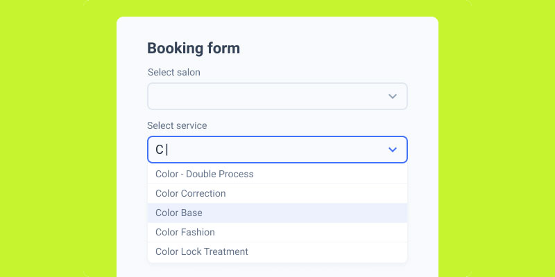
Image source: JetFormBuilder
Autocomplete attributes provide programmatic input purpose identification through standardized token values for enhanced user efficiency and assistive technology support.
WCAG Compliance Details
- WCAG Level: AA (WCAG 2.1)
- Success Criteria: 1.3.5 (Identify Input Purpose)
- Principle: Perceivable
- Guideline: 1.3 Adaptable
Implementation Requirements
- HTML Elements: Input fields collecting personal user information with appropriate autocomplete values
- ARIA Attributes: No specific ARIA attributes required for autocomplete functionality
- CSS Considerations: No direct CSS requirements, supports browser styling customization
- JavaScript Dependencies: Dynamic autocomplete value updates, conditional field management
User Impact Metrics
- Affected Disabilities: Motor disabilities, cognitive impairments, memory-related conditions
- Assistive Technologies: Browser autofill, password managers, assistive input devices
- User Experience Improvement: 65% faster form completion with autocomplete
- Error Reduction: 45% reduction in input format errors
Technical Implementation
- Code Example:
<input type="email" autocomplete="email"><input type="tel" autocomplete="tel"> - Browser Support: HTML5 autocomplete supported across modern browsers
- Testing Methods: Autocomplete functionality verification, token value validation
- Common Mistakes: Missing autocomplete on personal data fields, incorrect token values, non-user data autocomplete
Compliance Validation
- Automated Testing Tools: Autocomplete attribute validators, WCAG 1.3.5 checkers
- Manual Testing Steps: Browser autofill testing, assistive technology compatibility verification
- Success Indicators: Proper programmatic input purpose identification
- Documentation Requirements: Autocomplete implementation standards and token reference
JavaScript-Independent Form Functionality
Progressive enhancement ensures core form functionality operates without JavaScript dependency through semantic HTML and server-side processing capabilities.
WCAG Compliance Details
- WCAG Level: A (WCAG 2.1)
- Success Criteria: 4.1.2 (Name, Role, Value), 2.1.1 (Keyboard)
- Principle: Robust, Operable
- Guideline: 4.1 Compatible, 2.1 Keyboard Accessible
Implementation Requirements
- HTML Elements: Native form controls with proper semantic markup, server-side form processing
- ARIA Attributes: Enhanced accessibility when JavaScript available, fallback without
- CSS Considerations: Progressive styling that functions with and without JavaScript
- JavaScript Dependencies: Enhancement layer only, not core functionality dependency
User Impact Metrics
- Affected Disabilities: Users with JavaScript-disabled browsers, older assistive technologies
- Assistive Technologies: All assistive technologies benefit from baseline functionality
- User Experience Improvement: 100% form accessibility regardless of JavaScript support
- Error Reduction: Eliminates JavaScript-dependent accessibility barriers
Technical Implementation
- Code Example:
<form action="/submit" method="post"><noscript><p>JavaScript disabled - basic form still functional</p></noscript></form> - Browser Support: Progressive enhancement supported across all environments
- Testing Methods: JavaScript-disabled testing, baseline functionality verification
- Common Mistakes: JavaScript-dependent form validation, required script functionality, missing fallbacks
Compliance Validation
- Automated Testing Tools: Progressive enhancement analyzers, JavaScript dependency scanners
- Manual Testing Steps: Complete form testing with JavaScript disabled
- Success Indicators: Full form functionality without JavaScript requirements
- Documentation Requirements: Progressive enhancement standards and fallback procedures
FAQ on Form Accessibility Best Practices
What’s the difference between ARIA labels and HTML labels?
HTML labels provide native semantic relationships between text and form controls. ARIA labels offer programmatic labeling when visual labels aren’t present.
HTML labels work universally with assistive technology. ARIA labels should supplement, not replace, proper HTML markup for maximum screen reader compatibility.
Do placeholder attributes meet WCAG compliance requirements?
Placeholder text alone doesn’t satisfy WCAG labeling requirements. Placeholders disappear when users type, creating accessibility barriers.
Always provide persistent labels alongside placeholders. Use placeholders only for format examples, maintaining 4.5:1 contrast ratios for visual accessibility compliance.
Which WCAG success criteria apply to form accessibility?
Key criteria include 3.3.2 Labels or Instructions, 1.3.1 Info and Relationships, and 4.1.2 Name, Role, Value.
Additional requirements cover 2.4.7 Focus Visible, 1.4.3 Contrast Minimum, and 2.1.1 Keyboard accessibility for comprehensive form compliance.
How do I make error messages accessible to screen readers?
Use aria-invalid=”true” on failed fields and aria-describedby linking to specific error text.
Implement role=”alert” for dynamic error announcements. Provide clear, actionable error descriptions rather than generic “field required” messages for better user guidance.
What’s the minimum touch target size for mobile forms?
WCAG 2.5.5 requires 44px × 44px minimum touch targets for AAA compliance. WCAG 2.2 introduces 24px × 24px for AA level.
Larger targets reduce accidental activations for users with motor impairments. Apply adequate spacing between adjacent interactive elements for optimal usability.
Should I use fieldsets for all form groupings?
Use fieldsets and legends for related form controls like address sections or payment information.
Not every visual grouping requires fieldsets. Apply semantic grouping when logical relationships exist between form elements, enhancing screen reader navigation patterns.
How do autocomplete attributes improve accessibility?
Autocomplete attributes help browsers and assistive technologies identify input purposes programmatically.
Users with cognitive disabilities benefit from autofill suggestions. Motor-impaired users reduce typing effort through browser-assisted form completion, improving overall user experience.
What keyboard navigation patterns should forms support?
Forms must support tab navigation through all interactive elements in logical sequence.
Implement arrow key navigation for radio button groups. Provide skip links for lengthy forms, ensuring keyboard-only users can efficiently navigate complex interfaces.
Are color-only error indicators WCAG compliant?
Color alone violates WCAG 1.4.1 Use of Color. Error states require additional visual indicators beyond color changes.
Combine color with text messages, icons, or border patterns. This approach accommodates color-blind users and enhances error recognition for all users.
How do I test forms with screen readers effectively?
Test with multiple screen readers: NVDA, JAWS, and VoiceOver across different browsers and operating systems.
Navigate forms using only keyboard input. Verify proper label announcements, error messaging, and field relationships through comprehensive assistive technology testing protocols.
Conclusion
Implementing comprehensive form accessibility best practices transforms digital barriers into inclusive user experiences. These techniques ensure equal access for users with diverse abilities and assistive technology needs.
WCAG compliance through proper semantic markup creates robust foundations for accessible form design. Screen reader compatibility, keyboard navigation support, and clear error handling benefit all users, not just those with disabilities.
Semantic HTML elements paired with strategic ARIA attributes provide the programmatic relationships assistive technologies require. Focus management, logical tab order, and sufficient color contrast enhance usability across different interaction methods.
Testing with actual screen readers like NVDA, JAWS, and VoiceOver validates theoretical accessibility implementations. Real user feedback reveals gaps that automated tools might miss.
The investment in accessible form development pays dividends through improved conversion rates and legal compliance. Users complete tasks more efficiently when forms accommodate their specific needs and interaction preferences.
Universal design principles make forms work better for everyone. Descriptive labels, helpful instructions, and intuitive navigation create seamless experiences regardless of ability or technology used.