



Most WordPress sites reach for a plugin the moment they need a contact form. It works, but it is not the only way. You can create forms in WordPress without…
Table of contents
Baymard Institute’s 2025 checkout research puts the recoverable figure at $260 billion in lost US and EU ecommerce orders, a number built from a documented 35.26% average conversion gain once checkout usability issues get fixed.
That’s the size of the gap between someone adding a product to their cart and someone actually paying for it. Checkout optimization is the work of closing that gap: stripping friction out of the payment and order completion flow so more of the people who already decided to buy actually finish buying.
It lives on a narrow strip of the site, the pages between the cart and the order confirmation screen. Ecommerce teams treat that strip separately from everything else because it converts on its own logic and breaks for its own reasons.
What Is Checkout Optimization?
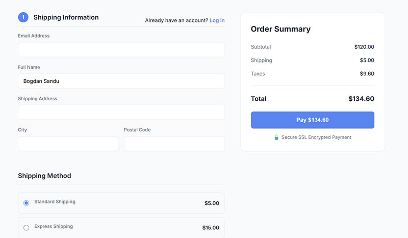
Scope is really the whole story here. General CRO touches every page a visitor sees, headlines, product photos, pricing pages, all of it. Checkout optimization only cares about what happens after “add to cart,” from the shipping page through to the order confirmation screen.
The goal is not more traffic. It’s getting a bigger share of the traffic already sitting in the cart to finish the purchase, which is a different problem than getting more people to the site in the first place.
In practice this usually means:
- Shortening or restructuring the checkout flow
- Adjusting which fields and steps are required
- Expanding payment method coverage
- Placing trust signals where hesitation happens
Amazon’s 1-Click ordering, patented in 1999, is one of the earliest documented examples of a business treating checkout speed as a revenue lever rather than a formality. Fewer clicks between intent and payment, that idea still drives most checkout optimization work today, almost thirty years later.
What Causes Cart Abandonment at Checkout?
Cart abandonment happens when a shopper adds something to their cart and leaves before paying. The triggers repeat across almost every store, which is actually good news, because it means most of them are fixable.
Forcing account creation before checkout is a big one. Requiring a login pushes away first-time buyers who just want to try the experience without committing to a relationship with a brand they’ve never bought from.
Missing a shopper’s preferred digital wallet or card network kills the transaction before it even starts, and a payment form that looks unfinished or unfamiliar is often enough on its own to make someone stop typing their card number halfway through.
Baymard Institute’s 2025 research found that 18% of shoppers who abandon a cart cite being required to create an account before checking out, and this friction hits first-time visitors hardest.
Some of this is fixable in an afternoon. Some requires a full rebuild of the flow.
Sites tracking a rising abandonment number can start by reviewing our guide on improving form abandonment rate for tactics that apply directly to the checkout step.
Hidden Costs and Shipping Fees
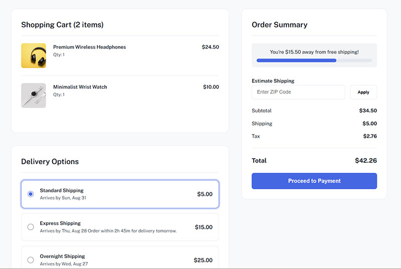
Unexpected costs revealed at the final step are the single biggest driver of checkout abandonment, ahead of account requirements or a long form.
Shoppers build a mental total in their head as they browse. A shipping fee or tax line that appears only on the payment page breaks that total, and breaks trust with it.
- Show estimated shipping cost on the product or cart page, not only at payment
- Offer a free shipping threshold and display progress toward it
- Calculate tax before the final confirmation screen, not after
Retailers that surface the full order cost early tend to see fewer late-stage exits, because there’s no surprise left to react to. It’s a basic fix, and it’s a little surprising how many stores still skip it.
What Checkout Metrics Indicate a Problem?
A checkout has a problem when its completion rate falls below the benchmark for its industry, its device split, or its own historical average. Watching the wrong number, or watching one number in isolation, hides where the actual leak is.
| Metric | What it reveals | Where to check it |
|---|---|---|
| Checkout abandonment rate | Drop-off after checkout starts, distinct from cart abandonment | Funnel step in analytics |
| Completion rate by step | Which exact page loses the most people | Step-level funnel report |
| Mobile vs desktop completion | Whether the gap is a device problem, not a checkout problem | Segmented conversion report |
| Time to complete checkout | Whether the flow is objectively slow to finish | Session duration on checkout pages |
The numbers here are worth sitting with for a second:
- The average documented cart abandonment rate sits at 70.22% across 50 aggregated studies (Baymard Institute, 2025)
- Mobile abandonment runs close to 80% against roughly 66% on desktop, a gap that has not closed in years (Dynamic Yield)
- The average checkout displays about 23 form elements, against a workable ideal closer to 12 to 14 (Baymard Institute)
- Fixing documented checkout usability issues lifts conversion by as much as 35.26% on large ecommerce sites (Baymard Institute)
Treat checkout abandonment and cart abandonment as separate numbers, even though people use them interchangeably all the time. Cart abandonment measures interest. Checkout abandonment measures whether the execution held up once someone actually tried to buy.
Benchmarks vary a lot by category, so a rate that looks alarming in one vertical is normal in another. Our breakdown of conversion rate benchmarks by industry gives a more honest baseline than a single average.
Step-level completion is really a chain of micro conversions, and treating each step as its own small goal makes it easier to see exactly where a redesign paid off.
Free Form Abandonment Rate Cost Calculator
How Does Checkout Flow Length Affect Completion Rate?
Every additional step in a checkout flow gives a shopper one more chance to close the tab.
Cognitive load builds page by page. A shopper who has already entered a shipping address does not want to re-enter parts of it on the next screen.
Ashley Furniture removed a mandatory address-entry step from its checkout funnel and saw a 15% increase in conversions along with a 4% drop in bounce rate, according to a published AB Tasty case study.
That single change took about thirty minutes to implement.
One-Page Checkout vs Multi-Step Checkout
Neither format wins in every situation. The right choice depends on order complexity and how much trust the brand already carries.
| Aspect | One-page checkout | Multi-step checkout |
|---|---|---|
| Best for | Simple, low-SKU orders | Complex orders with shipping options |
| Perceived effort | Lower, everything visible at once | Higher, but broken into digestible parts |
| Progress signal | None needed | Requires a progress indicator |
A visible progress indicator matters more on a multi-step flow than almost any other design choice, because it tells the shopper exactly how much is left.
Our comparison of multi-step forms versus single-step forms covers the completion-rate tradeoffs in more depth, and the same logic carries over almost directly to checkout design.
Sites unsure how to signal progress can look at real form progress bar examples before deciding between a numbered stepper and a graphical bar.
How Does Mobile Checkout Performance Affect Conversion?
Mobile checkout underperforms desktop checkout on almost every ecommerce site, and the gap has stayed wide for years despite constant redesign work.
Smaller screens mean smaller tap targets, slower typing, and more accidental exits.
Digital wallets close most of that gap. A saved card and address behind Apple Pay or Google Pay removes the typing entirely.
Newegg added Google Wallet as a mobile payment option and reported that mobile web users converted twice as often once the option was live, according to a published Google case study.
A few practical fixes carry more weight on mobile than on desktop:
- Autofill and address lookup, since typing a full address on a phone keyboard is slow
- Larger buttons and input fields sized for a thumb, not a mouse
- Wallet buttons placed above the fold, not buried under the card form
Our guide to mobile form best practices covers input sizing and layout choices that apply directly to a mobile checkout screen.
How Do Trust Signals Affect Checkout Completion?
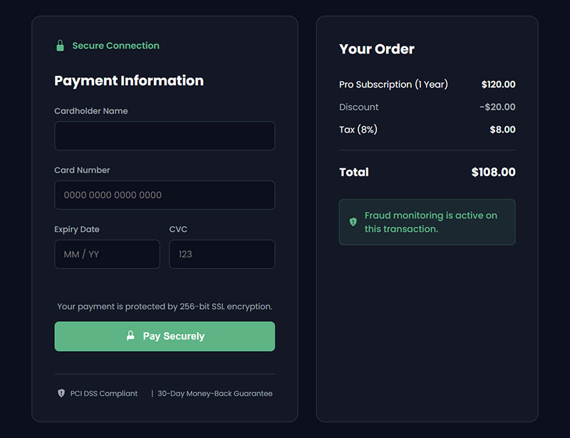
Trust signals are badges, seals, and payment logos, basically anything visual that tells a shopper their card is safe on this specific page.
Most shoppers cannot explain what SSL actually does. They react to how secure the page looks, not to the underlying protocol.
Baymard Institute’s research found that 19% of shoppers abandon a purchase specifically because they did not trust the site with their credit card information.
Placement changes the outcome as much as the badge itself does.
- Security badges near the payment form outperform the same badges in the footer
- A recognizable seal, Norton Secured Seal is the most tested example, reads as more trustworthy than a generic padlock icon
- Payment logos (Visa, Mastercard, PayPal) reassure shoppers who recognize the brand faster than any text explanation
In Baymard’s own testing, a plain, made-up padlock icon simply signaling “this site is SSL secured” outperformed several real seals from lesser-known third-party providers, suggesting the visual cue itself does much of the work, regardless of who issues it.
A trust badge that sits where hesitation actually happens, next to the card fields, earns its place. One buried at the bottom of the page mostly goes unseen.
How Does Form Design Affect Checkout Completion?
Form design decides how much effort a checkout feels like it takes, independent of how many products are in the cart.
Field count is the first lever. Every field removed is one less reason to stop typing and leave.
- Combine first and last name into a single full name field
- Drop the second address line unless a shopper opts to add one
- Use autofill and address lookup instead of manual entry wherever possible
Blivakker.no, a Norwegian beauty retailer, removed three fields from its registration form and saw an 11% increase in completed submissions, according to a published VWO case study.
Then there’s when validation actually happens. Real-time validation catches a mistyped card number or email before submission; post-submit validation only shows the error after the shopper has already clicked pay and sat there waiting.
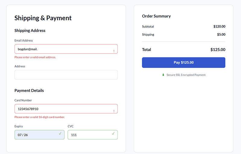
The difference sounds small until a shopper hits it on a slow connection and gives up rather than retype the whole form.
Our breakdown of form validation best practices compares both timing approaches in more detail, including when post-submit checks are still the safer technical choice.
Every field kept in a checkout should earn its place. A closer look at how many fields is too many is covered in our piece on form fields.
Should Checkout Require Account Creation or Allow Guest Checkout?
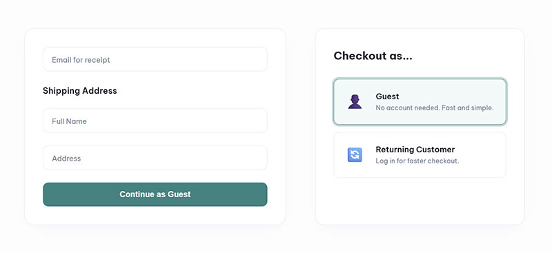
Guest checkout should be the default for most stores, with account creation offered after the order is placed rather than before.
The exception is a business built on repeat purchases and loyalty, where the account itself is part of the product experience.
Guest checkout does a few things well:
- Removes the single biggest first-purchase barrier for new customers
- Speeds up impulse buys and one-time gift orders
- Loses the chance to build a saved profile at the moment of highest intent
Requiring an account is the opposite trade, and it’s worth naming honestly:
- Builds a customer database for retargeting and email marketing
- Speeds up every purchase after the first one
- Pushes away first-time buyers who haven’t decided if they trust the brand yet
Baymard Institute’s 2025 checkout research found that 47% of leading ecommerce sites still fail to make guest checkout the most prominent option on the page, even when it exists.
Jewelry retailer Reve Jewel, where guest checkout already accounted for roughly 8 in 10 orders, adopted a one-click checkout system that quietly captured guest shoppers’ details without requiring account creation upfront. Conversions rose 19%, while the share of recognized, known shoppers grew 34%, since nearly every returning customer was now identifiable without ever being forced through a signup form.
A simple checkbox after payment, asking if the customer wants to save their details for next time, captures most of the account value without the upfront friction. A quick look at how a basic checkbox is built shows why this small element does more work than a full registration form ever could.
Which Payment Methods Should a Checkout Support?
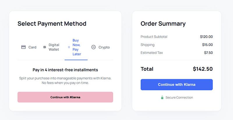
At minimum, a checkout needs a card network, a digital wallet, and some form of buy-now-pay-later, though plenty of stores add a third-party wallet like PayPal on top of that baseline to cover how differently people actually want to pay.
Missing any one of these doesn’t always show up cleanly in analytics. It just looks like a normal checkout abandonment.
| Method type | Processing cost | Setup effort | Best fit |
|---|---|---|---|
| Card network (Visa, Mastercard) | Standard interchange | Low, built into most gateways | Universal baseline |
| Digital wallet (Apple Pay, Google Pay) | Similar to card rates | Low to moderate | Mobile-heavy traffic |
| Buy now, pay later (Klarna, Affirm) | Higher merchant fee | Moderate, needs approval | Higher-ticket items |
| Third-party wallet (PayPal) | Standard to slightly higher | Low | International buyers |
Baymard Institute’s quantitative study of US shoppers found that 11% had abandoned a checkout in the past three months specifically because their desired payment option wasn’t offered.
Selection UI matters almost as much as coverage. Payment options are mutually exclusive, so a shopper picks exactly one, which makes radio buttons the correct input type rather than checkboxes.
Deals platform Brands Galaxy added Apple Pay and Google Pay alongside its existing card processing and saw 18% of orders shift to those digital wallets within the test period, contributing to a 19% overall conversion increase.
Should You Build a Custom Checkout or Use a Checkout Platform?
Most stores are better off on a hosted checkout platform. A custom build only pays off when the business has payment volume and engineering resources most stores don’t have.
PCI compliance is the deciding factor more often than design flexibility.
| Option | PCI compliance | Customization | Time to launch |
|---|---|---|---|
| Hosted platform (Shopify, BigCommerce) | Handled by the platform | Limited without apps | Days |
| Checkout-specific platform (Bolt, Shop Pay) | Handled by the provider | Moderate | Weeks |
| Custom build | Merchant’s responsibility | Full control | Months |
A hosted platform absorbs most of the security burden that would otherwise sit with an internal engineering team.
Businesses running on WordPress who still want payment control without a full custom build often start smaller, and our guide on building a WordPress payment form without a plugin covers exactly that middle ground.
How Do You Optimize a Checkout Page Step by Step?
A checkout audit works best as a fixed sequence, not a list of ideas tackled in random order.
- Pull current step-by-step funnel data before changing anything, so the baseline is documented
- Remove or combine non-essential form fields, starting with anything not required to fulfill the order
- Add or restore a visible guest checkout option if one isn’t already the default
- Expand payment method coverage based on what the funnel data shows shoppers actually want
- Run a controlled test on one change at a time before rolling it out to all traffic
Skipping step one is the most common mistake. Without a baseline, there’s no way to prove a later change actually helped.
Field-level changes tend to produce the fastest measurable wins in this sequence, since they touch every visitor who reaches the page. Our practical guide on ways to increase form conversions breaks down the field-reduction tactics referenced in step two.
How Do You Test and Measure Checkout Optimization Changes?
A checkout change should never go live to all traffic without a controlled test behind it.
Baymard Institute’s evaluation of leading ecommerce sites found that 65% performed “mediocre” or worse on overall checkout UX, which is exactly the gap that structured testing is built to close.
- Run an A/B test with a defined sample size and a clear success metric before calling a result
- Use session recordings to see where shoppers hesitate or backtrack, not just where they leave
- Track completion by step, not just the final conversion number
- Wait for statistical significance before rolling a change out to 100% of traffic
A funnel without step-level tracking is a funnel you’re testing blind.
Setting this up correctly usually means wiring checkout events into an analytics platform, and our walkthrough on how to track form submissions in Google Analytics applies directly to tracking checkout step completions.
How Do You Recover Abandoned Checkouts?
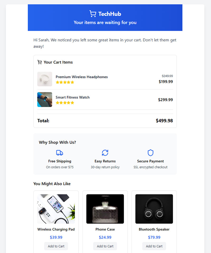
Recovery tactics work on the cart abandonment that already happened. They don’t fix the checkout itself, but they do recapture a meaningful slice of what leaks out of it.
Email is still the most consistent recovery channel, usually run as a short sequence rather than one message dropped and forgotten. Retargeting ads keep the abandoned product visible across the other sites a shopper visits afterward, which works well as a quiet background nudge.
SMS gets higher open rates than email, no contest, but it also feels more intrusive sitting in someone’s texts next to messages from actual people, so it’s worth saving for higher-intent segments rather than blasting everyone.
Klaviyo’s 2023 platform analysis of over 143,000 abandoned-cart email flows found an average 50.5% open rate, a 6.25% click rate, and a 3.33% placed-order rate.
A discount in the second or third email recovers more orders than the first email alone, though it also trains repeat shoppers to wait for one.
That tradeoff is worth watching closely on categories with thin margins.
When Does Checkout Optimization Not Improve Conversion?
Checkout optimization has a ceiling. Past a certain point the number stops moving no matter how much of the flow gets rebuilt, and it helps to know what’s actually driving that ceiling before blaming the checkout itself.
A lot of abandonment is just people who were never buying that session. Baymard Institute’s research attributes an estimated 42% of cart abandonments to shoppers who were comparing prices or saving items for later, never intending to buy that session.
Traffic quality matters too, and no amount of checkout redesign fixes visitors who arrived through a mismatched ad or an irrelevant search query. Order volume plays a role as well: a store processing a handful of orders a week rarely has enough traffic to reach statistical significance on an A/B test within a reasonable timeframe.
Then there’s the part that’s structural rather than fixable. Long B2B sales cycles, where a purchase runs through a procurement team and a multi-week approval process, never had checkout speed as the bottleneck to begin with. And fraud controls add friction on purpose, trading a small conversion cost for a real reduction in chargebacks, which is usually the right trade even though it shows up in the same abandonment number as everything else.
A checkout can be fast, simple, and fully optimized and still convert poorly if the product, price, or traffic source is the actual problem.
FAQ on Checkout Optimization
What Is the Difference Between Checkout Optimization and Conversion Rate Optimization?
Conversion rate optimization covers the entire site, from landing pages to product pages.
Checkout optimization narrows that scope to the payment and order completion flow.
It targets cart abandonment specifically, while broader CRO work targets traffic, messaging, and browsing behavior across the whole funnel.
Does Page Load Speed Affect Checkout Abandonment?
Yes. Slow-loading payment pages increase checkout abandonment because shoppers read lag as a technical failure or a security risk.
Pages that load within two to three seconds retain more shoppers, especially on mobile checkout, where connection speed varies more than on desktop.
How Much Does Checkout Optimization Typically Cost?
Cost ranges from nothing to six figures.
A DIY audit using free analytics and heatmap tools costs only time.
A full platform migration, PCI compliance work, and custom checkout development for a large ecommerce site involves real engineering budget, not just design changes.
What Are Common Checkout Optimization Mistakes?
Hiding the guest checkout option behind a login screen is the most frequent mistake.
Others include surprise shipping costs at the final step, skipping mobile-specific testing, and treating checkout abandonment and cart abandonment as the same metric when they measure different things.
What Tools Are Most Commonly Used for Checkout Optimization?
Google Analytics tracks step-by-step funnel drop-off, and Hotjar-style heatmap tools show where shoppers hesitate.
Optimizely and VWO run controlled A/B tests on checkout variations, while Stripe and PayPal handle the payment gateway layer most of these tools sit on top of.
What Should You Fix First in Checkout Optimization?
Checkout optimization delivers its fastest return when a team fixes cost transparency first, removes forced account creation second, and expands payment method coverage third, in that priority order rather than starting with trust badges or a platform migration.
That order follows reach, since unexpected costs and forced registration turn away the largest share of visitors before smaller fixes close the remaining gap.
- Show shipping and tax costs early
- Default to guest checkout
- Add a digital wallet and a buy now pay later option
This order trades a slower platform rebuild for gains a team can bank within weeks, and migration waits until cheaper fixes stop moving the completion rate.
Teams extending this same friction work beyond checkout can start with our form optimization tips, which apply the same principles to every other form on a site.