


WordPress is a giant. A legend. A default. It powers more than 43% of the web — an empire that has stood strong for years. But as we move into…
Table of Contents
Every designer knows the rule: break long forms into steps to boost conversions.
Except the data says otherwise.
Multi-step forms often kill completion rates instead of improving them. While the theory sounds logical, real users abandon between steps at alarming rates, especially on mobile devices.
This article exposes what the numbers actually show. You’ll see completion statistics from Baymard Institute, Zuko Analytics, and ConversionXL that contradict conventional wisdom.
More importantly, you’ll learn when multi-step works (rarely), when it doesn’t (usually), and what to do instead. The difference between these approaches can mean a 15-30% swing in conversion rates.
Your forms are probably losing you money right now.
The Comfort of Conventional Wisdom
Everyone repeats the same advice.
Break long forms into steps. Make them digestible. Users hate overwhelming forms.
Except the data tells a different story.
Multi-step forms often kill conversions instead of helping them. The logic sounds perfect on paper but falls apart when real users interact with your site.
Progress bars don’t motivate people. Each click creates another exit opportunity.
And mobile users? They’re abandoning faster than anyone wants to admit.
The Multi-Step Myth and Where It Came From
The theory makes sense: cognitive load.
Designers borrowed concepts from psychology. Show users less at once, reduce overwhelm, increase completion.
Form design evolved around this principle. One question per screen feels manageable. Three fields on step one, four on step two, payment details on step three.
The approach spread through UX blogs, design systems, conference talks.
But here’s what nobody questioned: does breaking forms into steps actually work better than keeping them on one page?
Turns out, sometimes it does. Often, it doesn’t.
The industry adopted multi-step as gospel without testing the assumption across different contexts. E-commerce checkout? Lead gen forms? Contact pages?
Different goals need different approaches.
What the Data Actually Shows
The numbers don’t lie, even when they contradict what designers expect.
The Drop-Off Reality
Zuko Analytics tracked completion rates across thousands of forms. Their data: 66% of users who start a form complete it.
Sounds decent until you realize 34% abandon mid-process.
That’s one in three people who began entering information, then left. According to Baymard Institute, the average checkout has 11.3 form fields but only needs 8. Extra fields create unnecessary friction.
When Venture Harbour tested a four-step form with 30+ questions, they hit a 53% conversion rate. But that’s the exception, not the rule.
Most multi-step forms don’t perform this well.
ConversionXL found that some tests showed multi-step forms increasing conversions by 300%. Other tests? The opposite happened.
The conflicting data reveals an uncomfortable truth: form structure alone doesn’t guarantee success.
Mobile Is Where It Dies
Desktop users convert at 55.5% starter-to-completion rate.
Mobile? 47.5%.
That’s an 8-percentage-point gap (Fluent Forms data). On mobile devices, every extra tap matters more.
Zuko’s research shows desktop has a 47% view-to-starter rate compared to 42% on mobile. Mobile users are less likely to even begin filling out forms, and when they do, they’re less likely to finish.
Think about the physical experience.
Tapping through multiple screens on a 6-inch display while standing in line, or sitting on a couch, or walking down the street. Each step transition requires a decision to continue.
Desktop users have keyboards, larger screens, more patience. Mobile forms face steeper challenges.
And yet, mobile traffic exceeds 50% globally while desktop hovers around 40% (Formsort data). You’re optimizing for the wrong device if you prioritize multi-step experiences designed for desktop comfort.
Industry-Specific Breakdown
Not all forms fail equally.
Insurance forms see 95% completion rates once users start them (Feathery). These are complex, necessary forms where users expect length.
Application forms hit 75% completion (Zuko Analytics). People filling out job applications or loan forms have high intent.
But contact forms? Only 9.09% of people who see one actually submit it (Zuko).
E-commerce checkout abandonment sits at 70.19% across industries (Baymard Institute’s 2025 data). Seven out of ten shoppers add items to cart, then leave before purchasing.
B2B services convert at 2.2% for forms. Real estate? 0.6%. The industry context matters more than the number of steps.
Lead generation forms perform differently than registration forms, which behave differently than checkout flows.
One-size-fits-all approaches ignore these fundamental differences.
Why Multi-Step Forms Fail
The theory breaks down in practice for predictable reasons.
Each Click Is An Exit Opportunity
Every “Next” button creates a decision point.
Users evaluate: is this worth continuing?
Single-page forms have one decision: fill it out or leave. Multi-step forms force multiple decisions across multiple screens.
Baymard found 18% of users abandon checkout due to complexity. More steps means more perceived complexity, even when individual steps look simple.
Users see step one, think “this isn’t so bad,” then hit step two and reconsider. By step three, they’re questioning the time investment.
The commitment escalation problem works against you.
Users haven’t invested much after step one. Quitting costs nothing. After step three, they’ve invested more but also built up more frustration.
Each transition creates friction. Page loads, animations, progress bar updates. These micro-interactions add up.
Progress Bars Create Anxiety
Designers think progress bars help.
“Look, you’re 33% done!”
Except users think: “I’m only 33% done?”
Research on progress indicators shows they create awareness of time investment. When you don’t know how long something takes, you might keep going. When you see you’re at step 2 of 5, you calculate the remaining effort.
Zuko’s data shows users abandon comparison forms after an average of 50 seconds. They see the steps ahead and quit early.
Progress bars work for tasks where users expect length, like software installations or file uploads. For forms? They often backfire.
The anxiety compounds on mobile where screen real estate is limited. That progress bar takes up valuable space, constantly reminding users of unfinished work.
“Looks Shorter” Doesn’t Mean “Completes More”
Here’s the trap designers fall into.
Show users four fields instead of twelve. Looks less intimidating, right?
Initial engagement might increase. More people start the form.
But starter-to-completion rate matters more than view-to-starter rate. Getting people to begin is worthless if they don’t finish.
Single-page forms average 53% completion (Start Up Bonsai). Multi-page forms? 13.85% completion.
Wait, that can’t be right.
Actually, those numbers require context. Forms with legitimately long requirements (loan applications, detailed registrations) benefit from multi-step layouts. Short forms that get needlessly split? They suffer.
The Manifest survey found 27% of users abandon forms they perceive as too long. Splitting a short form into multiple steps makes it feel longer, not shorter.
Users aren’t fooled by the interface trick. They recognize when you’re asking for the same information, just spread across more screens.
The Counter-Argument (And Why It’s Still Wrong)
Defenders of multi-step point to success stories.
HubSpot claims multi-step forms convert 86% higher than single-step forms with many questions. Zuko Analytics says they can increase conversions up to 300%.
These stats aren’t false.
They’re incomplete.
The success cases share common traits: very long forms (30+ fields), high user intent (insurance, applications), or qualifying funnels where you want to filter out unqualified leads.
“But the form was overwhelming as a single page!”
Then you have too many fields.
Baymard found the average checkout displays twice as many form fields as needed. The real problem isn’t the layout, it’s asking for unnecessary information.
“Users told us they prefer multiple steps!”
What users say and what they do often diverge. 36% of marketers never run user tests on their forms (FormStory). The ones who do often test self-reported preferences instead of actual completion rates.
Preference and performance aren’t the same thing.
A well-designed single-page form beats a poorly-executed multi-step form every time. And vice versa.
The mistake is assuming the number of steps determines success. Form fields, field types, label placement, error messaging, trust signals, mobile optimization—all these factors matter more than whether you split the form or not.
When Multi-Step Actually Works
Not all forms should be single-page.
Some contexts demand multiple steps.
The Rare Exceptions
Insurance applications hit 95% completion once users start (Feathery). These forms need extensive information: policy details, coverage amounts, beneficiaries, health questions.
Users expect length here.
Same with mortgage applications, loan forms, detailed onboarding. Application forms maintain 75% completion rates, highest of any form type (Zuko Analytics).
The difference? User intent.
People filling insurance quotes or loan applications already decided to invest time. They’re not browsing, they’re committed.
What Makes These Different
High-value transactions justify longer forms.
A $200,000 mortgage? Users will answer 30 questions. A newsletter signup? Three fields maximum.
Time investment expectations matter. Nobody expects a quick insurance quote. They expect thoroughness.
Lead generation for insurance agents requires qualification. Forms that pre-screen save both parties time.
B2B lead qualification works similarly. Sales teams need detailed information before calling. A longer form filters out tire-kickers while providing context for real prospects.
What To Do Instead
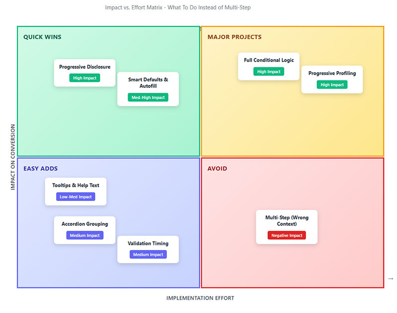
Skip the multi-step unless you’re selling houses or insurance.
Single-Page Design That Doesn’t Overwhelm
Single-column layouts complete 15.4 seconds faster than multi-column forms (CXL).
Google’s UX research confirms: top-aligned labels reduce visual fixations, speed completion.
Group related fields together. Shipping address fields cluster. Payment details cluster. Use whitespace between groups, not separate pages.
Keep form fields under 8 for most use cases. Baymard found sites need only 8 fields total, yet average 11.3.
Cut the extras first: company name, title, middle name, phone number (unless required).
Making phone number optional nearly doubles completions (WPForms). 37% of users abandon when phone number is required.
Use conditional logic to hide irrelevant fields. Show “Company Name” only for B2B selections. Display “Apartment Number” behind a link for those who need it.
Visual hierarchy guides users. Make primary actions (Submit) larger and brighter than secondary actions (Cancel, Reset).
Testing Your Own Forms
Track these metrics:
- View-to-starter rate (how many begin)
- Starter-to-completion rate (how many finish)
- Field-level abandonment (where they quit)
- Time to complete
- Error rates per field
Run tests with 1,000+ visitors per variation minimum for statistical significance (Optimizely). Smaller samples produce misleading data.
Test duration: 2-6 weeks ideal. Cover full business cycles. B2B forms need complete weekly cycles including weekends.
Don’t peek early. Checking results daily increases false positives. Set your sample size, wait until you hit it, then analyze.
Compare single-page vs. your current multi-step. Test different field orders. Try removing optional fields entirely.
Track quality, not just quantity. More leads mean nothing if they’re unqualified. Measure downstream metrics: sales calls scheduled, deals closed, customer lifetime value.
The Quick Wins
Remove these immediately:
- Middle name fields
- Fax number
- Company name (unless B2B-only)
- “How did you hear about us?”
- Confirmation fields (email confirmation, password confirmation)
Replace dropdowns with radio buttons where possible. Dropdowns require two clicks (open, select). Radio buttons need one.
Show inline validation but not real-time. Wait until users leave a field, then show errors. Real-time validation during typing frustrates users.
Inline validation reduces errors by 22% and completion time by 42% (CXL).
Add trust signals near sensitive fields. Lock icons next to payment info. “Why we need this” links for unusual requests.
Trust badges boost conversions 16% overall, 22% among new visitors (Zuko).
Auto-format inputs. Let users enter phone numbers any way they want. Format it on your end. Same with credit cards, zip codes, dates.
Pre-fill what you can. Browser autofill works if you use proper field names (email, first-name, city).
Test your mobile forms specifically. 60% of traffic is mobile but completion rates lag desktop by 8 percentage points.
Make touch targets 44×44 pixels minimum. Use vertical scrolling only. Single column becomes mandatory on small screens.
The Real Numbers
Revenue impact from form optimization isn’t theoretical.
Average Conversion Lift
Switching poorly-designed multi-step to optimized single-page: 15-30% conversion increase typical (multiple CRO studies).
Baymard Institute calculated 35.26% average conversion increase possible through better checkout design alone.
That’s $260 billion in recoverable lost orders across US and EU e-commerce.
Removing one unnecessary field? Expect 5-10% lift in completion rate.
Fixing inline validation issues: 22% fewer errors, 42% faster completion (Luke Wroblewski study).
Checkout optimization specifically sees massive returns. Average checkout abandonment sits at 70.19% (Baymard 2025 data).
Cutting that to 65% through better form design translates to millions in recovered revenue for mid-size retailers.
Time-to-Complete Improvements
Single-column over multi-column: 15.4 seconds faster (CXL).
Reducing fields from 11 to 8: 20-30 seconds saved average.
Proper autofill and formatting: 30-40% time reduction on address and payment fields.
Time matters for conversion rate benchmarks. Users spending less time completing forms means less opportunity to reconsider or get distracted.
Mobile users especially. 47% abandon forms taking longer than 3 minutes (mobile UX research).
Revenue Impact Calculations
Simple math: 10,000 monthly visitors, 2% conversion, $100 average order value.
That’s 200 orders, $20,000 monthly revenue.
Increase conversion 25% through form optimization: 250 orders, $25,000 monthly.
$5,000 monthly increase, $60,000 annually from form changes that take a week to implement.
The ROI on form design work is stupid good compared to most marketing initiatives.
Better yet, improvements compound. Fix your forms once, benefit forever. Not like paid ads where you stop paying and traffic disappears.
Industry Benchmarks
Your mileage varies by industry.
- Insurance: 95% completion once started (Feathery)
- Applications: 75% completion (Zuko)
- Contact forms: 9% submission rate (Zuko)
- E-commerce checkout: 30% completion (inverse of 70% abandonment)
- B2B services: 2.2% form conversion (Ruler Analytics)
- Real estate: 0.6% form conversion (Ruler Analytics)
Desktop converts at 55.5% starter-to-completion. Mobile at 47.5% (Fluent Forms).
These benchmarks help set realistic expectations. If you’re in real estate pulling 1.5% form conversion, you’re crushing it. If you’re in B2B hitting 1%, you’ve got work to do.
Track your baseline before changing anything. Can’t measure improvement without knowing where you started.
Most companies never measure field-level abandonment. They just know “forms don’t convert well.”
Use tools like Zuko, Hotjar, Microsoft Clarity to see exactly where users quit. Often it’s one problematic field killing your entire funnel.
Password fields abandon at 10.5% mean rate (Zuko). Email and phone at 6.4% and 6.3% respectively.
Fix these high-friction fields first for maximum impact.
Conclusion
The data doesn’t lie about multi-step forms.
For most use cases, they hurt conversion rates instead of helping them. Each additional step creates another exit opportunity, especially on mobile where completion rates already lag desktop by 8 percentage points.
The exceptions exist but they’re narrow: insurance applications, mortgages, detailed B2B qualification forms where users expect length.
For everything else? Single-page wins.
Start by auditing your current forms. Track field-level abandonment, measure completion rates, run proper A/B tests with adequate sample sizes.
Cut unnecessary fields first. The average form asks for 3 more fields than needed.
Your conversion rate will thank you. So will your revenue.

