Gallup’s 2024 data shows only 31% of U.S. employees feel engaged at work. Annual surveys can’t catch that kind of decline fast enough. Pulse surveys can. These short, frequent questionnaires…
Table of Contents
Every day, we encounter online forms, whether it’s signing up for a newsletter, completing a survey, or making a purchase. But have you ever stopped to think about why some forms feel effortless to fill out while others seem like a tedious chore?
The truth is that behind the simplicity of a form lies a complex web of psychological principles. From the moment you land on the page to when you hit ‘submit,’ every decision is subtly shaped by many design elements. Why do we feel more inclined to click a certain button? What makes a form seem trustworthy, urgent, or even worth our time? Believe it or not, the answer lies in psychology.
In this article, we’ll explore how different aspects of form design – from the colors we see to the words we read and the layout we navigate – are far more than just a random choice.
The Hidden Psychology Behind Form Design
When you think of an online form, it likely seems like a straightforward task. You just need to fill out a few fields and move on with your life. But in reality, every choice a designer makes when creating a form is a deliberate attempt to guide user behavior.
The form design taps into cognitive psychology in so many different ways. For instance, our brains are wired to seek patterns and familiarity. A well-structured form follows a certain template, such as placing the most important fields at the top, using clear labels, and grouping related information together. This reduces the cognitive load and makes it easier for us to navigate the form. The less mental effort required, the more likely we are to complete it.
The layout isn’t just functional, either. It’s designed to encourage certain behaviors, like reducing anxiety or creating a sense of progress. In the next few segments, we’ll cover how these elements can be fine-tuned to encourage submissions so you get the most out of your design every time.
Power of Words: Crafting Messages That Lead to Actions
The words we see on an online form are not just instructions or placeholders. They are cues that guide our decisions as well. In the world of forms, language is also a powerful tool that influences how we feel and whether or not we take action.
Psychologically speaking, certain words can evoke specific emotions or reactions. For example, using phrases like “limited time offer” or “only a few spots left” can trigger a sense of urgency, making users feel like they need to act quickly before the opportunity is gone. On the flip side, words like “secure” or “privacy guaranteed” can create feelings of trust, reassuring users that their personal information is safe and giving them confidence to complete the submission.
It’s not just about creating urgency or trust, though. The way we phrase calls to action (CTAs) plays a crucial role in motivating people to click the “submit” button. Instead of using passive language like “Submit” or “Send,” action-driven phrases such as “Get Started” or “Claim Your Offer” are more likely to evoke a sense of accomplishment. These small tweaks shift the applicant’s mindset from completing a task to engaging in a meaningful action.
Additionally, the tone of voice used in a form can set the overall mood for the interaction. A friendly, conversational tone can make a form feel more approachable, while a too-formal tone might create a sense of distance. So, choosing the right one can make all the difference in how users connect with the form.
The Psychology of Colors: More Than Just Pretty Hues
When we think about color, it’s easy to assume it’s just a superficial design element. But the truth is that colors play more than one role. The psychology of forms shows us that colors influence our actions in ways we might not even consciously realize. While you always want a form to match your website’s color scheme, you should know that they have the power to influence user’s emotions, decisions, and perceptions without them even realizing it.
For instance, bright colors evoke a positive emotional response, while dark colors usually have the opposite effect. While a single color can be associated with multiple emotions, red usually leads to excitement and a sense of urgency, green represents calmness, and blue is tied to trust and security.
When used correctly, these colors can guide users’ feelings and prompt them to take the action you want, whether that’s signing up, making a purchase, or completing a survey.
How to use these colors to your advantage?
While we can’t really give you a completed blueprint to simply copy and paste, the main thing here is to align colors with users’ intent. Here are a few general rules so you use each color to its advantage:
- Use red to trigger urgency, like for time-sensitive offers or limited-time actions. Red is bold and attention-grabbing, signaling that users need to act fast.
- Blue is perfect for creating trust and reassurance, making it ideal for form fields that request sensitive information such as credit card details or personal data.
- If you want to keep things calm and positive, green works wonders. It’s ideal for success messages or confirmation screens, helping users feel like they’ve made the right choice.
- On the other hand, if you are looking to evoke happiness, yellow is the perfect option. It’s best used for for highlighting special offers or deals, but be careful it can be overwhelming if overused.
Highlight CTAs
No matter the color scheme you settle on, one principle you should follow is to always highlight your call to action. This button should stand out, so choose bold colors. If these buttons are not, let’s say, “in your face,” you are risking the chances of people noticing it.
Secondly, for other buttons that lead to less urgent actions, use more neutral tones like grey or light blue so they don’t distract from the primary goal.
Create visual flow
You want your form to stand out so people don’t miss any of the fields. So, in order to achieve this page shouldn’t look like one of those “find the element” puzzles. Keep the background clean and simple with neutral shades like white or light grey. This lets your form fields, CTAs, and important messages shine without visual clutter.
A splash of yellow, red, or orange can draw attention to limited-time offers or important alerts, but remember – less is more. Too much can feel overwhelming. While many colors can give you desired effects, keep in mind that you need to also think about specific shades and, on top of everything, match them to the color scheme you landed on when you created your brand. The key is creating a cohesive image, not making it resemble a carousel.
Layout and Design: How Structure Affects Engagement
Form structure isn’t just about making things look neat; it’s more about guiding users through a seamless experience. A well-organized layout can significantly affect how users engage with your form and whether they follow through to the end. Think of it as some sort of mental map for the user. The easier it is to navigate and understand, the likelihood of completion will increase.
And studies support this as well – 67% of people said they ultimately decide to abandon the form that is hard to navigate. It all comes down to a cognitive load when trying to figure out where to input information or how to proceed. But the good news is that several design tricks can help you get the most out of your forms.
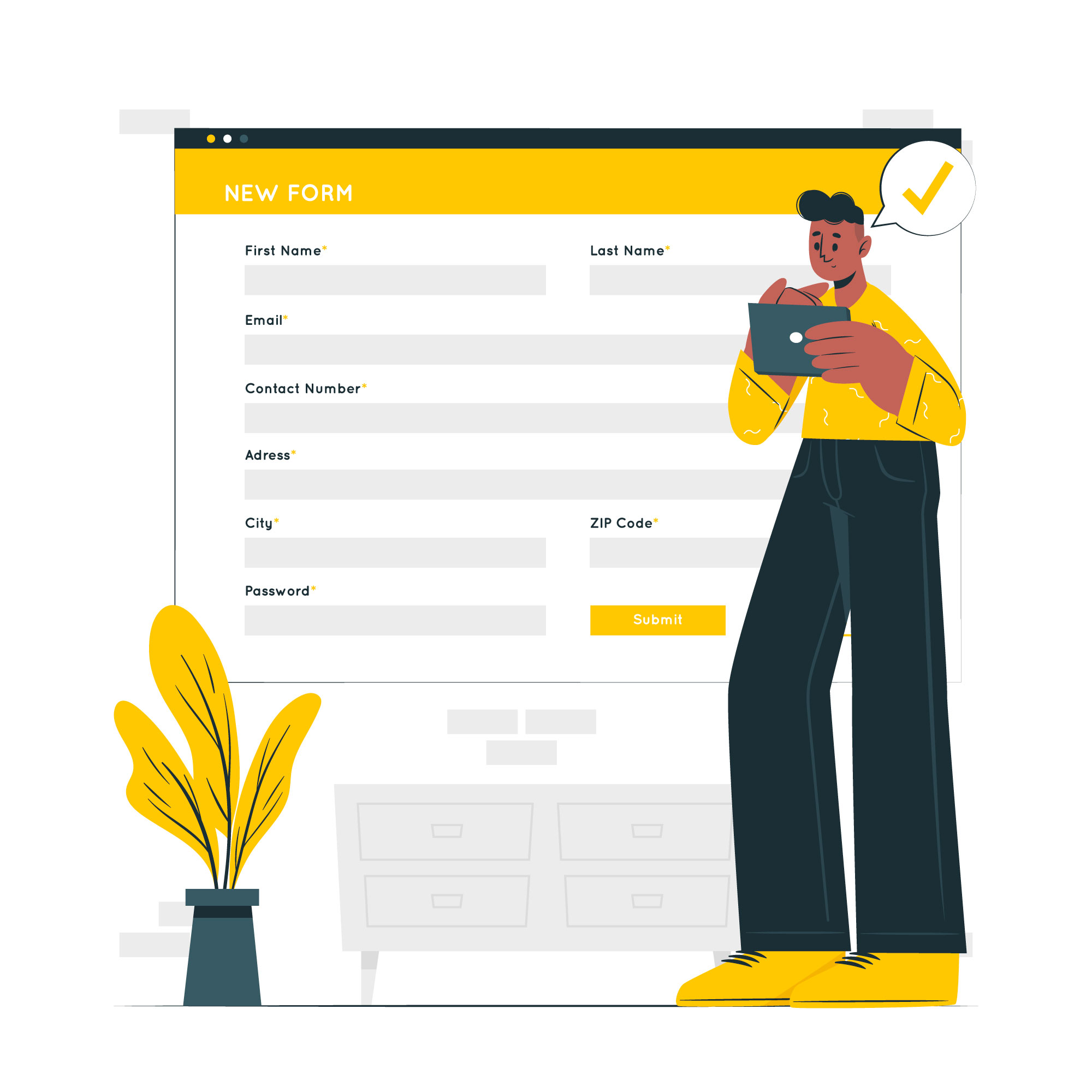
Group related information
Organizing your form into logical sections is a key strategy for improving usability. This way, users will know what to type in and what is next to come. When related fields are grouped together, people process information more easily.
For example, keep personal details like name, email, and phone number in one section. For payment details, group fields like credit card number, expiration date, and CVV together. Similarly, preferences or additional options can go into a separate section.
This principle applies to whichever type of form you are creating. You’ll be reducing the cognitive load, and users will naturally progress through the form. The results are forms that can be filled out quickly with little to no confusion, ultimately leading to higher conversion rates.
Use visual hierarchy
A strong visual hierarchy is essential for guiding users through your form. Think of it as creating a roadmap: where do you want the user to look first, second, and third? Larger fonts, bold headings, and strategic use of colors help establish this order.
Once they open a page, people tend to first look at the top left corner, which is where we naturally start reading. This means you should place the most important elements of your form – such as the title, introduction, or first field – at the top left to immediately catch the user’s attention.
As for the specific fields, start with the most important information, typically fields like name, email, or contact details – and make them stand out. This can be done with size, color, or position. Secondary fields, like optional information or additional preferences, can be smaller or placed lower on the form.
By clearly establishing a hierarchy, users will know exactly what to focus on first, making the form easier to navigate and reducing the chances of mistakes or omissions.
Minimize distractions
Your form should be the focal point of the page. Avoid cluttering it with distractions like ads, pop-ups, or unnecessary links. When users are filling out a form, every unnecessary element adds friction and increases the likelihood of abandonment.
Whitespace is crucial in this regard. It separates sections, keeps the design clean, and helps the user focus on one task at a time. Providing plenty of space between form fields gives users the breathing room they need to think clearly and complete the form without feeling rushed or overwhelmed.
Create a seamless flow
If your form is part of a larger process, like a checkout or sign-up, users need to feel like they’re progressing toward completion. Progress bars or step indicators provide users with a sense of how much longer the process will take.
For example, a form with multiple stages can display a progress bar at the top of the page, showing users where they are in the process. This reduces anxiety and increases motivation to complete the form.
The Impact of Mobile Design: Adapting to the Digital Environment
In this digital era, it’s no surprise that mobile usage surpasses desktop usage in many areas, including form submissions. In fact, about 70% of people completed their job application forms on mobile devices in 2022, and the number is only growing. This shift has made it more crucial than ever to adapt your forms for smaller screens, ensuring they are user-friendly, easy to complete, and actually look good.
Forms that are not optimized for mobile will not only look cramped and hard to navigate, but they’ll also create friction for users, which can ultimately lead to abandonment.
Make buttons and fields touch-friendly
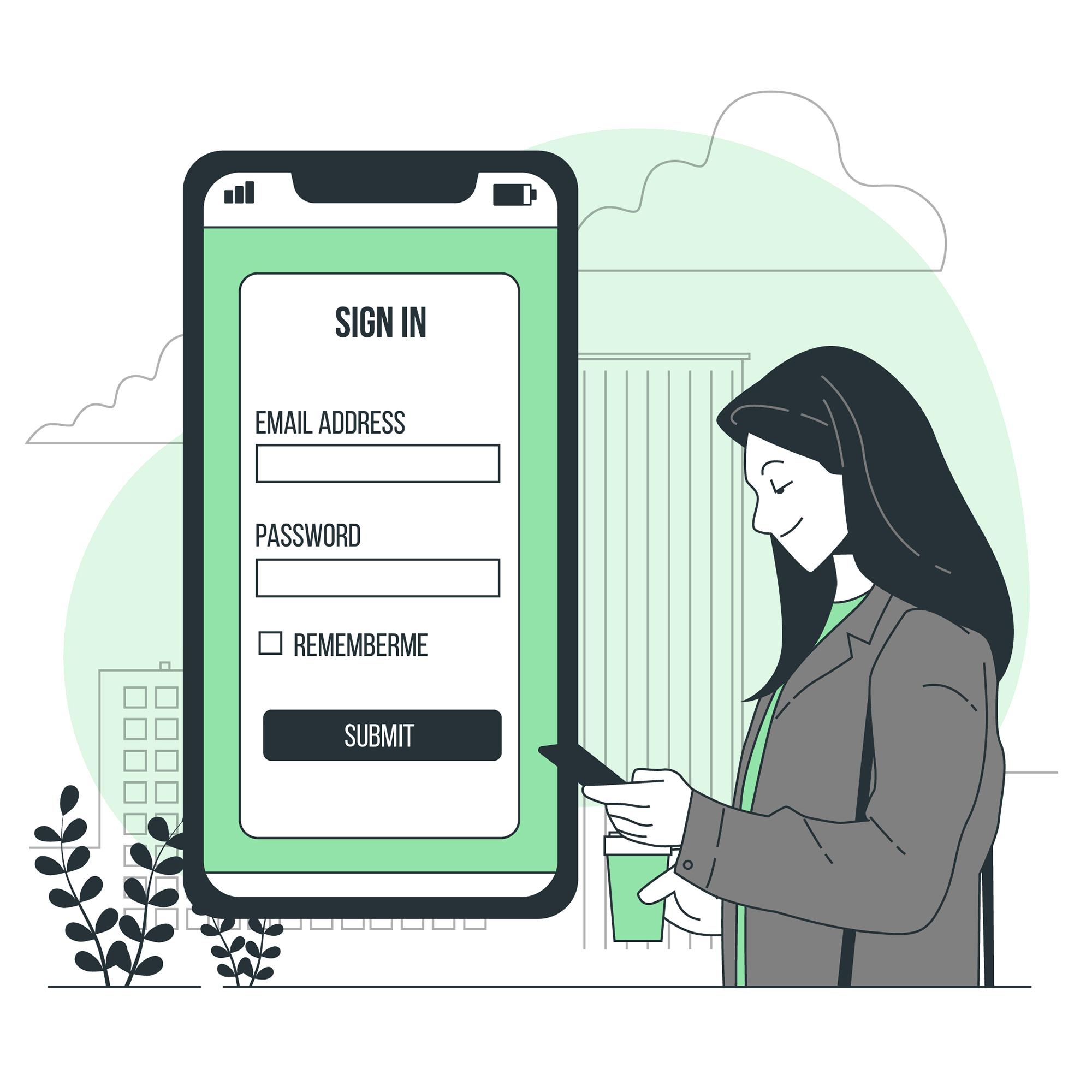
On mobile, users rely on touch, not clicks. This means that all buttons and fields should be large enough to tap without mistakes. Make sure that input fields are at least 44×44 pixels, and CTA buttons should be prominent and large enough to be easily clickable.
Use single-column layout
While multi-column layouts can look good on a desktop screen, they tend to be cumbersome on mobile devices. On the other hand, single-column layouts are easier to navigate because they allow users to scroll naturally without zooming or adjusting their view. Keep fields stacked vertically and ensure that the form flows logically from one field to the next.
Use auto-fill and auto-format
The less time the form takes to complete, the more likely it is to generate a high number of submissions. By using auto-fill (when possible), you can reduce the amount of manual input required. Additionally, consider incorporating auto-formatting where appropriate. This will be useful for phone or credit card numbers as it saves time and ensures accuracy.
Keep it simple
There is only so much you can fit in the mobile screen, and and less is more when it comes to form design on mobile devices. Users are often on the go, looking to complete tasks quickly and without hassle. The more fields you ask for, the more time and effort the user needs to invest, which can easily lead to frustration and form abandonment. Focus on what you really need and ask for additional info later on if needed.
Frankly, there are so many other considerations when creating the perfect form design. But to avoid pitfalls, it’s also crucial to recognize common form design mistakes.
Overcoming Barriers to Submission
Even the most well-designed forms can face obstacles that prevent users from hitting the “submit” button. Whether it’s a confusing field, a slow loading time, or a lack of trust signals, these barriers can create friction and cause abandonment. However, being aware of the barriers makes overcoming them much easier.
Unclear call to action (CTA)
When you see an online form, the next steps should be clear. The ultimate goal is to submit the form, but what if the button isn’t obvious enough? An unclear or hidden call to action (CTA) can create confusion, causing users to hesitate or abandon the form entirely. If the button is buried within the design or the language isn’t specific, users might not know what action they’re supposed to take next.
To fix this, make your CTA immediate and obvious. Use actionable, benefit-driven phrases like “Get Started” or “Claim Your Discount” instead of generic ones like “Submit.” Ensure that the button is visibly prominent, with a contrasting color that stands out from the rest of the form. And don’t forget to place it strategically so it’s easily accessible at every stage.
Slow load times
People don’t really “surf” the web like they used to. Now, we all expect instant solutions to our problems, and when things take too long to load, we’re quick to move on. Slow load times aren’t just frustrating – they can be a dealbreaker for users filling out your form.
Sluggish forms lead to abandonment, especially on mobile, where speed is critical. To avoid this, optimize your form for speed. Compress images, minimize unnecessary scripts, and prioritize essential elements to reduce load time.
Lack of trust signals
Does your form look legitimate? Well, it should be if you expect to get some submissions out of it, especially if you request sensitive info. Adding trust signals like SSL certificates, privacy policies, and recognizable payment security icons can reassure users that their data is safe. Testimonials or security badges can also help build credibility.
Imagine building a form that asks for payment information while looking like it could’ve been thrown together in a few minutes. Users would likely be wary and decide to exit the page no matter how much they wanted to make a purchase.
Too many fields
Lastly, the most common culprit for abandoned submissions is lengthy forms. Your form shouldn’t feel like homework if you want users to complete it. When they are asked to fill out an overwhelming number of fields, especially if they seem irrelevant or unnecessary, it can quickly lead to frustration.
To keep users engaged, streamline your form by asking only for the essential information. For example, if a user is signing up for a newsletter, just ask for their name and email. Anything beyond that should be saved for later after you’ve built some sort of relationship.
Putting All the Pieces Together: Conclusion
Form design may seem simple on the surface, but as we’ve seen, it’s a powerful tool that can shape user behavior and drive conversions in subtle but significant ways. While psychology plays a big part in creating the best experience for your clients, you don’t need a degree to leverage its principles.
At its core, form design is about understanding what makes users tick – and making their journey as effortless as possible. When you tap into psychology through the strategic use of colors, the right words, or a layout that feels intuitive, you create more than just a form – you create an experience that guides people toward the action you want them to take.
Ultimately, don’t overthink it. Focus on factors that will make the whole process clear, comfortable, and rewarding.
