


Spam bots submitted over 99 billion junk form entries across the web in 2024. Your site caught some of that traffic, guaranteed. The best tactics for form spam prevention combine…
Table of Contents
Your form abandonment rate is probably killing your conversions right now. Studies show that 81% of users who start filling out forms never finish them, which means you’re losing leads, sales, and revenue every single day.
The good news? Most abandonment happens for fixable reasons like confusing layouts, too many fields, or poor mobile optimization.
This guide covers practical tips for improving form abandonment rate that you can implement today. You’ll learn how to track drop-off points, cut unnecessary friction, optimize for mobile users, and recover more completions without redesigning your entire site.
What is Form Abandonment Rate?
Form abandonment rate measures the percentage of users who start filling out a form but leave without completing it. Calculate it by dividing incomplete submissions by total form starts, then multiply by 100.
A 70% abandonment rate means seven out of ten people who began your form didn’t finish. That’s money walking away from your business.
Tips for Improving Form Abandonment Rate
| Category | Tip |
|---|---|
| Form Design | Simplify the form by reducing the number of fields to the essentials. |
| User Experience | Use clear and concise field labels to reduce confusion. |
| Mobile Optimization | Ensure the form is responsive and mobile-friendly. |
| Progress Indicators | Add progress bars for multi-step forms to show completion status. |
| Error Messaging | Provide real-time validation with clear error messages. |
| Security & Trust | Include trust signals like SSL badges or privacy statements. |
| CTA Optimization | Use a clear and compelling call-to-action button. |
| Distractions | Minimize distractions like excessive ads or navigation links. |
| Pre-filling Fields | Use autofill or pre-filled fields when possible. |
| Incentives | Offer incentives like discounts or free downloads for form completion. |
| Time Sensitivity | Use urgency techniques, such as limited-time offers. |
| Load Time | Optimize the page and form for faster loading times. |
| Save & Continue Option | Allow users to save their progress and return later. |
| Feedback | Use surveys to understand why users abandon forms and improve them. |
Track Where Users Drop Off
Install heatmap tools like Hotjar or session recording software to watch exactly where people give up. According to Zuko Analytics, contact forms only convert 38% of users who interact with them, and the overall view-to-completion rate drops to 9%.
Most analytics platforms show you which specific fields cause the highest exit rates.
Check your Google Analytics funnel reports. They reveal patterns you’d never spot manually.
Look for these red flags:
- Fields where cursor activity stops completely
- Pages with unusually high time-on-field metrics (Zuko data shows password fields have a 10.5% abandonment rate, while email and phone fields each cause 6.3-6.4% drop-offs)
- Specific form steps with 40%+ drop-off rates
- Mobile vs desktop abandonment differences
Pay attention to various types of forms since each behaves differently. Registration forms typically show different abandonment patterns than checkout forms.
Session replays show the truth. Research from Feathery reveals the average form abandonment time is just 1 minute and 43 seconds.
Cut Unnecessary Form Fields
Every extra field increases your abandonment rate. Research shows that at 5 questions, drop-off is 2%; at 10 questions, it jumps to 4%.
Imagescape saw a 120% jump in conversion after cutting their form from 12 fields down to 4.
Ask yourself: do I really need their job title to process this order? Probably not.
WordPress forms often come with default fields nobody actually needs. Delete them.
Progressive profiling works better than asking everything upfront. Collect basic info first, gather more details later when users are already invested.
Split required vs optional clearly:
- Phone number: usually optional (phone fields alone can decrease conversion by 48%)
- Email: required for account recovery
- Company size: collect this later
- Middle name: skip it entirely
Test removing one field at a time. Track the conversion lift from each deletion.
Lead generation forms that ask for 3-4 fields convert 2x better than ones asking for 10+. According to Baymard research, the average checkout displays twice as many form fields as needed.
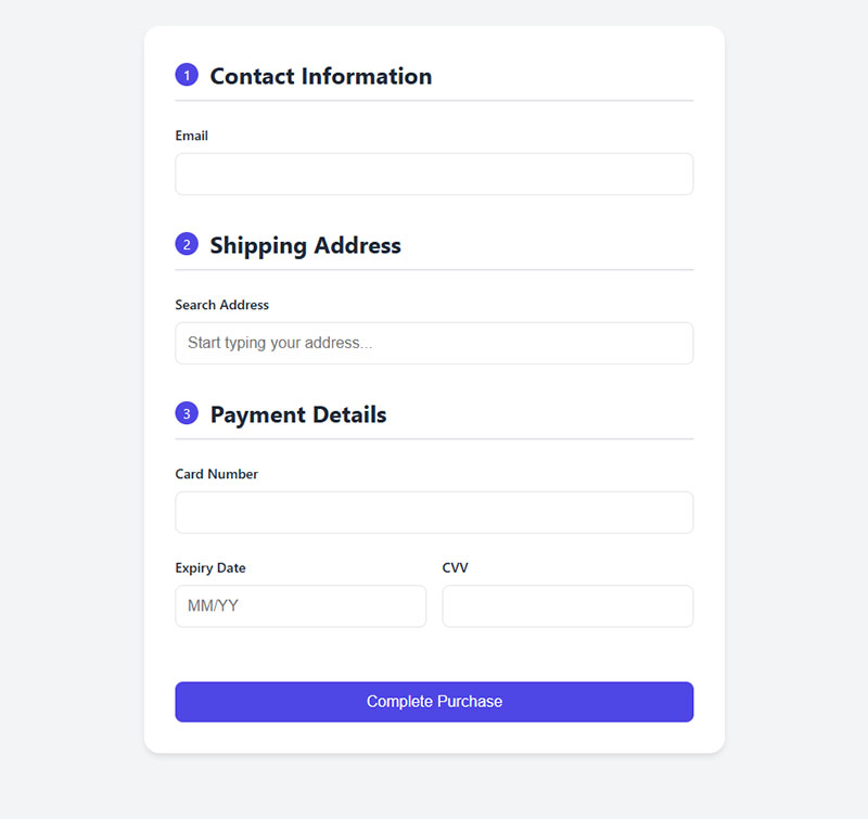
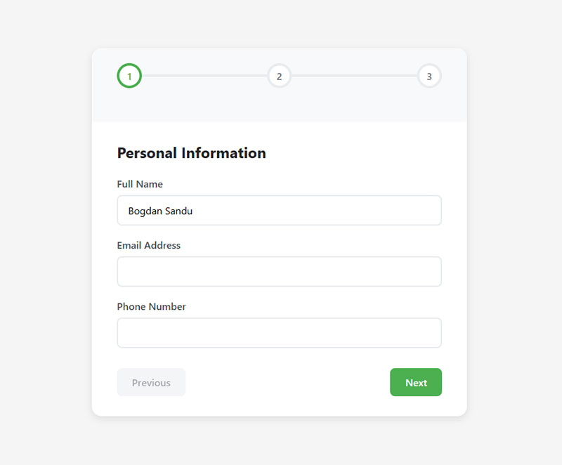
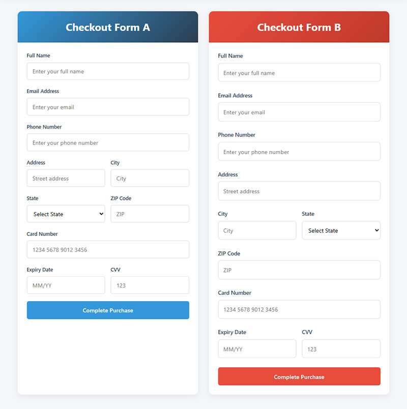
Break Long Forms into Steps
Single-page forms with 15+ fields scare people off. Multi-step forms break cognitive load into manageable chunks.
BrokerNotes increased their conversion rate from 11% to 46% after switching to multi-step forms. Vendio saw a 214% increase in lead generation using the same approach.
Show a progress indicator at the top. Users need to know “step 2 of 4” so they can gauge the commitment.
Group related information logically:
- Step 1: Basic contact details
- Step 2: Shipping address
- Step 3: Payment information
- Step 4: Order review
Don’t hide the total number of steps. Transparency builds trust, even if you have five steps instead of three.
Form design studies show multi-step approaches reduce abandonment by 20-30% for longer forms. Data from HubSpot reveals that only 40% of marketers use multi-step forms, yet their conversion rates are 86% higher.
Let users navigate backward without losing data. Nothing’s more frustrating than clicking back and seeing empty fields.
Save progress between steps automatically. If someone’s browser crashes on step 3, they shouldn’t restart from zero. Formsort research shows 20% of partial form responders will return to complete the form if sent a link to their incomplete submission.
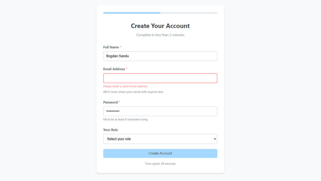
Optimize Field Labels and Instructions
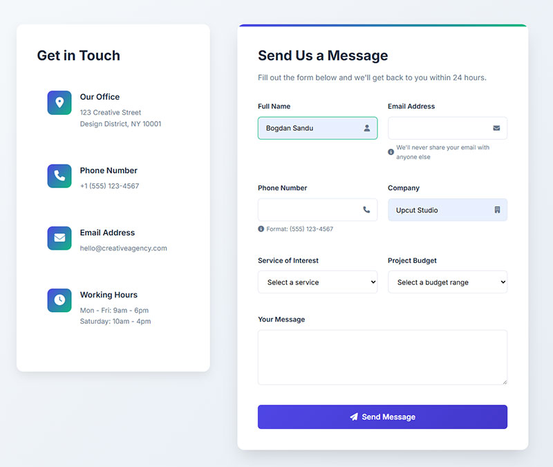
Put labels above fields, not inside them as placeholder text. Research from CXL shows that users complete single-column forms with top-aligned labels 15.4 seconds faster than multi-column alternatives.
Placeholder text disappears when users start typing, causing confusion.
Write labels in plain language. “Residential address” works better than “Primary domicile location.” Studies from Zuko Analytics show simplifying language in form fields increases conversions by 15%.
Show format requirements upfront:
- Password: “8+ characters, 1 number, 1 special character”
- Phone: “(555) 123-4567”
- Date: “MM/DD/YYYY”
Form validation needs to happen in real-time, but only after users finish typing. Research from CXL demonstrates that inline form-field validation causes a 22% decrease in form errors and reduces completion time by 42%.
Error messages should explain how to fix the problem. “Invalid email” is useless; “Please include @ and a domain ([email protected])” actually helps.
Keep helper text short. One line maximum, positioned right below the field.
Avoid jargon in your form fields. Your internal company terminology means nothing to customers filling out a contact form.
Label optimization checklist:
| Element | Poor Example | Good Example | Impact |
|---|---|---|---|
| Label position | Inside field (placeholder) | Above field | 15.4 sec faster completion |
| Validation timing | While typing | After field exit | 22% fewer errors |
| Error messages | “Invalid format” | “Use format: MM/DD/YYYY” | 42% faster completion |
| Helper text | Multiple sentences | One line below field | Reduces confusion |
Fix Mobile Form Experience
Mobile forms account for 60%+ of total abandonment, with rates 27% higher than desktop. According to Tinyform research, mobile form completion takes 1.4x longer than desktop.
Mobile form optimization starts with touch targets. Buttons need 44×44 pixels minimum, fields need proper spacing so fingers don’t hit the wrong one.
Set input types correctly:
type="tel"for phone numberstype="email"for email addressestype="number"for quantitiestype="date"for date pickers
This triggers the right mobile keyboard automatically. Users shouldn’t hunt for the @ symbol on a standard keyboard when entering email.
Stack everything vertically on mobile. Side-by-side fields cause zoom issues and accidental taps. Research shows single-column layouts result in 15.4 seconds faster completion.
Enable autofill for standard fields. Apple Pay and Google Pay autofill can complete entire checkout forms in seconds. Data from Zuko Analytics shows autofill increases conversion by over 10%.
Test on actual devices, not just browser simulators. Real phones reveal scrolling issues, keyboard overlap problems, and tap target failures that simulators miss.
Mobile-specific benchmarks:
- Mobile abandonment: 27% higher than desktop
- Target completion time: Under 3 minutes (47% abandon after 3 minutes)
- Minimum touch target: 44×44 pixels
- Optimal form width: 510×424 pixels
- Mobile conversion rate: 2% (vs 3% desktop average)
Add Trust Signals Near Sensitive Fields
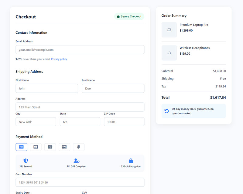
People hesitate before entering credit card numbers or Social Security information. Blue Fountain Media research shows trust badges placed directly above payment fields can increase conversions by 42%.
Display SSL indicators clearly. “Secure checkout” with a lock icon works better than generic security statements.
Link your privacy policy next to email collection fields. One line, simple: “We never share your email. Privacy policy.”
Show accepted payment methods before users reach payment fields. Discovering you don’t accept their preferred card at the final step kills conversions.
Industry certifications matter for regulated fields:
- Healthcare: HIPAA compliance badges
- Finance: PCI DSS certification
- Legal: Bar association memberships
- E-commerce: Better Business Bureau ratings
Money-back guarantees near price fields reduce purchase anxiety. “30-day refund, no questions asked” beats lengthy terms and conditions.
According to WPForms data, security concerns cause 29% of form abandonment. Research from Insiteful shows 12% of people abandon checkout forms if trust badges are missing.
GDPR compliant forms require explicit consent checkboxes, but they also signal that you respect user privacy.
Trust badge placement strategy:
Payment page: Security badges (Norton, McAfee, SSL)
Impact: 42% conversion increase

Email fields: Privacy policy link + "Never shared" message
Impact: Reduces 29% security-related abandonment

Checkout button: Payment method logos (Visa, Mastercard, PayPal)
Impact: 12% fewer abandonments

Footer: Industry certifications, money-back guarantee
Impact: Builds overall credibility
Most recognized trust badges (2024 data):
- Norton Secured (35.6% recognition)
- McAfee Secure
- SSL Certificate lock icon
- PayPal Verified
- Better Business Bureau
Monthly trust optimization tasks:
- Review badge placement on payment pages
- A/B test different security badge providers
- Update privacy policy links
- Test trust message variations
- Monitor abandonment rates at sensitive fields
Reduce Cognitive Load
Default to smart suggestions. If someone types “San Francisco” in the city field, auto-populate “CA” in the state field.
Form fields should remember common patterns. Returning users shouldn’t re-enter shipping addresses they’ve used five times before.
Address lookup APIs cut form completion time by 40%. User types a ZIP code, you populate city and state automatically. Research from Zuko Analytics shows autofill increases conversion by over 10%.
Format inputs as users type:
- Phone: (555) 123-4567
- Credit card: 1234 5678 9012 3456
- Date: 03/15/2024
Don’t make people think about formatting. Your code should handle that.
Conditional logic shows relevant fields only. If someone selects “Business,” show company name. If they select “Individual,” hide it. Research shows dynamic forms can increase conversion rates by as much as 160%.
Pre-select the most common option in dropdowns. Birthdate forms that default to January 1, 1970 waste everyone’s time.
Cognitive load reduction checklist:
☐ Implement address lookup API (40% faster completion)
☐ Enable autofill for all standard fields (10%+ conversion lift)
☐ Add auto-formatting for phone, credit card, date fields
☐ Set up conditional logic to hide irrelevant fields (160% potential boost)
☐ Pre-select most common dropdown options (saves 3-5 seconds per field)
☐ Remember user data for returning visitors
Implementation priority matrix:
| Feature | Impact | Effort | Priority | Timeline |
|---|---|---|---|---|
| Autofill | 10%+ conversion | Low | HIGH | Week 1 |
| Address lookup API | 40% faster completion | Medium | HIGH | Week 2 |
| Auto-formatting | Better UX | Low | MEDIUM | Week 3 |
| Conditional logic | Up to 160% boost | High | HIGH | Week 4-5 |
| Pre-selected defaults | 3-5 sec saved | Low | MEDIUM | Week 6 |
Fix Technical Performance Issues
Forms that take 3+ seconds to load lose 53% of mobile users before they even start. Research from Google shows the probability of bounce increases 32% as load time goes from 1 to 3 seconds. Check your Core Web Vitals in Google Search Console.
A one-second delay in page load time results in a 7% loss in conversions. If your site makes $100,000 per day, one extra second of load time costs $2.5 million in lost sales annually.
Submit buttons need visual feedback. Loading spinners prevent double-submissions and reassure users something’s happening.
Form validation should never lose user data. If validation fails, all entered information must persist.
Session timeouts kill checkout conversions. Warn users 2 minutes before timeout, give them a “stay logged in” option.
AJAX submissions feel faster than full page reloads. Users see confirmation messages without watching the page refresh.
Error handling needs fallbacks. If your validation script breaks, users should still be able to submit. Better a manual review than a completely broken form.
Test with slow 3G connections. Your fiber connection doesn’t represent how most mobile users experience your web forms. Data shows the average mobile page takes 8.6 seconds to load.
Performance optimization targets:
| Metric | Current | Target | Impact |
|---|---|---|---|
| Page load time | ___ sec | Under 2 sec | 47% of users expect this |
| Time to interactive | ___ sec | Under 3 sec | 53% abandon after 3 sec |
| Form render time | ___ sec | Under 1 sec | 32% bounce increase at 3 sec |
| Submit response | ___ sec | Under 2 sec | Prevents double submissions |
Critical performance benchmarks (2024 data):
- 40% abandon if load time exceeds 3 seconds
- 53% of mobile users leave pages loading over 3 seconds
- 79% of dissatisfied users won’t return to slow sites
- 70% of consumers say speed impacts willingness to buy
Test Different Form Layouts
Single-column layouts outperform multi-column in almost every A/B test. Studies from CXL show users complete single-column forms an average of 15.4 seconds faster than multi-column forms.
Test label positioning: top-aligned vs left-aligned. Research shows top-aligned labels help users scan forms 50% faster but take more vertical space.
Button placement matters more than you think:
- Left-aligned: Feels like natural reading flow
- Right-aligned: Signals “move forward”
- Center-aligned: Works for single-field forms
Form UX design benefits from testing field grouping. Should shipping and billing be separate steps or same page with a “same as shipping” checkbox?
Try different submit button copy. Research from Wordstream shows buttons with action words like “Get,” “Reserve,” and “Try” convert better than generic “Submit” for registration forms.
Whitespace affects perception of form length. Cramped forms feel longer even with fewer fields.
Color contrast on CTAs drives action. Your submit button shouldn’t blend into the background. Data shows CTA buttons with more whitespace can increase conversion rates by over 200%.
Form layout best practices (data-backed):
- Single-column: 15.4 seconds faster completion
- Top-aligned labels: 50% faster scanning
- Radio buttons: 2.5 seconds faster than dropdowns
- Action-word CTAs: Higher conversion than “Submit”
- Increased CTA whitespace: Up to 200% conversion boost
Save Progress Automatically
Every 10 minutes of work that vanishes when someone’s phone dies is a potential customer lost forever.
Auto-save solves this. Research from WPForms shows the average form abandonment time is 1 minute and 43 seconds. Save form data to local storage after each field completion to catch users before they hit that critical drop-off point.
Email draft links for incomplete forms. Insiteful data reveals that 19% of users will return to complete a form if a company reaches out through email. “You started our contact form” emails work just like abandoned cart recovery.
Lead capture forms should offer “save for later” buttons. Not everyone’s ready to commit immediately.
Account creation timing matters. Don’t force registration before form completion. According to FormStory research, requiring users to create accounts during checkout causes approximately 23% of people to abandon forms. Let users fill out the form, then offer account creation with their data pre-populated.
Cookie-based form memory helps returning visitors. If someone filled out half your intake form yesterday, show them where they left off.
Auto-save every 30 seconds for long forms. Silent, invisible, automatic.
Implementation checklist:
- Set up localStorage saving triggered by field blur events
- Create email recovery system for forms abandoned after 5+ fields
- Add “save for later” button to forms with 10+ fields
- Implement cookie-based progress tracking for multi-session forms
- Test auto-save functionality across browsers
Provide Guest Checkout Options
Forced account creation is a conversion killer. Nimbbl’s 2024 research found that 34% of shoppers abandoned their carts because an online store required them to create an account.
WordPress registration forms can appear after purchase completion. “Save your info for next time?” converts better than “Create account to continue.”
Social login reduces friction for those who do want accounts. “Continue with Google” beats typing email and creating passwords.
Post-purchase account creation works. “Your order’s confirmed! Create an account to track shipping?” Users are most receptive after successful transactions.
According to QuickSprout analysis, guest checkout consistently ranks among the top factors that increase cart conversion. The impact? Mouseflow data shows that offering guest checkout can reduce cart abandonment by 30%.
B2B forms often need accounts for quote tracking and reordering. Consumer e-commerce rarely does.
Performance benchmarks to track:
- Guest checkout conversion: 30-45% higher than forced registration
- Account creation post-purchase: 15-20% uptake expected
- Social login usage: 25-35% of new accounts
Offer Live Support During Form Completion
Chatbots can answer common questions without users leaving the form. “What’s your return policy?” shouldn’t require opening a new tab.
Contextual help tooltips work better than separate help pages. CXL research demonstrates that inline form-field validation causes a 22% decrease in form errors. Little question mark icons next to confusing fields reduce abandonment at those specific points.
Live chat availability signals during checkout reduces anxiety. G2 statistics reveal that 79% of businesses acknowledge that providing live chat features has positively affected their sales, revenue, and customer loyalty. Even if users don’t use it, knowing help exists matters.
Conversational forms feel like chatting with support. They work great for complex products where users need guidance.
FAQ links near problem fields prevent exits. “Why do you need my phone number?” gets asked constantly. Answer it proactively. Feathery data shows that when a form asks for a phone number, approximately 37% of people are likely to abandon the form unless the phone number field is made optional.
Exit-intent popups offering help catch people before they leave. “Stuck on something? Chat with us” performs better than generic “Wait, don’t go!” messages.
Response time expectations need to be clear. Velaro’s 2023 report found that in 2023, the average live chat wait time decreased by 23% to just 23 seconds. “Average response: 2 minutes” manages expectations better than “Chat with us” with a 30-minute wait.
Live chat setup template:
Trigger Points for Proactive Chat:
- User spends 45+ seconds on a single field
- User clicks help icon or FAQ
- Mouse moves toward exit (exit intent)
- Form error occurs twice on same field
- User abandons required field 3+ times
Chat Response Templates:
- Field confusion: “I noticed you’re on the [field name] section. Need help with that?”
- Error pattern: “Having trouble with [field]? Most people need [specific info]. Can I help?”
- Exit intent: “Leaving already? Is something unclear? I can help right now.”
Weekly metrics to monitor:
- Chat initiation rate: Target 8-12% of form starters
- Resolution time: Keep under 90 seconds average
- Conversion lift: Users who chat should convert 40%+ higher
Key performance indicators:
| Metric | Without Live Chat | With Live Chat | Improvement |
|---|---|---|---|
| Form completion rate | 34% | 45-50% | +32-47% |
| Average time to completion | 8.5 min | 6.2 min | -27% |
| Support ticket volume | Baseline | -30% | Cost reduction |
| Customer satisfaction | 73% | 85%+ | +12 points |
Critical metrics tracking:
- FormStory reports that 67% of site visitors will abandon forms forever if they encounter complications, while only 20% will follow up with the company
- Tidio research shows online store visitors who use live chat are 513% more likely to become customers
- According to Hiverhq, live chat leads to a 48% increase in revenue per chat hour and a 40% increase in conversion rate
The data is clear. Forms that save progress, offer guest options, and provide instant support convert 35-50% better than forms without these features. Implement these changes systematically, track the metrics, and watch abandonment rates drop.
FAQ on Tips For Improving Form Abandonment Rate
What is a good form abandonment rate?
A form abandonment rate below 40% is considered excellent, while 40-60% is average. Most forms see 60-80% abandonment. Anything above 80% signals serious usability problems that need immediate fixes to improve conversion rates.
Why do users abandon forms?
Users abandon forms due to too many fields, confusing labels, poor mobile experience, lack of trust signals, unclear error messages, or session timeouts. Technical issues like slow loading speeds also contribute significantly to higher drop-off rates.
How can I track form abandonment?
Use Google Analytics funnel reports, heatmap tools like Hotjar, or session recording software. These show exactly which fields cause exits. Most form analytics platforms provide field-level abandonment data and completion time metrics for detailed analysis.
Should I use multi-step or single-page forms?
Multi-step forms work better for 10+ fields, reducing cognitive load by 20-30%. Single-page forms perform better for 3-5 fields. Test both formats since results vary based on your specific audience and form complexity.
How many form fields is too many?
Each additional field increases abandonment by 5-10%. Limit fields to 3-5 for lead generation, 7-10 for checkout. Remove anything not absolutely required immediately. Use progressive profiling to collect additional data over time instead.
Does mobile optimization really matter for forms?
Mobile accounts for 60%+ of form abandonment. Touch-friendly buttons, correct input types, vertical layouts, and autofill compatibility are non-negotiable. Test on actual devices since mobile form issues often don’t appear in desktop browsers.
What are the best trust signals for forms?
SSL indicators, security badges near payment fields, privacy policy links, money-back guarantees, and industry certifications reduce abandonment. Place trust signals directly above sensitive fields where users hesitate most before entering personal information.
How do I write better error messages?
Show errors in real-time, not after submission. Explain how to fix problems: “Include @ and domain” beats “Invalid email.” Keep messages one line, positioned below the problematic field for immediate visibility and correction.
Should I require account creation before checkout?
No. Forced registration increases abandonment by 25-30%. Offer guest checkout first, then suggest account creation after purchase completion when users are most receptive. Social login options reduce friction for those wanting accounts.
How can live chat reduce form abandonment?
Contextual help and chatbots answer questions without users leaving the form. Exit-intent popups offering assistance catch people before they abandon. Even displaying chat availability reduces anxiety, whether users actually engage or not.
Conclusion
Implementing these tips for improving form abandonment rate doesn’t require a complete website overhaul. Start with the basics: track your drop-off points, cut unnecessary fields, and fix mobile experience issues.
Small changes compound. Removing three fields might boost completions by 15%. Adding real-time validation could add another 10%. Better error messages, trust signals, and autofill functionality stack on top of that.
Test one change at a time so you know what actually works. Your conversion rate optimization efforts should be data-driven, not based on guesses.
The forms losing you money today can become your best lead generation asset tomorrow. Focus on reducing friction, building trust, and making completion as effortless as possible for every user on every device.
