


A login form is one of the most important UI components on a website or web application. It’s the entry point for users accessing accounts, dashboards, or private content. If…
Table of Contents
Browser-default form controls look different on every device, every OS, every screen. That is the problem. And CSS is the fix.
This collection of CSS forms examples covers the techniques that actually work in production, from basic input styling and custom checkboxes to responsive layouts, dark mode support, and the new appearance: base-select property that finally makes native select dropdowns fully stylable.
You will find ready-to-use code for login forms, contact forms, and registration templates. Each example uses pure HTML and CSS with no JavaScript dependencies.
Whether you are resetting browser defaults for the first time or building a complete form design system, these patterns will save you hours of cross-browser debugging.
What Is CSS Form Styling?
CSS form styling is the process of overriding browser-default appearances on HTML form elements with custom CSS rules. Every browser ships its own user-agent stylesheet, and those defaults look different depending on the rendering engine and operating system underneath.
That is why a <select> dropdown in Chrome on Windows looks nothing like the same element in Safari on macOS. The underlying OS handles part of the rendering, and each browser makes its own choices about padding, margins, font sizes, and borders.
MDN Web Docs breaks form controls into three categories based on how easily you can style them. Text inputs, textareas, and buttons sit in the “easy” group. Checkboxes, radio buttons, and select dropdowns fall into the “bad” and “ugly” groups because their internals are tied to the operating system.
The appearance property is the single most useful CSS tool for resetting native form control styles. Setting appearance: none strips the OS-level look from an element, giving you a blank slate for custom styling. In 2025, Chrome 135 shipped appearance: base-select, a new value that finally allows full CSS customization of <select> elements without JavaScript workarounds.
| Stylability Level | Elements | CSS Control |
| Easy | Text inputs, textareas, buttons | Full control over box model, fonts, and colors |
| Moderate | Checkboxes, radio buttons | Requires appearance: none + pseudo-elements |
| Difficult | Select dropdowns, date pickers, range sliders | Limited without base-select or JS alternatives |
Knowing which category your form elements fall into saves you hours of debugging. Took me a while to learn that the hard way, but once you internalize this breakdown, your approach to any form design project changes completely.
If you are working with a CMS like WordPress, you may find that WordPress forms come with their own pre-applied styles that sit on top of browser defaults, adding another layer you need to account for.
Basic CSS Form Layout Examples
Layout is the foundation. Get it wrong and no amount of border-radius or color tweaking will save the form. The structure of your form determines how users move through it, where their eyes land, and whether they actually finish filling it out.
FormStory research shows that single-column formats result in faster form completion compared to multi-column layouts, with users finishing 15.4 seconds faster on average.
Stacked Form with Flexbox
See the Pen
Stacked Form with Flexbox by Bogdan Sandu (@bogdansandu)
on CodePen.
The stacked layout is the default pattern for most web forms today. Labels sit above inputs, and every field runs the full width of its container. Flexbox makes this dead simple.
Set display: flex and flex-direction: column on your form wrapper. Use gap instead of margin-bottom on individual fields. Gap is cleaner, and you avoid the collapsed margin headaches that come with vertical stacking.
This pattern works best for contact forms, login screens, and any form under 6 fields. It is the safest layout for mobile because there is zero horizontal complexity.
Inline Form with CSS Grid
See the Pen
Inline Forms with CSS Grid by Bogdan Sandu (@bogdansandu)
on CodePen.
Best use case: search bars, filter controls, short subscription inputs.
An inline form places the label, input, and submit button on a single row. CSS Grid handles this well because you can define exact column widths with grid-template-columns and let the input stretch with 1fr while the button stays fixed.
A horizontal form layout keeps things compact, but it falls apart fast on small screens. Always pair it with a media query that switches to stacked below 600px or so.
Multi-Column Form Layout
See the Pen
Modern Multi-Step Checkout by Bogdan Sandu (@bogdansandu)
on CodePen.
Two-column forms are tricky. They look organized on desktop but Zuko Analytics data shows that two-column layouts cause confusion and can lead to higher form abandonment.
If you need a multi-column layout (think registration or checkout forms with address fields), use CSS Grid with named areas. Something like:
- First name and last name side by side
- Email spanning full width below
- City and zip code paired, state on its own row
Wrap the whole thing in a container query or media query that collapses to one column under 768px. Proper form layout practices make the difference between a form that converts and one that frustrates people into leaving.
Styling Text Inputs and Textareas
See the Pen
SaaS Form Design with Production-Grade Input Styling by Bogdan Sandu (@bogdansandu)
on CodePen.
Text inputs and textareas are the most common form elements on the web, and luckily, they are the easiest to style with CSS. But “easy” does not mean “obvious.” There are quirks.
Baymard Institute found that the average checkout displays twice as many form fields as needed. Styling alone will not fix that, but well-styled form fields make even longer forms feel less overwhelming.
Resetting Defaults and Custom Borders
Step one: normalize everything. Browsers do not inherit font-family or font-size on form elements by default. MDN explicitly calls this out. Add this to your reset:
input, textarea, select, button { font: inherit; }
From there, strip the default border and outline. Apply your own border-radius, padding, and border color. I prefer a subtle 1px solid border in a neutral gray, then a colored border on focus. Keeps things clean without looking like a wireframe.
Focus States and Placeholder Styling
The :focus-visible pseudo-class is better than :focus for most cases. It only activates on keyboard navigation, so mouse users do not see the outline. This matters for form accessibility because keyboard users absolutely need visible focus indicators.
For placeholder text, use the ::placeholder pseudo-element. Set a lighter color than your input text (around 60% opacity works). Do not use placeholders as label replacements. That is a UX anti-pattern that still shows up everywhere.
Handling Autofill Backgrounds
Chrome’s autofill paints a bright yellow or light blue background on pre-filled inputs. It ignores your background-color declaration entirely.
The workaround uses :-webkit-autofill with a box-shadow trick: box-shadow: 0 0 0 1000px white inset;. It is a hack. No way around it. But it has been the standard fix for years, and it still works in 2025.
Custom Checkboxes and Radio Buttons with Pure CSS
See the Pen
Modern Checkbox Collection by Bogdan Sandu (@bogdansandu)
on CodePen.
Default checkboxes and radio buttons are tiny, inconsistent across browsers, and basically impossible to brand. But replacing them with pure CSS is one of those techniques that, once you learn it, you use on every project.
Forrester research shows that well-designed UI can improve conversion rates by up to 400%. Custom form controls are a big part of that. When checkboxes and radios match the rest of your design, the whole form feels more trustworthy.
The appearance: none Technique
How it works:
- Set
appearance: noneon the native input to strip its OS styling - Give it explicit width, height, border, and border-radius
- Use
::beforeor::afterpseudo-elements for the check mark or dot - Style the
:checkedstate to show the indicator
Radio buttons get border-radius: 50% to stay circular. Checkboxes stay square or get a small radius for softness. The :checked pseudo-class triggers the visual change, and you can add transition for a smooth animation between states.
Accessibility Considerations
Never hide the native input with display: none. Screen readers will skip it entirely.
Use position: absolute with clip or the “visually hidden” pattern instead. The input stays in the DOM and remains focusable, but it is invisible to sighted users. The <label> element handles the click target.
CXL research shows that inline form validation reduces errors by 22% and cuts completion time by 42%. That applies to checkbox groups too. Show validation messages right next to the fieldset, not at the top of the form.
CSS Select Dropdown Styling
See the Pen
CSS Select Dropdown Styling by Bogdan Sandu (@bogdansandu)
on CodePen.
The <select> element has been the single most frustrating form control to style for over two decades. The dropdown portion is rendered by the operating system, not the browser’s CSS engine, which means your stylesheets had almost zero control over it.
That changed in 2025.
Why Native Selects Resist Styling
MDN classifies select elements as one of the “ugly” form controls. The <option> elements inside a standard select are rendered at the OS level. You can change the border, background, and font on the select button itself, but the moment the dropdown opens, you are looking at whatever Chrome, Safari, or Firefox decides to show.
The State of CSS 2024 survey found that browser support issues remain the top CSS pain point, and form controls are a big contributor. Different rendering engines (Blink for Chrome, Gecko for Firefox, WebKit for Safari) each handle select elements differently.
The Classic Workaround
Remove, then rebuild:
- Set
appearance: noneon the select - Add a custom arrow using a background SVG or a pseudo-element on a wrapper div
- Style the button portion with your own padding, border, and colors
This approach gives you control over the closed state only. The open dropdown still renders natively. For many projects, that is acceptable. When looking at different types of forms, simple dropdowns with a few options rarely need full custom styling.
The New appearance: base-select
Chrome 135 introduced appearance: base-select, and it is a genuine breakthrough. The Chrome for Developers blog describes it as putting the select element into a “new, configurable and styleable state.”
What changes with base-select:
- The dropdown renders in the top layer (no clipping by parent containers)
- You can style
<option>elements with full CSS, including images and SVGs inside them - The
::picker(select)pseudo-element gives access to the dropdown itself - CSS anchor positioning ties the picker to the select button automatically
Browser support is still limited (Chrome 135+ as of early 2025), but it shipped as part of Interop 2025, so other browsers are actively working on it. For production, use progressive enhancement: the select falls back gracefully in unsupported browsers.
Floating Labels and Animated Input Effects
See the Pen
Floating Label Form with Animated Input Effects by Bogdan Sandu (@bogdansandu)
on CodePen.
Floating labels became popular with Google’s Material Design, and they have stuck around because they solve a real problem: showing the field label and saving vertical space at the same time. The label sits inside the input as a placeholder, then floats above when the user starts typing or the field gets focus.
The :placeholder-shown Technique
Key CSS selectors involved: :placeholder-shown, :focus, and :not(:placeholder-shown).
The trick relies on an empty placeholder attribute (placeholder=" ") on the input. When the input is empty, :placeholder-shown matches, and the label is positioned inside the field. When the user types something, the placeholder is no longer shown, so the label transitions upward.
The CSS uses transform: translateY() and font-size changes on the label, with a transition for smooth animation. No JavaScript needed.
Underline and Glow Effects
Underline-only inputs (no top or side borders, just a bottom line) give forms a minimal look. Use border: none followed by border-bottom: 2px solid #ccc. On focus, change the border color and optionally add a box-shadow for a glow effect.
Transition timing matters here. Anything over 300ms feels sluggish. I usually set transition: border-color 0.2s ease, box-shadow 0.2s ease. Fast enough to feel responsive, slow enough to actually see.
According to UXCam research, 68% of users would not submit a form requiring too much personal information. Animated effects do not fix bad form UX design, but they do make well-structured forms feel polished and professional. The visual feedback tells users the interface is alive and responding to their actions.
If you are building forms that need to capture leads while keeping the experience smooth, applying these CSS techniques to a lead generation form can noticeably improve how users perceive the interaction.
CSS Form Validation Styling
See the Pen
CSS Form Validation Styling by Bogdan Sandu (@bogdansandu)
on CodePen.
CSS pseudo-classes let you show visual feedback on form inputs based on their validation state, with zero JavaScript. This is one of those things that most developers underuse because they default to JS validation libraries out of habit.
WPForms data shows that inline form-field validation causes a 22% decrease in form errors and cuts completion time by 42% (CXL research). CSS handles this natively now.
Built-in Validation Pseudo-Classes
| Pseudo-Class | What It Matches | Typical Use |
:valid |
Input passing all constraints | Green border, checkmark icon |
:invalid |
Input failing constraints | Red border, error icon |
:required |
Fields with required attribute |
Asterisk indicator |
:optional |
Fields without required |
Lighter label styling |
Pair these with HTML5 attributes like type="email", pattern, minlength, and required. The browser handles the actual validation. CSS just styles the result.
One catch: :invalid fires immediately on page load for empty required fields. That means a blank form shows red borders before the user even touches it. Not great.
The :user-valid and :user-invalid Fix
Since November 2023, all major browsers support :user-valid and :user-invalid. These pseudo-classes only activate after the user interacts with the field.
MDN defines it clearly: the pseudo-class matches only once the user has changed the value, moved focus elsewhere, or attempted to submit the form. No more angry red borders on a fresh page load.
For older browser support, wrap the newer selectors in @supports and fall back to :valid / :invalid. Progressive enhancement at its simplest.
Styling Validation Feedback
Color alone is not enough. MDN’s accessibility guidelines warn that people with color blindness cannot distinguish red from green borders. Always combine color with a secondary indicator.
- A checkmark or X icon via
::afteron the input wrapper - Descriptive text that appears when
:user-invalidmatches - Border width changes (thicker for errors) alongside color shifts
Stripe’s checkout team redesigned their form error messages to appear inline rather than in a summary block at the top. The result was a smoother flow where users could fix issues without scrolling. If you are building client-side validation alongside server-side checks, CSS handles the visual layer while your backend handles the security layer.
Responsive Form Design with CSS
See the Pen
Responsive SaaS Onboarding Form by Bogdan Sandu (@bogdansandu)
on CodePen.
StatCounter data from 2025 shows that roughly 60% of global web traffic comes from mobile devices. Forms that look fine on a 1440px monitor but break on a phone screen are losing more than half their potential submissions.
Responsive form design is not about making things shrink. It is about rethinking layout, spacing, and interaction targets for touch screens.
Breakpoint Strategies for Forms
The standard approach: multi-column on desktop, single-column on mobile.
Use CSS Grid or Flexbox for the desktop layout, then collapse to a stacked format below 768px (or wherever your design breaks). Container queries are also production-ready now, with Lovable reporting 93.92% global browser support as of December 2025.
Container queries are better than media queries for form components because they respond to the parent container’s width, not the viewport. Drop a form inside a sidebar and it adapts automatically.
Touch-Friendly Input Sizing
Apple’s Human Interface Guidelines specify minimum 44×44 pixel tap areas. Your inputs need to meet that threshold, or mobile users will struggle to tap the right field.
Set font-size: 16px or larger on all inputs. Anything below 16px triggers automatic zoom on iOS Safari when the field gets focus, as CSS-Tricks documented. This is one of those bugs that took me forever to track down the first time it happened on a client project.
Proper mobile form design goes beyond CSS. But the CSS part (sizing, spacing, font rules) is where most of the quick wins live.
Spacing and Layout Adjustments
Desktop: you can afford tighter gaps between fields, side-by-side columns, compact padding.
Mobile: increase vertical gap between fields to at least 12px to prevent accidental taps. Full-width buttons. Larger padding inside inputs (at least 12px vertical, 16px horizontal).
BusinessDasher research shows responsive designs have 11% higher conversion rates compared to non-responsive sites. For forms specifically, that gap is probably wider because forms require precise interaction from the user. If you are working with longer flows, consider breaking them into multi-step forms so each screen stays clean and focused on mobile.
Dark Mode Form Styling
See the Pen
Dark Mode Form – SaaS Sign-Up with prefers-color-scheme by Bogdan Sandu (@bogdansandu)
on CodePen.
Earthweb reports that nearly 82% of smartphone users have dark mode enabled on their devices as of 2024. WifiTalents data shows 64% of users want websites to automatically match their system color scheme.
If your forms ignore this preference, they will look like a flashbang in an otherwise dark interface.
Using prefers-color-scheme
The prefers-color-scheme media query detects the user’s OS-level theme setting. Two values: light and dark.
Every major browser (Chrome, Firefox, Safari, Edge) supports it. The cleanest implementation uses CSS custom properties:
- Define color variables in
:rootfor light mode defaults - Override those variables inside
@media (prefers-color-scheme: dark) - All form elements reference the variables, not hardcoded color values
This approach means your entire form color scheme changes from one media query block. No duplicated rulesets. No JavaScript toggle needed (though you can add one for manual override).
Handling Autofill and Contrast in Dark Mode
Autofill is the biggest headache. Chrome’s autofill background override (that bright yellow/blue) looks even worse on dark backgrounds.
The same :-webkit-autofill box-shadow trick from light mode works here, just swap the inset color to match your dark background. Something like box-shadow: 0 0 0 1000px #1a1a2e inset; and set -webkit-text-fill-color to your light text color.
For contrast, WCAG 2.1 requires a minimum 4.5:1 ratio for normal text. Dark mode makes this tricky because light text on dark backgrounds can appear to “glow” or blur, especially at smaller sizes. Test your form input text, placeholder text, and border colors against your dark background with a contrast checker.
Slack was one of the first major platforms to ship dark mode across web and mobile, and their form fields maintain clear boundaries with subtle lighter borders against dark surfaces. That pattern (slightly lighter border, not white) works better than harsh white outlines on dark forms.
Full CSS Form Templates with Code
Everything above comes together in actual templates. These are complete HTML and CSS examples, no JavaScript, no framework dependencies. Copy them, tweak them, use them.
Zuko Analytics data shows that two-thirds of people who start filling out a form successfully complete it. The other third drops off, often because of poor design, confusing layouts, or visual friction. Good CSS can address all three.
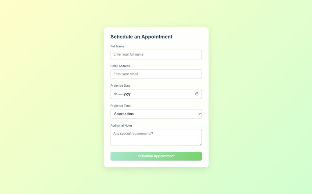
Login Form Example
See the Pen
Modern Login Form Collection by Bogdan Sandu (@bogdansandu)
on CodePen.
Structure: a centered card with two fields (email and password), a submit button, and a “forgot password” link.
Keep it minimal. Use Flexbox for vertical stacking, a max-width of 400px, and generous padding (32px or more). The inputs get full width, consistent border-radius, and clear focus states.
Stripe’s login form is a good reference. Clean, centered, no visual noise. Their input fields use a single bottom border with a floating label effect. Shopify takes a similar approach for their merchant login, proving that the pattern scales across different brands.
Contact Form Example
See the Pen
Modern E-commerce Contact Form by Bogdan Sandu (@bogdansandu)
on CodePen.
Feathery research shows that 67% of site visitors will abandon a form forever if they hit any complications. A contact us page template needs to be dead simple.
Recommended fields: name, email, message textarea, submit button. Four fields, max.
Use CSS Grid for a two-column layout on desktop (name and email side by side), then stack on mobile. The textarea should span the full width. Add a visible form submission confirmation message styled with a green background and smooth fade-in transition.
Registration Form Example
See the Pen
Modern Multi-Step Form with Animated Progress Indicators by Bogdan Sandu (@bogdansandu)
on CodePen.
Registration forms have more fields, which means more chances for users to bail. The Manifest reports that 27% of users abandon forms because they are too long.
Break the visual density with fieldset groups. Personal info in one section, account details in another. Use <fieldset> and <legend> elements with CSS resets to remove the default browser styling on those elements.
- Password strength indicator using a colored bar (pure CSS with
:validand pattern matching) - Inline validation on email and password fields using
:user-invalid - A clear registration successful message that appears after submission
If you are managing registration forms at scale, applying these CSS patterns consistently across your website forms creates a unified experience that builds trust. And when you are ready to go beyond static CSS and add logic like showing or hiding fields based on selections, that is where conditional logic comes in.
FAQ on CSS Forms Examples
How do I style HTML form elements with CSS?
Start by resetting browser defaults with appearance: none and font: inherit on inputs, selects, and buttons. From there, apply your own borders, padding, colors, and focus states. Use normalize.css or a custom reset for consistency across Chrome, Firefox, and Safari.
Why do forms look different across browsers?
Each browser ships its own user-agent stylesheet, and form controls are partly rendered by the operating system. WebKit, Blink, and Gecko each apply different default margins, padding, and font sizes. A CSS reset eliminates most of these inconsistencies.
How do I create custom checkboxes with pure CSS?
Set appearance: none on the checkbox input, give it explicit dimensions and border styling, then use the ::before pseudo-element with the :checked pseudo-class to show a custom check indicator. No JavaScript required.
Can I fully style a select dropdown with CSS?
Since Chrome 135, yes. The appearance: base-select property unlocks full CSS control over the dropdown picker, including option elements. Older browsers still limit styling to the closed button state only, so use progressive enhancement.
How do I make forms responsive on mobile?
Use a single-column layout with CSS Flexbox or Grid, set input font-size to at least 16px to prevent iOS zoom, and ensure tap targets meet the 44×44 pixel minimum. Collapse multi-column layouts below 768px with media queries.
What CSS pseudo-classes work for form validation?
The :valid, :invalid, :required, and :optional pseudo-classes style fields based on HTML5 validation. For better UX, use :user-valid and :user-invalid, which only activate after the user actually interacts with the field.
How do I build a floating label effect in CSS?
Add an empty placeholder attribute to the input. Use the :placeholder-shown pseudo-class to position the label inside the field, then transition it upward on :focus and :not(:placeholder-shown). Pure CSS, no libraries needed.
How do I style forms for dark mode?
Use the prefers-color-scheme: dark media query combined with CSS custom properties. Define light-mode color variables in :root, then override them inside the dark mode media query. Handle autofill backgrounds separately with the :-webkit-autofill selector.
What is the best CSS layout method for forms?
CSS Grid works best for multi-column form layouts with named areas. Flexbox is simpler for single-column stacked forms. Most production forms use Grid on desktop and switch to a Flexbox stack on mobile via a breakpoint.
How do I fix Chrome autofill background color on inputs?
Chrome ignores your background-color on autofilled inputs. The workaround uses :-webkit-autofill with an inset box-shadow: box-shadow: 0 0 0 1000px white inset. Swap the color value to match your background, especially for dark mode forms.
Conclusion
These CSS forms examples prove that you do not need JavaScript frameworks or third-party libraries to build polished, functional form interfaces. Pure CSS handles custom checkboxes, floating labels, validation states, and even fully styled select dropdowns now.
The gap between what browsers give you by default and what users expect keeps shrinking. Properties like appearance: base-select, pseudo-classes like :user-invalid`, and tools like CSS custom properties for dark mode theming have changed what is possible without a single line of script.
Start with a solid reset. Layer in your custom input styling and focus effects. Add responsive breakpoints and validation feedback. Test across Chrome, Firefox, and Safari.
Good form styling is not decoration. It directly affects completion rates, user trust, and conversions. Build forms that look intentional on every screen, and users will actually finish filling them out.

