


Most WordPress sites reach for a plugin the moment they need a contact form. It works, but it is not the only way. You can create forms in WordPress without…
Table of contents
Most lead capture forms don’t fail because of bad design. They fail because nobody tested whether the form actually matched what visitors were willing to give up.
Learning how to create lead capture forms that convert means getting the details right: field count, CTA copy, placement, the offer behind the form, and what happens after someone hits submit. Skip any one of those and your conversion rate drops.
This guide covers the full process. From defining what a lead capture form actually is, to choosing the right form builder, picking lead magnets that pull their weight, and setting up tracking in Google Analytics 4 so you know which forms are working. No fluff, just the stuff that moves the number.
What Is a Lead Capture Form?
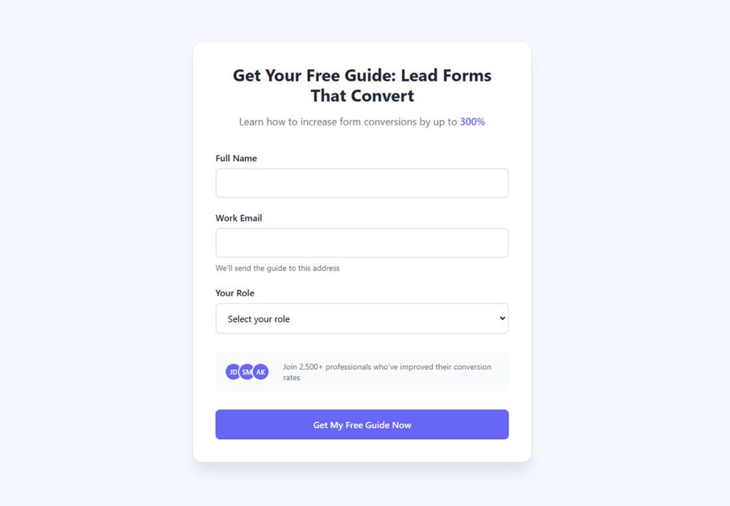
A lead capture form is a website form built to collect visitor information in exchange for something of value. That “something” could be an ebook, a free trial, a discount code, a webinar seat, or access to a gated tool.
The basic transaction is simple. A visitor gives you their name, email, phone number, or company details. You give them a resource, a demo, or a quote.
This is different from a standard contact form, which just opens a conversation. It’s also different from a checkout form, which processes a payment. A lead capture form sits between the two. It qualifies interest and starts a relationship.
HubSpot data shows that close to 50% of marketers consider web forms their highest-converting lead generation tool. That tracks with what most teams see in practice.
These forms show up in specific spots across a site. You’ll find them on landing pages, inside blog posts, as popup forms, in sticky bars, and as embedded widgets in sidebars or footers. Where the form lives changes how it performs, but the core function stays the same: turn an anonymous visitor into a known contact inside your CRM or email platform.
Salesforce, HubSpot, ActiveCampaign, Mailchimp, and ConvertKit all accept form submissions directly or through integrations with tools like Zapier and Make. The form itself is just the front door. What happens after submission (lead scoring, segmentation, automated email sequences) is where the real value builds.
How Lead Capture Forms Differ from Other Form Types
There are many types of forms used across websites. The confusion usually starts when people treat them interchangeably.
A contact us page form collects a message. An intake form gathers detailed information for onboarding. A survey form asks questions to collect feedback. And a registration form creates an account.
A lead capture form does one thing: it trades value for contact data so your sales or marketing team can follow up. The difference matters for contact forms or lead generation forms because the design, field count, and CTA strategy change based on the form’s actual purpose.
| Form type | Primary purpose | Typical fields | Outcome |
|---|---|---|---|
| Lead capture | Collect contact data for follow-up | 2–5 | Enters nurture sequence |
| Contact form | Open a conversation | 3–4 | Goes to inbox |
| Intake form | Gather onboarding details | 8–15+ | Starts client process |
| Registration form | Create an account | 4–6 | Account access granted |
What Makes a Lead Capture Form Convert?
A 2024 HubSpot study found that conversion rates drop an average of 4.1% per additional form field. That single stat explains most of the performance gap between forms that work and forms that don’t.
But field count is just one piece. The full picture includes design, copy, placement, trust signals, and the strength of whatever you’re offering in return.
Field Count and Friction
Forrester Research (2024) puts the optimal number of form fields for B2B lead generation at 3 to 5. Go beyond that and you start losing people fast.
MarketingSherpa’s 2024 analysis confirms it: forms with more than 5 fields in B2B saw a 30% average drop in conversions compared to shorter versions.
Zuko Analytics data paints the picture at the field level. Password fields cause the highest abandonment at 10.5%, followed by email (6.4%) and phone number (6.3%). That’s why smart teams make phone number fields optional, which nearly doubles completion rates according to multiple studies.
The form fields for capturing high-quality leads depend on your funnel stage. Top-of-funnel? Email only. Mid-funnel? Add name and company. Bottom-of-funnel? Now phone and budget make sense.
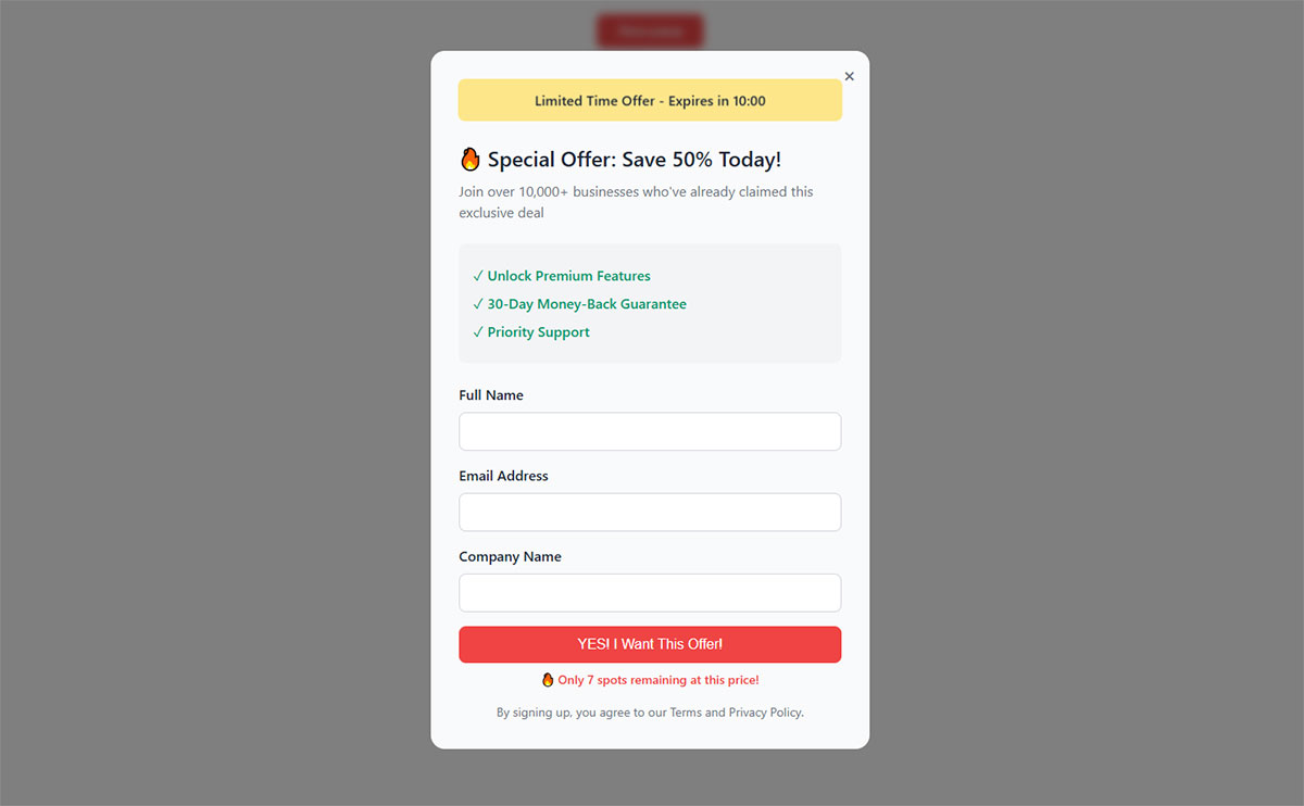
CTA Text and Value Proposition
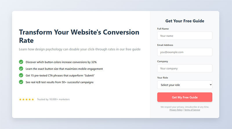
Button text matters more than most people think. Changing “Submit” to something specific like “Get My Free Guide” or “Start My Trial” can move conversion rates by several percentage points. Research shows 3% more people abandon when the button just says “Submit.”
The value proposition needs to sit right above or beside the form. Not buried in the page copy. Not assumed. Stated clearly, in plain language, so the visitor knows exactly what they get the moment they hand over their email. Check out strong call to action examples to see what works in practice.
Trust Signals and Page Context
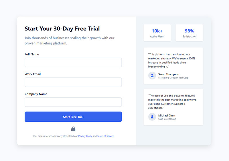
Security concerns are the number one reason people bail on forms, at 29% according to The Manifest. That’s ahead of form length (27%) and upselling (11%).
Adding trust badges near the form helps. Privacy policy links, customer logos, and short testimonials all reduce hesitation. For any form collecting sensitive data, form security isn’t optional.
And if you’re collecting data from EU visitors, your forms need GDPR compliant consent checkboxes. Real ones, not pre-checked boxes. Ignoring this creates legal risk and kills trust simultaneously.
Single-Step vs. Multi-Step Forms
HubSpot reports that multi-step forms convert 86% higher than single-step forms. Only 40% of marketers use them, which means there’s a lot of easy improvement sitting on the table.
The reason is psychological. A long form looks overwhelming. A short first step (like “What’s your goal?”) feels low-commitment. By the time a visitor reaches step two, they’ve already invested effort and are more likely to finish.
BrokerNotes went from an 11% conversion rate to 46% after switching to a multi-step form. Vendio saw a 214% increase in leads with the same approach. These aren’t edge cases.
But multi-step forms or single-step forms depends on context. Newsletter signups don’t need multiple steps. A B2B demo request with qualifying questions? That’s where multi-step shines. And if you’re worried about implementation pitfalls, watch out for common reasons multi-step forms kill conversions when progress bars are missing or steps feel pointless.
Types of Lead Capture Forms by Use Case
Not all lead capture forms look the same, and they shouldn’t. The right format depends on what you’re offering, where the visitor is in your funnel, and how much friction they’ll tolerate.
Inline Forms
These sit directly inside your page content. Blog posts, landing pages, resource libraries. No interruption, no popup, just a form embedded where it makes sense contextually.
Inline forms work well for content-heavy sites where visitors are already engaged. Comparing inline forms or popup forms comes down to one thing: inline forms have lower conversion rates per impression but generate zero annoyance. They’re the steady, passive collector.
Best for: gated blog content, resource downloads, newsletter sign up forms.
Popup and Slide-In Forms

Wisepops data from analyzing over 1 billion popup displays shows the average popup conversion rate reached 4.65% in 2025. The top 10% of campaigns? OptiMonk found those averaged 42.35%.
That’s a massive range, and it tells you everything about the difference between a lazy popup and a well-targeted one.
Popupsmart’s 2025 benchmark report across 10,000+ campaigns puts the average at 3.49% with a 7.05% interaction rate. Campaigns using time-on-page triggers outperformed others by up to 25%. Sleeknote’s data says timer-led triggers (showing after 6 seconds) beat scroll-based triggers by 67%.
The different types of popups each serve different goals. Centered modals grab maximum attention. Slide-ins feel less aggressive. Sticky bars stay visible without interrupting. For WordPress sites, WordPress exit intent popup plugins like OptinMonster and Sumo make deployment simple.
Exit-Intent Forms

Exit intent popups fire when a visitor’s cursor moves toward the browser close button on desktop. On mobile, they trigger on back-button taps or rapid scroll-up patterns.
These are your last shot at converting someone who’s about to leave. GetSiteControl found that well-built exit-intent forms can save 7% of abandoning visitors as email subscribers and rescue 13.5% of potentially lost sales with checkout incentives.
Conversational Forms

Instead of showing all fields at once, conversational forms present one question at a time in a chat-like interface. Typeform popularized this format.
They work especially well on mobile. The sequential flow reduces cognitive load and feels more like a conversation than a data entry task. Sleeknote’s research showed that onsite quizzes (which use a similar one-at-a-time approach) achieved an 8.65% average conversion rate.
Full-Page Squeeze Pages and Welcome Mats
Zero distractions. No navigation, no sidebar, no footer links. Just the offer and the form.
Squeeze pages strip away everything except the value proposition and the opt-in. That focused approach works because there’s literally nothing else to click on. Unbounce, Leadpages, Instapage, and ClickFunnels all specialize in building these.
Welcome mats do something similar but overlay the existing page. Visitors can scroll past them, but the form takes up the full viewport on load.
Choosing the Right Form Type for Your Funnel Stage
| Funnel stage | Visitor intent | Best form type | Fields |
|---|---|---|---|
| Top of funnel | Browsing, low commitment | Inline embed Popup |
Email only |
| Mid-funnel | Researching, moderate interest | Gated content form Slide-in |
Name Company |
| Bottom of funnel | Ready to buy or talk | Squeeze page Multi-step |
Name Phone Budget |
The key is matching friction to intent. At the top of your lead generation funnel, people barely know you. Don’t ask for their phone number. At the bottom, they’re requesting a demo or consultation. More fields are expected and even appreciated because they signal a serious process.
How to Build a Lead Capture Form Step by Step
Took me a while to learn this, but the actual form builder is the last thing you should open. Most of the work happens before you touch any tool.
Define the Offer and Audience First
What are you giving away? Who is it for? And what information do you actually need to follow up?
Those three questions shape everything. A lead magnet aimed at CMOs of mid-market SaaS companies needs different fields than a discount code popup for ecommerce shoppers. If you haven’t nailed the offer yet, check out lead magnet ideas and how to create a lead magnet that actually gets downloads.
Write down the minimum fields required. Then cut one more. Seriously. That Forrester data about 3-5 fields being optimal? It applies to most use cases.
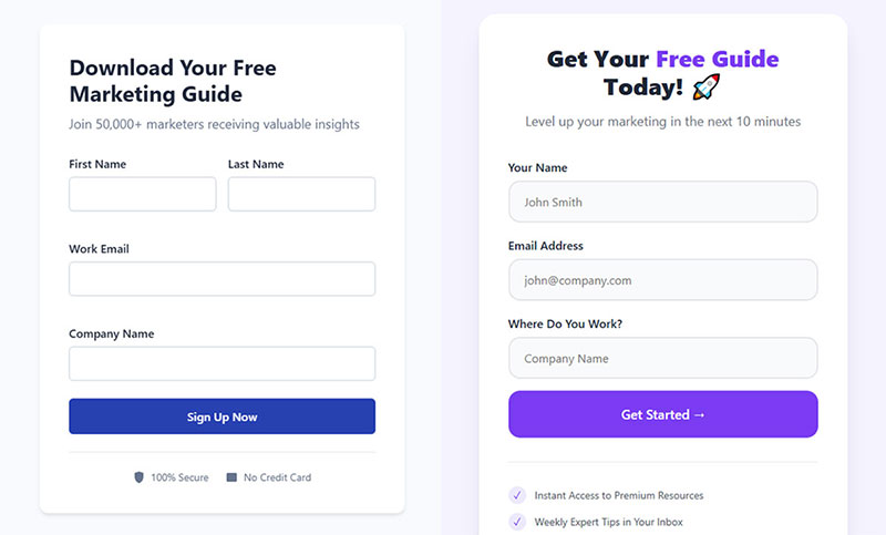
Write the Headline, Supporting Copy, and CTA
Headline: States the benefit in 6-10 words. “Get Your Free SEO Audit Report” beats “Download Our Resource.”
Supporting copy: One or two lines that explain what’s inside and why it matters. No fluff.
CTA button: Action-specific. “Send Me the Checklist” or “Book My Free Call” work because they’re first-person and benefit-focused. Good placeholder text inside your fields helps too. “[email protected]” signals what goes where without adding visual clutter.
Build the Form in Your Chosen Tool
For WordPress sites, WordPress contact form plugins like WPForms and Gravity Forms handle basic lead capture. For more advanced features (A/B testing, CRM routing, conditional logic), WordPress lead generation plugins or dedicated builders like Unbounce, Typeform, and OptinMonster are better fits.
Set up the form design to match your site. Single-column layout. Generous field padding. High-contrast submit button. CXL research confirms single-column forms complete an average of 15.4 seconds faster than multi-column layouts.
If you’re building on WordPress without a plugin, it’s still doable. Check out how to create WordPress registration forms without extra software for the basic approach.
Setting Up Form Validation and Error Handling
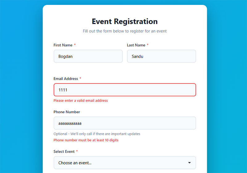
Inline validation catches errors as the visitor types. CXL data shows it reduces form errors by 22% and cuts completion time by 42%. That’s a big deal.
Your form validation should check email format in real time, flag missing required fields before submission, and use clear form error messages that tell people exactly what to fix.
Bad error handling is one of the top reasons forms lose completions. “Please fix the errors above” helps nobody. “Please enter a valid email address” tells the visitor what’s wrong and where.
For the technical side, understanding client-side vs server-side form input validation matters. Client-side catches issues instantly (better UX). Server-side validates data securely before it hits your database. You need both.
Connecting Forms to Email Automation and CRMs
The form captures the lead. What happens next determines whether that lead actually becomes revenue.
Most form builders integrate directly with Mailchimp, ActiveCampaign, ConvertKit, HubSpot, and Salesforce. If your tools don’t connect natively, Zapier or Make can bridge the gap.
Key setup steps:
- Tag new leads based on which form they submitted and which page they were on
- Segment into lists by funnel stage or content topic
- Trigger an automated welcome sequence within minutes
- Set up lead scoring if your CRM supports it (Marketo’s 2024 data shows data-rich lead scoring improves Sales Acceptance Rate by 35%)
Double opt-in is required for GDPR compliance and recommended everywhere else. It verifies the email is real and the person actually wants to hear from you. Look into GDPR consent form examples if you’re serving European audiences. For WordPress email settings, make sure your confirmation emails don’t end up in spam.
Lead Capture Form Builders Compared
The tool you pick depends on your platform, budget, and how much testing you plan to do. There’s no single best form builder. There’s only the best one for your stack.
Platform Comparison Overview
| Builder | Best for | Starting price | Key strength |
|---|---|---|---|
| HubSpot Free Forms | CRM-native capture | Free | Direct CRM integration |
| Typeform | Conversational UX | $29/mo | Beautiful one-at-a-time format |
| OptinMonster | Popup targeting | $16/mo | Advanced display rules |
| Elementor | WordPress page building | $49/yr | Drag-and-drop, theme-integrated |
| Unbounce | Landing page + form | $74/mo (annual) | Smart Traffic AI routing |
| WPForms | WordPress forms | $49.50/yr | 2,000+ templates, 6M+ installs |
| Gravity Forms | Developer-friendly WP | $59/yr | Extensive add-on marketplace |
Free vs. Paid Form Builders
What free tiers actually give you: limited submissions per month, basic field types, the builder’s branding on your form, and usually no A/B testing.
Google Forms is free and functional. But there’s no native lead routing, minimal styling options, and no way to run split tests. For personal projects or quick internal surveys, fine. For serious lead generation? You’ll outgrow it fast.
The free WordPress form plugins on the market (including WPForms Lite and Formidable Forms) cover basic needs. Upgrading makes sense when you need conditional logic, payment integration, or form builders with conditional logic for dynamic field display.
If you’re comparing specific alternatives, there are solid breakdowns of Typeform alternatives and JotForm alternatives that walk through pricing, features, and limitations side by side.
WordPress-Specific Options
Most lead capture on WordPress runs through plugins. WordPress forms built with WPForms, Gravity Forms, Elementor, or Formidable Forms cover the majority of use cases.
WPForms leads the market with over 6 million active installations. It’s beginner-friendly with a drag-and-drop builder and 2,000+ pre-built templates, including lead capture form templates ready to deploy.
Gravity Forms appeals to developers and agencies. Its third-party add-on ecosystem is significantly larger than competitors, making it the go-to for complex custom setups. If you need features like WordPress forms with file upload or WordPress payment forms, both platforms handle those use cases well.
Lead Magnets That Make Forms Worth Filling Out
The form converts only if the offer behind it is strong enough. I’ve seen beautifully designed forms with perfect UX sit at 1% conversion rates because the lead magnet was generic or irrelevant.
MailerLite analyzed over 41,000 forms and popups to find which lead magnets convert best. The average conversion rate across all forms was 22.16%. But the spread between magnet types was dramatic.
What Converts Best (and What Doesn’t)
Giveaways and contests had the highest conversion rate at 29.37%. But they attract everyone, not just your target audience. The leads tend to be lower quality.
Learning resources (webinars, micro-courses, tutorials) converted at 27.4% and produced better-qualified leads. For most businesses, this is the sweet spot.
Interactive tools and reports pulled 26.44% and 24.61% respectively. ROI calculators, assessments, and interactive forms like quizzes perform well because they deliver personalized value.
Newsletter signups were the most commonly used offer but the second-worst performer by conversion rate at 17.46%. No surprise. “Get updates” isn’t a compelling trade for an email address.
Discounts had the lowest conversion rate in MailerLite’s data, though they drive direct revenue in ecommerce. For a breakdown of what works for specific industries, look at types of lead magnets and the lead magnet best practices that separate performing offers from dead weight.
Matching Lead Magnets to Industry and Funnel Stage
A SaaS company and a real estate agency need completely different offers. What works for lead generation for SaaS (free trials, product demos, ROI calculators) won’t move the needle for lead generation for real estate (home valuation tools, neighborhood guides, mortgage calculators).
Same goes for lead generation for ecommerce (discount codes, free shipping thresholds) versus lead generation for law firms (free case evaluations, legal guides).
The lead magnet has to solve a specific, narrow problem your target audience actually has right now. Broad ebooks collect dust. Specific tools and templates get used. If you need ideas, lead magnet checklists and content upgrade ideas are good starting points.
Gated Content Strategy
About 76% of B2B marketers plan to use a hybrid gating approach by 2025, mixing free and gated content. The strategy makes sense. Give away enough value to build trust, then gate the premium stuff.
Gated content still works, but the bar keeps rising. A 3-page PDF isn’t going to cut it anymore. Look at gated content examples from companies that do it well: in-depth reports, proprietary data, tools that produce personalized output.
For webinar-based lead capture, webinar registration forms work best with 3-4 fields and a clear description of what attendees will learn. LeadPages data shows webinars can increase conversion rates by up to 60%.
Where to Place Lead Capture Forms on a Website
The same form, with the same fields and the same offer, will perform completely differently depending on where you put it. Placement is a conversion variable that a lot of teams overlook.
Nielsen Norman Group research shows content placed above the fold captures 57% of page-viewing time. That’s a big reason why most landing page forms sit at the top of the page.
Above-the-Fold on Landing Pages

For simple offers with clear value propositions, above-the-fold placement works best. Visitors see the form immediately. No scrolling required.
But there’s a catch. MECLABS research found that moving forms below the fold increased conversion rates by 220% in some cases, specifically when the below-fold placement gave room to explain the value proposition first.
Rule of thumb: if your offer needs explaining, let the page do the explaining before asking for data. If the offer is self-evident (like a newsletter or free trial), put the form front and center.
Within Blog Post Content
Embedding a form after the introduction or mid-article catches visitors at their most engaged. They’ve already started consuming your content, so the form feels like a natural next step rather than an interruption.
SuretyBonds.com increased lead capture by 27% just by testing form placement and CTA prominence on their homepage, according to an Unbounce case study. Small positioning changes compounded into significant results.
Sidebar and Footer Placements
Sidebar performance is worse than most people assume.
Blog Marketing Academy testing found sidebar opt-in forms converted at just 0.58%. The same offers in callout boxes (on pages without sidebars) converted between 1.8% and 6.09%. That’s a 310% better conversion rate without the sidebar.
Footer forms catch visitors who read the entire page. Research confirms 91% of users scroll to the bottom, so there’s still opportunity down there. Just don’t rely on footer placement as your primary capture point.
Trigger Rules for Popup and Slide-In Forms
| Trigger type | How it works | Best use case |
|---|---|---|
| Scroll depth (50–70%) | Fires after visitor scrolls midway | Blog content Long pages |
| Time delay (6 seconds) | Shows after set time on page | Homepage Product pages |
| Exit intent | Detects cursor moving to close | Cart recovery Last-chance offers |
| Page-specific | Displays only on selected URLs | Targeted campaigns |
Sleeknote data shows timer-led triggers outperform scroll-based triggers by 67%, with 6 seconds being the optimal delay. For exit-intent specifically, set page-specific rules rather than site-wide display. A popup that fires on every page trains visitors to close it reflexively.
For practical guidance on designing these triggers, review the best approaches to form UX design and form layout best practices to make sure placement decisions are backed by solid user experience principles.
How to A/B Test Lead Capture Forms
HubSpot (2024) data shows structured A/B testing programs lift conversions by an average of 18% within 6 months. And yet, 36% of marketers never run user tests on their forms at all.
That gap is where most of the easy wins are hiding.
What to Test First
Priority order for maximum impact:
- CTA button text (quickest to change, often the biggest lift)
- Number of form fields (reducing from 4 to 3 can boost conversions by nearly 50%, per Quicksprout)
- Headline and supporting copy
- Form placement on the page
- Single-step vs. multi-step layout
Test one variable at a time. Changing the headline and the CTA simultaneously tells you nothing about which change drove the result.
Sample Size and Statistical Significance
You need at least 1,000 unique visitors and 100 conversions per variant before drawing conclusions. Anything less and you’re working with noise, not signal.
Google Optimize is gone. Current alternatives include VWO, Convert, Optimizely, and AB Tasty. Some form builders (like Unbounce and OptinMonster) have built-in split testing, which is easier to set up if you’re only testing form elements.
Measuring Success Beyond Conversion Rate
Conversion rate alone doesn’t tell the full story. A form that converts at 15% but fills your CRM with junk leads is worse than one converting at 5% with high-quality contacts.
Track both: form conversion rate (volume) and lead-to-customer rate (quality). Econsultancy (2024) reports that companies with formal CRO programs see a median ROI of 223%. That return comes from testing quality, not just quantity.
For more on tightening conversion rate across all your web forms, the focus should always be on matching form complexity to visitor intent. Tips on increasing form conversions cover the full spectrum from copy tweaks to layout overhauls.
Lead Capture Form Mistakes That Kill Conversion Rates
Most form problems are obvious once you know what to look for. The tricky part is that teams build forms, launch them, and never go back to check for basic issues.
Asking for Too Much Information Upfront
Formstack’s 2025 study of 1,500 B2B decision makers shows the average form abandonment rate hits 67.8% when more than 7 fields are requested. That’s two out of three people walking away.
If you need more data, use progressive profiling. Collect email on the first visit. Name and company on the second. Phone and job title on the third. Marketo’s 2024 Benchmark Report shows progressive profiling increases form completion rates by 35% and reduces abandonment by up to 45%.
Generic CTA Buttons
The word “Submit” actively hurts performance. Research shows 3% more people abandon forms using this word on the button.
Specific, benefit-driven language works. “Get My Free Report” tells the visitor what happens next. “Submit” tells them nothing.
No Mobile Optimization
Zuko Analytics data shows desktop forms complete at a 47% rate versus 42% for mobile. That gap exists because many forms still aren’t built for smaller screens.
Minimum tap targets should be 44×44 pixels (Apple HIG) or 48×48 pixels (Google Material Design). Single-column layouts only. And use input types that trigger the right mobile form keyboards (email keyboard for email fields, numeric pad for phone numbers).
Missing Privacy Policy and Trust Signals
29% of people cite security concerns as their top reason for abandoning a form (The Manifest). That number is higher than form length.
A visible privacy link, a short “We’ll never share your data” line, or recognized trust badges can reduce this friction significantly. For forms handling sensitive data, proper form spam prevention tactics and a honeypot setup protect both you and your visitors.
No Confirmation After Submission
The Manifest found that 11% of people receive no contact at all from a company after filling out a form. No confirmation email, no thank you page, nothing.
That’s a broken experience. After someone submits a form, they should see a clear form submission confirmation message and receive the promised resource within seconds. A good post-submission flow includes a thank you page with a next step, an automated email with the download link, and (for high-intent leads) a sales notification for immediate follow-up.
Leads contacted within 5 minutes convert at 3x the rate of leads followed up after 24 hours, according to Surface Labs.
Slow Page Load from Heavy Form Scripts
Every 1-second delay in page load causes a 7% drop in conversions, per Portent (2024). Heavy form scripts are a common culprit.
Lazy load your forms so they render only when a visitor scrolls into view. Defer analytics scripts. Minify CSS and JavaScript. If you’re on WordPress, use caching plugins to keep things fast. You can also look into optimizing your forms and following HTML form best practices for lighter, faster implementations.
Tracking and Measuring Lead Capture Form Performance
Deploying a form is step one. Knowing whether it’s actually working is the part that separates teams that grow from teams that guess.
Key Metrics to Track
Form conversion rate: the percentage of visitors who see the form and submit it. Ruler Analytics puts the average across all industries at 1.7%. Your mileage will vary by industry, traffic source, and form type.
Cost per lead: total spend to acquire one lead. Without this number, you can’t calculate whether your form is profitable. First Page Sage data shows organic traffic converts at 2.4% while paid traffic from Google Ads averages 1.3%, which directly affects your CPL.
Lead-to-customer rate: the downstream metric that tells you if the leads your form captures are actually worth anything. A form generating 500 leads per month means nothing if none of them buy. For conversion rate benchmarks by industry, compare your numbers against your specific vertical rather than generic averages.
Google Analytics 4 Event Tracking for Form Submissions
GA4 uses event-based tracking. Set up a custom event (like “formsubmit” or “leadcapture”) that fires when someone completes your form. You can do this through Google Tag Manager without touching site code.
The key is configuring the event as a “key event” (formerly called a conversion) in GA4 so it shows up in your acquisition reports. Without this step, you’re collecting pageview data but missing the action that actually matters.
A 2024 Gartner survey found 43% of US businesses have significant gaps in their conversion tracking setup. If your forms aren’t firing events properly, you’re flying blind on attribution.
UTM Parameters for Lead Attribution
Every link driving traffic to your form pages should carry UTM parameters: utmsource, utmmedium, and utmcampaign at minimum.
Without UTMs, roughly 25-30% of your traffic shows up as “Direct” in GA4, hiding the true source of your leads. That’s money you can’t attribute to the campaign that earned it.
| UTM parameter | What it tracks | Example value |
|---|---|---|
utm_source |
Traffic origin | facebook newsletter |
utm_medium |
Channel type | cpc social |
utm_campaign |
Specific campaign | spring-ebook-2025 |
utm_content |
Creative variation | cta-blue-button |
Use lowercase and consistent naming. GA4 is case-sensitive. “Facebook” and “facebook” show up as two separate sources in your reports.
Heatmap Tools for Spotting Form Friction
Hotjar and Microsoft Clarity (free) show you exactly where visitors click, how far they scroll, and where they hesitate on your form pages.
Session recordings are where the real insights live. Watch 20-30 recordings of people interacting with your form. You’ll spot issues no analytics dashboard can reveal: confusing field labels, broken validation, CTA buttons that blend into the background. Look at improving your form abandonment rate for specific actions to take once you identify friction points.
For larger operations generating leads across multiple channels, tying form data back to CRM reporting is where you close the loop. Understanding which form, on which page, from which traffic source, produced which customers. That’s the level of using website forms for lead generation that actually drives business decisions. If you’re just getting started with the full process of generating leads for your business, start with tracking before you start scaling.
FAQ on How To Create Lead Capture Forms
What is a lead capture form?
A lead capture form is a web form that collects visitor information (name, email, phone) in exchange for something valuable like an ebook, free trial, or consultation. It feeds contact data directly into your CRM or email marketing platform.
How many fields should a lead capture form have?
Stick to 3 to 5 fields for most use cases. Forrester Research (2024) confirms this range is optimal. Each additional field drops conversion rates by roughly 4%, so only ask for what you actually need to follow up.
What is the best form builder for lead capture?
It depends on your platform. WPForms and Gravity Forms work well for WordPress. Typeform suits conversational formats. OptinMonster handles popups. HubSpot offers free forms with built-in CRM. Match the tool to your stack and budget.
Where should I place a lead capture form on my website?
Above the fold on landing pages for simple offers. Mid-content on blog posts for gated resources. Exit-intent popups as a last-chance capture. Test placement because the same form performs differently depending on location and page context.
What is a good conversion rate for lead capture forms?
Ruler Analytics puts the average form conversion rate at 1.7% across all industries. Email collection forms average closer to 15%. Your target depends on traffic source, form type, and industry vertical. Benchmark against your own data first.
Do multi-step forms convert better than single-step forms?
Yes, in most cases. HubSpot reports multi-step forms convert 86% higher than single-step versions. They reduce cognitive load by breaking fields into smaller steps. Progress bars and low-friction first questions improve completion rates further.
What lead magnet works best with a capture form?
Learning resources like webinars and tutorials convert at 27.4% on average, according to MailerLite. Interactive tools and checklists also perform well. Generic newsletter signups underperform. The magnet needs to solve a specific, narrow problem your audience has.
How do I reduce form abandonment?
Cut unnecessary fields, use inline validation, add trust signals, and make the form mobile-responsive. Progressive profiling collects data across multiple visits instead of all at once. Marketo data shows this approach reduces abandonment by up to 45%.
How do I track lead capture form performance?
Set up custom events in Google Analytics 4 through Google Tag Manager. Tag all inbound links with UTM parameters. Use heatmap tools like Hotjar or Microsoft Clarity to spot friction. Track both form conversion rate and downstream lead-to-customer rate.
Do lead capture forms need to be GDPR compliant?
If you collect data from EU visitors, yes. Add an explicit consent checkbox (not pre-checked), link to your privacy policy, and set up double opt-in. Non-compliance creates legal risk and kills visitor trust at the same time.
Conclusion
Knowing how to create lead capture forms is only useful if you actually build, test, and refine them. The best form is the one that’s live, collecting data, and connected to your email automation workflow.
Start with fewer fields than you think you need. Pick a form builder that fits your CMS (whether that’s Elementor, WPForms, or Unbounce). Write a CTA that tells visitors exactly what they get.
Then measure everything. Set up event tracking in GA4, tag your links with UTM parameters, and watch session recordings in Microsoft Clarity to find the friction you can’t see in spreadsheets.
Run your first A/B test within the first week. Even small changes to button text or form field count can shift your conversion rate more than a full redesign ever would.
The forms that perform aren’t the prettiest ones. They’re the ones that got tested, fixed, and tested again.
