


A login form is one of the most important UI components on a website or web application. It’s the entry point for users accessing accounts, dashboards, or private content. If…
Table of Contents
Long forms lose people. HubSpot data shows that multi step forms convert 86% higher than single-page forms, yet most websites still cram every field onto one screen.
The fix is not fewer fields. It is better structure.
This guide breaks down real multi step form examples across lead generation, e-commerce checkout, and SaaS onboarding. You will see how companies like Shopify, Slack, and Typeform use step-by-step form design to reduce abandonment and collect better data.
We also cover the tools, validation patterns, and UX principles that separate high-converting multi step forms from the ones users quit halfway through. Whether you are building with React Hook Form or a WordPress plugin, the examples here give you something concrete to work from.
What Is a Multi Step Form
A multi step form breaks a single long form into two or more sequential screens. Instead of dumping every input field on one page, it groups related questions together and walks the user through them one step at a time.
You have probably filled one out today without thinking about it. Bought something online? That checkout was a multi step form. Signed up for a new app? Same thing.
The structure usually looks like this: step one asks for basic info, step two digs into specifics, and a final step confirms everything before submission. Navigation buttons (next, back) move the user between steps, and a progress bar or step indicator shows how far along they are.
These forms show up across nearly every type of form on the web. Checkout flows, onboarding wizards, lead generation forms, insurance quote calculators, registration forms, and multi-page surveys all use this pattern.
The core tradeoff is straightforward. You reduce visual overwhelm and make each step feel manageable. But you add interaction cost because users have to click through multiple screens. For short forms with three or four fields, a single page works fine. For anything longer, splitting into steps almost always wins.
How Multi Step Forms Differ from Single-Page Forms
A single-page form shows everything at once. The user sees all fields, fills them in, and clicks submit. Clean and simple for small forms like a basic contact form.
Multi step forms hide upcoming fields behind a “next” button. This does something psychologically interesting. Users judge the effort based on what they can see right now, not the total number of fields.
Formstack found that multi-page forms convert at 13.9% compared to 4.5% for single-page forms. That is a pretty big gap, and it gets wider as the total number of fields increases. If you want the full breakdown on when each type works best, there is a solid comparison of multi-step forms or single-step forms.
Why Multi Step Forms Improve Completion Rates
HubSpot data shows that multi step forms produce 86% higher conversion rates than their single-page counterparts. Only 40% of marketers actually use them, which means most teams are leaving conversions on the table.
Why does breaking a form into steps work so well? A few reasons.
Reduced Cognitive Load
Shorter perceived effort per step is the biggest factor. When users see three fields instead of twelve, they are far more likely to start filling things out. And once they start, they tend to finish.
This connects to something called progressive disclosure. You only show the information users need at each point. No clutter, no scrolling past fields that do not apply to them yet.
The Manifest reports that 81% of people have abandoned a form after starting it. Form length accounts for 27% of those abandonments. Multi step forms directly address this by making long forms look short.
The Sunk Cost Effect and Partial Data
Once someone completes step one and step two, they have invested time. Walking away feels like wasting that effort. This is the endowed progress effect at work, and multi step forms take full advantage of it.
There is a practical benefit too. Even if a user drops off at step three, you have already captured their name and email from steps one and two. That partial data is still valuable for follow-up. A good strategy for improving form abandonment rate includes building your forms to capture the most valuable fields first.
Conditional Logic Reduces Total Input
Multi step forms pair well with conditional logic. Based on a user’s answer in step one, you can skip irrelevant steps entirely.
An insurance quote form is a good example. If someone selects “homeowner,” they see property questions. If they select “renter,” those fields never appear. The form stays lean and relevant. Dynamic form fields like these cut total input time and keep users moving forward.
ConversionXL research shows multi step forms can increase conversions by up to 300% compared to long single-page forms.
Common Multi Step Form Patterns
Not every multi step form works the same way. The pattern you pick should match the type of data you are collecting and how users naturally think about that information.
Linear Sequential
Step 1, step 2, step 3, done. The most common pattern.
Users move through a fixed sequence. Each step must be completed before the next one appears. Checkout flows almost always use this because the order matters: shipping address before payment method before order review.
The average e-commerce checkout has 5.1 steps from cart to order review, according to EmailVendorSelection. That number has stayed the same since 2012, which tells you something about how well this pattern works for purchases.
Branching and Conditional
Answers on step one determine what comes next. This is different from linear because users can take completely different paths through the form.
A survey form might ask about your industry first, then route you to industry-specific questions. A medical intake form might branch based on symptoms. The form adapts in real time, and users only answer what is relevant to them.
Branching forms need a form builder with conditional logic that can handle complex routing. Not every tool supports this well.
Accordion Style
All steps are visible on the same page, but only one section is expanded at a time. Users click a section header to open it and collapse the previous one.
This works well when people want to jump between sections or review their answers without clicking “back” multiple times. It gives users more control over their path through the form. The tradeoff is that it can look visually heavier than a clean step-by-step wizard because users can see the full list of sections from the start.
Conversational and Chat-Style
One question at a time. Full screen. Feels like messaging rather than filling out a form.
Typeform made this pattern popular. Each answer triggers the next question with smooth animations. Conversational forms work well for surveys and lead capture where you want the experience to feel casual and low-pressure. They tend to get high completion rates for shorter forms but can feel slow for anything with more than 10 questions.
Multi-Step Form Examples
See the Pen
Modern Multi-Step Job Application Form by Bogdan Sandu (@bogdansandu)
on CodePen.
See the Pen
Modern Multi-Step Cardiology Intake Form by Bogdan Sandu (@bogdansandu)
on CodePen.
See the Pen
Modern Multi-Step Job Application Form by Bogdan Sandu (@bogdansandu)
on CodePen.
See the Pen
Modern Logo Designer Client Onboarding Form by Bogdan Sandu (@bogdansandu)
on CodePen.
See the Pen
Modern Multi-Step Survey Form by Bogdan Sandu (@bogdansandu)
on CodePen.
See the Pen
Modern Multi-Step Quiz Form by Bogdan Sandu (@bogdansandu)
on CodePen.
See the Pen
Modern Multi-Step Profile Form by Bogdan Sandu (@bogdansandu)
on CodePen.
See the Pen
Modern Multi-Step Course Enrollment Form by Bogdan Sandu (@bogdansandu)
on CodePen.
See the Pen
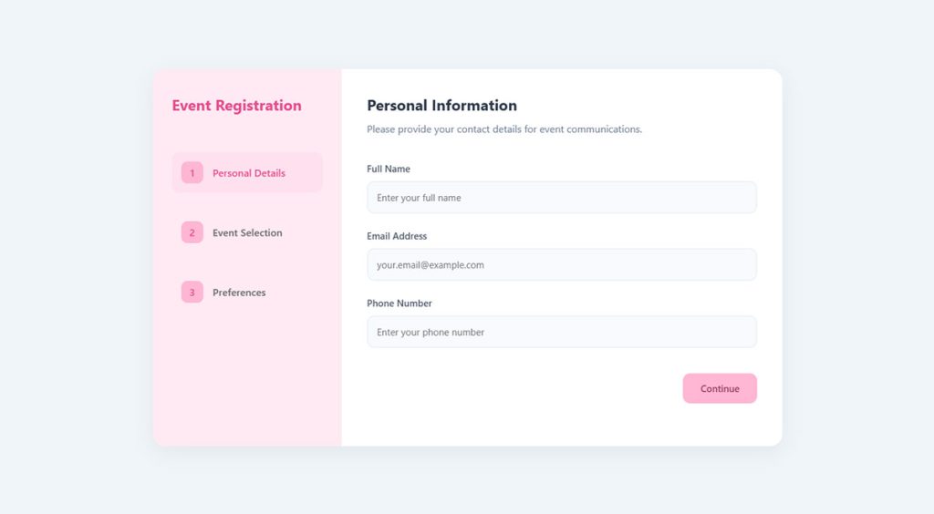
Modern Multi-Step Event Registration Form by Bogdan Sandu (@bogdansandu)
on CodePen.
Multi Step Form Examples Built with Specific Tools
The tool you pick shapes everything: how validation works, how data persists between steps, and how much custom code you will actually write. Some platforms give you multi step forms out of the box. Others need you to wire up the logic yourself.
Multi Step Forms with React
React Hook Form + Zod is the standard combination for building custom multi step forms in React. React Hook Form handles input state and submission. Zod handles per-step schema validation.
The typical architecture uses a parent stepper component that tracks the current step and child step components that each act as separate forms. State management across steps can be handled with React Context, useReducer, or a dedicated library like Zustand.
Formik is the older alternative. It works but re-renders more aggressively than React Hook Form, which matters when your form has a lot of fields. Most new projects in 2025 default to React Hook Form.
Multi Step Forms with WordPress Plugins
Gravity Forms, WPForms, and Fluent Forms all support multi step forms through built-in features or add-ons. Each takes a different approach.
WPForms has over 6 million active installations and offers 2,000+ templates, including ready-made multi step layouts. Gravity Forms gives developers more flexibility for complex conditional routing and custom field types. For free WordPress form plugins, Fluent Forms offers a solid free tier with multi step support included.
No-Code Multi Step Form Builders
Typeform and Tally sit on the opposite end of the spectrum from React. No code needed. Build your form visually and embed it.
Typeform pioneered the one-question-at-a-time conversational format. It looks great and gets strong completion rates for shorter forms. The catch: forms live on Typeform’s servers, not yours. And you cannot build a traditional multi-column layout.
Tally is a newer option that is free for most use cases. It supports both conversational and classic form layouts with multi step navigation. Webflow handles multi step through custom interactions, though it requires more setup than a dedicated form builder. If you are evaluating alternatives to established platforms, there is a good rundown of Typeform alternatives and JotForm alternatives worth looking at.
How to Validate Input Across Multiple Steps
Validation is where multi step forms get tricky. You have fields spread across multiple screens, and some fields on step three might depend on answers from step one. Getting this wrong is one of the fastest ways to frustrate users.
Per-Step Validation vs. Final-Step Validation
Per-step validation wins. Almost always.
CXL research shows that inline form validation reduces errors by 22% and cuts completion time by 42%. Users should never reach step four only to find out they made a mistake on step two. Validate each step before allowing progression.
With React Hook Form and Zod, this means assigning a separate Zod schema to each step and running safeParse before calling the next step transition. If the current step’s data does not pass validation, show errors inline and block navigation.
Schema-Based Validation with Zod or Yup
Zod: TypeScript-first. Schemas double as type definitions. Works natively with React Hook Form through zodResolver.
Yup: Older, broader ecosystem. Still widely used but lacks Zod’s TypeScript inference.
Both let you define validation rules per step. The pattern is the same: create a schema object for each step, validate against that schema on “next” click, and only validate the full combined schema on final submission. This is how you handle cross-step dependencies without blocking users unnecessarily.
Handling Cross-Step Dependencies
Sometimes a field on step three depends on what was selected on step one. A shipping method choice might determine which address fields appear later.
The fix is conditional schema composition. Build your step three schema dynamically based on stored values from earlier steps. Zod’s .refine() and .superRefine() methods handle this well. Yup uses .when() for the same purpose.
For client-side vs server-side validation, always do both. Client-side catches mistakes before submission and keeps the user experience smooth. Server-side catches anything that slips through and protects against malicious input. You need proper input sanitization on the backend regardless of how good your front-end validation is.
Design Principles for Effective Multi Step Forms
A multi step form can have solid validation and clean code but still fail because the design makes it hard to use. Form UX design decisions at this level directly impact completion rates.
Group Related Fields Logically
Each step should have a clear theme. Personal information on one step. Preferences on the next. Payment details on the last.
When fields feel random or disconnected, users lose trust in the process. They start wondering why you are asking certain questions and whether the form is longer than it needs to be. Zuko’s research confirms that grouping similar question types together keeps users focused and reduces cognitive overload.
A good rule: 3 to 5 fields per step, max. Forms with 3 fields see a 25% completion rate. Adding a fourth drops that to 20%, according to Reform’s data.
Mobile-First Layout Considerations
Shopify reports that 79% of total traffic to their stores comes from mobile devices. But mobile conversion rates (1.2%) trail desktop (1.9%) significantly. Multi step forms need to close that gap.
Key mobile rules:
- Thumb-friendly tap targets (minimum 42px, ideally 48-72px)
- Single-column layout only, no side-by-side fields
- Minimal scrolling per step
- Input types matched to field content (tel for phone, email for email)
Empire Flippers discovered this the hard way during their multi step form optimization. Desktop conversions hit 36% while mobile lagged at 26%, partly because key buttons were outside the comfortable thumb zone. For a deeper dive, see these mobile form guidelines.
Accessibility in Multi Step Forms
The WebAIM Million 2025 report found that 95.9% of the top million websites fail basic WCAG 2 compliance. Forms are a consistent trouble spot, with unlabeled inputs ranking among the six most common accessibility errors on the web.
Focus management: When a user clicks “next,” keyboard focus should move to the first field of the new step. Without this, screen reader users get lost.
ARIA live regions: Announce step changes so assistive technology users know the page content has updated. Also announce validation errors immediately when they occur.
Proper form accessibility is not just a compliance checkbox. AllAccessible reports that inaccessible sites see cart abandonment rates of 69%, compared to 23% on accessible ones. That is a 3x difference in completion. Accessible forms convert better for everyone, not just users with disabilities.
Mistakes That Break Multi Step Forms
Multi step forms fail for predictable reasons. Most problems come from ignoring how users actually behave rather than how you assume they will behave.
Losing Data on Browser Back Button
This is the single most common complaint. A user is on step four, hits the browser back button instead of the form’s “previous” button, and all their data is gone.
The Manifest found that 67% of users will abandon a form permanently if they hit any usability complication. Losing four steps of input definitely qualifies. Use browser history state management or persist form data in memory (React state, Zustand store) so that back navigation does not wipe everything.
Missing Progress Indicators
Without a step counter or progress bar, users have no idea how much more is coming. Are they halfway done? Is there one more screen or five?
A LeadCapture.io study found that removing the progress bar from step one and showing it starting from step two actually increased conversions by 133%. The takeaway is not to skip progress indicators entirely but to introduce them strategically once the user has committed past the first step. You can find solid visual examples and patterns in these form design examples.
Too Many Steps for Simple Forms
Splitting a 3-field form into three separate steps is overkill. It adds clicks without reducing cognitive load, and users can tell when they are being manipulated.
Multi step forms earn their complexity when there are 6+ fields that can be grouped logically. Below that threshold, a single-page form with clean form design will outperform a multi step version. Zuko’s guidance is clear: for anything simple, keep it on one page.
Forcing Account Creation During Checkout
Feathery data shows that requiring users to create an account causes roughly 23% of shoppers to abandon checkout entirely. Baymard puts it even higher, with 26% of cart abandonments attributed to forced account creation.
Guest checkout should always be the default. Offer account creation after the purchase is complete, when the user already has a reason to come back. If you do include a registration step, check out these WordPress registration form approaches that keep it frictionless.
Poor Error Communication
Generic form error messages like “Please fix the errors above” tell users nothing. Good error messages are specific, visible, and placed next to the field that caused the problem.
CXL’s research on inline validation showed a 22% drop in errors and 42% faster completion times. Real-time feedback beats post-submission error dumps every single time. And on the flip side, a well-crafted form submission confirmation message reassures users that their data was received successfully, which matters more than most people realize.
FAQ on Multi Step Forms
What is a multi step form?
A multi step form splits input fields across two or more sequential screens instead of showing everything on one page. Users move between steps using next and back buttons, with a progress bar tracking completion.
When should you use a multi step form instead of a single-page form?
Use multi step forms when your form has six or more fields. Below that, a single-page layout works fine. Checkout flows, quote calculators, registration wizards, and onboarding sequences all benefit from the stepped approach.
Do multi step forms actually increase conversion rates?
Yes. HubSpot data shows multi step forms convert 86% higher than single-page forms. Formstack found multi-page forms convert at 13.9% compared to 4.5% for single-page versions. The difference grows as form length increases.
What tools can I use to build a multi step form?
For WordPress, Gravity Forms, WPForms, and Fluent Forms all support multi step layouts. For custom builds, React Hook Form with Zod is the standard. No-code options include Typeform and Tally.
How many steps should a multi step form have?
Most high-converting forms use 3 to 5 steps. Keep each step focused on one topic with 3 to 5 fields. More than 7 steps risks fatigue unless the form genuinely requires that depth, like insurance applications.
Should I validate each step or only at the end?
Validate each step before allowing progression. Inline validation reduces errors by 22% and speeds up completion by 42%, according to CXL. Never let users reach the final step only to discover earlier mistakes.
How do I prevent data loss between steps?
Store form data in application state using React Context, Zustand, or Redux. For WordPress, plugins handle this automatically. Persist data on each “next” click so the browser back button does not wipe user input.
Are multi step forms accessible to screen reader users?
They can be, but it takes effort. Move keyboard focus to the first field of each new step. Use ARIA live regions to announce step transitions. Label all inputs properly and test with NVDA or VoiceOver.
Do multi step forms work well on mobile devices?
They work better than long single-page forms on mobile. Use single-column layouts, thumb-friendly buttons (minimum 42px), and matched input types. Mobile users benefit from seeing fewer fields per screen.
What is the biggest mistake people make with multi step forms?
Over-splitting simple forms. A 3-field contact form does not need three steps. Multi step design earns its complexity only when you have enough fields to group logically. Otherwise, it just adds unnecessary clicks.
Conclusion
The multi step form examples covered here share a common thread: they reduce friction by showing users only what they need at each stage. Whether it is a Shopify checkout, a Notion onboarding wizard, or a Gravity Forms quote calculator, the logic stays the same.
Start with low-commitment fields. Group related inputs on each screen. Validate per step, not at the end.
Pick the right tool for your stack. React Hook Form with Zod for custom builds. WPForms or Fluent Forms if you are on WordPress. Tally if you want something free and fast.
Keep each step to 3 to 5 fields. Add a progress indicator from step two onward. Test on mobile before you ship.
Do not over-split simple forms. A stepped layout only earns its complexity when the form completion rate improves because of it. Measure, adjust, and let the data guide your decisions.

