Your website probably has at least three types of forms right now, and you might not even realize how differently they work. Contact forms collect inquiries. Registration forms create accounts….
Table of Contents
A well-designed form can make the difference between a user completing the process or abandoning it altogether. This is where the debate between single-step and multi-step forms comes into play.
Single-step forms present all the required fields at once, offering a quick and straightforward experience. However, as the complexity of forms increases, the risk of overwhelming users grows, often leading to lower completion rates. On the other hand, multi-step forms break the process into smaller, digestible steps, providing a more engaging and user-friendly experience.
But why exactly are multi-step forms outperforming single-step forms? In this blog, we’ll explore the psychology behind these forms, the advantages they offer in boosting conversions, and why businesses are increasingly turning to multi-step designs to improve user engagement and collect high-quality data.
What are Multi-Step Forms?
Multi-step forms are online forms that break down a longer set of questions or fields into smaller, more manageable steps, rather than presenting all questions at once. Instead of overwhelming users with a long form on a single page, multi-step forms guide them through several steps, each containing a few fields at a time.
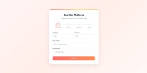
For example, instead of asking for name, email, address, payment details, and preferences all at once, a multi-step form might first ask for the name and email, then proceed to the address, and later to payment information, in separate stages. Each stage typically includes a progress indicator or step numbers, helping users understand how much of the form is left.
These forms are commonly used in scenarios where more information is required, such as:
- Sign-up processes for services or memberships
- Checkout processes in e-commerce
- Job application or registration forms
- Surveys and feedback forms
By splitting the form into smaller chunks, multi-step forms create a less intimidating experience, leading to higher completion rates and a better user experience. They allow you to collect the same amount of data while improving engagement and reducing abandonment, particularly for more complex or lengthy forms.
Benefits of Multi-Step Forms Over Single-Step Forms
Improved user experience
One of the biggest advantages of multi-step forms is the enhanced user experience. When users are presented with all form fields at once, especially in long or complex forms, it can feel overwhelming. Multi-step forms break this information into smaller, manageable steps. By focusing on one section at a time, users find the process less daunting and are more likely to engage, which directly leads to higher form completion rates.
Higher conversion rates
Because multi-step forms reduce the cognitive load on users, they often result in better conversion rates compared to single-step forms. Users are more likely to complete forms that seem simpler, even if the total amount of information requested is the same. The step-by-step structure creates a sense of progress, making users feel more comfortable and motivated to finish the process.
Progress indicators keep users engaged
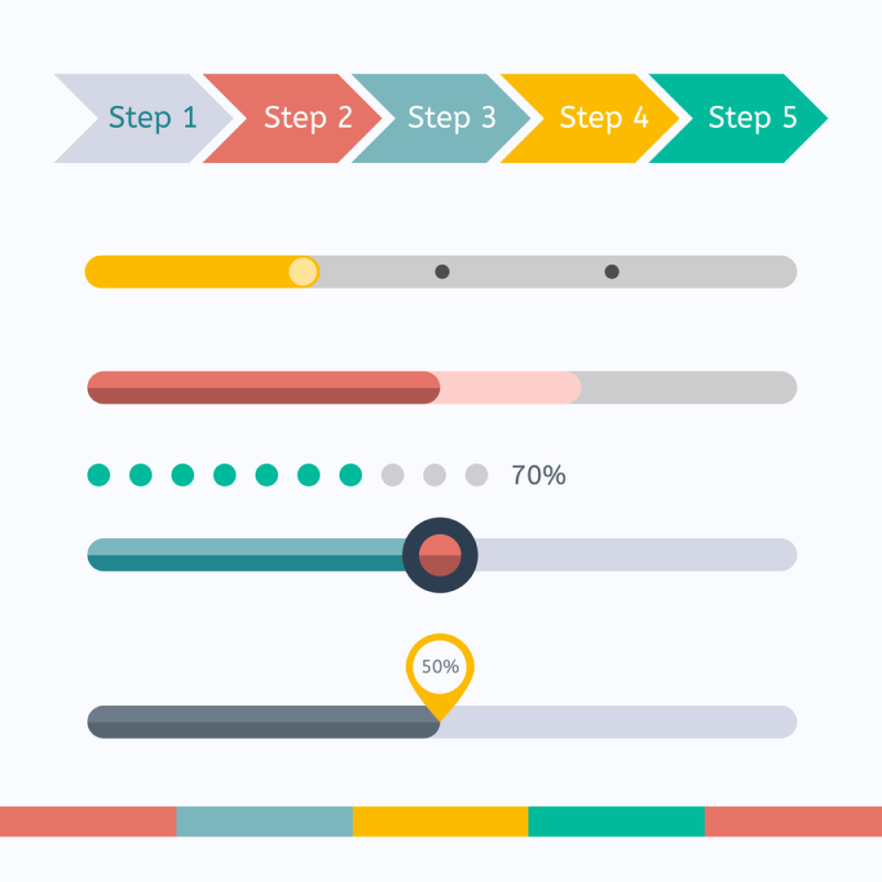
Multi-step forms often include a progress bar or step indicator to show users how far along they are in the process. This visual cue serves as motivation, giving users a sense of accomplishment as they move through the steps. The psychological effect of seeing progress encourages users to complete the form, as they feel they are close to finishing.
Reduced form abandonment
When a form feels too long or too complex, users are more likely to abandon it before completion. Multi-step forms mitigate this issue by spreading out the required fields across multiple screens, making the form feel shorter and less cumbersome. Additionally, multi-step forms often save partial progress, allowing businesses to follow up with users who don’t complete the form, providing an opportunity to recover the lead.
Improved data quality
With single-step forms, users can easily rush through the fields, leading to inaccuracies or incomplete responses. In contrast, multi-step forms guide users through the process, encouraging them to take their time with each step. This focused attention on smaller sections helps users provide more accurate and complete information. Multi-step forms can also employ conditional logic, showing users only the questions relevant to their previous answers, which improves the overall quality of data collected.
Design flexibility
Multi-step forms offer more flexibility in design and layout. Each step can be designed independently, allowing for more user-friendly navigation, visual elements, and help instructions. This customization enhances the overall experience, making the form feel more interactive and personalized. Additionally, this structure is more adaptable for mobile devices, providing a better experience for users filling out forms on smaller screens.
Psychological motivation (Zeigarnik Effect)
The Zeigarnik effect, a psychological principle, suggests that people are more likely to complete tasks once they’ve started them, especially when they know how close they are to finishing. Multi-step forms capitalize on this by showing progress indicators and breaking down the process into smaller, achievable steps. Once users begin, they feel motivated to continue, increasing the chances of form completion.
When Should You Use Multi-Step Forms?
Multi-step forms are highly effective in specific scenarios, particularly when forms are long, complex, or require detailed information. Here are some situations where using a multi-step form is the best approach:
Complex forms with multiple fields
If your form requires users to input a lot of information, such as in applications, surveys, or registration forms, breaking it into smaller, digestible steps can significantly improve user experience. A long, single-step form can overwhelm users, leading to form abandonment. Multi-step forms guide users through the process without making the form feel too daunting, resulting in higher completion rates.
If you’re using longer forms, it’s important to properly embed multi-step forms so they don’t overwhelm users.
Multi-step form examples:
- Job applications
- Event registrations
- Service sign-ups that require detailed information (e.g., insurance forms, tax forms)
E-commerce checkouts
In e-commerce, multi-step forms are commonly used during the checkout process. These forms allow customers to input their information one step at a time, such as shipping details, billing information, and payment details. By separating each section, the checkout feels more manageable and less overwhelming, leading to fewer cart abandonments and a smoother purchasing experience.
Multi-step form examples:
- Online retail checkouts
- Subscription sign-ups with multiple plan options
- Payment and delivery information collection
Lead generation forms

For businesses collecting leads, especially in industries like real estate, finance, or SaaS, multi-step forms can help improve conversion rates by asking for basic information upfront (e.g., name and email) before progressing to more detailed questions. This approach minimizes the risk of overwhelming potential leads and allows you to capture initial data even if they don’t finish the form, providing an opportunity for follow-up.
Multi-step form examples:
- Lead capture forms for webinars, consultations, or demos
- Surveys to gather user preferences before offering tailored recommendations
- Quote request forms for services
Surveys and quizzes
Surveys or quizzes are another area where multi-step forms excel. If you’re asking a series of questions, breaking them into sections helps keep the user engaged and prevents survey fatigue. Users are more likely to complete the survey when questions are grouped logically and presented in smaller chunks.
Multi-step form examples:
- Customer feedback surveys
- Personality quizzes or assessments
- Market research surveys with multiple sections
Forms with conditional logic
If your form requires conditional logic – showing or hiding certain fields based on previous answers – multi-step forms make this process much smoother. Conditional logic allows you to ask only the most relevant questions, reducing the number of unnecessary fields the user sees and improving their overall experience.
Multi-step form examples:
- Financial or insurance applications that need specific information based on user input
- Real estate forms that change based on property types
- Health or fitness assessments that customize questions based on user responses
Mobile-friendly form experiences
When targeting users on mobile devices, multi-step forms are often the better choice. Long single-step forms can be challenging to navigate on smaller screens, leading to poor user experience. Multi-step forms, with their short and focused steps, are easier to complete on mobile devices and ensure the form stays responsive and user-friendly.
Multi-step form examples:
- Sign-up forms for mobile apps
- Mobile-responsive e-commerce checkouts
- Surveys designed for mobile users
Data collection over time
In cases where you want to collect user data incrementally or track partial completions, multi-step forms provide an excellent solution. Each step can be saved progressively, allowing users to return and complete the form at a later time. This is useful for long applications or processes that users may not finish in one sitting.
Multi-step form examples:
- College or scholarship applications
- Long-term surveys or forms that require extended input
- Membership sign-ups with multiple verification steps
Multi-Step vs. Single-Step Forms: A Conclusion
When deciding between multi-step and single-step forms, the choice depends largely on the complexity of the information you’re collecting and the user experience you want to deliver.
Multi-step forms excel in situations where forms are lengthy or require detailed information. They break down the process into smaller, manageable sections, providing a smoother user experience by reducing overwhelm.
Multi-step forms tend to perform better in terms of conversion rates, form completion, and data accuracy because they guide users through the process, step by step.
Features like progress indicators, conditional logic, and mobile responsiveness also contribute to higher engagement. They’re ideal for use cases such as e-commerce checkouts, lead generation, and applications that need a lot of information.
Single-step forms, on the other hand, work best for short, simple processes where only a few fields are required. These forms are quick and efficient for users who want to get through the process as fast as possible. Single-step forms are well-suited for scenarios like email sign-ups, basic contact forms, or newsletter subscriptions, where simplicity and speed are the primary goals.
Key differences:
- User experience: Multi-step forms offer a more comfortable experience by breaking down complex tasks, while single-step forms are faster for simple tasks.
- Conversions: Multi-step forms generally lead to higher conversions for complex forms by reducing cognitive load, whereas single-step forms may lead to faster conversions for short forms.
- Form abandonment: Multi-step forms reduce abandonment rates by spreading fields across steps, but single-step forms may cause users to drop off if there are too many fields to fill at once.
- Use cases: Multi-step forms are best for detailed applications, checkouts, or surveys, while single-step forms are perfect for quick submissions like email sign-ups or contact forms.
Having said all this, multi-step forms provide a more user-friendly, engaging experience, ultimately leading to higher conversions and better data collection, making them the superior choice for complex forms.
