Gallup’s 2024 data shows only 31% of U.S. employees feel engaged at work. Annual surveys can’t catch that kind of decline fast enough. Pulse surveys can. These short, frequent questionnaires…
Table of Contents
Anyone can tell you that WordPress isn’t the easiest to navigate, and with forms being such a crucial part of our online interactions, knowing what the common mistakes are and how to avoid them is pivotal. Yet, many website owners underestimate the impact that poorly designed forms can have on user experience and conversion rates.
With so much at stake and where one misstep can lead to frustrated users, abandoned submissions, and lost opportunities, we must approach form design with care. In this post, we will highlight key mistakes to avoid when designing your WordPress form so you get the most out of it every time.
Why Do You Need WordPress Forms?
When you look at your website, what do you aim to achieve? Whether your end goal is generating leads, collecting feedback, processing registrations, or conducting surveys, a well-designed form is essential for reaching your goal.
Here are a few key reasons why WordPress forms are fundamental for your website:
- Capture leads. No other tool can help you gather contact information from potential customers as well as forms can. Whether it’s through newsletter sign-ups, free trials, or special offers, forms help you build a valuable database of leads.
- Streamline communication. A good form provides a straightforward way for visitors to contact you with questions or requests, leading to better customer service.
- Collect feedback. Forms enable you to gather insights from your audience about their experience, suggestions, or preferences. All this data is invaluable for later on improving your products or services.
- Enhance engagement. Any form of engagement with your audience can help you convert them into customers or retain them. Forms allow users to interact with your website, either through comments, surveys, or inquiries, fostering a sense of involvement.
- Facilitate transactions. If you run an e-commerce site, you already know that forms are essential for processing orders, registrations, or payments. They help ensure a smooth purchasing experience for customers.
In short, there is so much WordPress forms can do for your business, and no matter which type of website you are trying to run, it’s inevitable that you’ll need them at some point. With this inevitability, crafting good forms and making them an integral part of your website can significantly boost its success.
What Are Some Common Mistakes to Avoid When Designing Your WordPress Form
Designing an effective WordPress form requires careful consideration to ensure it meets your needs and achieves your goal. But even with a good understanding of its importance and careful planning, many website owners fall into common pitfalls that significantly reduce their conversion rates.
In the next few segments, we’ll cover the most common mistakes you can see and how to avoid them while building your forms.
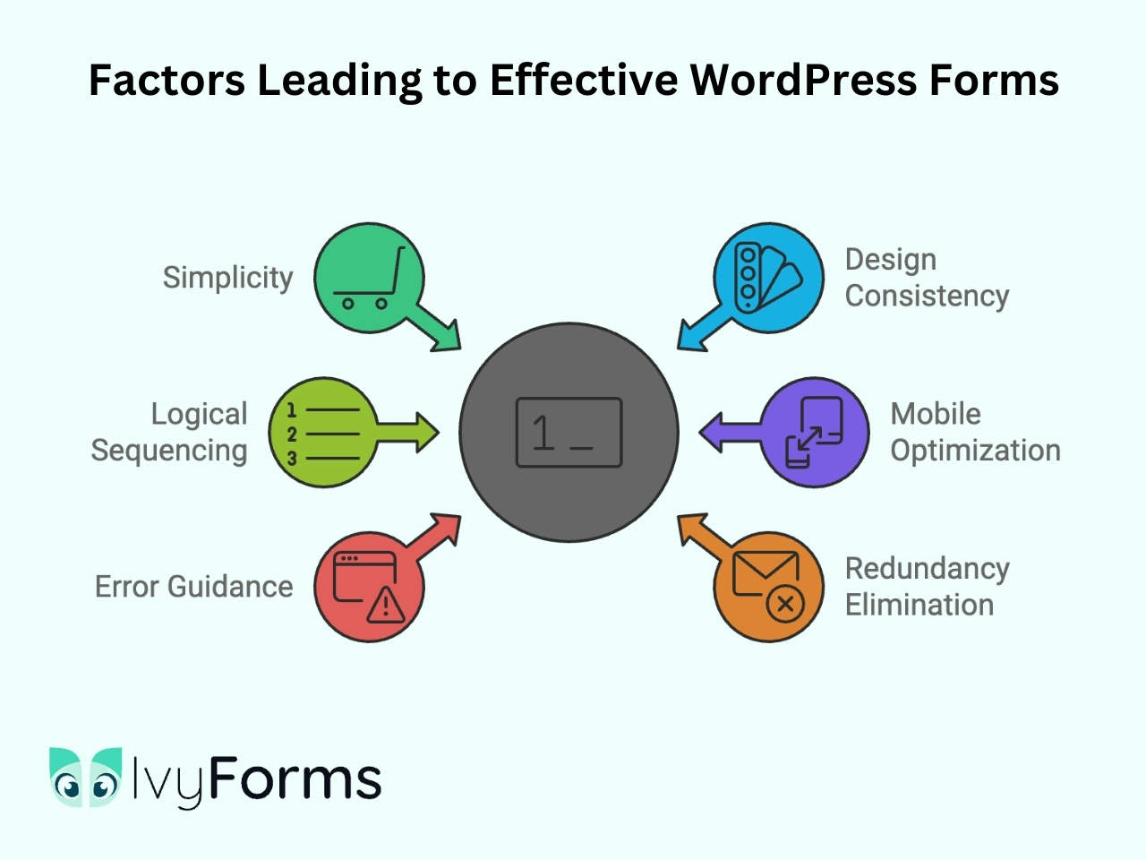
Mistake 1: Overcomplicating the form
Did you know that over 27% of users will abandon the form if they find it too complicated or lengthy? You, as a visitor, have for sure also come across those websites asking for a plethora of your personal information in order to either sign up or subscribe to something. And that’s where we meet our first and most common mistake. Many website owners overcomplicate their forms, thinking “the more, the better,” but that couldn’t be further from the truth here. When forms are cluttered with unnecessary fields and complex requirements, they overwhelm the users and lead to frustration and abandonment.
The question forming in your head right now probably is, how can you bypass this mistake and still get all the information you need? Well, there are a few key points to consider:
- You should limit the number of fields. Only ask for information that is absolutely essential. Think of it this way- each additional field increases the likelihood of users exiting the page completely. Moreover, reducing the number of fields from 11 to just four can result in a 160% increase in form submission. So, focus on asking for the basics, such as name, country, and email address.
- Use simple language. This doesn’t mean you should implement jargon or popular slang terms, but instead, focus on what you need and the simplest way to ask for it. Instructions and field labels should be easy to understand.
- Prioritize user experience. Your website visitors and loyal customers should always be the first on your mind. Try to look at the form from their point of view. Does it have a clean design that encourages completion? Or does it look like it will take a lifetime to fill out?
Lastly, simplicity should be the sole core of your form. Don’t ask for address information if there is nothing to be sent out, and don’t ask for a phone number if you don’t plan on calling.
Mistake 2: Not considering the design
While this isn’t an arts and crafts contest, the design of your form does play an important role in its effectiveness. The main thing you want to avoid is the form looking unprofessional and uninviting, leading to decreased engagement.
Consistent branding is essential, and your form should align with the overall website design and color scheme. Take a look at the fonts, styles, and sizes, and make sure they don’t stand out too much from the visual identity of your brand.
Moreover, establishing a clear visual hierarchy is important. By utilizing headings, spacing, and varying font sizes, you can guide users through the form and enhance readability. For example, adequate spacing between fields can make the form look less crowded.
Using headings to categorize sections, such as “Personal Information” and “Contact Details,” helps users quickly identify what information is required. Subheadings can provide additional clarity, breaking down categories into more manageable parts. Additionally, font sizes play a significant role in guiding users. Larger fonts for headings can draw attention, while slightly smaller fonts for labels maintain readability without overwhelming the user.
Mistake 3: Lack of sequencing
Suppose your form has multiple pieces of information within the same category (e.g., personal data, address, shipping information, etc.). In that case, you should try to group them together and create a logical flow between them. This sequencing helps guide users through the form in a natural manner, making it easier for them to understand what information is required and in what order.
Jumping back and forth may feel more like a test for your customers rather than a form they’ll want to fill out. On the other hand, when they encounter a well-structured form, they can quickly process the information and feel less overwhelmed. Lack of sequencing leads to confusion, frustration, and ultimately lower conversion rates, all of which we aim to avoid.
As a general rule, start by organizing your form into clear sections that group related fields together. For instance, place fields for first name, last name, and email address in one section before moving on to address details or other information needed.
Mistake 4: Using too many columns
When designing your WordPress form, we should also account for how people perceive visual information. We prefer to read the content top to bottom, so having too many columns can impact how intuitive the form seems. A cluttered multi-column layout can do more harm than good, as users may struggle to determine where to begin or which fields are related.
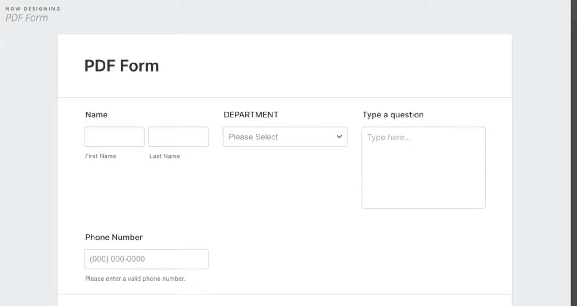
Opt for a single-column layout that guides users in a clear, linear progression to enhance visual perception and usability. And if you just can’t give up on columns yet, two should be more than enough to get the look you desire while not sacrificing the leads you can generate.
Mistake 5: Not optimizing for mobile devices
The perfect form still won’t do much for your business if you only optimize it for the web browsers. With over 54% of users accessing websites via smartphones, failing to optimize your WordPress forms for mobile can lead to missed opportunities. You don’t want to drive clients away, even if only a small proportion of them access your website via these devices.
To ensure your forms are mobile-friendly, start by using a responsive design that adapts to various screen sizes. This means that fields, buttons, and text should scale appropriately, providing a seamless experience regardless of your customers’ devices. Additionally, there are several other practices you can follow to enhance mobile form usability.
First, simplify your forms by reducing the number of fields. Mobile users prefer quick and straightforward interactions, so only ask for essential information. Use auto-fill options where possible to make it easier for users to complete forms.
Also, ensure that all form elements are touch-friendly. Input fields should be large enough for easy tapping and the use of appropriate keyboard types.
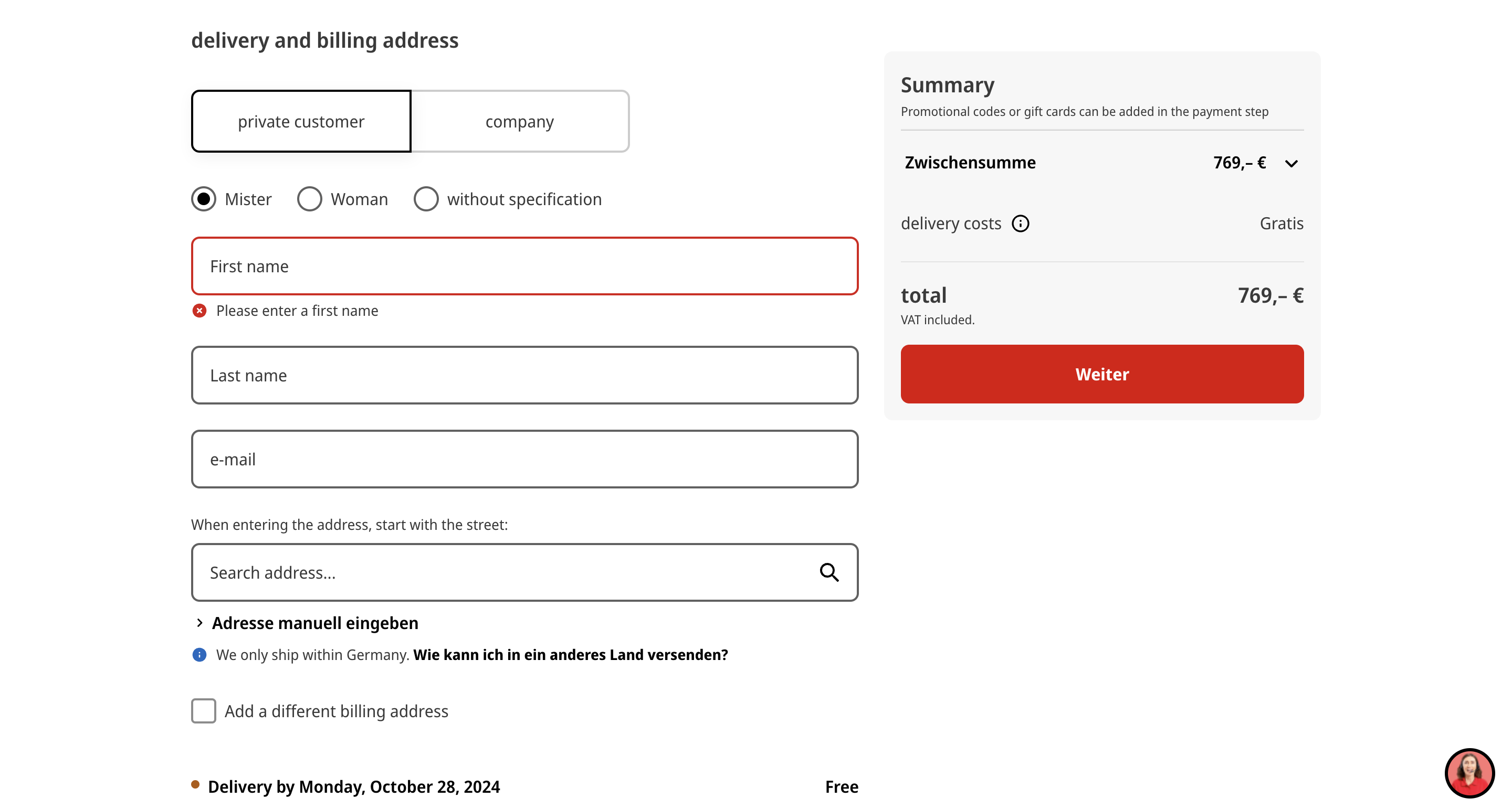
Mistake 6: Lack of guidance for mistakes
Imagine this: you are a customer who just input all the important data in the form for the website you love visiting, and once you click submit, nothing happens. You are unsure whether the form was sent or not, and while scrolling upwards, you see some fields outlined in red. Now, it’s obvious that the form wasn’t sent, but you are unsure why. It seems like you did everything right on your part, but the submission just doesn’t want to go through. What’s your next step? Well, it is probably to exit the page and never return after wasting your time and accomplishing nothing.
Now imagine this happening multiple times to a good number of your website visitors. We are sure you can picture all the revenue lost for a single little mistake: lack of guidance. Without clear feedback on what went wrong or how to fix it, users are likely to abandon the form altogether. In fact, over 67% of site visitors will abandon the form if they encounter complications.
To avoid this mistake, you must include a message giving customers guidance on how to proceed. For instance, if a user enters an invalid email address, a prompt should appear next to the field indicating the error. Seems simple enough, but many website owners completely forget about this step.
Mistake 7: Making the form too redundant
Many forms ask for the same information more than once, and while this makes sense when creating passwords, in many other cases, it just makes customers frustrated. Redundancy wastes time, and the likelihood of form abandonment will skyrocket. Does it really make sense to ask people to input their email addresses and then re-enter it again?
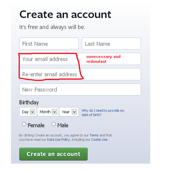
We want to improve user experience, so the aim should be to streamline the forms as much as possible. Each field should be necessary and distinct, serving a clear purpose. If you do require confirmation of certain details – like an email address – consider using a pre-filled field that allows users to verify their information with a single click.
Additionally, regularly review your forms to identify any repetitive fields. You can also take a look at the competitors just to see if any piece of information can be collected more efficiently.
Mistake 8: Failing to test out the form
The form is made, so job well done, right? Sadly, not quite done yet. And while this doesn’t technically qualify as a design mistake, it’s important to mention it alongside all the other common mistakes. Many website owners overlook this crucial step before the form goes live, and failing to test it beforehand can lead to some issues going unnoticed.
Testing your form is essential to ensure that all fields function properly, data is captured accurately, and any error messages are clear and helpful. Conduct thorough tests by filling out the form as a user would, checking for issues like broken submission buttons, validation errors, or improper field formatting. It’s also important to verify that notifications and confirmation messages are sent out as intended.
This preparation will help you avoid losing prospects while you adjust everything. Furthermore, you can even give your clients the deciding power and let them leave feedback on the form you created. The feedback collected can then be used to optimize the form even further.
Mistake 9: Placing the form on an irrelevant page
Lastly, while we are checking how the form functions, it is a great time to think of the WordPress form placement. What is often seen is that website owners place a form on a page where it doesn’t belong or where users might not expect to find it. As a result, you’ll get lower conversion rates that aren’t related to the form design, ultimately leaving you confused as to why your forms flopped.
While the form’s placement will greatly depend on its type, don’t post it on pages that are hard to find or have low traffic. Additionally, try to position your forms where they align with user intent and context. For example, if you’re offering a newsletter sign-up, include the form on relevant blog posts or product pages where visitors are likely to seek additional information.
Moreover, if you are trying to collect feedback, ensure the form is on relevant pages customers often open.
What To Do With the Data Collected?
Every form you place surely has a goal you are trying to achieve, but consider using them for more than just creating endless lists. The data collected can be a goldmine for improving your business and enhancing customer engagement.
Be sure you analyze the responses to gain insights into customer preferences and behaviors. With this information, you’ll know who your customers are and what their pain points or interests are. All this data plays a crucial role in creating marketing strategies, generating leads, or developing new products later on. Keep in mind that the relationship with your customers should be fostered, so don’t forget to follow up from time to time. Using newsletters for these purposes is a great option. As a matter of fact, in a survey done by Epsilon, over 80% of responders stated that they are more likely to do business with a company that offers personalized experiences.
Finally, ensure that you handle the collected data responsibly. Comply with data protection regulations and prioritize user privacy.
Conclusion
In this article, we explored nine common mistakes to avoid when designing your own WordPress form. From overcomplicating layouts to missing instructions, each misstep can significantly impact user experience and conversion rates. So, the goal is to focus on simplicity while still gathering all the information you need.
We encourage you to take a moment to review your own forms and assess whether they fall into any of these common pitfalls. Remember, a well-crafted form is not just a collection of fields; it’s a vital tool for connecting with your audience and achieving your business goals.
