


Your website probably has at least three types of forms right now, and you might not even realize how differently they work. Contact forms collect inquiries. Registration forms create accounts….
Table of Contents
Subscription forms are everywhere. You’ve likely seen them while browsing the web, looking for some answers, or searching for something you need. Maybe it’s that pop-up that interrupts your reading or a subtle footer asking you to subscribe. They’re nearly impossible to avoid, but here’s the catch: they don’t always work as intended.
A good subscription form can turn a casual visitor into a loyal follower. But what about a poorly executed one? It’s a one-way ticket to missed opportunities.
With an abundance of forms, you’d think they couldn’t be any more straightforward. But the reality is that there are some common subscription form mistakes you need to avoid if you are looking to capitalize on their benefits.
Why Do You Even Need a Subscription Form?
Frankly, subscription forms do a job no other tool can do. Sure, you can connect with your audience through social media or paid ads. But nothing quite compares to the direct line of communication that an email list offers.
Subscription forms are a cornerstone of digital marketing and user engagement. They offer one of the most effective ways to nurture relationships and get people excited about your products and services. Skipping on these forms leads to many missed opportunities. Imagine someone searching online for a particular service and they come across your website. They’re intrigued but not ready to make a purchase just yet. They browse your content, see your offerings, and then – poof – they’re gone. You’ve essentially had a potential customer, but without an email address, you cannot keep that connection alive.
This is where the magic of subscription forms comes in. By collecting their email, you’re giving yourself the opportunity to stay in touch. Maybe they’re not ready to buy today, but what about next week? Or next month? With a subscription form, you’re not just hoping for a return visit – you’re making sure they have a reason to come back.
Without it, you’re relying on people to remember you, and let’s face it – online distractions are endless. A well-placed subscription form ensures that you’re at the top of their mind when they’re ready.
Top 9 Subscription Form Mistakes to Avoid at All Costs
You know why subscription forms matter. But even knowing they can transform your business, there is one thing that can stop them from performing at their best: common subscription form mistakes.
These are the slip-ups that can cost you subscribers and waste your marketing efforts. But don’t get discouraged, as you don’t have to reinvent the wheel. Avoiding a few pitfalls is more than enough to give your forms the boost they need to succeed. So, let’s dive in!
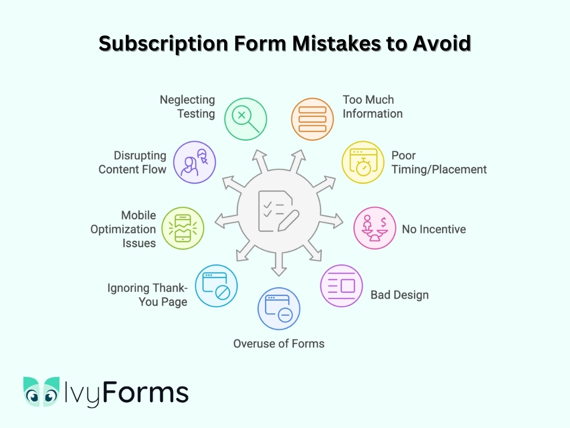
1. Requesting too much information
When you’re about to collect information from your clients, it may seem like a perfect opportunity to gather as much as possible. After all, the more you know, the better, right? Well, not quite.
If you’re asking for too much information on your subscription form, such as full names, phone numbers, address details, or even birthdates, you’re likely to scare people off. The ultimate goal should be to make the process as easy as possible. And frankly, most visitors just aren’t ready to share that much with you right from the start. They may be curious about your content, but they’re not committed enough to hand over personal details. At this stage, all you need is their email address. That’s it.
A great piece of advice is to always stick to the basics when it comes to subscription forms. Anything beyond email and maybe first name can cause friction and result in losing a perfectly good lead.
2. Placing the form on the wrong page or at a bad time
Even a perfect form won’t do much for you if it’s impossible to notice or impossible to get rid of. Timing and placement are everything. Just imagine you’re browsing a website, just getting into a blog post, or checking out some cool products, and suddenly – BAM! A pop-up form appears out of nowhere. You haven’t even had time to digest the content, and you’re already being asked for your email. Frustrating, right?
This is a classic mistake: showing a subscription form at the wrong time or in the wrong place. If you’re asking for someone’s email too soon, they’re far less likely to give it to you. This is because they haven’t even had a chance to browse the website and see any value in it.
Similarly, placing a form on the wrong page can also cause you to miss the mark. Let’s say someone lands on a product page but is immediately hit with a “subscribe to our newsletter” prompt; that’s not good. Your visitor was far more focused on making a purchase than signing up for an email. On the other hand, placing a form on a page that’s too far removed also won’t do much. For instance, imagine what impact it would have if you decided to put a subscription form on a terms and conditions page.
So, how can you hit the sweet spot for both?
- Timing: Give visitors a moment to engage with your content or product. A good rule of thumb is to wait for them to scroll a bit or spend a few minutes browsing.
- Placement: Ensure your form is relevant to the content the user is engaging with. If they’re reading a blog post, offer them an opportunity for content upgrade.
3. Not offering anything in exchange
Here’s a deal: people don’t like giving up their personal information and gaining nothing in return. There should always be an exchange happening. They are providing you with their email, and you are offering them something valuable in return.
A strong subscription form always highlights what’s in it for them. Whether it’s a discount, exclusive content, a free resource, or access to something special, you’ve got to give your visitors a reason to sign up. The more valuable the offer, the higher the chance they’ll hand over their email.
An easy rule to follow is: If you wouldn’t sign up for a form yourself, why do you expect others to do so? So, be clear about the value your visitors are getting. “Get 10% off your first purchase” or “Download our free guide” are simple yet effective ways to sweeten the deal. The clearer and more specific the offer, the better your chances of filling up that subscriber list.
4. Overlooking the design
You’ve probably spent a lot of time designing your website, so anything you add late on should still represent the coherent picture you’ve created in the first place. This logic doesn’t exclude your subscription form. It shouldn’t feel like an afterthought or a random pop-up that doesn’t match your brand.
If your form looks out of place, cluttered, or just plain ugly, it’s a potential turn-off. Visitors will instantly notice if a form doesn’t align with the rest of your site’s aesthetics. To avoid this off-putting effect, focus on fonts, color schemes, and overall form layout.
A well-designed form should feel like a natural extension of your website. It should be visually appealing but also simple to navigate. This doesn’t mean you need a flashy design, but the form should have clear, readable text, a clean layout, and a button that stands out but doesn’t overpower the rest of the page.
Ultimately, a subscription form is part of your brand’s experience. The more polished and user-friendly it looks, the more confident visitors will feel about leaving their details.
5. Utilizing too many forms
Offering an opportunity for visitors to subscribe is pivotal for building your email list. However, bombarding them with too many forms throughout your site can quickly backfire. Picture this: you’re reading an interesting blog post or exploring a product, and just as you’re getting into it, a pop-up asks you to subscribe. You close it, only to find another form lurking in the footer. Then, a few scrolls down, and here comes yet another one.
While it’s important to create opportunities for people to subscribe, overwhelming them with forms is the best way to drive them away. This is a classic mistake – placing subscription forms everywhere without considering the user experience. You can’t focus on only your side of the bargain and must consider how an average user feels in the whole process. Plus, a cluttered site with too many pop-ups and forms can make your brand appear pushy or unprofessional.
To avoid this, try focusing on quality over quantity. It’s better to have a few strategically placed, high-converting forms than a million ones just trying to catch something.
Similarly, if you are utilizing many different form types on your website (such as one for content upgrades, another for updates, and a few more for newsletters, new feature alerts, etc.), be sure to place them strategically so people know what they are signing up for.
Ultimately, balance is the key. You want to offer enough chances for people to subscribe, but you don’t want to turn your website into a minefield.

6. Forgetting about the thank-you page
What happens after someone subscribes to your form? If your forms simply disappear once someone clicks “Subscribe,” how will they know their submission was successful?
Without even a simple “Thank you” message, you’re missing a golden opportunity to connect with your subscribers. A thank-you page is a chance to build on the connection you’ve started. After all, the moment someone subscribes, they’re showing a willingness to engage with your brand – so why not nurture that enthusiasm?
Be sure to express genuine gratitude. Also, consider offering them exclusive content or a special deal right after they subscribe, like a discount code or access to a free resource. This strategy will make them even more likely to engage with your brand in the future.
Additionally, don’t hesitate to encourage them to take the next step. This could be reading a related blog post, following you on social media, or checking out a product you think they’d like. The thank-you page is a perfect place to offer additional links or content that will keep them engaged.
7. Ignoring mobile optimization
If your subscription form isn’t optimized for mobile devices, you’re leaving a lot of potential subscribers on the table. Mobile usage continues to rise, and the last thing you want is for a visitor to try to subscribe on their phone only to find your form doesn’t work properly.
Imagine the frustration of trying to fill out a form where the fields are too small, the text is cut off, or the submit button is hidden off-screen. If your form isn’t mobile-friendly, they’ll likely abandon it – and that’s a missed opportunity.
Optimizing for mobile is no longer optional. You need to ensure that your forms are responsive across all devices so no one feels left out. Check that all fields are easily tappable, text is readable without zooming, and buttons are large enough for mobile users to click comfortably.
Also, make sure your form loads quickly; slow-loading forms can be a deal-breaker on mobile, where speed is critical.
8. Forcing visitors to navigate away from the content
Let’s for a second imagine you are invested in certain content. You are reading an article, fully engaged in the topic, and suddenly, something pops up, covering the whole screen. You soon realize it’s a subscription form without an apparent way to close, so you need to fill it out before returning to the content you were reading.
Suddenly, the flow of the content is broken, and you’re forced to pause and complete the task. This interruption can be frustrating. You were in the middle of something, and now you’re being pulled away from the content you were enjoying. And what if you are not ready to subscribe yet?
One major mistake many website owners are making is forcing visitors to navigate away from content just so they can get as many people on the subscription list as possible. But this practice will shortly backfire. Even if the person subscribes, they will still remember how frustrating it was when they tried to read something valuable on your website.
Remember: visitors are there for your content first. A subscription form should be a gentle suggestion, not a roadblock. The best practice to follow is to put user experience as the core value to follow, not only through your forms but also through your whole website.
9. Neglecting testing and tracking
You’ve set up a perfectly designed subscription form, placed it in the right spot, and crafted an enticing offer – well done! But there are still things to pay attention to.
If you are not testing and tracking the performance of your forms, you’re missing out on some valuable insights. Testing is critical to understanding what works and what doesn’t. You may think your form is flawless, but the reality is that user behavior can be unpredictable. What looks great in theory might not always perform as expected.
This is where A/B testing comes into play – by testing different versions of your form (for example, changing the call-to-action, the color of the button, or the form’s placement), you can see which version yields the highest conversion rates.

But testing is only part of the equation. You also need to track how your form is performing over time. Use analytics to see how many people are interacting with your form, how many complete the subscription process, and where visitors might be dropping off. Maybe the form is too long, or maybe it’s not loading properly.
Without testing and tracking, you’re flying blind. You could be missing out on opportunities to fine-tune your forms and improve their conversion rates. Frankly, a subscription form is not a one-and-done project. It’s an ongoing process of constant monitoring and optimization.
Final Thoughts on Subscription Form Mistakes
With so many forms everywhere, you’d think there is no particular science behind making them. However, an abundance of subscription form mistakes tells a completely different story. There’s more to crafting a successful form than simply adding it to your site and hoping for the best.
Every detail, from design to timing to the value you offer in exchange, can make or break the experience for your visitors. It’s about making the process seamless and ensuring your form aligns with the user’s journey.
The reality is that a great subscription form does more than just collect emails. It builds trust, fosters long-term relationships, and serves as a gateway to ongoing engagement with your audience. So, take the time to test, optimize, and refine your forms because even small adjustments can lead to big results.

