



Of the native CSS form features now shipping, field-sizing (the property that sizes a textarea to its content) appears on about 2.204% of Chrome page loads. :user-invalid, the selector that…
Table of contents
Most advice about form completion starts and ends with one number: how many fields you have. Cut fields, win conversions. Simple.
It’s also wrong, or at least incomplete.
The real story is that a handful of specific fields do most of the damage. Some cost you two points of completion. Others cost you forty. This breaks down which fields actually bleed your numbers, backed by field-level data instead of guesses.
Does Field Count Actually Predict Completion Rate?
The “shorter is always better” rule is the first thing everyone learns and the first thing worth questioning.
Field count matters. It just isn’t the whole game, and treating it like the only lever means you’ll optimize the wrong things.
The completion curve most people quote
Fewer fields, higher completion. The pattern holds at the top of the curve.
Consumer forms with three fields convert around 25%. Add a fourth and it slides to 20%. A fifth drags it to 15%.
Digital Applied’s 2026 benchmark set puts cross-industry median form conversion at 17.3%, with a newsletter signup hitting 32.1% while a 10-field demo request sinks to 6.9%.
Same form, wildly different results. Intent and buying cycle move the number more than field count does.
HubSpot’s 2024 data found each extra field cuts conversion by roughly 4.1% on average. Small per field. Brutal when they stack.
The five-to-seven field cliff nobody mentions
Here’s the part the smooth “2% per field” curve hides.
The drop isn’t linear. Digital Applied’s segmented data shows conversion sliding gently from 23.1% at three fields to 17.0% at five, then falling off a ledge to 11.4% at seven and 6.9% at ten-plus.
Where it breaks: somewhere past five visible fields, each new one costs about 2.8 points instead of 1.5.
MarketingSherpa’s 2024 analysis backs the threshold. B2B forms with more than five fields recorded a 30% average conversion drop versus shorter versions.
The likely reason is cognitive. At four or five fields a person can still take in the whole form at a glance. Past that, it reads as work.
Where the “fewer fields” rule breaks
Not everyone’s data agrees, and that’s the interesting bit.
Zuko, which has run analytics across millions of form sessions, plotted field count against completion across their whole dataset. The trend line came out flat. Their read: number of inputs is not the main thing deciding whether a form gets finished.
Financial comparison forms average 36 inputs and still complete. Recruitment forms run even heavier. People push through when the payoff is worth it.
| Signal | What it tells you |
|---|---|
| Field count | A rough proxy, not a verdict |
| Field type | The actual friction source |
| Intent level | Overrides length when high |
So the count is a symptom. The friction lives in which fields you pick, which is where the rest of this goes. If you want the mechanics of trimming without gutting your data, there’s a solid rundown on cutting the number of form fields that drag completion down.
Why People Walk Away From Forms
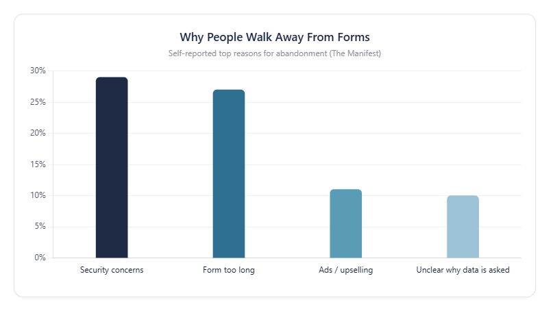
What the data shows:
This one breaks down the self-reported reasons people bail on a form. Security worries top the list at 29%, with form length close behind at 27%. The back half, ads and unclear data requests, sits much lower but still costs real submissions.
Key insights:
- Trust beats length. More people quit over data-safety fears than over how long the form looks.
- The top two reasons (56% combined) are both fixable with design, not new tech.
- “Unclear why you’re asking” at 10% is the sneaky one. People don’t hate the field, they hate the mystery behind it.
Why it matters:
Two of the four biggest drop-off causes get solved with a privacy line near the submit button and a shorter field list. Cheap fixes, real recovery.
Sources: The Manifest, WPForms
Which Individual Fields Cause the Most Abandonment?
Some fields are quietly fine. Others are repeat offenders that show up in the data every single time.
Zuko’s field-level analysis, drawn from a dataset of over 93 million sessions, ranks the worst by mean abandonment. The order barely changes across industries.
Field-level drop-off across 100M+ sessions (Zuko Analytics, 2025). *Name drops are usually early bounces, not friction.
Why does the phone number field kill so many forms?
This one’s the headline villain, and it earns it.
Ask for a phone number and roughly 37% of people will abandon unless the field is optional (WPForms). That’s not a rounding error. That’s more than a third of your traffic gone over one input.
One MarketingExperiments case flipped the field from mandatory to optional and watched abandonment fall from 39% to 4%.
The fix isn’t always removal. Baymard found 14% abandon checkout when phone is simply required with no explanation, yet 39% of sites give no reason for asking.
Add one line of microcopy (“only used if we need to confirm your order”) and the resistance drops. People don’t hate giving the number. They hate not knowing why you want it.
How much does a password field cost you?
Passwords are the single highest-friction field in Zuko’s ranking, full stop.
Mean abandonment sits at 10.5%, well above every other common field. The pdfFiller 2026 data report confirms the same figure across its aggregated set.
The confirm-password field makes it worse. A second password box roughly doubles the drop-off, costing an estimated 15 to 20% of completions on forms that use it.
Stacked validation rules pile on. Minimum length, one uppercase, one number, one symbol, all firing at once. Good form validation practices fire clear messages the moment someone leaves a field, not after they hit submit.
Is CAPTCHA worth the conversion hit?
Short answer: almost never, for most forms.
A Stanford study found a CAPTCHA challenge can cut form conversions by up to 40%. Forrester reported 19% of consumers have abandoned a site entirely after hitting one.
Baymard’s testing showed something wild. An extra 1.47% of people abandoned an incentivized survey when a CAPTCHA appeared at the end, despite already finishing 80% of it and standing to lose their payment.
One sign-up form documented jumping from 48% to 64% conversion after the CAPTCHA came off. That’s a 33% lift from removing a single friction point.
If spam is the worry, there are quieter defenses. A honeypot field catches bots without making a single real user prove anything.
What does forced account creation do to checkout?
Making people register before they buy is one of the most expensive things a checkout can do.
Baymard’s research pins forced account creation as the cause of 26% of checkout abandonments. Over a quarter of ready-to-pay shoppers walk because you asked them to make a login first.
Switching to guest checkout drops that forced-account abandonment from around 26% to roughly 8%, per Baymard’s usability data.
Better play: offer guest checkout by default, then invite account creation after the order lands. At that point the value is obvious (“save your details for next time”) and post-purchase account creation converts far higher than the forced version.
There’s also a compliance angle. Under GDPR’s data-minimization principle, requiring a persistent account for a one-time payment is hard to justify, which is worth knowing if you’re building forms that need to stay GDPR compliant.
Email, address, and the second-tier fields
Not every field is a five-alarm fire. Some just cost a little.
Zuko’s field-level numbers put these in the tier right below password:
- Email: 6.4% mean abandonment
- Phone (as a field, separate from the “required phone” penalty): 6.3%
- Address: the slowest to fill, averaging 7.4 seconds
These are mostly unavoidable. You usually need the email. The move isn’t to cut them, it’s to reduce the effort around them with autofill and native mobile keyboards.
That last part pays off hard. Chrome’s 2024 data showed forms with working autofill complete about 35% faster and see roughly 75% lower abandonment. One of the highest-leverage fixes going.
Dropdowns and date pickers that break on mobile
The field type you choose matters as much as the data you ask for.
Date of birth is the classic disaster. A calendar picker forces someone born in 1974 to scroll back through decades, one month at a time on some sites. Baymard and Zuko both flag this as pure friction.
Zuko’s eye-tracking on date-of-birth fields found the three-text-box format (day, month, year) produced a smoother scan path and lower fixation count than dropdowns or pickers.
Rule of thumb:
- Near-future date (appointment, delivery) – picker is fine
- Historical date (birthday) – three text boxes win
- Long option list on mobile – reconsider the dropdown entirely
Nielsen Norman Group found 38% of mobile checkout errors come from people accidentally tapping the wrong field. On a 375px screen, native input types and generous tap targets aren’t polish. They’re the difference between a submit and a bounce. The deeper mechanics live in designing forms that hold up on mobile screens.
It’s Not Just the Field, It’s How You Build It
Same field, two builds, wildly different completion. The input you ask for is half the story. The other half is how it behaves when someone touches it.
Digital Applied’s 2026 data puts three levers above the rest: inline validation, single-column layout, and autofill. They account for most of the gap between a median form and a top-decile one.
| Lever | Completion impact | Source |
|---|---|---|
| Inline validation | +5% short forms11–13% longer forms | Digital Applied |
| Single-column layout | 15.4s faster completion | CXL |
| Autofill enabled | ~75% lower abandonment | Chrome · 2024 |
Inline validation changes everything
Validate as people go, not after they hit submit. That’s the whole trick.
CXL’s study found inline field validation cuts form errors by 22% and drops completion time by 42%. Reform’s data adds a 31% satisfaction bump and a 47% reduction in eye fixations.
One catch worth knowing: timing. Fire the check when someone leaves the field (on blur), or with a 300 to 500ms delay. Validate on every keystroke and you’re just yelling at people mid-typing.
And here’s the contrarian bit. GOV.UK’s design team tested this and landed on validating at submit, not on blur, for their government forms. Context wins. Your mileage varies.
The reason it works comes down to expectation. People forgive a late error more than a nagging one that fires before they’ve finished typing.
The mobile penalty is real
Mobile forms lose more people. Full stop.
Zuko’s benchmarking shows desktop view-to-completion at 47% against 42% on mobile. Tinyform’s data pushes the gap wider, with mobile abandonment running 27% higher than desktop.
Then there’s the tap problem. Nielsen Norman Group found 38% of mobile checkout errors come from people fat-fingering the wrong field.
- One field per row (side-by-side inputs break on small screens)
- Native input types (numeric keyboard for phone, email keyboard for email)
- Big tap targets
Costa Coffee bumped registrations 15% after session replays exposed a single password-error issue on mobile. One field. One fix.
Small copy, big swings
Real A/B results, not projections. Notice the pattern: every win removes friction or answers a hesitation.
Words on the form move numbers more than people expect.
The button label alone matters. Swapping a generic “Submit” for something specific tends to lift completions, and Insiteful clocked “Submit” as costing around 3% on its own versus a value-driven label.
Then the microcopy around sensitive fields. A single line explaining why you need a phone number or how you’ll use an email does more than any redesign.
Placeholder text helps too, though don’t lean on it as a label (it vanishes the second someone types). If you’re stuck on wording, these placeholder text patterns and error message examples cover the common cases.
What Happens When a Long Form Splits Into Steps
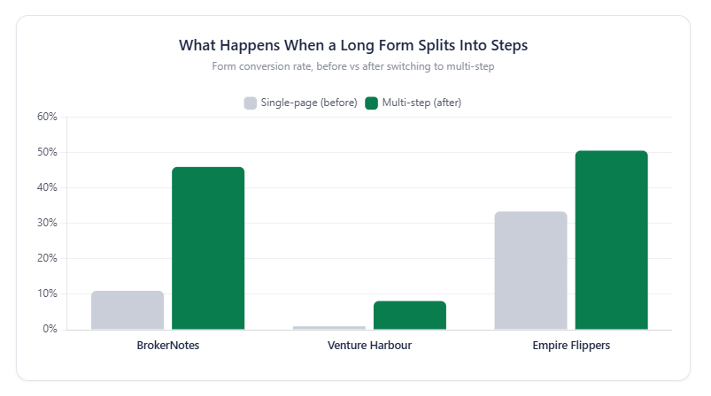
What the data shows:
Three real companies took a single-page form and rebuilt it as a multi-step flow. The chart puts their before-and-after conversion rates side by side. Every one climbed, and BrokerNotes basically quadrupled (11% to 46%).
Key insights:
- Venture Harbour’s consulting form went from under 1% to 8.1%. Tiny absolute numbers, but a 743% jump.
- BrokerNotes saw the biggest raw swing, 11% up to 46%, on a B2C finance lead form.
- Empire Flippers pulled a 51.6% lift in 47 days with clickable buttons and a progress bar, no field changes.
Why it matters:
Splitting a form doesn’t remove any fields. Same questions, same data, just paced across screens. The lift comes purely from lower perceived effort, which is about the cheapest conversion win available. Worth noting though: this only works on genuinely long forms. Split a 3-field form and you make it feel longer, not shorter.
Sources: CXL, Venture Harbour
How to Audit Your Own Form
You don’t fix a form by staring at it. You fix it by watching where people bail, then pulling the fields that cause it.
Zuko flags an ugly baseline: 81% of visitors leave web forms incomplete. The ones who quit an enquiry form do it after about 50 seconds, so you have almost no runway.
The three-question test for every field
Run every field through three questions before it earns a spot.
Can it be inferred? Pull it from IP, account data, or a prior session instead of asking.
Can it be deferred? Ask after submit, during onboarding, through progressive profiling.
Can it be removed? If nothing downstream uses the answer, cut it.
Any field that pushes your form past five inputs should clear a higher bar than the ones before it. Baymard found the average checkout shows roughly twice as many fields as it actually needs.
Most teams never do this pass. They add fields when someone in a meeting wants more data, and nobody ever removes one.
Field-level drop-off, not just overall rate
Overall completion rate tells you a form is leaking. It doesn’t tell you where.
Field-level drop-off does. The formula’s simple:
(Users who exit at field X / Users who reached field X) × 100
If 100 people hit your phone field and 40 leave without filling it, that’s a 40% drop-off. That field is the problem, not your traffic.
What to actually track:
| Metric | What it reveals |
|---|---|
| Field drop-off | Where people quit |
| Time in field | Where they struggle |
| Field return rate | Confusing or over-strict validation |
GA4 can do basic form funnels if you’re willing to tag every field, though dedicated tools save the developer hours. Zuko notes a completed session averages 5.6 field returns versus 4.6 for abandoned ones, so returns alone don’t spell doom. If you want the setup path, here’s tracking form submissions in Google Analytics.
The fields worth the friction
Not every high-friction field should go. Some earn their keep.
A newsletter signup with seven fields bleeds visitors. A quote request for a $50,000 project with seven fields converts fine, because the intent justifies the effort. Same field count. Opposite outcome.
MarketingSherpa’s counter-case: some forms that went from 4 fields to 10-15 saw qualified conversions rise, because the extra questions filtered out tire-kickers and improved lead quality. Reform’s lead-scoring data backs it, filling an optional field can add 10 to 20 points to a lead’s score.
Where more fields make sense:
- Demo requests for enterprise software (buyers expect qualification)
- High-ticket quote forms (effort matches the purchase)
- Anything where a junk lead costs more than a lost one
Field ranges and conversion bands by funnel stage (LeadSquared, 2026; Forrester, 2024). Match length to what the visitor gets back.
The principle underneath all of it: people trade information when the exchange feels fair. Ask for a phone number on a free ebook and they balk. Ask on a $50k consultation and they hand it over. Measure these forms by lead-to-meeting rate, not raw conversion, and you’ll see it. More on the split in the fields that pull in high-quality leads.
Field count is the symptom. Friction is the disease. Count your visible fields, run each through the three-question test, watch your field-level drop-off, and pull the ones that cost you more than they return. The rest can stay, even the long ones, as long as the person filling them out knows exactly why they’re there.
Conclusion
Field count gets all the attention. It’s the wrong thing to obsess over.
The damage comes from specific fields. A required phone number, a confirm-password box, a CAPTCHA, a forced account signup. Those cost you real completions, sometimes 30% or more.
Everything else is execution. Inline validation, a single column, native mobile keyboards, one line of copy explaining why you’re asking. Small changes, measurable lift.
So audit what you have. Run every field through three questions: can you infer it, defer it, or cut it? Then watch your field-level drop-off instead of guessing.
Long forms aren’t the enemy. Pointless friction is. Keep the fields that earn their spot, and make sure the person filling them out knows exactly why each one is there.