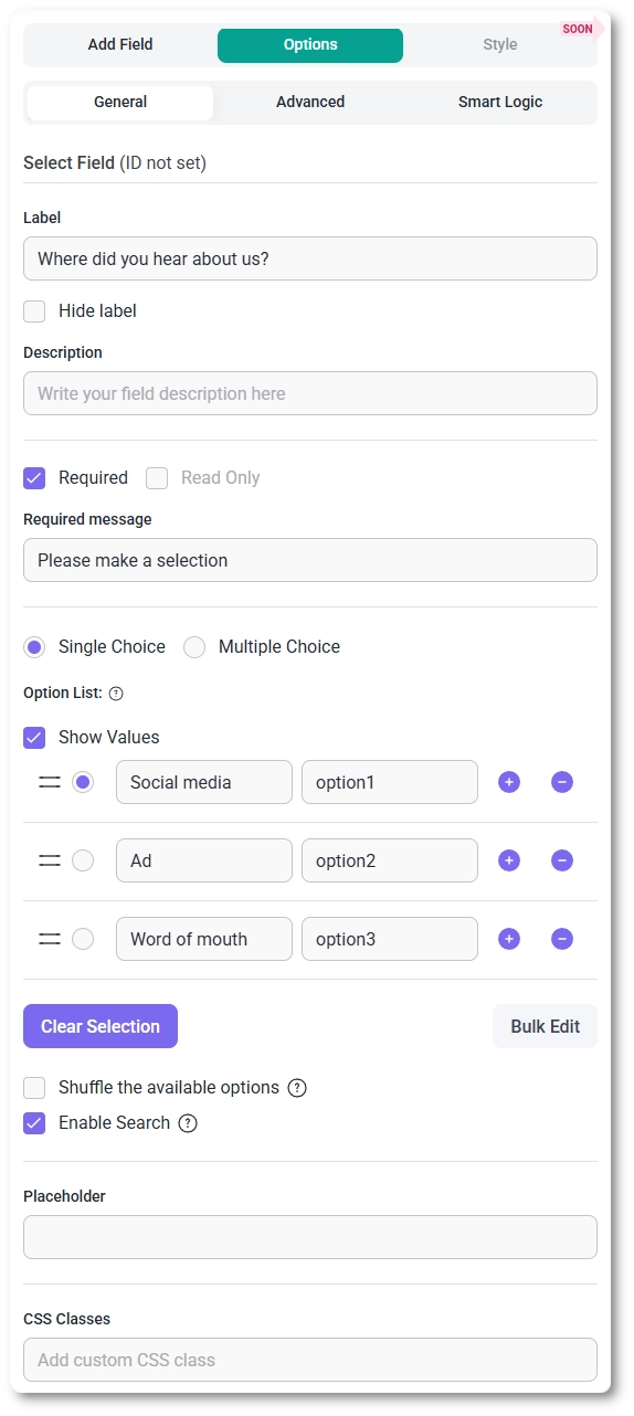
- Label – defines the visible title of the dropdown field.
- Hide label – hides the label on the front end, leaving only the dropdown visible.
- Description – adds a short note below the field to help users understand what to select.
- Required – requires users to select an option (for single choice) or at least one option (for multiple selection).
- Read-only – displays the dropdown with selected option(s), but prevents users from changing them.
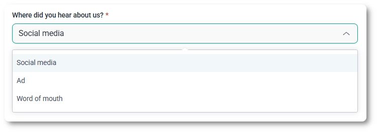
- Single choice / Multiple choice – defines whether users can select one option or multiple options.
- Show values – displays stored values next to option labels, useful when labels and saved values differ.
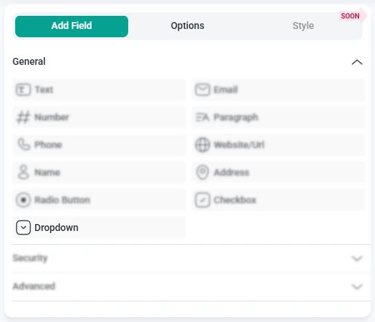
Below these settings, you can manage the list of available options:
- Add an option by clicking the plus (+) button.
- Remove an option using the minus (-) button.
- Clear selection – removes any preselected value(s), allowing the dropdown to appear without a default selection on the front end.
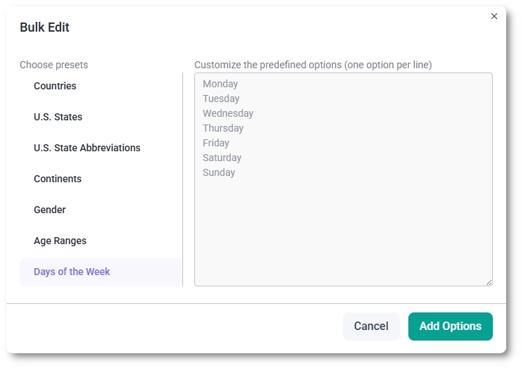
- Bulk edit – provides predefined option sets such as Countries, U.S. States, U.S. State Abbreviations, Continents, Gender, Age ranges, Days of the week, and Rating.
Additional controls below the option list define how users interact with the dropdown:
- Shuffle options – randomizes the order of options each time the page loads.
- Enable search – adds a search field inside the dropdown, allowing users to quickly find options in longer lists.
- Placeholder – displays hint text inside the dropdown before a selection is made.
- CSS classes – allows you to add custom class names for styling.
How does bulk editing work for option-based fields?
For option-based fields such as Dropdowns, Radio Buttons, and Checkboxes, IvyForms includes a Bulk Edit option that helps you manage longer lists of choices more efficiently.
When the field is selected in the builder, the Bulk Edit button appears directly below the option list. Clicking it opens a dedicated panel where you can add multiple options at once instead of creating them one by one.
Inside the Bulk Edit panel, you can choose from predefined presets and modify their values manually but you can’t add your own presets. Presets include commonly used option sets such as countries, age ranges, days of the week, and similar standardized lists.