documentation-logo
Menu
  • Guides
  • Form Creation
  • General fields

How does the name field work in IvyForms?

ON THIS PAGE

The Name field is a multi-part input designed to collect structured name information, such as first, middle, and last names. Each subfield can be customized individually, giving you full control over labels, placeholders, and required settings. This article explains how the Name field works and how to configure its components in the form builder.


Front-end view of a Name field in an IvyForms form.

Front-end appearance

Where can I find the Name field in IvyForms?

The Name field is available in the General fields section of the IvyForms builder. Once you expand this section, it appears as one of the multi-input field types you can add to your form. Select it to insert it into the layout, then click the field in the preview to begin configuring its subfields.


IvyForms field list with the Name field highlighted and other fields grayed out in the panel.

What settings can I configure for the Name field?

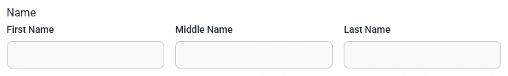
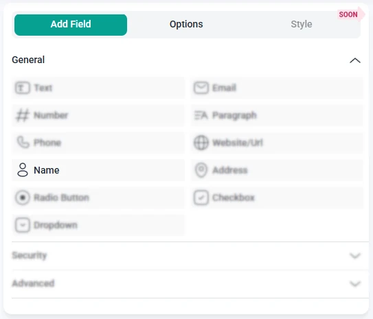
After adding the Name field to your form, the left panel switches to the Options view. Since the Name field contains multiple subfields, each segment can be edited individually. Options are grouped under the General and Smart logic tabs, while advanced behavior is managed per subfield rather than through a separate global panel.


How do general settings work for the Name field?


The General tab lets you customize each part of the Name field. You can rename subfields, adjust placeholders, control required settings, and fine-tune the text users see as they enter their information. Each subfield behaves like a smaller, independent input with its own editable settings.


General options for the Name field in IvyForms showing editable subfields with labels, descriptions, and placeholders.
 

  • Sublabel – sets the name of each individual part, such as “First name” or “Last name”.
  • Description message – adds additional instructions below a specific subfield, useful when you want users to provide more detail.
  • Hide label – removes the visible label for a subfield on the front-end while keeping the input active.
  • Required – lets you choose which subfields must be filled in before submitting the form. Each required subfield includes a dedicated Required message.
  • Placeholder – adds example text inside the subfield, such as “John” or “Doe”.
  • Add option – inserts an additional subfield, allowing you to expand the Name field with entries like “Middle name”, “Prefix”, or “Suffix”.


At least one subfield is expanded by default, while others remain collapsed to keep the panel organized. You can expand or collapse any subfield using the toggle arrow on the right.


How do advanced settings work for the Name field?


The Advanced tab for the Name field includes a single global option: Label position. This setting controls where the main field label appears in relation to the entire Name field group. You can choose between Default, Top, Left, or Right, which helps you match the field layout to the rest of your form design. All other customization remains subfield-based, meaning each part of the Name field still has its own label, placeholder, required status, and visibility settings.


How can I use smart logic with the Name field?

Smart Logic is available only in the Pro version of IvyForms.


The Smart logic tab allows you to display or hide the entire Name field based on conditions from other inputs. Smart logic is off by default, so the field is always visible until you turn the feature on and define conditional rules.


Smart logic settings for the Name field in IvyForms showing rule controls and conditional match options.
 

When smart logic is enabled, the Conditional match section appears with two rule modes:

  • Any – the Name field appears if at least one of the conditions you set is true.
  • All – the Name field appears only when every selected condition is met at the same time.


These conditions are based on values from other fields in the form. For example, you can display the Name field only when users choose a specific registration type or select a relevant category from a dropdown. This allows you to request detailed name information only when it’s relevant to the user’s input.