documentation-logo
Menu
  • Guides
  • Form Creation
  • General fields

How do I configure the number field in IvyForms?

ON THIS PAGE

The Number field is designed for collecting numeric values such as quantities, scores, prices, or any other number-based input. It supports ranges, step increments, and different formatting styles, so you can control exactly which values users are allowed to enter. This article explains how the Number field works, which options it includes, and how to adjust its behavior in the form builder.

 
Front-end view of a Number field in an IvyForms form.

Front-end appearance

Where can I find the Number field in IvyForms?

You can insert a Number field from the General fields section in the left sidebar of the IvyForms builder. When you expand this section, all basic input types are listed, and the Number field appears alongside Text, Email, and other general fields. Click it once to add it to your form, then select it in the preview to start configuring its options.
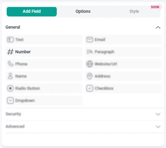
 
IvyForms field list with the Number field selected and other fields grayed out.

What settings can I configure for the Number field?

After you click the Number field in the form preview, the left panel switches from Add field to Options. From there, you can adjust the field through three main sections: General, Advanced, and Smart logic. Together, these tabs control how the field is displayed, which values are allowed, and when the field is shown to users.


How do general settings work for the Number field?


The General tab contains the core appearance and content options for the Number field. Here you define the label, helper text, and basic behavior that users see when they interact with the input on the front-end.

 
General options tab for the Number field in IvyForms showing label, description, required, read-only, placeholder, CSS classes, range, step, and format settings.
 

  • Label – sets the title of the field that appears next to or above the input.
  • Hide label – shows only the input without the label text on the front-end.
  • Description – adds an explanatory line below the field to guide users.
  • Required – forces users to provide a valid number before the form can be submitted.
  • Read-only – displays a fixed value that users can see but not modify.
  • Placeholder – displays example content inside the input, such as “0” or “Enter quantity”.
  • CSS classes – lets you add custom class names for styling the field via your theme or custom CSS.
  • Range from / to – defines the minimum and maximum values that are accepted. Numbers outside this interval are treated as invalid.
  • Step – controls by how much the value changes when users use the built-in increase or decrease controls. For example, if the current value is 4 and the step is 5, the next values will be 9, 14, 19, and so on. Users can still type any number manually, but the step applies whenever they use these controls.
  • Format – chooses how numbers are displayed, so you can switch between US and EU styles, with or without decimal values.


How do advanced settings work for the Number field?


The Advanced tab lets you refine how numeric input is stored and presented, including character limits, pre-filled values, and label positioning. These options are useful when you want to guide users toward a specific format or keep values consistent across multiple entries.
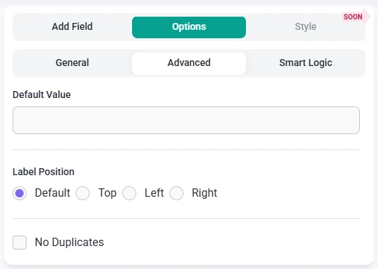
 
Advanced options tab for the Number field in IvyForms showing maximum length, default value, label position, and no duplicates settings.
 

  • Limit maximum length – caps how many characters can be entered into the Number field, which can help avoid overly long values.
  • Default value – fills the Number field with an initial value that users can keep or overwrite, unless the field is set to read-only.
  • Label position – adjusts where the label appears in relation to the input (Default, Left, or Right), helping you align the layout with your form design.
  • No duplicates – blocks users from submitting the same number in multiple entries when this option is enabled, which is useful for IDs, ticket numbers, or other unique values.


How can I use smart logic with the Number field?

Smart Logic is available only in the Pro version of IvyForms.


With Smart logic, you can control when the Number field is visible based on other answers in the form. By default, Smart logic is disabled, so the field always appears. Once you enable it, you can configure conditions that determine when the Number field should be shown.
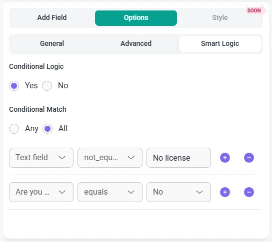
 

Smart logic settings for the Number field in IvyForms showing conditional match options and rule configuration.
 

When Smart logic is turned on, the Conditional match setting appears with two options that define how rules are evaluated:

  • Any – the Number field is displayed if at least one of the configured conditions is satisfied.
  • All – the Number field is displayed only when every condition you have set is true at the same time.


These rules are based on values from other fields in the same form. For example, you can show a Number field only when a user selects a specific option in a Radio Button field or chooses a certain category. This makes it easy to collect numeric details only when they are relevant, keeping your forms focused and easier to complete. If you are already using Smart logic with other inputs, such as the Text field or Email field, the configuration process for the Number field will feel very familiar.