Spring Deals Are in Full Bloom
Up to
70%Off
Table of Contents
The Text field is one of the most commonly used input types in IvyForms. It lets you collect short, single-line information such as names, titles, labels, or any brief text response. This article explains how the Text field works, which settings you can adjust, and how to configure it inside the form builder.

Front-end appearance
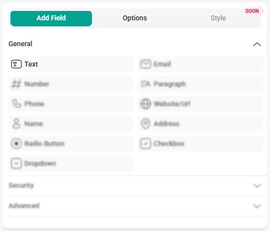
You can add the Text field from the General Fields section in the left panel of the IvyForms builder. When this section is expanded, all general input types appear in a list, with the Text field available as the first option.

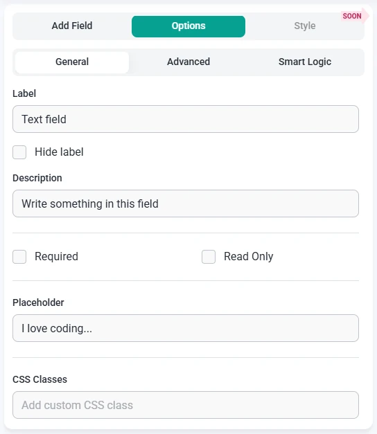
When you select the Text field in the form builder, the panel on the left switches from Add field to Options. This is where you can configure the General, Advanced, and Smart logic settings for the selected field.
All basic customization options for the Text field are found in the General tab on the left panel. These options control how the field looks on the front-end and what users see when they fill out the form.

The Advanced tab provides additional options for fine-tuning how the Text field behaves and how user input is handled.

Smart Logic is available only in the Pro version of IvyForms.
The Smart logic options let you control when the Text field is shown based on conditions you define. By default, Smart logic is set to No, which means the field is always visible. When you switch this option to Yes, additional conditional settings become available.

When Smart logic is enabled, the Conditional match section appears with two options:
These conditions are based on other fields in the same form, so Smart logic is only effective when your form contains multiple fields. This allows you to show or hide the Text field dynamically, depending on how users interact with previous fields.